

I adore how Chinese calligraphy tattoos weave ancient beauty into modern personal expression. The flowing artistic style adds such graceful movement that feels empowering on women. My own experiences with similar ink have shown me how these designs spark conversations and confidence. These 23 ideas capture that lively essence in ways I find truly delightful and fresh.
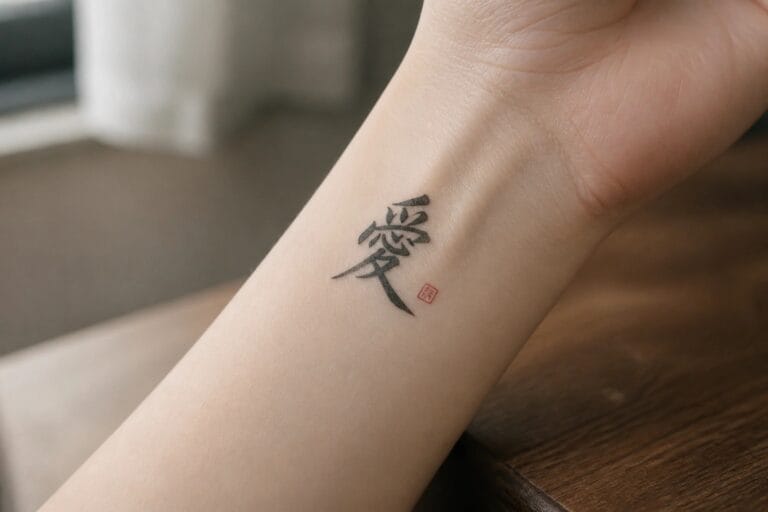
A love character on the inner wrist

The tattoo shows the Chinese character for love in a flowing script. It sits on the inner wrist with a small red seal placed just below. The single character keeps the design compact and clear on that narrow area.
I think the wrist works for this because the tattoo stays visible only when the hand moves. The scale also prevents the lines from feeling crowded.
Vertical calligraphy on the forearm
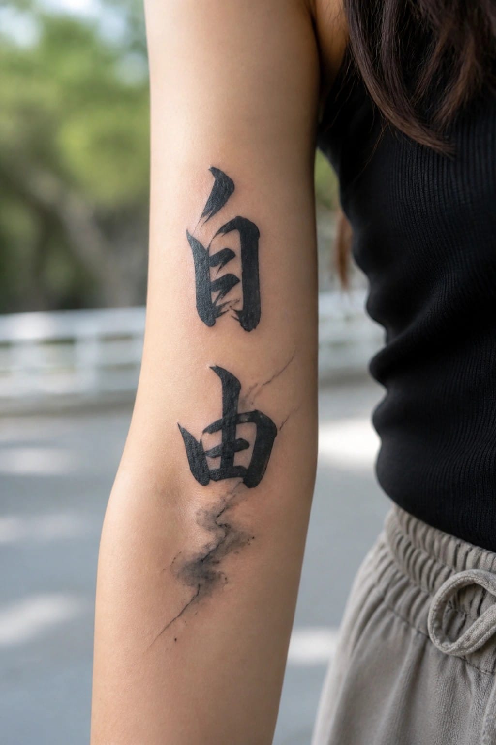
The two large characters run straight down the inner forearm. This placement lets the tall strokes sit evenly without twisting around the arm. The bold ink stays clear even with some texture in the lines.
I like how the length matches the space here. It gives the script room to read well without needing extra elements.
Chinese calligraphy spans the upper back
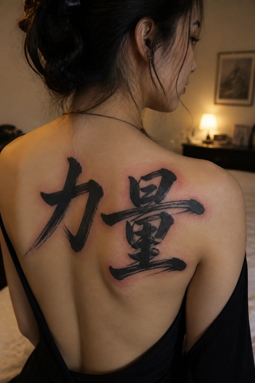
The tattoo uses two groups of characters placed across the shoulders. One sits on the left side and the other on the right, leaving the spine clear in the middle. This arrangement takes advantage of the width available on the upper back.
The spacing prevents the design from feeling cramped. It also lets each set of strokes stand out on its own.
Chinese character behind the ear

The tattoo sits just behind the ear in a spot that stays mostly out of sight. A single black character fills the space with clean lines and no extra detail. Its small size keeps everything compact and simple.
I think the placement makes sense here because it lets the design stay personal while still showing when the hair moves. The character stays easy to read without needing more space.
Chinese characters running down the spine

The vertical line sits right along the spine so each character stays straight and evenly spaced. This setup matches how Chinese text is traditionally written which keeps the whole piece balanced from neck to lower back.
I think the placement works because it uses the body’s natural center without needing extra framing or decoration. The characters stay clear at this length and the ink sits flat against the skin.
Chinese characters on the upper back
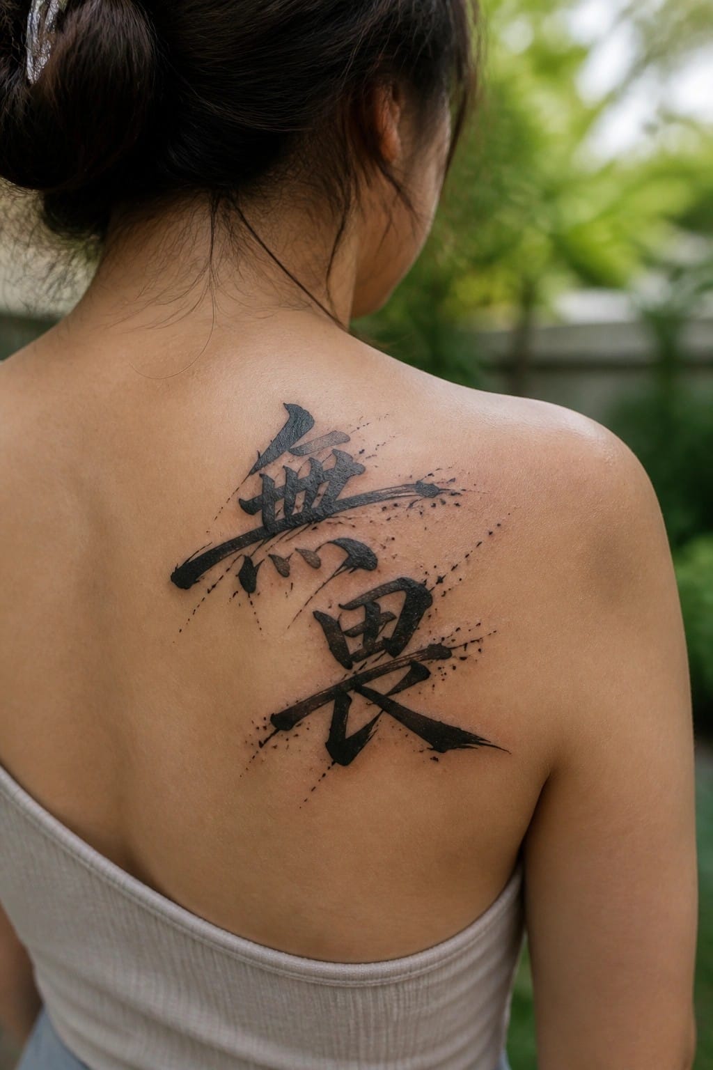
The upper back gives these two characters enough space to spread without feeling cramped. Bold brush strokes run at a slight angle with ink splatters trailing off the edges. The black ink stays solid but keeps some texture from the brush.
This placement works because the design can extend sideways while staying centered. I think the size helps the strokes stay clear and balanced on the skin.
Calligraphy tattoo on the side
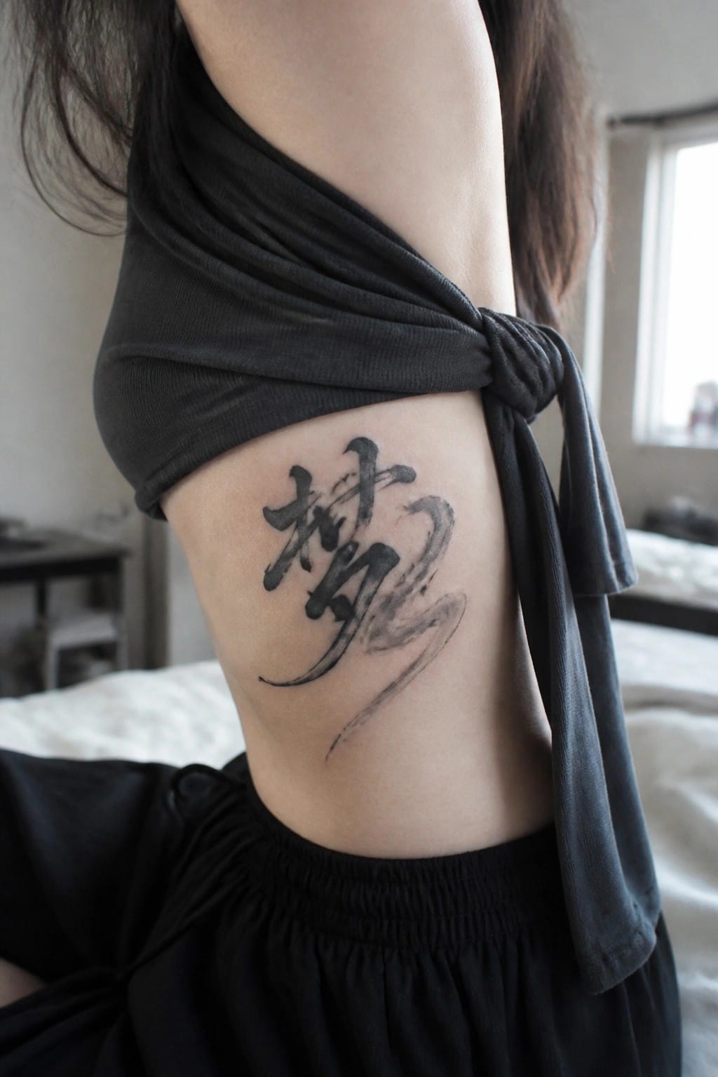
The tattoo sits on the ribcage area. The characters use a loose brush style that lets the strokes extend downward in one continuous motion. This placement gives the design space to breathe without forcing the lines into a tight box.
I think the side works because the natural curve helps the ink feel more dynamic. The size stays balanced so the details remain clear from a normal viewing distance.
Hope characters on the ankle
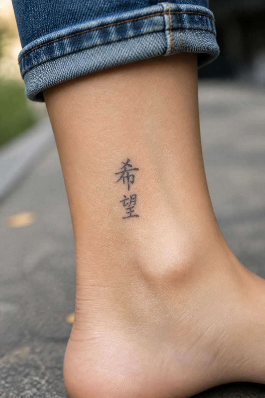
The ankle gives these two characters a quiet spot that stays mostly hidden. They sit in a short vertical line on the inner side. The scale stays small enough to suit the narrow area without crowding.
I think the vertical layout matches the ankle shape better than a wider design would. It keeps the tattoo simple and easy to read even up close.
Chinese characters on the upper back
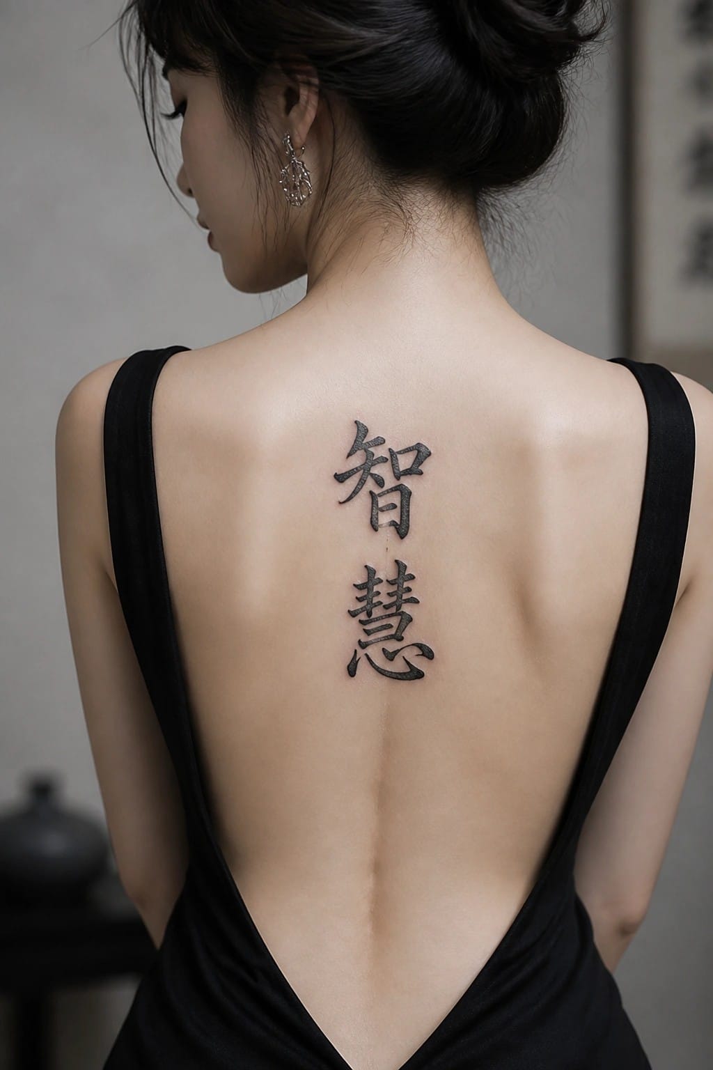
The tattoo sits centered between the shoulder blades. Two characters stack vertically in black calligraphy ink. They take up a medium space that follows the line of the spine.
This placement keeps the vertical layout balanced. The characters stay clear without crowding the area. I think the size works well here because it leaves the design simple and easy to read.
Small character on the side of the finger
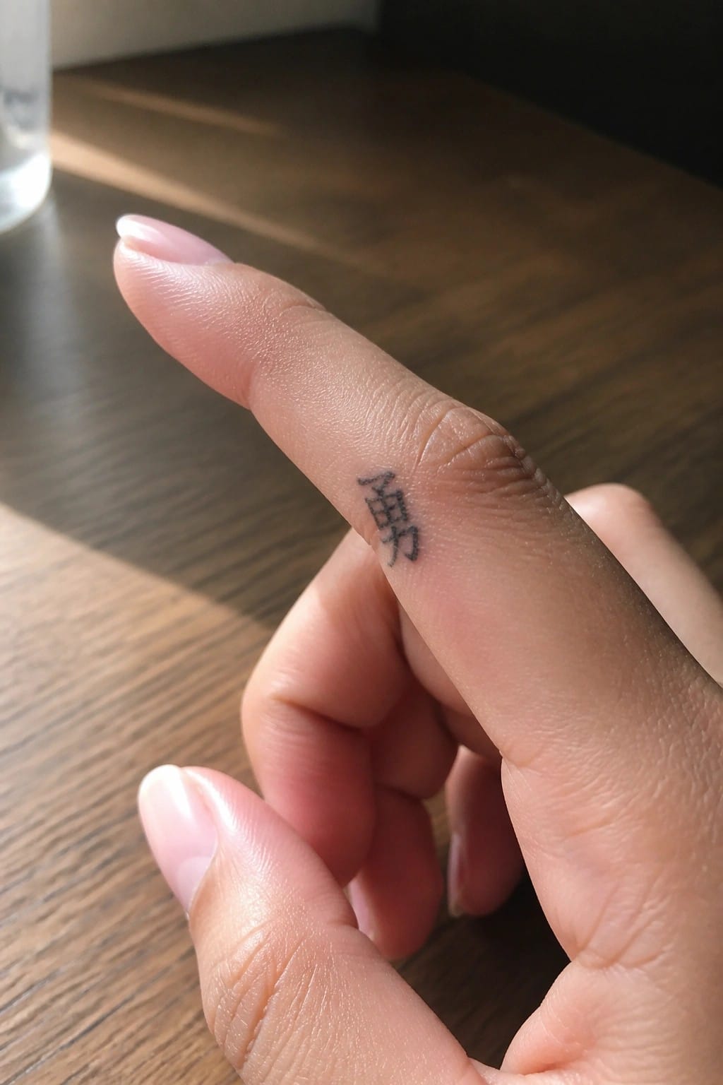
The tattoo sits along the side of the index finger near the middle knuckle. This narrow spot holds just one Chinese character in simple black ink. The size stays small enough to remain subtle in most positions.
I chose this placement because the finger shape naturally limits the design to a compact scale. It keeps the tattoo readable without needing extra detail or shading.
Vertical calligraphy on the thigh
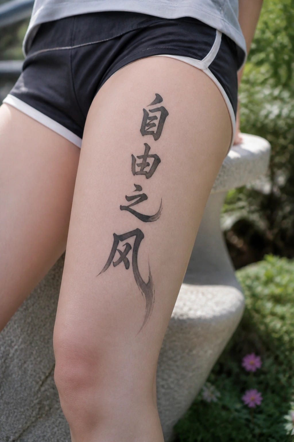
The thigh works well for a vertical piece like this because it offers a long flat area. The characters run straight down in a single column with clear spacing between each one. The brushwork stays bold at the top and fades slightly toward the bottom.
I think the length feels balanced here since the thigh can support taller designs without them looking stretched. The slight curve in the lower strokes also sits naturally along the leg.
Chinese characters on the upper back
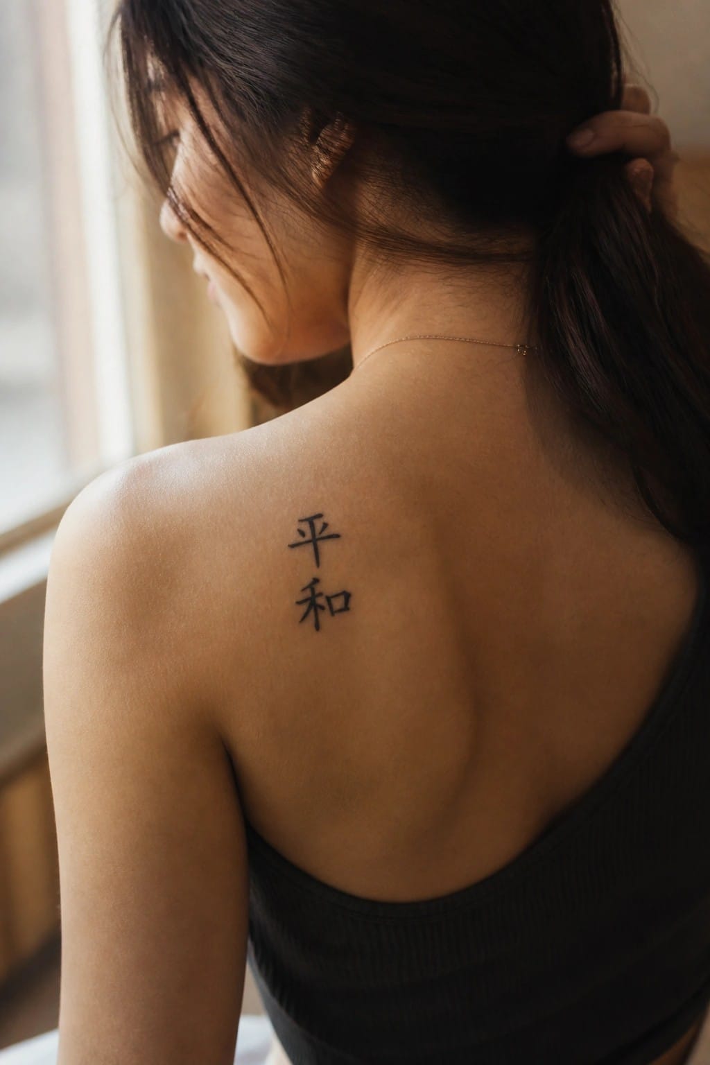
The tattoo sits on the left shoulder blade area. Two Chinese characters are stacked vertically in clean black ink. The placement lets the design stay compact while remaining easy to see when the top is low cut.
I think this spot works because the vertical stack fits the shape of the shoulder without extra spacing or filler. The simple lines also keep the tattoo readable even on skin that moves a lot.
Dream character on the back of the neck
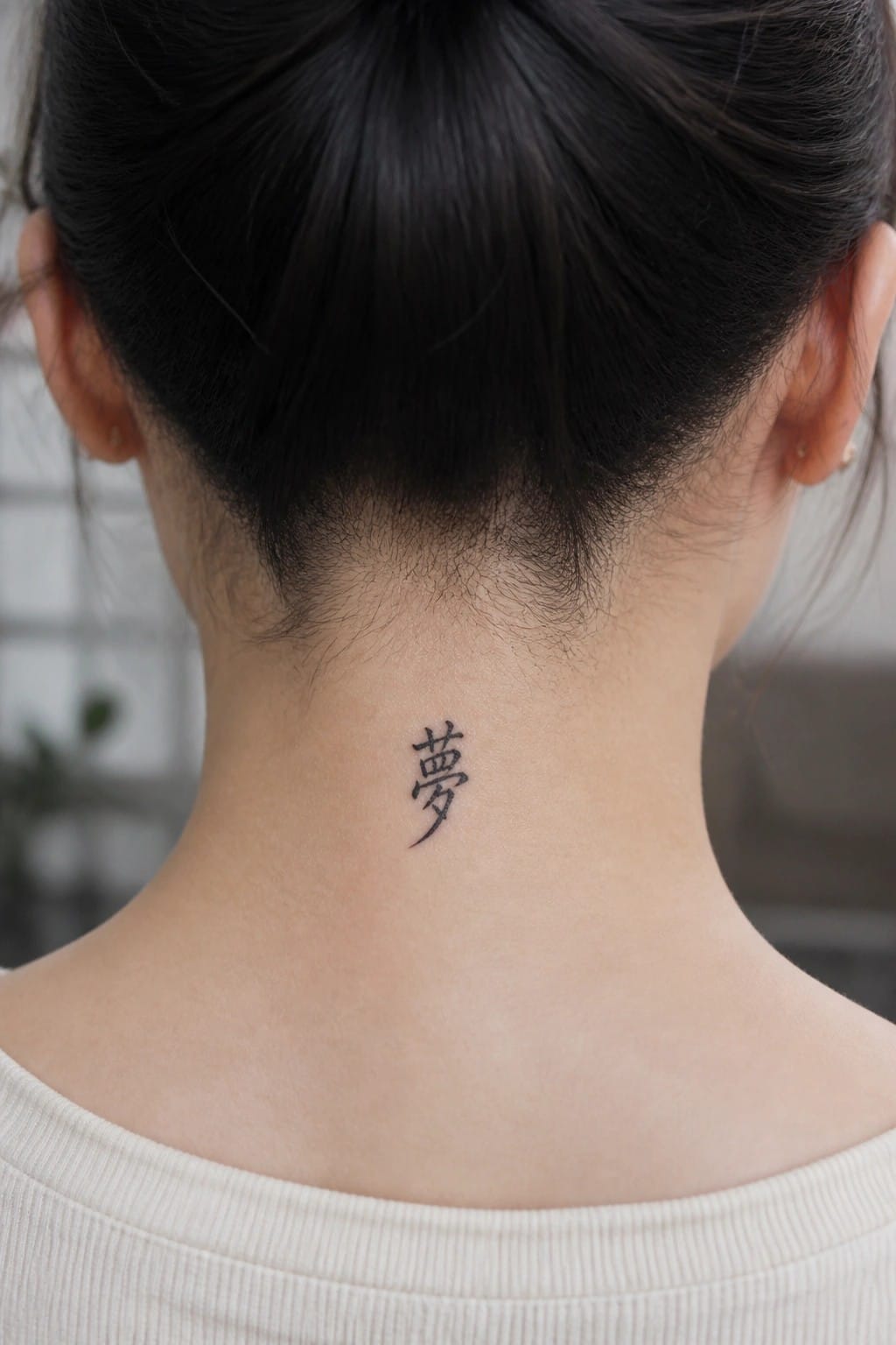
The tattoo sits at the nape in a slim vertical line. A single character in flowing script fills the space without spreading wide. The small scale keeps it private most of the time.
I think the narrow shape suits the neck’s natural lines well. It stays readable without needing extra detail or shading.
chinese characters on the inner forearm

The tattoo uses two chinese characters placed on the inner forearm. The script stays minimal and flows in a natural direction along the arm. This location makes the design easy to show or cover depending on clothing.
I chose this spot because it gives the text room to sit flat without crowding. The size also keeps the lines clear and simple to read at a glance.
chinese characters lined up on the inner wrist

The tattoo runs in a straight row across the inner wrist. Repeated Chinese characters in flowing script form the full design. This placement keeps the line flat and contained.
The wrist width matches the length of the row without forcing any curve. I think the repetition works best in this spot because it stays readable at a small scale.
Small character on the back of the hand

The tattoo sits on the back of the hand in a compact spot near the base of the thumb. It shows one Chinese character done in simple black ink with clean lines. The small scale keeps the whole piece contained and easy to place.
This area works because the design stays visible without taking over the hand. I think the minimal size makes it feel balanced and readable at a glance.
Vertical chinese characters along the side
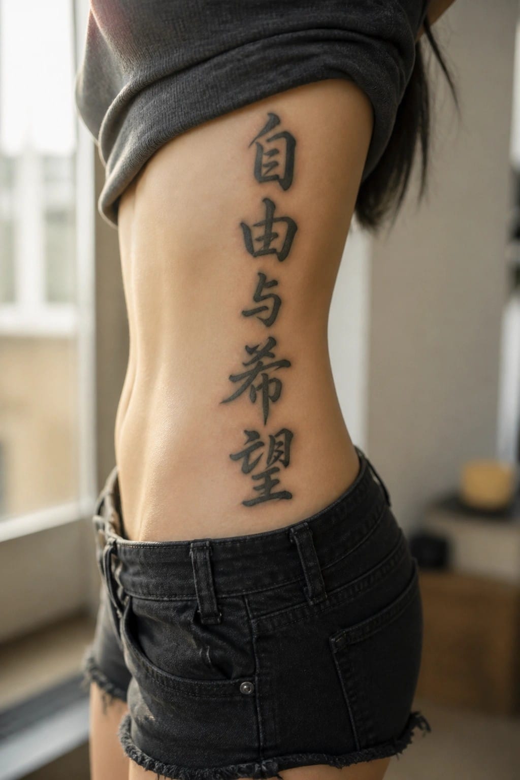
The tattoo runs vertically down the side of the torso. Four bold Chinese characters form the design in a simple calligraphy style. They take up a narrow strip that fits the space between the ribs and waist.
I think the vertical layout keeps the characters balanced and clear without spreading too wide. This makes the whole piece feel straightforward while still showing the script properly.
Lower back works for a single chinese character
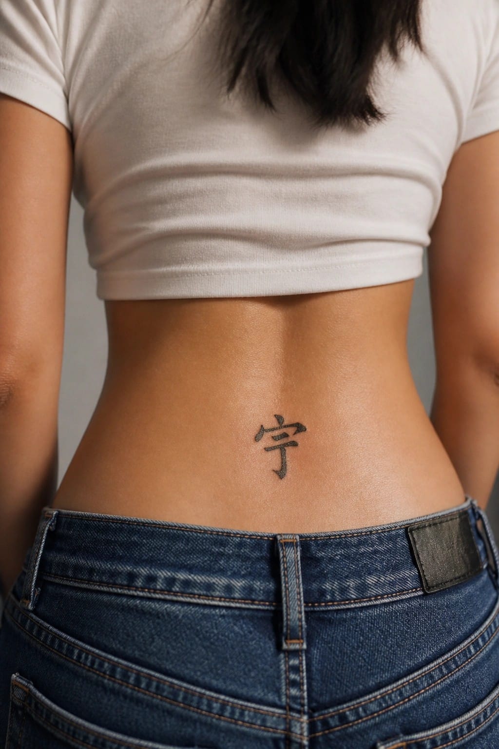
The lower back gives this character a flat surface that keeps the lines straight. It stays mostly covered but appears with certain clothing choices. The small size prevents the design from feeling heavy in that area.
I think the placement fits because it leaves the tattoo subtle without losing its shape when the body moves. A larger design would crowd the same spot and lose the clean look this one has.
Vertical calligraphy on the shin
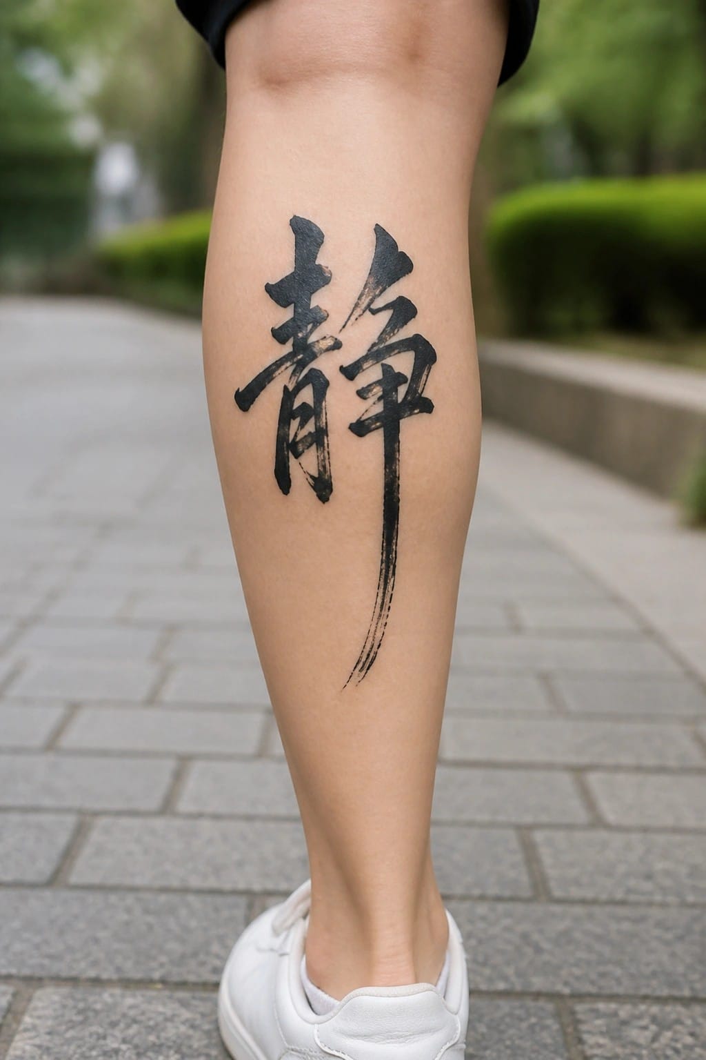
The tattoo runs down the front of the lower leg in a single vertical line. The long brush strokes stretch naturally along the shin and end in a tapered tail near the ankle. This keeps the design clean and avoids bunching on a flatter area of the leg.
I think the vertical layout works because it uses the length of the shin without needing extra elements. The ink weight stays consistent from top to bottom so the characters stay easy to read.
Vertical calligraphy on the nape of the neck

The back of the neck holds a vertical line of Chinese characters. The script runs downward in a narrow column that follows the spine. Thin black lines keep the whole piece compact and easy to read.
This spot works because the tall format matches the shape of the area. The tattoo stays covered most days but shows when the hair is tied up. I think the narrow width stops it from feeling crowded.
Vertical calligraphy runs down the neck
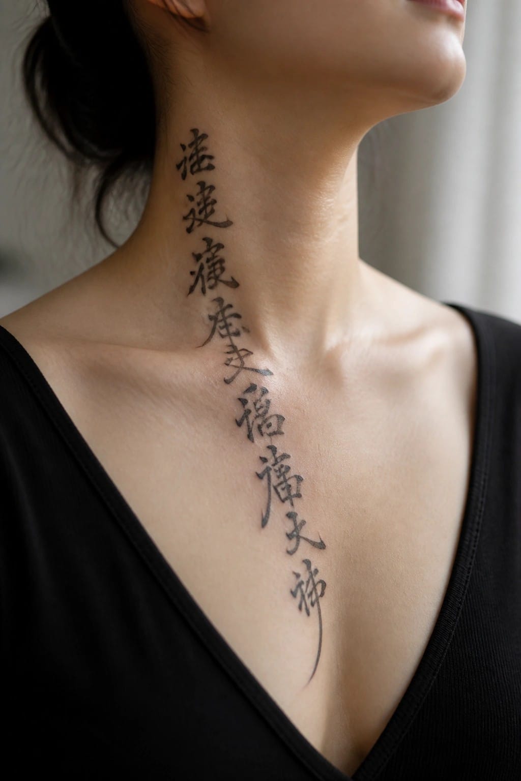
The tattoo places a column of Chinese characters along the side of the neck. It starts high near the hairline and extends down across the collarbone area. This setup lets the script follow the body’s natural length in one continuous line.
I think the vertical format keeps the characters easy to read at this size. The neck placement also gives the design room to breathe without needing extra elements around it.
Chinese character on the inner elbow
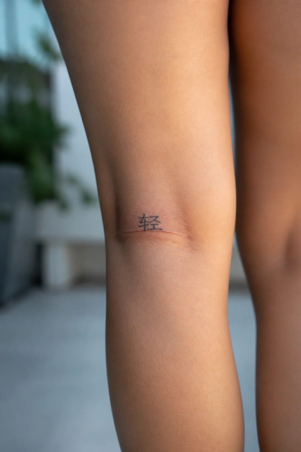
The tattoo sits along the inner elbow crease. A single Chinese character appears in simple black ink. The size stays small enough to remain understated.
I think the placement works because the spot keeps the design mostly private. It also lets the clean lines show without extra detail around them.
Chinese character on the wrist

The tattoo sits on the inner wrist. The character uses thick black strokes with a few extended lines that follow the natural curve of the arm. This keeps the design compact while still showing clear brushwork details.
I think the wrist placement works here because it lets the flowing lines spread without needing much extra space. The size stays balanced so the character remains easy to read up close.
Frequently Asked Questions
1. How do I select a meaningful Chinese phrase for a flowing calligraphy tattoo? Start by reflecting on personal values or experiences such as strength, peace, or growth. Research characters through reliable translation sources or consult a native speaker to avoid errors. Pair the phrase with a flowing script style that matches your vision, and test small sketches on paper before committing to skin.
2. What body placements suit flowing Chinese calligraphy tattoos for women? Areas like the inner forearm, collarbone, or along the ribs allow the script to curve naturally with body lines. The upper back or side of the thigh also works well for longer phrases that need space to flow. Consider how clothing might cover or reveal the design and choose spots with less movement to preserve fine details over time.
3. How can I ensure cultural accuracy in my Chinese calligraphy tattoo? Work with an artist experienced in traditional scripts and verify the characters with a linguist beforehand. Avoid mixing unrelated styles or altering meanings for aesthetics alone. Many women opt for phrases drawn from poetry or classic texts to keep the design respectful and authentic.
4. What aftercare steps help a flowing calligraphy tattoo heal properly? Clean the area gently with unscented soap twice daily and apply a thin layer of recommended moisturizer. Avoid sun exposure, tight clothing, and submerging the tattoo in water for the first two weeks. Follow your artist’s specific instructions since fine lines in calligraphy can blur if not cared for correctly during healing.
5. How do I find an artist skilled in artistic Chinese calligraphy tattoos? Look at portfolios that show examples of flowing script work on skin rather than just paper. Ask for references from past clients and discuss how they handle custom designs. Schedule a consultation to review your chosen phrase and placement so the artist can adapt the flow to your body shape.
