

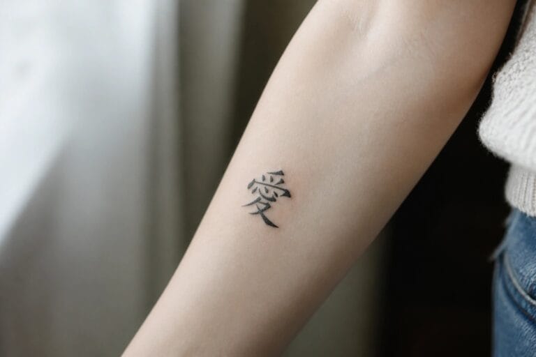
I adore how Chinese calligraphy adds such graceful elegance to tattoos for women in ways that feel truly timeless.
My own fascination with these designs started when I saw how a single character could tell a personal story with style and charm.
These 19 ideas capture that perfect mix of beauty and meaning for anyone looking to ink something special.
Chinese character on the inner forearm
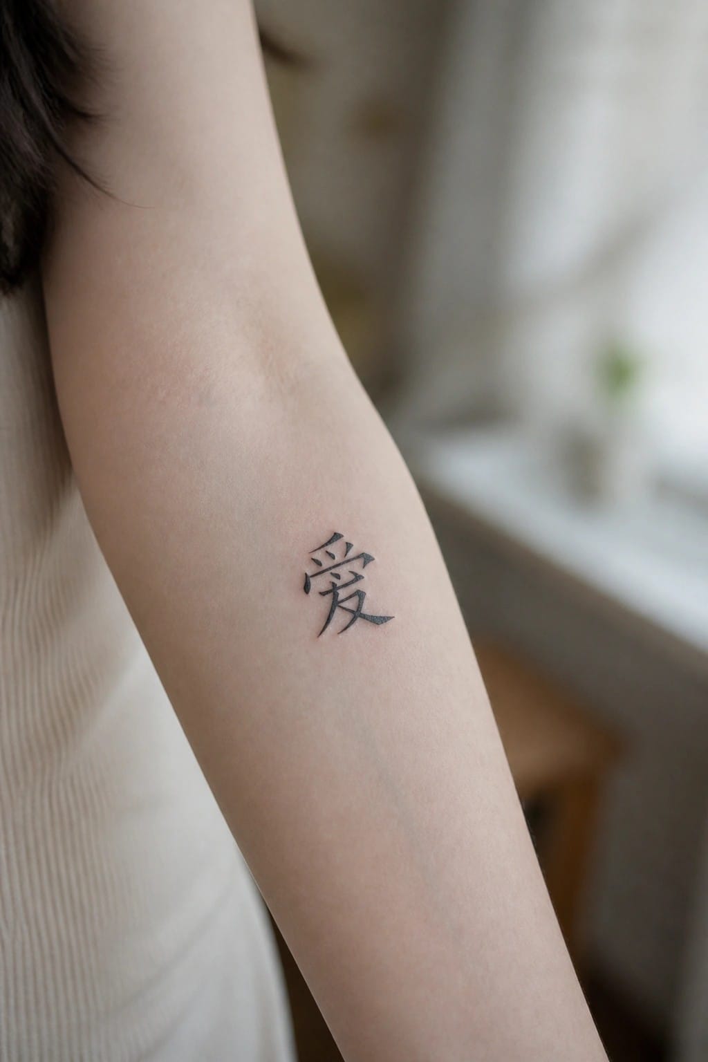
The inner forearm gives a single Chinese character room to sit without crowding. The black ink stays sharp against the skin and the symbol shows up clearly from most angles. This placement also lets the tattoo stay visible during daily movement while remaining easy to cover.
I think the size works here because the lines stay distinct even at a small scale. It feels straightforward without extra elements around it.
Characters run vertically down the side
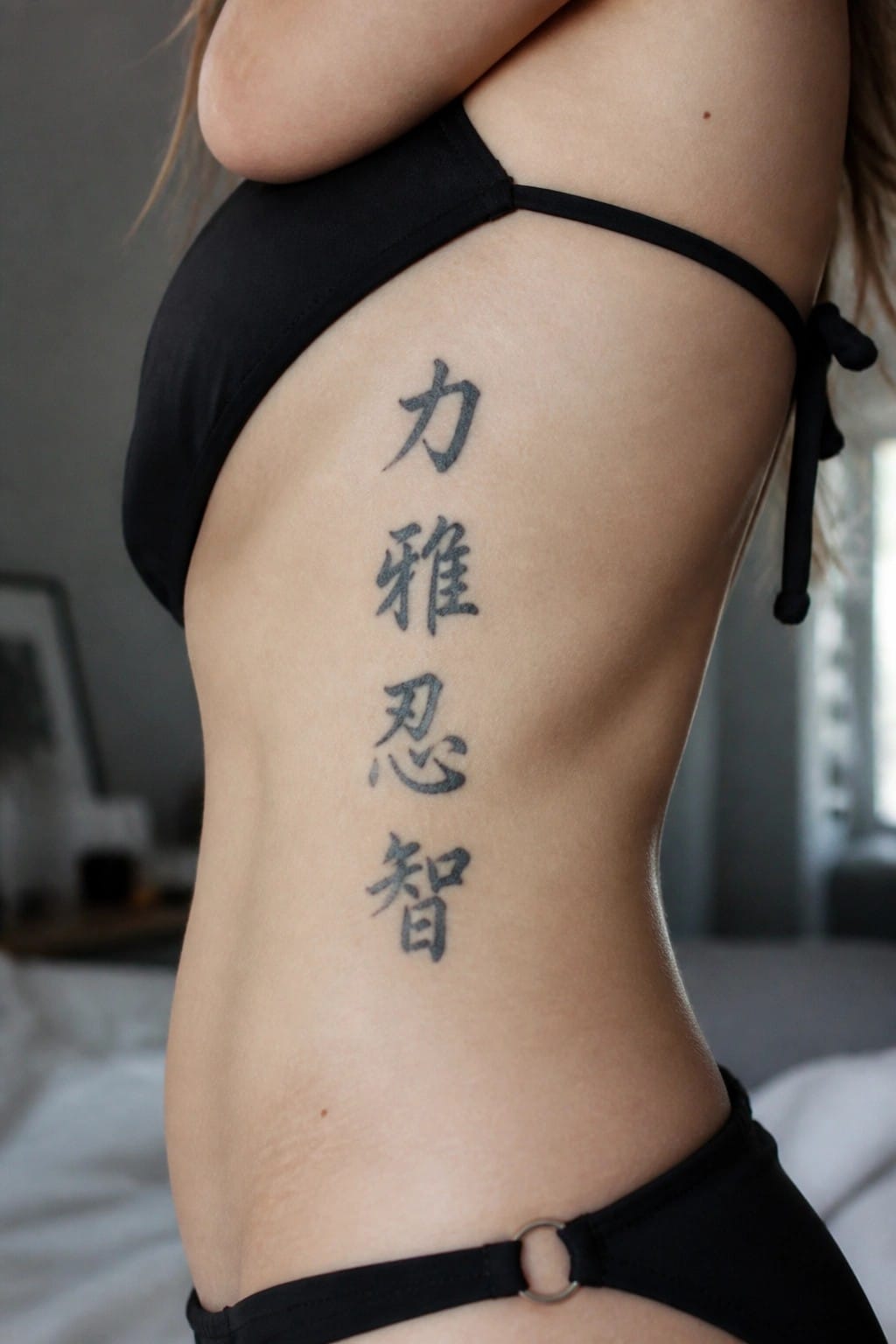
The four characters form a clean vertical column along the side of the torso. This placement uses the natural length of the area to keep the stack straight and evenly spaced. The black ink stays simple with no extra shading or flourishes.
I think the vertical layout works because it matches the shape of the characters without forcing them into a tighter spot. The side position also leaves room for the design to sit flat and stay easy to read.
A small fu character on the wrist
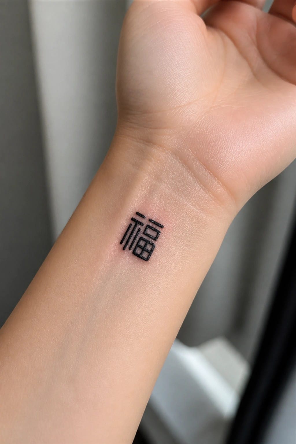
The wrist keeps a small tattoo like this easy to see without taking up much space. The fu symbol sits flat on the inner side and stays readable even at this size. Black ink and simple lines help it hold up over time without extra detail.
I think the wrist placement makes sense here because the design stays low key but still shows up in daily movement. It suits someone who wants a clear meaning without a larger piece.
Chinese characters along the collarbone
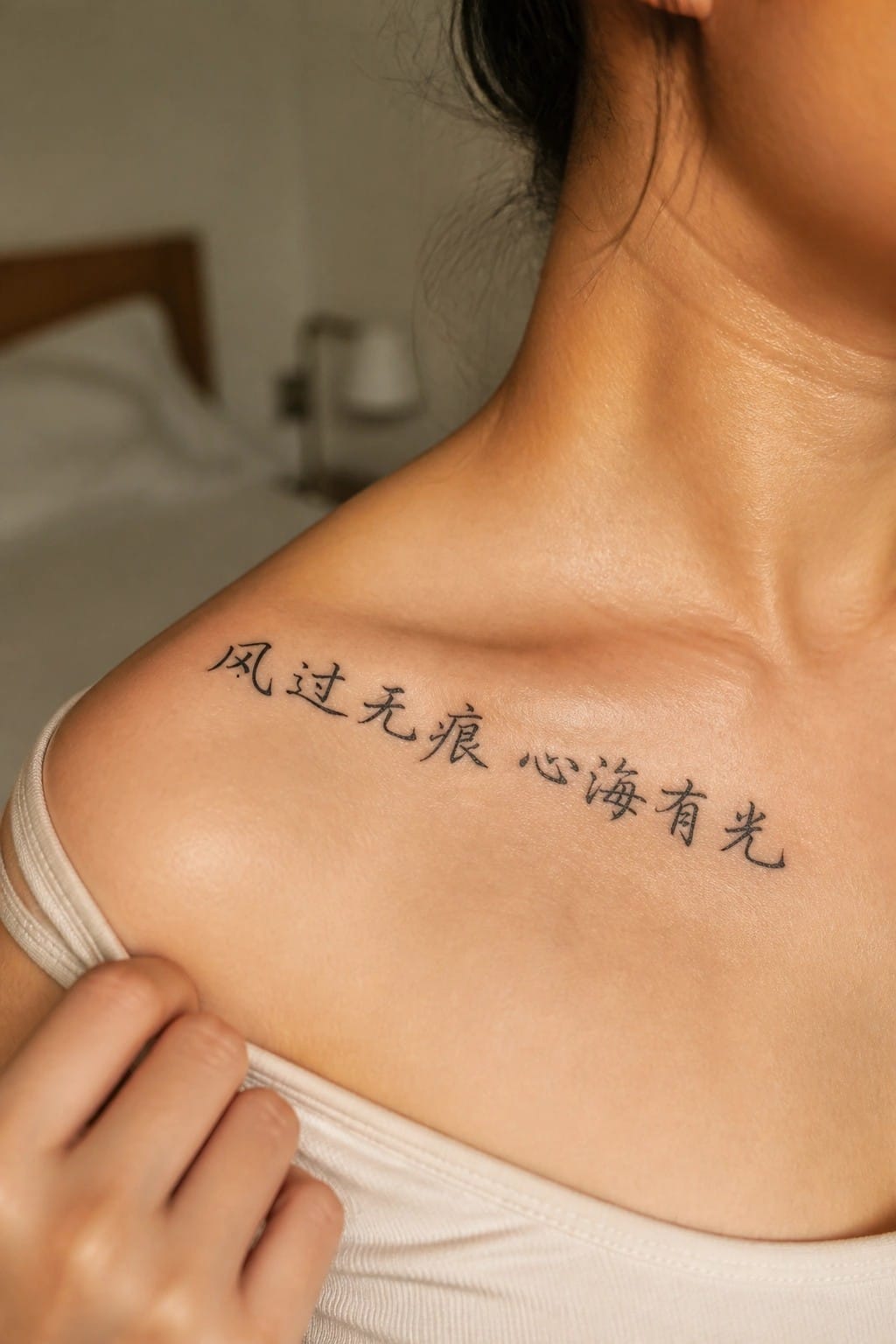
The tattoo shows several Chinese characters in black ink running across the collarbone. The script follows the natural line of the bone with steady spacing and no added flourishes. It uses a classic calligraphy style that stays clear at this size.
This spot works because the text stays visible yet sits in a low-key area. The length of the phrase fits the space without crowding the skin.
Minimal characters rest at the nape
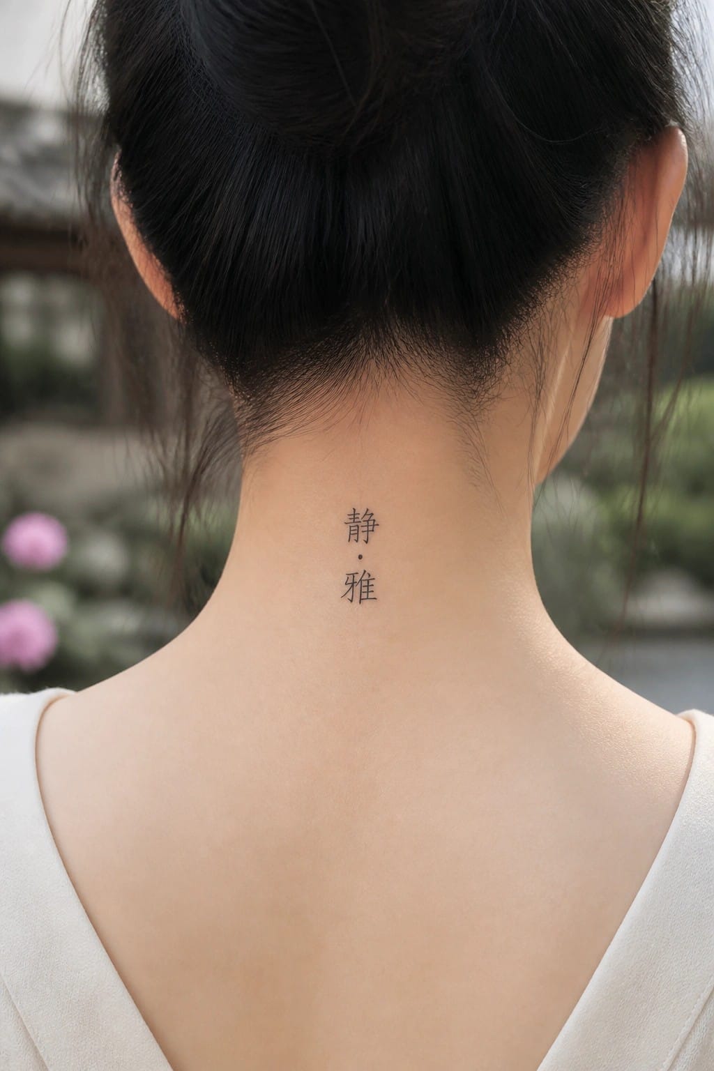
The two characters sit in a straight vertical line right below the hairline. A small dot separates them and the whole piece stays compact. The placement lets the tattoo show when hair is up but disappear under a collar otherwise.
I think this spot works well because the neck curves naturally hold the text without extra spacing. It also keeps the design from competing with other pieces if someone adds more later.
Vertical calligraphy runs down the spine
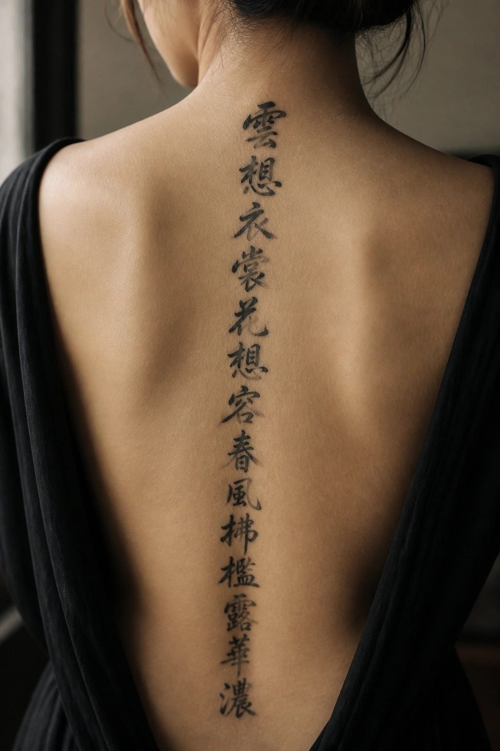
The tattoo sits in a single vertical column along the spine. The characters run from the upper back down toward the mid back in traditional script. This setup keeps the full verse visible in one flowing line.
I chose this placement because the spine gives the text a natural path without crowding. The calligraphy stays clear at this scale and does not need any added details to hold together.
Finger placement keeps the character subtle
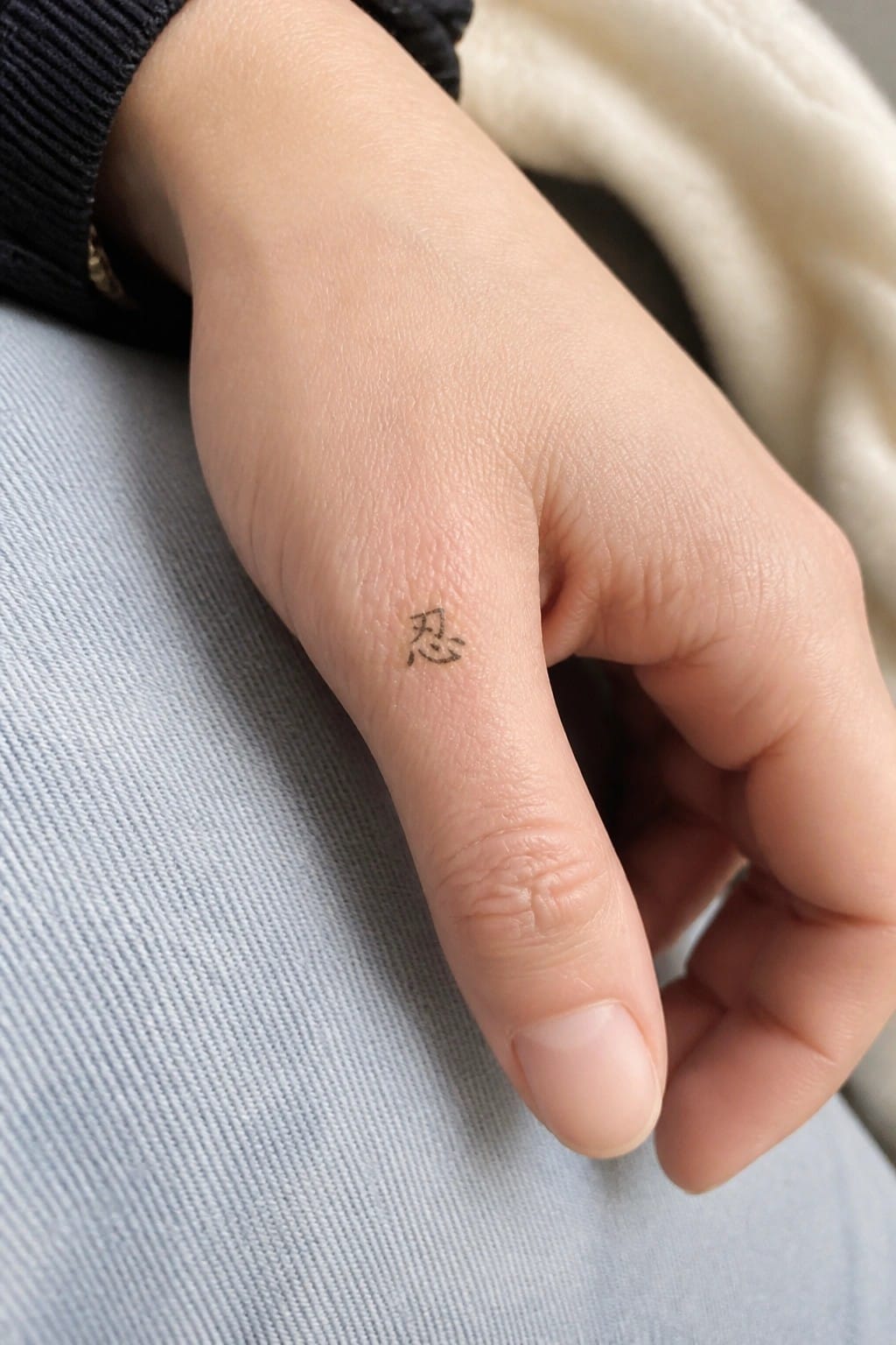
The side of the finger gives this single character a low profile spot. It stays mostly out of sight until the hand turns or opens. The narrow surface forces the design to stay small and direct.
I like this location because it avoids the need for any framing or extra lines. The character reads cleanly on its own and does not fight for space.
Calligraphy and cherry blossoms cover the upper back
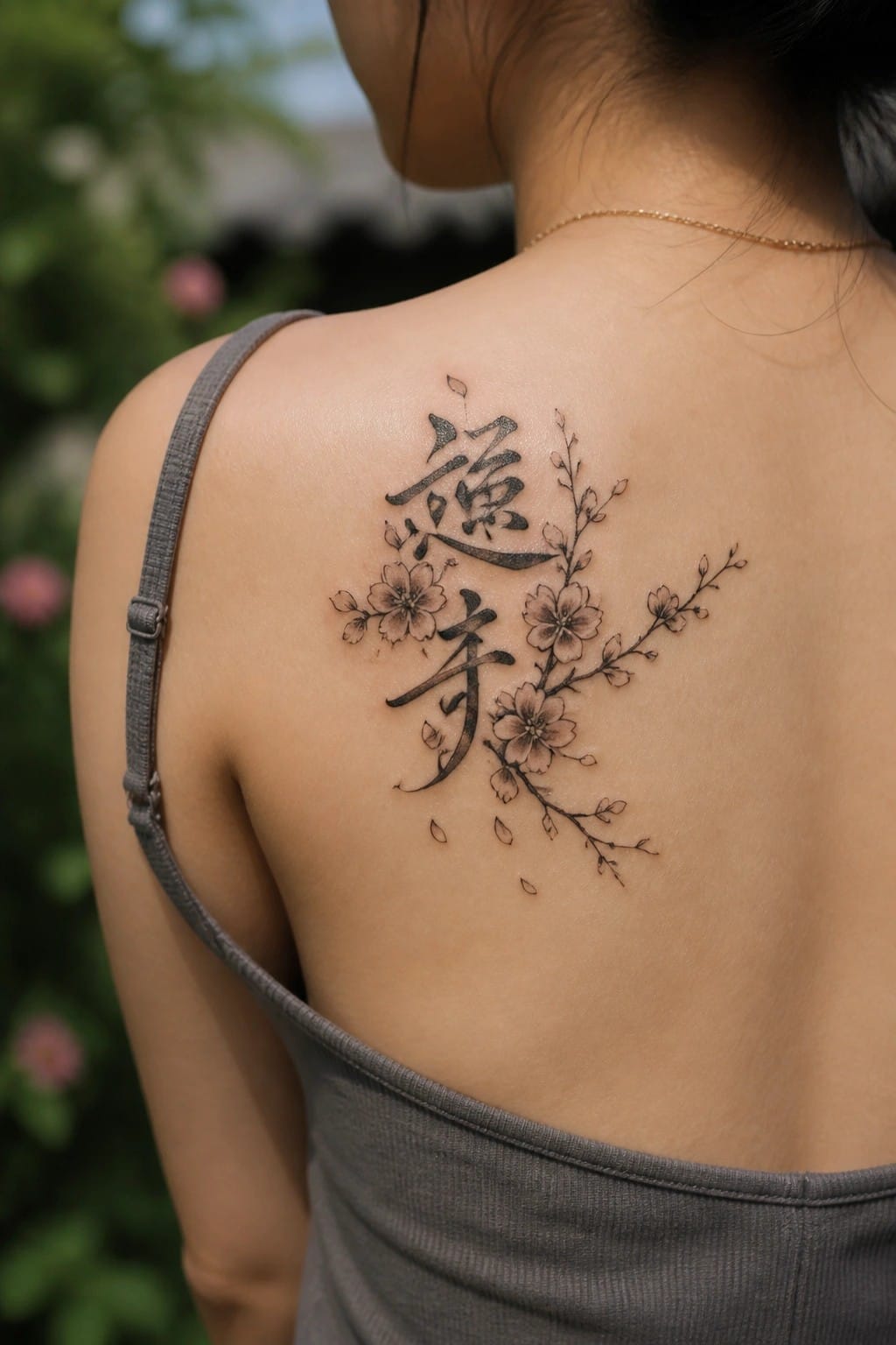
The upper back offers a flat area that lets the branches spread out evenly on both sides. The characters stay centered while the flowers and stems extend outward in a loose pattern. This keeps the whole piece readable without feeling cramped.
I like how the medium size lets the text hold its own next to the blossoms. It avoids turning into a scattered layout or a heavy block of ink.
Chinese characters running down the finger
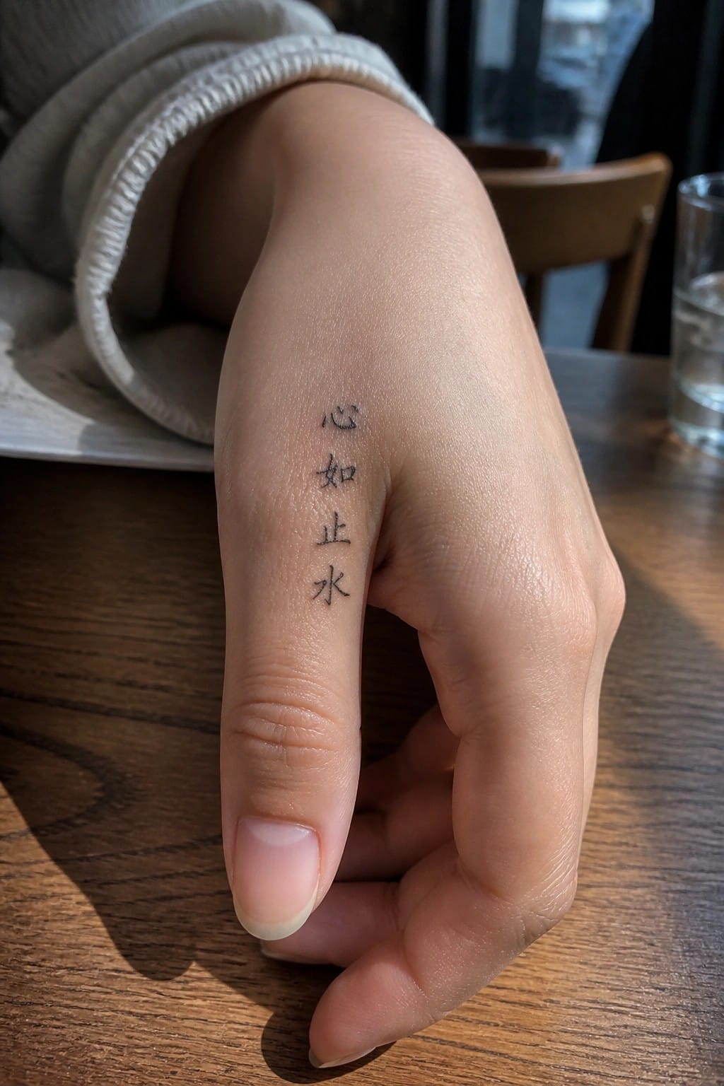
The tattoo shows three Chinese characters placed in a straight vertical line along the side of the finger. This arrangement uses the narrow space well and keeps each character distinct. The black script stays simple with no added details or shading.
I think the placement works because it matches the way the text is meant to be read. It also gives the tattoo a clean look that fits easily on a smaller area.
Chinese characters line up along the side
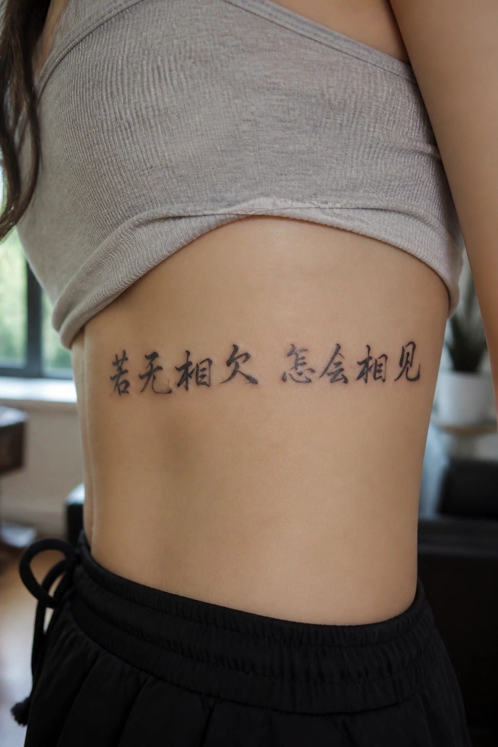
The tattoo sits on the side of the torso right above the waistband. The characters run in one straight row using black ink.
The horizontal layout matches the shape of the area. It keeps the text easy to read at this size without needing extra detail.
Characters behind the ear

The tattoo sits right behind the ear on the side of the neck. Two Chinese characters stack vertically in clean black lines. They spell out breathe.
This spot keeps the design private most of the time yet easy to see when hair is pulled up. I think the small scale fits the area without crowding it.
Vertical calligraphy on the thigh
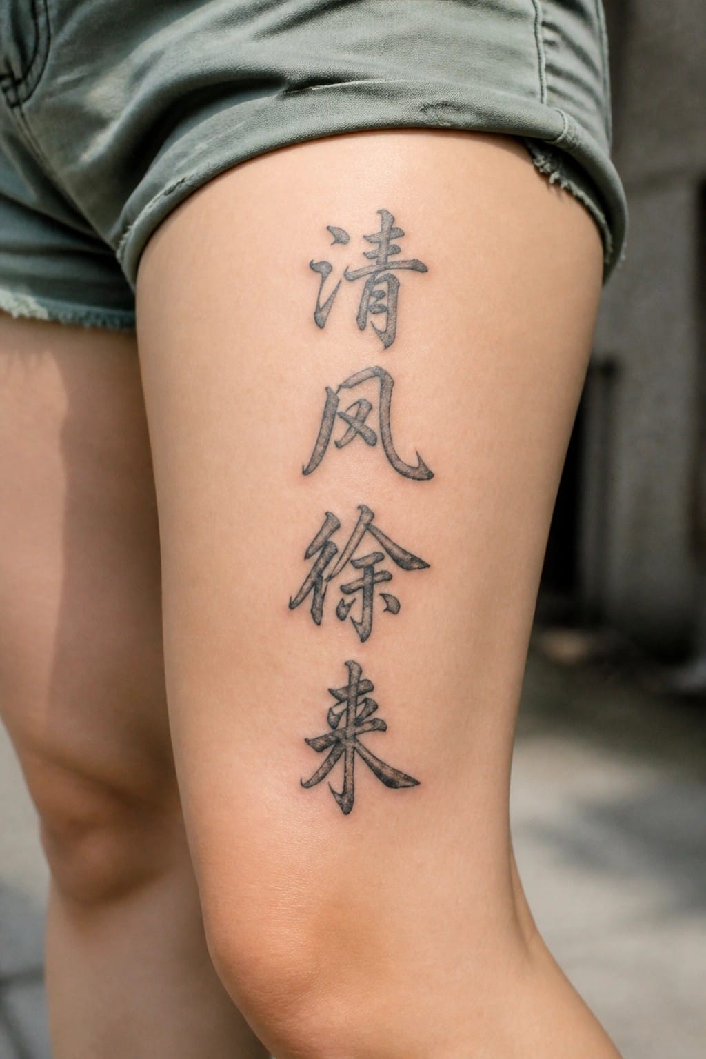
The thigh gives a long flat surface that fits a stacked set of characters. Four characters run straight down in black traditional script. The spacing stays even from top to bottom.
I think the placement works because it lets the phrase sit upright without turning or crowding. It also keeps the lines readable when the leg is straight.
Chinese script on the ankle
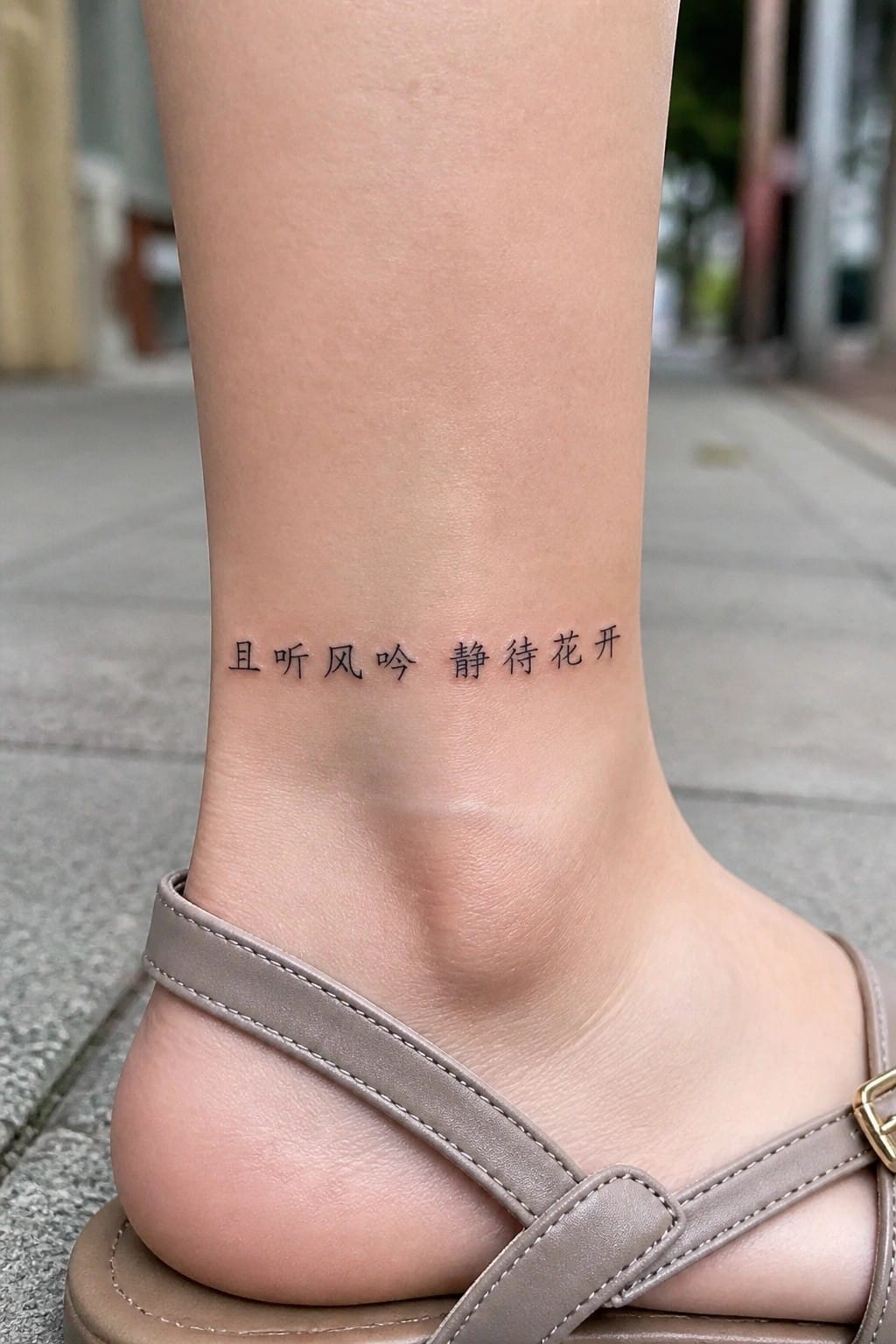
The tattoo sits right above the ankle bone in a straight line. Thin characters keep the design compact and readable at this size. The placement lets the text show when wearing sandals or low socks but stays hidden under longer pants.
I think this spot suits the script because the ankle gives just enough flat space without forcing the text to curve. The light line weight also prevents the tattoo from looking heavy on the lower leg.
Vertical characters on the inner forearm
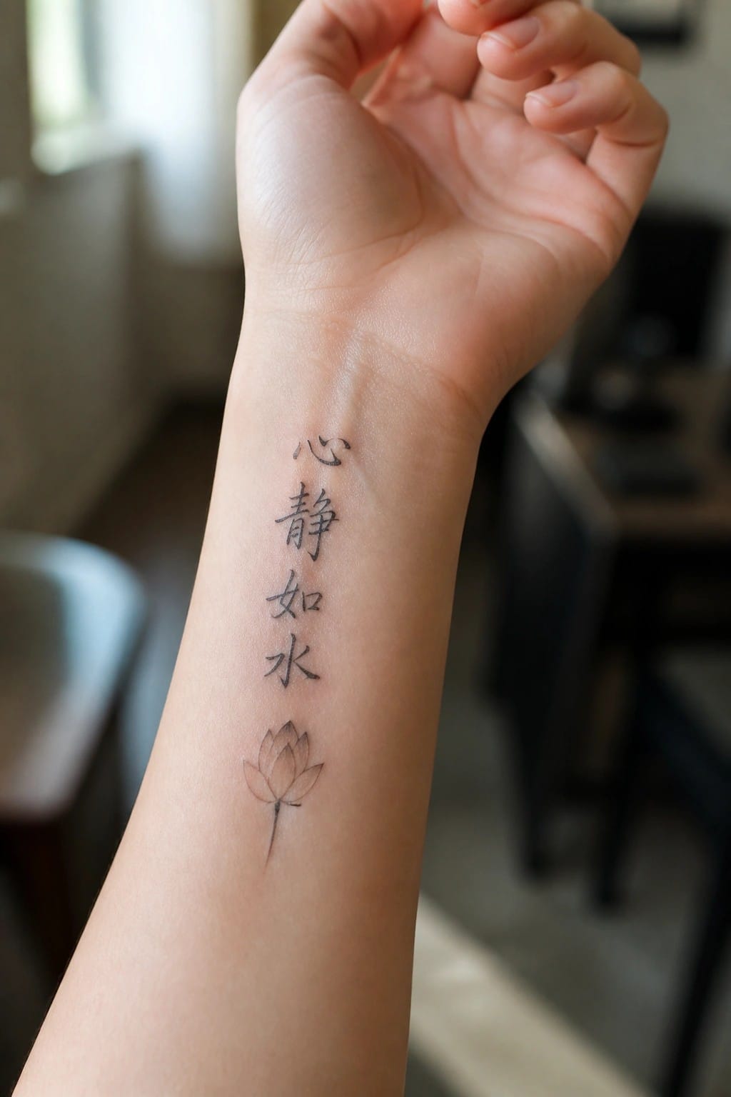
The tattoo sits along the inner forearm in a straight vertical line. Four Chinese characters stack neatly from top to bottom above a simple lotus outline. The script stays compact and clear without extra flourishes.
This layout matches the shape of the arm so the design stays balanced. I think the vertical format keeps the text easy to read even when the arm moves.
Longevity character on the side
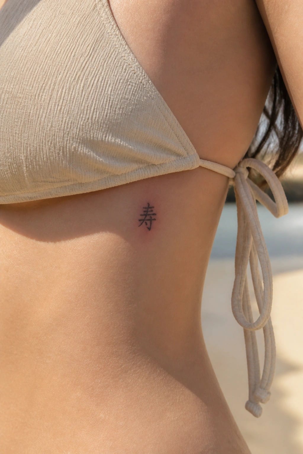
The character sits low on the side of the torso. This placement keeps it discreet while still allowing the lines to show clearly against the skin. The small scale matches the area well and avoids crowding.
I think the spot works because it stays mostly hidden under normal clothing. The simple black ink adds to that understated feel without extra decoration.
Chinese text with bamboo on the upper arm
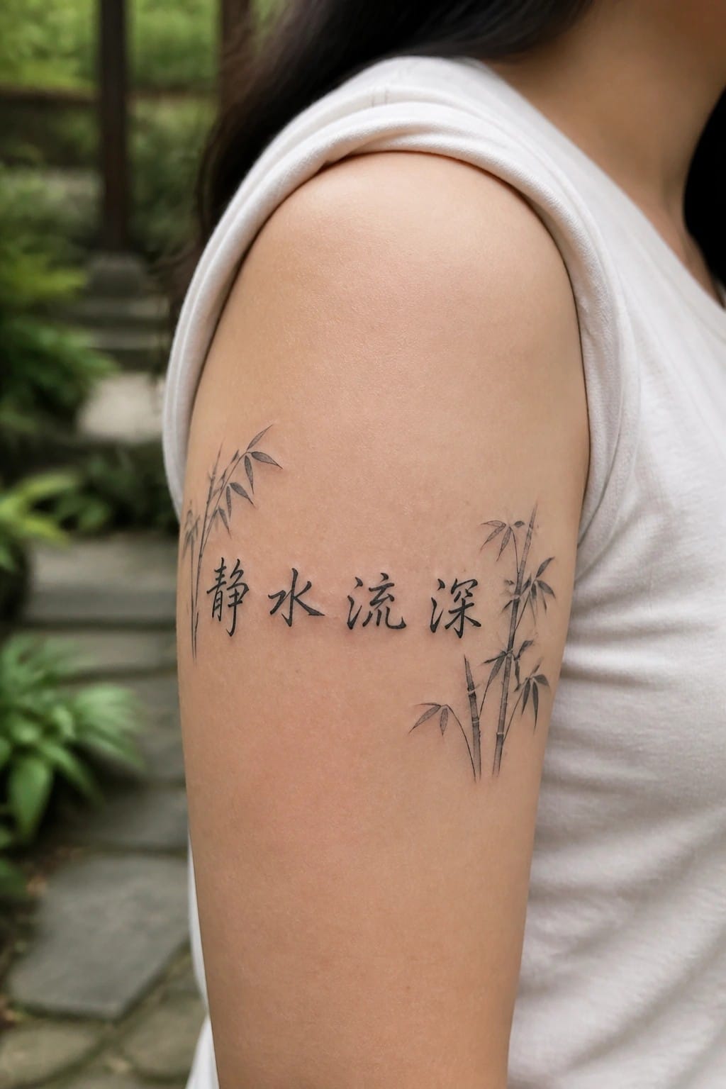
The tattoo stretches across the upper arm in a clean horizontal line. Chinese characters form the center while bamboo drawings sit on each side to frame them.
This placement keeps the text easy to read at a glance. I think the bamboo works best here because it adds shape without pulling attention away from the characters.
Chinese characters along the finger

The tattoo runs vertically down the side of the finger in three stacked characters. Black ink keeps the lines clean and simple against the skin. The narrow space holds the text without any crowding or extra flourishes.
This placement works because the finger shape naturally supports the vertical stack. I like how it stays readable at this small size while still feeling personal and contained.
One character on the ankle
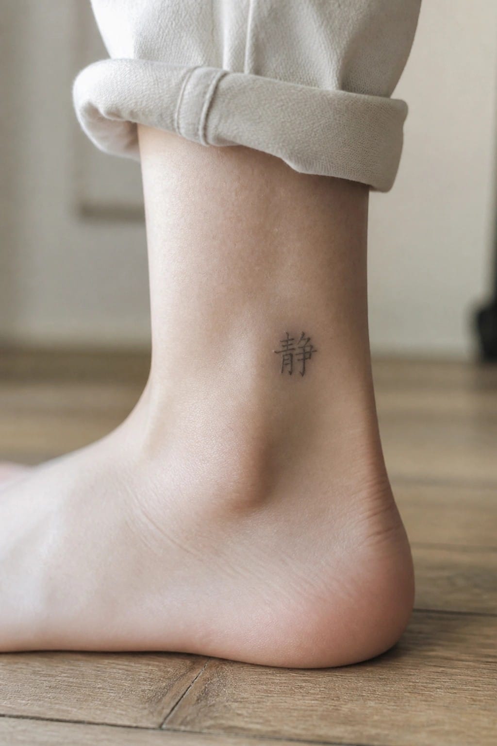
The ankle gives this character a quiet spot that stays mostly hidden. A single mark like this sits neatly without filling much space or competing with clothing. The lines stay sharp against the skin and keep the whole thing simple.
I think the placement works because it lets the character feel personal rather than loud. It also matches the meaning without adding extra detail that might crowd the area.
Small character on the collarbone
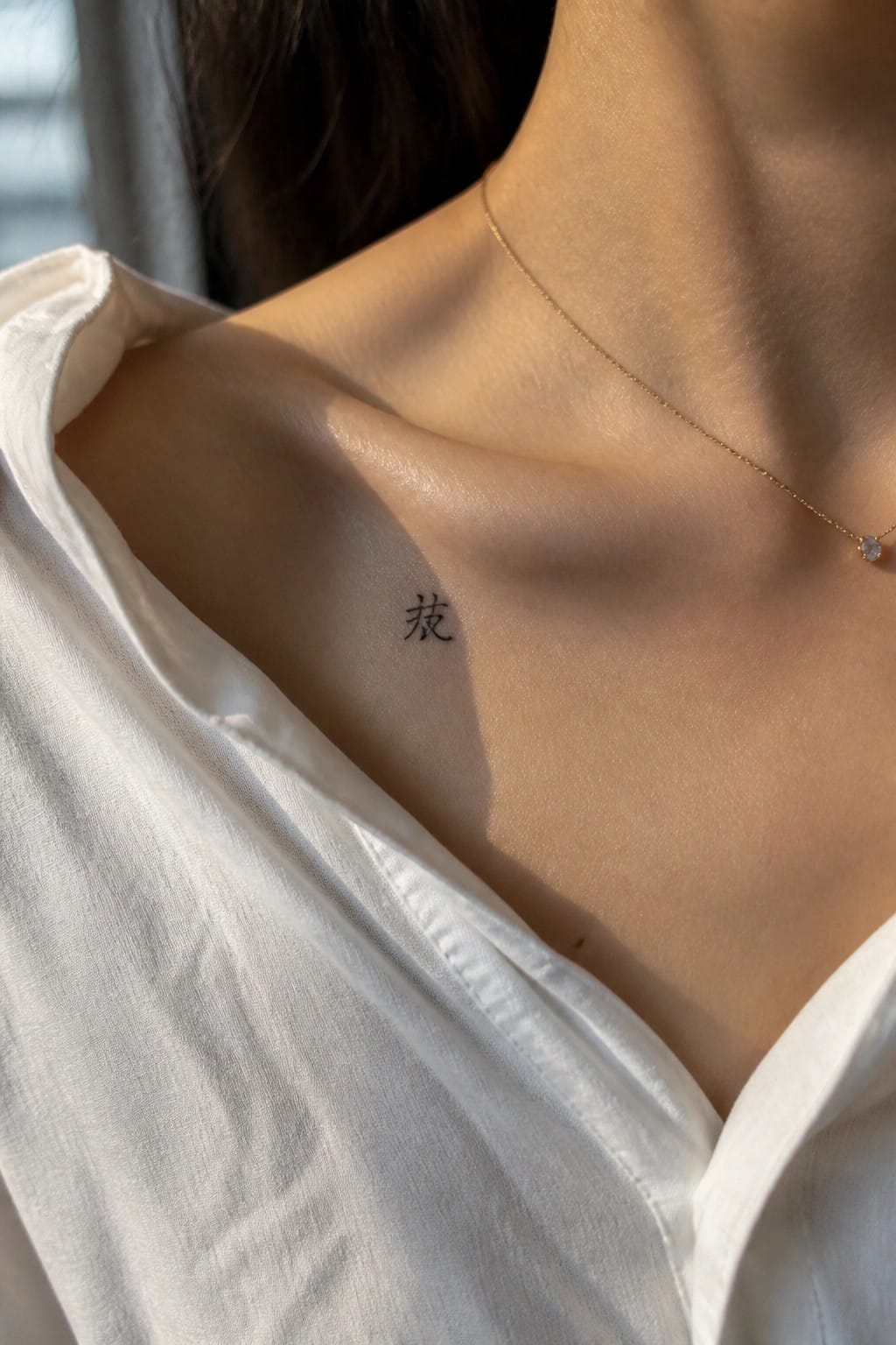
The tattoo uses one Chinese character placed directly on the collarbone. The ink stays thin and the size remains compact so it follows the natural line of the bone without crowding the area. Light hits the spot easily during the day which keeps the lines readable.
I chose this spot because the bone gives the character a clean surface and the small scale prevents it from competing with necklaces or clothing. It reads as a quiet personal mark rather than a statement piece.
Frequently Asked Questions
FAQ 1: What meanings are most common in elegant Chinese calligraphy tattoos for women? Many women choose characters that represent inner strength, love, balance, or personal growth such as the symbol for resilience or serenity. Research each character thoroughly with a native speaker to confirm accuracy and select phrases that hold deep personal significance rather than generic terms.
FAQ 2: How do I pick a placement that suits feminine and timeless calligraphy designs? Subtle locations like the inner wrist, ankle, or nape of the neck work well for delicate script while allowing the strokes to flow naturally with body contours. Larger ideas can suit the upper back or rib area but always consider future visibility and how the design ages with skin changes.
FAQ 3: What steps ensure the calligraphy remains authentic and culturally respectful? Consult a fluent Chinese speaker or scholar during the design phase to verify stroke order and avoid misinterpretations. Choose traditional script styles over modern adaptations and discuss the historical context of your chosen words with your artist to honor their origins.
FAQ 4: How long does healing take for fine line Chinese character tattoos and what aftercare helps? Healing usually spans two to four weeks with proper care. Keep the area clean, apply fragrance free moisturizer, and avoid sun exposure or tight clothing that could irritate the fresh ink. Follow your artist’s specific instructions closely for optimal results with delicate lettering.
FAQ 5: Can I combine several ideas from the list into one cohesive tattoo? Yes, blending two or three complementary characters creates a personalized design when arranged with balanced spacing and flow. Work closely with an experienced calligraphy tattoo artist to test layouts on paper first and ensure the final piece maintains elegance without overcrowding.
