

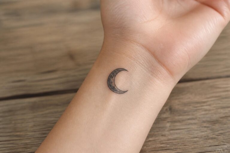
I find black and grey moon tattoos incredibly striking with their classic contrast. My own lunar ink has this quiet power that pulls me in every single time I catch a glimpse. These 25 designs capture that timeless feel in ways that feel fresh and feminine.
Crescent moon on the inner wrist
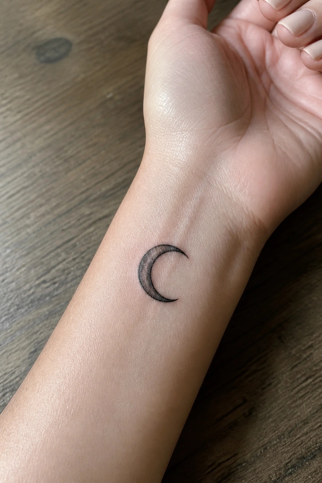
The inner wrist works well for a small crescent moon because it keeps the design visible but low key. The compact size fits the area without crowding the skin. Black and grey shading gives the moon a bit of depth while staying simple.
I think the curve of the moon sits naturally here and avoids looking forced. It stays clear even up close and makes for an easy first tattoo choice.
Moon with a peony on the upper arm
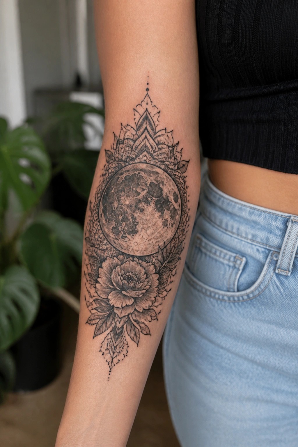
The moon takes center stage here with soft shading that shows its surface texture. A large peony sits directly below while an open mandala pattern sits above to frame the whole thing. Leaves help connect the pieces without filling every gap.
Black and grey works well for this because it keeps the moon as the clear focal point. The style avoids extra color that might pull attention away from the main shapes. I think the open space around the edges keeps it from feeling heavy on the arm.
Moon with clouds on the upper back
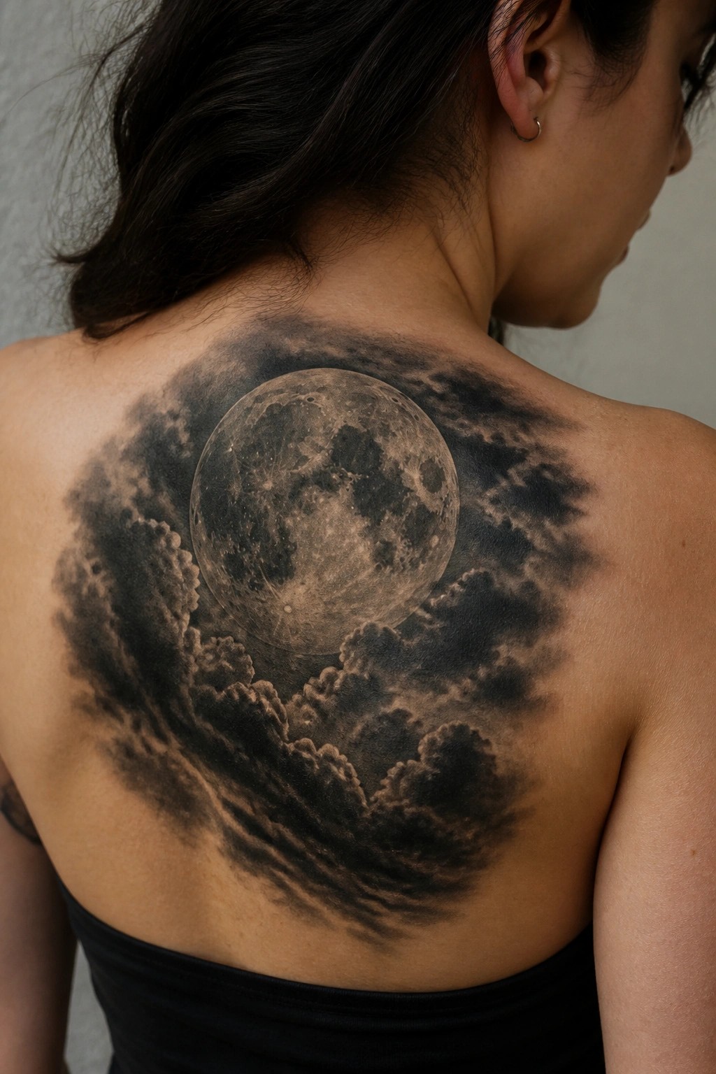
The upper back offers a wide flat area that fits this centered moon design well. Clouds spread out from the sides and help balance the round shape without crowding the edges. The black and grey tones keep the whole piece cohesive across the skin.
I think the size works because the moon surface stays readable even with the surrounding smoke. The clouds also soften the outer lines so the tattoo does not feel boxed in by the shoulders.
Crescent moon on the inner forearm
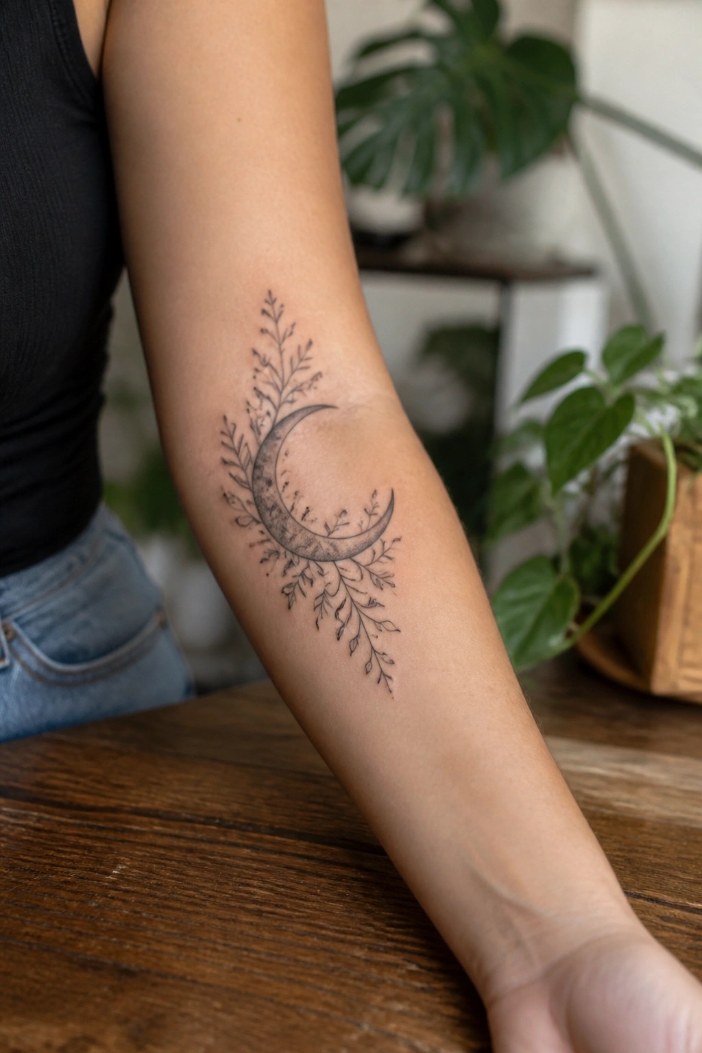
The design runs vertically along the inner forearm. A crescent moon sits in the center with thin branches extending outward on both sides. Black and grey shading gives the moon some texture while the branches stay light and fine.
This placement lets the shape stretch naturally without crowding the skin. I think the vertical layout helps the branches look balanced on either side of the moon. The size stays readable from a normal distance too.
Large crescent moon covers the upper back
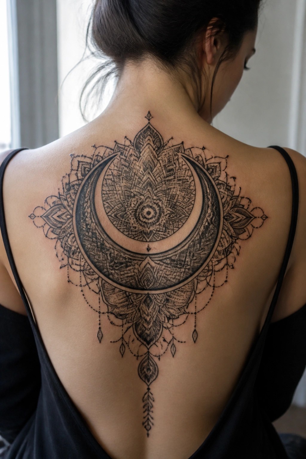
The tattoo sits centered across the upper back with the crescent moon as the main focus. Mandala patterns fill the space inside and around the moon while thin dangling lines run down the spine. This placement lets the full width of the design show without crowding.
I think the scale keeps every line readable even with all the fine details inside the moon. The black and grey shading adds depth without making the whole piece feel heavy.
A moon tattoo behind the ear
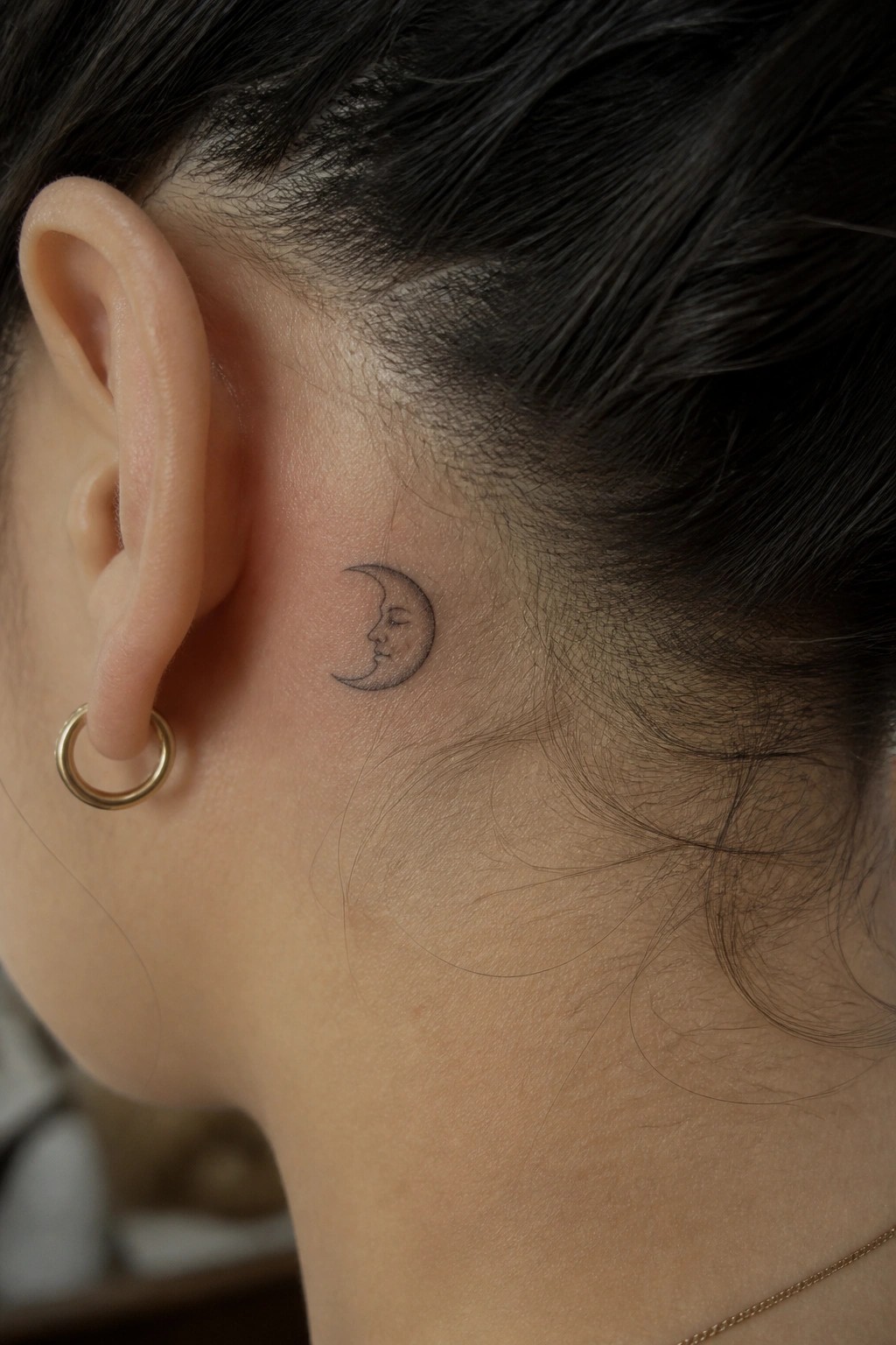
This spot tucks the design close to the hairline. The crescent moon sits at a slight angle that follows the natural curve there. Fine black lines shape the face inside the moon while grey shading adds light depth.
The small size keeps the whole piece contained. It works for anyone who wants something simple that stays mostly out of sight until the hair moves.
Moon tattoo on the thigh
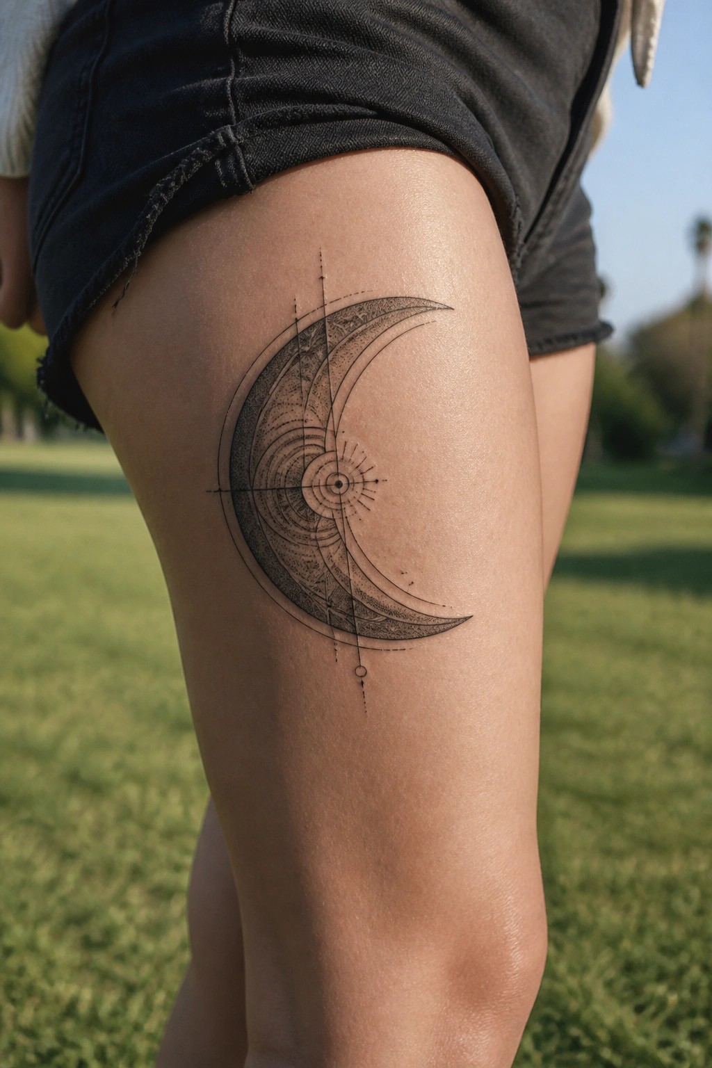
The thigh gives this crescent moon enough room to curve naturally along the leg. The design uses the space to keep the spiral and line work visible without crowding.
I think the placement makes the whole piece feel grounded instead of floating on a smaller area. It also leaves room to add more later if the person wants to expand it.
Crescent moon with stars on the ankle
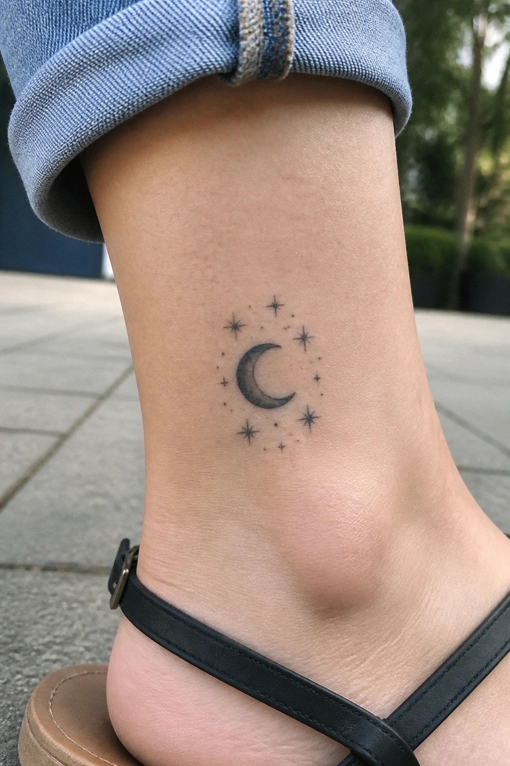
The ankle works as a natural spot for a compact moon design. A small crescent sits in the middle with stars placed around it in black and grey. The fine lines stay clear at this size.
I think the scale keeps the tattoo from feeling crowded on the lower leg. It gives a simple layout that matches the shape of the ankle without extra elements.
Crescent moon on the shoulder with ornate details below
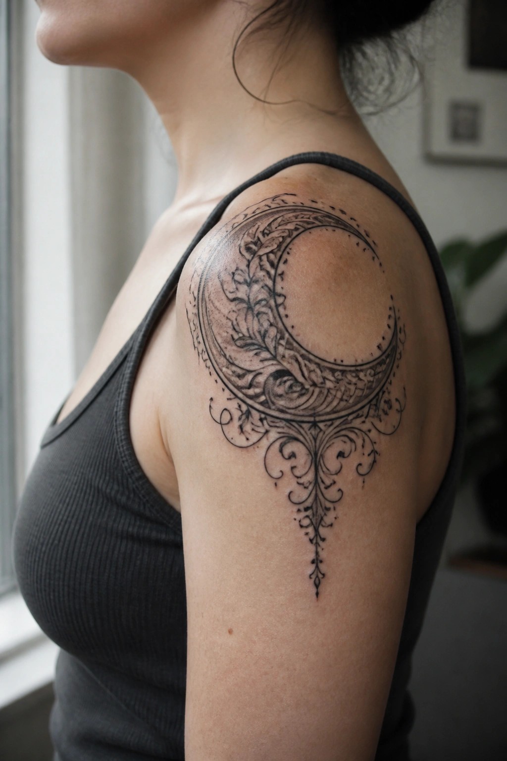
The shoulder lets the crescent moon follow the natural curve of the arm. Vines and leaves fill the inside of the moon while thin scrolls hang from the bottom point. Black and grey shading adds some depth to the lines.
This size keeps the details clear without crowding the space. I think the hanging section helps balance the round shape above it.
Moon phases follow the spine
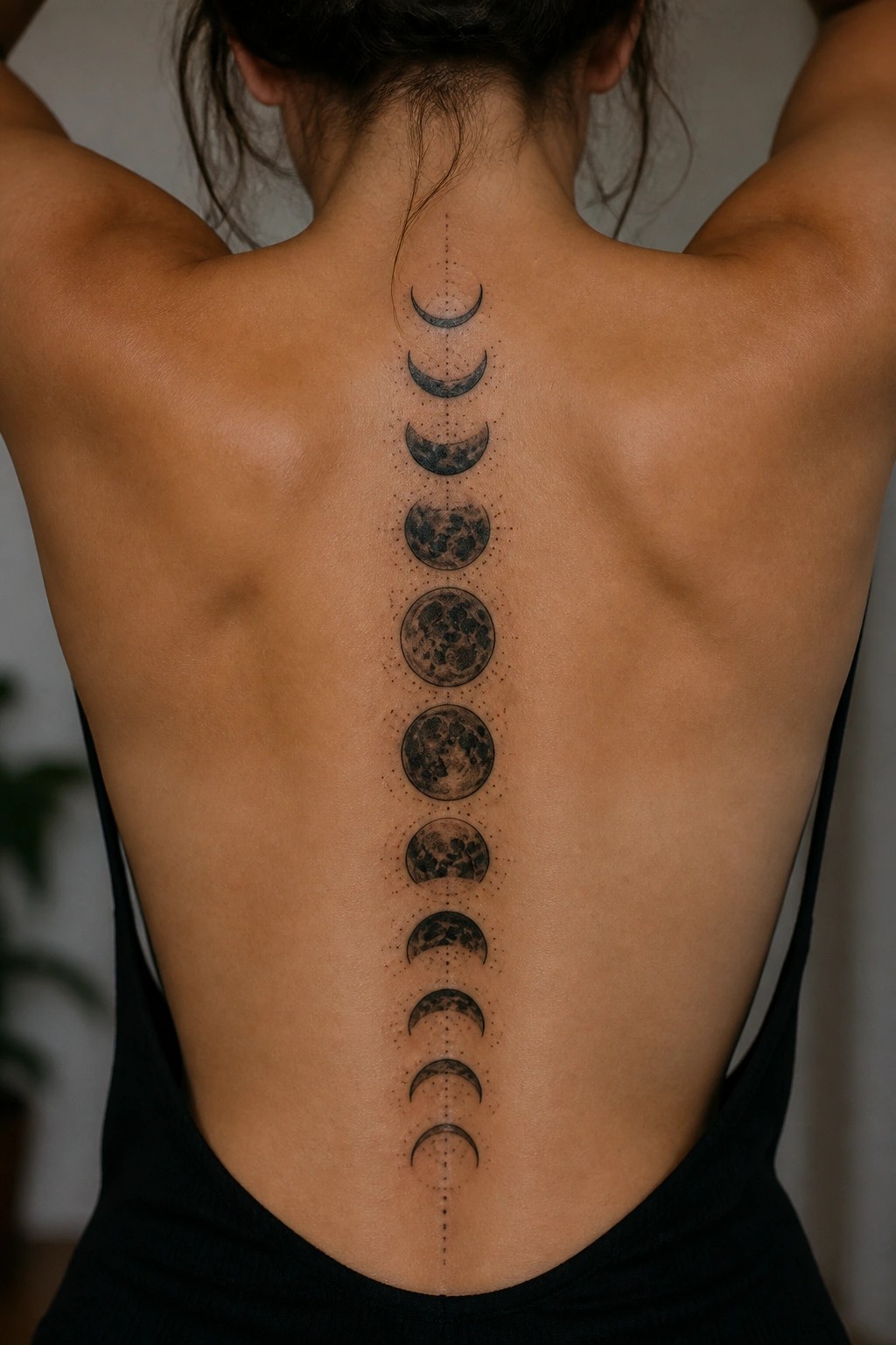
The design runs straight down the center of the back in one long column. Each moon phase appears in order from the upper back near the neck down to the lower back. This layout lets the cycle read from top to bottom without extra framing.
The vertical line keeps the phases evenly spaced and easy to follow. I think the spine placement works here because it turns the sequence into a single flowing strip instead of separate pieces.
Placement on the finger suits a small constellation
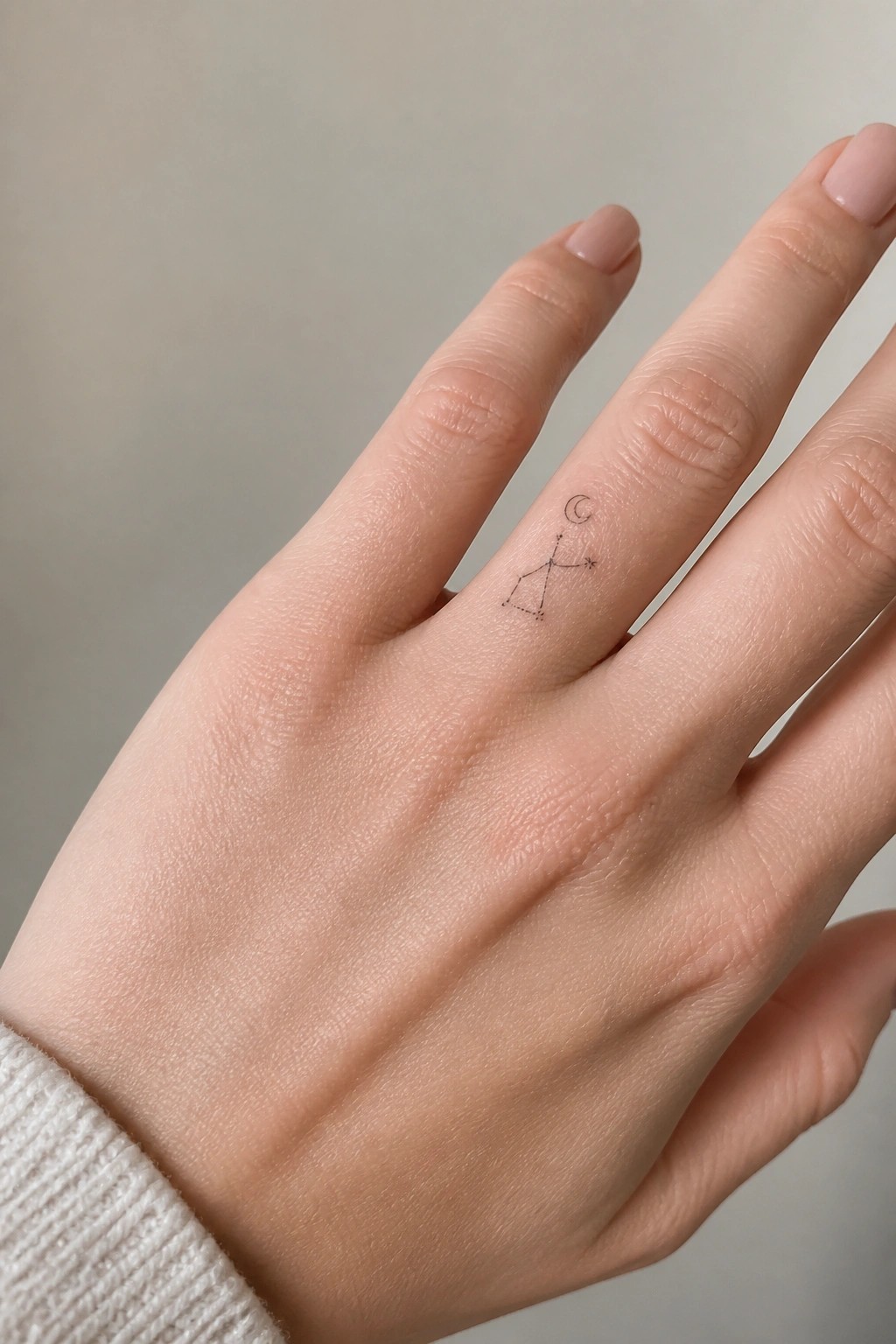
The finger gives this design a compact space that matches its scale. Fine lines trace a simple figure with a crescent moon above and a single star nearby. The black ink stays light without filling much skin.
I think the narrow spot helps the lines hold their shape over time. It also keeps the whole piece from competing with other jewelry on the same hand.
Crescent moon on the chest
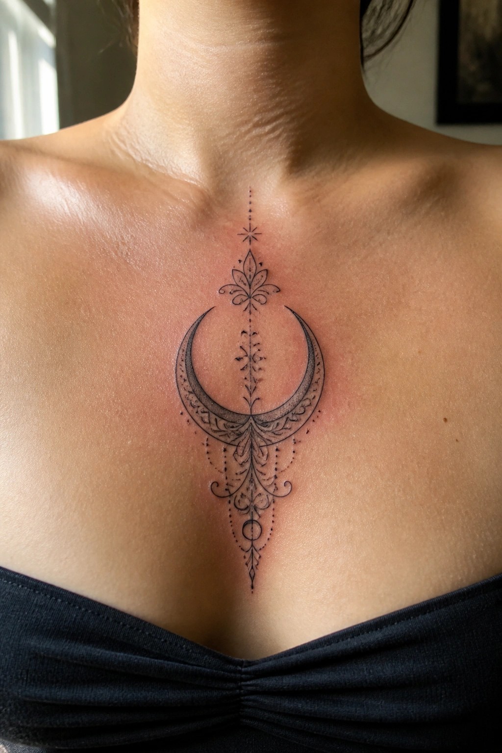
The upper chest gives this moon tattoo a clear center point. The crescent sits around a vertical line of leaves and dots that runs straight down the middle. This keeps the whole design balanced without needing extra elements on the sides.
I think the size works here because it lets the fine lines stay sharp while the lower part tapers off naturally. The black and grey shading gives the moon enough weight to stand out against the skin.
Crescent moon on the upper back
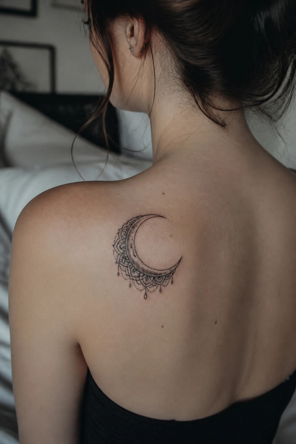
The upper back placement lets the crescent moon follow the shoulder curve in a natural way. Black and grey shading brings out the mandala patterns around the edge without making them too heavy. The dangling drops at the bottom give the design a bit of downward flow.
I think the size keeps the details readable while leaving room on the skin. It avoids looking crowded in this spot.
Crescent moon with flowers on the side
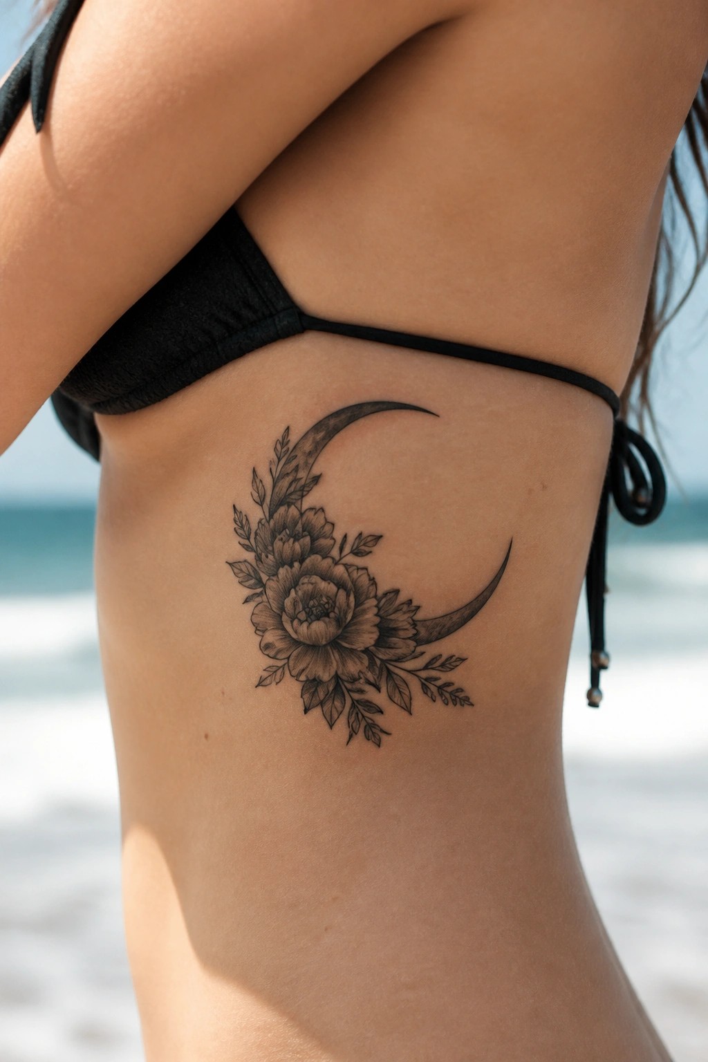
The tattoo sits along the ribs where the body curves naturally. A crescent moon takes up most of the space while flowers and leaves fill the inner area and extend outward. The black and grey shading keeps everything clear even at this smaller scale.
This placement lets the moon shape follow the torso without forcing the design into a stiff box. It also makes the piece simple to hide or show depending on clothing.
Ornate moon tattoo on the lower back
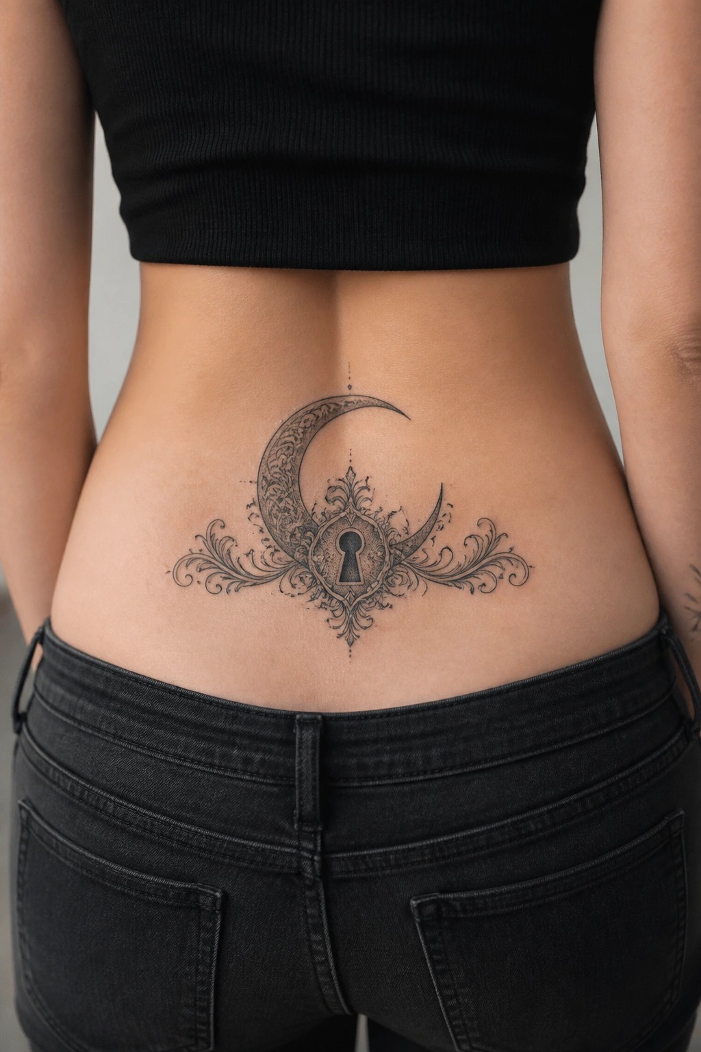
The lower back gives this moon design enough width to spread the side flourishes evenly. The crescent sits centered with the keyhole as its main focal point and the details taper out toward the hips.
I like how the placement keeps the tattoo balanced without forcing the lines into a tighter space. It also stays easy to cover with most clothing while still showing the full layout when needed.
The crescent moon sits on the inner wrist
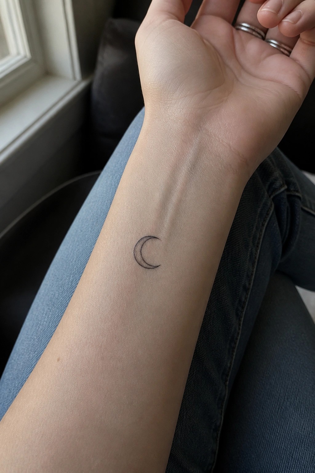
The inner wrist gives this crescent moon a clean spot that shows the shape without crowding it. Fine lines keep the tattoo small and simple. Black ink creates the needed contrast on its own.
I think the size works because it stays clear even on a narrow area. The placement also makes the design easy to see when the arm is resting.
Moon phases run down the inner forearm
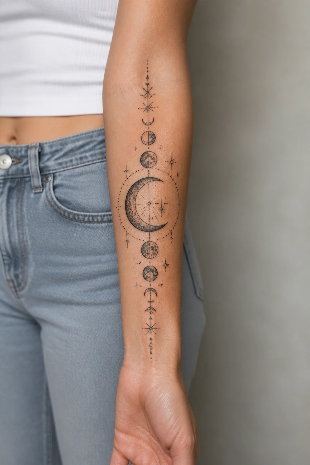
The design sits in a straight vertical line along the inner forearm. Moon phases stack from a small crescent at the top down to a larger one near the bottom with stars and dots filling the spaces between them. The black and grey approach keeps the phases easy to read without adding color.
This layout makes the full cycle visible in one glance. I think the vertical flow matches the shape of the arm and avoids crowding.
Crescent moon on the collarbone
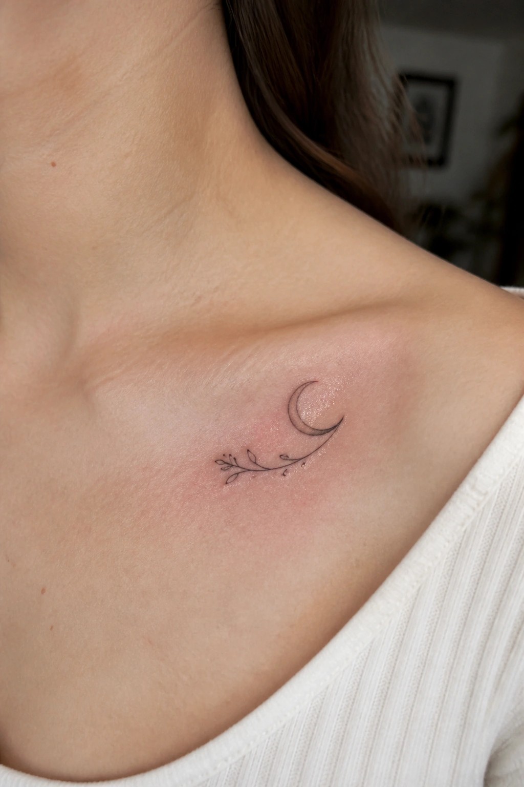
The tattoo sits along the collarbone in a spot that stays visible but stays out of the way. A small crescent moon pairs with a short leafy branch that extends from one side. The lines stay thin and the whole design stays compact.
This spot works because the bone gives the moon a gentle curve to rest on. I think the size keeps the tattoo from feeling crowded or overdone in that area.
Crescent moon on the thigh
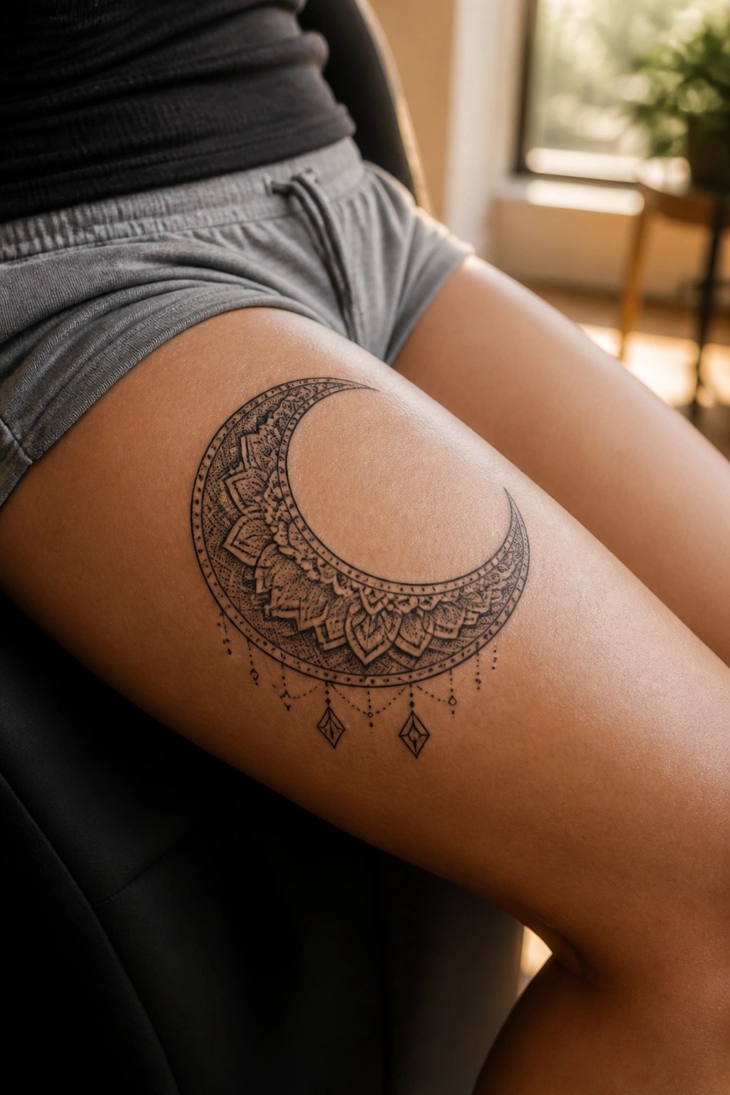
The upper thigh gives this crescent moon enough space to sit without feeling cramped. The curve of the design lines up with the leg shape. Black and grey mandala work fills the inside and stays readable at this scale.
I think the small hanging details help balance the lower edge. They keep the whole piece from looking top heavy on the skin.
A small crescent moon on the inner wrist
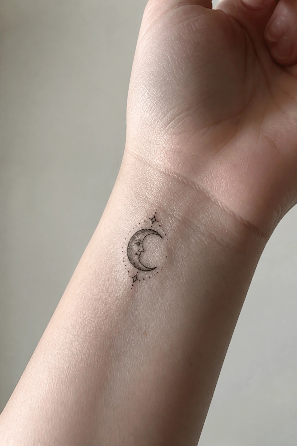
The inner wrist works well for this compact moon because it keeps the design in a spot people notice without it feeling large. The crescent sits inside a ring of dots with a couple of stars placed around it. Black and grey shading gives the moon its shape and depth.
I think the wrist placement makes sense here since the small scale stays readable even with the fine details. It also lets the tattoo sit flat against the skin in a way that feels natural for everyday wear.
Lower back crescent moon with fine lines
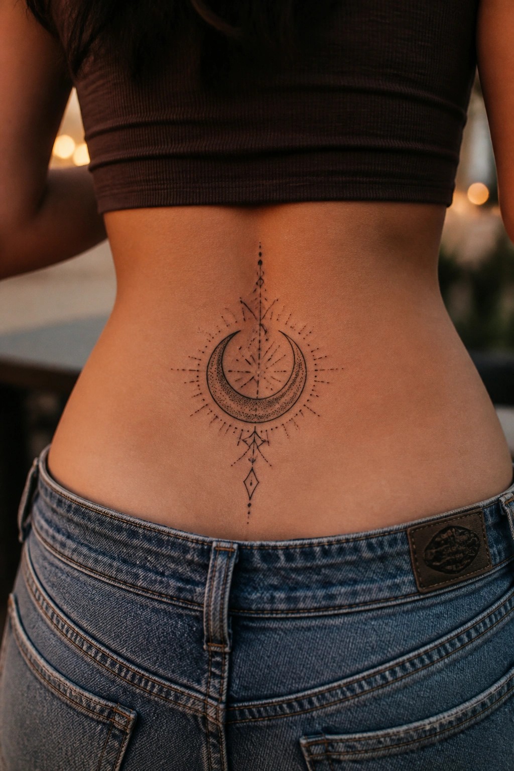
The lower back works for this design because it gives the moon a flat centered space. Thin lines and dots spread out evenly from the center without fighting the body’s shape.
I think the scale keeps the details clear while still feeling balanced from a distance. It avoids looking cramped or stretched when the person moves.
Crescent moon with a face on the upper arm
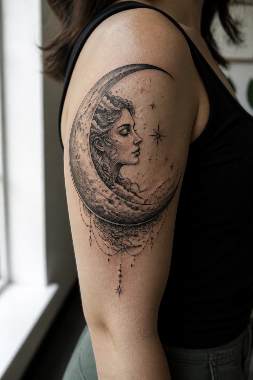
The upper arm gives this crescent moon enough space to follow the natural curve of the shoulder. The design places a woman’s profile inside the moon, with stars scattered around and a few hanging details below. Black and grey shading builds the texture without needing extra color.
I think the size works well here because the main shapes stay clear even from a short distance. The hanging lines add a bit of movement without crowding the lower arm.
Moon and compass on the side
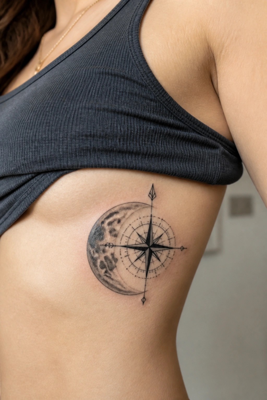
The tattoo sits on the upper ribs where the skin has some natural give. A crescent moon fills most of the space with shaded texture while a compass rose sits over the middle in finer lines.
This spot keeps the round moon shape from looking cramped. The mix of heavy shading on the moon and lighter compass lines stays clear without fighting each other.
Crescent moon and vine on the neck
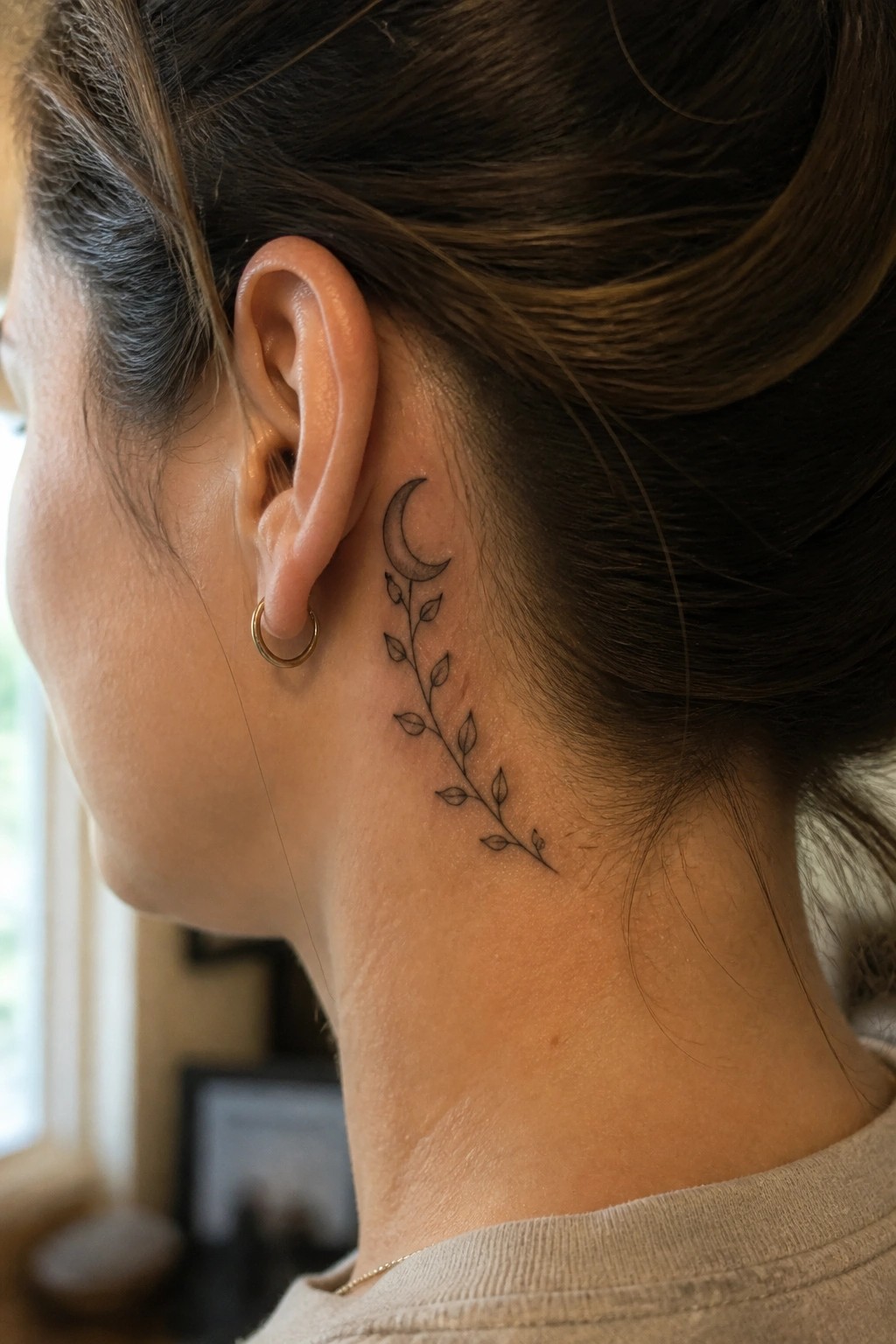
A crescent moon sits behind the ear with a thin vine of leaves trailing down the side of the neck. The fine line work keeps the whole piece light and narrow. It runs in a loose vertical path that matches the area.
This placement keeps the tattoo easy to show or cover depending on hair and clothing. I think the length works because it uses the space without crowding the ear.
Moon and leaf tattoo on the thigh
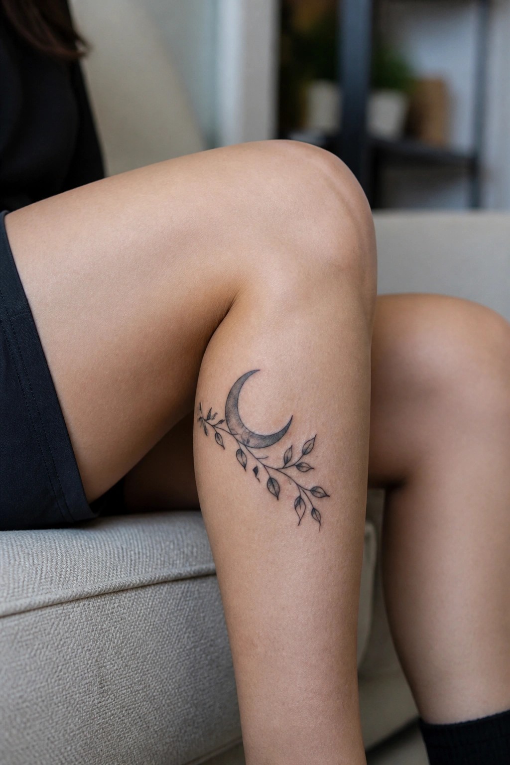
The thigh works well for this crescent moon because the curve of the leg lets the leaves trail naturally along the skin. The design sits in a spot that shows when seated but stays easy to cover. Black and grey shading gives the moon some depth without making it heavy.
I think the scale keeps the whole piece readable even with the fine leaf details. It avoids looking crowded while still showing the branch clearly.
Frequently Asked Questions
What does a moon tattoo typically symbolize for women? Moon designs often represent intuition, feminine energy, and life’s natural cycles. In black and grey with classic contrast, the shading highlights these themes by creating depth that feels timeless and personal.
How do I pick the right size and placement for one of these designs? Consider your body shape and daily lifestyle first. Smaller moons work well on wrists or ankles for subtle visibility, while larger versions suit shoulders or ribs. Always discuss proportions with your artist to maintain the classic contrast across curves.
What aftercare steps help preserve the strong contrast in black and grey moon tattoos? Clean the area gently with unscented soap twice daily, apply a thin layer of recommended moisturizer, and avoid sun exposure for at least six weeks. Consistent care prevents fading and keeps the grey tones sharp over time.
Can I add personal elements to one of the 25 designs without losing the classic style? Yes, many women incorporate subtle stars, phases, or small constellations in the same black and grey palette. Share reference photos with your artist early so the added details enhance rather than overpower the moon’s contrast.
How painful is getting a black and grey moon tattoo on common female placements? Pain varies by location and your tolerance. Areas like the inner wrist or ribs tend to feel more intense due to thinner skin, while shoulders and thighs are often more manageable. Sessions usually last two to four hours depending on detail level.
