

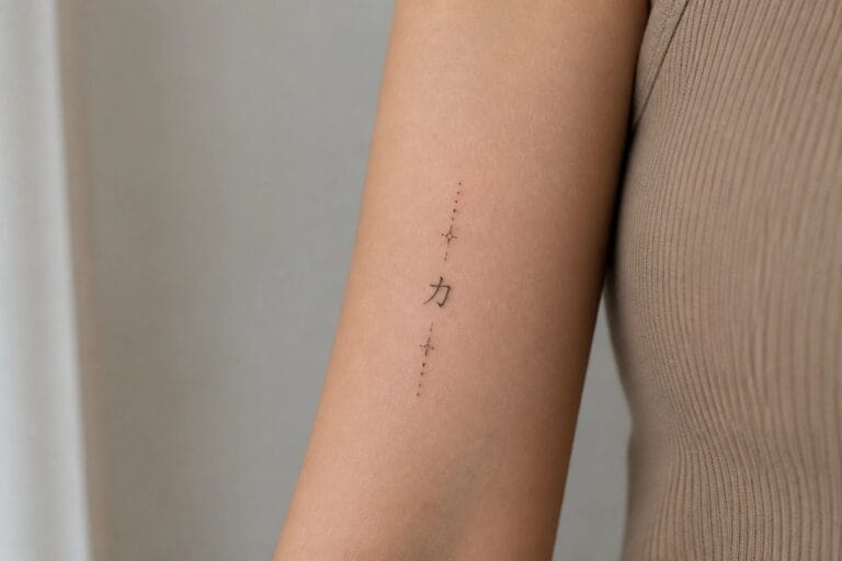
I have always loved how Chinese symbols bring a quiet power to tattoos that feels both personal and timeless. My favorite part is finding designs that blend strength with wisdom in ways that speak to real life experiences. These 22 ideas for women capture that balance beautifully and make me want to add another piece to my collection. You might spot one that matches your own story of growth and resilience right away.
Vertical strength character on the inner forearm
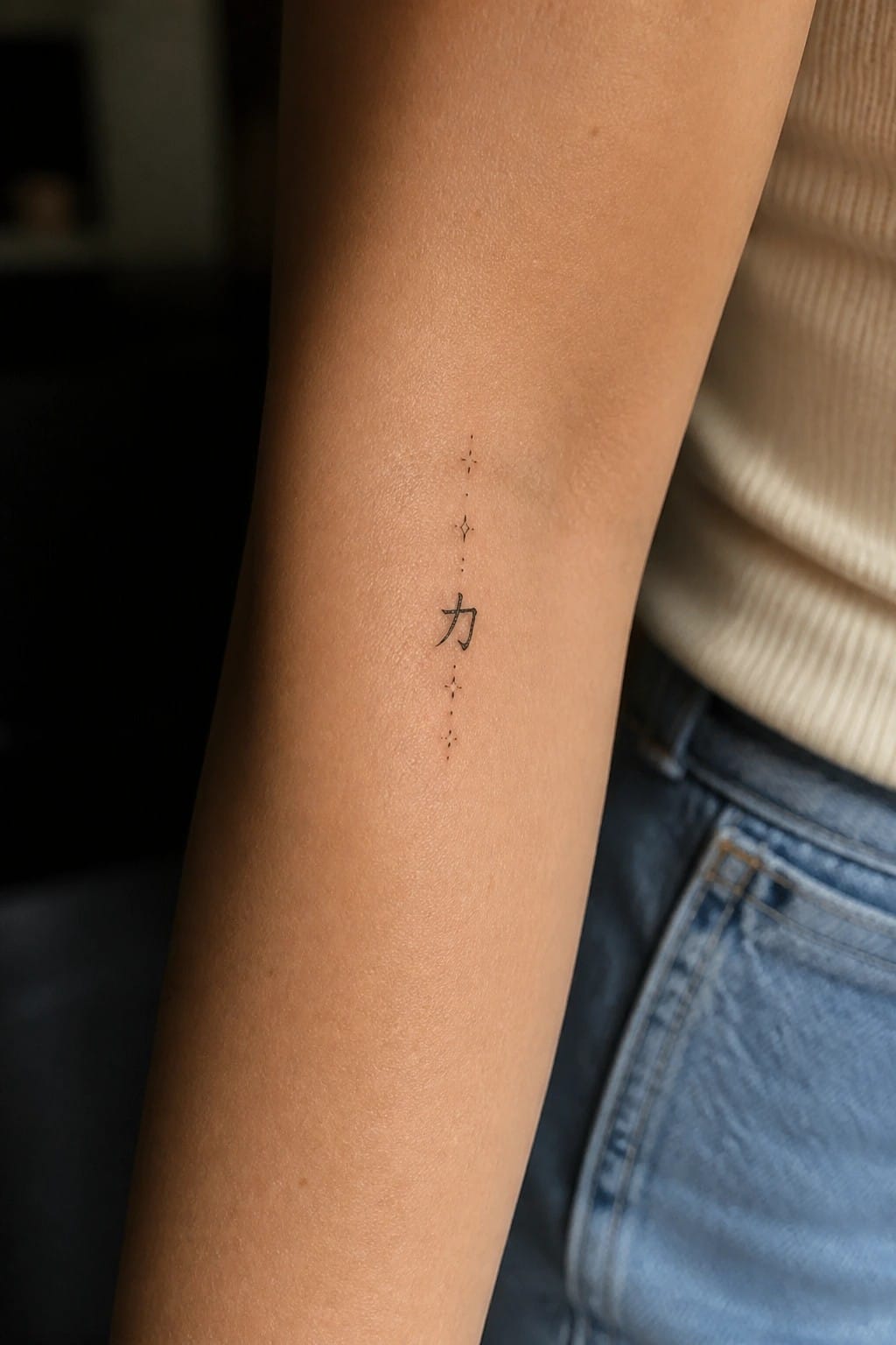
The tattoo shows the Chinese character for strength in a clean, minimal script. Small dots run in a straight line above and below the character along the inner arm.
I think the vertical format works because it stays narrow and fits the shape of the forearm without spreading out. The simple dots add a bit of interest while keeping the whole piece understated.
Small chinese character behind the ear
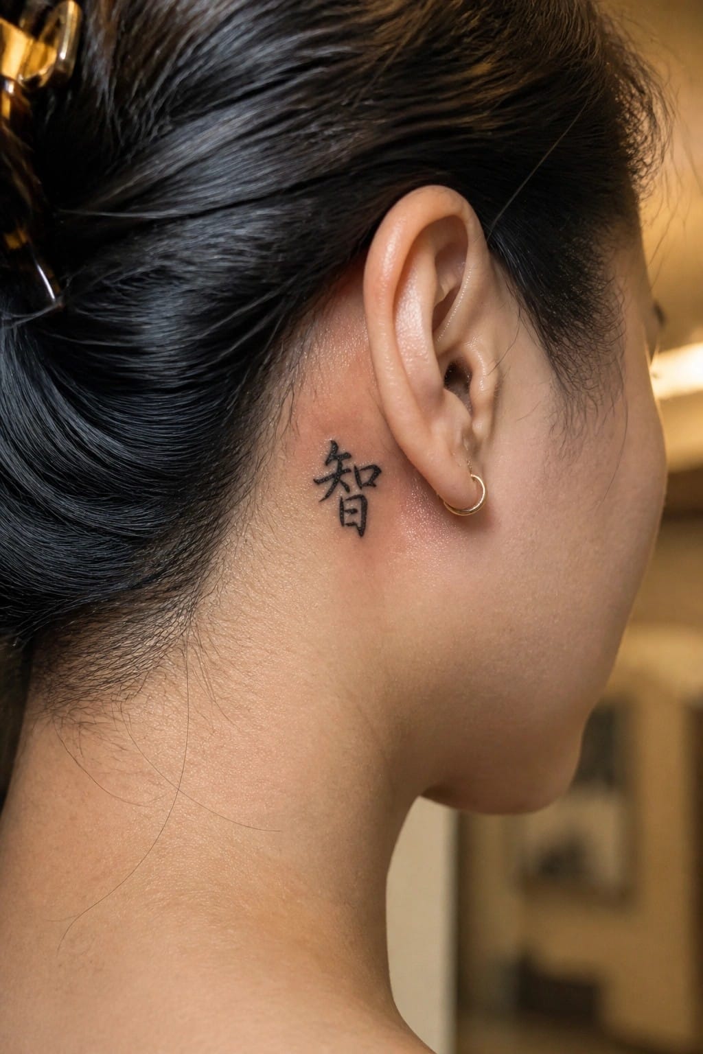
The placement keeps the design discreet. It rests just behind the ear along the hairline. This spot lets the symbol stay mostly hidden while still visible in certain angles.
I think the small size works because the character stays sharp without extra lines. The location makes the tattoo feel personal rather than bold.
Phoenix tattoo on the upper back
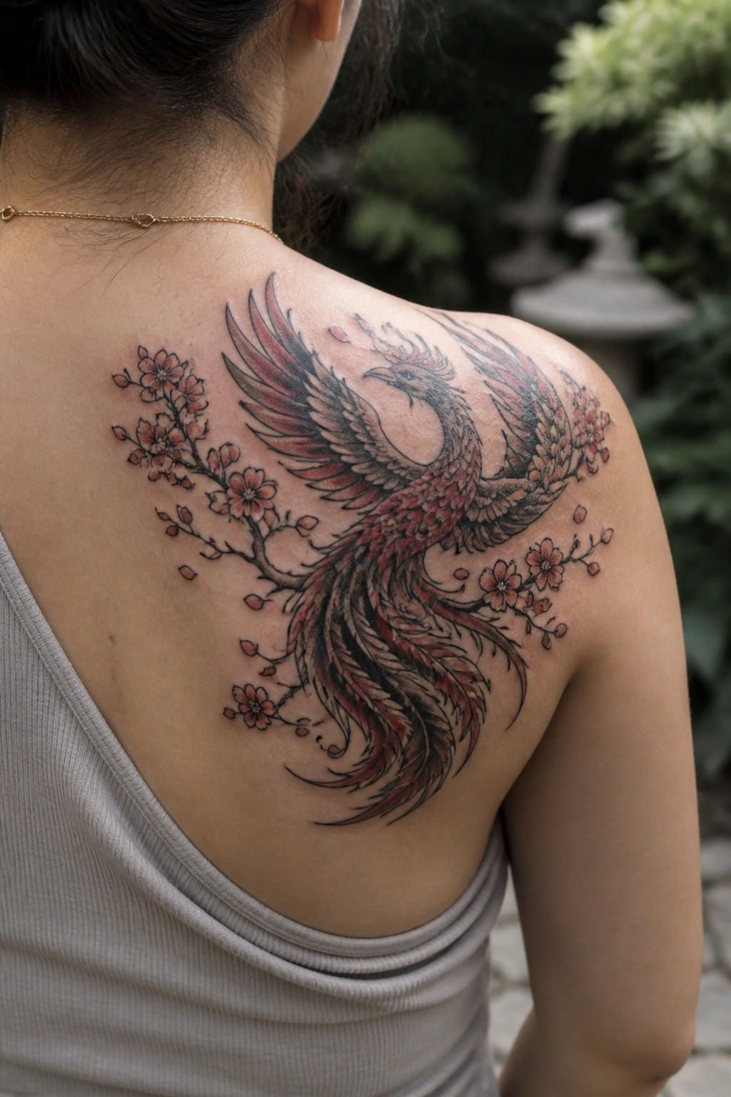
The phoenix sits across the upper back and stretches onto the shoulder. Cherry blossoms run along the sides of the wings and tail. Red tones fill most of the feathers while black lines add the main structure.
This placement gives the wings room to spread without looking cramped. I think the downward curve of the tail fits the shoulder blade area well.
Koi fish on the thigh
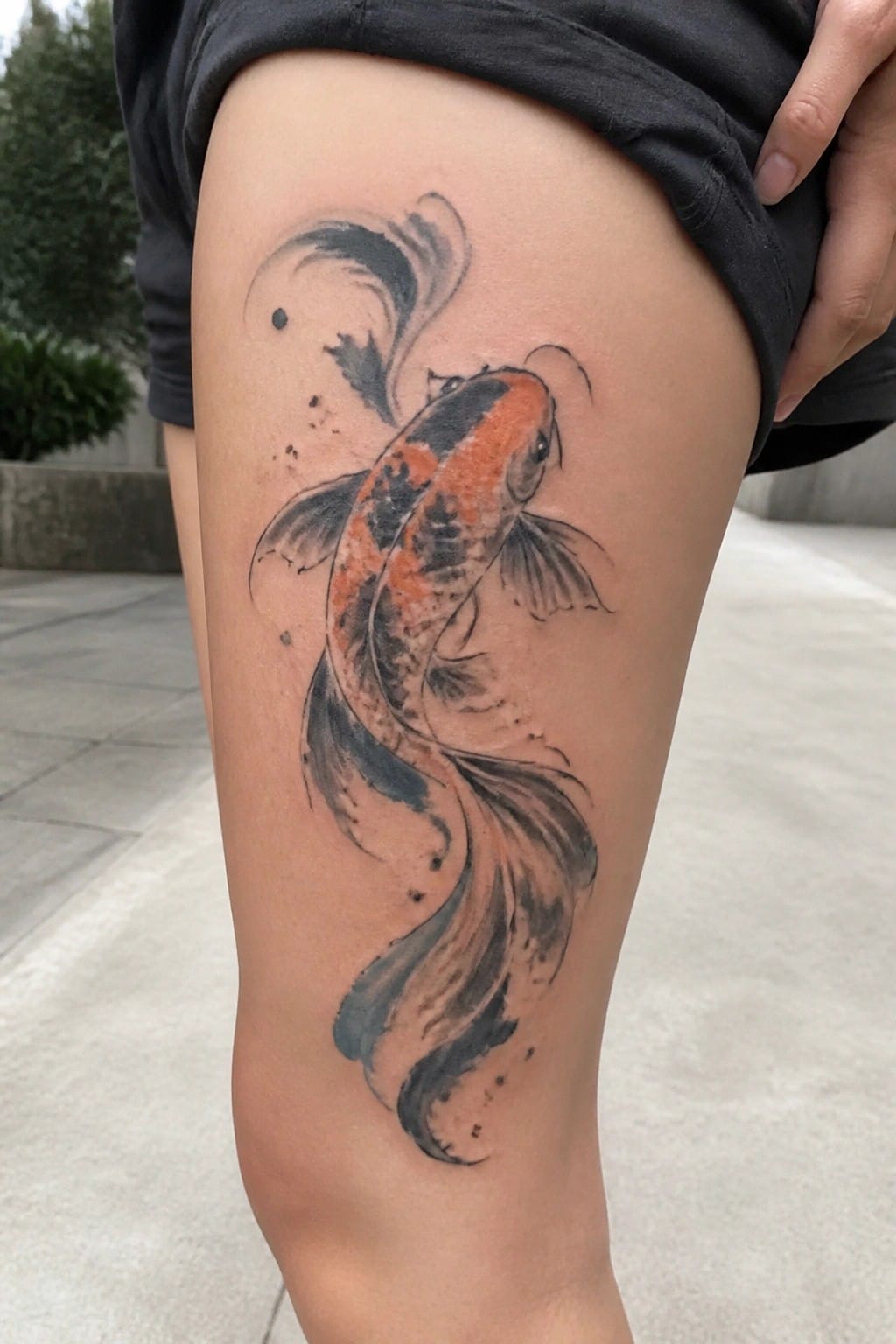
The thigh gives a koi fish room to stretch out in a long vertical line. The body runs down the leg with the tail curving at the bottom and water strokes filling the upper space. Orange and black ink keeps the fish visible even on a larger area.
This placement lets the design move with the leg instead of fighting against it. I think the scale works because the fish stays clear without crowding the skin.
Bamboo tattoo along the side
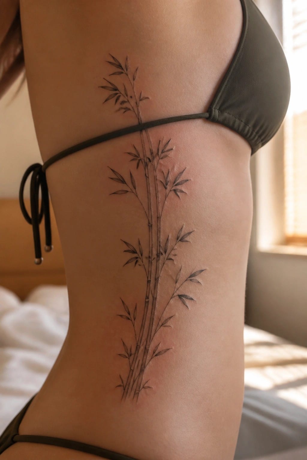
The side torso gives a tall bamboo design plenty of room to stretch out. Thin lines form several stalks with small leaves that stay close to the stems. The tattoo sits under the arm and runs down toward the hip.
This placement lets the straight stalks follow the body without crowding. I think the clean lines help the bamboo stay readable at this size.
Red seal on the back of the neck
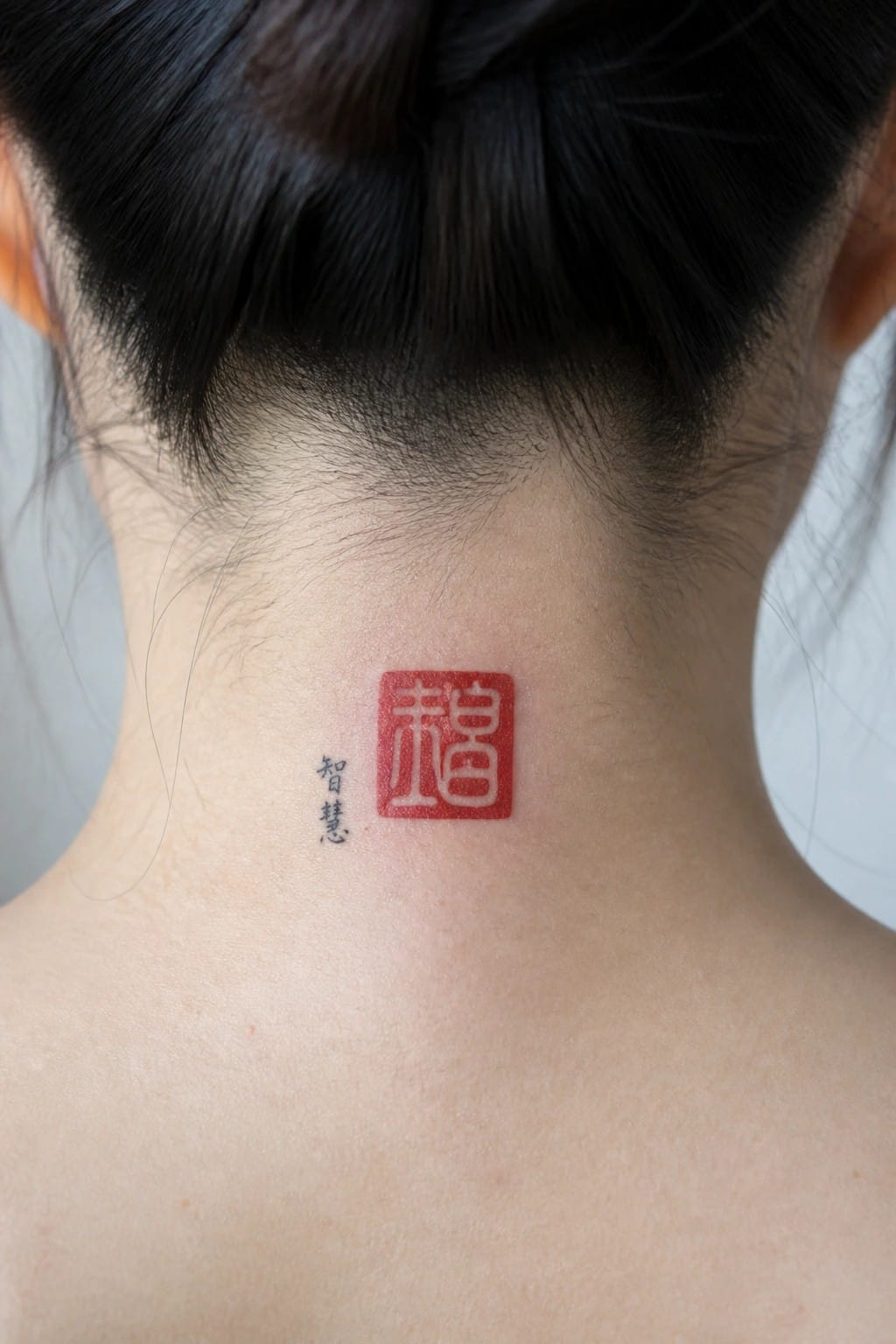
The back of the neck keeps this small seal tattoo mostly out of sight. It only appears when the hair is pulled up. The compact square shape fits the narrow space without crowding the area.
I like how the red ink stays bold but contained. It gives the design a clean stamp like quality that does not need extra lines or shading to read well.
Dragon tattoo along the spine
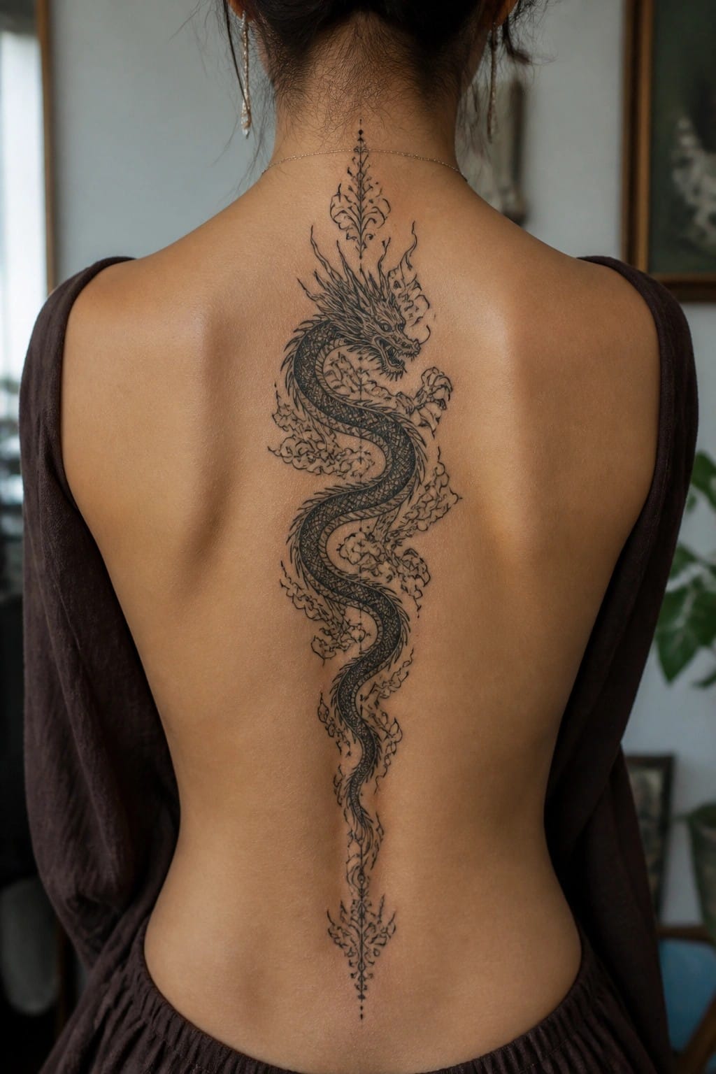
A dragon tattoo runs straight down the spine from the base of the neck to the lower back. The body curves slightly as it moves downward and stays centered the whole way. Clouds wrap around the scales without crowding the lines.
The vertical placement lets the design follow the natural shape of the back instead of fighting it. I think this works because the length gives the dragon room to stretch while keeping every section easy to read.
A cherry blossom branch on the ankle
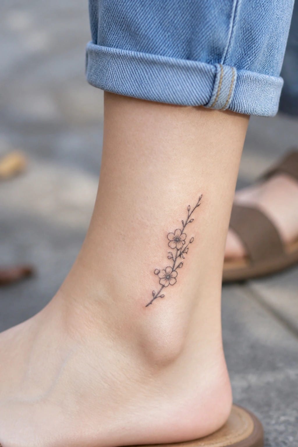
The ankle works for a narrow vertical design like this one. A thin branch with a few small blossoms sits neatly along the side without taking up much space. The fine line style keeps the whole thing light and simple.
I think this placement makes the tattoo feel balanced because the length of the branch matches the shape of the ankle. It stays subtle from a distance but shows the details when you look closer.
Bamboo design on the shoulder
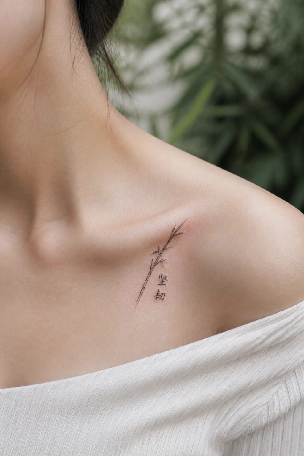
The bamboo stalks sit at a slight angle on the upper shoulder. Thin black lines form the stems and a few small leaves. The two Chinese characters rest below the stalks in a matching fine line style.
This placement lets the bamboo follow the natural slope of the shoulder without needing extra detail. I think the angle keeps the design balanced and easy to read at this small size.
Ginkgo leaves on the upper arm
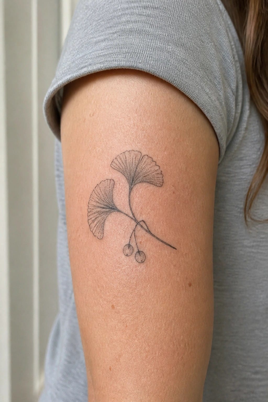
A ginkgo tattoo sits on the upper arm. Two leaves face different directions and connect through thin stems. Small round shapes hang near the bottom.
I picked this spot because the arm gives the leaves enough space to sit naturally. The fine line work stays clear without needing extra shading.
Endless knot mandala on the thigh
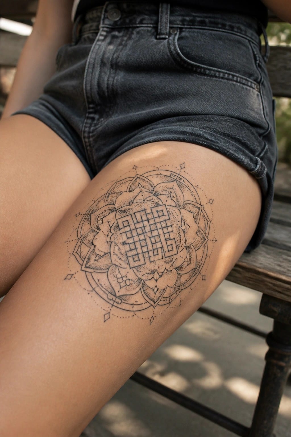
The thigh gives this design a solid flat area to sit on. A circular mandala needs that kind of space so the outer rings and inner knot stay even. Fine lines help the lotus petals and the central pattern read clearly without crowding.
I like how the endless knot sits right in the middle. It keeps the Chinese meaning front and center while the rest of the mandala frames it. The size feels right for the spot too.
Vertical Chinese characters on the forearm
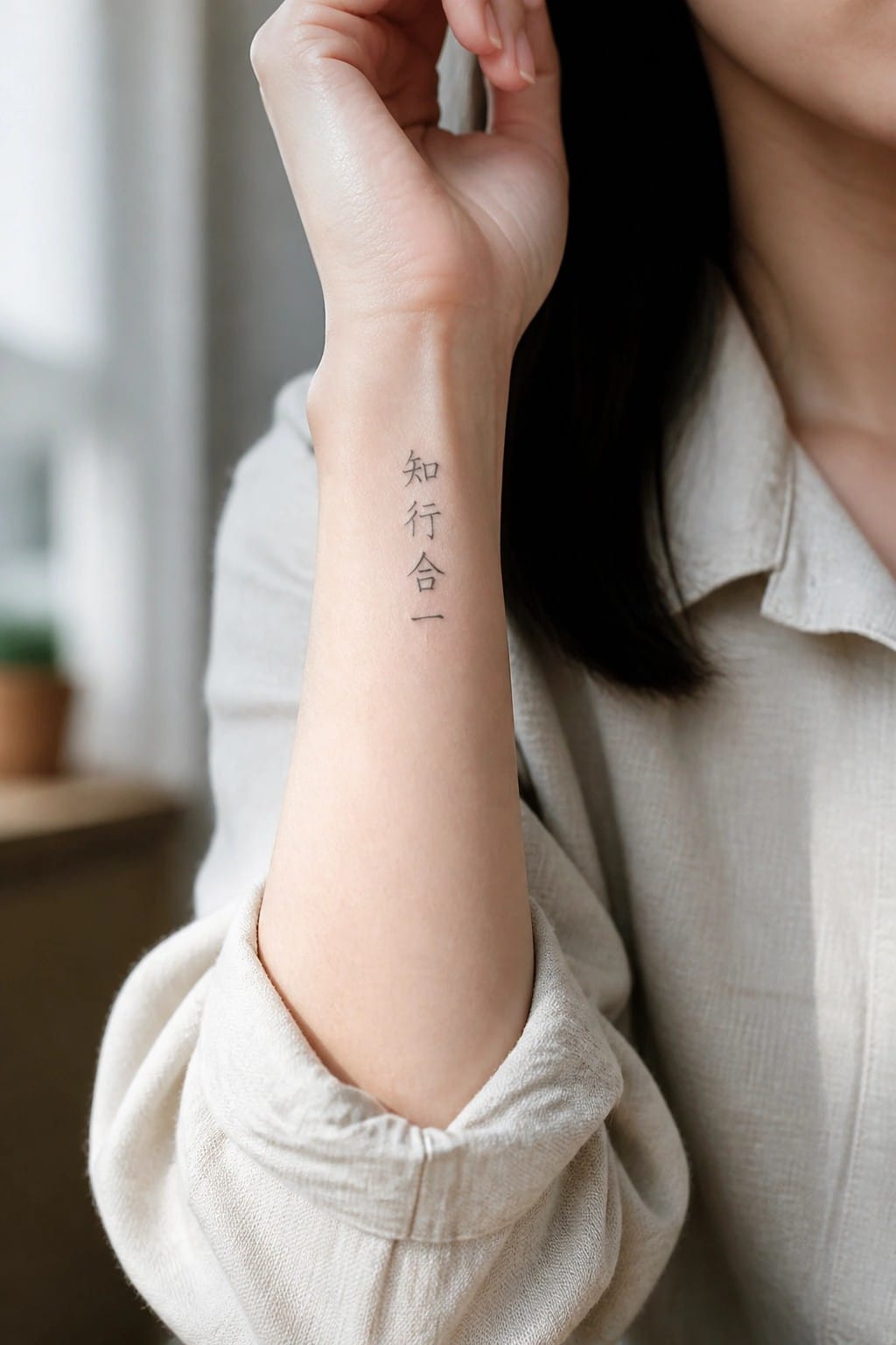
The inner forearm gives this vertical script room to breathe. The four characters line up neatly and stay readable even at a modest size. Black ink keeps the whole thing simple and direct.
I chose this spot because the arm’s natural length supports the upright layout without forcing any curves. It also lets the tattoo stay visible in daily movement while remaining easy to cover when needed.
Peony tattoo on the shoulder
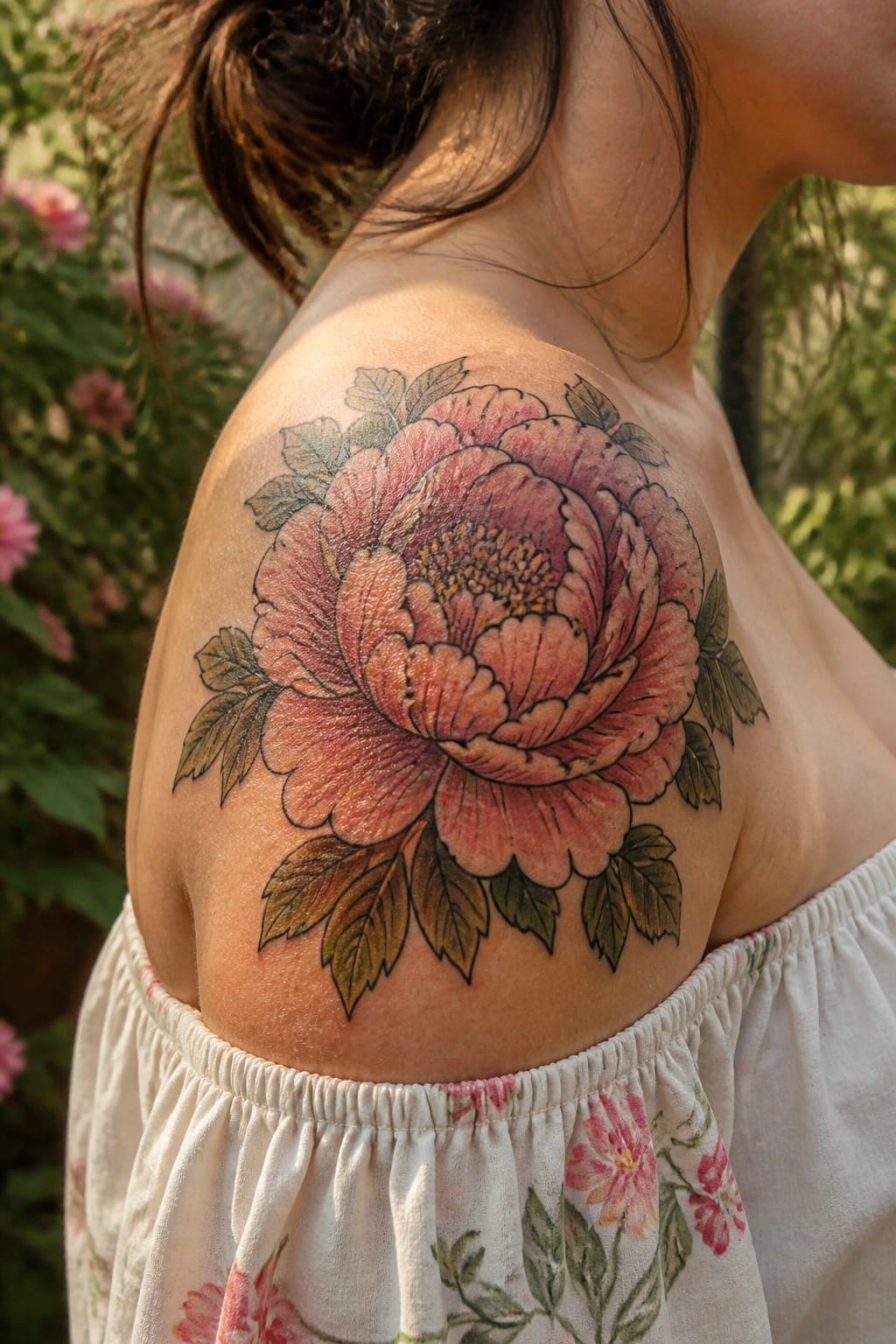
The shoulder gives room for a full peony bloom with leaves extending outward on each side. This lets the design spread without feeling cramped or forced into a smaller space.
The size helps the petals and leaves stay readable from a normal distance. I like how the placement lets the flower sit across the natural curve instead of fighting against it.
Bamboo covers the upper arm
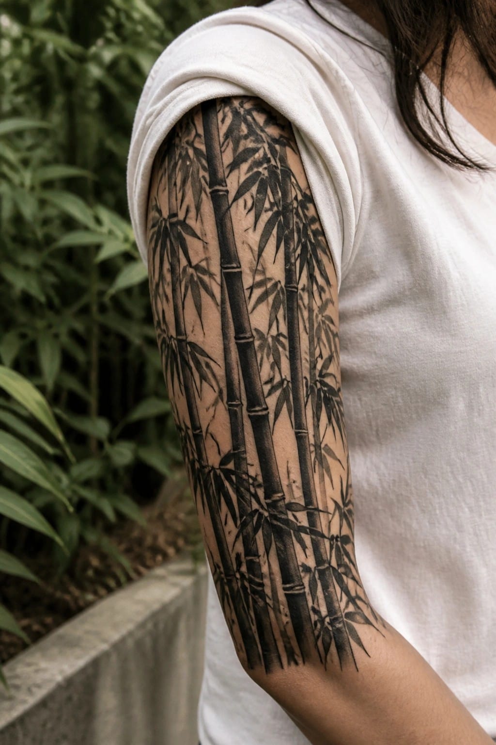
Bamboo stalks run straight down the arm from the shoulder. Black ink and shading bring out the segments and leaves along each stalk. The vertical layout matches the natural growth of the plant.
This placement keeps the stalks readable from top to bottom. I think the size works because it gives each cane enough space without looking cramped.
Sword tattoo along the ribs
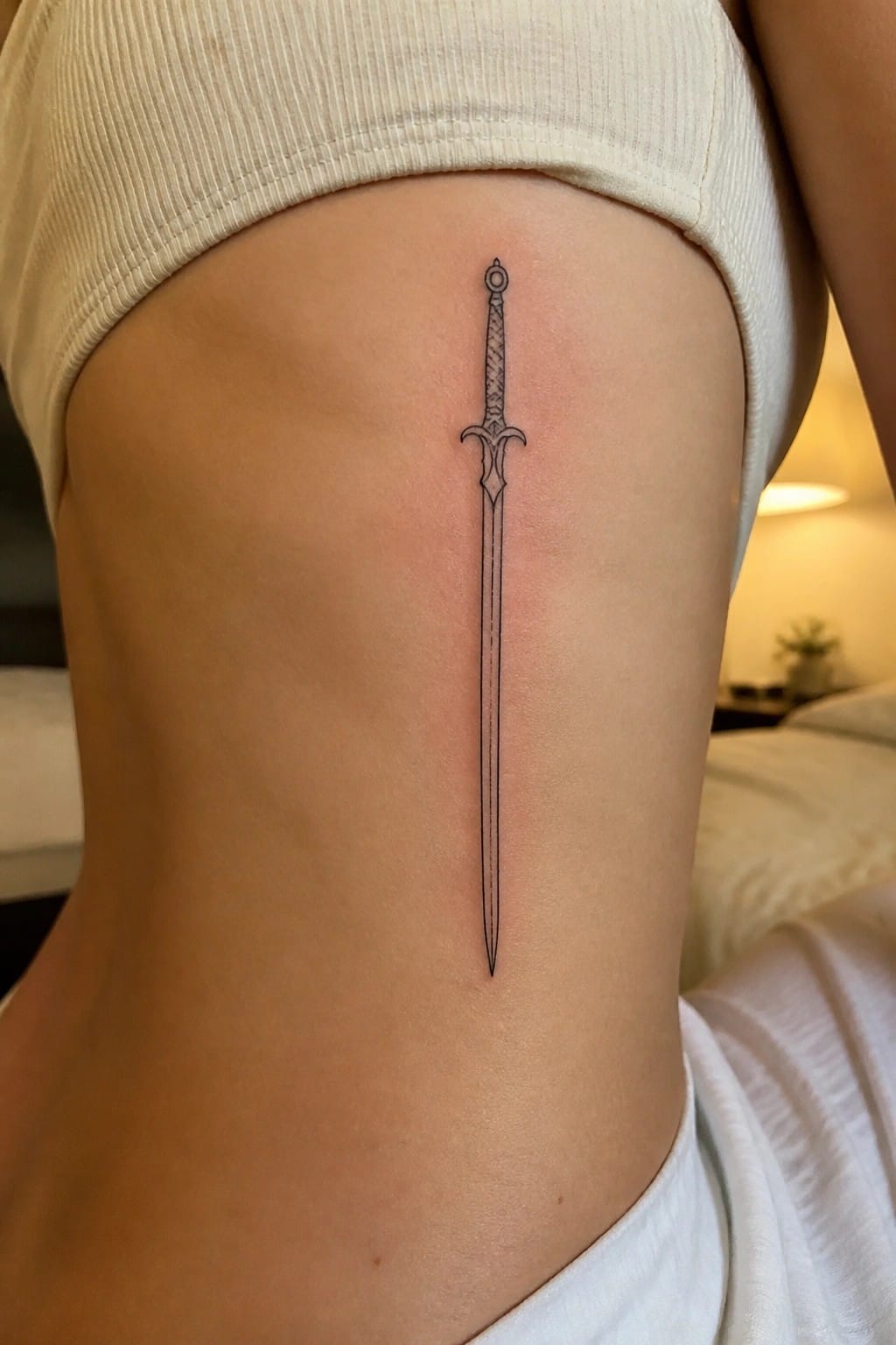
The sword sits vertically along the side of the torso. It follows the natural curve from under the arm down toward the waist. The line work stays thin and simple with no fill or shading.
This placement lets the design sit flat even when the body twists. I think the vertical layout keeps the sword readable without needing extra detail.
Wings across the collarbone
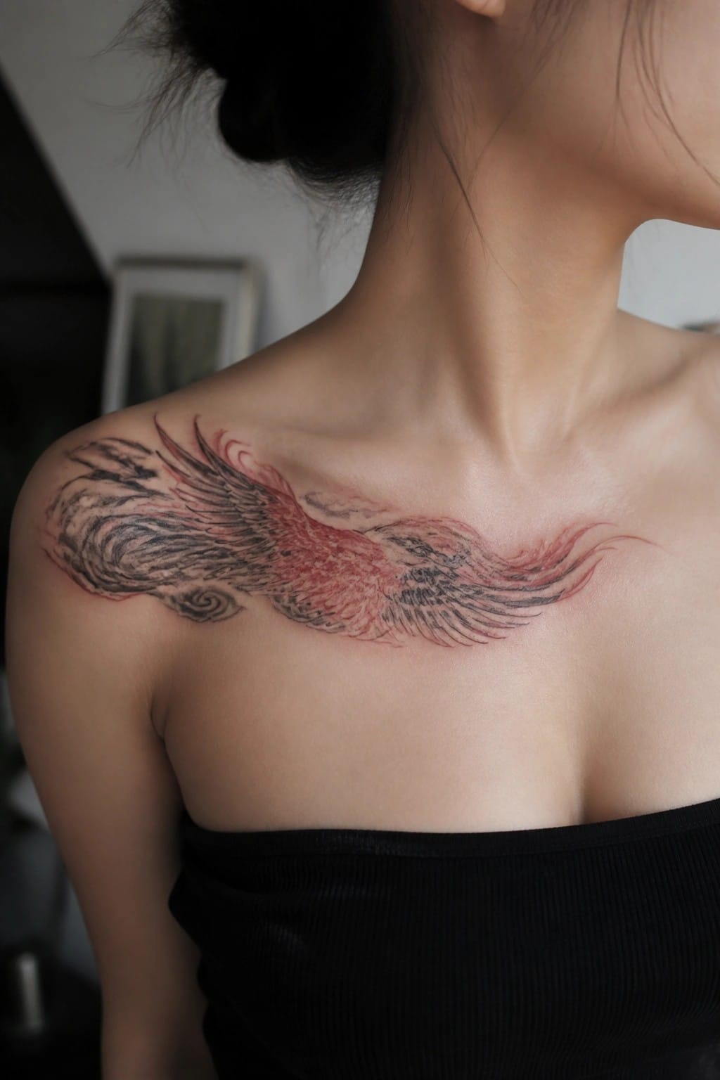
The wings run straight across the collarbone and reach out over both shoulders. Black lines define the feathers while red shading adds depth in the middle sections. This placement lets the design sit wide without pushing up toward the neck.
The horizontal layout keeps the wings readable even at this scale. I think the spread works because it matches the natural width of the upper chest.
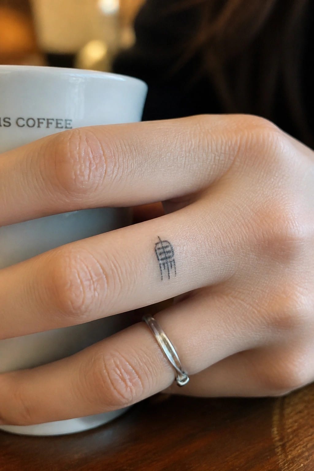
Lantern tattoo on the finger
The design sits along the side of the finger in a compact line style. It shows a simple lantern shape with minimal details that fit the narrow space. This placement keeps the tattoo easy to see during daily movement.
I chose the finger because the small scale prevents it from feeling crowded. The lines hold up without needing extra shading or fill.
Tree and mountains on the upper back
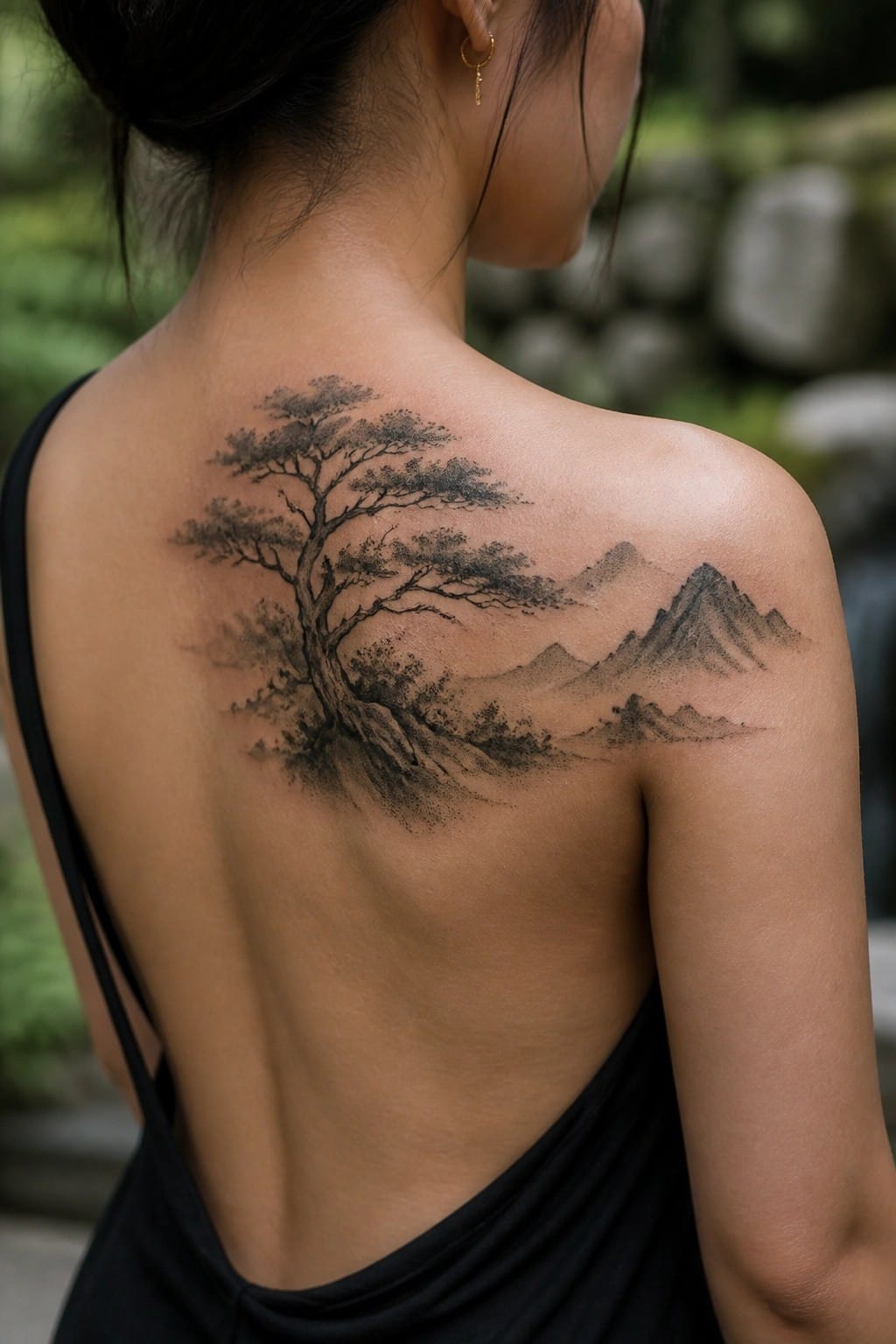
The design places a tree with wide branches beside a mountain range. It runs across the upper back and onto the shoulder. This spot gives the wide scene enough room to stay open.
The horizontal layout fits the area because it follows the natural width of the back. I think the scale keeps the main shapes clear without needing extra fill.
Bamboo and moon on the thigh
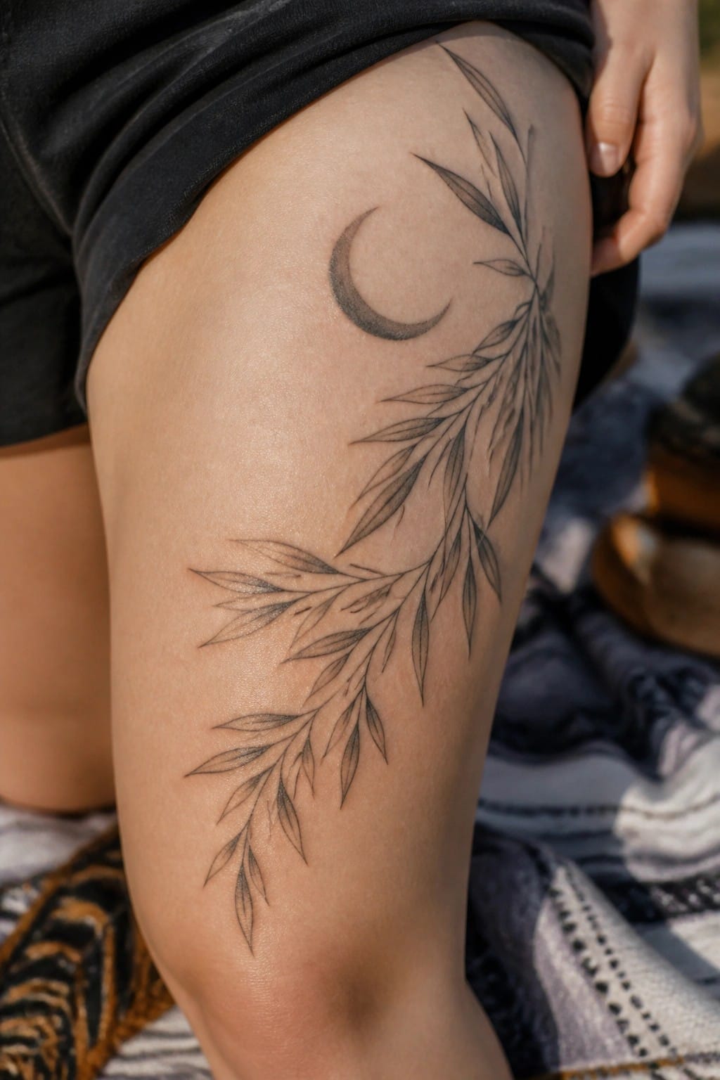
A crescent moon sits at the top of the thigh with bamboo leaves extending down the leg in fine lines. The design uses the natural flow of the stalks to cover a medium area without crowding the skin. Bamboo carries a long history in Chinese symbolism as a mark of strength and steady growth.
The thin linework keeps the leaves looking light while still showing clear structure. This approach works for anyone who wants the symbol to stay visible but not overpower the rest of the leg.
Chinese character on the inner forearm
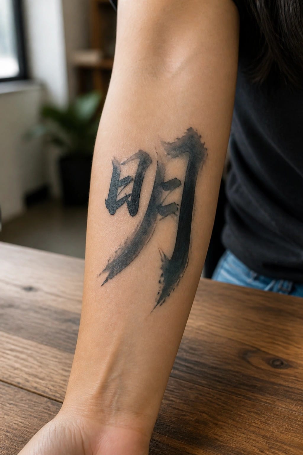
The tattoo sits on the inner forearm in a vertical layout. The character ming is done in thick brushstrokes with some ink bleed at the edges. This keeps the design compact while still showing clear lines.
The placement works because the arm gives enough length for the strokes to flow without crowding. I chose this spot since it lets the character sit flat and stay easy to read from most angles.
Vertical chinese characters along the spine
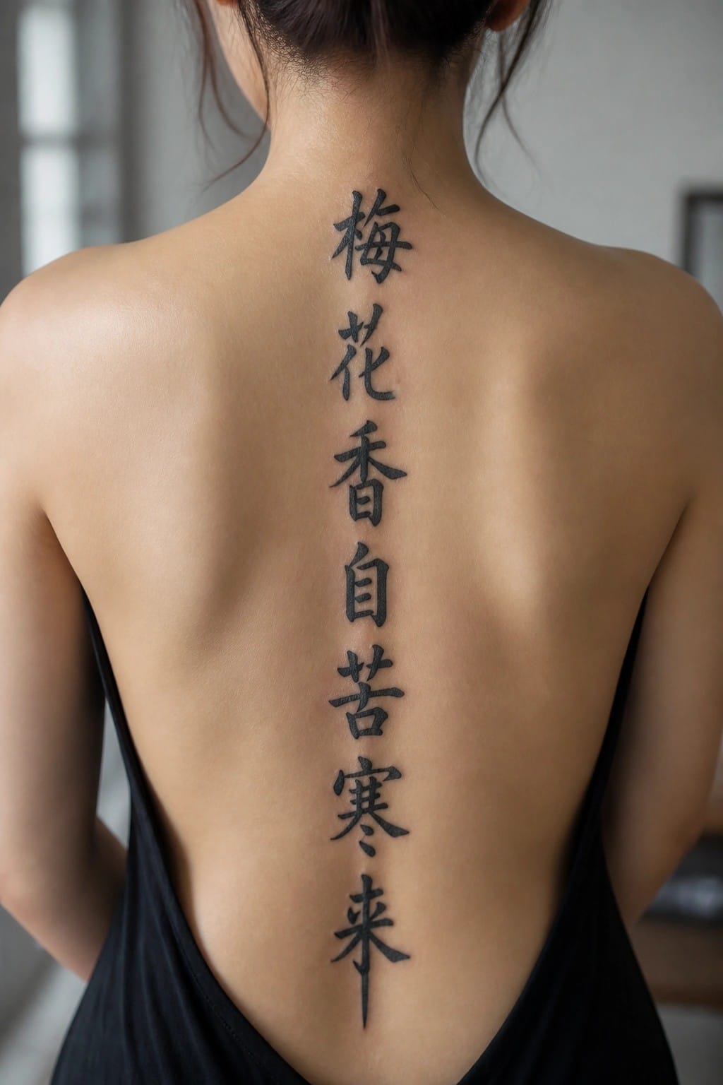
The tattoo runs in a single column straight down the spine. This placement keeps the characters aligned and balanced without needing extra framing or decoration. The black ink stays bold and clear across the full length.
I think the vertical format works here because it matches the natural flow of the back. The design stays simple and readable even when the phrase is long.
Scroll tattoo on the forearm
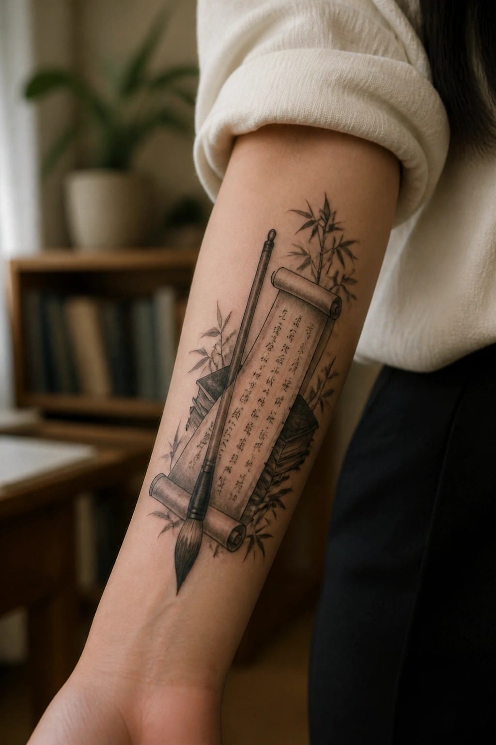
The tattoo sits vertically along the forearm. It shows a hanging scroll with Chinese characters, a brush laid across the lower part, and bamboo branches on either side.
This layout keeps the text easy to read at a medium size. The placement also lets the scroll follow the natural line of the arm without feeling cramped.
Frequently Asked Questions
How can I verify that a Chinese character tattoo truly represents strength or wisdom without risking mistranslation?
Work with a native Mandarin speaker or a certified translator who specializes in classical Chinese to double check every character. Cross reference multiple reputable sources such as university language departments or published calligraphy dictionaries rather than relying solely on online translators. Bring the final approved characters to your tattoo artist in both simplified and traditional forms so they can replicate the strokes exactly.
What body placements work best for these symbolic tattoos on women while keeping them elegant and personal?
Popular choices include the inner wrist for daily visibility, the upper back between the shoulder blades for a more private symbol, or along the ribcage where the design can follow natural curves. Smaller single characters often suit the ankle or behind the ear, while flowing script versions look balanced on the forearm or collarbone area. Consider how clothing will cover or reveal the tattoo in professional settings.
Are there cultural aspects to consider before choosing a Chinese symbol for strength or wisdom?
Respect the origins of the characters by learning their historical context and avoiding any that carry unintended political or religious meanings. Many women opt to pair the symbol with personal elements like birth dates or meaningful dates rendered in Chinese numerals to make the design more individual. Discuss your intent with the artist so they can suggest stylizations that honor traditional calligraphy while suiting modern aesthetics.
How do I narrow down the 22 ideas to find the one that matches my own story of strength and wisdom?
Start by listing the specific qualities you want to emphasize, such as inner resilience or quiet insight, then match them to the core meanings provided in the article. Test the shortlist by writing the characters by hand and meditating on how they feel. Many women combine two complementary symbols, like one for strength and one for wisdom, into a single flowing design that tells a personal narrative.
What aftercare steps will keep a Chinese character tattoo looking sharp over time?
Clean the area gently with fragrance free soap and apply a thin layer of recommended ointment several times daily for the first two weeks. Avoid sun exposure, tight clothing, and submerging the tattoo in water until it fully heals. Schedule a touch up appointment with your artist after six months if any fine strokes begin to blur, since Chinese characters rely on crisp lines for legibility.
