

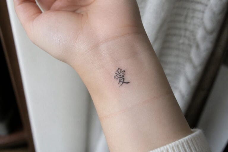
I adore Chinese script for tattoos as it brings an air of quiet elegance to the skin.
My personal favorites are the flowing characters that curve gently along the body.
These designs focus on refined lettering that feels both timeless and fresh.
I believe every woman can find a meaningful phrase to express her unique spirit through this art.
Small character on the inner wrist
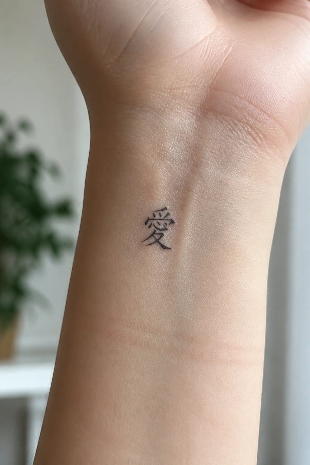
The inner wrist gives a single Chinese character room to sit without feeling crowded. The small scale keeps the lines clean and easy to read. This placement also makes the tattoo simple to cover or show depending on the day.
The spot suits a minimal design like this one. It turns the character into something personal rather than a big statement.
Chinese characters placed vertically on the inner forearm
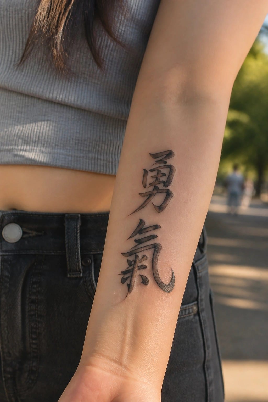
The tattoo runs down the inner forearm in two stacked characters. This placement lets the script follow the natural line of the arm without needing extra space or twisting. The lettering uses a bold traditional style with some shading on the strokes.
I think this layout keeps the design readable even when the arm moves. The vertical format also matches how these characters are usually written in Chinese.
Small Chinese character behind the ear
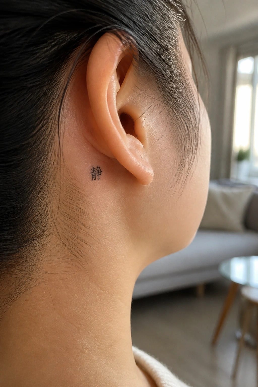
The tattoo sits just behind the ear in a spot that stays mostly out of sight. A single character in simple black script keeps the whole piece small and contained. This placement lets the design remain private for daily wear.
I chose this spot because it suits a character meant to feel personal rather than bold. The scale stays readable without crowding the area around the ear.
Chinese characters on the shoulder
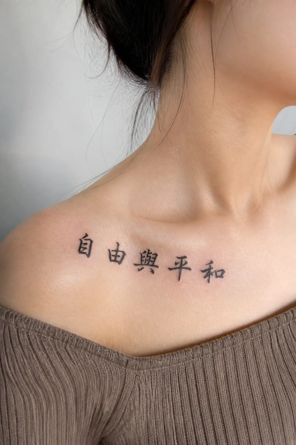
The tattoo runs in a straight line across the upper shoulder. Four Chinese characters sit in a clean black script that stays simple and even. The ink sits flat without extra shading or flourishes.
I like how the shoulder gives the text room to stay level and readable. The size works because each character stays distinct while the whole line still feels compact.
A single character behind the ear
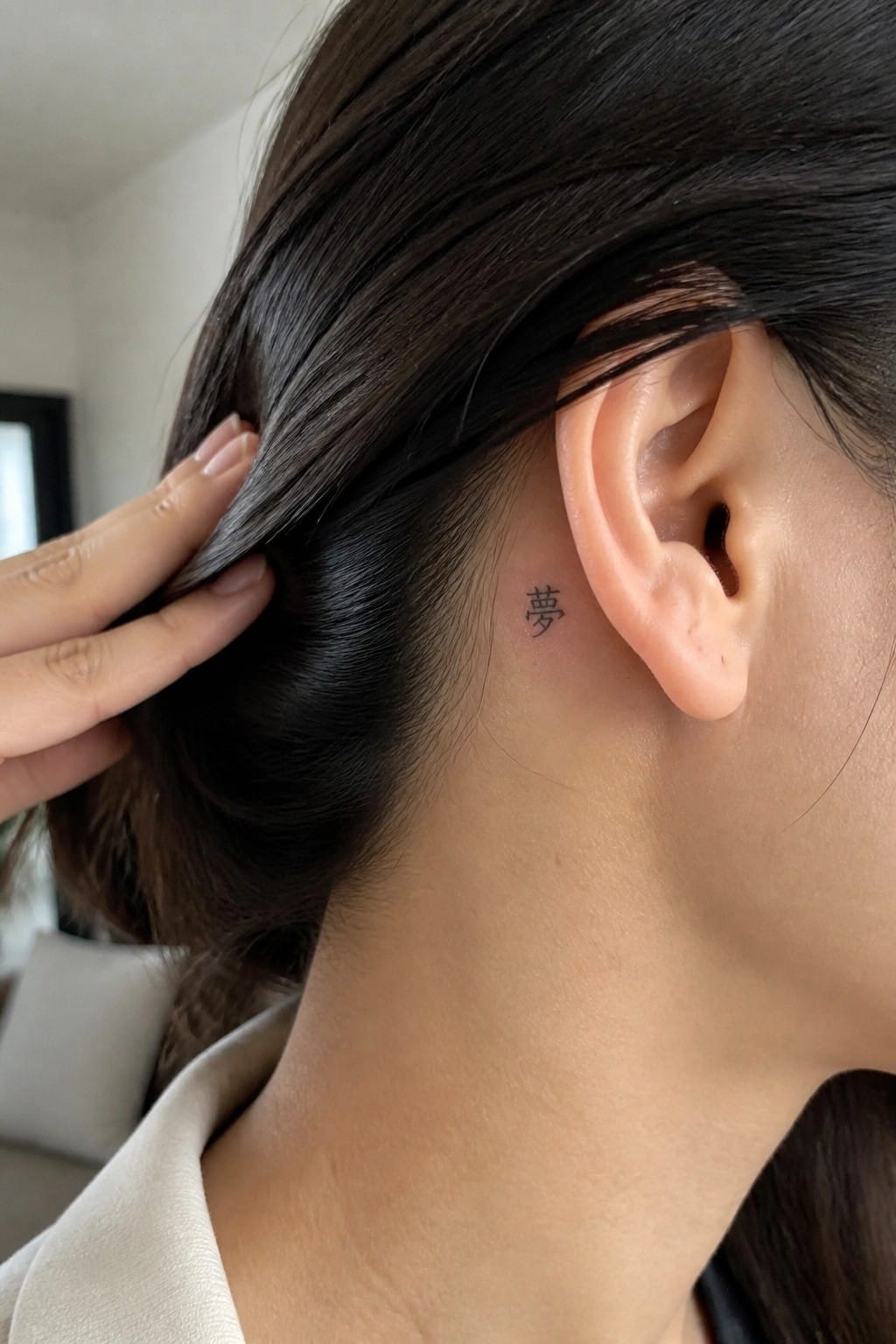
The tattoo sits just behind the ear along the upper neck. Hair can cover it easily during the day but it shows when the hair is pulled back. The single Chinese character stays small and uses thin black lines.
This spot works because the design does not need to be large to feel balanced. I like how the placement keeps it understated while still leaving room for the lettering to sit flat on the skin.
A fate character on the shoulder
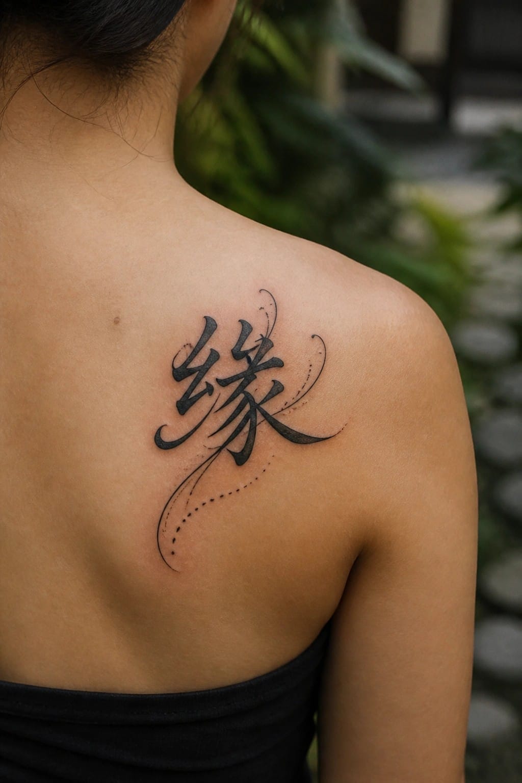
The tattoo rests on the upper shoulder where the skin curves outward. The Chinese character for fate forms the core with extended strokes that sweep downward. Dotted accents trail along one side to guide the eye without adding bulk.
I chose the shoulder because the natural slope lets the longer lines settle into the body rather than fight against it. The medium scale keeps the script clear while still allowing the brushwork to show movement.
Small characters on the side of the hand
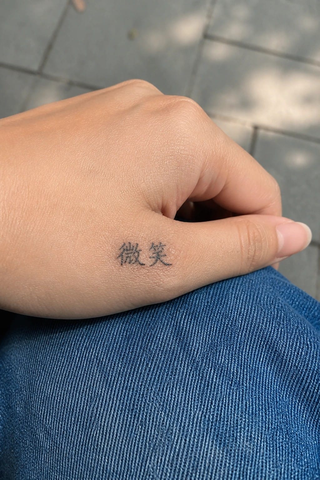
The tattoo uses two Chinese characters in a simple script. It sits along the outer edge near the base of the pinky. This spot keeps the design visible only when the hand moves a certain way.
I think the placement works because it stays discreet most of the time. The compact size also helps the lettering stay clear without crowding the skin.
Vertical chinese characters on the ribs
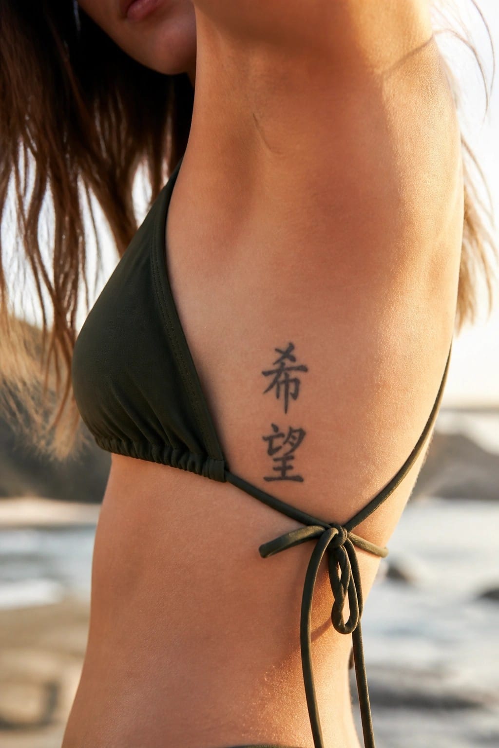
The tattoo shows two chinese characters stacked vertically along the side of the torso. This placement lets the script follow the natural line of the ribs without needing extra space. The black ink stays simple and clear against the skin.
I like the vertical format here because it fits the area without crowding. It also keeps the design compact while still readable from a short distance.
Small chinese character on the ankle
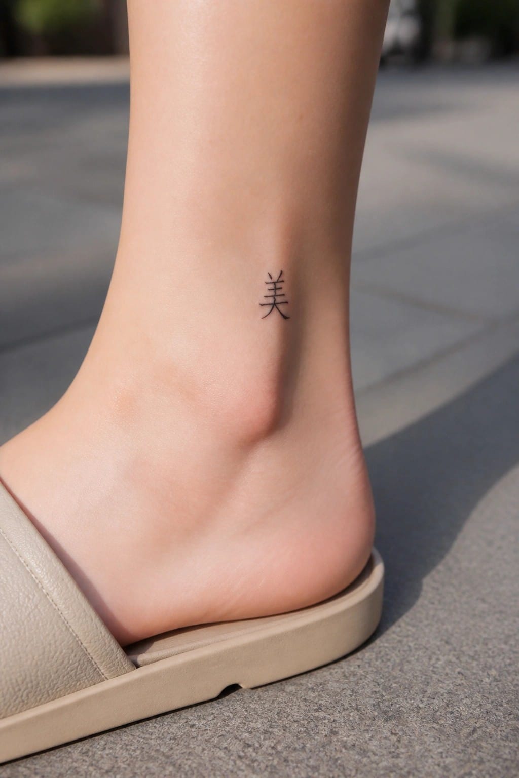
The ankle gives a narrow area that works for a single character. It stays mostly hidden but appears when sandals or cropped pants are worn.
I picked this spot because the size stays balanced without stretching or crowding. The lines hold their shape even on the slight curve above the heel.
Chinese characters placed vertically on the thigh
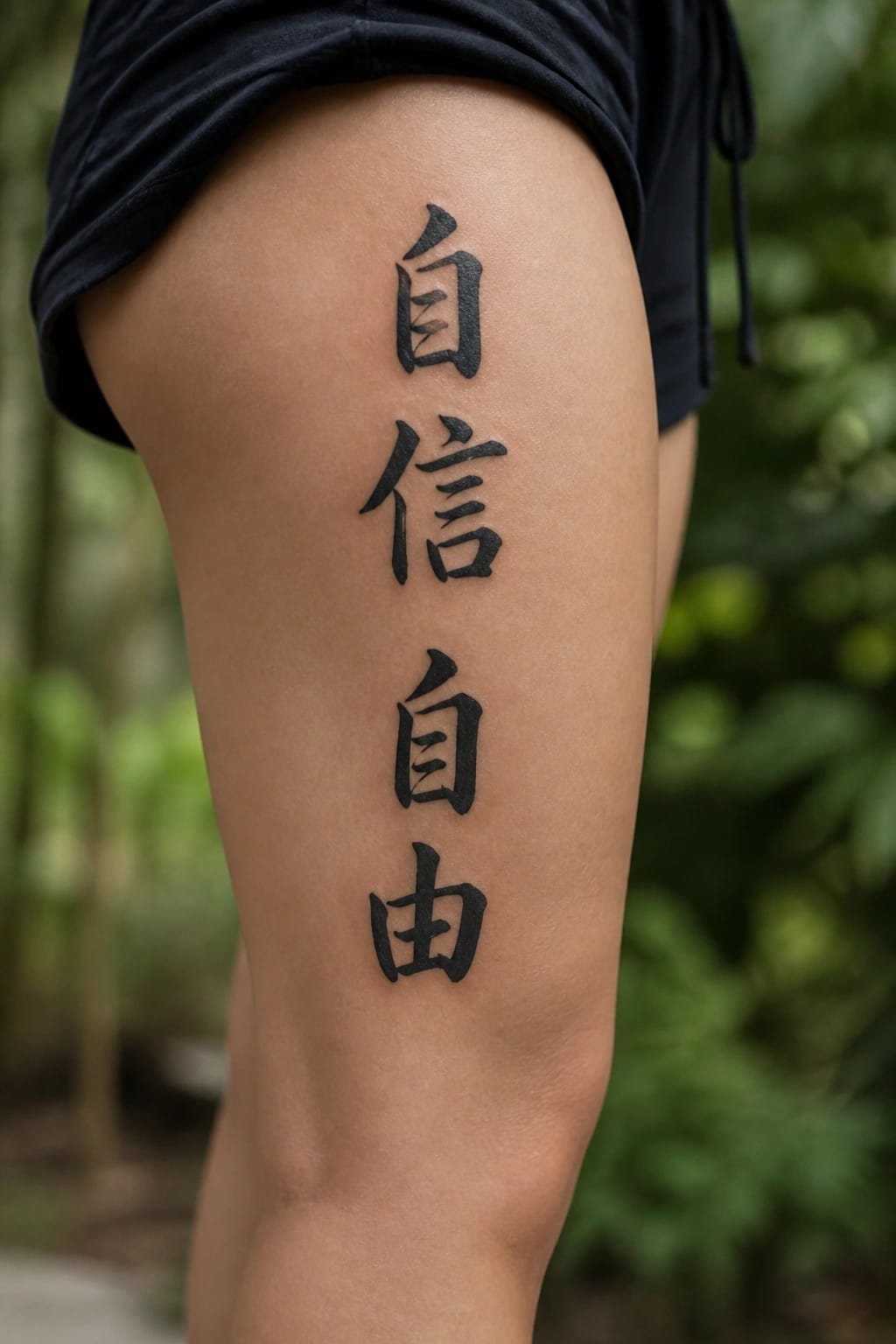
The tattoo runs straight down the thigh in four stacked Chinese characters. This layout uses the longer surface of the leg to keep the script aligned and readable. The bold black ink fills each character evenly without extra flourishes.
The vertical format fits the natural shape of the thigh and avoids crowding. I think the clean stacking makes the whole piece feel balanced even when the leg is in motion.
Small character on the inner forearm
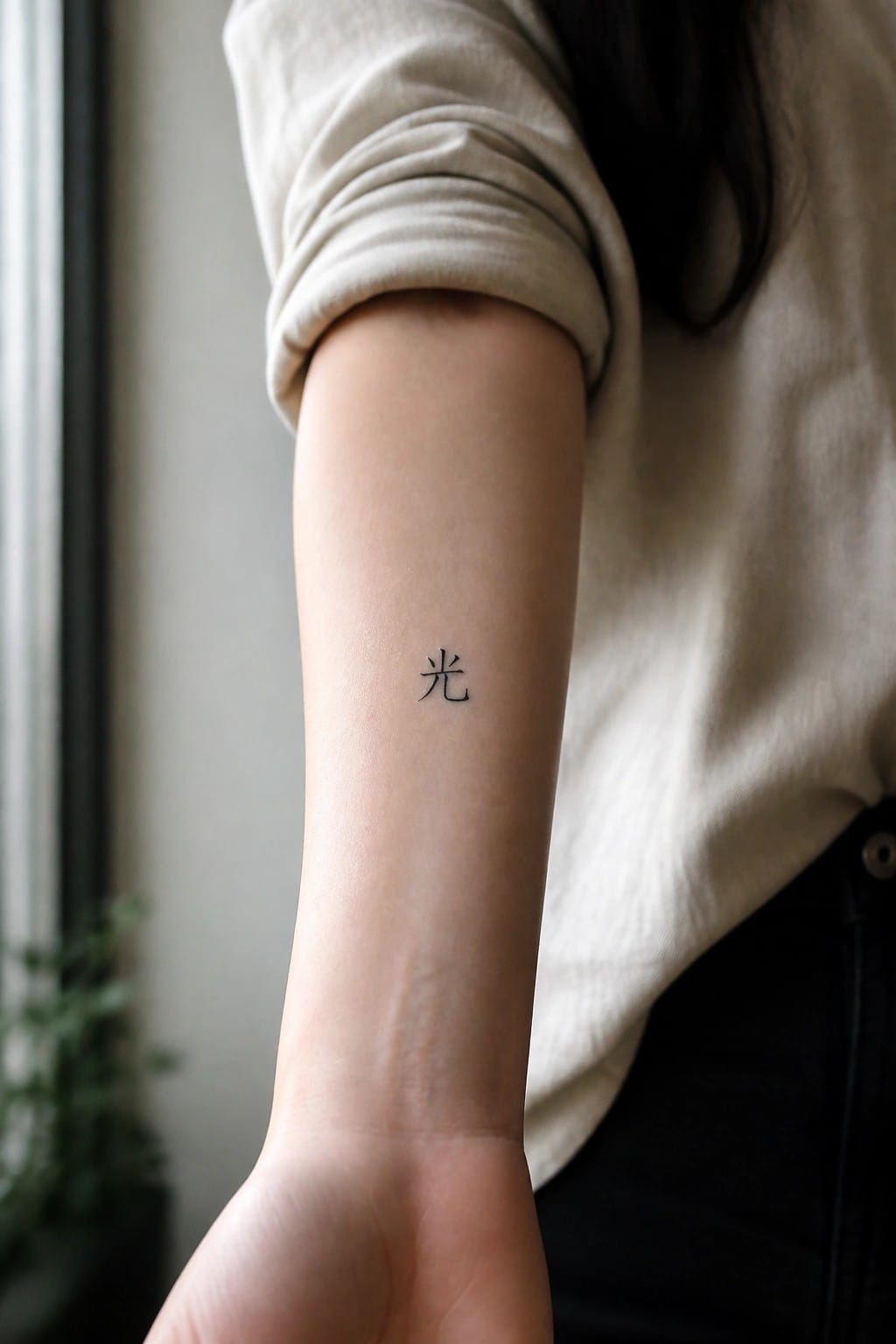
The inner forearm keeps this tattoo easy to show or hide. A single character fits the space without crowding it. The simple lines stay clear even at this size.
I think the placement helps because the area stays fairly flat. That makes the lettering readable from most angles.
Chinese script on the upper back
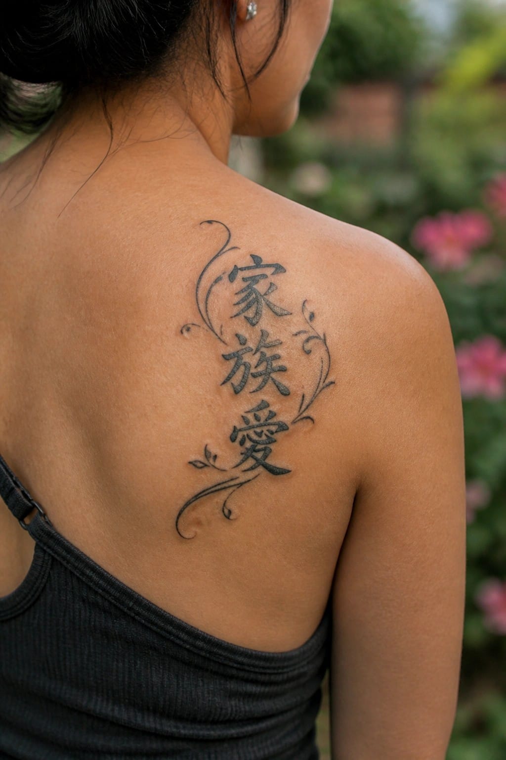
The tattoo sits on the shoulder with three vertical Chinese characters. Thin swirls and small leaves curve around the text on either side. This keeps the lettering as the main focus while the added lines give the design some shape.
I think the upper back works well here because it lets the characters run straight without looking cramped. The scale also stays clear from a short distance.
Small chinese characters on the finger
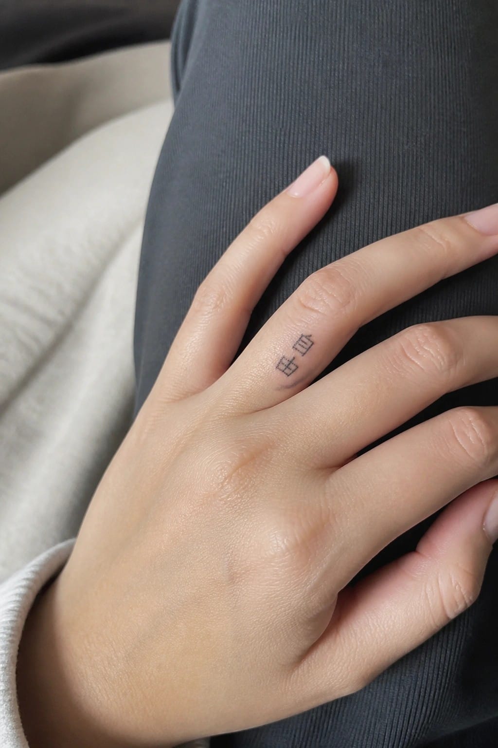
The tattoo sits on the side of the finger in a narrow strip of skin. Two chinese characters appear in a thin line style with clean edges. The whole piece stays compact to match the limited space.
I think the side placement makes sense here because it keeps the design subtle during daily movement. The small scale prevents the lines from blurring over time.
Chinese characters on the thigh
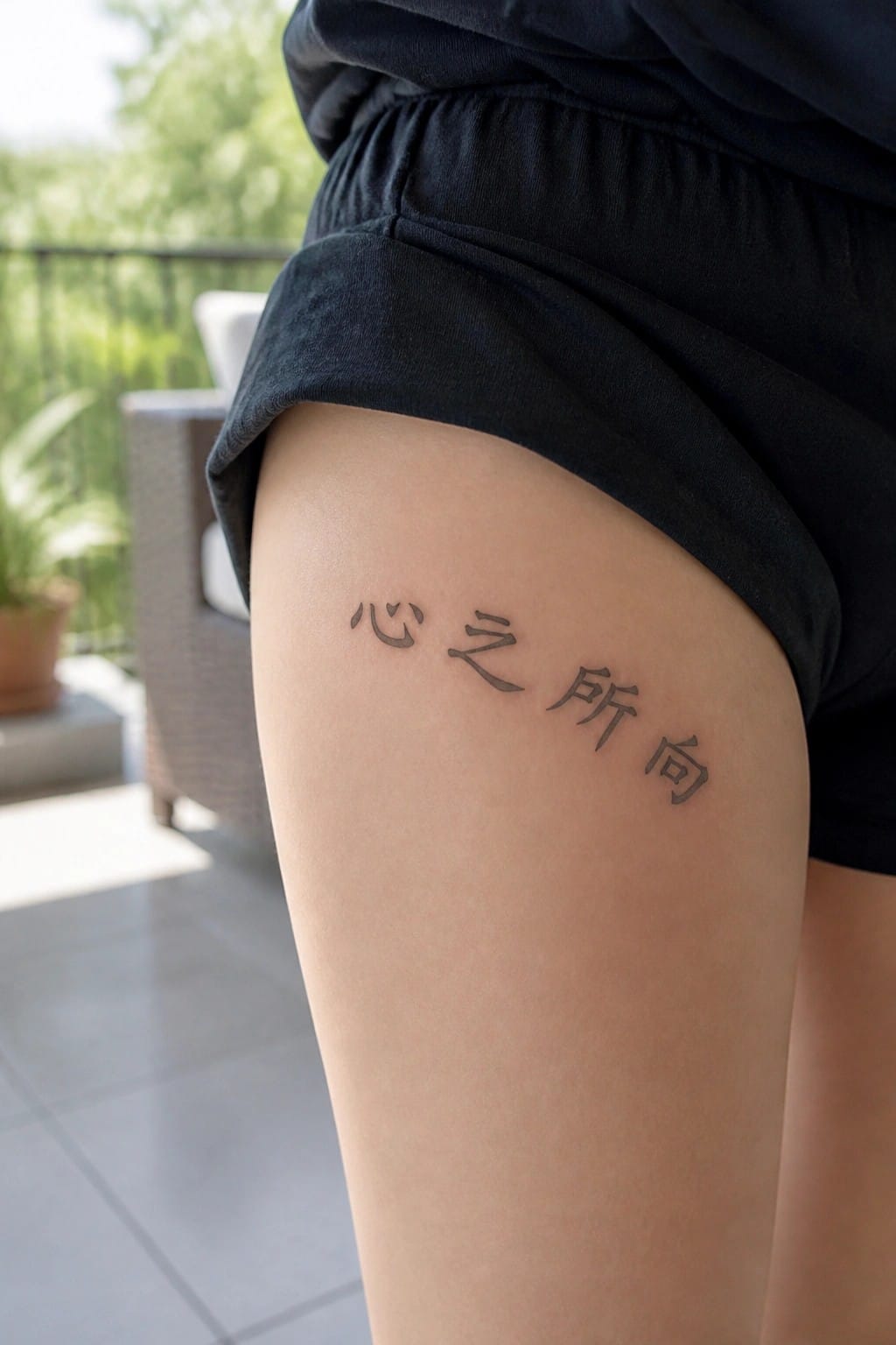
The thigh gives enough flat space for a full Chinese phrase to sit evenly. The script runs horizontally without bunching, so each character stays clear. This placement also lets the tattoo stay mostly covered in daily clothes.
The size feels right for this script because it leaves breathing room between the strokes. I would pick this spot when the phrase is longer than a single word and needs to read as one line.
Small character on the hip
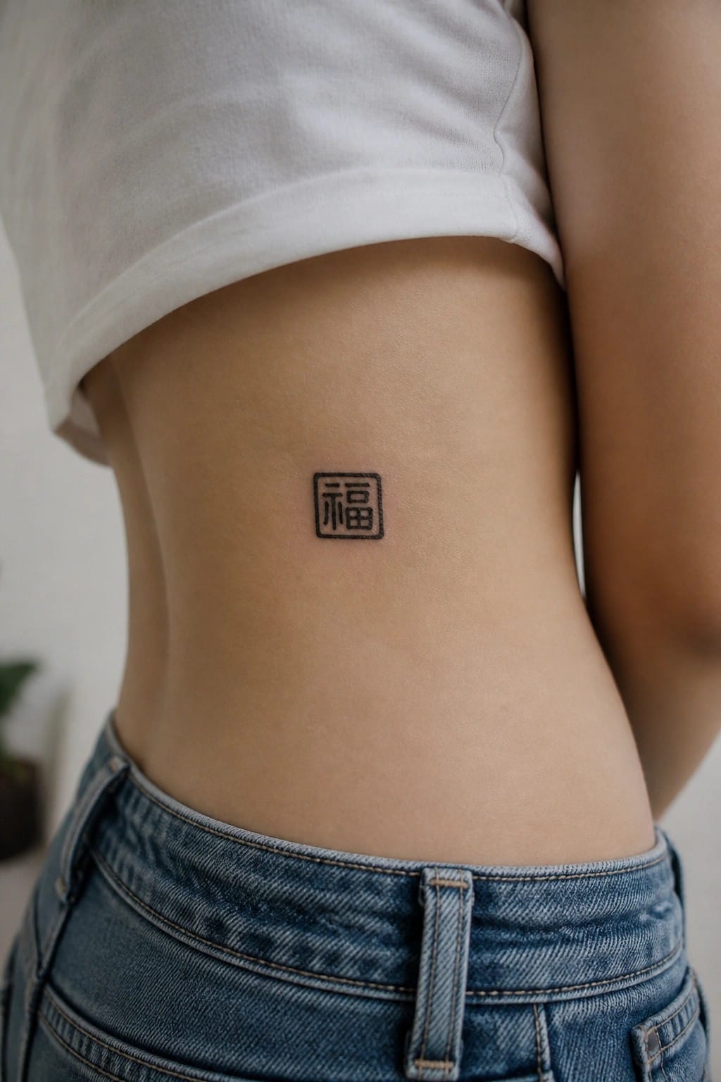
The tattoo sits just above the waistband on the side of the lower back. It shows a single Chinese character inside a thin square border done in simple black lines. The compact size keeps the whole thing contained without spreading across the skin.
I like how this placement lets the design stay mostly covered during daily wear while still showing when clothes shift. The minimal outline style fits the small scale without losing clarity.
Chinese characters placed vertically on the abdomen
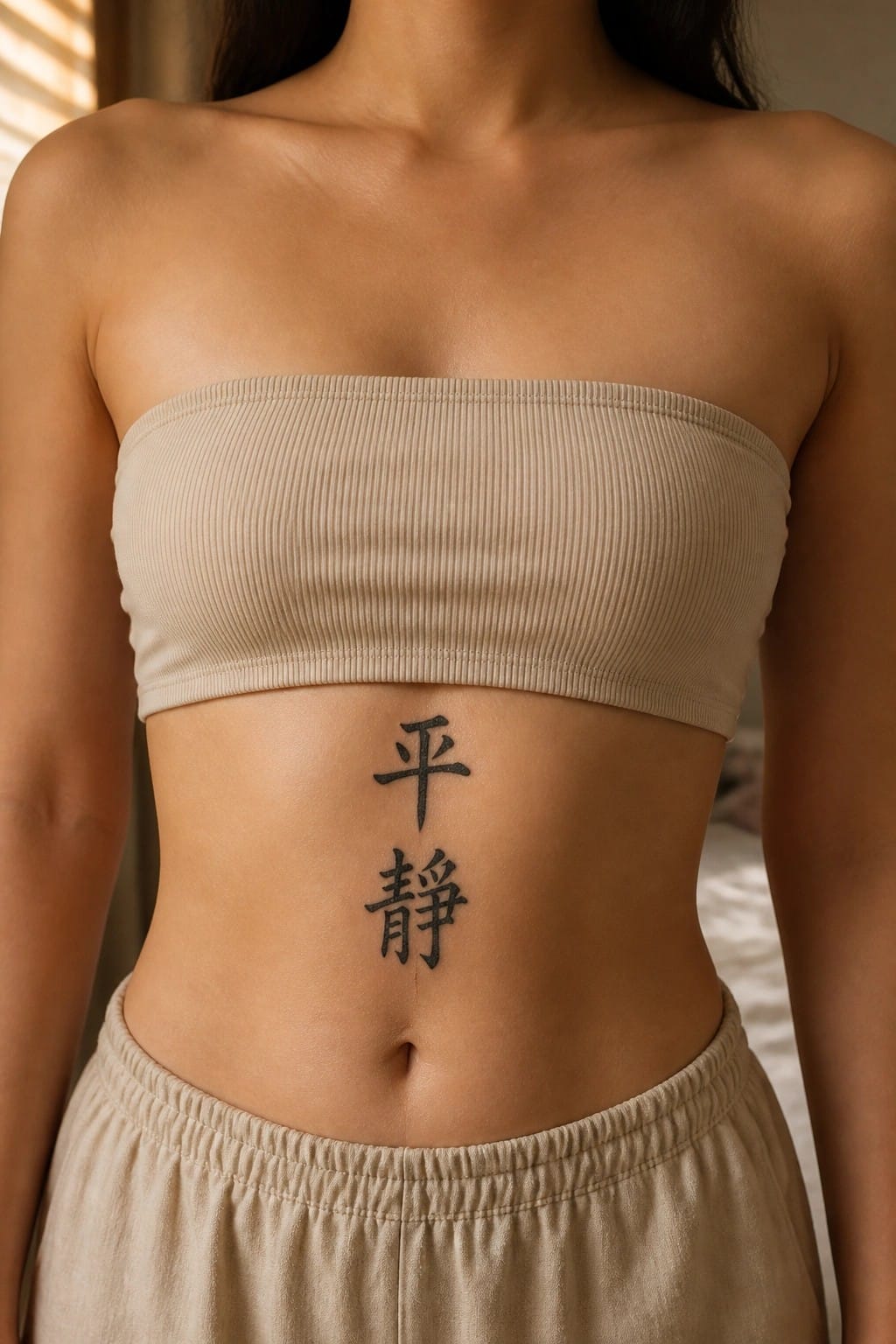
The tattoo sits centered on the upper abdomen just below the chest. Two characters stack in a straight vertical line using simple black lettering. This keeps the design narrow and contained within the natural shape of the torso.
The vertical layout fits the space without needing extra width. I think it works because the characters stay clear and balanced at this size.
Small chinese character on the nape
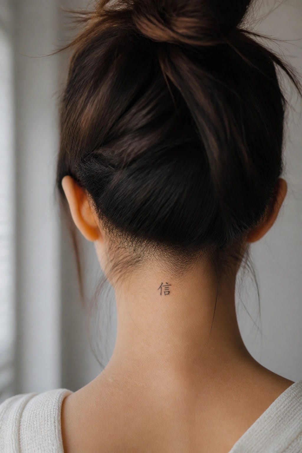
The character rests low on the neck just below the hairline. Its compact size keeps it discreet under most hairstyles. The simple lines stay clear without any added shading or flourishes.
This spot works because it lets the design stay personal until the hair is pulled up. I think the minimal approach fits the area better than anything larger or more detailed would.
Chinese characters on the lower back
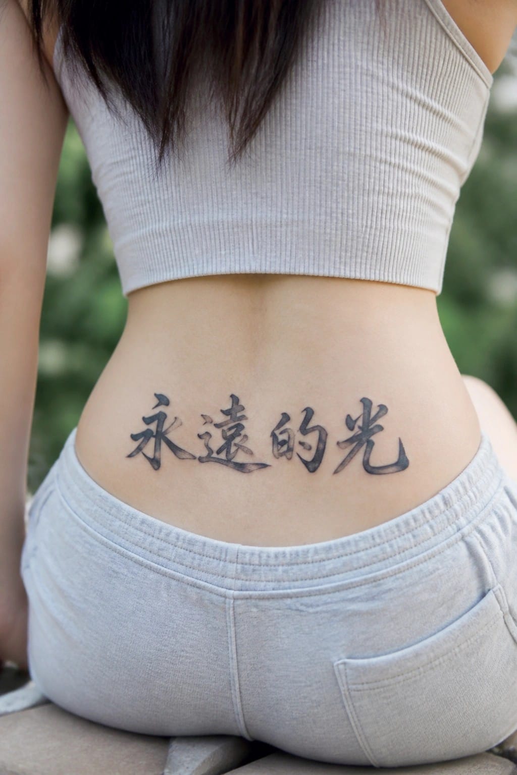
The phrase runs horizontally across the lower back in black ink. The characters use a flowing script that keeps the lines even and easy to read at this width.
I think the placement fits because it lets the full phrase sit flat without crowding the ends. The size stays balanced for the spot and avoids looking stretched.
Balance characters on the upper chest
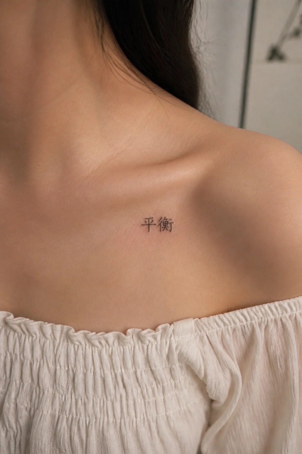
The characters for balance appear in a compact script on the upper chest. They sit just above the collarbone in a simple black font with clean strokes. The lettering stays small enough to blend into the area without crowding the skin.
I chose this placement because the flat surface lets the characters sit evenly. It keeps the focus on the meaning rather than any added decoration.
Chinese characters running down the upper arm
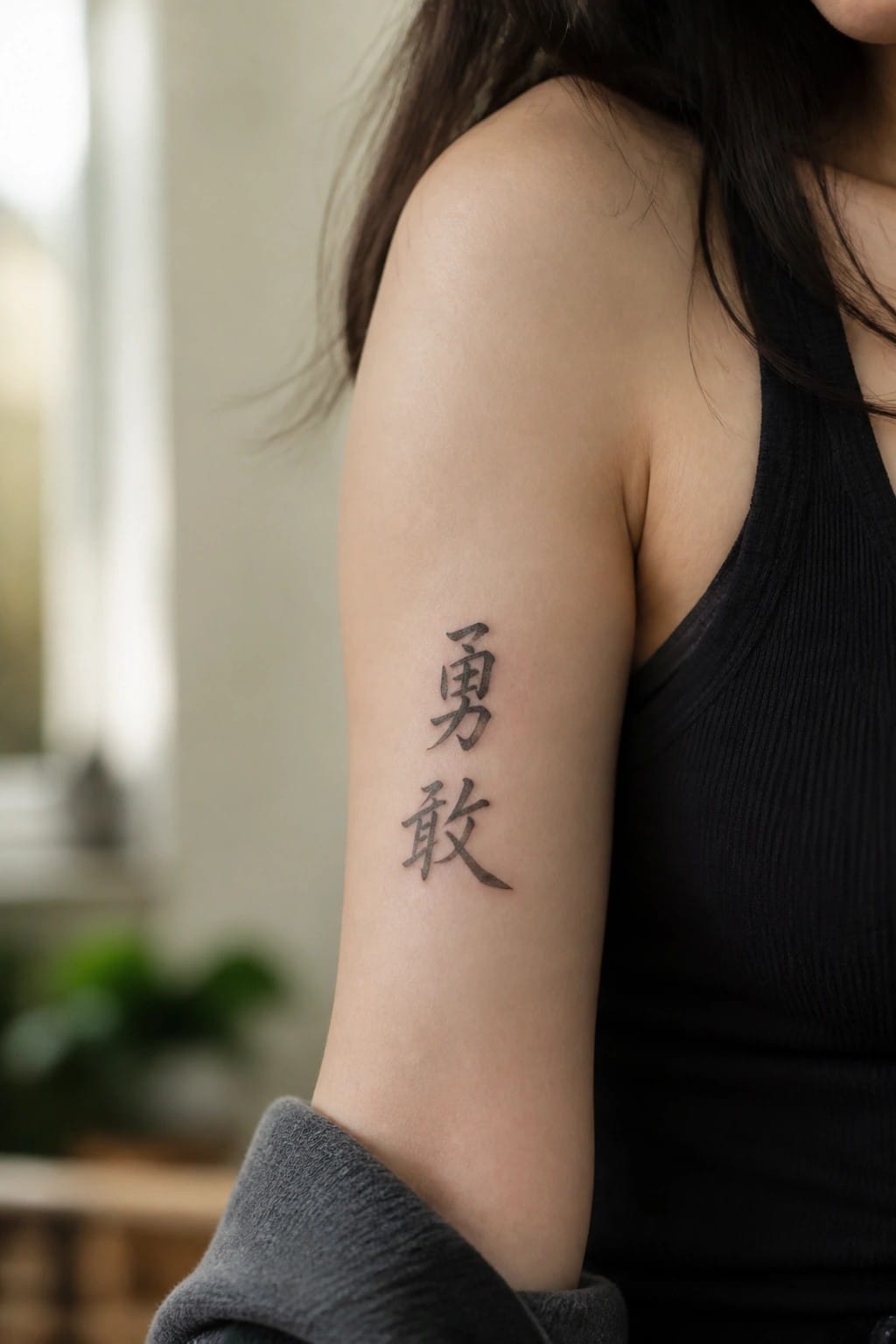
The tattoo uses two Chinese characters stacked vertically in black script. They sit along the inner upper arm where the skin stays smooth and flat.
This layout keeps the lettering easy to read at a medium scale. I think the traditional style fits the characters well because it stays clear without added flourishes.
Chinese script along the ribs
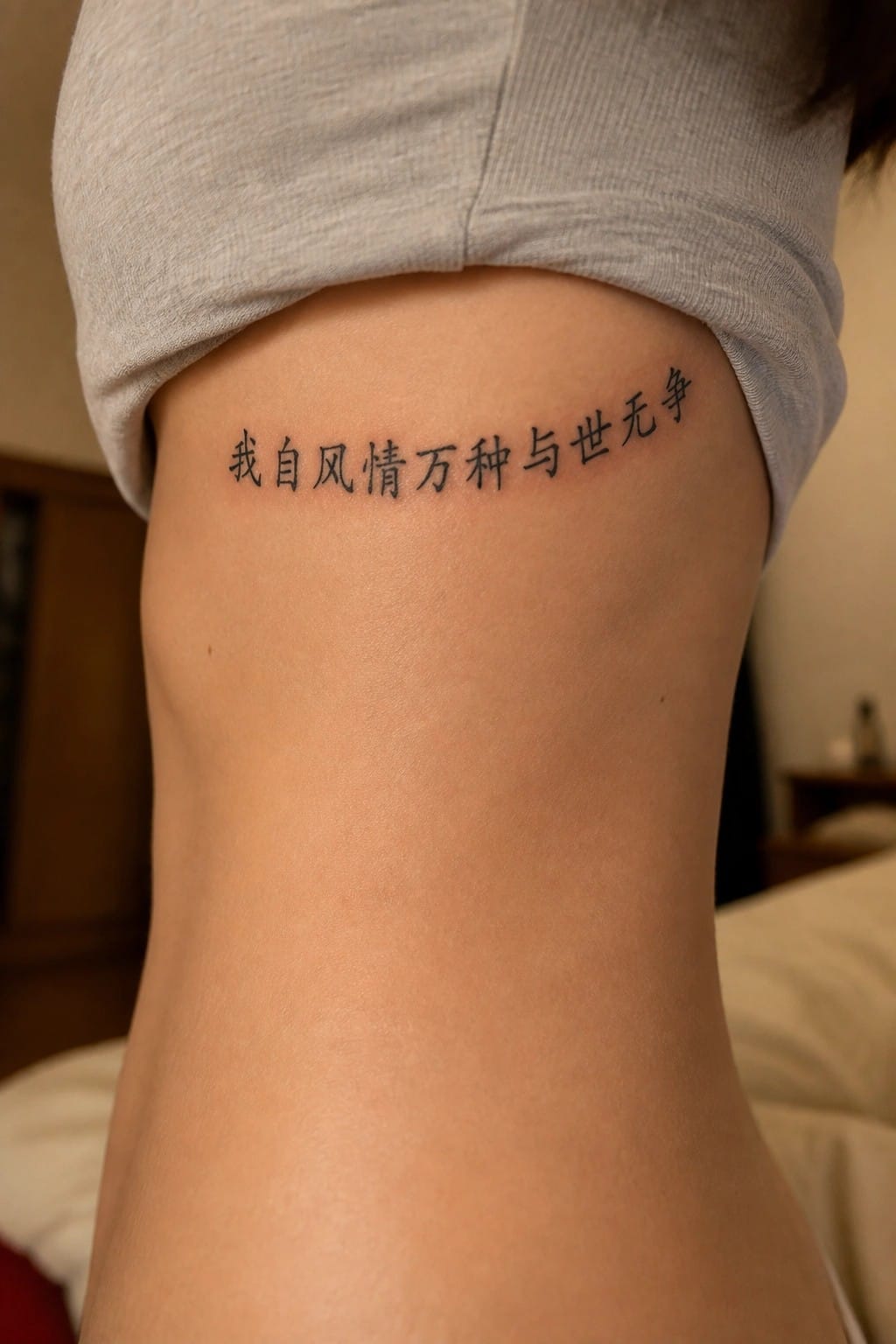
The tattoo shows a single line of Chinese characters placed on the side of the torso. It runs horizontally just under the lifted shirt hem and follows the curve of the body. The lettering stays in a simple black script with even spacing.
This area works for a longer phrase because it gives the text room to breathe. I think the placement keeps the design readable while still allowing it to stay mostly covered.
Chinese script on the forearm
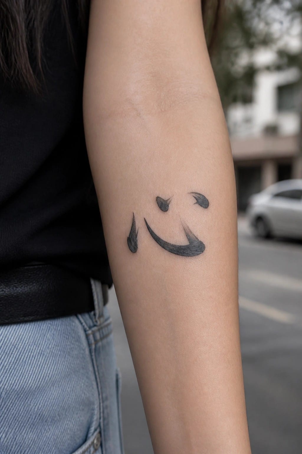
The tattoo sits on the inner forearm in black ink. Brush strokes create a curved base with small accents above it to form a simple shape. The lines vary slightly in thickness for a handwritten feel.
I think the forearm placement works because it gives the curves room to stay clear without wrapping around the arm. The overall size keeps the design personal while still readable up close.
Frequently Asked Questions
How do I verify that the Chinese characters for my tattoo have the correct meaning and are not misspelled?
Work with a native Chinese speaker or a professional translator who specializes in calligraphy to double check every character and its context. Provide them with your intended English phrase and ask for multiple options that capture the nuance you want. Many tattoo artists also recommend getting the script written by hand first before digitizing it for stencils so the flow remains authentic.
What body placements suit elegant Chinese script tattoos best for women?
Popular spots include the inner forearm, along the collarbone, the side of the ribcage, or the back of the neck because these areas allow the lettering to follow natural curves without distortion. Smaller script works well on wrists or ankles while longer phrases look graceful when placed vertically down the spine or across the shoulder blade. Always consider how clothing will cover or reveal the design in daily life.
Which calligraphy styles create the most elegant look in Chinese script tattoos?
Seal script and running script often produce refined, flowing lines that photograph beautifully and age gracefully on skin. Seal script gives a classical, balanced appearance while running script adds gentle movement without becoming too casual. Discuss stroke weight and spacing with your artist so the final design maintains clear readability even at smaller sizes.
How do I care for a fresh Chinese script tattoo so the lettering stays crisp over time?
Follow standard aftercare by keeping the area clean and moisturized with fragrance free products for the first two weeks. Avoid sun exposure and tight clothing that could rub the fresh ink. Once healed, apply sunscreen daily to prevent fading, especially on areas like the wrist or ankle that see frequent movement and light.
What cultural points should I consider before choosing Chinese characters for a tattoo?
Research the historical and modern usage of each character so your design respects the language rather than treating it as decoration. Some phrases carry strong traditional associations that may not translate directly into English intent. Consulting someone familiar with Chinese culture helps avoid unintended meanings and shows thoughtful selection of the script.
