

We may earn from ads and some links. How we work.
People treat placement as an afterthought, something to decide once the drawing is perfect. In practice the spot you choose changes almost everything: how much the session hurts, who will see the tattoo on a Tuesday morning, how the design should be shaped and how crisp it will look in five years.
This guide walks through the body the way I think about it when readers send a photo and ask, “Does this spot make sense?” For a faster comparison you can also use the Placement & Pain Finder, which pulls typical pain, visibility and aging notes into one panel. Pain is always personal, so treat every range as a planning tool, not a guarantee.
How to choose a spot
I run through four questions. Can you cover it if you want to? How much sun does that skin get in a normal year? Is the area bony, stretchy or always moving? And does the design actually fit the shape of the body there?
A long verse wants a longer bone or a flatter plane, such as an inner forearm or a rib, not a tiny inner wrist. A small symbol can live almost anywhere, but fingers, feet and the hairline behind the ear will ask more of it over time. If the tattoo is your first, the step-by-step guide explains why I usually point people toward the outer upper arm, the outer forearm or the outer thigh.
Arms and hands
The outer upper arm and shoulder are some of the kindest places to start. There is more flesh, the session is often comfortable compared with bony sites and a short sleeve covers the work. Sun on bare shoulders in summer is the main long-term caution.
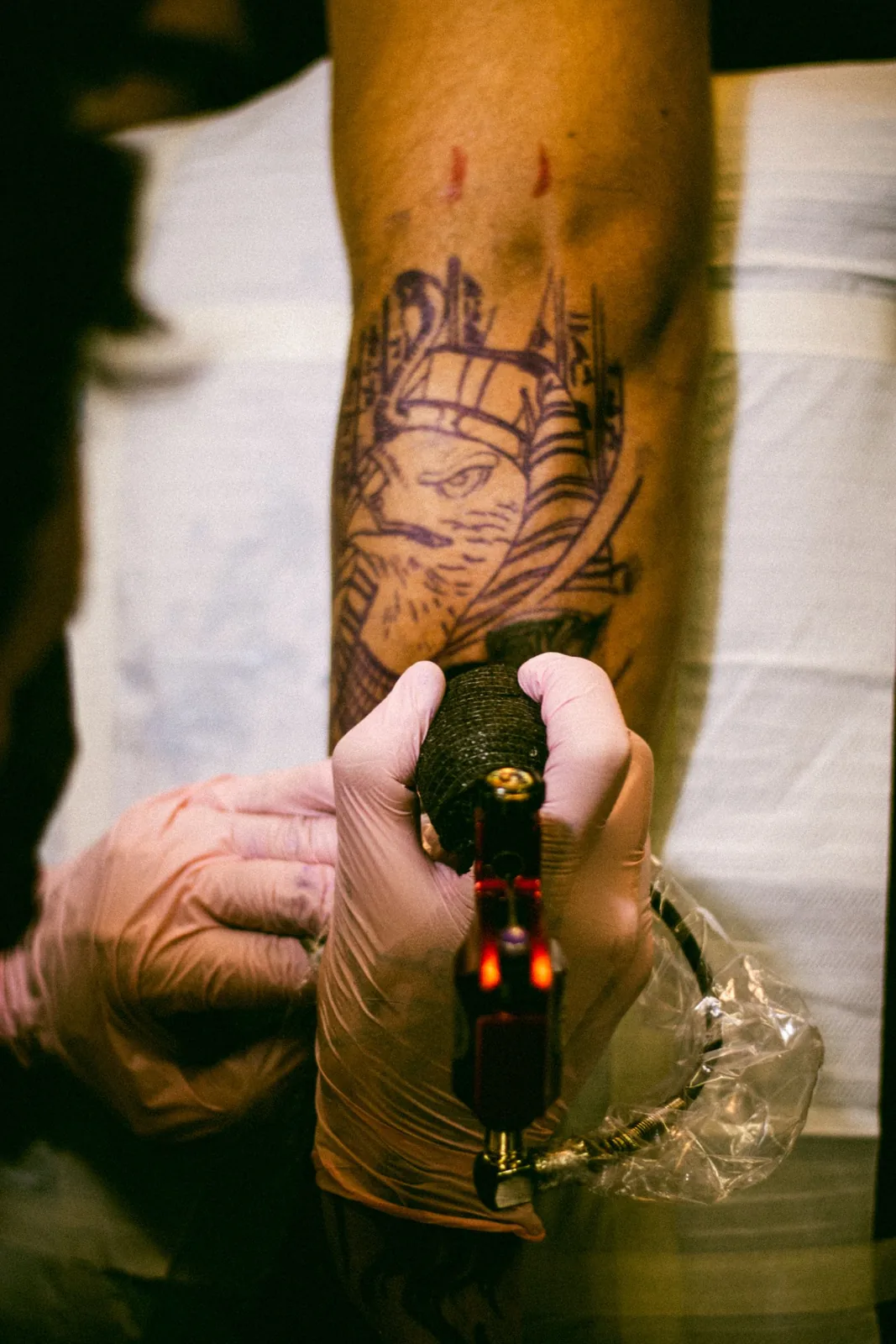
The outer forearm is visible and still relatively friendly. The inner forearm is a little more tender and much more visible to you, which some people love and others find surprisingly intense during the session. Both age well if you use sunscreen and give script enough height.
The inner wrist is popular for tiny crosses, dates and initials. It hurts more than people expect, because the skin is thin over tendons, and very small letters can blur. Hands and fingers hurt more again and fade faster from washing, sun and friction. Many shops prefer those spots for people who already have tattoos and who understand they may be back for a touch-up.
Chest, collarbone and ribs
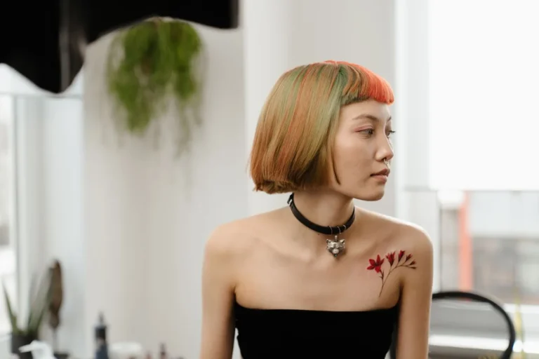
The collarbone suits short verses and small symbols, and a crew neck will hide most of them. It is a bonier session than an upper arm. The outer chest is often more comfortable than the sternum, which sits right over bone and is a common place people ask to split into more than one sitting.
Ribs are a favourite for private memorial pieces and longer lines of text. They also rank high on every published pain chart I use, including the Healthline tattoo pain chart (last checked November 2026), because you are tattooing thin skin over bone that moves every time you breathe. If you want words there, talk with your artist about letter height and about how the design should follow the curve rather than fight it.
Back and spine
The back offers space. Shoulder blades can take medium pieces that stay hidden under ordinary shirts. The spine is more intense, and a tall design there needs to be planned while you are standing, sitting and bending so it still sits on the centre line in real life.
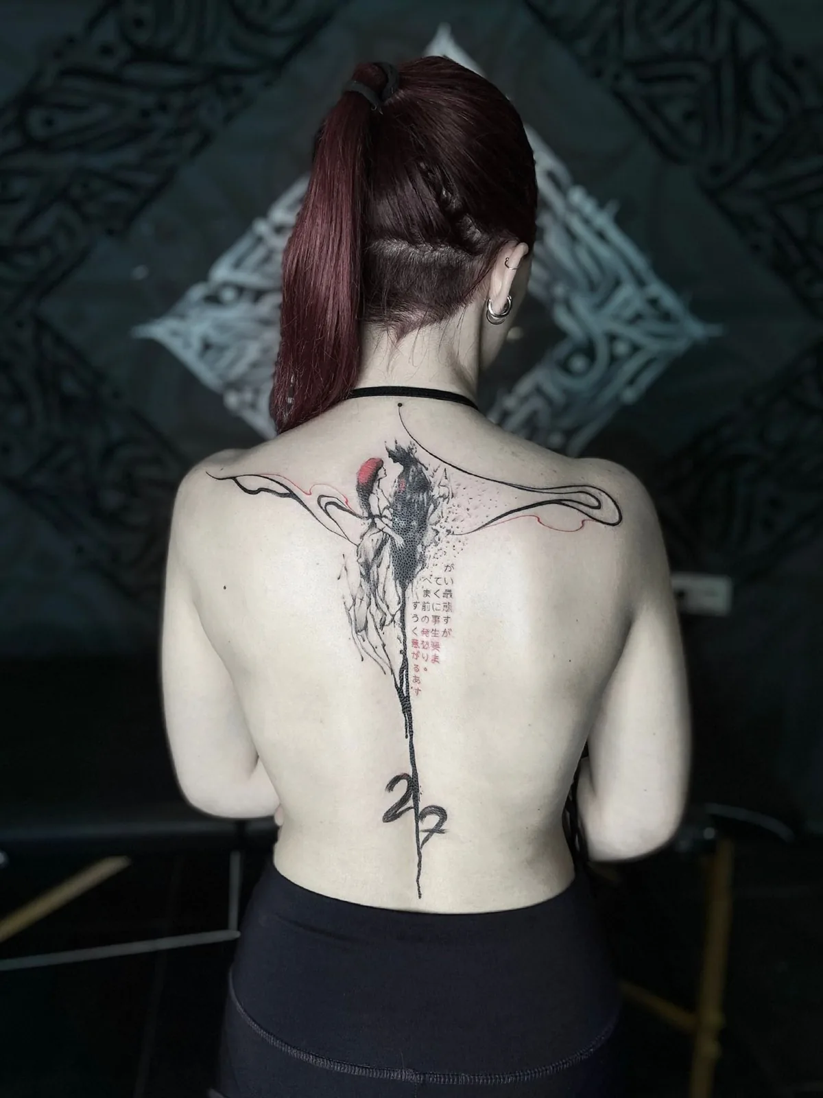
Back pieces are easy to protect from other people and less easy to protect from the sun at the beach. If you are planning a large floral or ornamental design, look at how similar work ages in your artist’s grid, not only how it looks on the day.
Legs, hips, ankles and feet
The outer thigh is another generous, relatively comfortable canvas and a good home for a larger first piece you do not want on your arm. The inner thigh is more sensitive and more private. The calf usually sits in the middle for comfort and visibility: hidden in trousers, obvious in shorts.
Shins, ankles and feet are bonier and tend to fade faster, especially where shoes rub. Simple shapes hold up better than tiny script on top of the foot. If you love the look of an anklet or a small symbol beside the ankle bone, ask your artist how they would thicken the line so it still reads after a summer in sandals.
Neck and behind the ear
These are high-visibility, higher-pain spots with thin skin over bone. A small mark behind the ear can stay almost private if your hair usually covers it. The front and sides of the neck rarely stay private at all. Think about work, family and how you feel about being asked “What does that say?” by strangers before you book either one.
Aging, sun and the long view
Every tattoo will change. The goal is not to freeze day-one sharpness forever. The goal is a design that still says what you meant after the skin has settled and after a few summers have passed.
Sun is the factor you can control most. Once your artist says the tattoo is ready, a broad-spectrum sunscreen does more for future-you than worrying about exact ink brands. Weight change, pregnancy and a lot of movement at a joint can also shift how a piece sits. None of those are reasons to avoid a tattoo. They are reasons to place it thoughtfully.
Fine-line work asks for a little extra honesty about size. I wrote more about that in how fine-line tattoos heal, fade and age. Traditional work, with its bolder outlines, often has more room to soften and still read, which you can see in our real traditional examples.
Match the design to the site
Take the stencil seriously. Look at it with your arm hanging naturally, with your hand on your hip, with your shoulders rounded at a desk. A design that looks centred on a standing photo can drift once you live in it.
If you are still undecided, pick the spot before you pick the exact drawing. Tell your artist, “I want a small faith mark I can cover at work, and I think I want the outer upper arm or the collarbone.” That is a much easier conversation than arriving with a large ribcage illustration and hoping it will somehow become discreet.
When you are ready to keep going, use the pain finder, read the first-tattoo walkthrough or browse a hub that matches the idea. The body you have is the one the tattoo has to live on, so it deserves as much attention as the drawing itself.
