

We may earn from ads and some links. How we work.
American traditional tattooing was built to last in sunlight and work: bold outlines, a limited palette, solid colour and shapes you can read from across a room. The ten pieces below come from artists and shops who publish this kind of work themselves. I picked them because the photographs show the rules doing their job, not because I sat in these chairs.
If you are comparing styles before you book, the styles hub is the wider map. Traditional also pairs well with the notes on aging in the placement guide, because a design this graphic can live almost anywhere if the scale is right.
An eagle and roses built for the chest
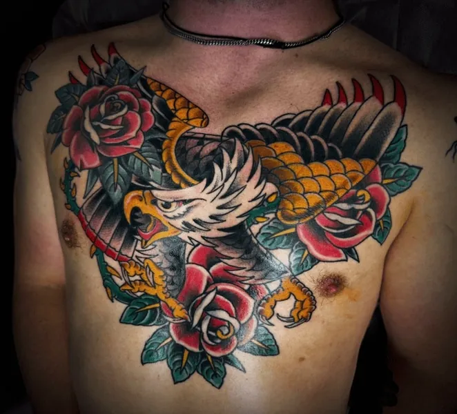
Chris Cockrill’s chest piece is a classic arrangement: an eagle with spread wings, roses packed into the remaining space, heavy black and saturated red and gold. The chest gives that kind of design the width it was invented for. A traditional eagle shrunk to a forearm often loses the face and the feather splits first. If you want this motif, ask your artist how they would land the wings on your sternum and collarbones so the bird still looks like a bird when you move. Look at healed colour in their book. Fresh red is easy. Healed red is the real test.
A bulldog that occupies the whole back
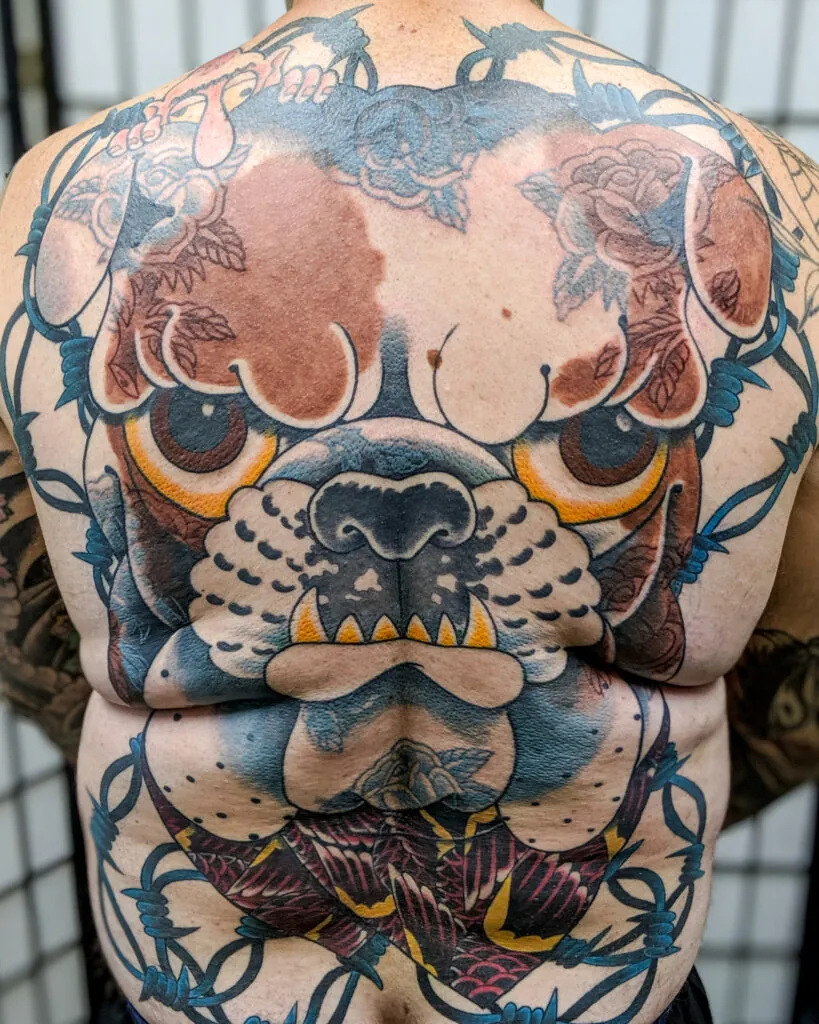
Dave Tedder’s back piece puts a full bulldog head in the centre of the back, wrapped with barbed wire, in the kind of packed, high-contrast traditional that reads from several feet away. Large back tattoos like this are a commitment in time and aftercare as much as in design. The payoff is a single strong image instead of a patchwork of smaller ones that never quite become one piece. If you are considering a back, talk through sessions, healing between them and how the head will sit on your particular shoulder-blade width. A face this big needs the right proportions more than it needs extra filler.
A moth with traditional weight, not a whisper
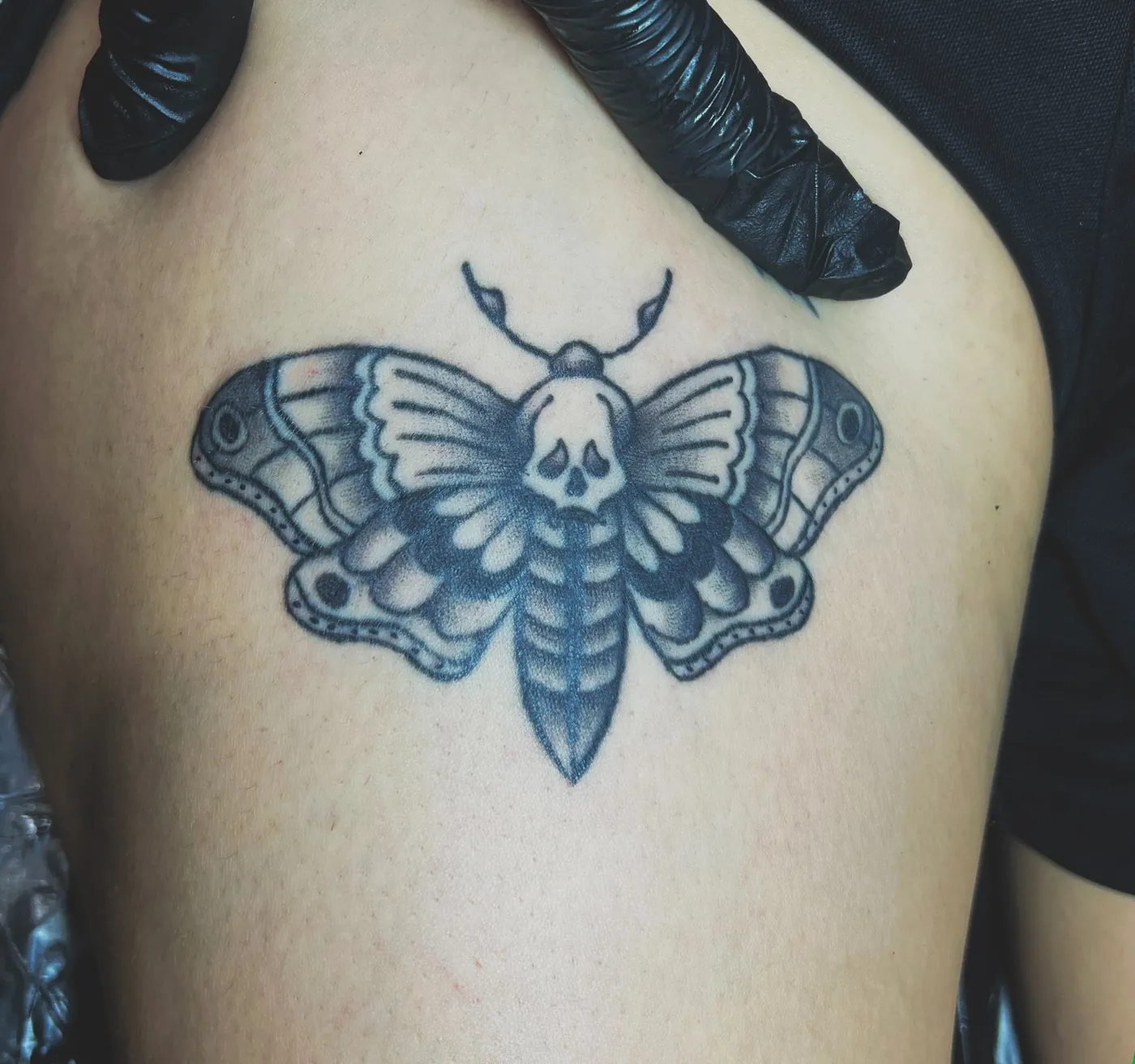
Matt Alex’s moth uses the vocabulary of American traditional on a subject people often request in fine line: a moth on the chest or sternum, with a skull-like marking in the upper wings and solid greys and blacks that will still read as a moth after the shine is gone. Fine-line moths can be gorgeous, but they ask more of the heal. A traditional moth asks less of the viewer from a distance. If you are torn between the two treatments, take examples of both to a consult and ask which version the artist would rather stand behind on your skin tone and placement. The fine-line aging guide is useful to read beside a photo like this.
The panther and dagger, done as flash intended
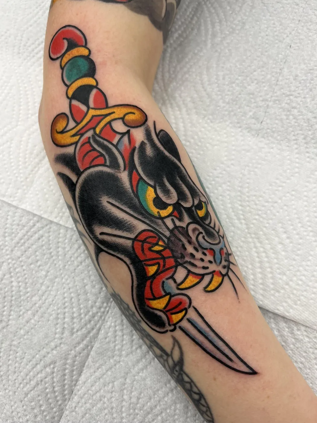
A traditional panther coming down a dagger is one of the oldest images in the style, and Marcos Ortega’s version shows why it survived: a black head with a clear snarl, a yellow eye, a red mouth, and a blade that still reads as a blade. Designs this familiar are not lazy when they are executed well. They are a shared language. If you want a panther, decide whether you want the classic downward climb or a redesigned pose, and be ready for your artist to protect the silhouette rather than adding extra realism. Extra detail inside a traditional panther is often the first thing to muddy.
A skateboard banner that still says now or never
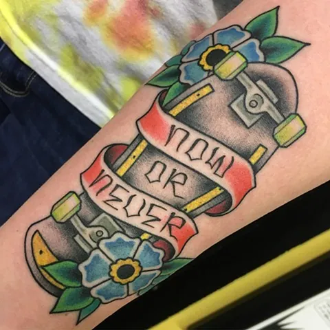
Tad Peyton’s skateboard piece puts a deck, trucks and a “NOW OR NEVER” ribbon on the forearm, with a flower tucked under the board. It is traditional thinking applied to a newer object: thick outline, readable lettering, colour that will hold. Banner lettering is the part to protect. If the words matter, they need more height than you think, especially on a forearm that twists. Ask your artist to keep the phrase in one or two short lines rather than wrapping it around every curve of the board. A motto you cannot read later is just decoration.
A butterfly-girl with traditional contrast
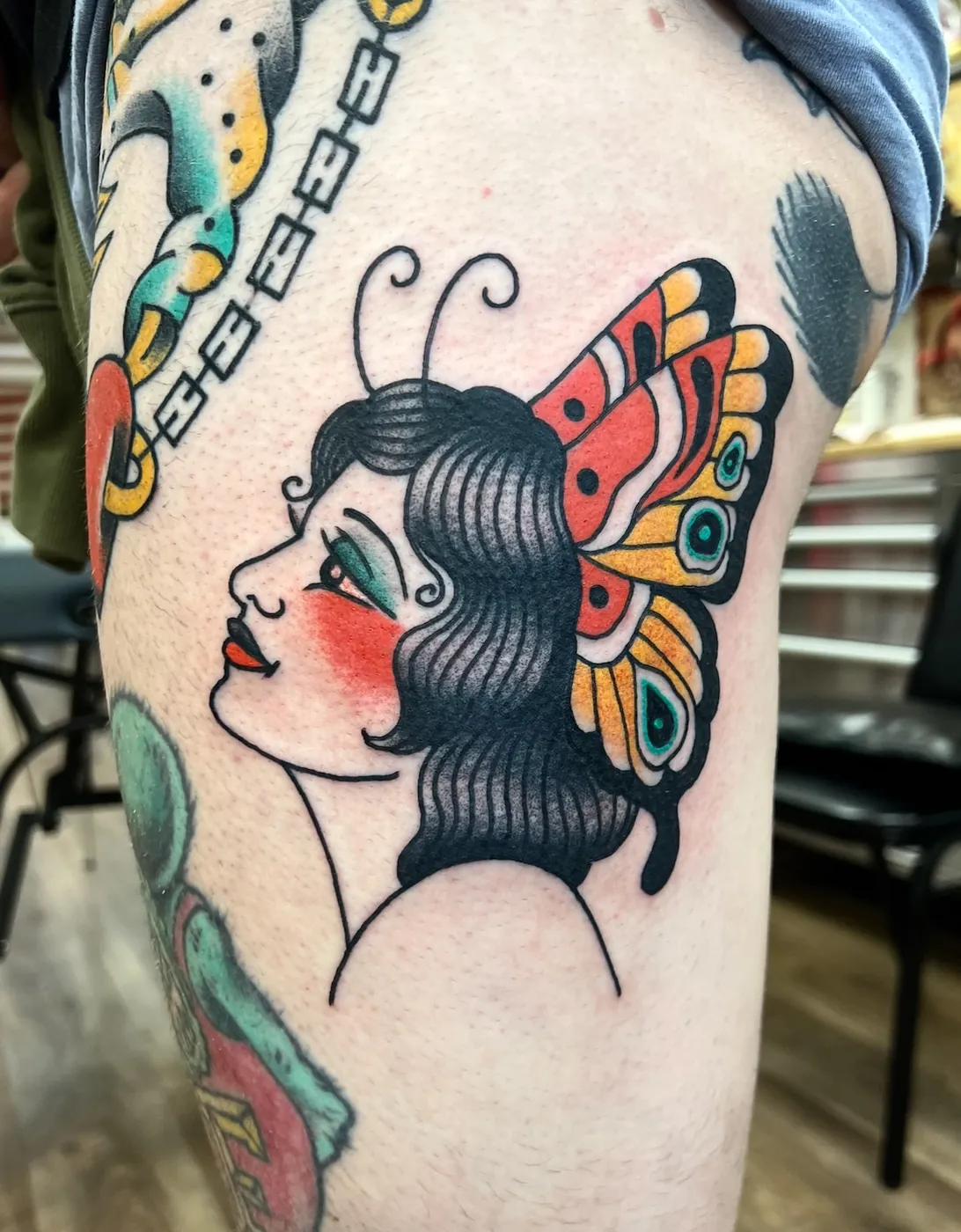
Chris Erickson’s butterfly-girl uses the classic profile, red cheek and wing-as-headdress that traditional tattooing has borrowed and rebuilt for generations. The photograph is useful because the black, the skin breaks and the colour blocks are all doing clear jobs. Figure tattoos in this style need a confident face. If the features are too small or too softly shaded, the portrait is what ages first. Ask to see healed heads and ladies by the same artist, and talk about size before you fall in love with a tiny version of the same idea.
A King of Hearts that fills the back
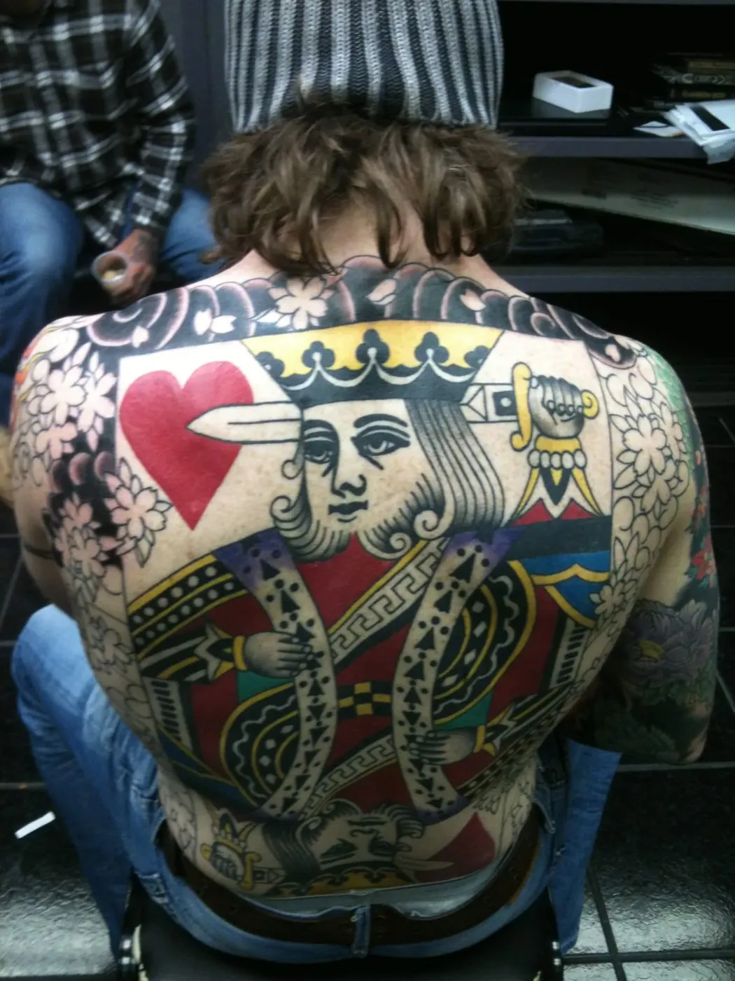
Jeff Jibran’s King of Hearts treats the whole back as a playing card: crown, heart suit and that frontal, graphic face traditional cards are built from. A back piece like this is a long project, and it only works if the artist is thinking in large shapes rather than tiny ornaments. If you want card imagery, decide whether you care about a particular suit or court card and whether the piece should feel like a printed card or like a looser flash painting. Then give it the space a card actually needs. A king the size of a phone will not carry the same face.
Eagle and snake, stacked for the upper arm
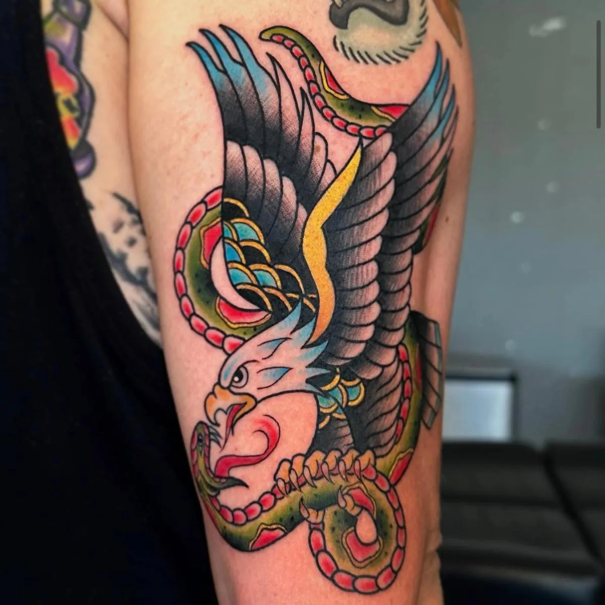
Nacho’s upper-arm piece stacks an eagle and a snake in a vertical fight, with open colour and a silhouette you can read from the side of a table. Battle motifs like this need a clear winner in the composition so the two animals do not cancel each other out. Here the eagle’s wings set the width and the snake’s coil sets the rhythm down the arm. If you want a two-animal traditional piece, ask your artist which creature should lead and how the design will crop at your sleeve or shoulder. Two full animals on a skinny placement is how details get lost.
A lighthouse, a crab and a rose on one panel
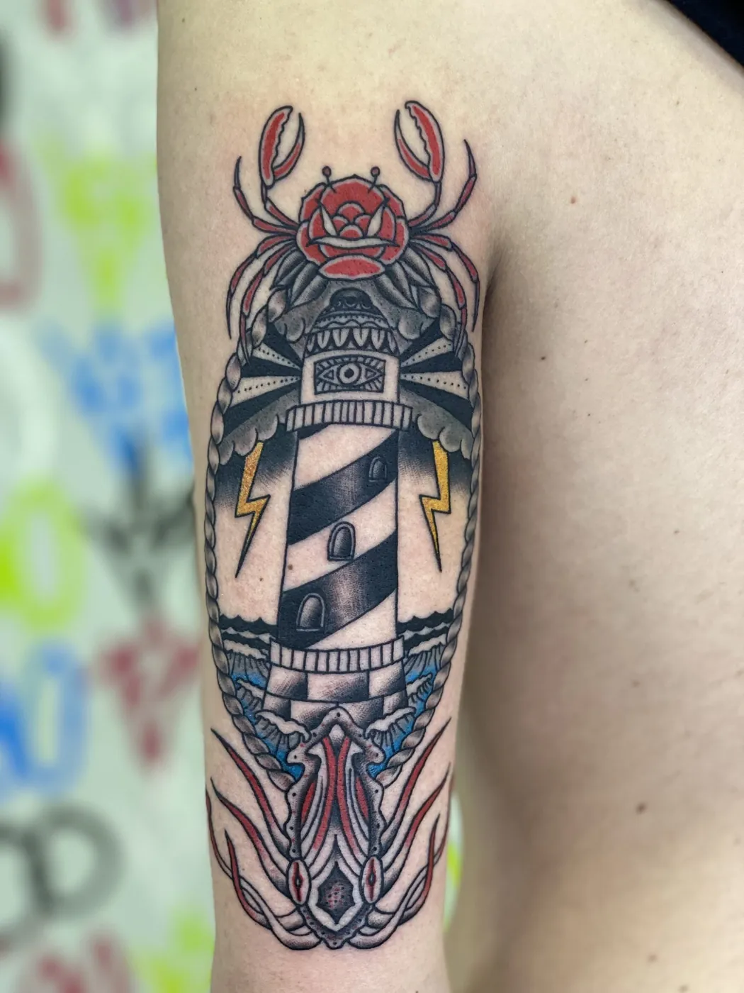
Mike Brown’s panel stacks a lighthouse, a crab and a rose into one vertical traditional composition, with the kind of packed but readable colour Stay True is known for publishing. Combining three motifs only works when each one keeps a simple silhouette. If any of them becomes too pictorial, the panel turns busy. If you want a “my place, my animal, my flower” tattoo in this style, bring the three references and let the artist rank them. The lighthouse here takes the centre, which is usually the right choice for a tall structure on a limb.
A dagger and rose, the sturdy pair
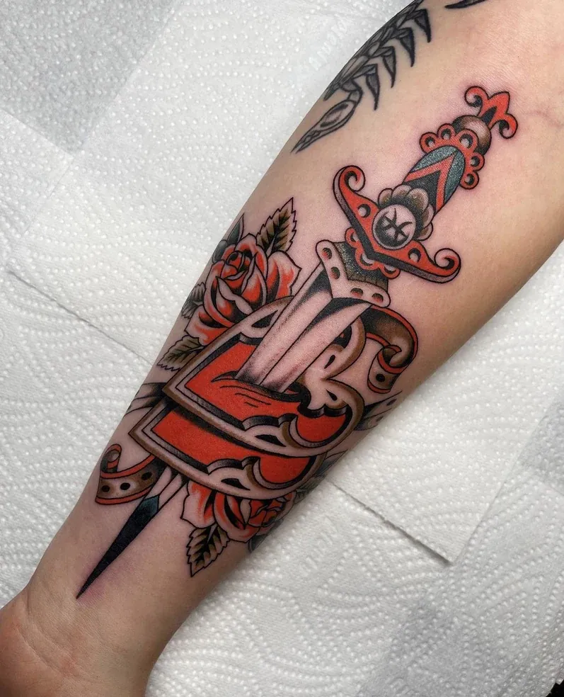
Alex Roze’s dagger-and-rose is the motif in its most useful form: a straight blade, a full red rose wrapped around it, bold black and enough leaf to finish the shape. It is a design people request constantly because it already knows how to age. The risk is asking for extra realism on top of a format that does not need it. If this is the tattoo you want, talk about length first. A dagger that is too short looks stubby; one that is too long may be cramped by your wrist or inner elbow. Look at how Alex places the piece on the inner forearm in the photograph and use that as a scale reference in your consult.
Traditional work rewards artists who already speak the style fluently. Browse a shop’s traditional pages before you send a mood board pulled from five other genres, and you will usually get a stronger tattoo.
