

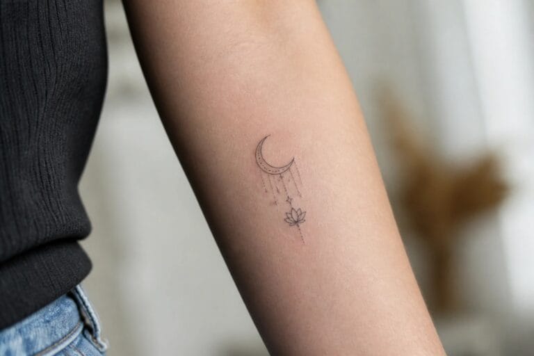
I adore how tattoos can capture the essence of divine feminine energy in such a playful way. My own path of personal growth has shown me that these symbols feel like little cheers from my inner self. These ideas mix spirituality with creativity and might just spark something special for your next piece.
Crescent moon with lotus on the inner forearm
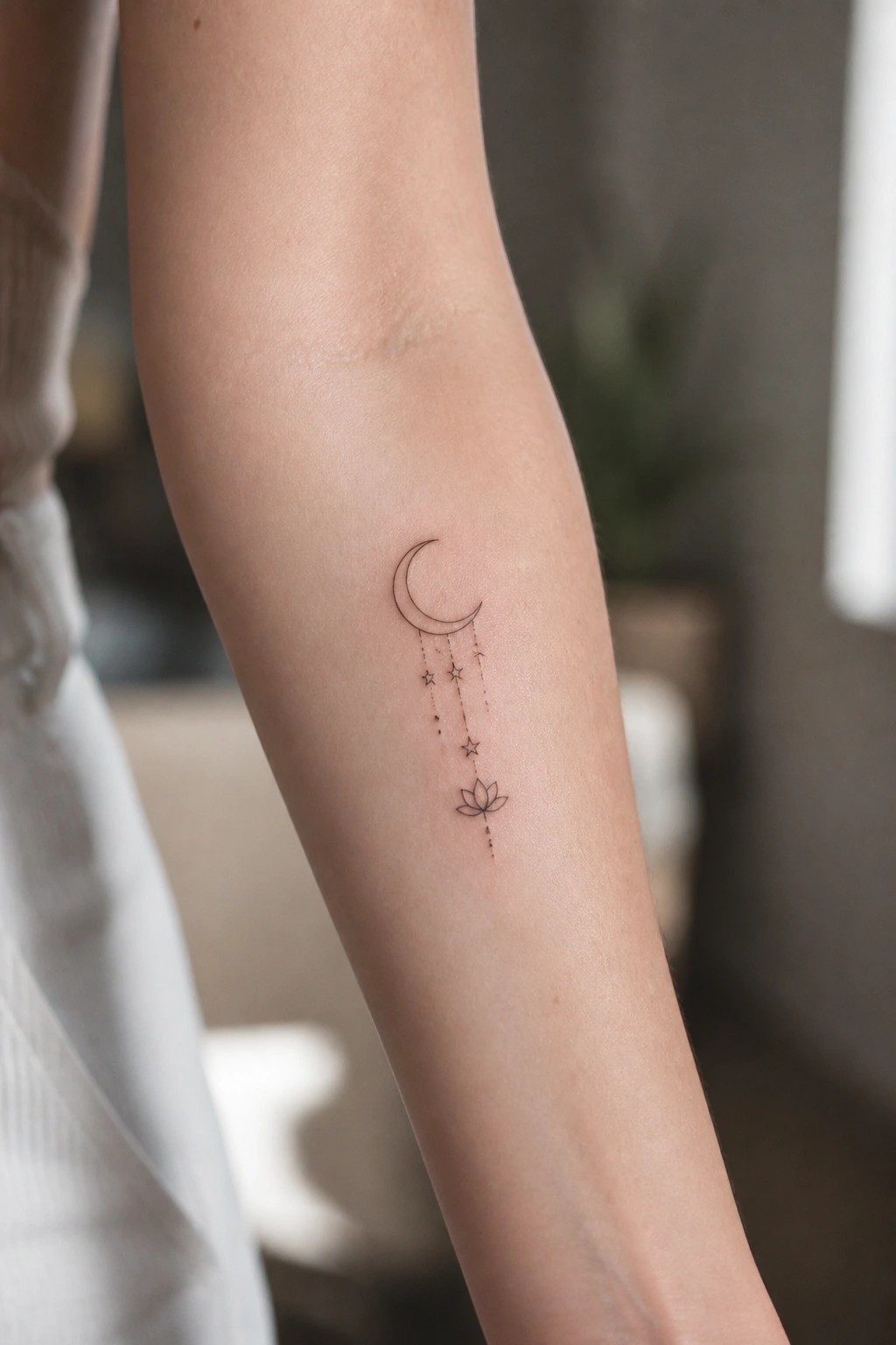
The inner forearm works well for this vertical layout. The crescent moon sits higher up while the lotus hangs lower near the wrist. Thin lines connect the stars between them without crowding the skin.
I think the fine line approach keeps the design readable at this size. The placement also lets the tattoo stay visible in most positions but still feels contained.
Moon phases tattoo along the inner forearm
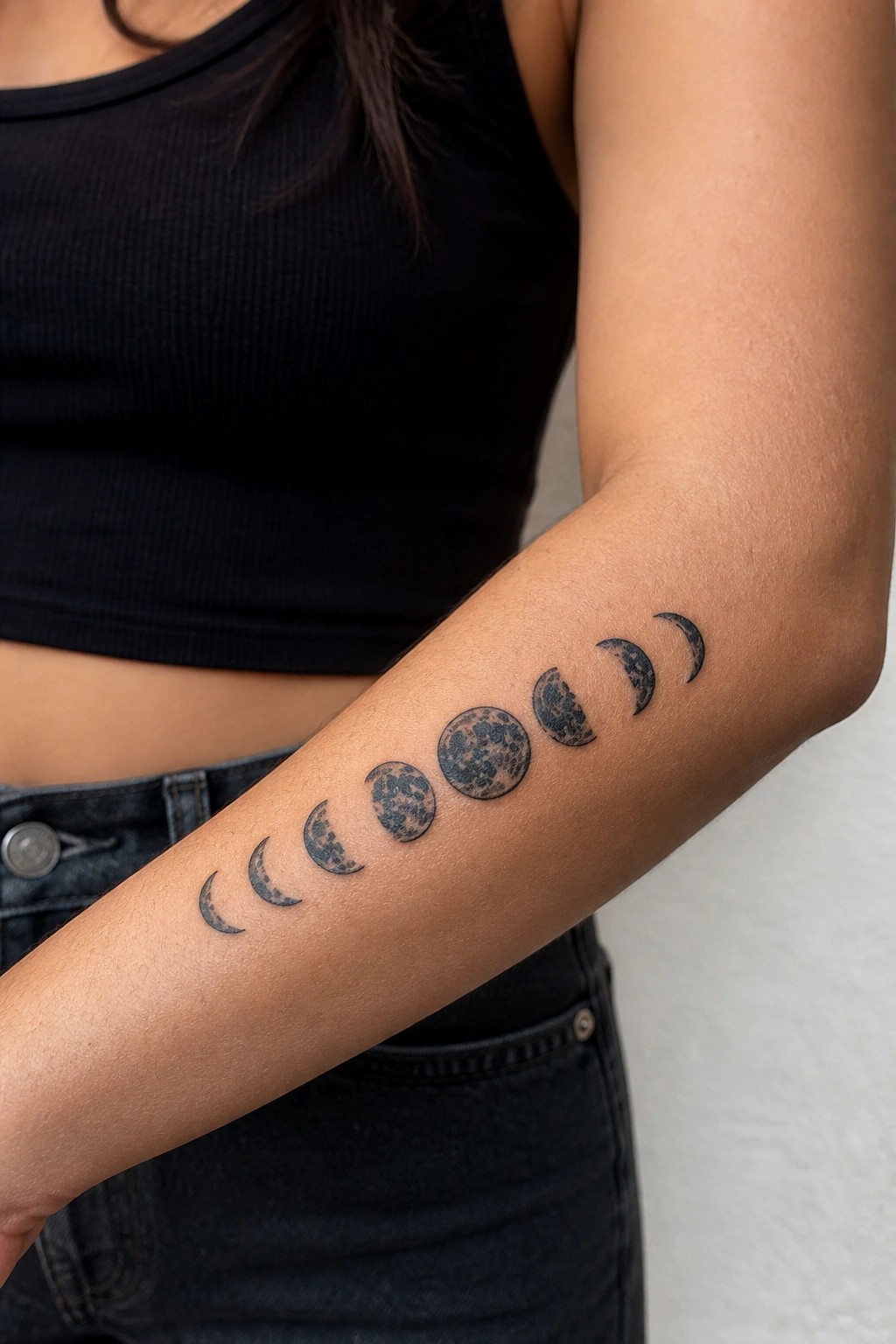
The tattoo shows the full cycle of moon phases in a straight line on the inner forearm. It starts small near the wrist and grows larger toward the middle before shrinking again. Black ink with textured shading gives each moon visible surface detail.
I think the placement works because the arm gives the sequence enough space to stay readable without feeling cramped. The gradual size shift also helps the design feel balanced from end to end.
Mandala design along the spine
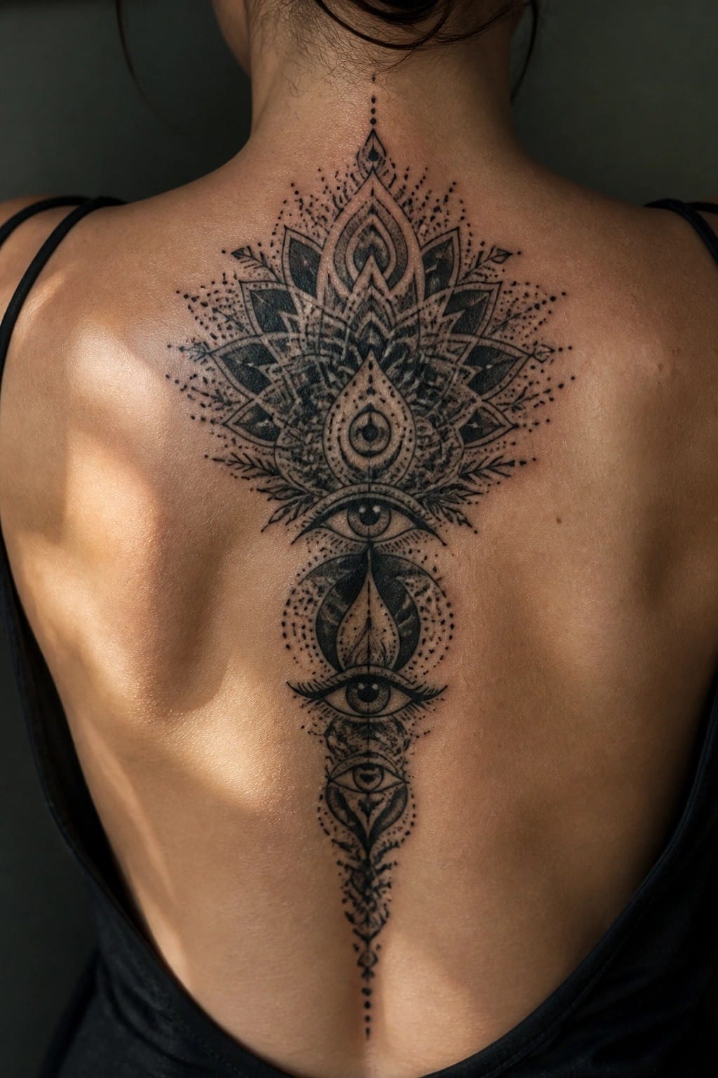
The tattoo runs straight down the center of the back from the base of the neck. It starts with a large mandala that holds several eyes and spreads into leaf shapes. The pattern narrows as it moves lower with smaller eye motifs and fine dotwork.
I think the spine placement helps the symmetry stay balanced without extra lines to guide it. The blackwork stays readable even with all the detail packed in. This setup works for someone who wants a single piece that feels complete on its own.
A small geometric flower on the ankle
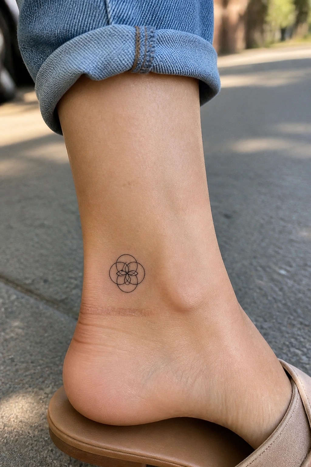
The ankle works well for a compact design like this. Fine lines create overlapping circles that form a flower shape in the center. The whole piece stays small and sits cleanly on the skin.
I think the placement keeps the details easy to notice without needing a large area. The simple outline also ages better in a spot that sees less stretching over time.
Crescent moon and face on the upper arm
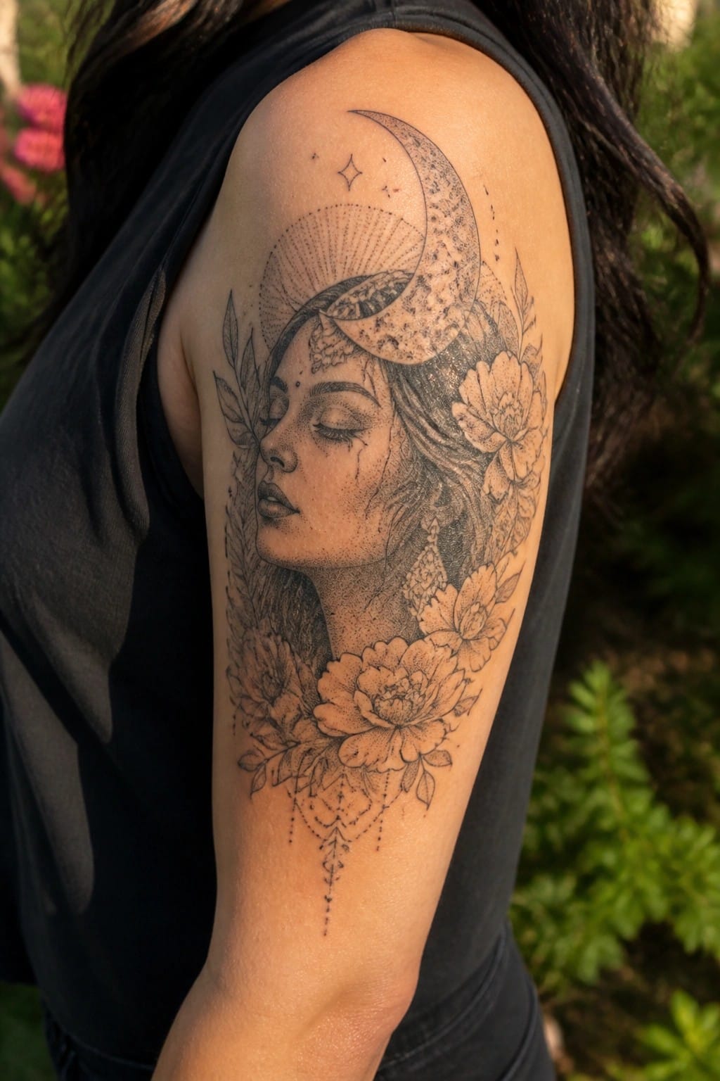
The upper arm gives this design enough space to spread out. The crescent moon sits at the top and the face rests below it. Flowers and leaves fill the lower section to balance the layout.
I think the blackwork approach helps the details hold up on a larger area like this. The size also keeps the whole piece readable without feeling cramped.
Lotus tattoo on the side
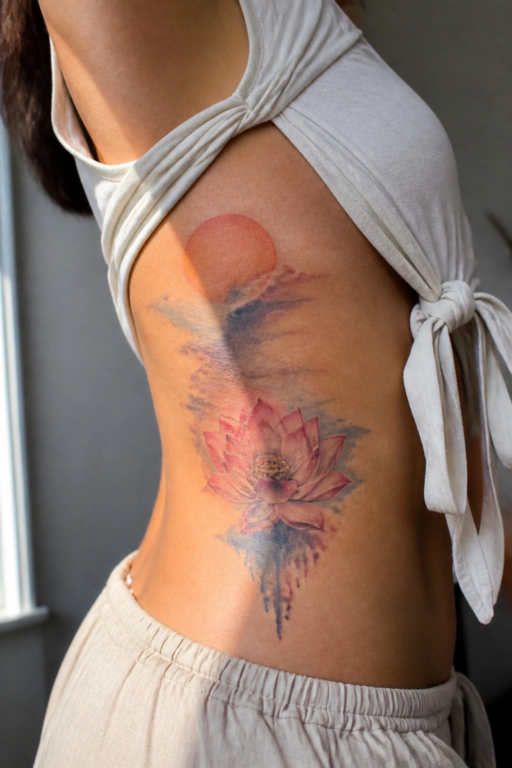
The side placement lets the design run vertically along the body. The lotus sits lower while the sun and soft clouds extend upward in a natural line. Watercolor shading keeps the colors light and blended across the skin.
I think the flowing shape fits this area because it moves with the body instead of fighting against it. The size stays balanced without overwhelming the space.
Moon and sunflower on the thigh
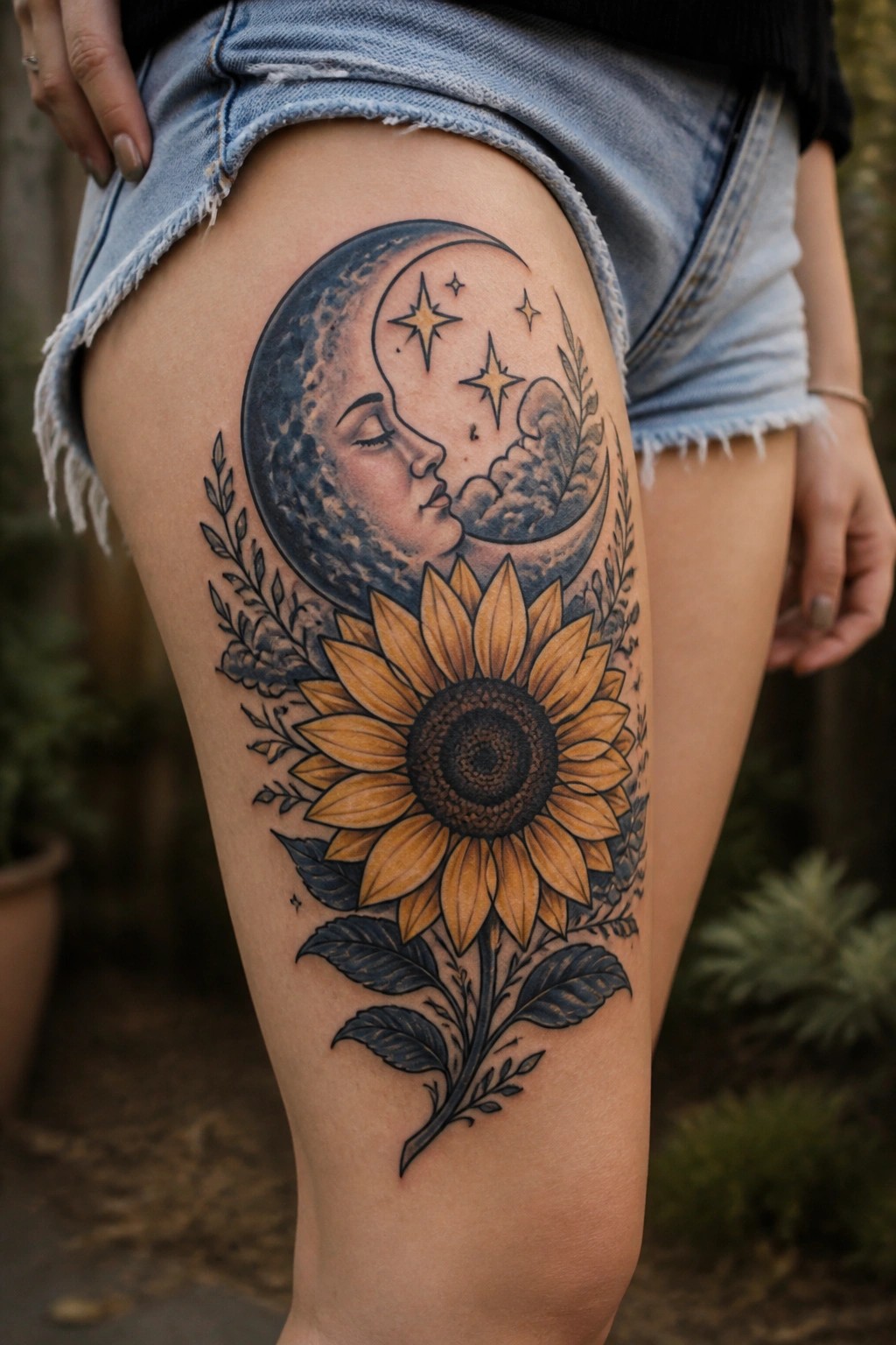
The thigh gives this design room to stretch out from top to bottom. The crescent moon takes the upper spot with its face and surrounding stars. The sunflower sits lower with its stem and leaves reaching down the leg.
I think the vertical layout keeps the two main parts from feeling crammed together. The placement also lets the leaves trail naturally along the skin.
Lotus and moons on the side torso
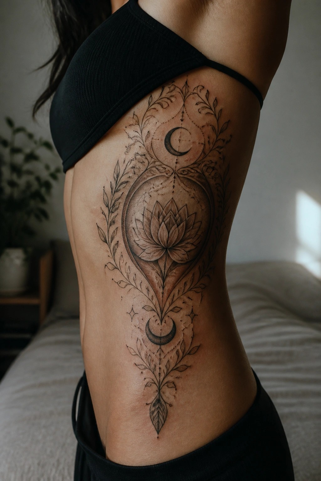
The tattoo runs vertically along the side of the torso. A central lotus sits in the middle with crescent moons above and below it. Leafy vines stretch out on both sides to fill the space without overwhelming it.
The layout follows the natural lines of the body so the piece stays readable from top to bottom. I think this placement keeps the symmetry clear while leaving room for the smaller details to show up well.
Minimal spiral behind the ear
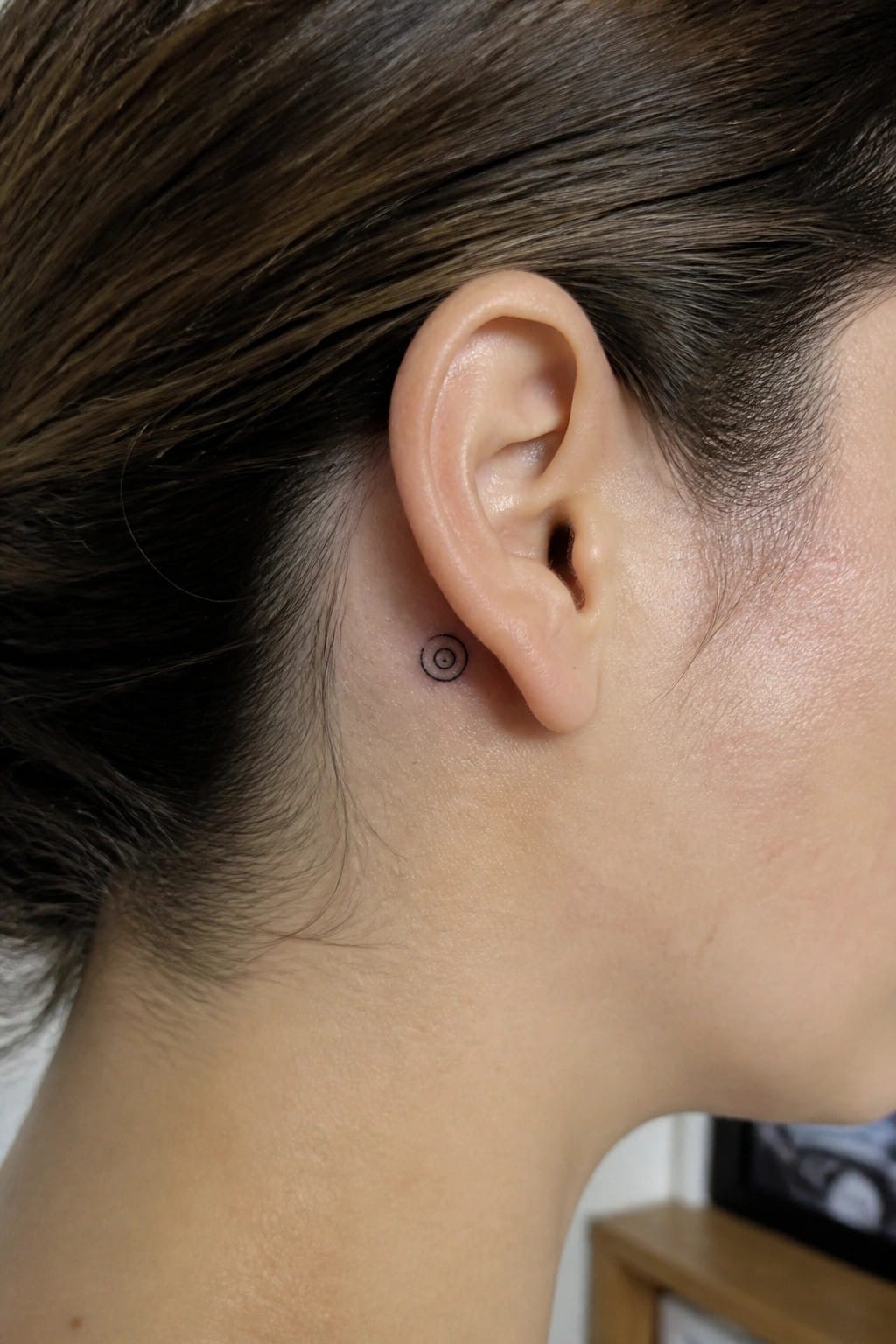
The area just behind the ear gives a small spiral room to sit without drawing constant attention. The placement keeps the design close to the hairline so it stays mostly private but still visible with certain hairstyles.
I think the scale works because it lets the lines stay simple and clear without needing extra detail. This spot also fits the kind of symbol someone might choose for steady personal growth rather than a big statement piece.
A goddess figure tattoo on the chest
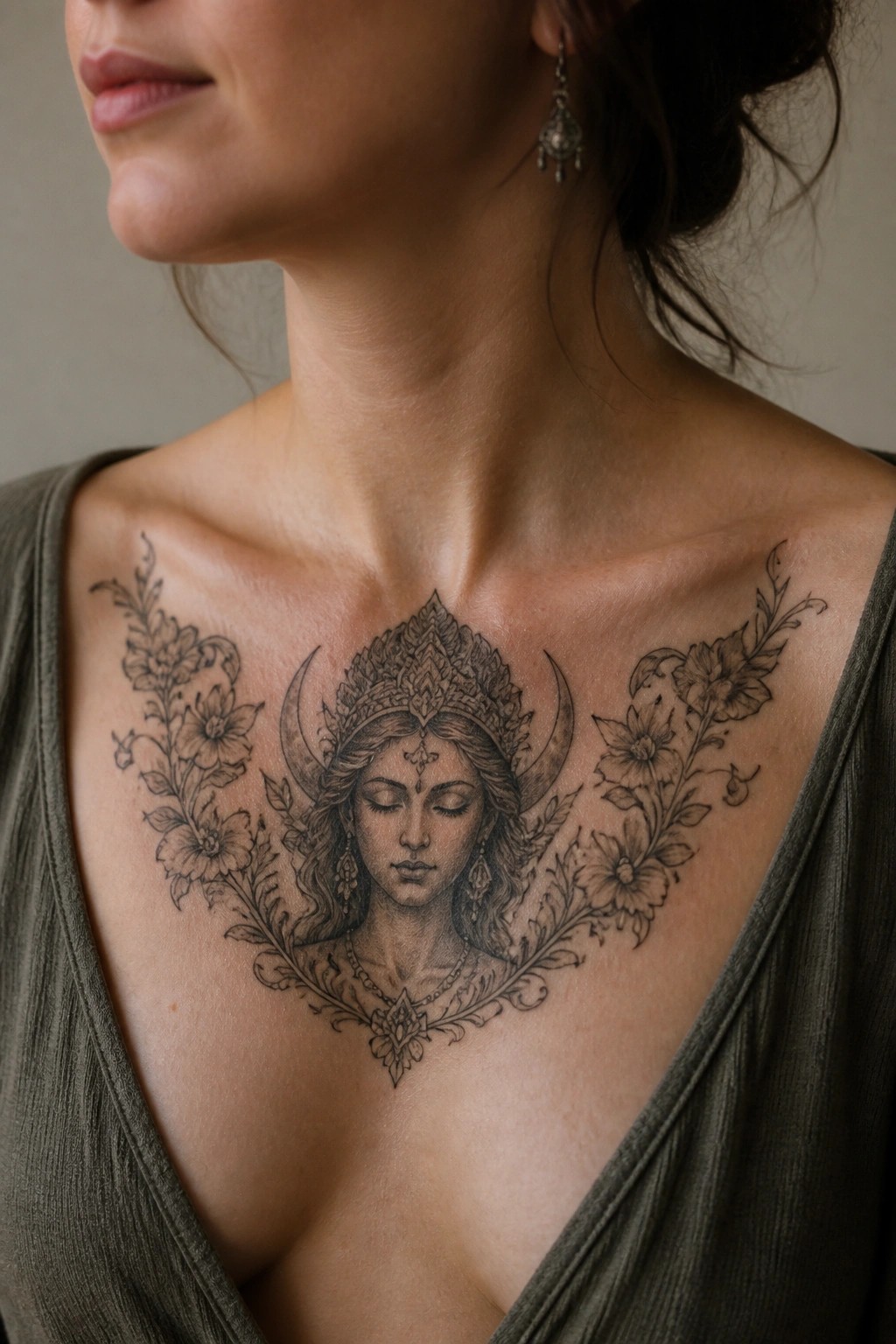
The tattoo sits centered on the chest with floral branches reaching out to each side. This placement keeps the design balanced and lets the central figure stand out clearly. The crescent moons and headdress add structure without needing extra elements.
I think the chest works well for this idea because it gives the whole piece enough width to feel complete. The black and grey style stays readable even with the finer lines around the face and flowers.
Lotus tattoo on the back of the hand
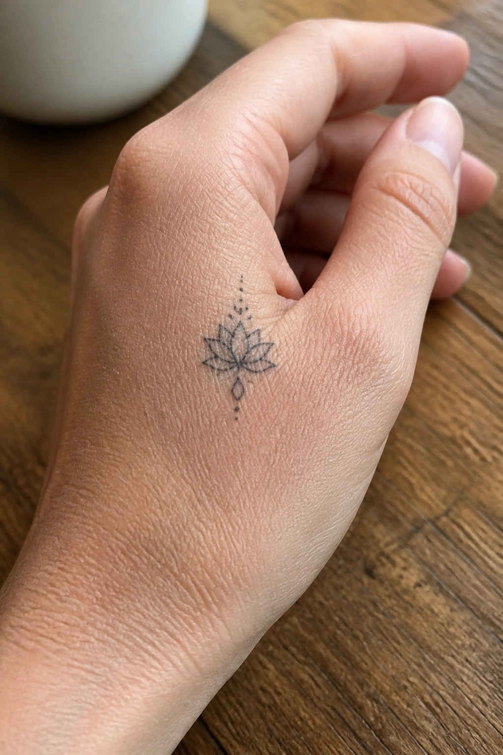
The back of the hand leaves room for a small lotus without it feeling cramped. Fine lines keep the flower light and the dotted accents add a simple vertical flow through the middle. This size stays easy to wear day to day.
I think the placement works because the design stays compact and readable even on a moving area like the hand. It avoids looking busy while still showing clear shape.
Peacock feather and moon on the upper back
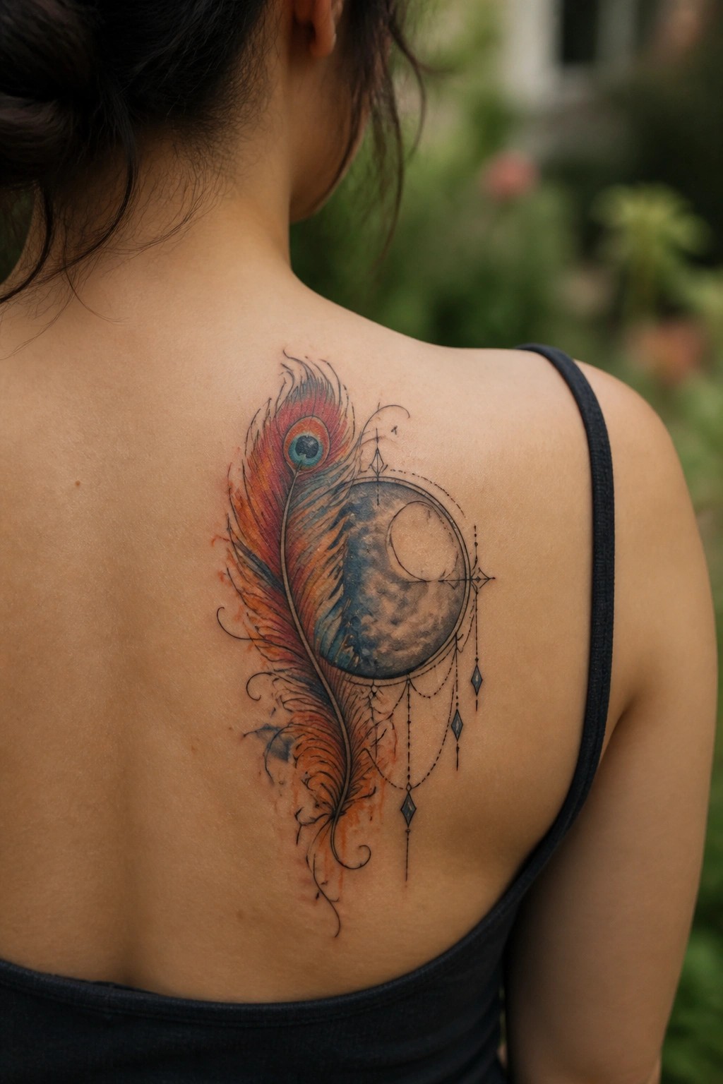
The upper back works well here because the design needs space to curve from the shoulder blade down toward the spine. The feather starts wide at the top and narrows as it drops, while the moon sits right in the middle of that flow. A few thin lines and small hanging shapes keep the lower part from looking empty without adding bulk.
I think the placement also helps the tattoo stay visible without forcing it onto a smaller area like the wrist or ankle. The watercolor edges soften the transition between the bright feather and the darker moon, so nothing fights for attention. It ends up feeling balanced even though the elements are quite different.
A small plant on the inner wrist
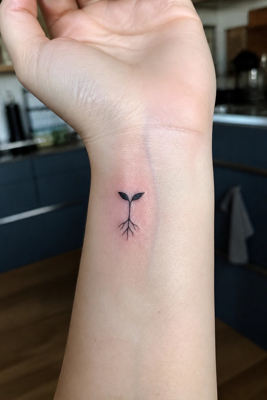
The inner wrist works for this design because the area stays narrow and the plant sits neatly along the natural line of the arm. The stem runs straight down with roots at the base and two small leaves at the top. Fine lines keep the whole thing compact and easy to read at this size.
I think the placement helps because the tattoo stays personal yet simple to show when wanted. The roots give it a grounded feel without adding extra weight to the design.
A crescent moon tattoo on the ankle
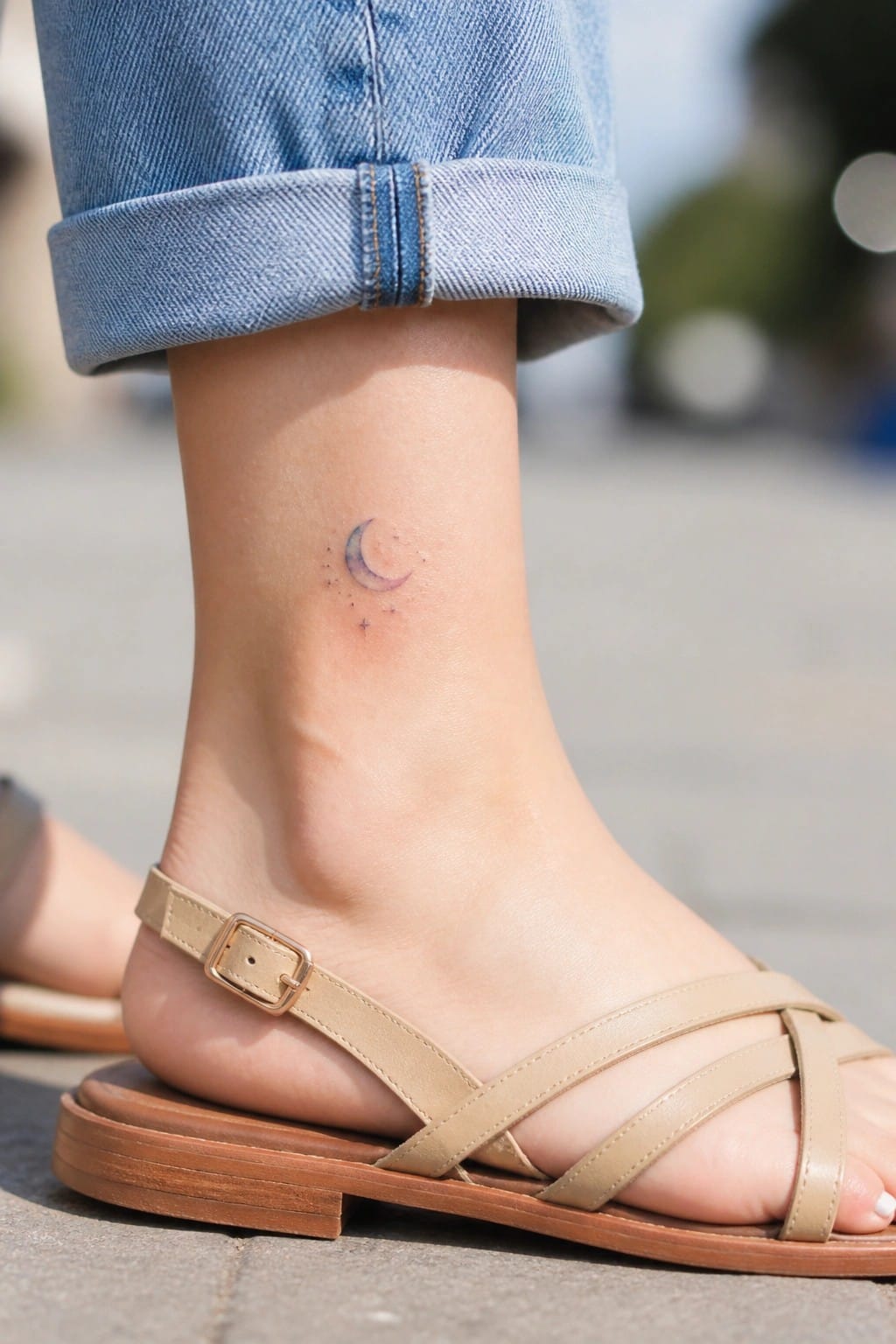
The ankle gives this moon design room to sit without competing with other body lines. A small crescent works here because the area stays visible in open shoes or cropped pants but hides easily under regular clothes. The stars around it keep the whole thing balanced without adding bulk.
I like how the placement keeps the tattoo personal rather than loud. It feels like a spot that suits someone who wants a reminder they see every day without it dominating their look.
Floral portrait on the side torso
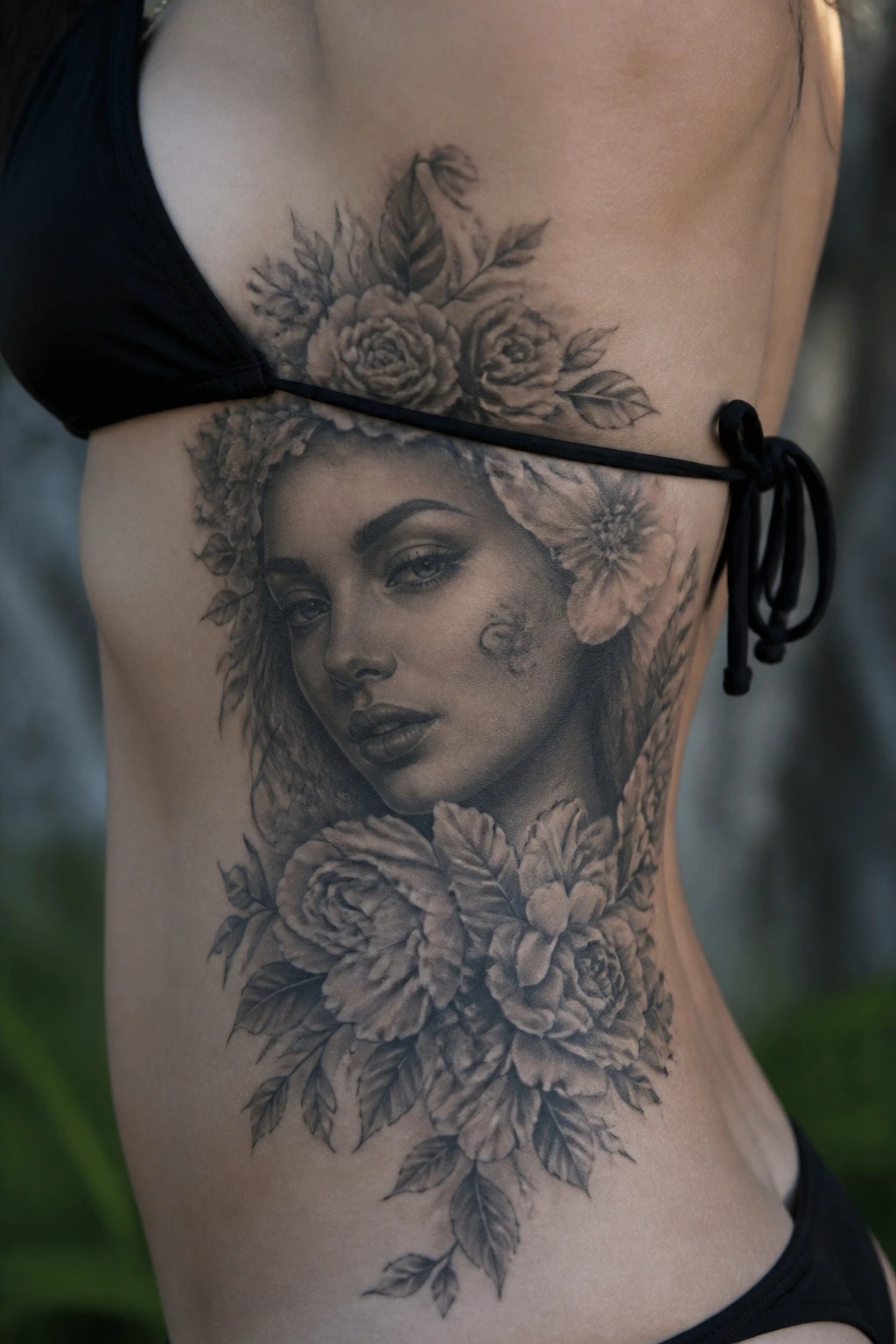
The side torso gives this design room to run vertically without feeling cramped. A central female face sits in the middle with roses and leaves wrapping around it from top to bottom. Black and grey shading handles the transitions between skin, petals, and hair.
I like how the placement lets the flowers guide the eye downward in a natural line. The scale stays large enough for the details to read clearly while still fitting the body shape.
Moon phases wrap around the ankle
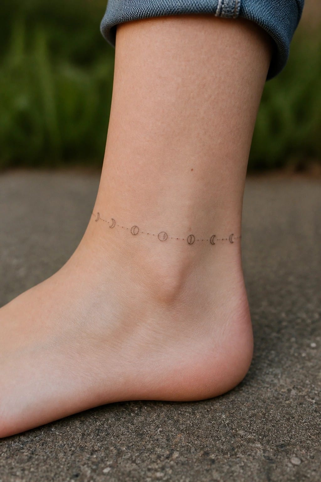
The tattoo sits low on the ankle as a thin band. Small moon phases run along a dotted line that circles the area without much width. This spot turns the design into something that feels like a piece of jewelry rather than a large statement.
I like how the placement keeps the phases visible only when the foot is bare or in low shoes. The dotted connectors stop the whole thing from looking too heavy on the narrow skin there.
Profile portrait on the thigh
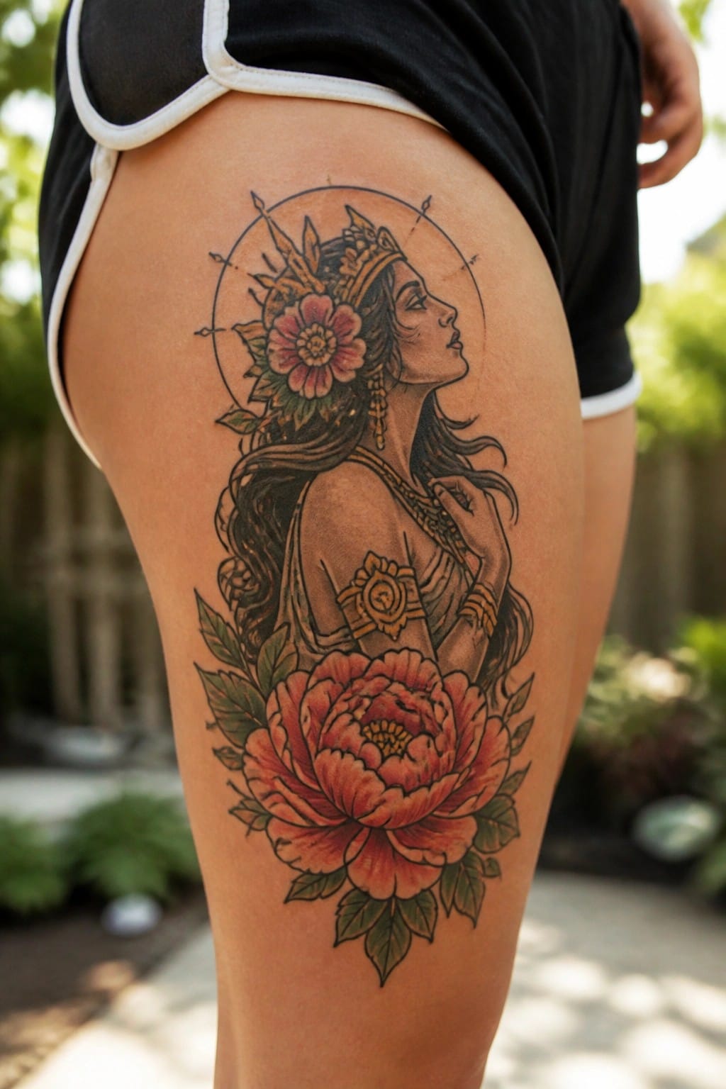
The thigh works well here because the design runs vertically from the upper leg downward. A woman appears in profile with a detailed headdress and a large flower near her face. The big peony at the bottom helps ground the whole image and gives it balance.
I like how the circle sits high enough to stay clear while the rest of the tattoo stretches out below it. That layout keeps the lines readable even on a larger scale.
Growth tattoo on the inner wrist
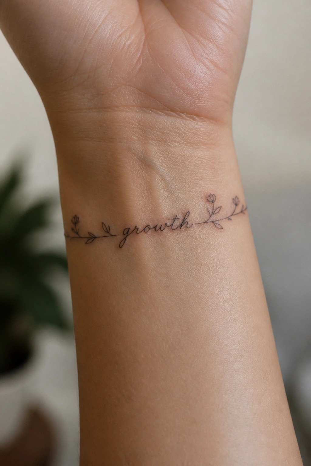
The inner wrist holds this fine line design in a compact layout. The word growth sits centered with small floral vines extending from each side. This spot makes the tattoo easy to see during regular movement.
The scale stays small enough to fit naturally without crowding the area. I think the wrist placement works here because it keeps the design personal while still visible as a daily note.
Lotus with arrows along the inner forearm
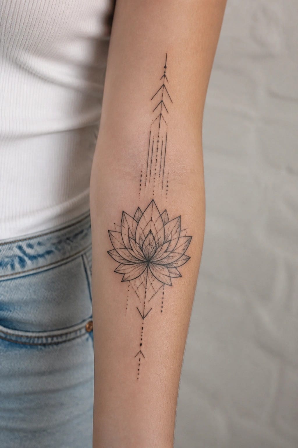
The design runs vertically down the inner forearm. A lotus flower sits in the center while thin lines and arrows extend above and below it. The dotted details keep the whole piece light and balanced.
This placement works because the arm gives the vertical lines room to breathe without looking cramped. The fine line style also helps the tattoo stay readable even at this size. I think the arrows add direction without overpowering the flower itself.
Crescent moon on the lower back
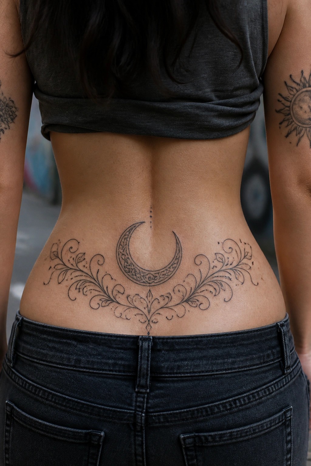
The lower back gives this crescent moon enough width to spread out evenly. Floral swirls sit on each side and connect back to the center without crowding the spine. Small dots sit above the moon and keep the focus there.
I think the scale works because the details stay clear even when the design stretches across the area. The line work stays light enough that it does not fight the natural shape of the back.
Frequently Asked Questions
1. How can I decide which of the 20 tattoo ideas best matches my personal growth stage? Reflect on your current life challenges and intentions first. For example if you are focused on healing past wounds choose symbols like the lotus or moon phases that represent renewal. Journal about which ideas evoke strong emotions then consult the article descriptions to match them with your goals. A consultation with a tattoo artist experienced in spiritual designs can help refine the choice further.
2. What body placement works well for tattoos inspired by divine feminine energy? Placement often depends on the symbol size and your comfort level. Areas like the wrist collarbone or upper back allow for meaningful visibility while supporting introspection. Larger designs such as goddess figures may suit the thigh or ribcage for a more private connection. Always consider how the placement feels during daily movement and energy flow.
3. Can I combine elements from several ideas into one custom tattoo? Yes combining elements creates a unique piece that tells your full story. For instance merge a tree of life with feminine moon motifs to represent both growth and intuition. Work with an artist to balance the design so it remains cohesive and avoids overcrowding. This approach often deepens the personal significance of the tattoo.
4. How should I care for a new spiritual tattoo to preserve its energy and appearance? Follow standard aftercare by keeping the area clean and moisturized with fragrance free products. Avoid sun exposure and tight clothing during healing to prevent irritation. Many people find that meditating on the tattoo symbol during aftercare strengthens its connection to divine feminine themes and supports ongoing personal growth.
5. What if I want a temporary version of one of these designs before committing to ink? Henna or temporary tattoo options let you test the symbol on your skin for several weeks. Search for artists who create custom spiritual stencils or use high quality temporary inks. This trial period helps confirm the design resonates with your energy before a permanent commitment.
