

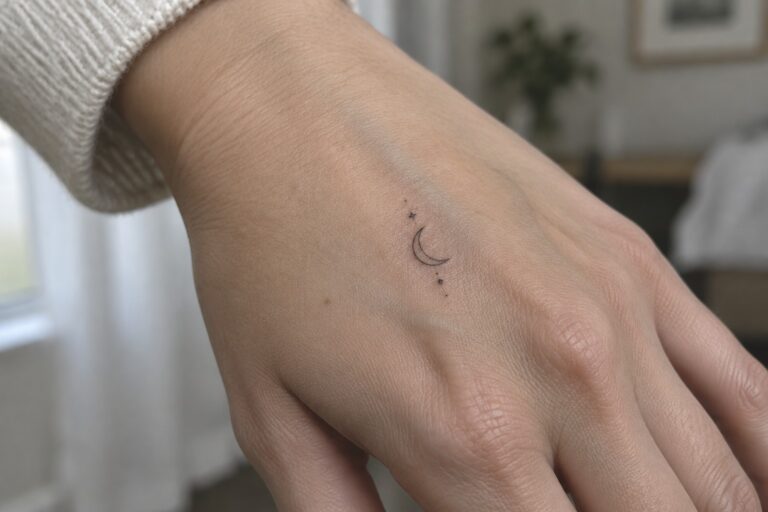
I love how fine line hand tattoos add a personal touch without demanding too much attention. My first small black ink symbol on my hand still makes me smile every time I glance at it. These practical designs feel right for women who want something subtle yet full of meaning. If you are hunting for fresh ideas the options ahead highlight simple symbols done right.
Small moon tattoo on the hand
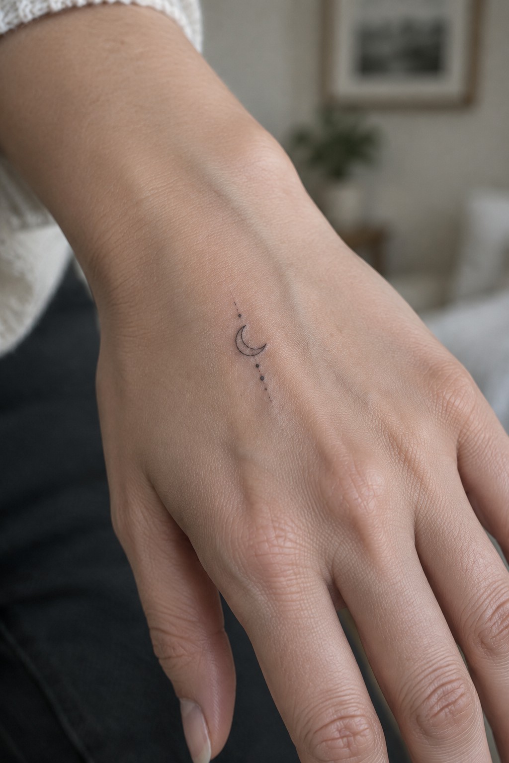
The design sits on the back of the hand in a spot that stays visible during daily tasks. It uses a thin crescent moon with a short trail of dots in fine black lines. The whole piece stays compact so it fits the area without crowding the skin.
I think the placement works because the hand moves often yet the simple lines keep the tattoo readable. The dots give it a bit of flow without adding extra detail that could blur later.
A fine line curve sits on the side of the hand
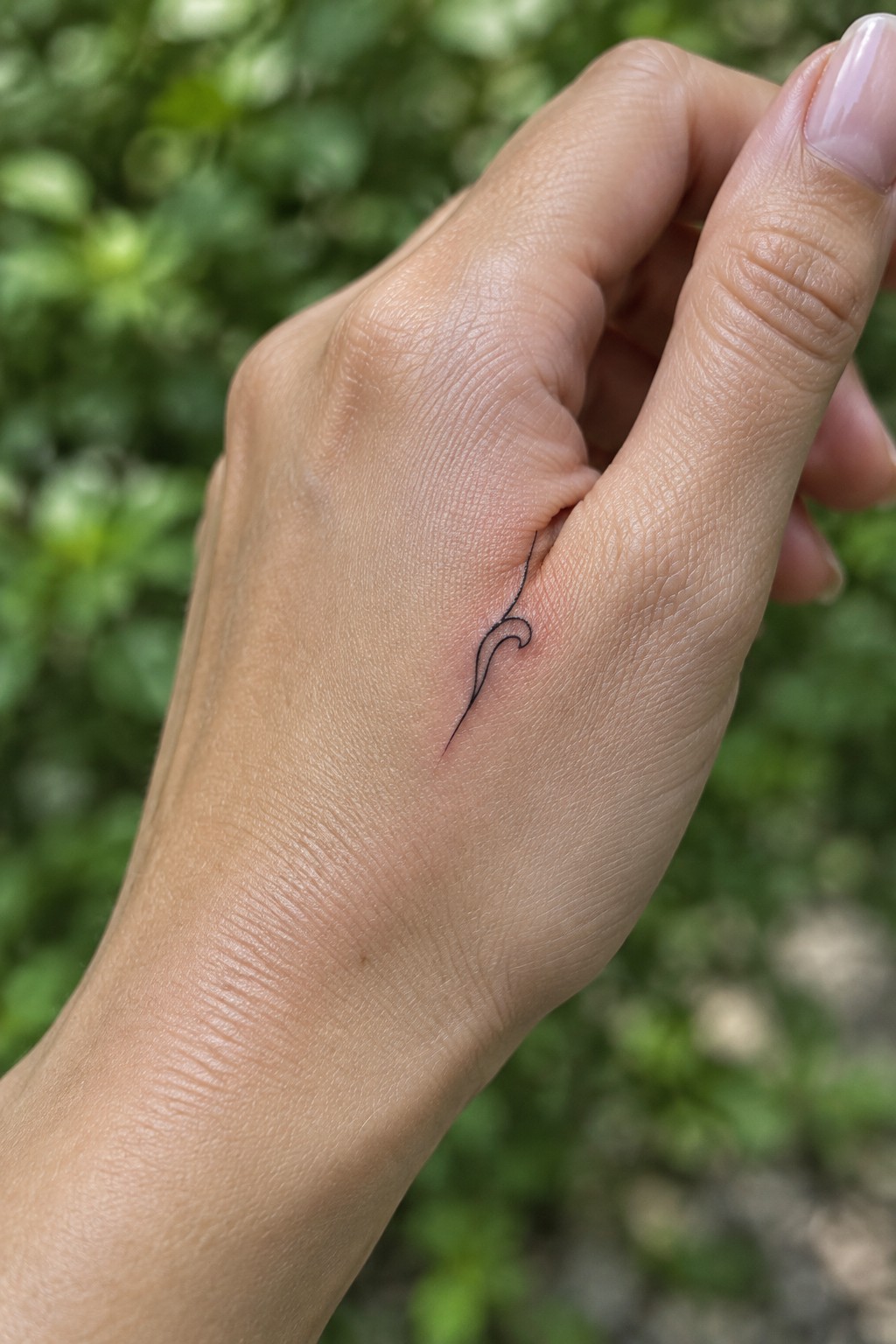
The tattoo sits in the soft fold between the thumb and index finger. A single black line flows down with one small loop before it tapers. The compact size keeps it contained within that narrow area.
I think the placement works because the skin there moves less than the top of the hand so the design stays clear longer. The fine line approach also prevents it from looking heavy in such a visible spot.
A sunburst on the back of the hand
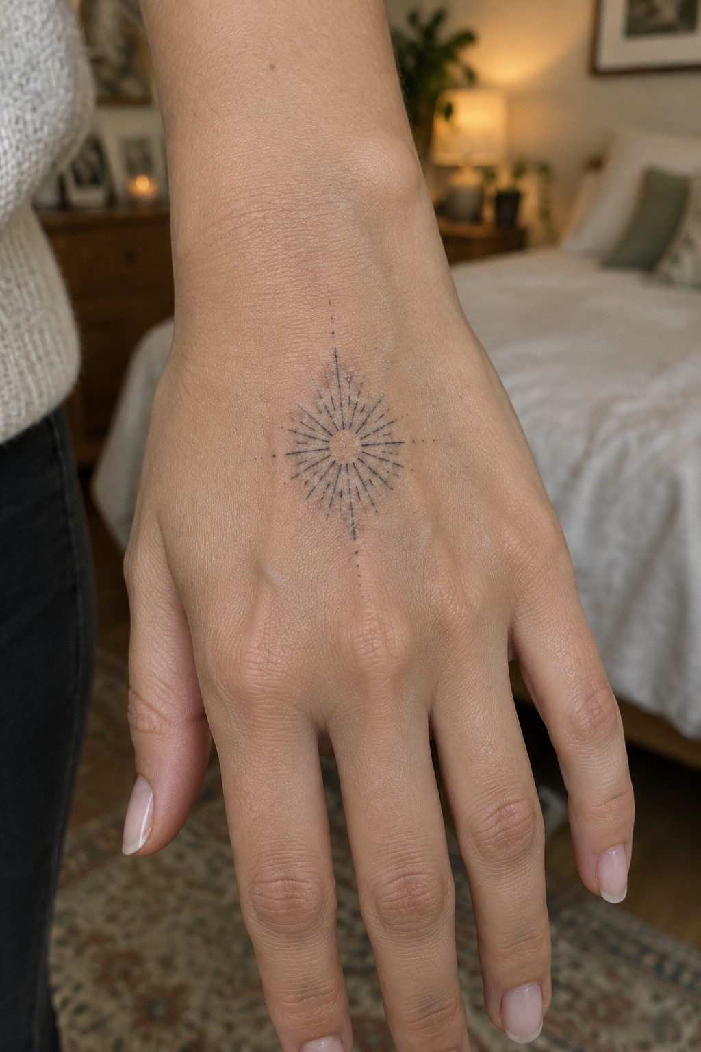
The design sits centered on the back of the hand. Fine lines radiate outward from a small open circle. A row of dots extends straight up and down through the middle.
This spot lets the rays stay evenly spaced without running into the fingers or wrist. I think the compact size helps the whole thing stay readable even after it heals.
Small heart on the finger
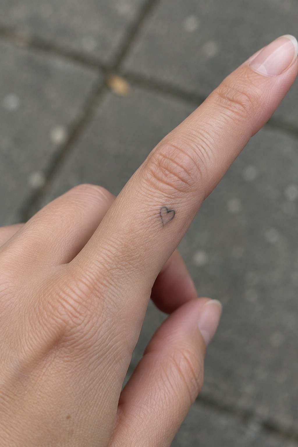
The side of the finger gives this heart a natural spot that stays visible during normal hand movements. A tiny symbol fits the area because it needs little space and avoids wrapping around curves. The fine line stays simple and readable without added shading.
I picked this placement because the scale feels balanced on the finger and does not draw too much attention. It works for someone who wants a basic symbol that remains low key.
Fine line arrow tattoo on the middle finger
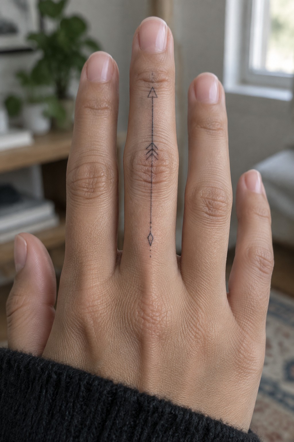
The middle finger offers a long, narrow space that fits this vertical design well. The arrow runs straight from near the top knuckle down past the middle one, with a few chevrons and a small diamond marking the lower section. Thin black lines keep the whole thing minimal.
I like how the length uses the finger’s natural shape without feeling cramped. It stays simple enough to read clearly even at this small scale.
Mountains on the inner wrist
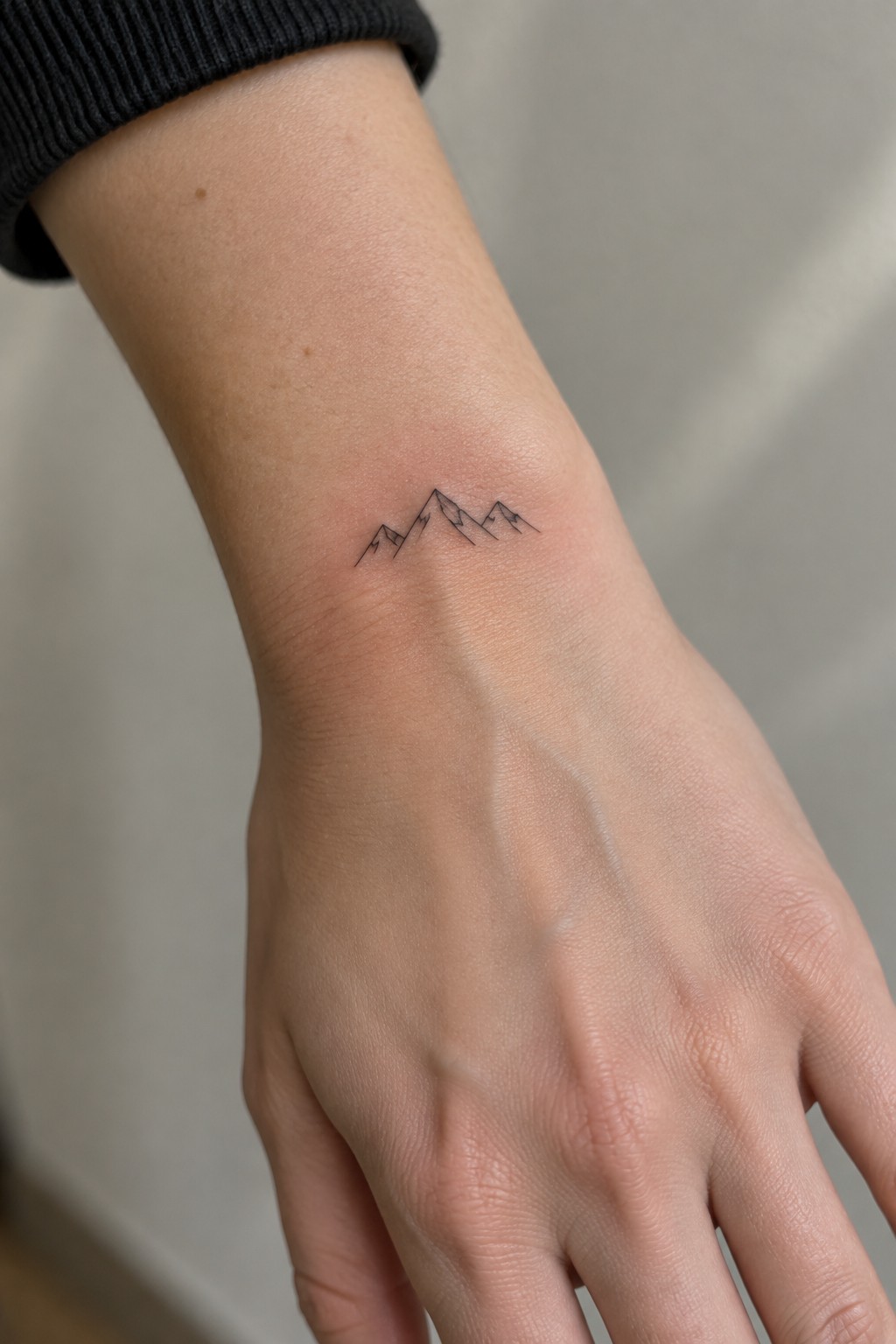
The wrist gives this mountain design room to breathe while staying compact. Thin lines keep the peaks from crowding the area and let the shape stay clear even at a small scale. The placement turns the tattoo into something you notice during everyday movements.
I like how the wrist curve supports the line of peaks without forcing extra detail. It keeps the whole thing simple and easy to read at this size.
Constellation tattoo on the back of the hand
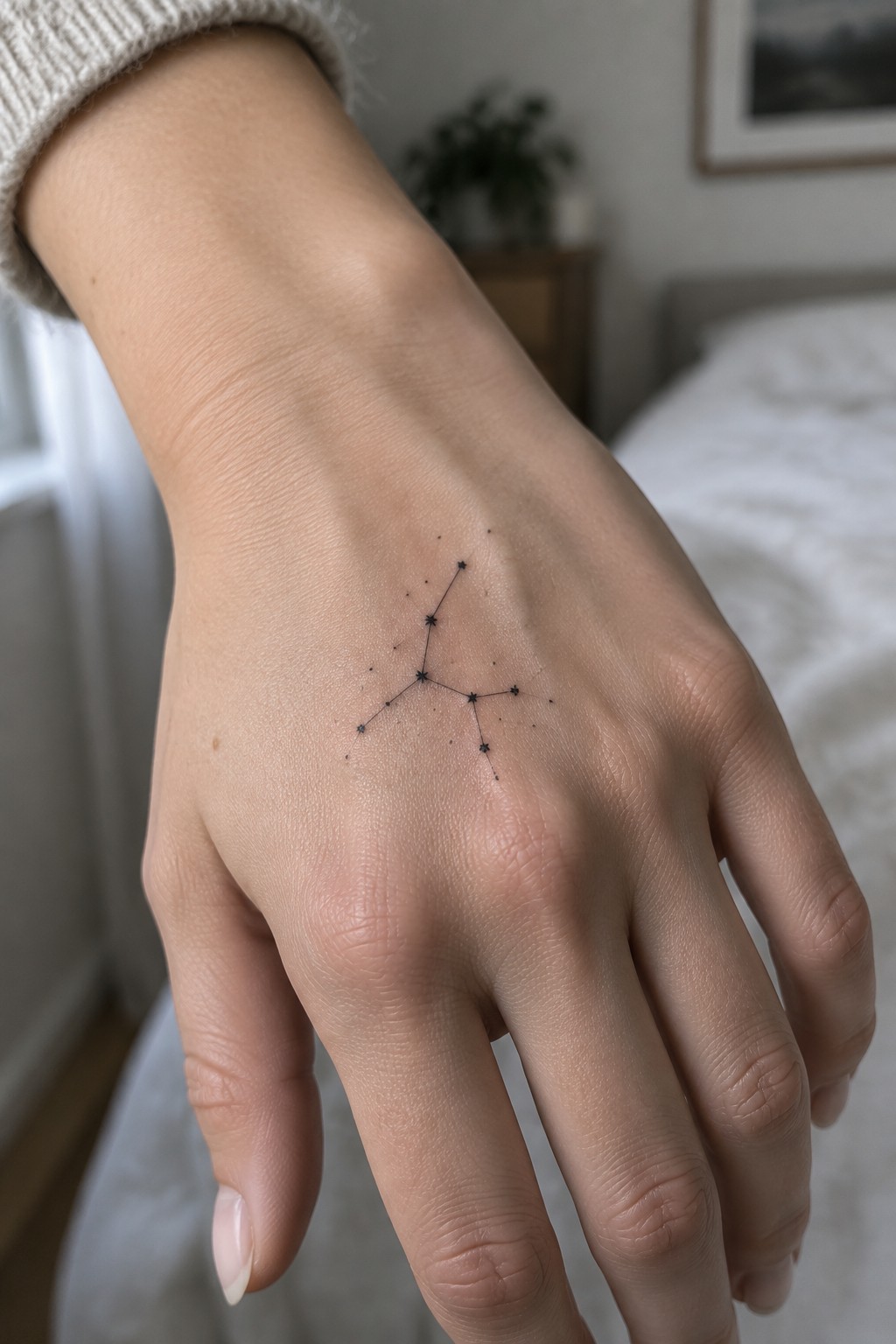
The back of the hand gives a constellation room to spread out without much distortion. The flat surface keeps the straight lines clean between each star point. At this small scale the dots stay sharp and the connections do not crowd.
The open spacing makes the shape easy to read even when the hand moves. I think this layout works because it avoids cramming too many elements into a tight spot.
A keyhole tattoo on the back of the hand
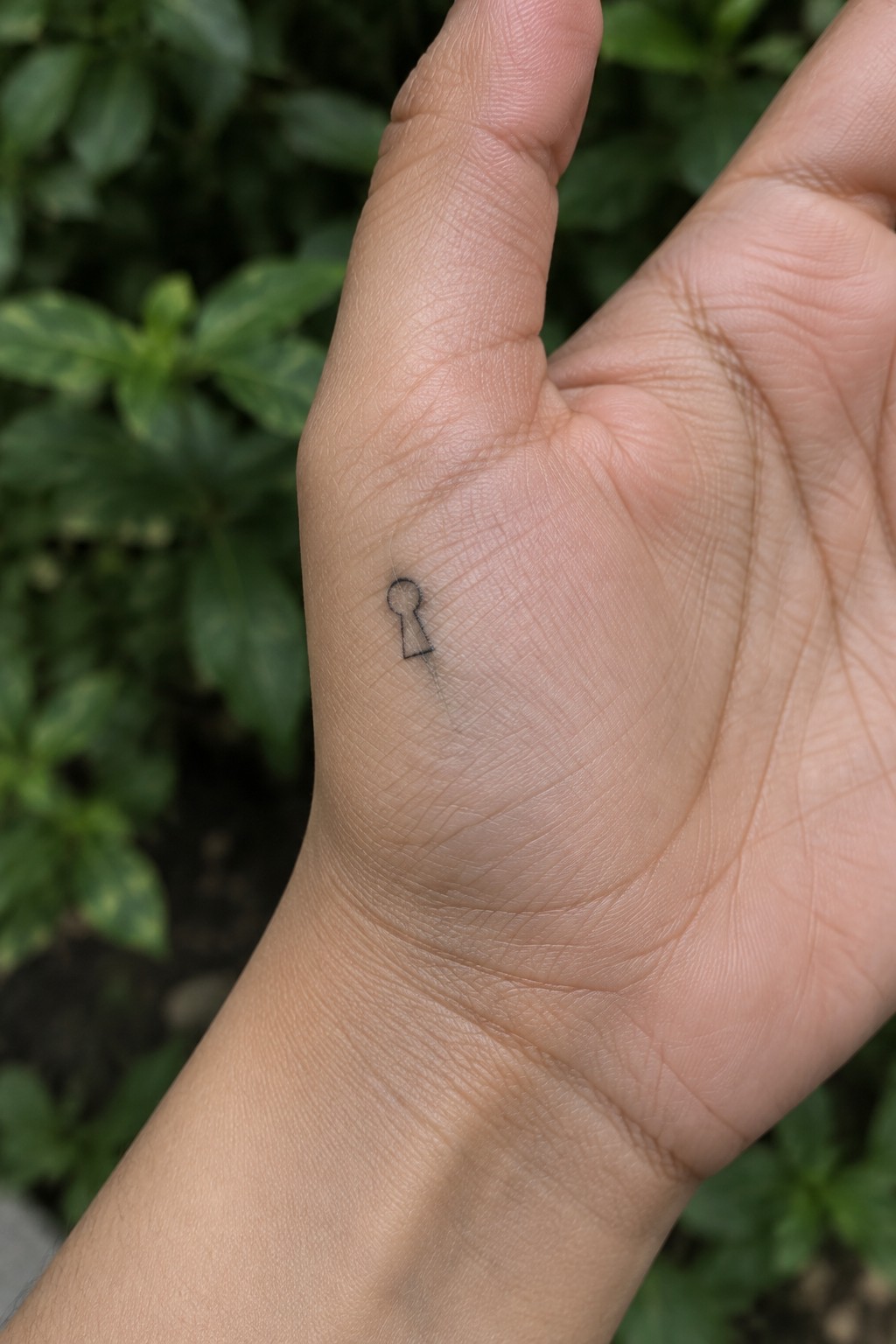
The tattoo sits near the base of the thumb on the back of the hand. It uses a very small keyhole shape drawn with thin black lines. The design stays simple and leaves plenty of skin showing around it.
This spot works because the hand moves often and the symbol stays visible without filling much space. I think the scale keeps the whole thing from feeling heavy on such an active area.
Crescent moons line the side of the hand
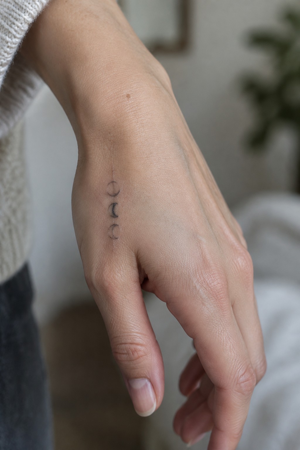
The tattoo runs in a straight vertical row along the outer edge of the hand. Three simple crescent shapes sit close together but spaced enough to stay clear. Fine line black ink keeps the whole piece small and contained.
I think this placement works because it follows the natural length of the hand without wrapping around any curves. The design stays easy to read even when the hand moves.
Fine line chain on the wrist
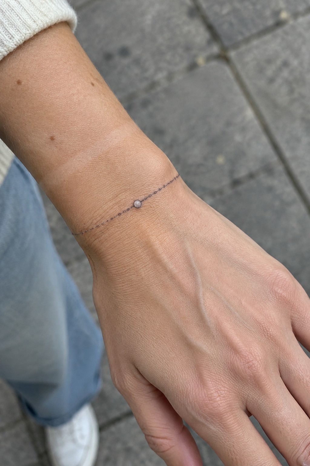
The wrist works well for a chain tattoo because the line can sit flat and wrap around without much distortion. A thin black line with one small bead keeps the whole thing minimal and readable at this scale.
This version feels practical since it mimics jewelry but stays in place all the time. I think the single bead stops it from looking plain while still letting the chain stay the main element.
Triangle on the side of the finger
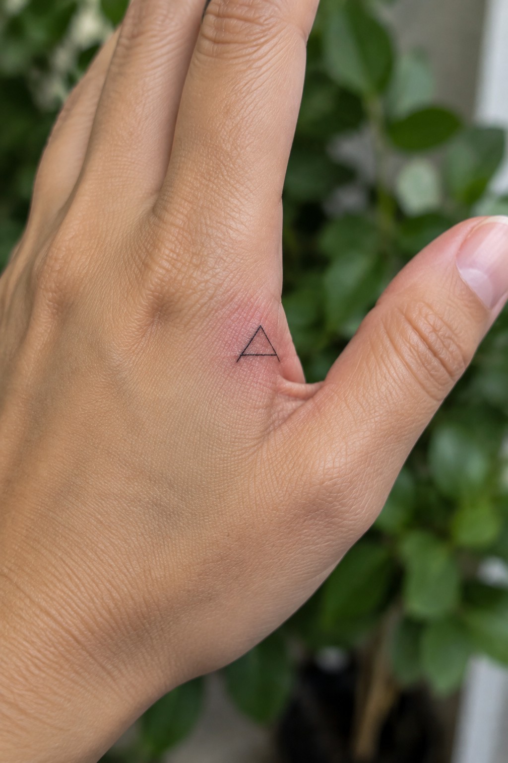
The side of the finger gives this triangle a steady surface that does not interfere with normal hand movement. The fine line style keeps the shape sharp even though the area is narrow. Black ink alone makes the design read clearly without extra detail.
I think the placement works because the tattoo stays visible when the hand rests but avoids the most used parts of the finger. This keeps the lines from fading fast over time.
Anchor tattoo placed on the side of the finger
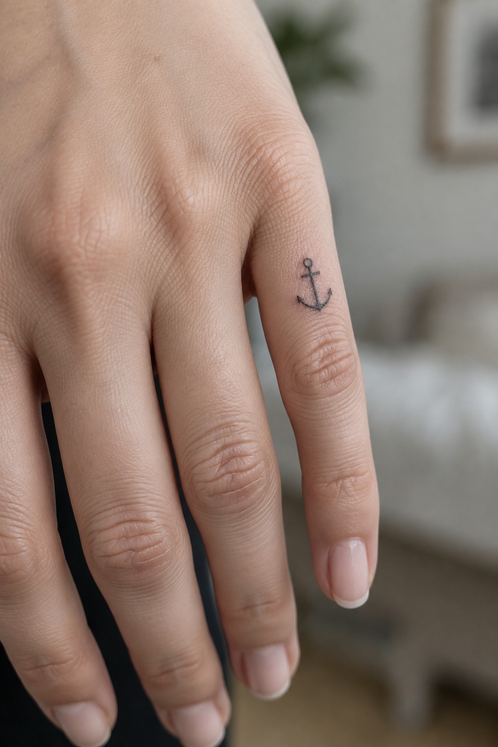
The anchor sits along the outer edge of the finger near the middle knuckle. This spot keeps the design compact and easy to hide or show depending on hand position. Fine line work helps the shape stay readable even at this small scale.
I think the side placement works because it avoids the top surface that sees more wear. The result feels understated without losing the symbol itself.
Semicolon tattoo on the ring finger
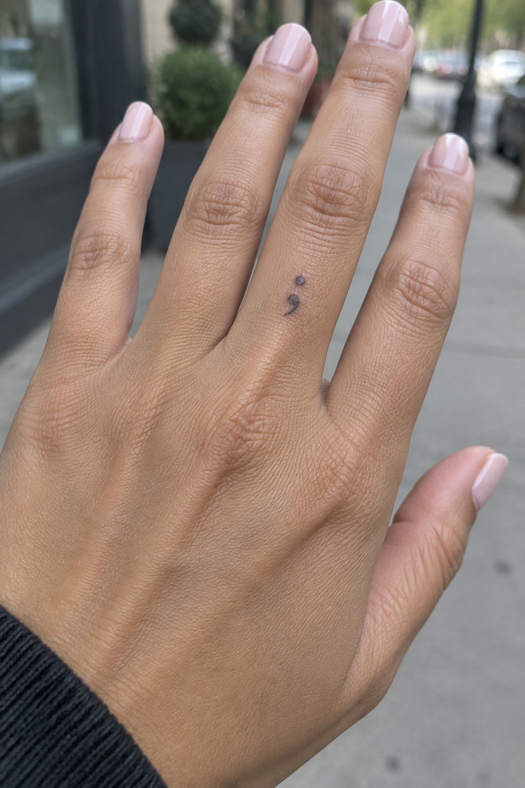
The ring finger gives this small semicolon a narrow and private spot. Fine line work keeps the curves clean and readable without filling much space. The placement on the side lets the symbol show when the hand moves but stays low key most of the time.
I think the tiny scale works here because it avoids crowding the finger. It feels like a personal mark rather than something meant to stand out in every photo.
Eye on the finger
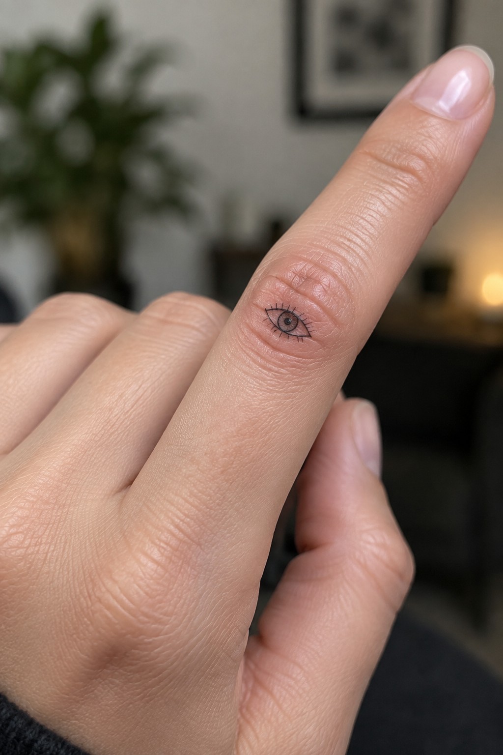
The side of the finger gives this eye tattoo a natural spot to sit without extra space. The small size keeps the whole design tight and contained along the skin. Fine lines handle the iris and lashes without adding bulk.
I think the placement works because the finger shape already guides the eye shape. It stays simple and clear even when the hand moves.
Small planet on the hand
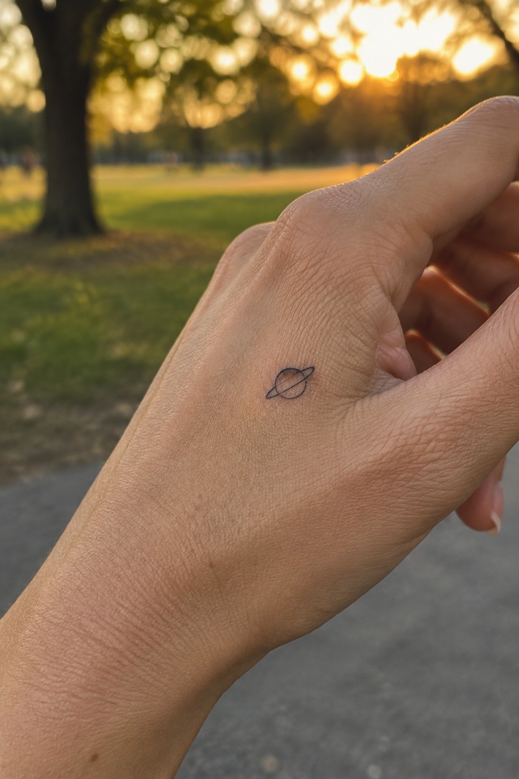
The back of the hand gives this planet tattoo room to stay small and simple. Fine black lines form the rings and sphere without any extra shading or fill. The scale stays compact so the design does not crowd the skin or catch on daily tasks.
I picked this placement because the symbol stays easy to see without feeling large. The clean lines also help it hold up well as it settles into the skin.
Small crosses run along two fingers
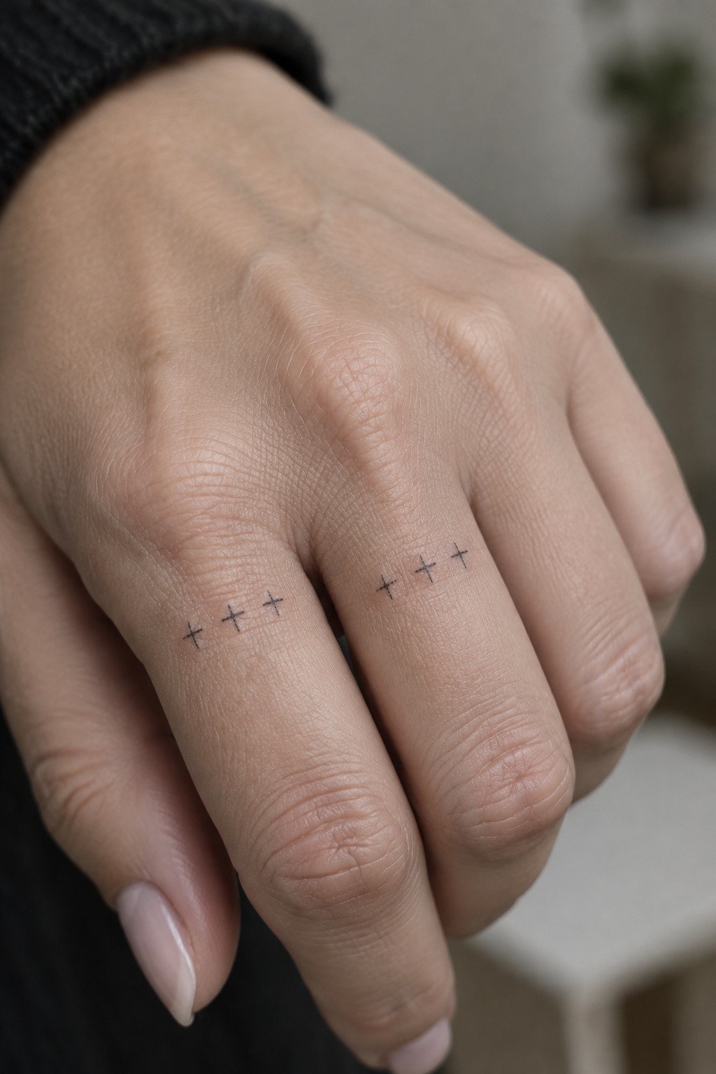
The crosses sit along the sides of the middle and ring fingers. Three marks appear on each finger in a simple row. This placement keeps the design narrow and contained on the hand.
The fine line approach works here because the symbols stay readable even when spaced out. I think putting them on these two fingers gives the tattoo a balanced look without filling too much space.
A vine tattoo along the side of the hand
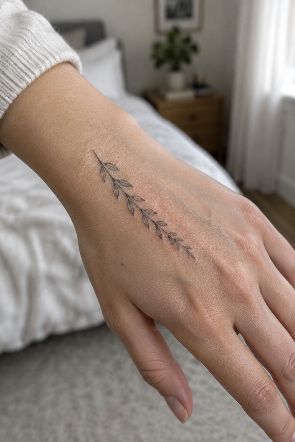
The design sits along the outer edge of the hand and runs toward the fingers. A single thin vine with small leaves keeps the whole piece narrow and contained. Fine line work holds the shape without adding bulk.
I picked this placement because the angle matches the natural line of the hand and avoids the areas that see the most movement. The light detail stays clear at this size without needing extra shading.
Paper airplane on the inner wrist
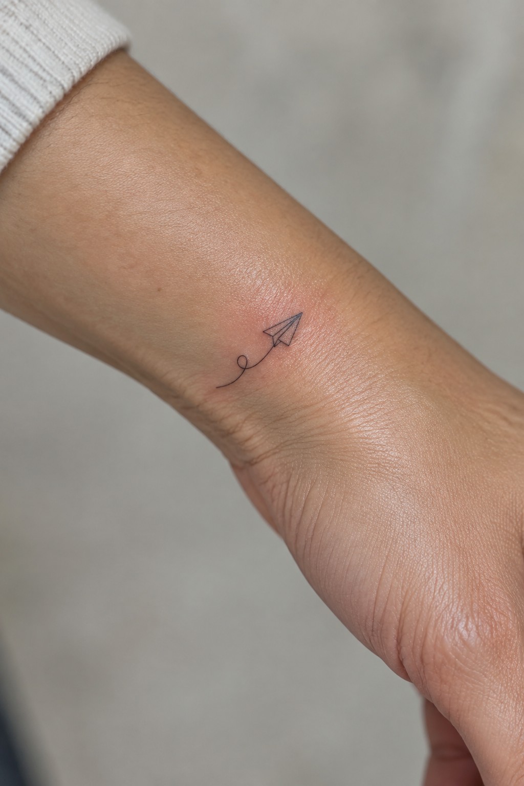
The inner wrist gives this paper airplane a clear path to sit flat and visible. The thin trail curves just enough to follow the natural line of the arm without extra detail. The whole design stays small and contained.
I like this placement because the tattoo stays easy to glance at yet simple to cover when needed. The fine line style keeps it from feeling heavy on a smaller area.
Frequently Asked Questions
1. How painful are fine line hand tattoos? Hand tattoos often cause more discomfort than other body areas because the skin is thin with many nerve endings nearby. Most women report a sharp scratching feeling during the session which lasts 20 to 60 minutes for simple symbols. Numbing creams can help reduce the sensation if your artist approves their use.
2. How quickly do black ink hand tattoos fade? Fine line designs on hands fade faster than tattoos elsewhere due to constant hand washing sun exposure and friction from daily tasks. Simple black ink symbols typically stay clear for three to seven years with good care before a touch up becomes useful. Avoiding harsh soaps and using sunscreen daily helps slow this process.
3. What aftercare works best for new hand tattoos? Clean the area gently with unscented soap twice a day then apply a thin layer of fragrance free moisturizer. Keep your hands dry as much as possible for the first two weeks and avoid rings or tight gloves that could irritate the fresh ink. Once healed apply broad spectrum sunscreen every morning to protect the symbols from fading.
4. How do I pick symbols that stay practical over time? Focus on small single line designs like dots waves or basic shapes that fit your hand size and lifestyle. Test the placement by drawing the symbol on your skin first and consider how it will look during work or social events. Women often choose timeless options such as a tiny crescent or initial that holds personal meaning without requiring frequent updates.
5. Can hand tattoos impact professional settings? Many workplaces now accept visible tattoos but conservative fields may still prefer covered hands. Simple black ink symbols on the side of a finger or near the wrist can be hidden with a ring or watch if needed. Research your industry norms and discuss placement options with your artist to keep the design both meaningful and adaptable.
