

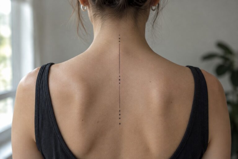
I love how these minimalist spine tattoos bring such a delicate elegance with their fine vertical lines. My own fascination with subtle body art makes me smile every time I spot one in the wild. They feel like a quiet secret that only reveals itself in the right light. I have to say these designs capture a playful yet refined vibe I wish more people would try.
A dotted line runs down the spine
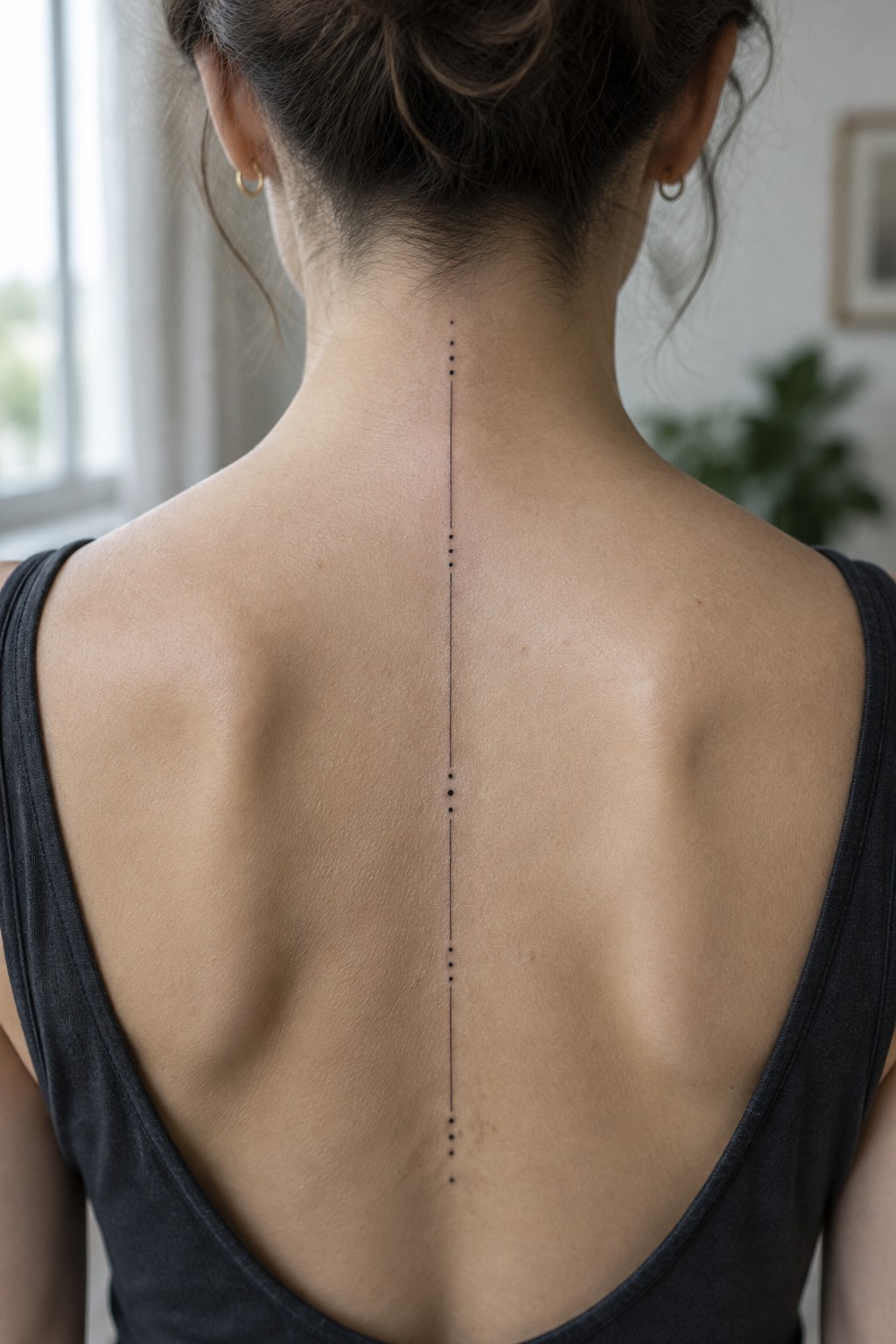
The tattoo follows the spine with a thin vertical line and evenly spaced dots. It starts at the base of the neck and extends down the center of the back. The narrow width lets the design sit flat without crowding the shoulders.
The dots break the line into segments that feel measured rather than plain. I think this approach keeps the tattoo readable while staying very simple. The spine placement gives the line a natural guide that needs no extra framing.
Three fine lines follow the spine
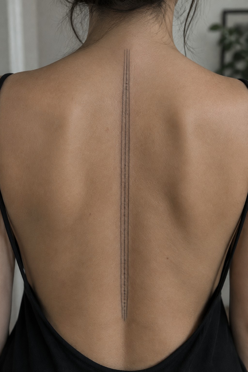
The spine creates a natural guide for these three parallel lines. They start near the base of the neck and run straight down the center of the back. Small dots break the lines at even intervals and add a light texture.
I think the narrow width works well here because it keeps the tattoo from spreading across the shoulder blades. The vertical format matches the body shape without needing extra details to hold it together.
Moon phases run down the spine
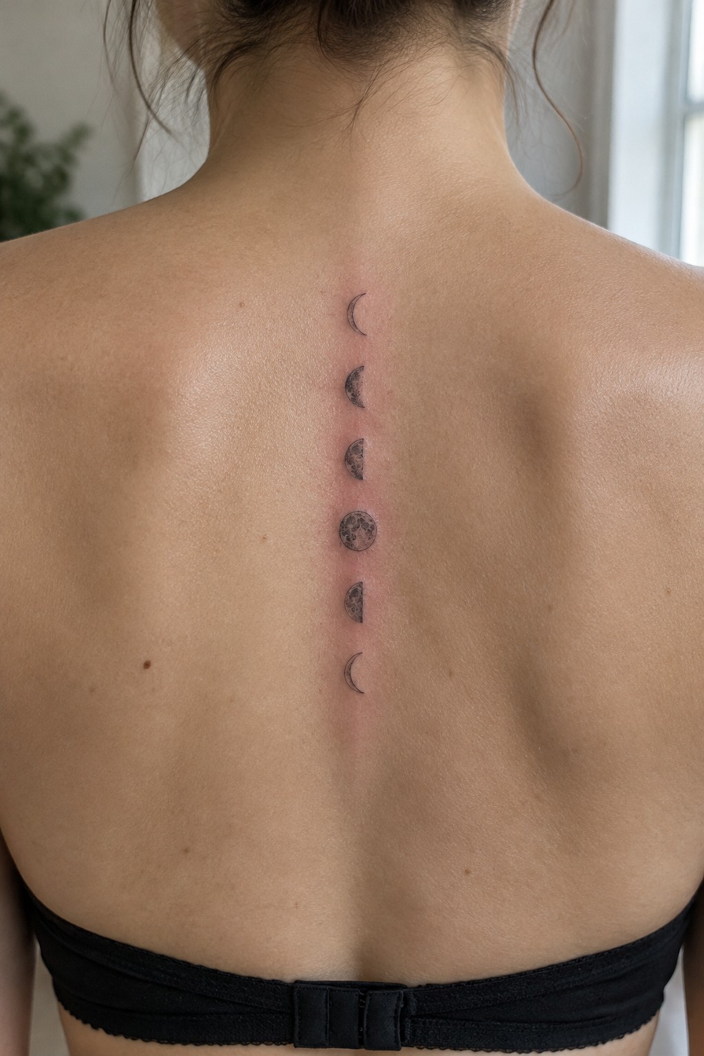
The spine works well for this sequence because it gives the moon phases a straight vertical path to follow. Each phase sits evenly spaced in a single column of fine black lines. The design stays compact and moves naturally with the body.
The thin linework keeps every phase distinct without any crowding. I think the even spacing is what makes the full cycle feel connected rather than scattered.
Thin vertical stem down the spine
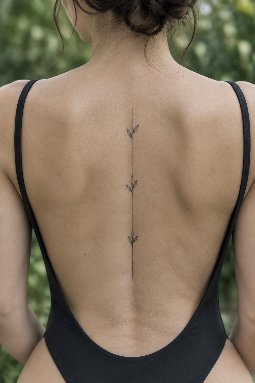
The tattoo follows the spine with one straight fine line. Small leaves attach at intervals along the stem to create a simple plant shape. The narrow width keeps the design clean and centered on the back.
I think the spacing between the leaves prevents the piece from feeling too empty or too crowded. It works because the thin line stays readable even as it runs the full length of the spine.
Triangles stack along the spine
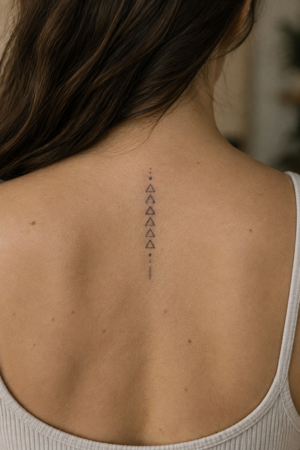
The tattoo sits centered on the upper spine. Small open triangles form a straight vertical column with even spacing. Dots sit at the top and bottom with a short line marking the end.
This placement keeps the whole piece narrow and contained. I think the vertical stack works because it follows the spine without needing extra width on either side.
A fine dotted line runs down the spine
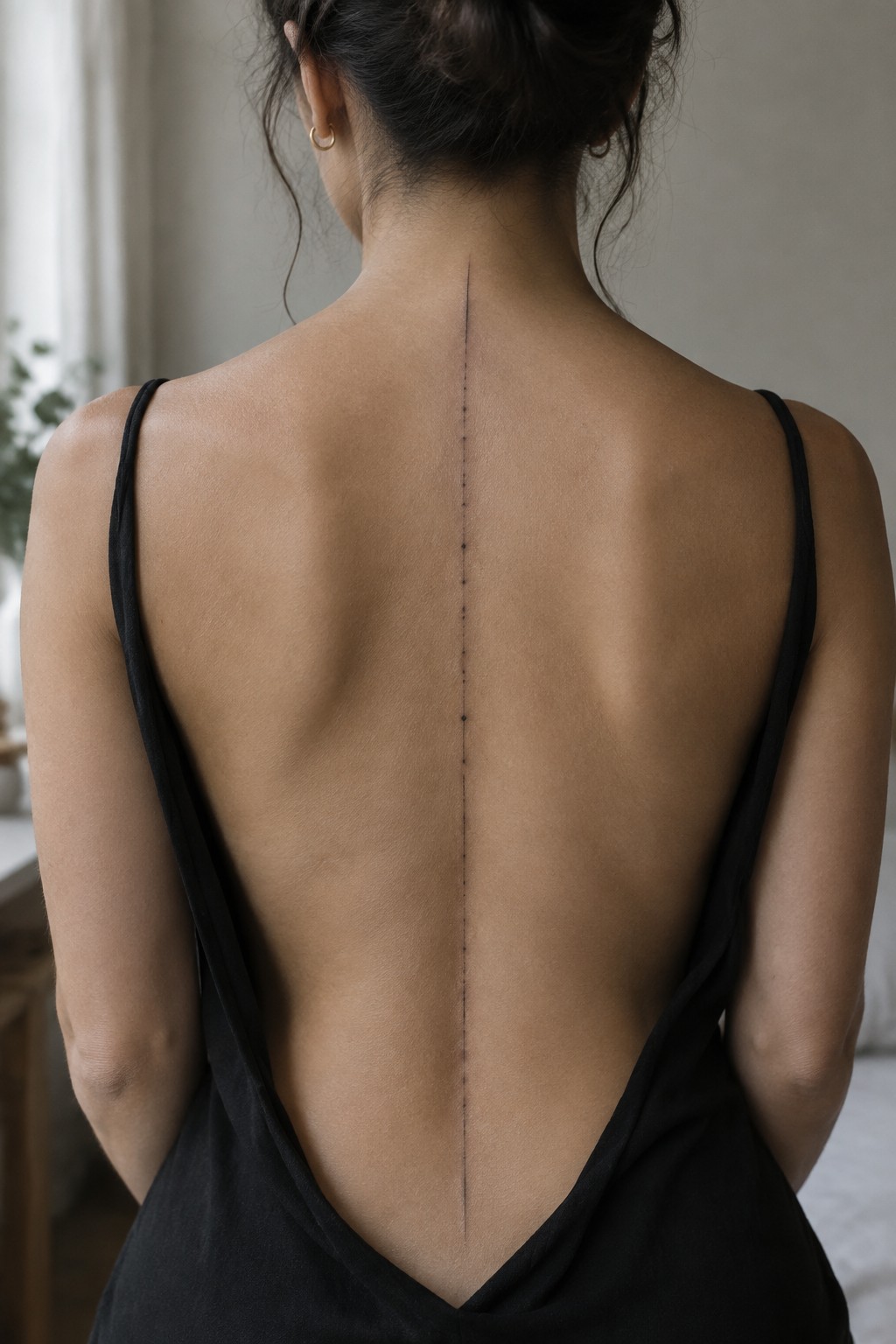
The spine placement keeps the dots perfectly straight from the neck to the lower back. Small dots create one long vertical mark without any extra detail. This approach stays true to minimalist linework.
I think the dots make the tattoo feel lighter than a solid line would. It suits anyone looking for a simple vertical element that stays subtle.
Text runs vertically down the spine
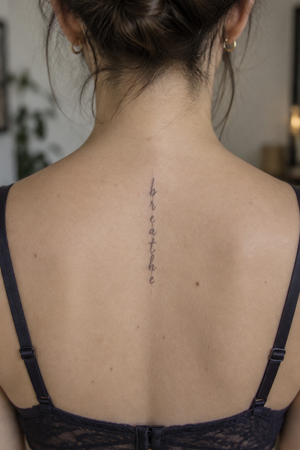
The spine gives this tattoo a straight path to follow. The word breathe sits in a thin script that moves from the base of the neck downward. The letters stay small and evenly spaced so the design stays simple.
I think the vertical layout works because it matches the natural line of the back without adding extra shapes. A short word like this also keeps the tattoo from stretching too far or losing clarity.
Three arrows follow the spine in a straight line
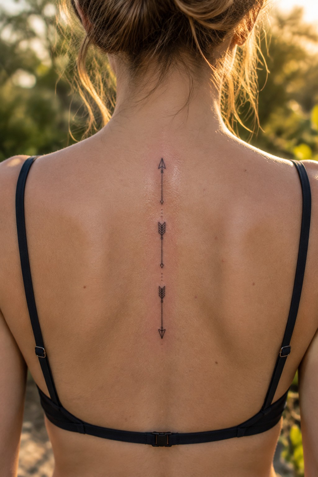
The spine gives this design a built-in guide that keeps everything straight. Three arrows stack in a narrow column with small dots marking the gaps. The top arrow points up while the lower two point down.
The spacing leaves enough room for the design to stay readable as the back moves. I think the simple arrow shapes add just enough direction without crowding the area.
A dotted line down the spine
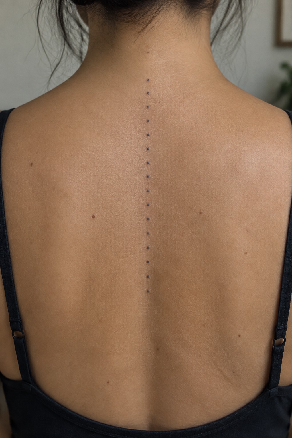
The dots sit in a single straight row along the center of the back. They start near the base of the neck and continue down the spine in even spacing. This placement lets the design follow the body’s natural center line without added shapes or curves.
I think the dot style keeps the tattoo from feeling heavy even though it runs a long distance. The simple vertical format works because it uses the spine itself as the guide rather than trying to create a separate shape.
Crescent moons line up along the spine
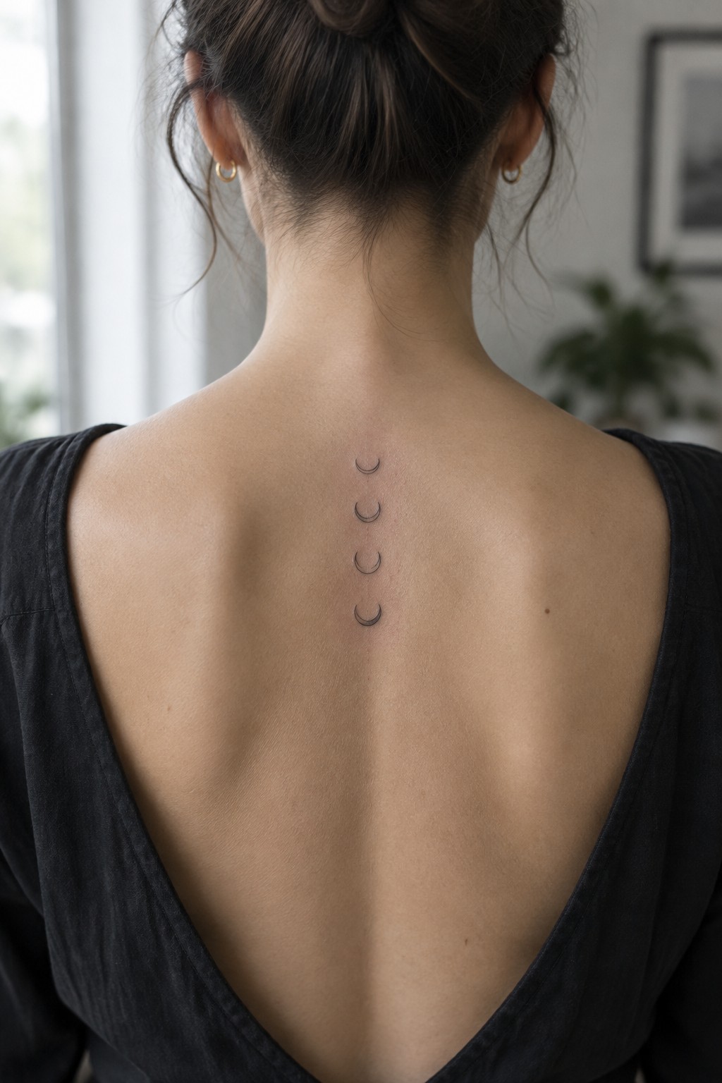
The tattoo places four crescent moons in a straight vertical row down the spine. They start between the shoulder blades and continue downward in even spacing. The fine linework keeps each moon light and minimal.
This setup works because the spine gives the design a built in center line to follow. I think the simple stacking keeps the whole thing balanced without extra elements.
A thin line follows the spine
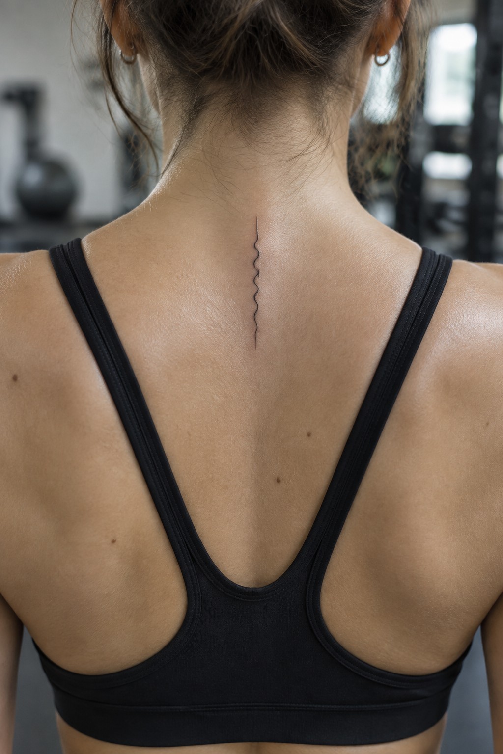
The spine gives this tattoo a clear path to stay centered and narrow. A single fine black line runs down the upper back with one gentle wave near the top. The vertical format keeps everything simple and contained.
The wave breaks up the straight drop without adding bulk. It works because the line stays readable at this small size while still marking the center of the back.
Celestial symbols follow the spine
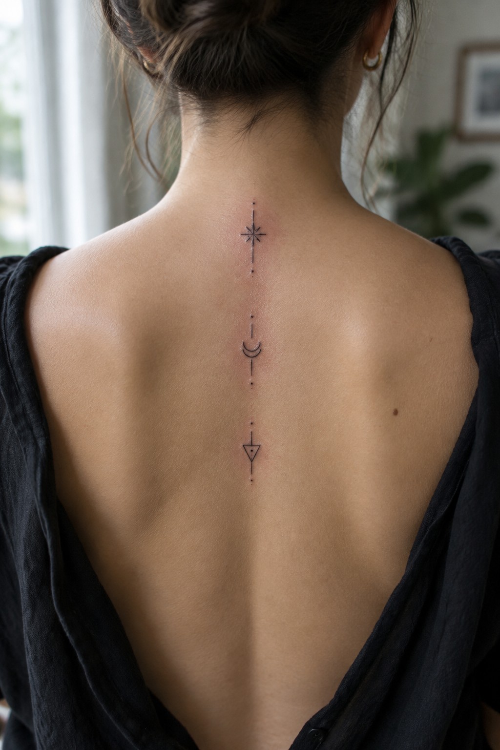
Placement on the spine supports this tall narrow design. The star sits near the neck. Dots connect it to the crescent moon and the triangle below.
The gaps between symbols prevent the tattoo from looking cramped. This approach keeps the focus on the shapes themselves.
Thin lines follow the spine
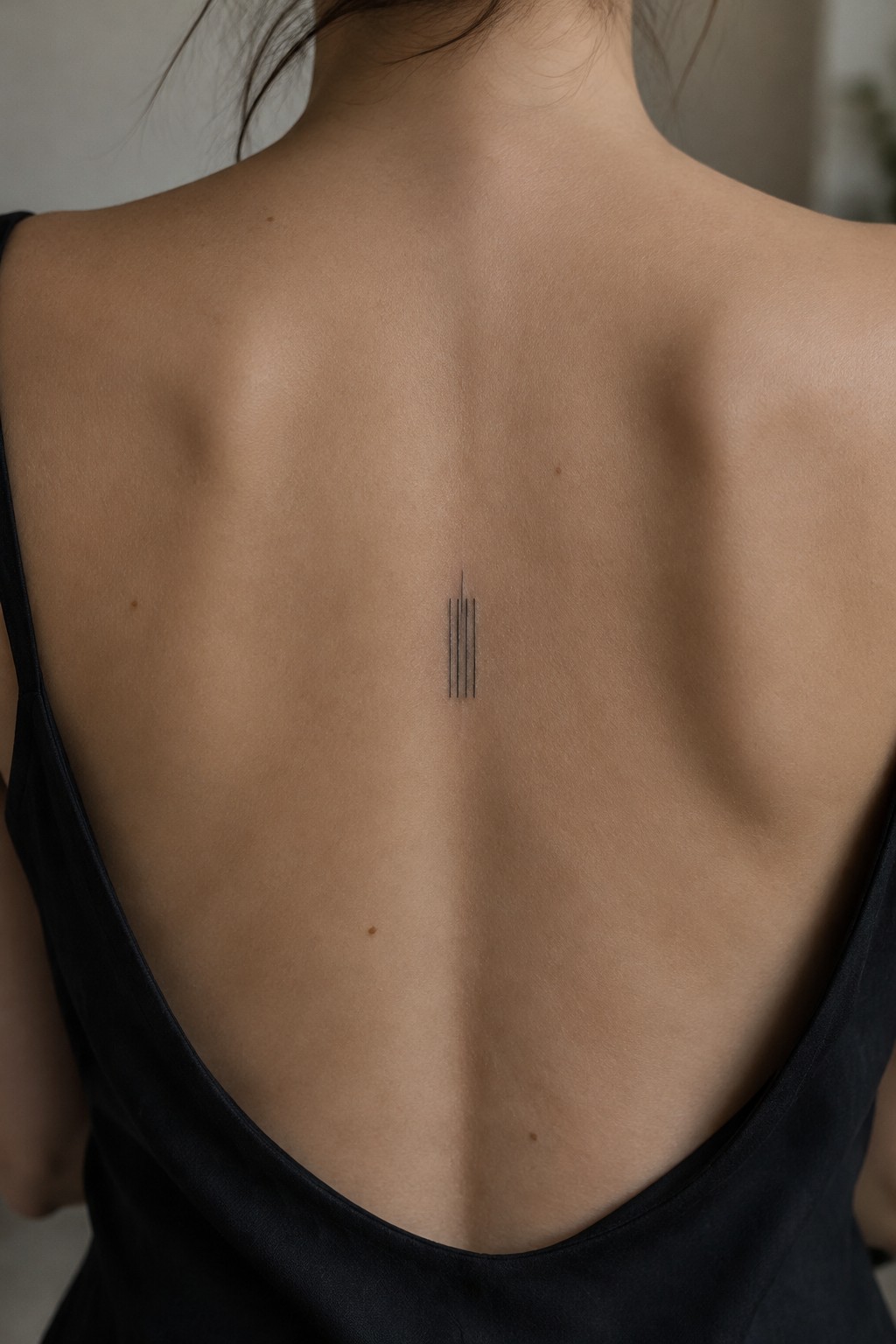
Four fine vertical lines sit centered on the upper spine. They run in a tight group between the shoulder blades with slight length differences. The fine black ink keeps the whole piece small and simple.
This placement lets the lines echo the spine’s natural direction without added elements. I think the vertical stack works because it stays clear and balanced even when kept compact.
symbols line up along the spine
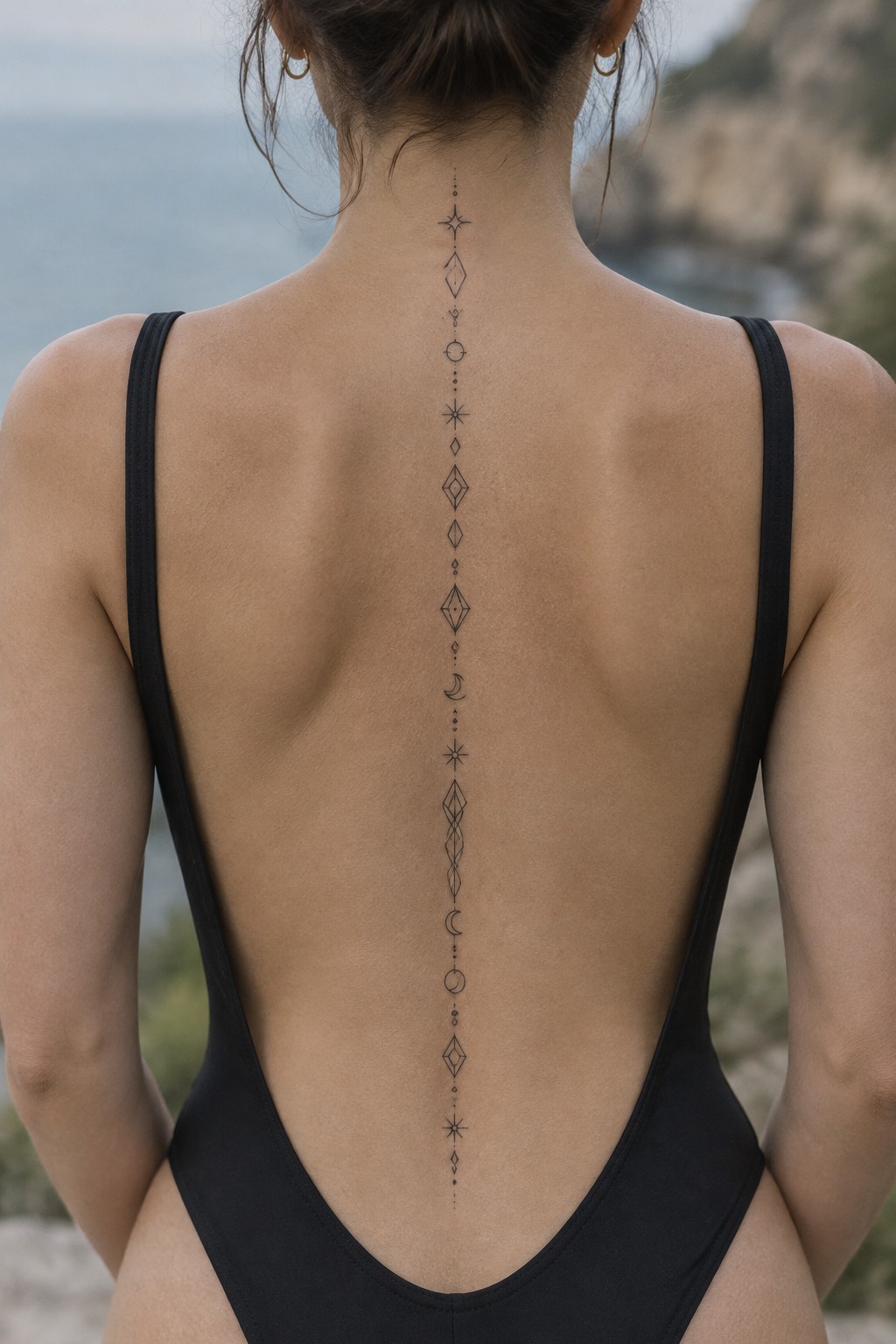
The tattoo follows the spine in one continuous vertical line. Small geometric shapes and moon symbols repeat down the center of the back with even spacing. Fine black lines keep the whole piece narrow and contained.
I think the repetition works because each shape stays simple enough to read from a distance. The moons break up the diamonds just enough to add interest without crowding the line.
Three hearts follow the spine
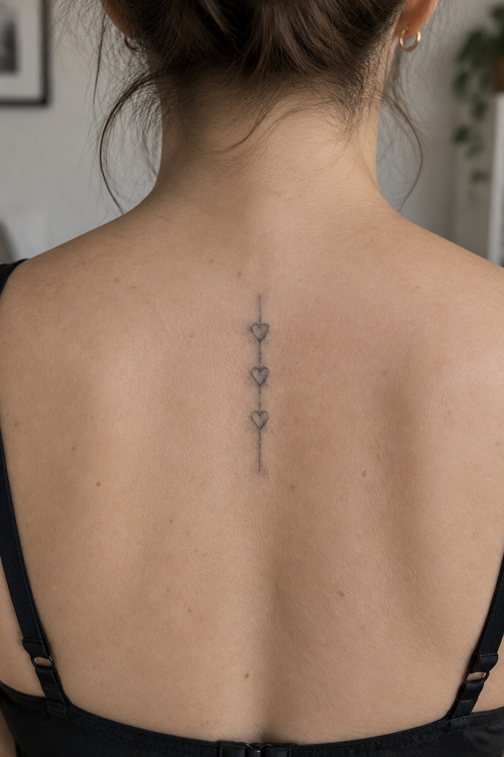
The tattoo sits along the upper spine in a straight vertical line. Three small hearts sit evenly spaced on that line with a short extension above and below. The fine linework keeps everything narrow and simple.
This placement works because the spine gives the design a clear center to follow. The hearts stay readable without needing extra detail. I think the even spacing prevents the piece from feeling too tight or scattered.
A constellation runs down the spine in fine lines
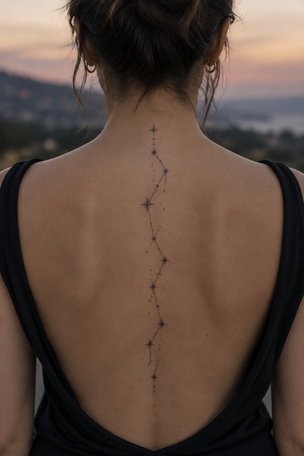
The tattoo places a series of stars linked by small dots in one straight vertical path. It starts at the upper back and continues toward the lower spine with even spacing throughout. The fine linework keeps each star simple and clear without extra detail.
This layout works because the vertical shape follows the spine directly. The scale stays readable without crowding the narrow area. I think the connected dots give it just enough structure while the stars prevent it from looking too plain.
Vertical line at the nape of the neck
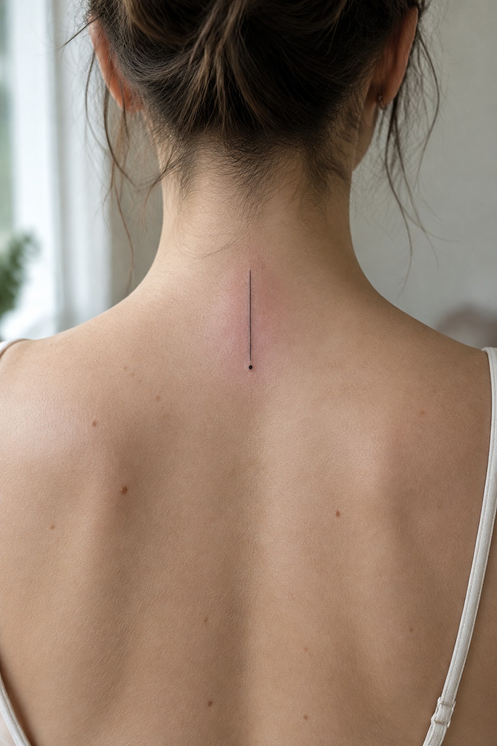
The tattoo sits right at the base of the neck along the spine. A single fine black line runs straight down and ends in a small dot. The whole piece stays compact and sits centered on the skin.
This placement works because the neck gives the line a clean path without extra curves to fight. The thin scale also keeps it from overpowering the area. I think the vertical direction feels natural here since it matches the spine’s own line.
Lotus flowers running down the spine
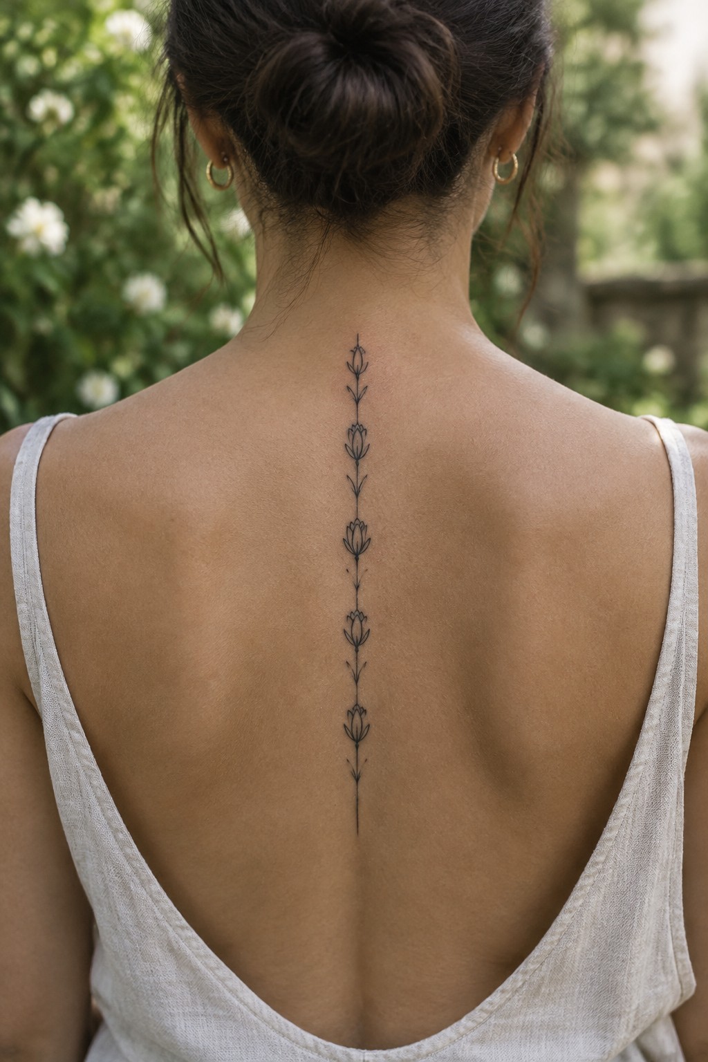
The spine gives this design a clean path to follow without extra framing. Each lotus sits one above the next in a narrow column that stays centered and balanced from the upper back down toward the lower spine. The fine lines keep the flowers light so the tattoo does not feel heavy or crowded.
I like how the simple stems and small leaves connect the blooms without adding bulk. The spacing feels even, which helps the whole piece read clearly even at this length.
Dots line up vertically along the spine
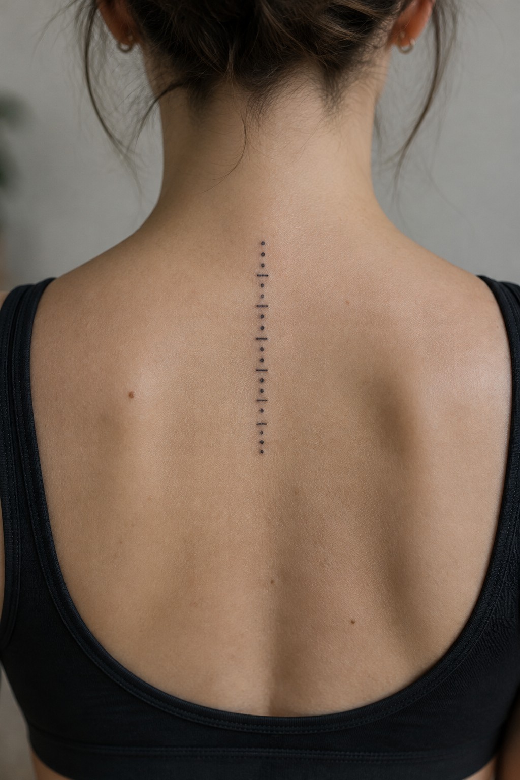
The spine gives these dots a built in guide. A single column of small black dots runs down the center of the upper back in even spacing.
The narrow vertical shape fits the area without spreading wide. It stays simple enough to read clearly while still marking the line of the back.
Spine tattoo with mandala at the top
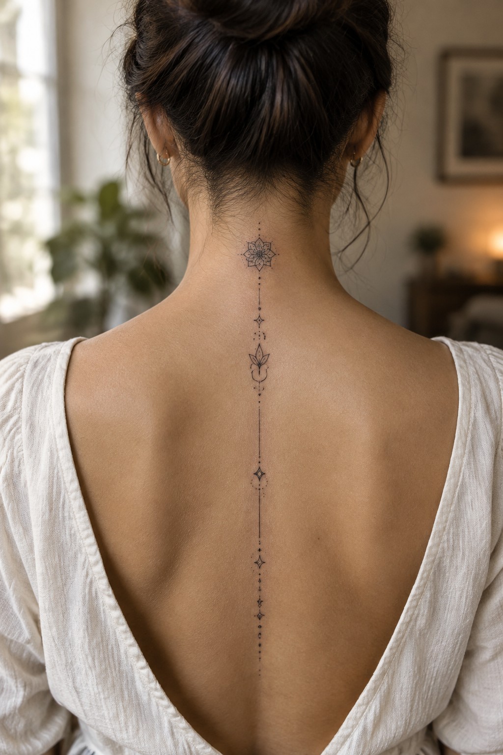
The spine placement lets this design run straight down the back in one narrow column. A small mandala sits near the neck and the line of dots and symbols follows below it without spreading wide. The vertical layout keeps every element aligned and easy to read from a distance.
I think the narrow width works well here because it leaves plenty of skin around the edges. The choice of simple motifs also stops the tattoo from feeling busy even though it covers some length.
Small chevrons run down the spine
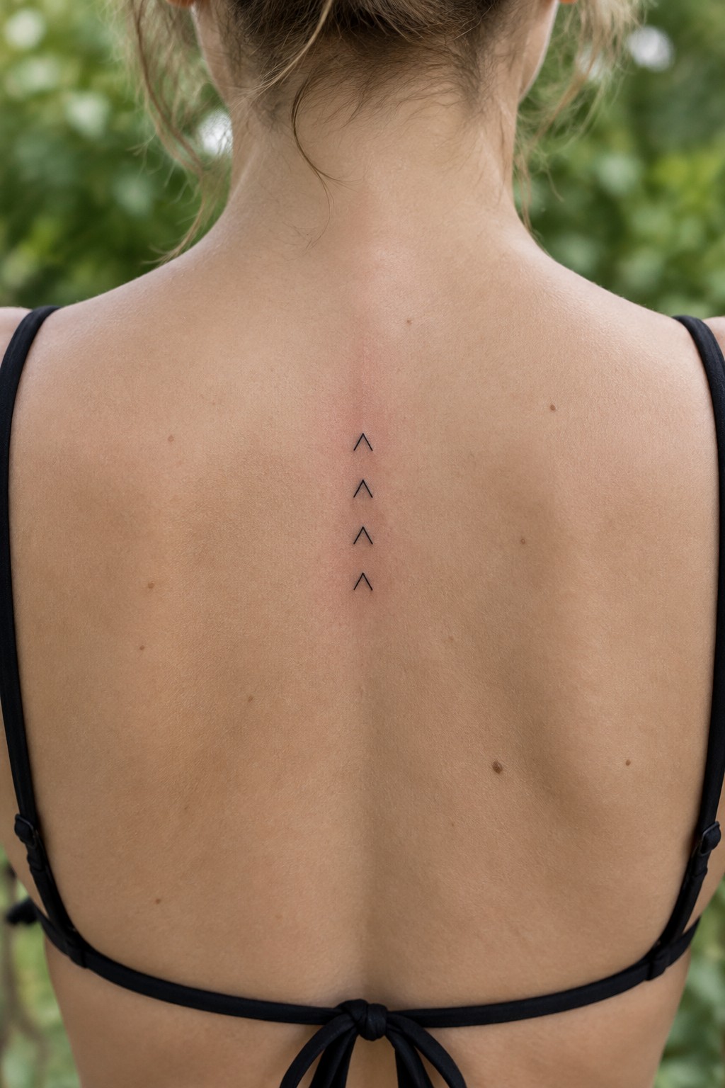
The spine gives these four chevrons a straight path to follow. Each shape uses thin black lines and points upward in a short stack. The design stays small and sits centered on the upper back.
The spacing between the shapes keeps things balanced without crowding the area. I think the simple repeat works because it does not need extra elements to feel complete.
Minimalist spine tattoo with fine line details
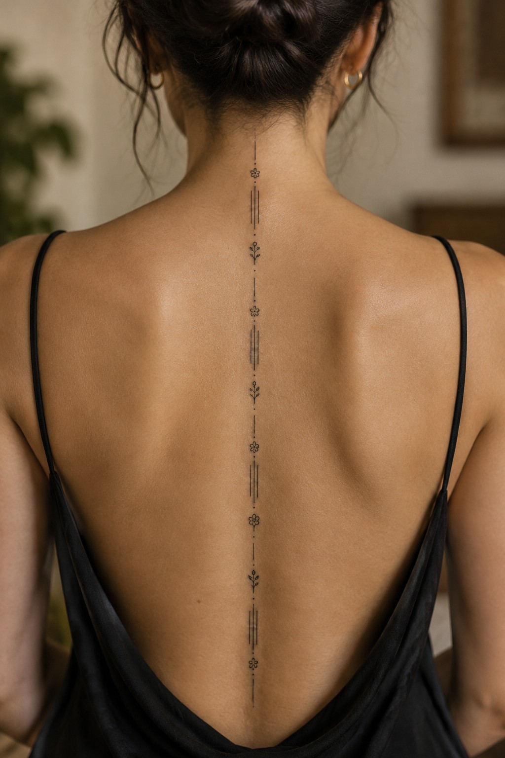
The design runs straight down the center of the back along the spine. Thin vertical lines connect small flower shapes and dots that repeat at regular intervals. This layout keeps the tattoo narrow and contained while still covering a long stretch of skin.
I think the vertical flow works because it matches the shape of the spine without any extra framing. The spacing between elements also helps the piece stay balanced from top to bottom.
Symbols stacked vertically on the spine
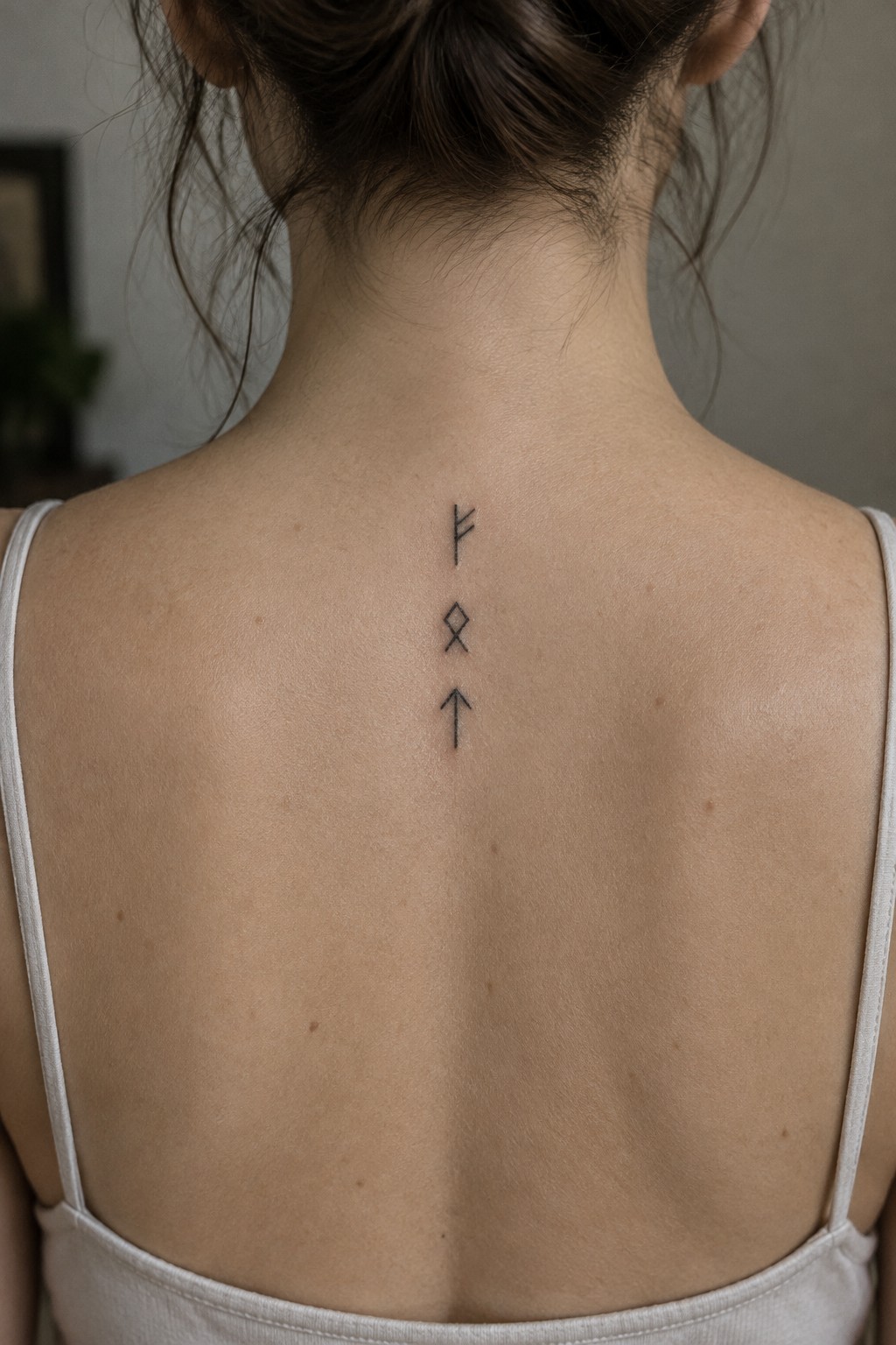
The tattoo sits right along the spine on the upper back. Three separate symbols are placed in a straight vertical row with even spacing between them. Fine black lines keep the whole thing simple and narrow.
The vertical layout fits the natural line of the spine without needing extra detail. It stays readable at this size while leaving plenty of skin around it. I think the even gaps help it feel settled rather than cramped.
Frequently Asked Questions
What is the typical pain level for a minimalist spine tattoo with fine vertical lines?
The spine is one of the more sensitive areas due to thin skin and proximity to bone, so expect moderate to high discomfort during the session. Fine vertical linework often requires less time than dense shading, which can shorten the overall experience. Many women report that breathing steadily and taking short breaks helps manage it. Discuss numbing options with your artist ahead of time if you have a low pain tolerance.
How should I care for a spine tattoo during the healing phase?
Keep the area clean with gentle soap and water, then apply a thin layer of fragrance-free moisturizer several times a day. Avoid tight clothing that rubs the spine for the first two weeks, and sleep on your side or stomach if possible. Fine linework can scab lightly, so resist picking at it. Full healing usually takes three to four weeks, and sun protection is essential afterward to preserve the crisp lines.
How do I select a design that suits my body and lifestyle?
Consider your spine length and natural curves when choosing vertical elements, as elongated lines can create an elegant flow. Look at your daily wardrobe to ensure the tattoo stays mostly covered if desired for professional settings. Test placement with a temporary stencil first. Fine vertical linework works well for subtle personalization, such as incorporating birthdates or coordinates without adding bulk.
Do fine line spine tattoos require frequent touch-ups?
Fine lines can fade slightly over time, especially in areas with more movement or sun exposure, but proper aftercare and quality ink help them last longer. Schedule a touch-up session around the one-year mark if any lines appear lighter. Artists skilled in this style often recommend annual check-ins for the first few years to maintain the minimalist look.
What factors should I weigh when choosing an artist for this style?
Seek artists who specialize in fine linework and have a portfolio of healed spine examples, as fresh photos do not always show how lines settle. Verify their hygiene standards and comfort with delicate placements on women. Request a consultation to discuss your skin type and any concerns about scarring, which can affect vertical line clarity.
