

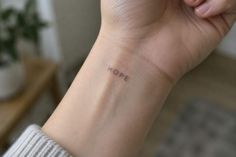
I love how minimalist word tattoos keep things simple yet powerful.
My go to style for ink is always the clean and readable kind.
If you are into designs that tell a story without extra fluff these will be right up your alley.
Some people love elaborate art but short lettering has my heart for its elegance.
There are 18 fresh ideas here that showcase the best of this trend.
Hope on the inner wrist
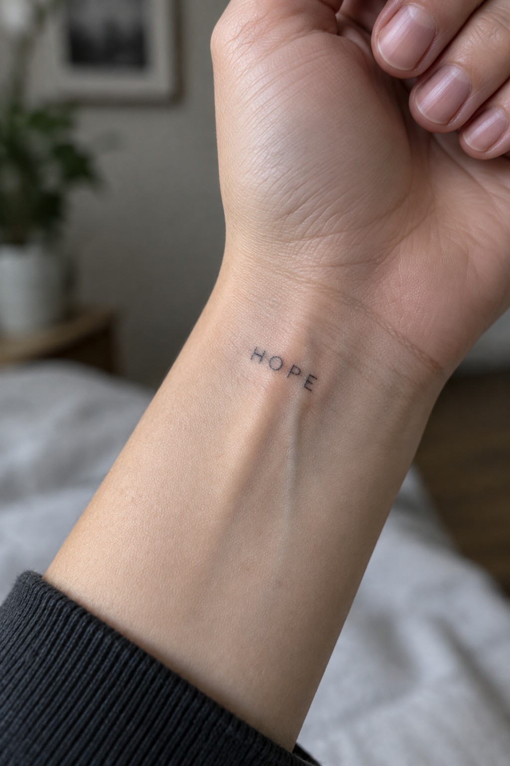
The word hope sits on the inside of the wrist in simple black lettering. This placement keeps the text flat against the skin so the letters stay even and easy to read. The small size fits the area without stretching or crowding.
I think the clean font choice makes sense here because it keeps the focus on the word itself. The wrist works well for short text since the skin does not move much and the tattoo stays visible in most positions.
A cursive breathe tattoo on the inner forearm
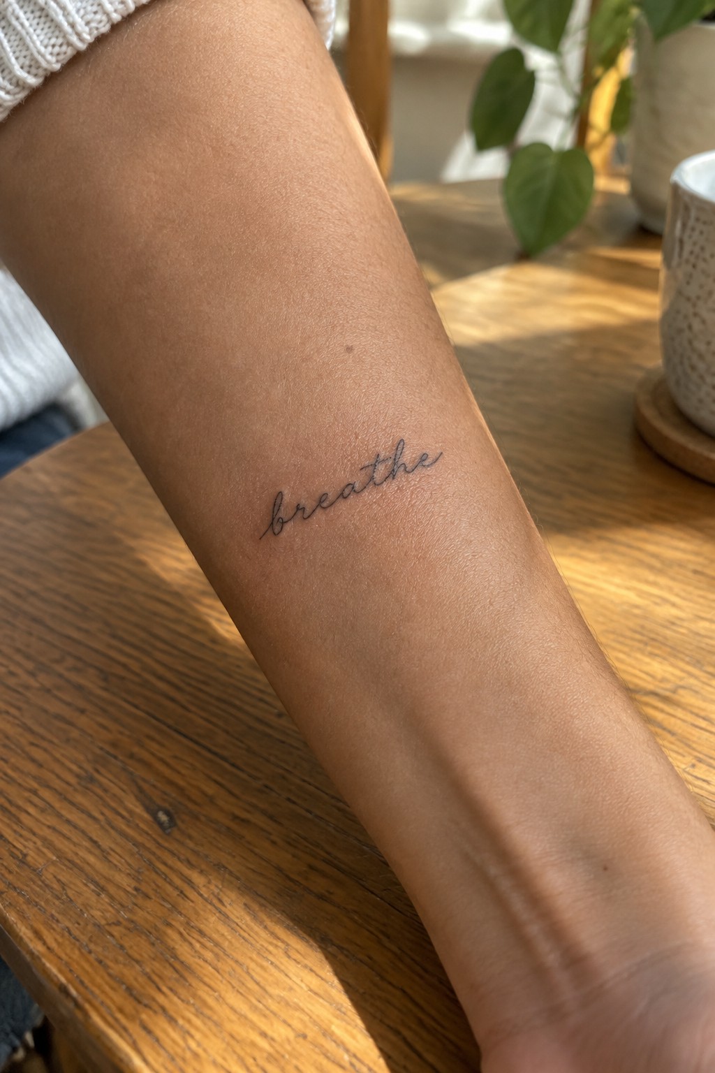
The word breathe appears in thin script along the inner forearm. This placement lets the lettering follow the natural line of the arm while staying visible in most positions. The small scale keeps the design simple and contained.
I think the inner forearm works here because the script remains clear without extra elements. It turns a short word into a reminder that feels personal but not overstated.
Small love tattoo on the ribs
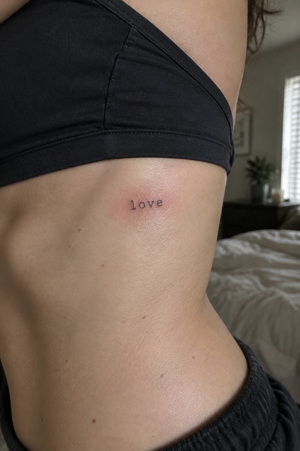
The word sits on the side of the torso in a spot that stays covered most of the time. A small script like this keeps the tattoo private until the person chooses to show it. The fine lines stay clear without needing much space.
I think the placement makes sense because the word does not fight against the natural shape of the ribs. It feels like a quiet choice rather than something meant to stand out.
Small free lettering on the ankle
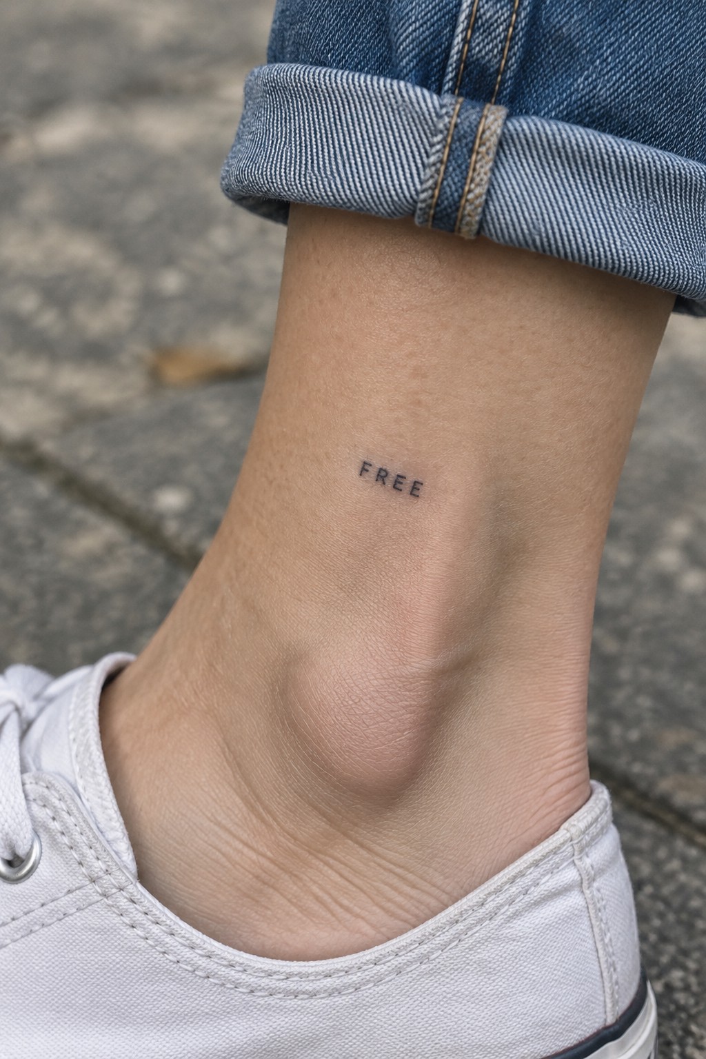
The ankle gives short words enough room without crowding. This tattoo uses thin block letters spaced evenly so each character stays clear even at a small scale. It rests just above the shoe line where it shows with sneakers or low socks.
I think the narrow width of the letters helps the design sit comfortably on that curved area. The placement also lets the person decide how often they want it visible during daily wear.
stay on the ring finger
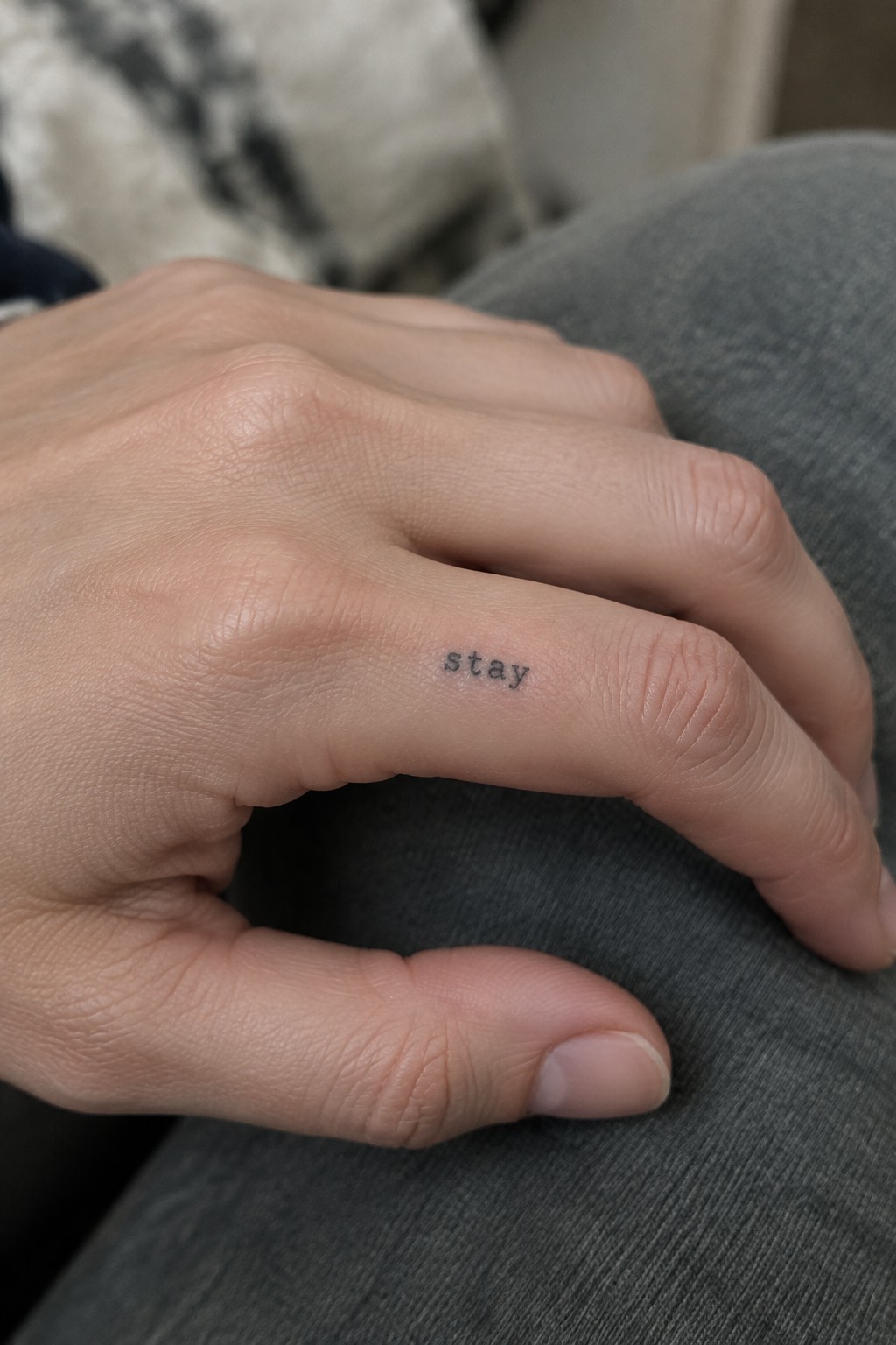
The ring finger gives this tattoo a narrow strip of skin that works well for short words. The lettering sits along the side in a clean lowercase font. Its small scale keeps the design from competing with the finger itself.
This spot works for someone who wants a daily reminder that stays mostly private. The placement lets the word remain visible to the wearer without drawing much attention from others.
Small word tattoo along the collarbone
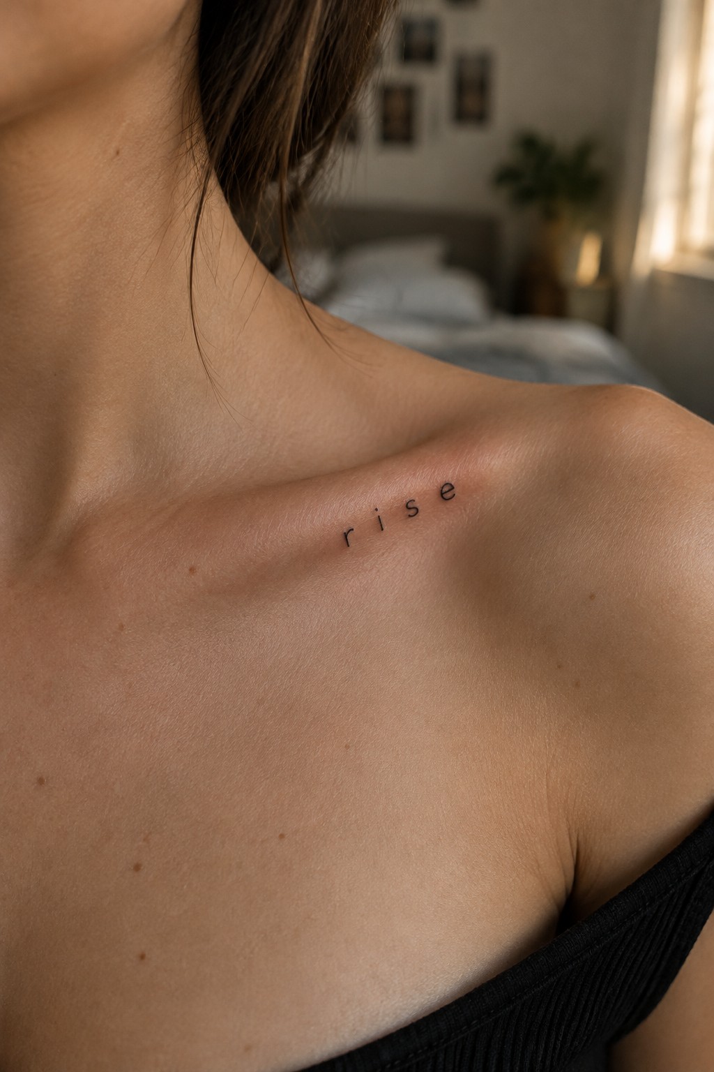
The tattoo rests along the collarbone in thin lowercase letters. The word spreads out with even spacing between each letter. This placement lets the text follow the bone line without bunching up.
I think the spacing works well here because it keeps the design open and clear on that flat area. The small scale also matches the narrow width of the collarbone itself.
calm tattoo behind the ear
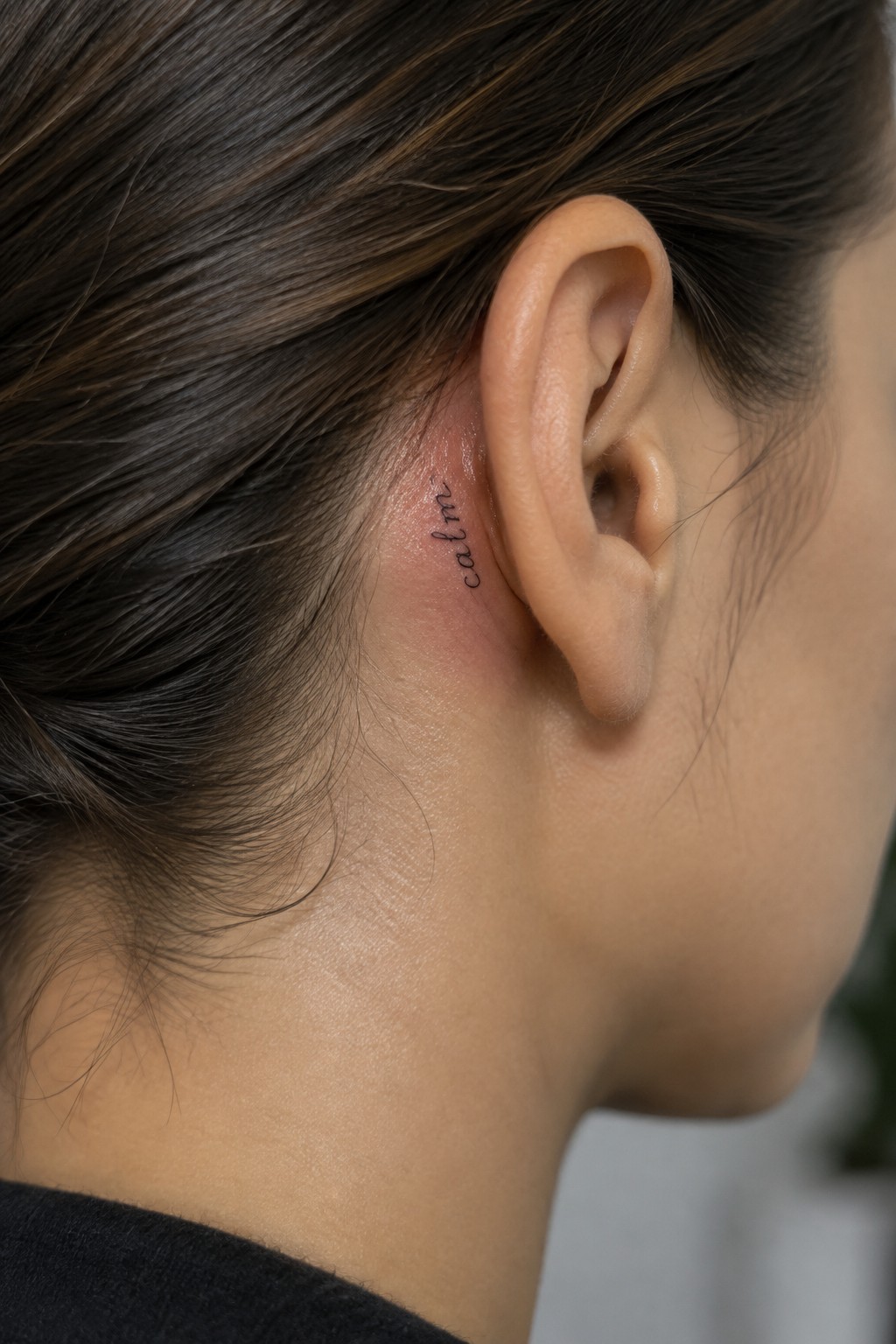
The word calm sits in a thin cursive script right behind the ear. The lettering stays compact enough to fit the narrow strip of skin without spreading out. Hair can cover it completely on most days.
I think the spot works well because it keeps the design private while still allowing the word to be noticed up close. The small scale prevents the tattoo from feeling crowded in that area.
Script lettering on the thigh
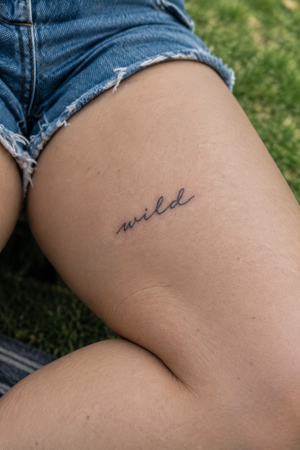
The upper thigh gives a short word like this a clean place to sit. The skin stays mostly flat there so the lettering does not get pulled or distorted. The size stays small enough to feel personal rather than bold.
I think the script works because it stays readable without extra flourishes. The placement also lets the tattoo stay covered most of the time unless someone chooses to show it.
Vertical text on the upper arm
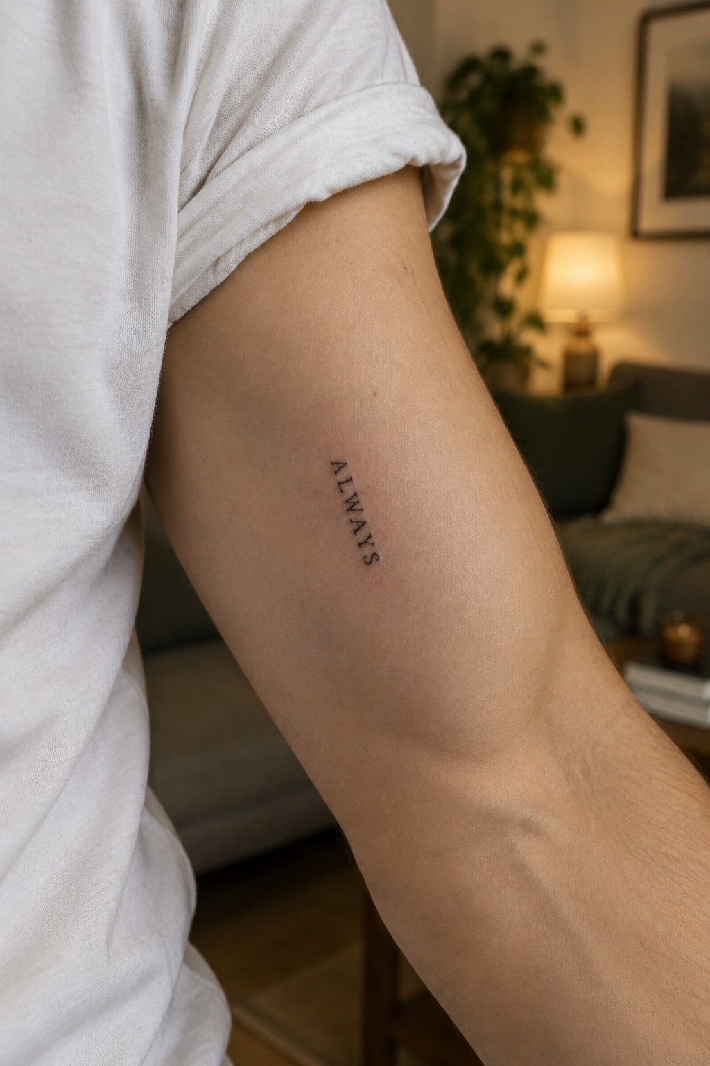
The tattoo sits vertically along the inner upper arm. It spells always in thin clean letters that run in a straight line. This setup keeps the design narrow and contained.
The vertical placement fits the arm’s natural length so the word stays compact. It reads clearly without needing extra space or detail.
Word tattoo on the side of the hand
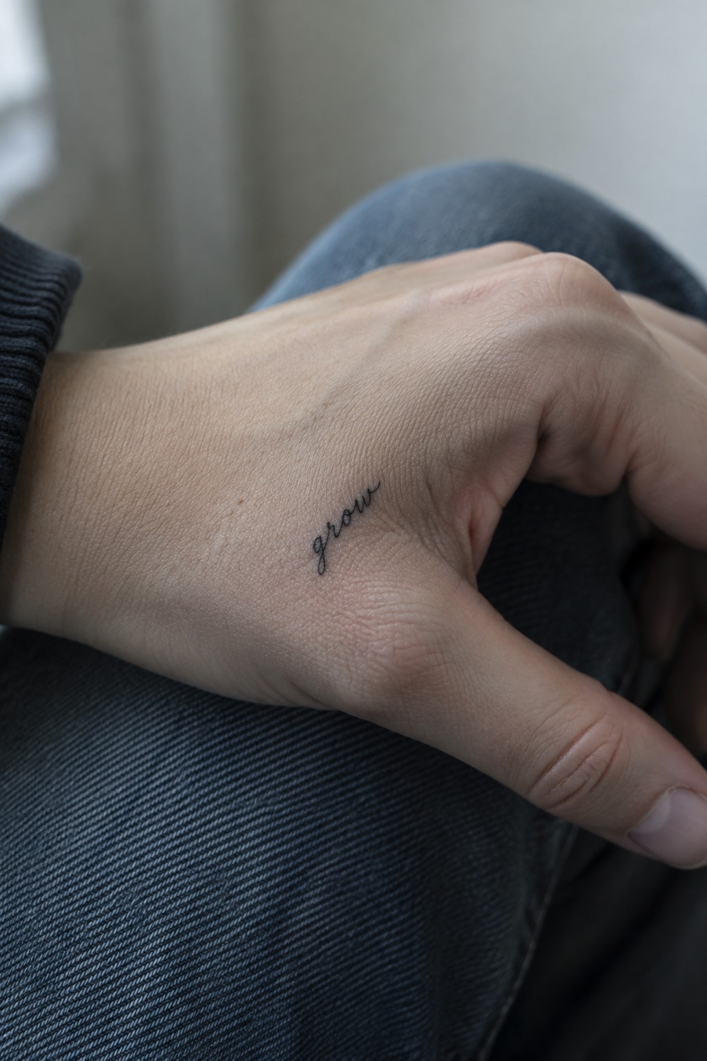
The tattoo sits on the outer edge of the hand near the thumb. It shows the word grow in a thin cursive script. The letters stay compact and flow in a single line.
This spot keeps the design visible without much effort. I think the small scale fits the area well because it avoids crowding while still showing up clearly during normal hand movements.
Trust tattoo on the upper arm
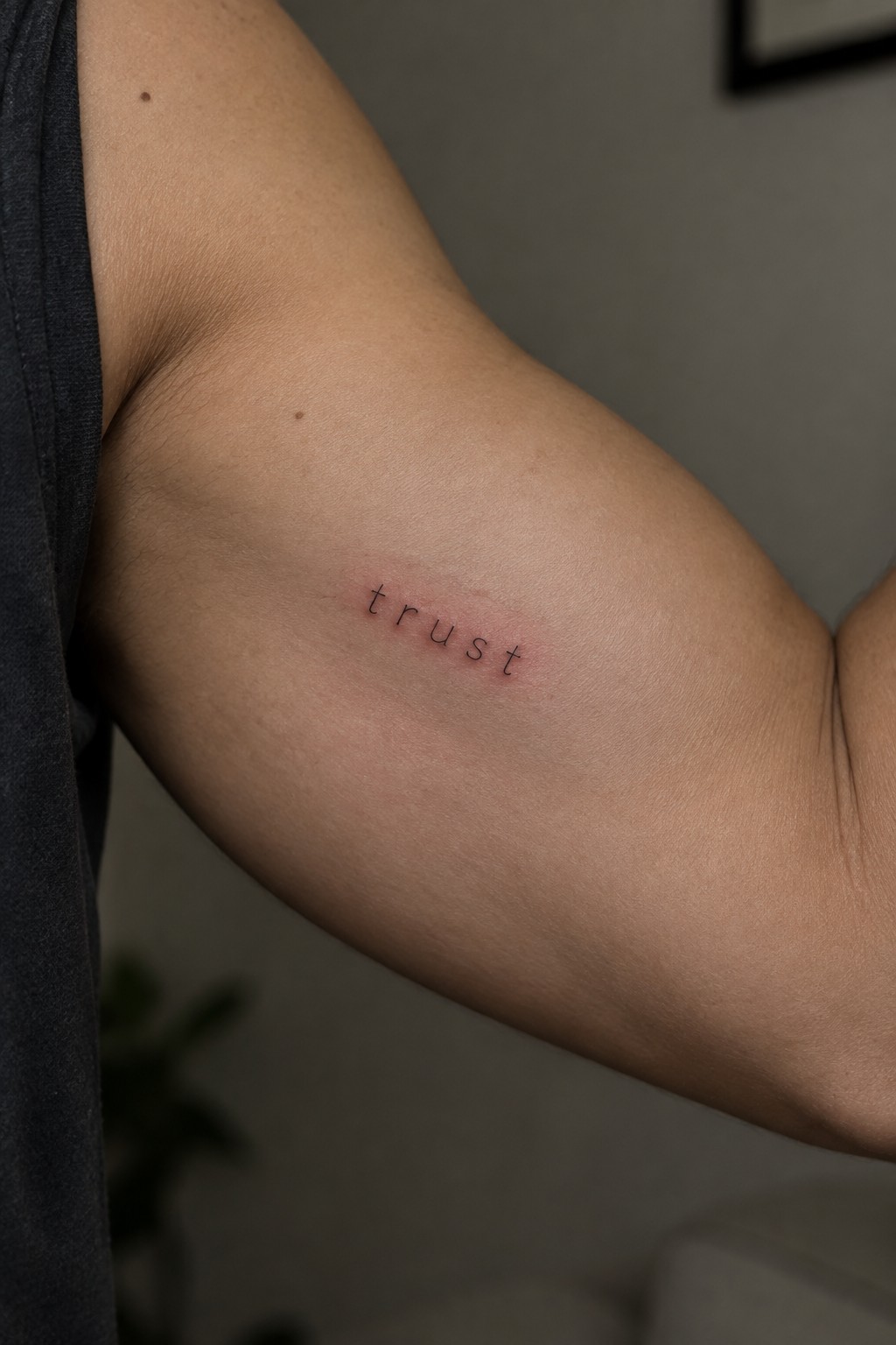
The word sits in thin lowercase letters along the inner upper arm. A simple sans serif font keeps the text clean and compact. The small size fits the area without crowding the skin.
This works because the letters stay readable even without any extra weight or decoration. I would pick it for a personal reminder that does not need to draw attention.
hope in script on the hip
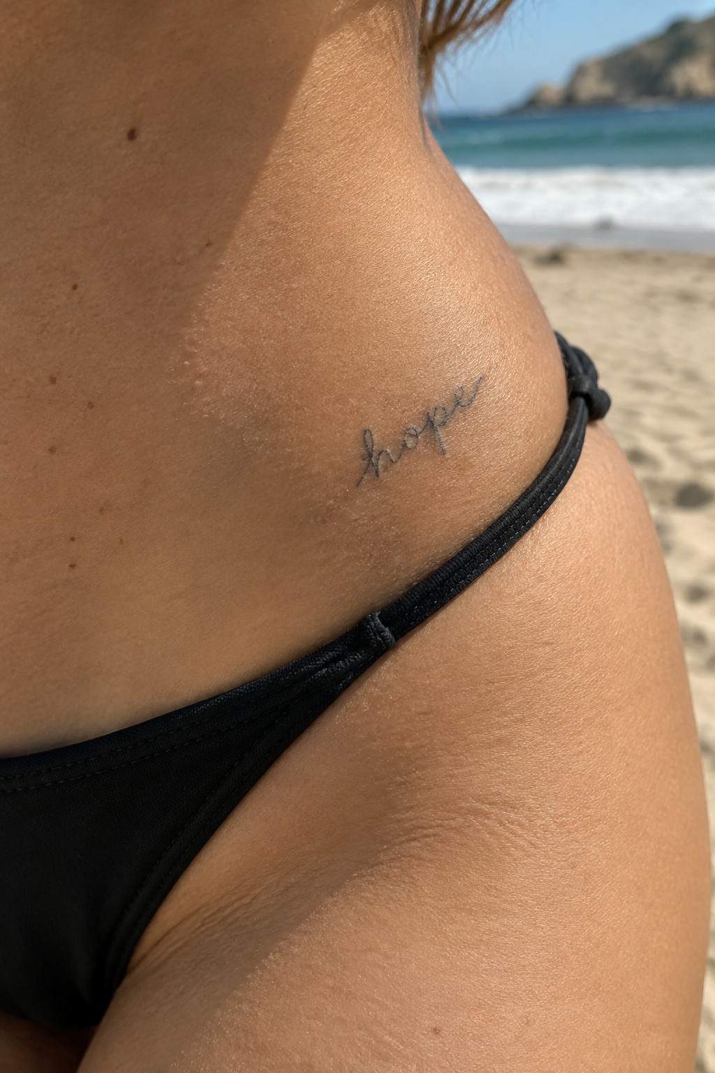
The hip gives this tattoo a natural spot that stays mostly private yet easy to reveal. The small lettering sits along the curve just above the waistband line. That placement keeps the design visible in swimwear without demanding attention in regular clothes.
The script stays light and flowing without extra swirls or weight. I think this choice makes the word feel personal instead of decorative. It suits someone who wants a simple reminder rather than a statement piece.
A word placed vertically on the neck
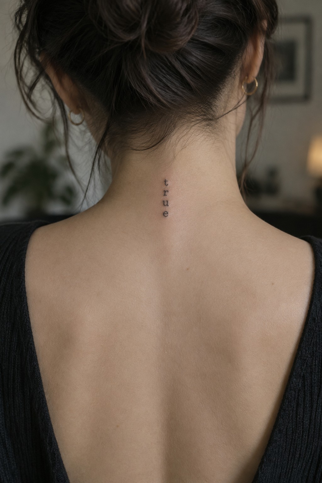
The tattoo sits centered at the base of the neck along the spine. Hair often covers it, but the word shows clearly when the hair is up. The letters are thin and spaced evenly in a straight line.
I think the vertical format keeps the design from feeling cramped in that narrow spot. It stays readable without any extra lines or shading.
Script lettering on the shoulder
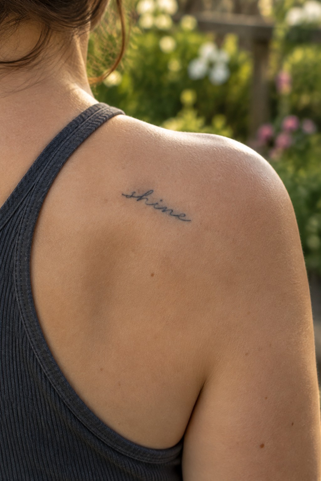
The tattoo sits on the upper shoulder near the edge of the tank strap. A short word works well here because the area gives it a flat surface without much interference from body movement. The thin script stays compact and easy to read at this size.
I think the placement makes sense for someone who wants the word visible from behind but not across a larger area like the back or ribs. It keeps the focus on the lettering itself.
Joy tattoo on the ankle
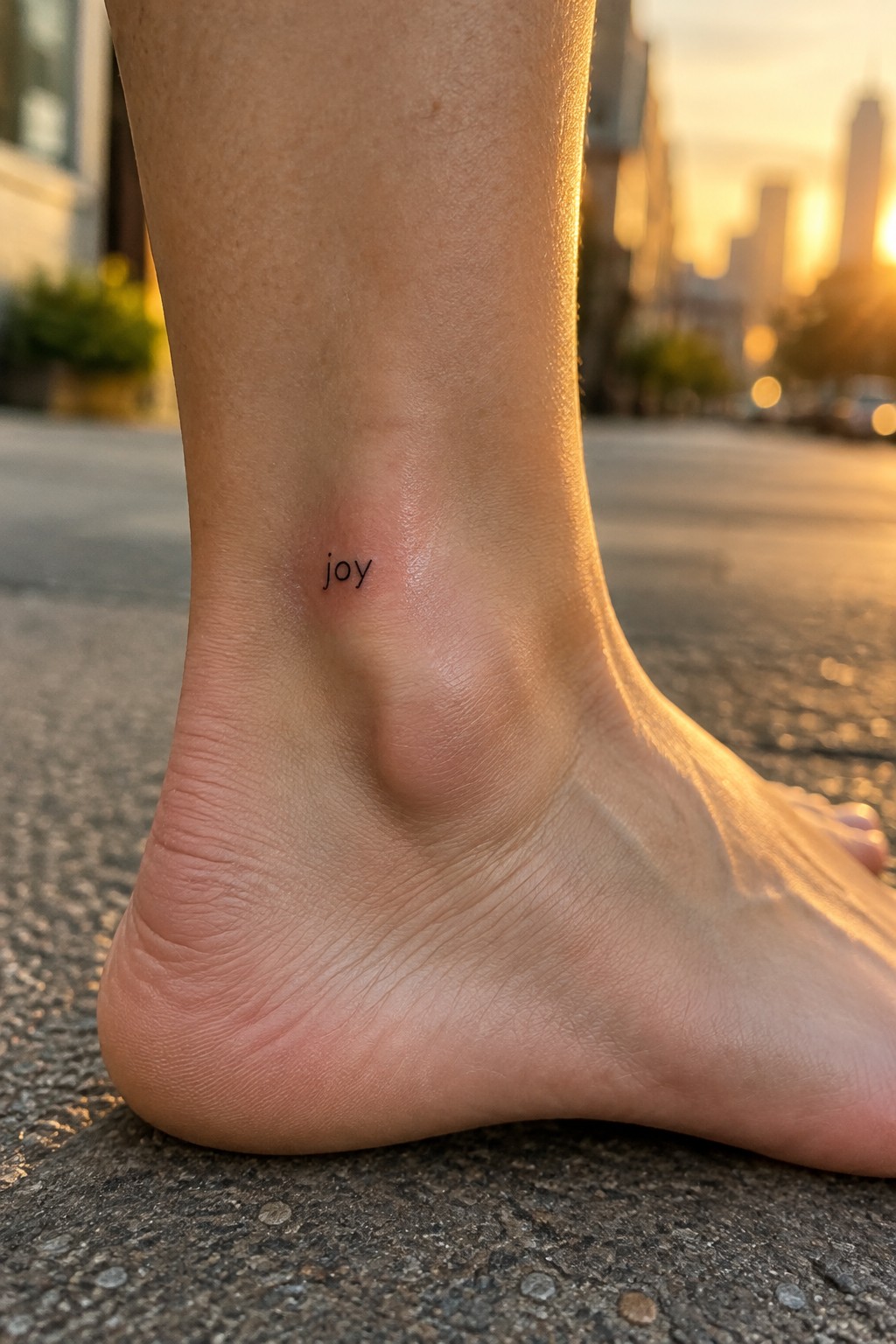
The ankle gives this word a quiet place that shows up during certain movements but stays low key most of the time. The small letters follow the natural line of the bone and stay clear without extra spacing or weight.
I think this spot works because it lets the word feel personal rather than decorative. The thin font holds its shape well here and avoids looking crowded even on a narrow area.
Pause tattoo on the inner wrist
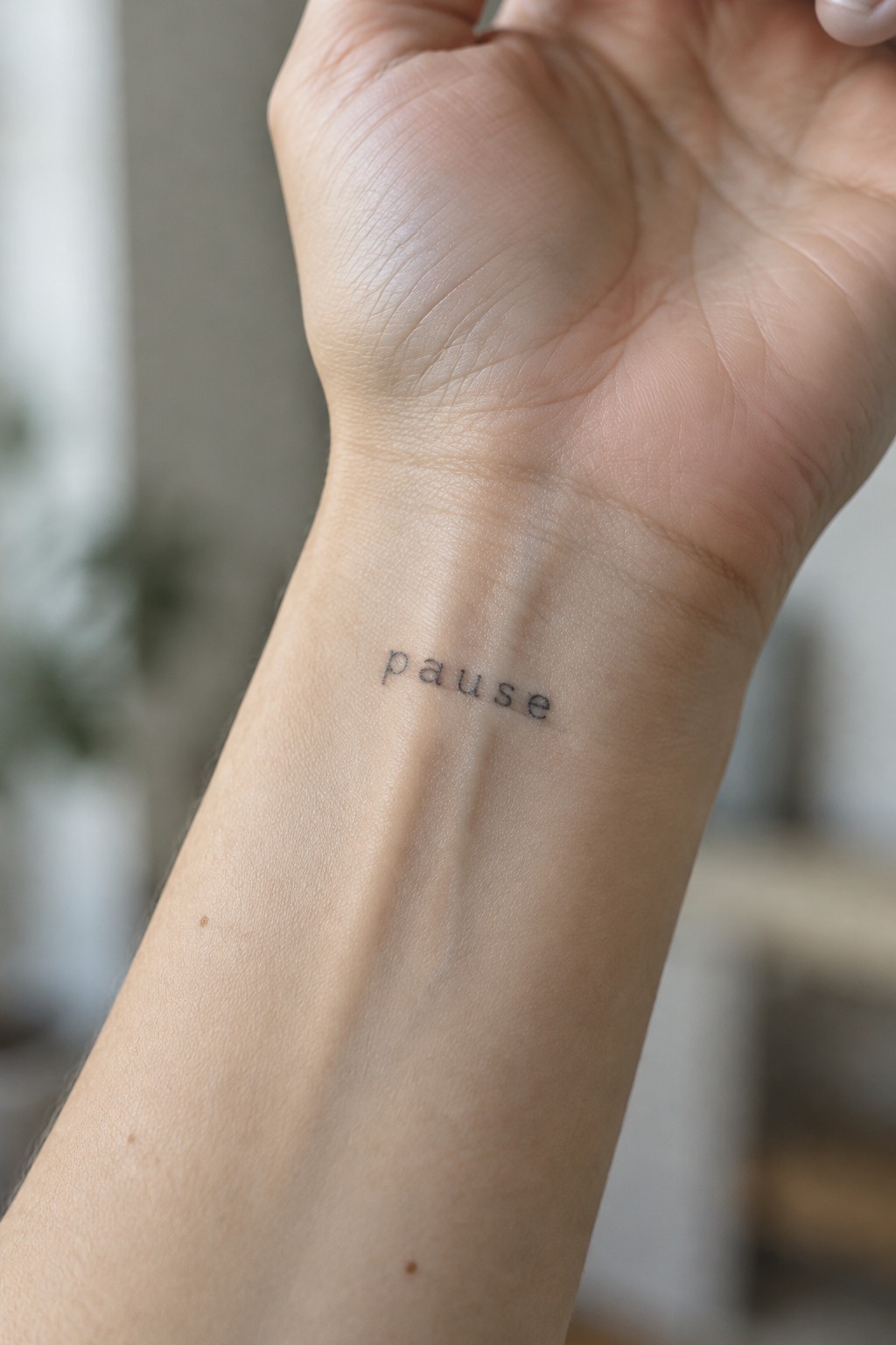
The inner wrist gives this word tattoo a personal spot. It shows up during daily movements but stays easy to cover. The flat surface helps the letters sit straight.
I think the small scale works because it avoids looking too bold for the message. A simple font like this one keeps the focus on the word itself.
Brave tattoo on the side torso
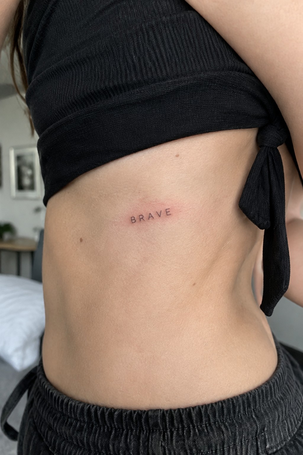
The side torso keeps a word like brave out of direct view while still giving it enough flat space to sit straight. The lettering stays small and thin so it does not compete with the natural lines of the waist or rib area. Horizontal placement follows the body without stretching when the person moves.
I like how the simple font avoids any extra weight in a spot that gets brushed by clothing every day. It reads as a quiet personal note instead of a statement piece.
here on the ankle
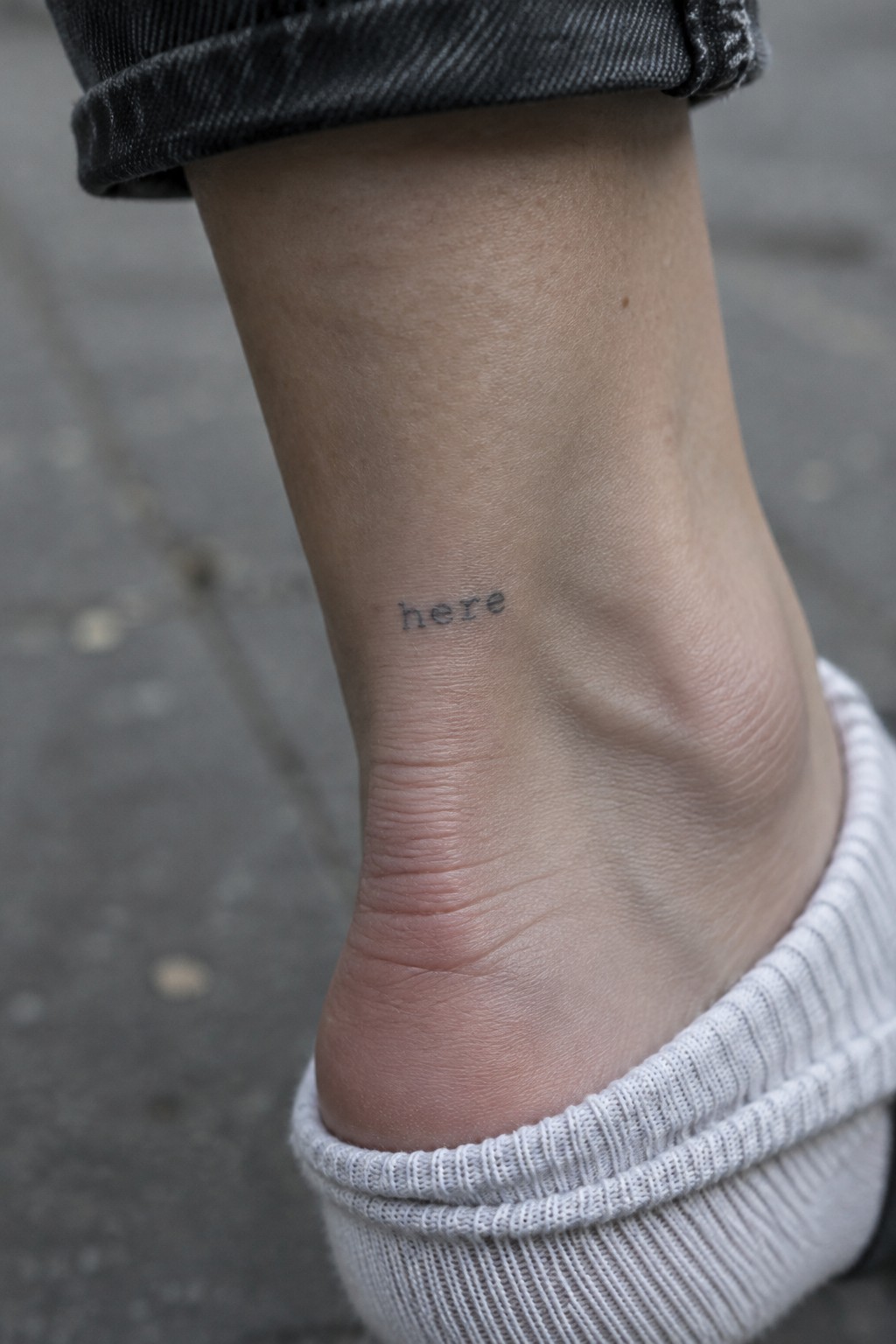
The ankle gives a small word like this a quiet place to sit. The letters stay lowercase and compact right above the heel. This spot keeps the tattoo mostly out of sight unless the person wants it seen.
I think the placement fits because it turns the word into something personal rather than public. The scale stays modest so the text does not need any extra lines or shading to work.
Frequently Asked Questions
What makes a word tattoo minimalist and readable? Minimalist word tattoos rely on clean simple fonts and brief text to avoid clutter. For lasting readability select sans serif styles with even spacing and avoid overly thin lines that may blur over time. Work with your artist to test the design at the intended size before committing.
Where are the best places on the body for these small tattoos? Common locations include the inner wrist, ankle, collarbone, or finger. These spots offer relatively smooth skin that helps lettering stay crisp and allow the tattoo to be shown or hidden as desired. Discuss your lifestyle with the artist to match placement to how much sun or friction the area will face.
How painful is getting a small word tattoo? Pain depends on the spot and your tolerance. Fleshy areas such as the upper arm tend to be milder while areas near bone like the wrist or ankle can feel sharper. Small designs usually take under an hour so any discomfort ends quickly. Many people describe it as a quick scratching sensation rather than intense pain.
What aftercare steps should I follow for my new tattoo? Clean the area twice daily with mild unscented soap and pat dry. Apply a thin layer of fragrance free moisturizer or ointment recommended by your artist. Keep it out of direct sunlight and avoid soaking in pools or baths until fully healed which normally takes two to three weeks. Follow your artist’s specific instructions for best results.
How do I choose meaningful words for my tattoo? Start with short terms that reflect your values such as peace, grow, or family. Read through the article examples and note which phrases connect with your story. Test the word by writing it in the chosen font at the planned size to confirm it feels right before booking the appointment.
