

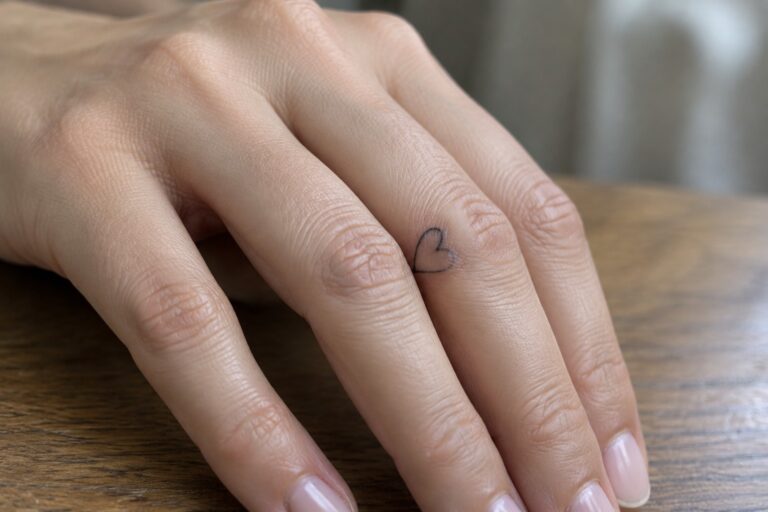
I adore how a tiny fine line tattoo on the finger can feel like a secret smile you carry everywhere. My own little heart inked there still brightens my day and sparks chats with friends. These 24 chic designs mix hearts stars and initials in ways that feel fresh and personal for women. If you love subtle art with meaning this list is full of ideas that fit just right.
Fine line heart on the finger
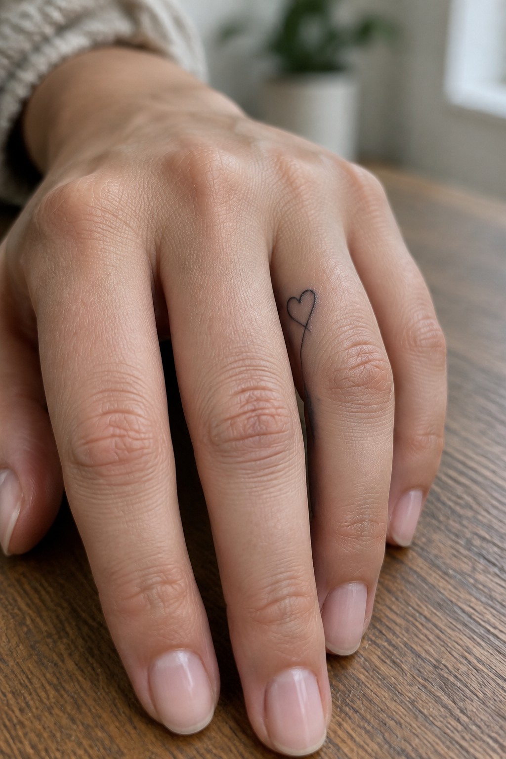
A small heart outline sits on the side of the ring finger with a thin line trailing down from the bottom point. The lines stay delicate and unbroken from top to bottom. This keeps the whole tattoo narrow enough to fit the finger without crowding.
The length of the line adds some height while the heart itself stays tiny. I think the placement makes sense here because it uses the finger’s length instead of trying to widen the design.
Stars stacked down the finger
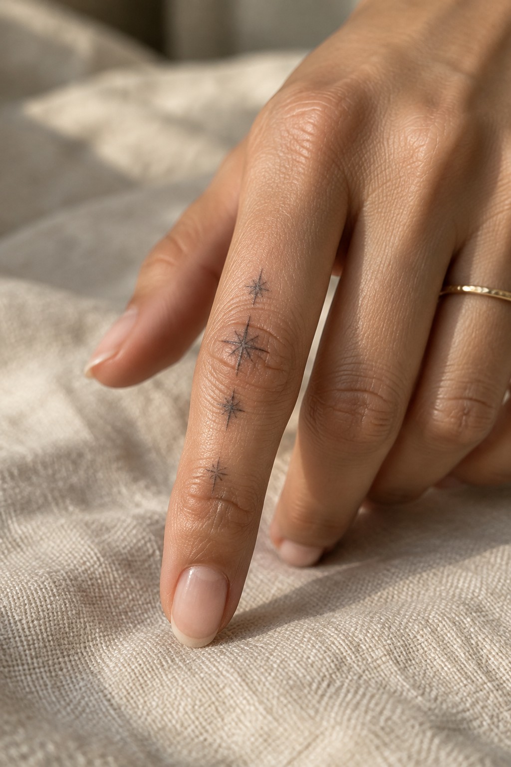
Placing small stars along the side of the index finger lets them follow the natural length of the digit. The vertical arrangement keeps each one separate while staying visible from most angles. Fine line work helps the design stay light without filling the narrow space.
I like how the different sizes add some movement without making it busy. The spacing feels balanced enough to read clearly even on a small area.
A cursive initial on the side of the finger
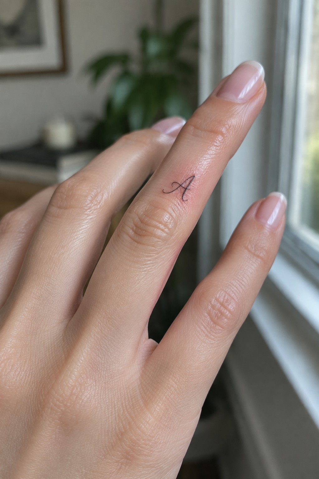
A small initial fits neatly on the side of the finger near the base. The placement keeps the tattoo out of the way during daily use while still showing when the hand turns. Fine lines help the letter stay light and contained in that narrow area.
I think the side position works because it gives the initial a more personal feel without making it the main focus of the hand. The script stays readable at this scale and does not crowd the skin.
Small heart and star on the ring finger
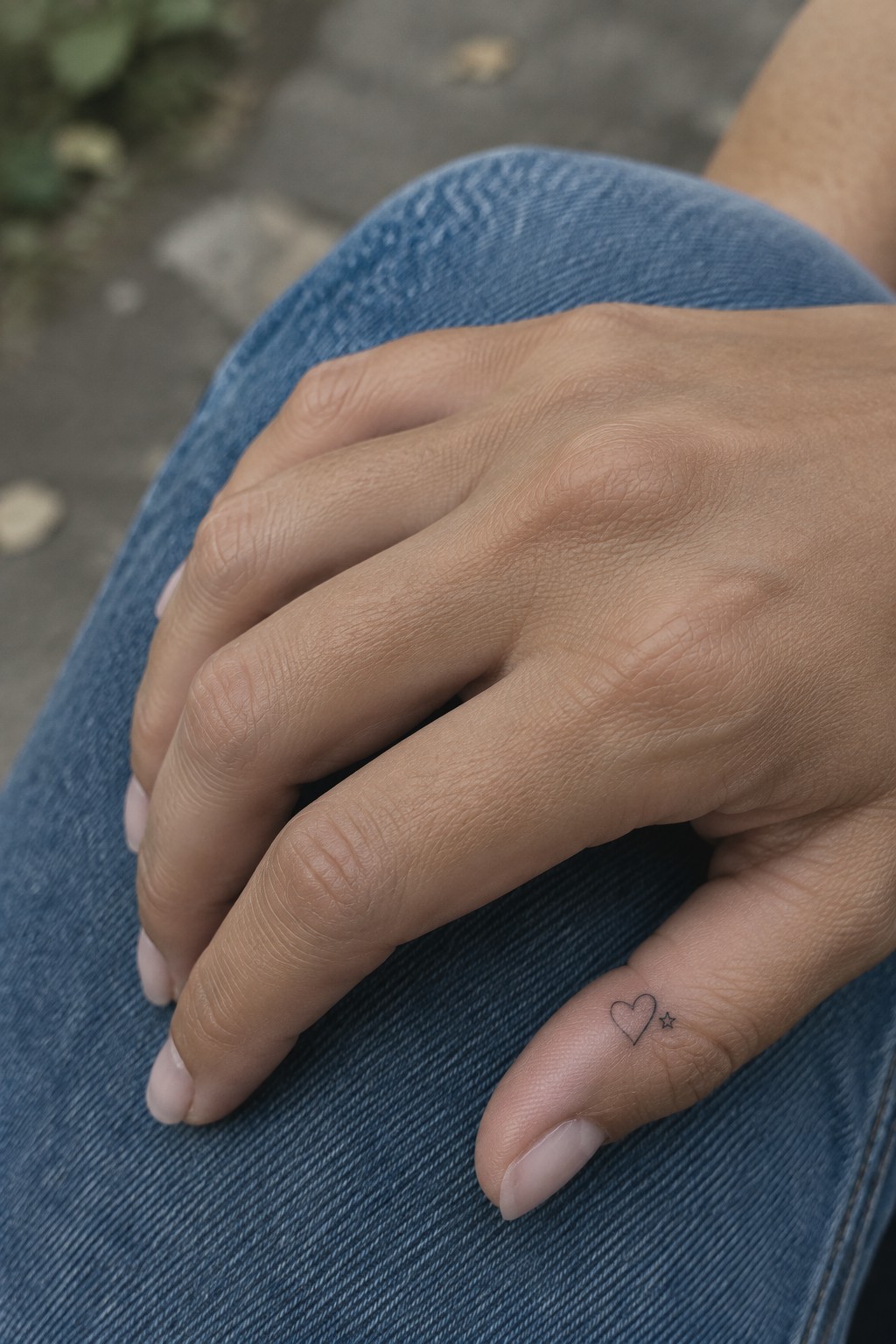
The tattoo sits on the side of the ring finger. A thin heart appears next to a small star in fine line style. The design stays compact and rests naturally against the skin.
I think the side placement works because it keeps the symbols visible only at certain angles. This lets the tattoo feel personal while the small scale prevents it from overwhelming the finger.
Initials on the ring finger
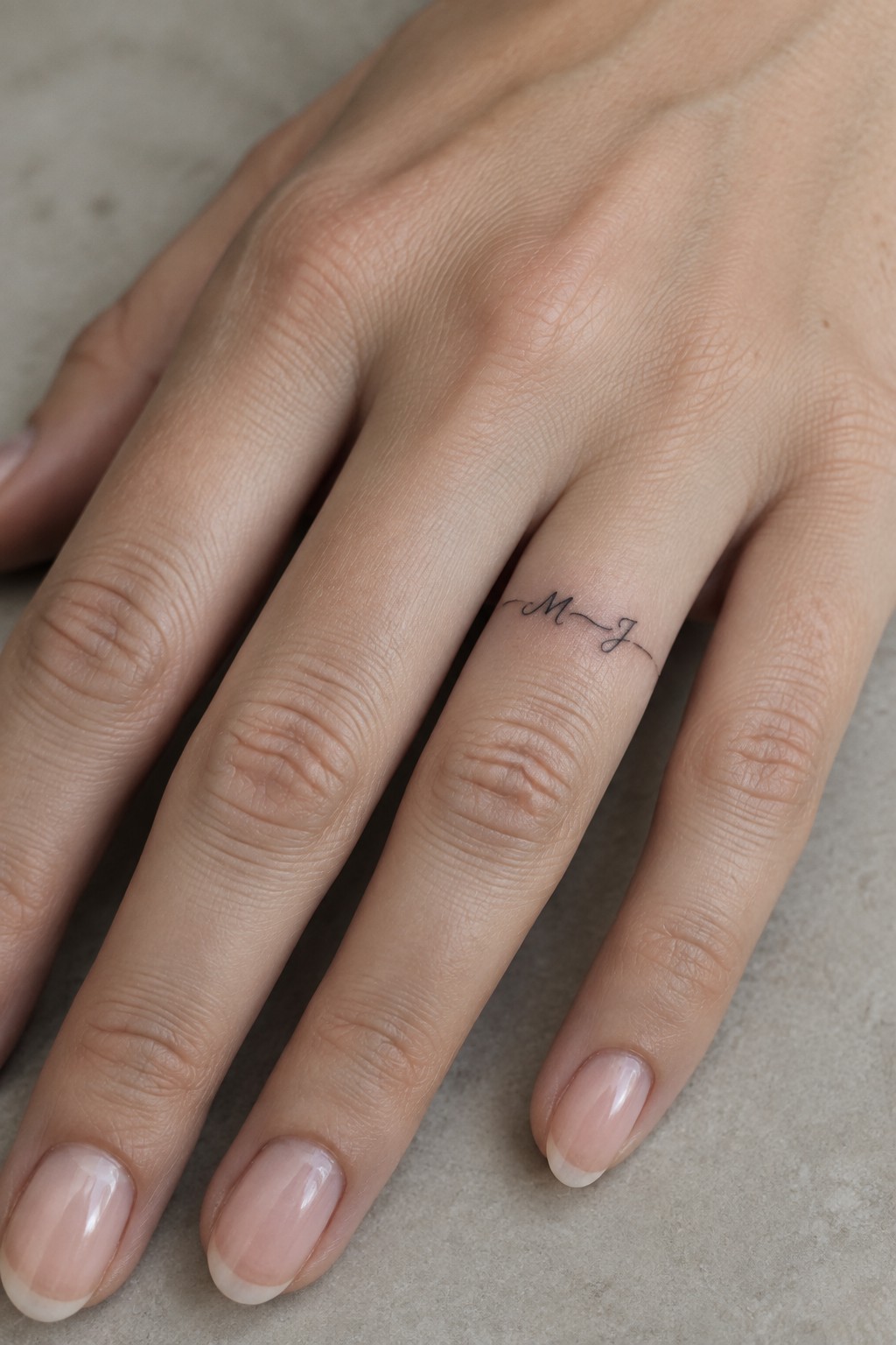
The ring finger gives small initial tattoos a discreet home. This version places two letters side by side in a thin script that follows the finger’s length. The compact size keeps the design from crowding the skin.
The thin line between the letters helps them sit together without extra decoration. It stays easy to read even on such a narrow area.
Tiny star on the finger
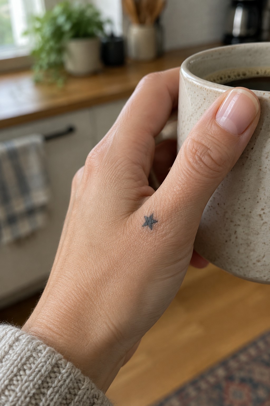
A small star sits on the side of the index finger. The fine line approach keeps the shape simple and the lines thin. This size lets the tattoo stay subtle while still showing up clearly against the skin.
I think the compact scale works because it fits the narrow surface without crowding the area. It also leaves room to add something else nearby if needed later.
Heart with initial on the ring finger
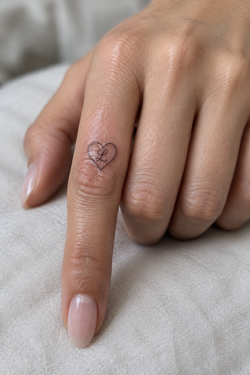
The side of the ring finger keeps this heart and letter design tucked in a spot that feels personal. Fine lines help the shape sit flat without spreading on the narrow surface. The whole piece stays small enough to avoid crowding the finger.
The letter sits centered inside the heart without extra flourishes. I think the placement works because it lets the design stay visible during normal hand positions but still reads as a quiet choice.
stars curve down the finger
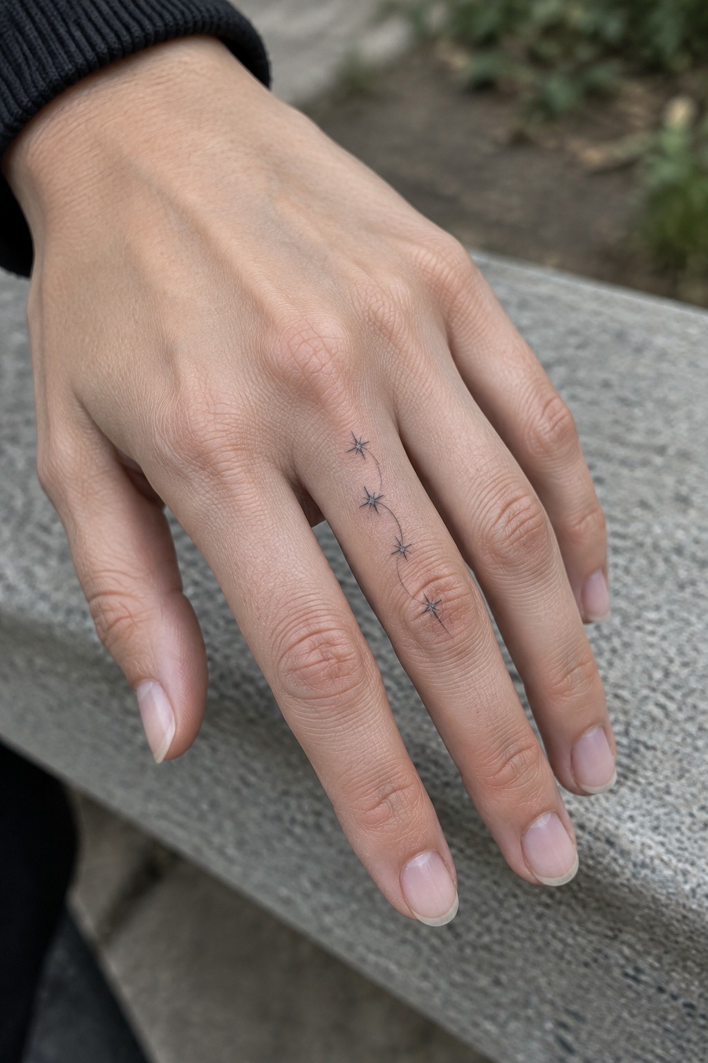
The tattoo sits along the side of the finger with four small stars linked by a thin curved line. The placement follows the finger’s natural shape so the design stays compact but still has some flow. Fine lines keep everything light and easy to read at this size.
I think this layout works well because the curve prevents the stars from looking static. It also leaves room for the skin to move without distorting the lines.
two small hearts on the ring finger
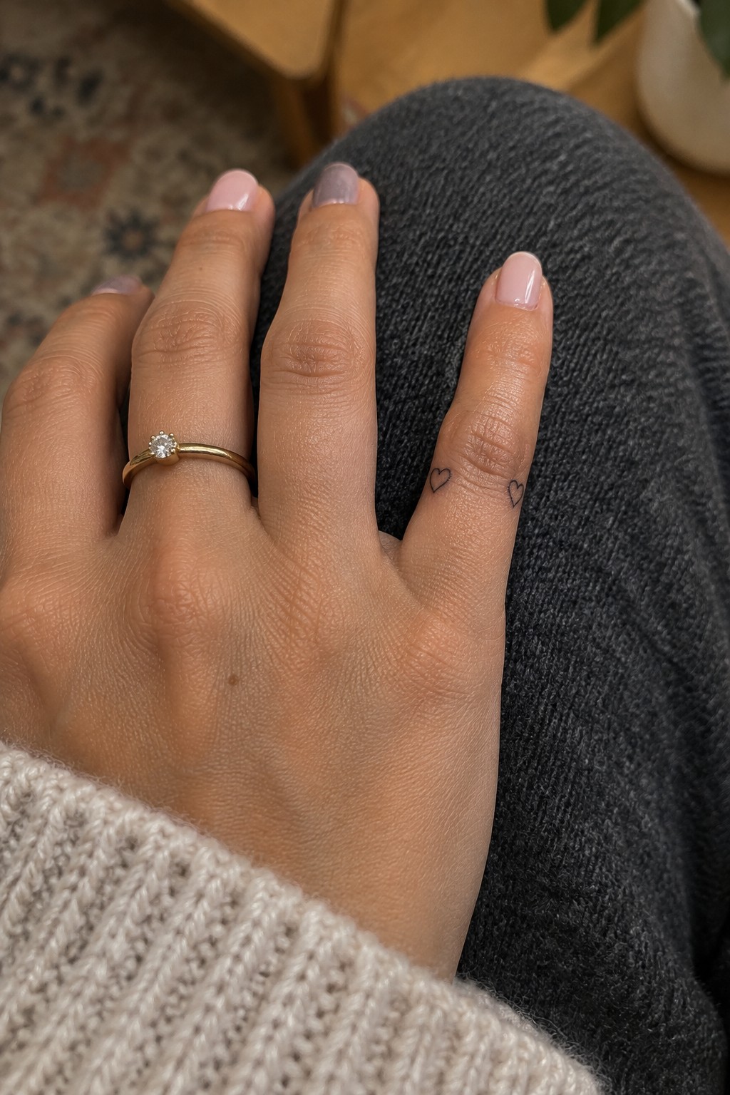
The ring finger works well for these hearts because it places them right beside a band. The two outlines stay small and separate so they do not crowd the finger. Fine lines keep the look light instead of busy.
I think the choice of size matters most here since it lets the ring remain the main detail while the hearts add a quiet touch.
Star and initial on the ring finger
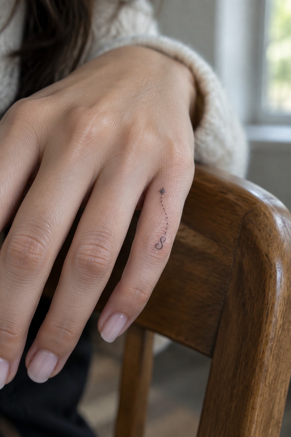
The ring finger gives this design a clean path to run along. A small star sits near the top and a series of dots drop down in a gentle curve to reach the initial below. The narrow surface keeps the whole thing contained and easy to read.
I like how the placement lets the line move without forcing extra bends or crowding. It stays simple while still showing a clear connection from one element to the other.
Three hearts on the ring finger
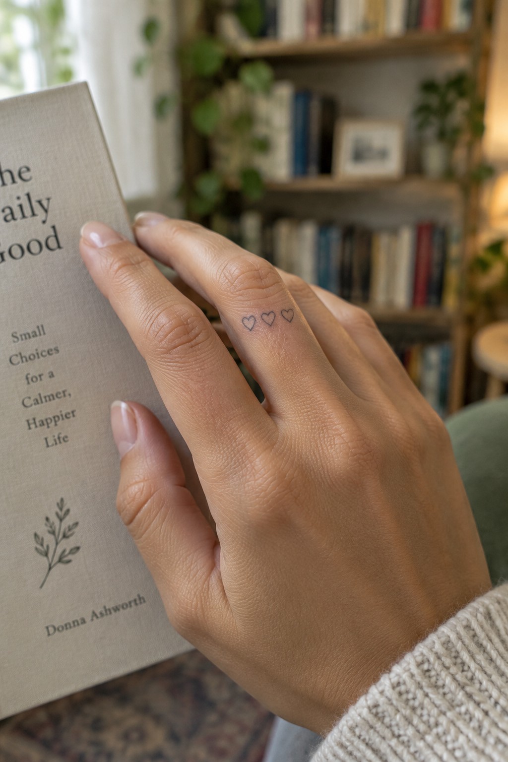
The side of the ring finger gives these three hearts a clean and contained spot. They sit in a straight row without crowding the skin. The fine line work keeps the shapes simple and easy to read.
I think the placement works because it stays visible during normal hand movements but does not draw constant attention. The small scale fits the area without looking cramped.
Tiny star on the finger
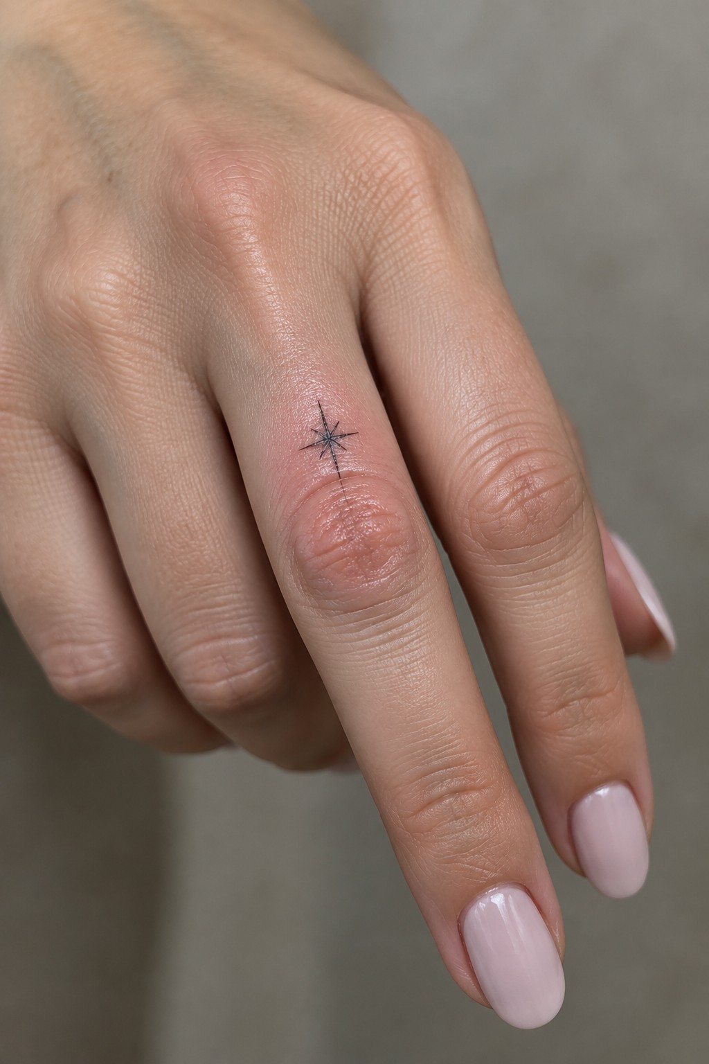
The star sits on the side of the finger close to the knuckle. Fine lines create a simple burst shape that stays small and contained. The scale keeps the design from overpowering the narrow space.
I think the placement works because it stays easy to hide or show depending on the angle. A star this size feels practical for anyone who wants something light on the hand.
Heart and star on the finger side
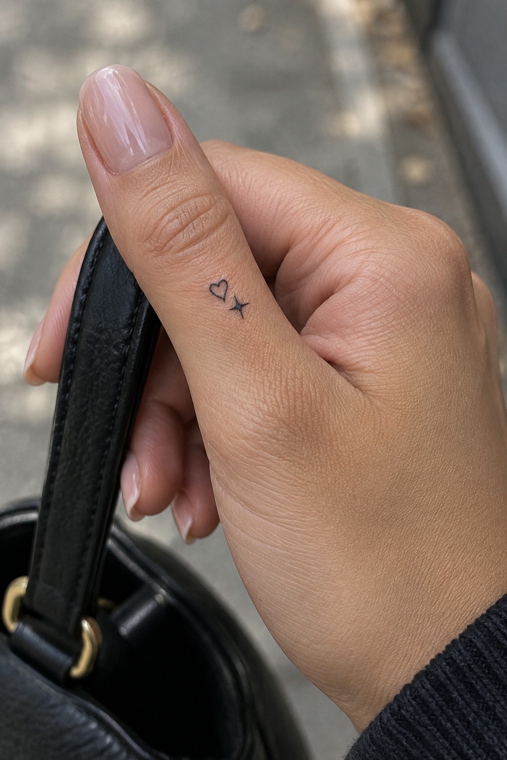
Placing a heart and star on the side of the finger keeps the design tucked away yet easy to notice during daily movement. The fine line work holds up at this tiny scale without crowding the skin. The two symbols sit close but separate for a clean look.
I like how the side placement turns the tattoo into something personal instead of a statement piece. It suits someone who wants a small symbol they can see without it dominating their hand.
Initials placed on the finger side
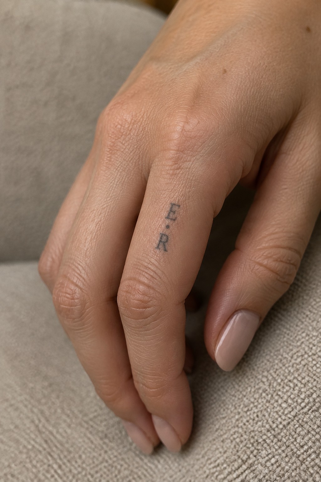
The initials sit vertically along the side of the finger. This keeps the tattoo narrow and out of the way during normal hand use. The fine line approach matches the small space without crowding the skin.
I think the side placement works well for initials because it stays somewhat hidden in daily life. The letters still read clearly when the hand moves or rests.
Tiny heart and star on the ring finger
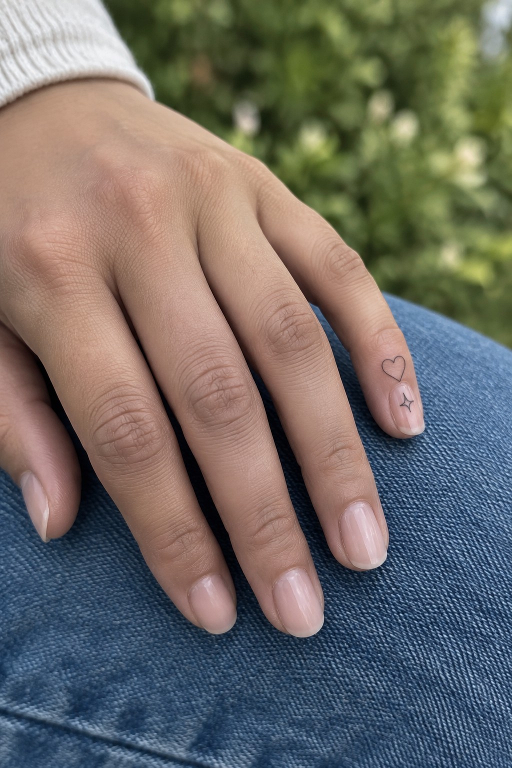
The side of the ring finger gives these small symbols room without crowding the hand. A simple heart outline sits higher up while the star rests just below it near the nail. Both stay thin and clean in fine line style.
I think the placement keeps the design subtle yet easy to notice during daily movement. The scale matches the finger width so nothing feels cramped or oversized.
Stars and hearts run down the side of one finger
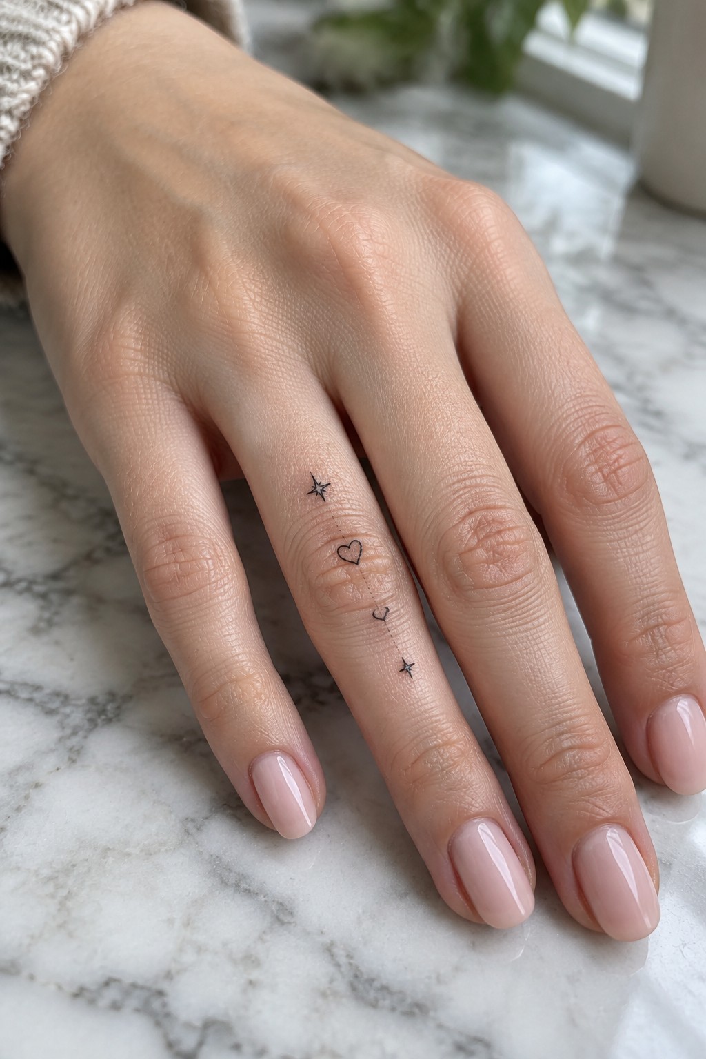
The tattoo follows a straight vertical path along the outer side of the finger. Two small stars sit at each end with two hearts placed between them and connected by a row of dots. The fine line work keeps every element light and narrow.
I think the side placement works because it uses the full length of the finger without spreading across the top. The simple line of symbols stays readable at this scale and feels easy to wear every day.
Heart with initial on the finger
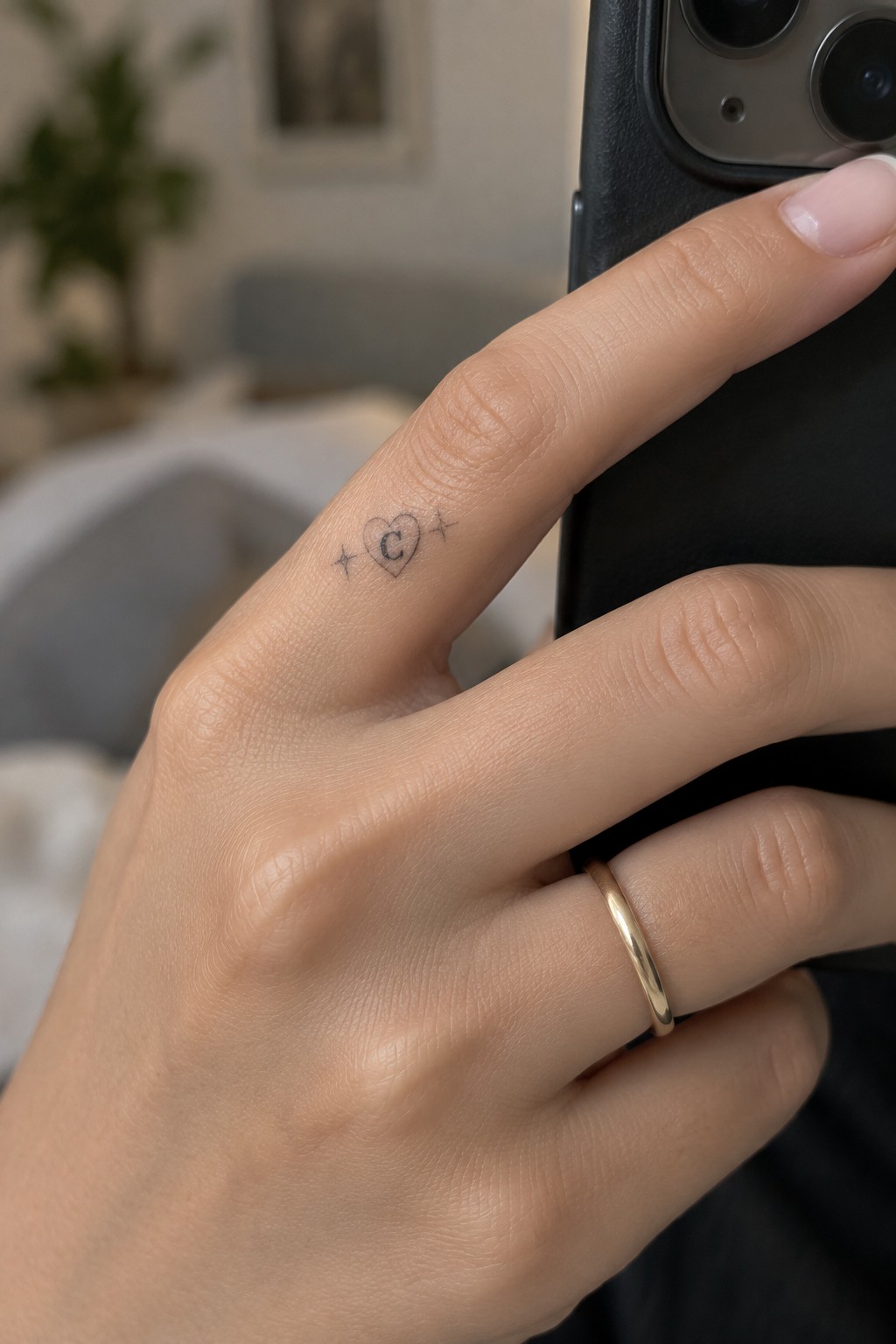
The tattoo runs along the side of the finger in a thin line style. A small heart holds the letter C inside it while two stars sit on either side. The whole design stays compact enough to fit the narrow space.
I think the side placement makes the tattoo easy to see without covering the top of the finger. The fine lines keep it light and simple. It suits anyone who wants an initial shown in a quiet way.
Hearts and stars line the side of the finger
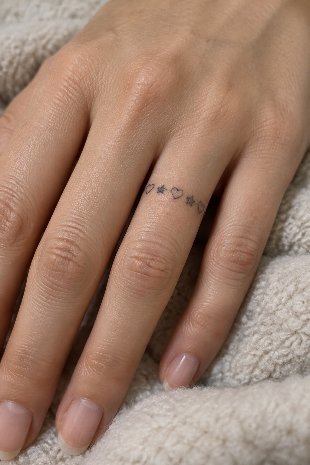
The tattoo runs along the side of the ring finger in a straight row. It shows three small hearts and two stars placed evenly with fine lines. The symbols stay tiny so the whole design fits the narrow space without crowding.
I think this side placement keeps the tattoo visible from certain angles while staying out of the way on the top or bottom. The even spacing helps the small shapes stay clear. It suits someone who wants a light pattern they can build on later.
Star and initial on the ring finger
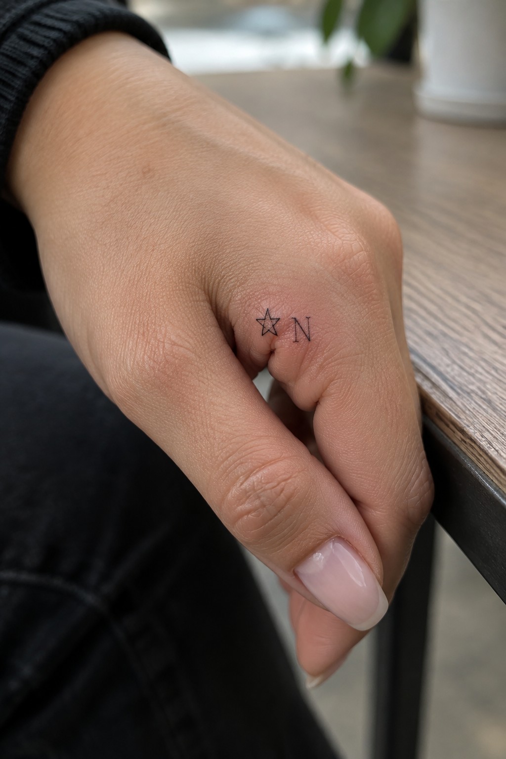
The tattoo sits on the outer side of the ring finger. A small star lines up next to the letter N in a fine line style. The narrow space holds both elements without any crowding.
I think the side placement works because it shows the design during normal hand movement yet keeps it away from the palm. The simple pairing also leaves room for the finger to bend freely.
Heart and star on the side of the finger
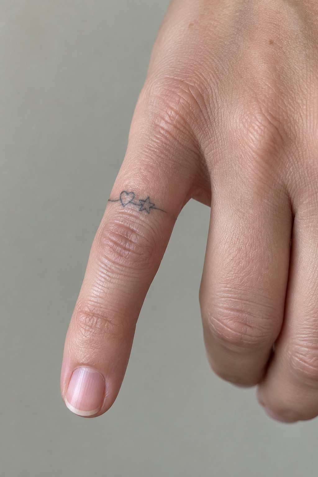
The tattoo runs along the side of the finger just past the first knuckle. A thin line connects a small heart to a star in a straight horizontal layout. This spot lets the design sit flat without wrapping around the finger.
I think the side placement gives the line room to breathe while keeping the symbols easy to see from most angles. The fine line style keeps everything light and simple at this scale.
Fine line initial on the ring finger
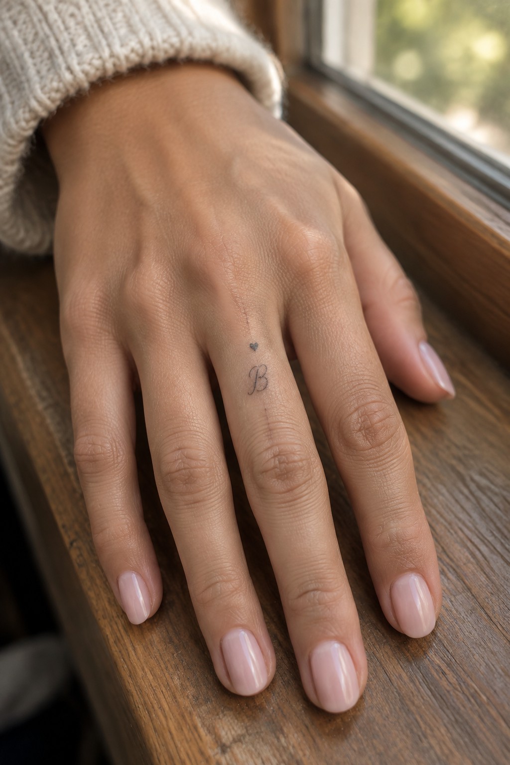
The tattoo sits along the side of the ring finger. A tiny heart sits above a cursive B in fine line work. The whole piece stays small so it fits the narrow space without crowding.
I think this placement makes sense because the tattoo stays mostly out of sight until the hand moves. It keeps the design personal without drawing attention every day.
stars line the side of the finger
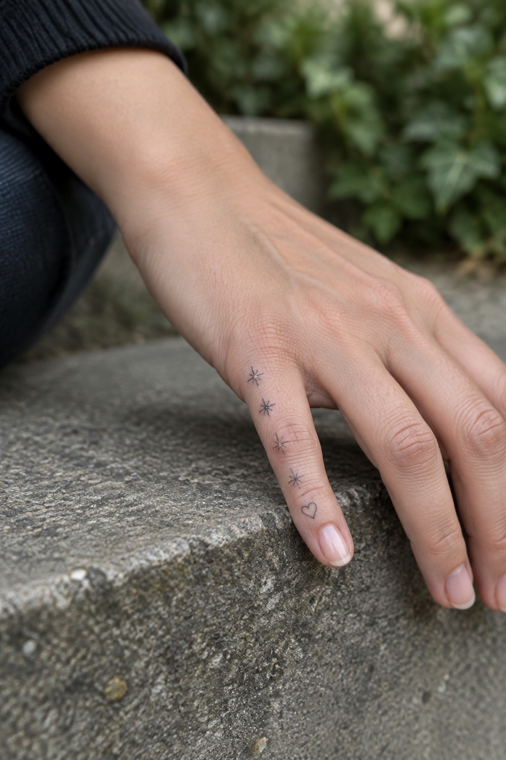
The side of the finger gives these small stars a clean path without taking up much space. They sit in a row that tapers toward the nail, with the tiniest one paired with a heart right at the base. The fine line work keeps each shape sharp even at this scale.
I think the vertical layout fits because it follows the natural length of the finger without wrapping around. It also leaves room to add more later if wanted. The overall size stays easy to cover with a ring when needed.
Heart and initial on the ring finger
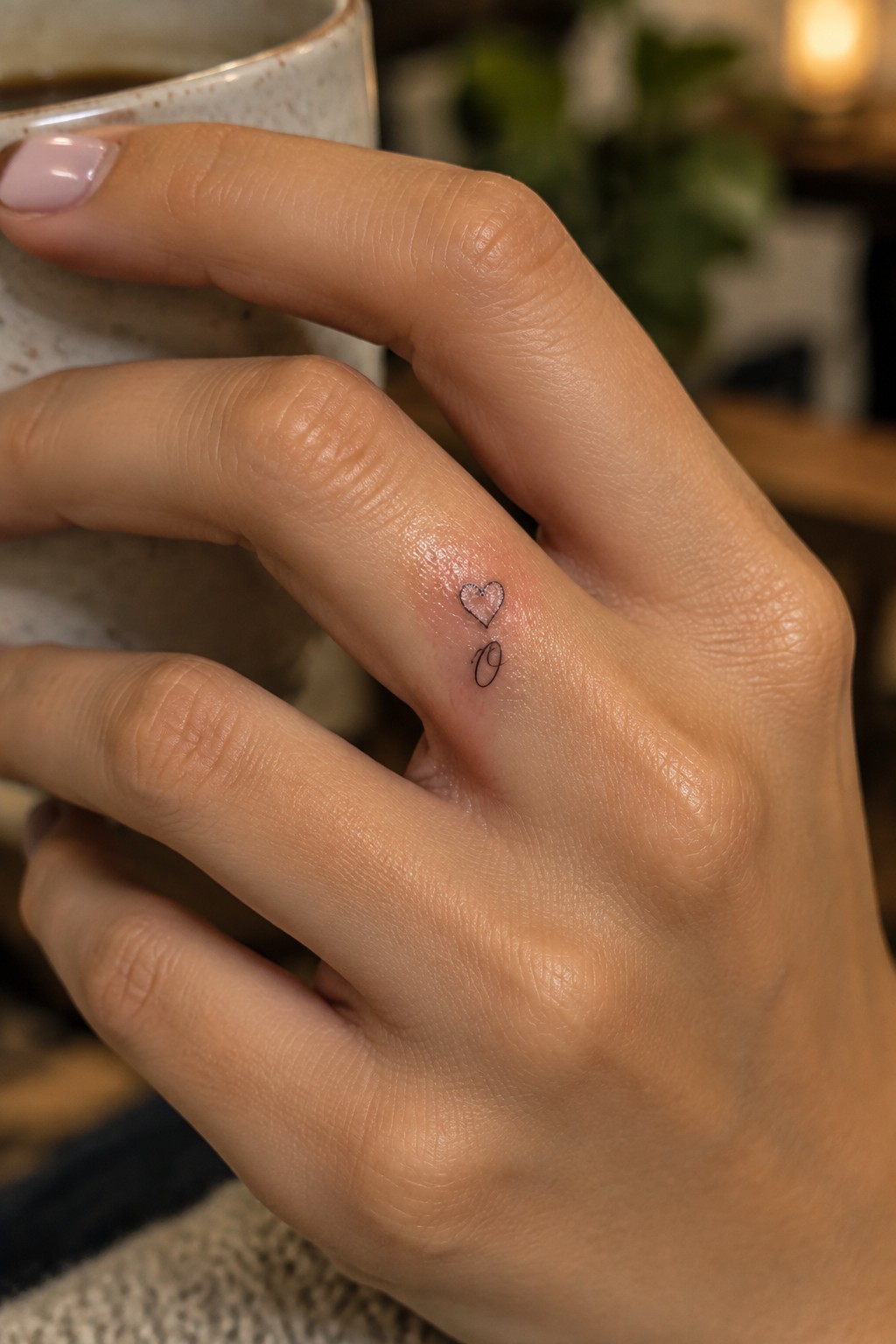
The tattoo sits on the side of the ring finger. A small outlined heart appears above a single cursive initial. The fine lines keep everything compact and understated.
I think the finger placement works because it lets the design feel personal without standing out in daily view. The minimal size also helps the initial stay clear without extra detail.
Star and heart align vertically on the finger
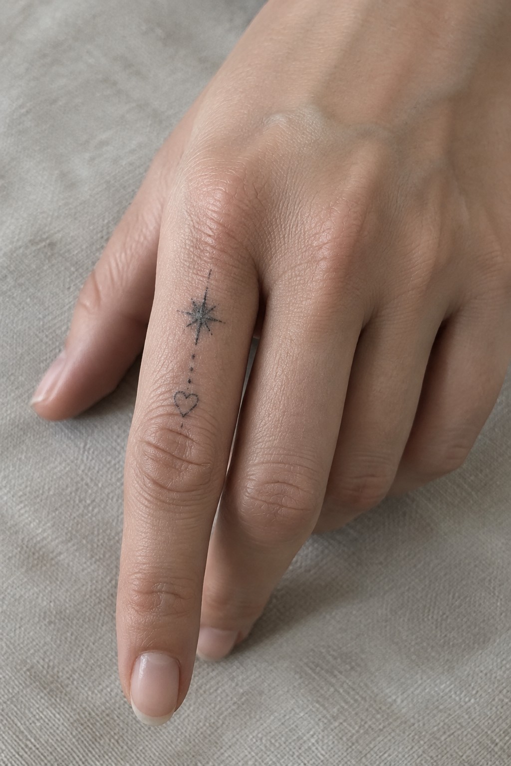
The tattoo runs straight down the side of the finger. A small starburst sits at the top. A few dots connect it to a tiny heart lower down.
This vertical layout keeps the design compact on a narrow space. The fine lines stay readable without overwhelming the skin. I think the spacing between the elements stops it from feeling cramped.
Frequently Asked Questions
How painful are fine line finger tattoos compared to other placements? Fine line tattoos on fingers involve delicate needle work close to bone and sensitive skin, so they can feel sharper than areas with more padding like the arm. Most people describe the sensation as a quick stinging or buzzing that lasts only a few minutes per design. Applying a numbing cream beforehand and choosing a skilled artist who works efficiently helps reduce discomfort. Sessions are typically short because the designs are small.
What aftercare steps keep finger tattoos looking crisp? Clean the tattoo gently with fragrance free soap twice a day, pat dry, and apply a thin layer of unscented moisturizer. Avoid soaking the hand in water for the first two weeks and wear gloves during chores that involve chemicals or dirt. Sun protection is essential because fine lines fade faster with UV exposure, so use sunscreen on healed tattoos daily. Consistent care prevents scabbing that can blur delicate hearts, stars, or initials.
How long do fine line finger tattoos usually last before they need touching up? Finger skin regenerates quickly and experiences constant friction, so fine line work often softens within one to three years. Designs using hearts, stars, and initials hold up better when the lines are slightly thicker than the thinnest possible hairline strokes. Scheduling a touch up session around the one year mark restores definition. People who work with their hands daily may notice fading sooner than those with desk jobs.
Can I combine multiple elements like a heart, star, and initial in one small finger tattoo? Yes, artists often nest a small initial inside a heart or place a tiny star beside lettering to create a personal symbol without overcrowding the finger. Fine line technique allows these elements to sit closely while remaining readable. Discuss proportions with your artist so the design fits the width of your finger and still leaves room for natural skin movement. Placement on the side of the finger rather than the top can help the tattoo stay clearer longer.
What should I consider before getting a finger tattoo for professional reasons? Finger tattoos remain visible in most workplaces, so think about dress codes, client facing roles, and future career plans. Temporary options such as henna or ink lasts can help you test how the design looks daily. If you choose hearts, stars, or initials, keep them minimal and elegant so they read as personal rather than distracting. Some people opt for placements on the inner finger that can be hidden with a ring when needed.
