

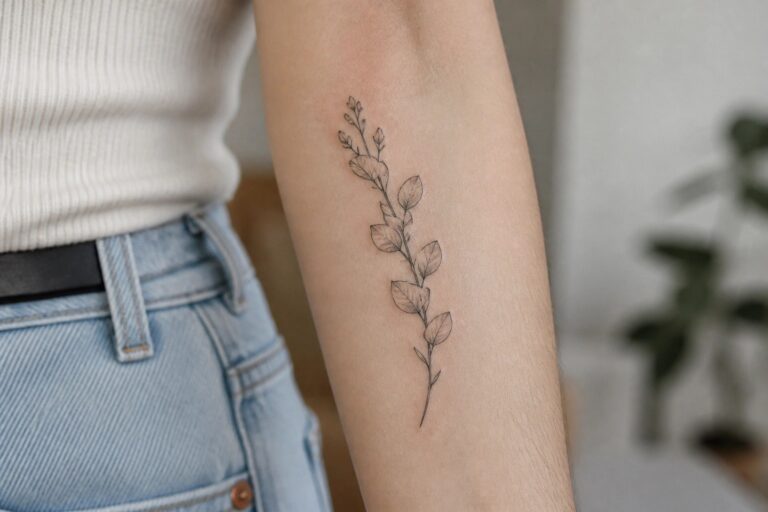
I love using small fillers to complete my feminine sleeve tattoos.
They make my patchwork layouts feel so much more personal and complete.
I have tried many options and these smart ideas really stand out.
Who knew that tiny additions could make such a big difference in the end.
Vertical plant stem on the forearm
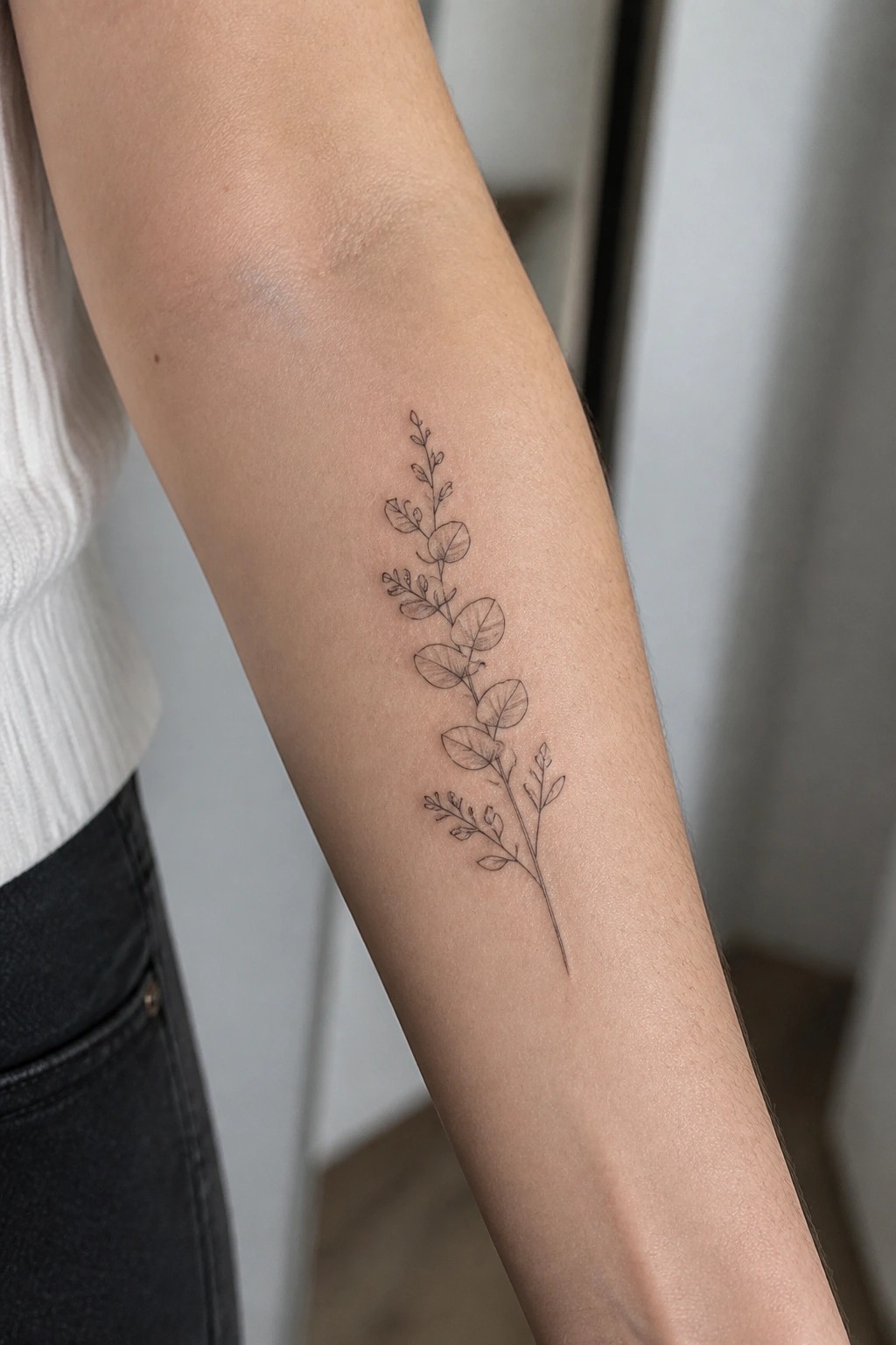
A thin stem with oval leaves runs down the inner forearm in fine line. The design stays narrow so it slots between other tattoos without taking over the space. Leaves and small branches appear at uneven intervals to avoid a stiff look.
This placement lets the stem follow the natural line of the arm. I think the open spacing makes it easy to build around later without crowding.
Mandala on the elbow
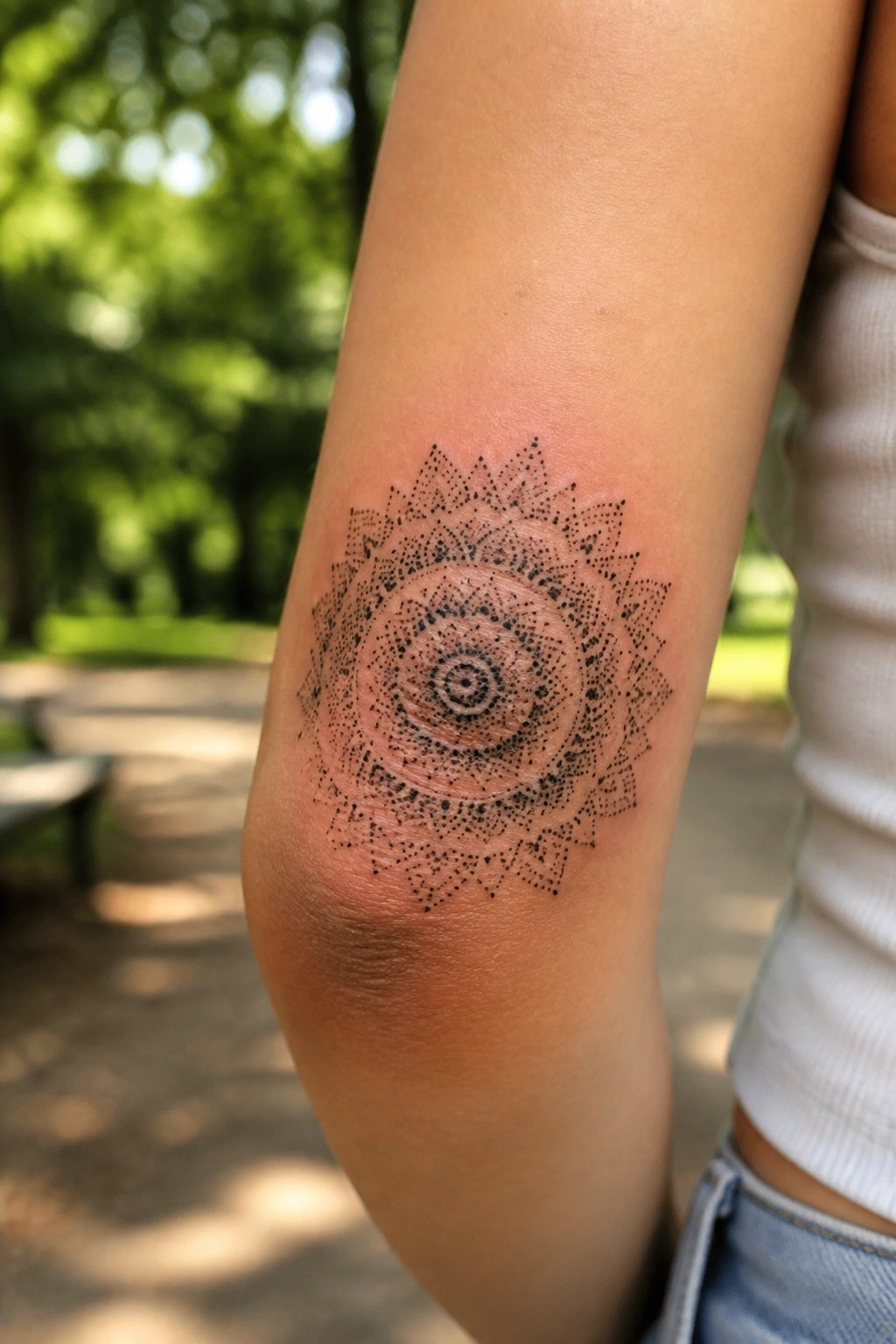
The round design sits right in the elbow crease. Its center lines up with the joint so the rings and points spread evenly as the arm moves. Dotwork builds the layers without packing the skin too full.
This spot suits a radial pattern because the shape follows the natural bend. The scale leaves space around it for other tattoos later.
Lace band wrapping the wrist
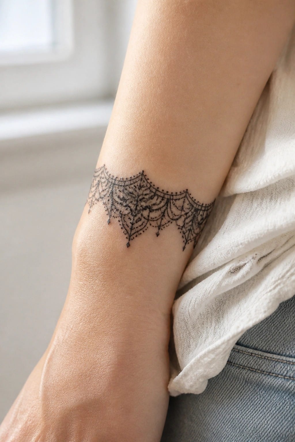
The wrist gives this band enough room to sit flat while still following the curve of the arm. It works as a connector in patchwork sleeves because the open pattern leaves space for other pieces to sit beside it. Fine line details keep the whole thing from feeling bulky.
The width stays narrow so it fills a gap without crowding the area. This kind of band adds texture that reads clearly even when other tattoos sit close by.
Geometric lattice fills space on the upper arm
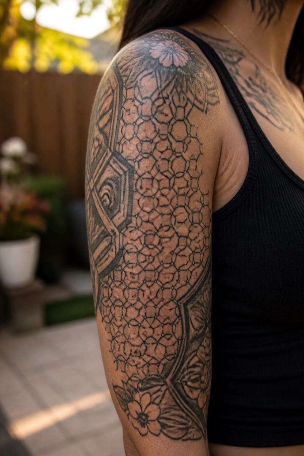
The tattoo uses a repeating honeycomb pattern to connect several flower outlines across the shoulder and upper arm. The lines stay clean while the shading adds depth without filling every gap. This approach turns empty areas into part of the overall layout.
The size keeps the pattern readable even when the arm moves. I think it works well as a connector because the geometric sections link the flowers without competing with them.
Stars and moons scattered on the forearm
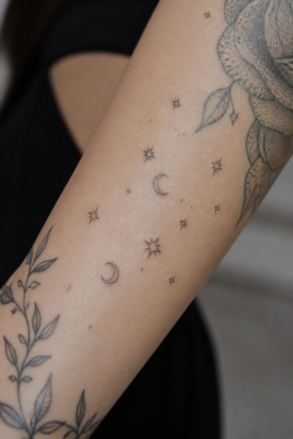
Small stars and crescent moons sit loosely along the inner forearm. They fill the open areas around bigger floral pieces without crowding the skin.
The fine line approach keeps each shape light and easy to read. This layout works well when building out a patchwork sleeve because the elements stay small enough to connect larger work.
Wildflowers fill the inner upper arm
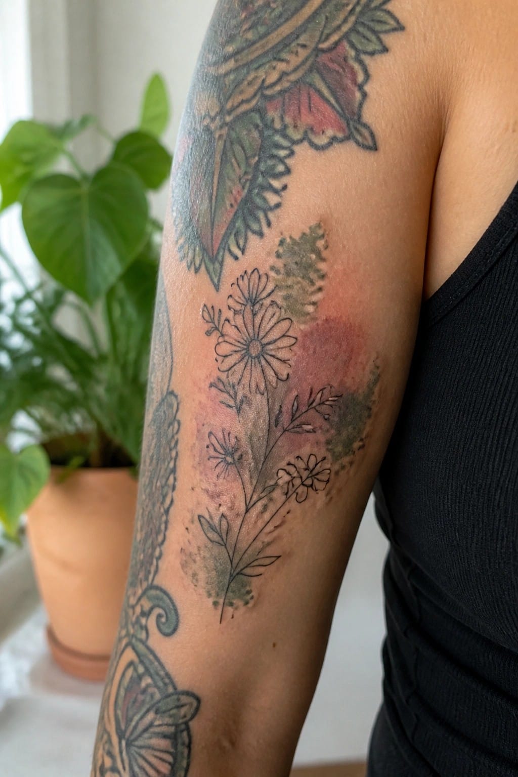
The wildflower spray sits on the inner upper arm. It runs between a larger mandala piece above and a butterfly below. The fine lines and light stems let it occupy the gap without fighting the surrounding tattoos.
The soft color washes stay muted so the design reads as a filler rather than a focal point. I think the scale works because it leaves clear space for future additions.
Script and sun along the inner forearm
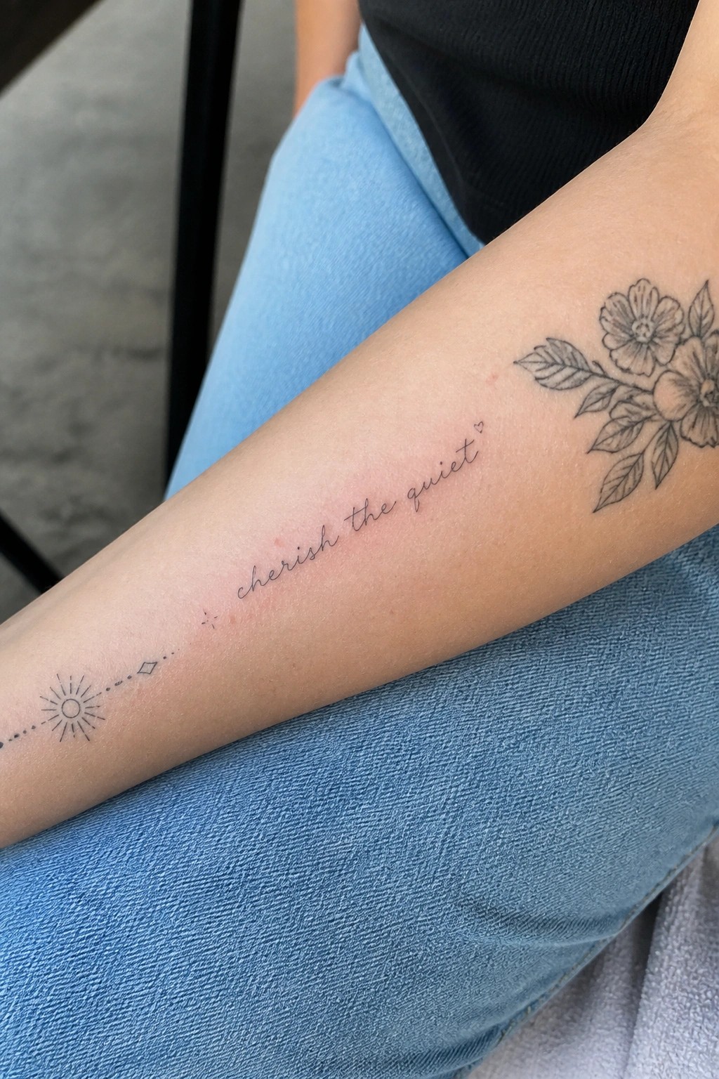
The design runs down the inner forearm with the sun near the wrist. A dotted line connects it to the cursive text. Flowers sit higher up to balance the layout.
This spacing keeps the elements from feeling crowded. It works as a filler because it leaves room for other pieces in a patchwork sleeve.
Swirling lines fill the shoulder area
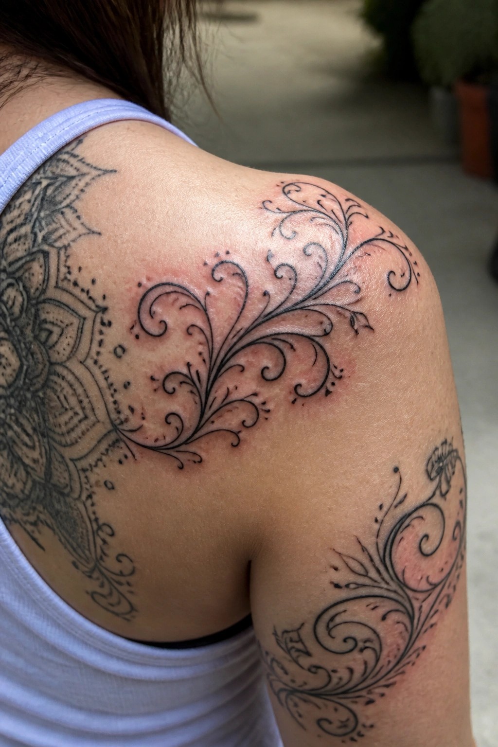
The tattoo sits on the top of the shoulder and runs down onto the upper arm. Flowing black swirls branch out from a central point and link up with the larger mandala on the back. Small dots keep the lines from looking too solid.
This placement lets the swirls act as a simple bridge between separate tattoos. The open style stops the area from feeling crowded. I think the curves make it easy to add more pieces later without clashing.
dotwork clouds connect flowers on the forearm
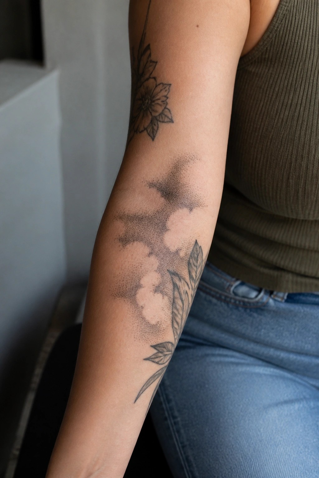
The tattoo sits on the inner forearm. Stippling builds soft cloud shapes that link the top flower to the leaves below.
This keeps the filler light so other pieces can sit around it later. I think the dotwork approach makes the layout easier to expand without crowding the skin.
A long floral line on the forearm
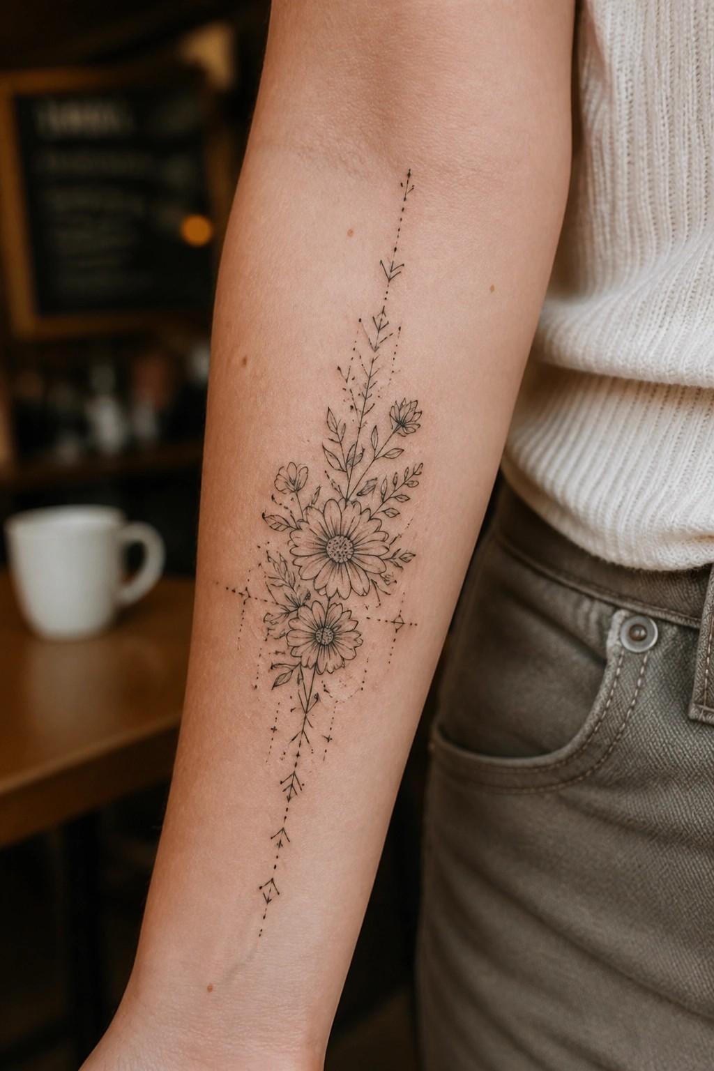
The tattoo runs vertically along the inner forearm. It centers on two daisy style flowers with leaves and smaller blooms around them. A dotted line with small accents stretches above and below to extend the shape.
This layout keeps the piece narrow so it sits cleanly on the arm. I think the dots help balance the weight of the flowers without crowding the skin.
Vertical vine on the upper arm
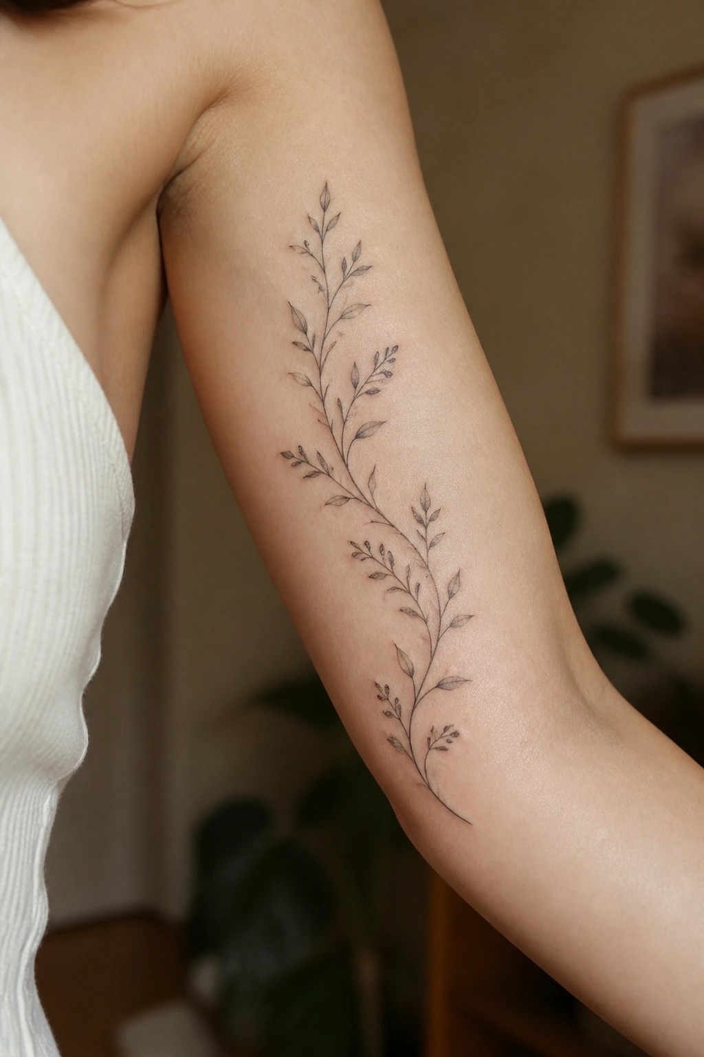
The tattoo follows a single thin vine down the length of the upper arm. Small leaves and buds branch off the main stem in a loose pattern. This layout keeps the design open and easy to work around.
I think the vertical direction fits the arm shape better than a compact shape would. It also leaves clear space for other pieces if the sleeve grows later.
Dotwork circle fills gaps between larger tattoos
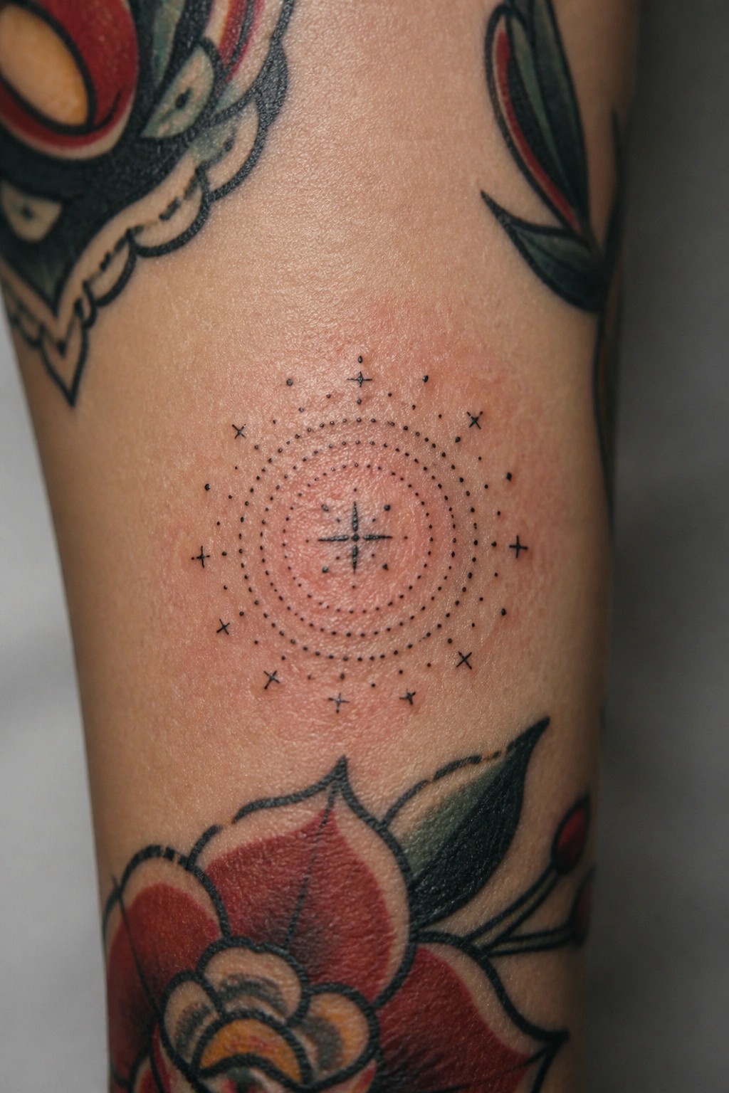
The tattoo sits on the arm in a spot left open between floral pieces. Its compact size and round shape let it occupy that space without pushing against the bigger designs around it. The dotwork style keeps the whole thing light and easy to read at a glance.
I went with this because it finishes the layout without making the sleeve feel crowded. The pattern adds a bit of structure that helps the surrounding tattoos stand out more clearly.
Mandala on the shoulder blade
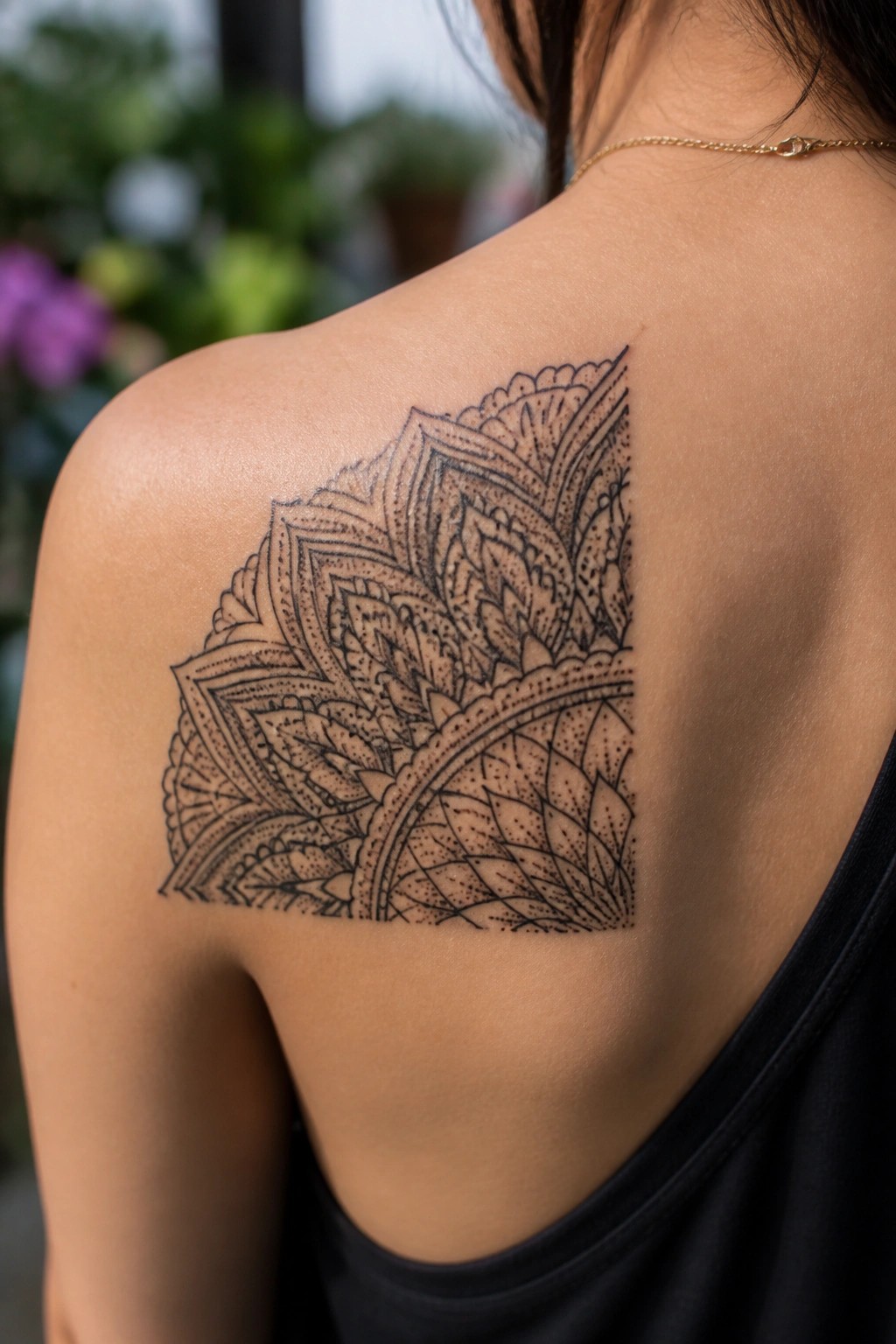
The shoulder blade offers a wide flat area that fits this type of mandala well. The design spreads outward in layers with clean lines and dots that hold shape across the curve. It sits high enough to pair with smaller pieces lower on the back or arm.
I think the open edges make it easy to build around without crowding. The blackwork stays readable even if more tattoos get added later.
Small flower sprig fills a sleeve gap
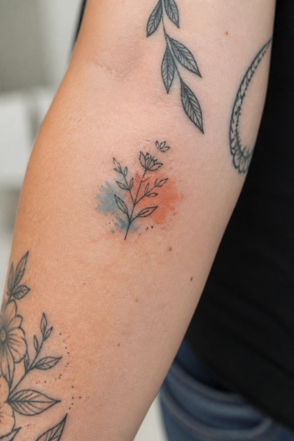
This small sprig uses fine black lines for the stem, leaves, and single bloom. A soft blue and orange watercolor wash sits behind the lines to add a hint of color. The design stays compact and sits on the inner arm.
It fits neatly between larger tattoos without crowding the layout. I think the light touch of color keeps the piece from feeling too heavy next to the other blackwork.
a thin chain of dots around the wrist
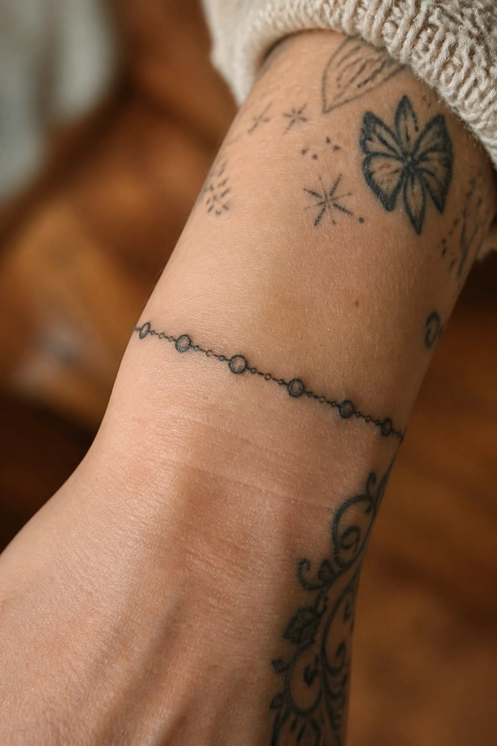
This placement sits right above the wrist bone. The design uses small connected circles to form a narrow band. It works as a simple divider in a larger sleeve layout.
The scale stays light so it does not compete with nearby pieces. I think this approach keeps the arm balanced when filling gaps between bigger motifs.
Dotted arrow lines on the wrist
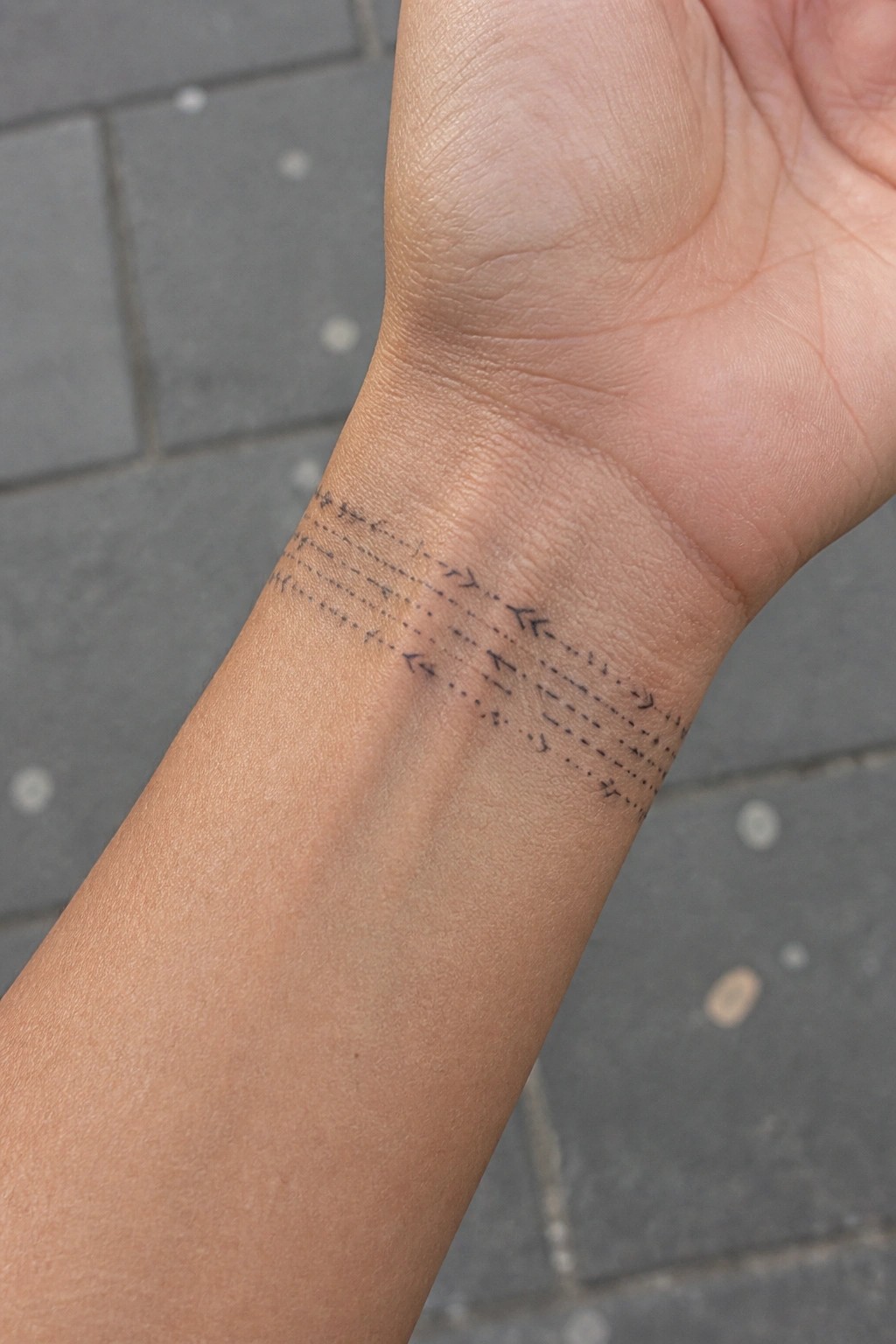
The tattoo runs across the inside of the wrist in several thin bands. Each band uses dotted lines with small arrows pointing different ways. The whole pattern stays narrow and sits flat against the skin.
This works as a filler because the fine lines leave room for other pieces nearby. I think the wrist placement keeps the design visible while still feeling light enough to fit into a larger sleeve.
Rose cluster on the upper arm
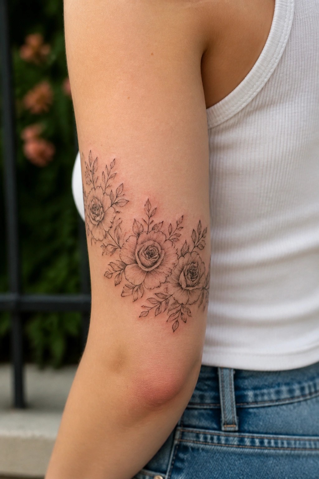
The piece sits on the upper arm above the elbow. Three main roses take the center with leaves and smaller buds branching outward in a loose curve.
This placement lets the design follow the natural shape of the arm as it moves. I think the open spaces between the blooms stop it from looking crowded.
stars scattered across the forearm
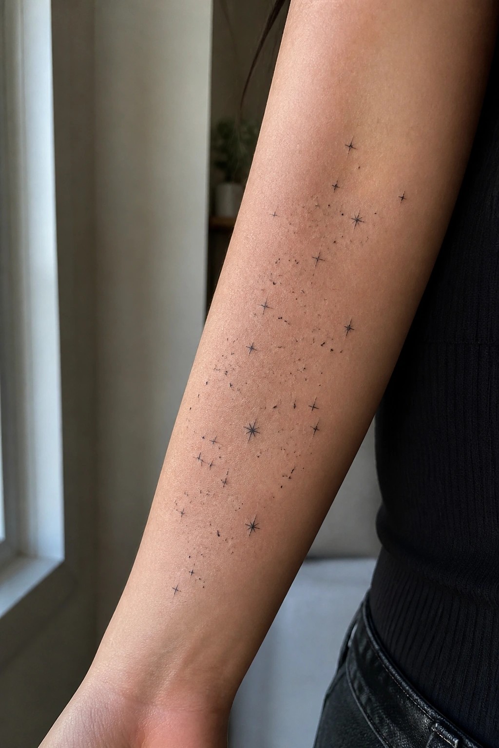
The forearm gives enough length to spread stars out without forcing them into a tight group. Some sit higher near the elbow while others drop lower toward the wrist. This lets the design breathe and avoids any single area looking crowded.
The loose spacing also makes it easy to add more stars later if the sleeve expands. I think that flexibility is what keeps the idea practical for patchwork layouts.
Ornate portrait on the upper arm
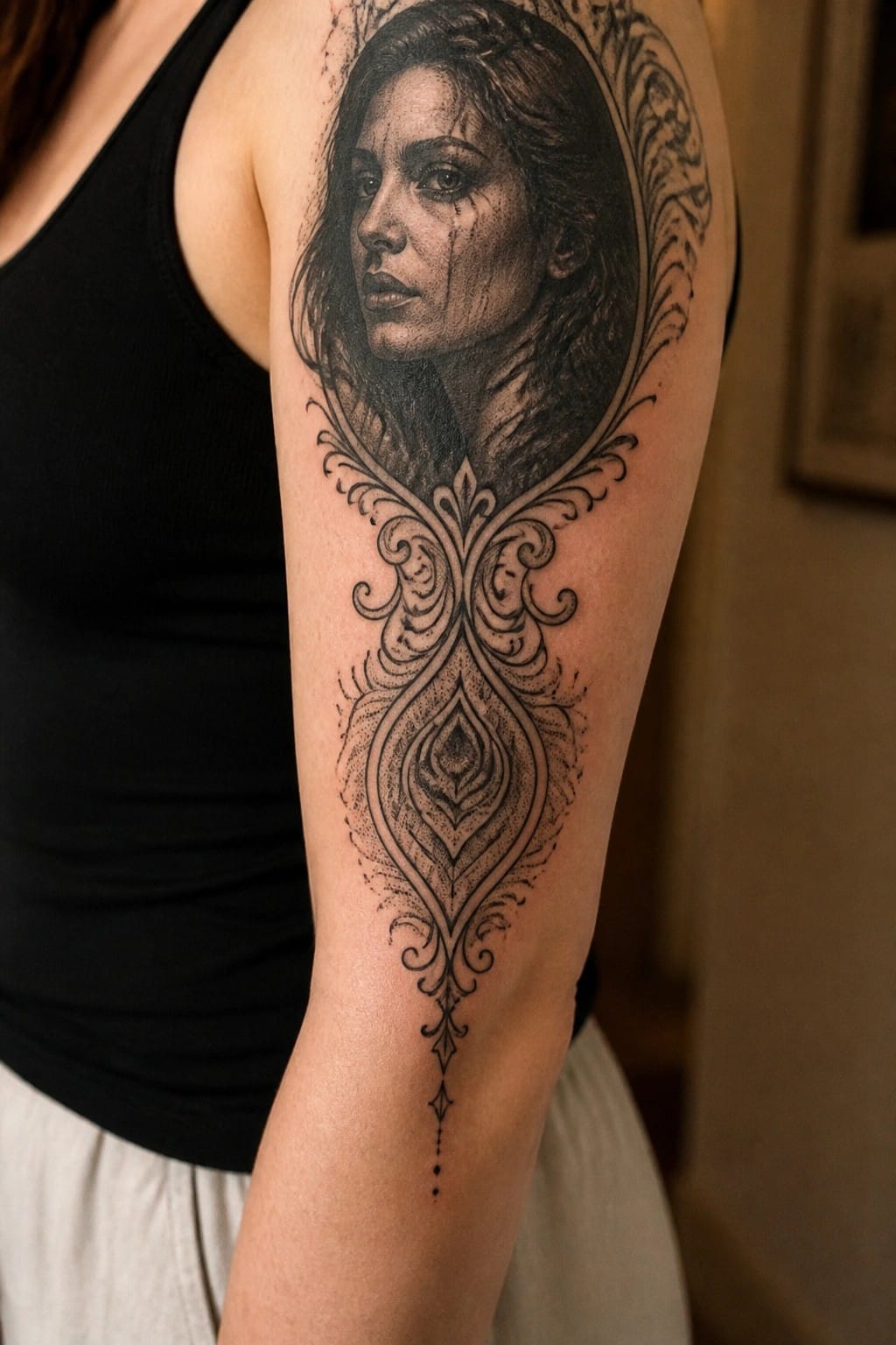
The tattoo runs down the upper arm as a single vertical piece. A realistic portrait sits inside an oval frame and connects to detailed scrollwork below. The lower patterns stretch the design without adding extra width.
This layout works as a sleeve filler because the frame keeps the face as the main focus while the filigree fills length. It pairs easily with smaller tattoos around it.
Fine line branch across the wrist
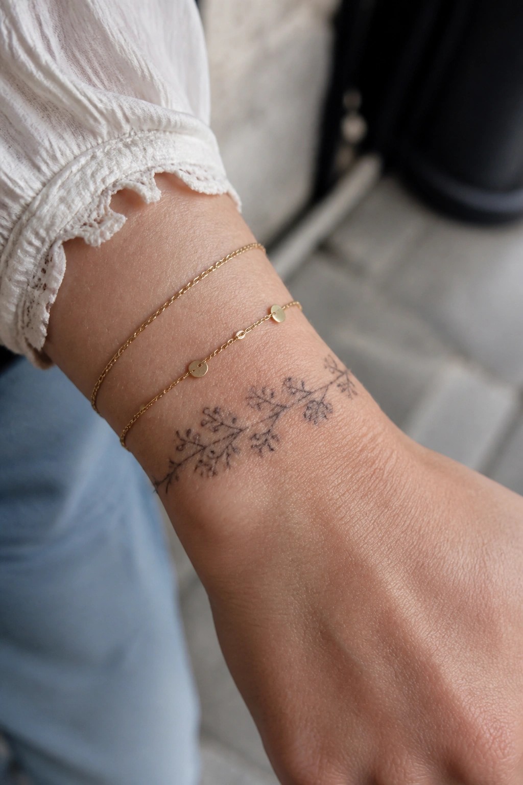
The wrist gives this small branch tattoo a clean horizontal stretch. Fine black lines form a simple vine with scattered leaves and tiny blooms. The scale stays narrow so it sits beside other work without overlap.
This spot lets the design fill a gap in a patchwork sleeve while staying easy to read. I think the thin style keeps it from competing with larger pieces nearby.
Compass rose sits centrally on the forearm
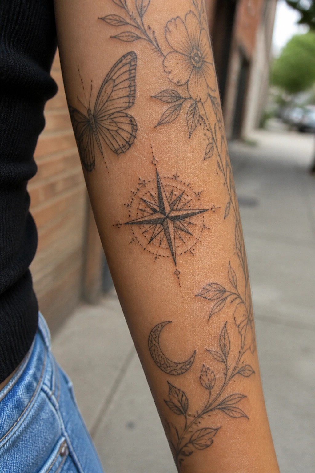
The compass takes the middle spot on the inner arm. It links the butterfly higher up with the crescent moon and vines below. Fine lines and light dots keep the shape readable without filling too much space.
This spot works because the arm gives the star points room to stay sharp. I think the balance of open skin around it stops the whole sleeve from feeling packed.
Fine line curve along the elbow
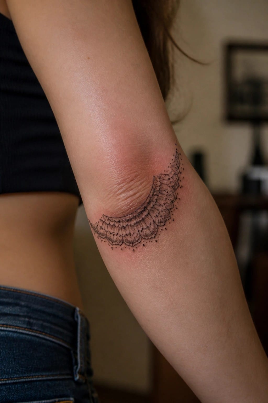
The design sits in the elbow crease and follows its natural bend. Its scalloped shape creates a gentle arc that fits the area without fighting the skin’s movement. Small dots and lines add texture while staying light.
I think the scale works because it fills the spot without crowding it. This kind of band can connect other pieces in a sleeve layout.
Frequently Asked Questions
Q1: How can I choose filler tattoos that blend seamlessly into an existing feminine sleeve without overwhelming the design? A1: Start by reviewing your current tattoos for recurring motifs such as soft florals, delicate lines, or pastel shades, then select fillers that echo those elements at a smaller scale. Space them evenly around larger pieces to maintain balance, and consult your artist about negative space to prevent crowding. Testing a few mock placements on paper first helps visualize the final patchwork flow.
Q2: What aftercare steps are essential when adding multiple small fillers to complete a sleeve over several sessions? A1: Keep each new tattoo clean with gentle soap and unscented moisturizer while avoiding sun exposure during healing. Schedule sessions at least four weeks apart so previous fillers fully settle before adding more. Your artist can recommend specific products suited to sensitive skin, and tracking progress photos helps spot any irritation early.
Q3: How do I ensure my patchwork sleeve maintains a cohesive feminine look across different tattoo styles and sizes? A1: Focus on a unifying color palette or line weight that ties everything together, such as soft pinks and grays with fine outlines. Discuss layout plans with your artist ahead of time to map out how new fillers connect existing pieces. Regular check-ins during the process allow adjustments that keep the overall design balanced and intentional.
Q4: Are there placement tips for fillers that help avoid common issues like distortion on curved arm areas? A1: Place smaller, flexible designs on the inner arm or near joints where skin stretches less, and reserve bolder fillers for flatter sections like the outer forearm. Your artist should account for natural arm movement when sizing and shaping each piece. This approach preserves detail and prevents stretching that could alter the feminine aesthetic over time.
Q5: What budget considerations matter when building out a full feminine sleeve with numerous filler tattoos? A1: Factor in per-session costs plus potential touch-up fees, and prioritize quality artists who specialize in fine-line work to reduce long-term corrections. Saving for multiple appointments rather than rushing can spread expenses while allowing time to refine choices. Many clients find that planning the full layout early helps avoid expensive rework later.
