

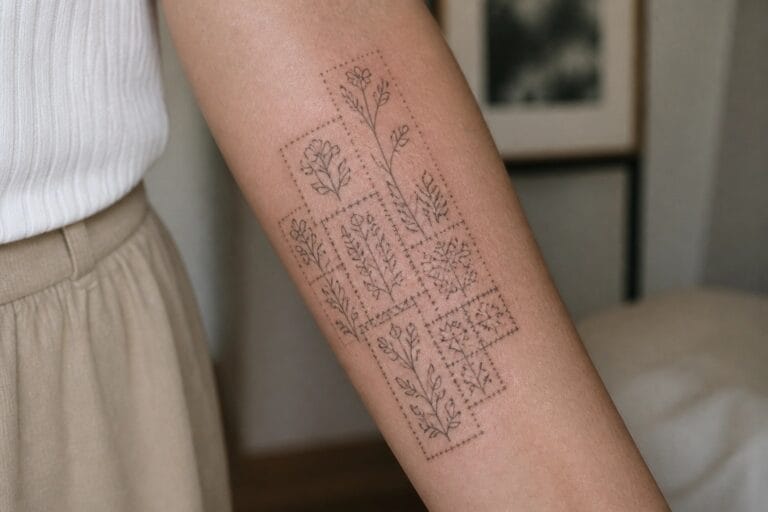
Patchwork tattoos have this magical way of turning your body into a cozy storybook of memories.
I remember starting my own collection with a tiny heart that now blends perfectly with bigger florals and stars.
It feels like chatting about home decor but on skin instead and that makes it even more exciting.
These creative feminine designs will help you mix and match for a look that is all your own.
Botanical patchwork sits along the forearm
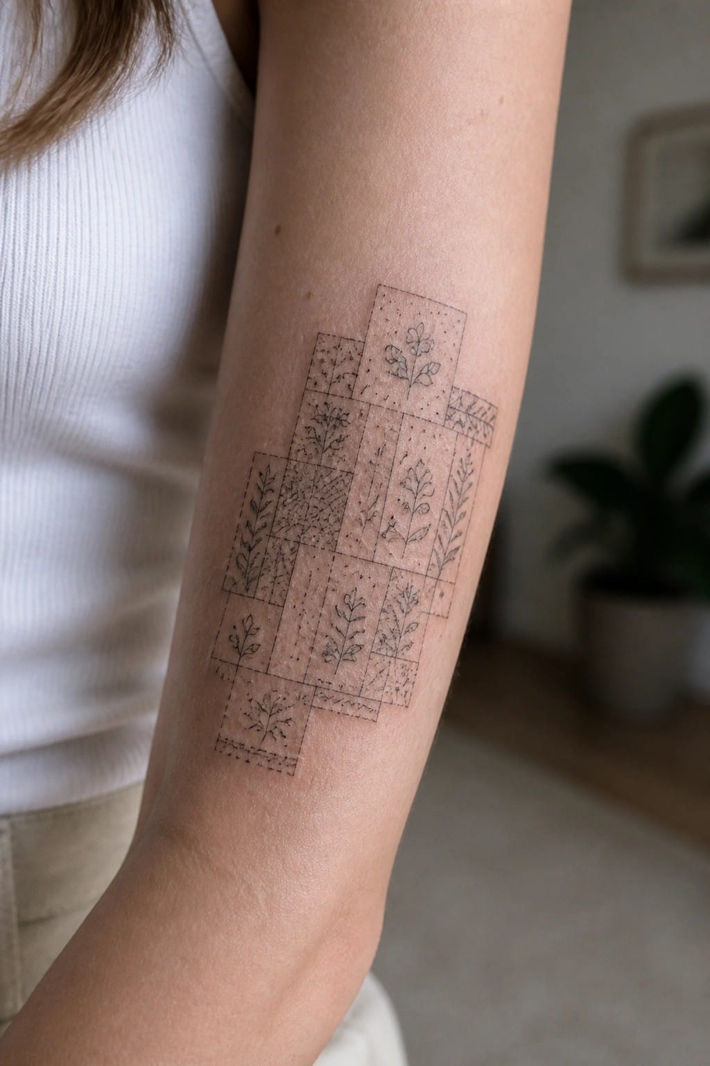
The design uses a loose grid of small rectangles that run down the inner forearm. Each panel holds a different plant motif with its own line pattern or texture. The vertical layout lets the pieces stack naturally without crowding the skin.
I like how the uneven edges keep the grid from feeling stiff. It leaves room to add more panels later if the wearer wants to expand the collection.
Patchwork flowers on the thigh
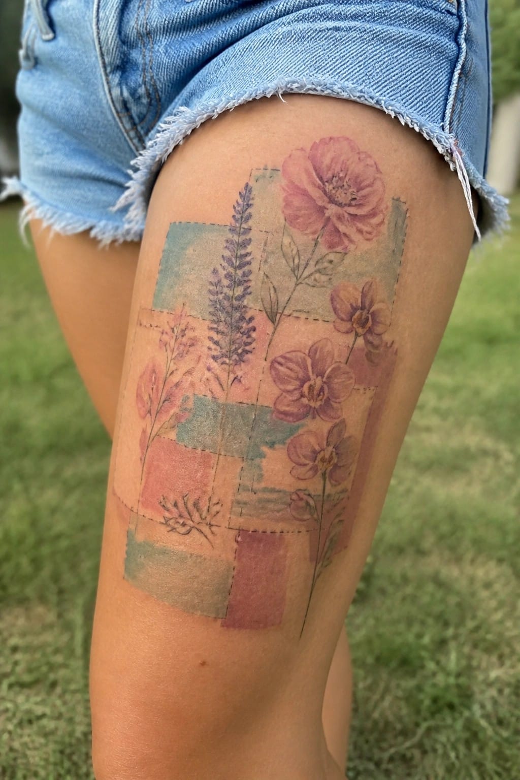
The thigh offers a flat area that fits this patchwork layout well. Different colored sections sit next to each other with stitched lines running through them. Flowers like poppies and lavender grow across the patches in soft colors.
This setup lets the design expand without crowding. I think the placement helps the whole thing stay balanced and easy to read as it grows.
Tic tac toe grid on the wrist
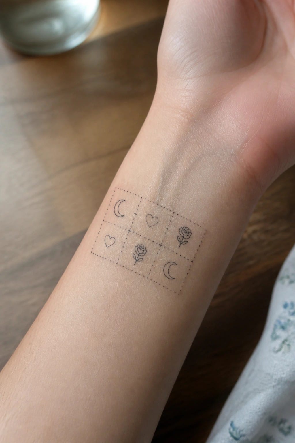
A tic tac toe layout gives a clean frame for mixing small symbols in one spot. The dotted lines hold a moon, heart, and rose without crowding the skin. This keeps the icons separate yet connected in a single small area.
The fine line style fits because each shape stays readable at this scale. I think the grid stops the mix from looking random while still feeling light.
Patchwork tattoo on the upper arm
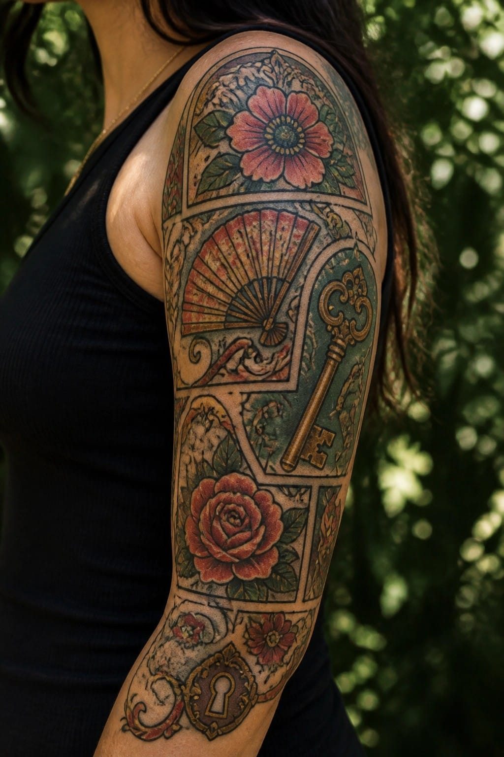
The design stacks framed sections down the arm from the shoulder. A large flower sits near the top, followed by a fan, a key, and a rose lower down. The frames keep each part separate while the colors tie them together.
I think the arm works well here because the length lets the panels build without feeling cramped. The mix of flowers and objects gives some variety but stays readable at this scale.
Mandala cluster on the ankle
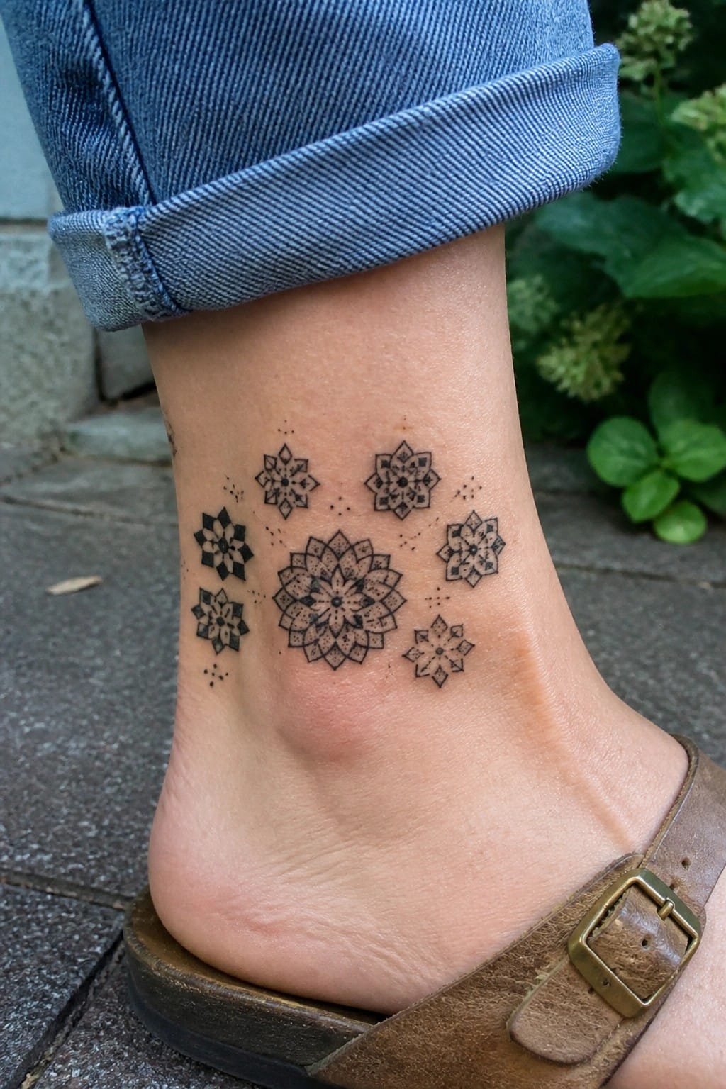
The ankle works well for a loose group of small mandalas. They sit at different heights and angles without crowding the area. A few dots link them lightly while leaving skin visible between each one.
I like how the different sizes stop the whole thing from feeling rigid. It leaves space to add more later if the person wants to keep building the same style.
Mandala on the upper back
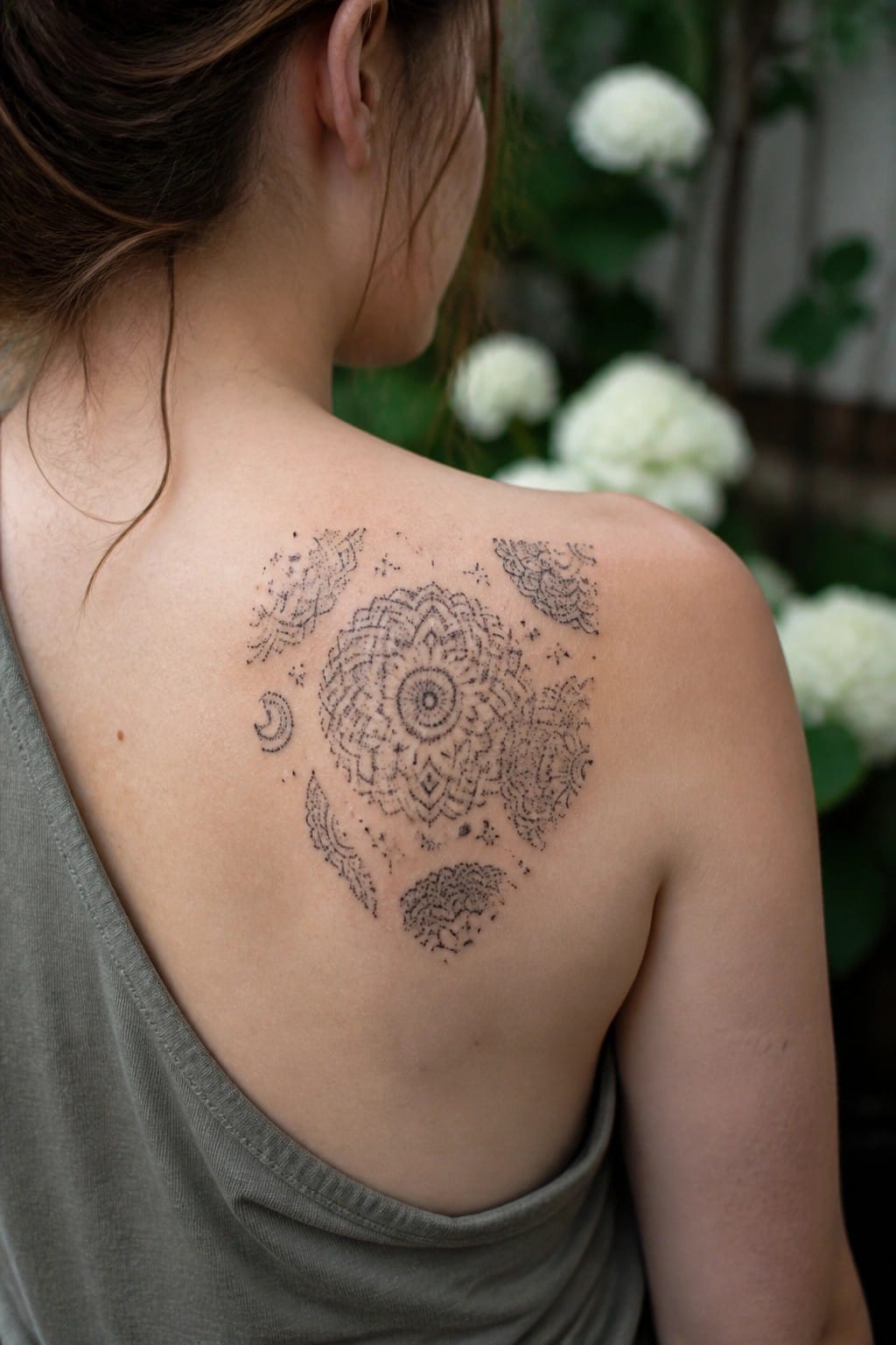
The design sits across the upper back with a large mandala as the center point. A crescent moon and a few patterned shapes sit around it to fill the space. The layout keeps the main piece prominent while leaving room on the sides.
This placement works because the flat area lets the mandala stay clear and balanced. The scattered pieces around it make it easy to add more later without crowding the original work.
Mandalas placed across the full back
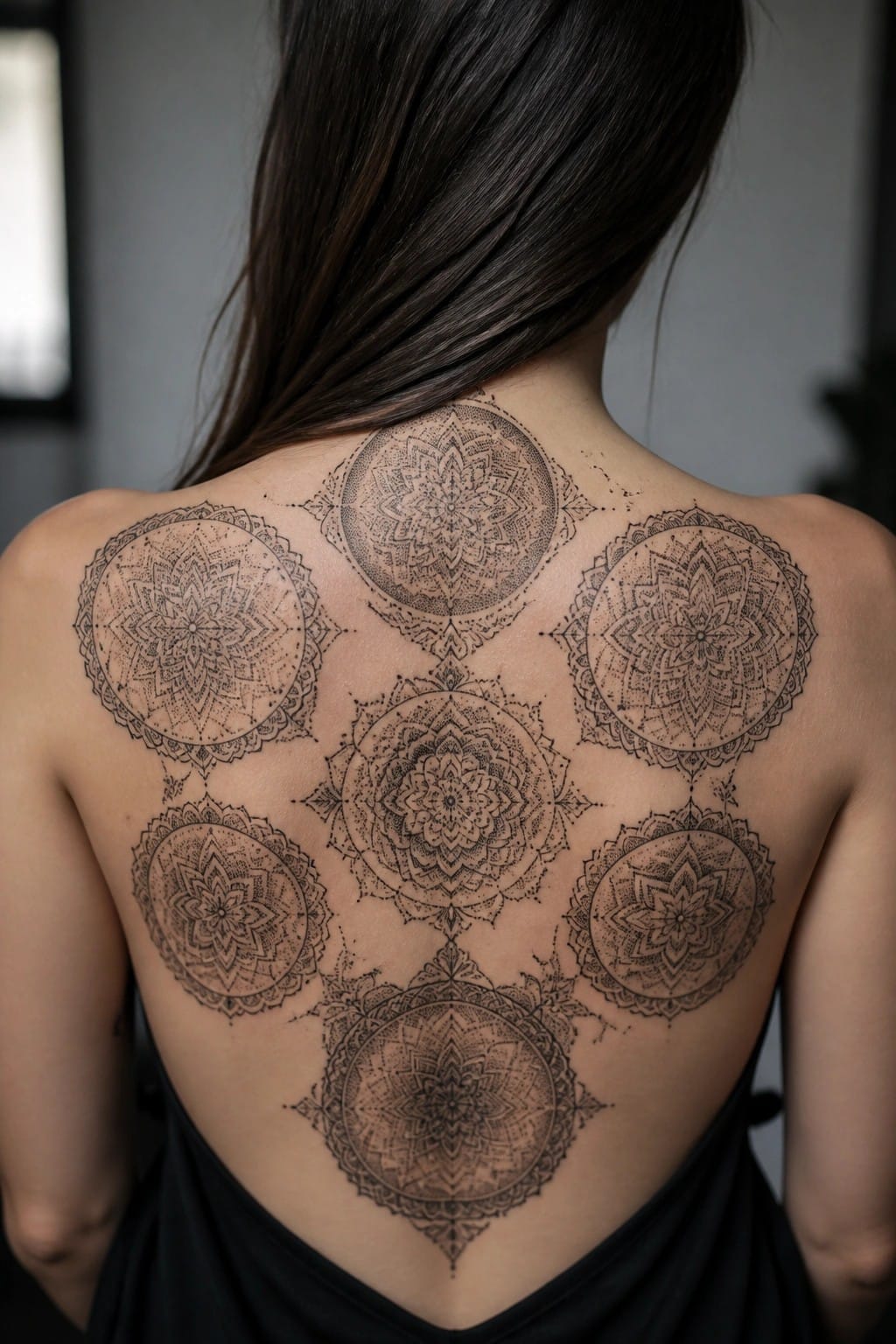
The back gives enough room to fit several mandala designs into one layout. Each circle sits at a different height so the whole group follows the natural lines of the shoulders and spine. Black ink and steady linework keep the patterns clear even when they sit close together.
This approach makes it simple to add more pieces later without breaking the balance. The separate circles still feel like they belong together because of the repeated shapes and spacing.
Stamp style botanicals on the forearm
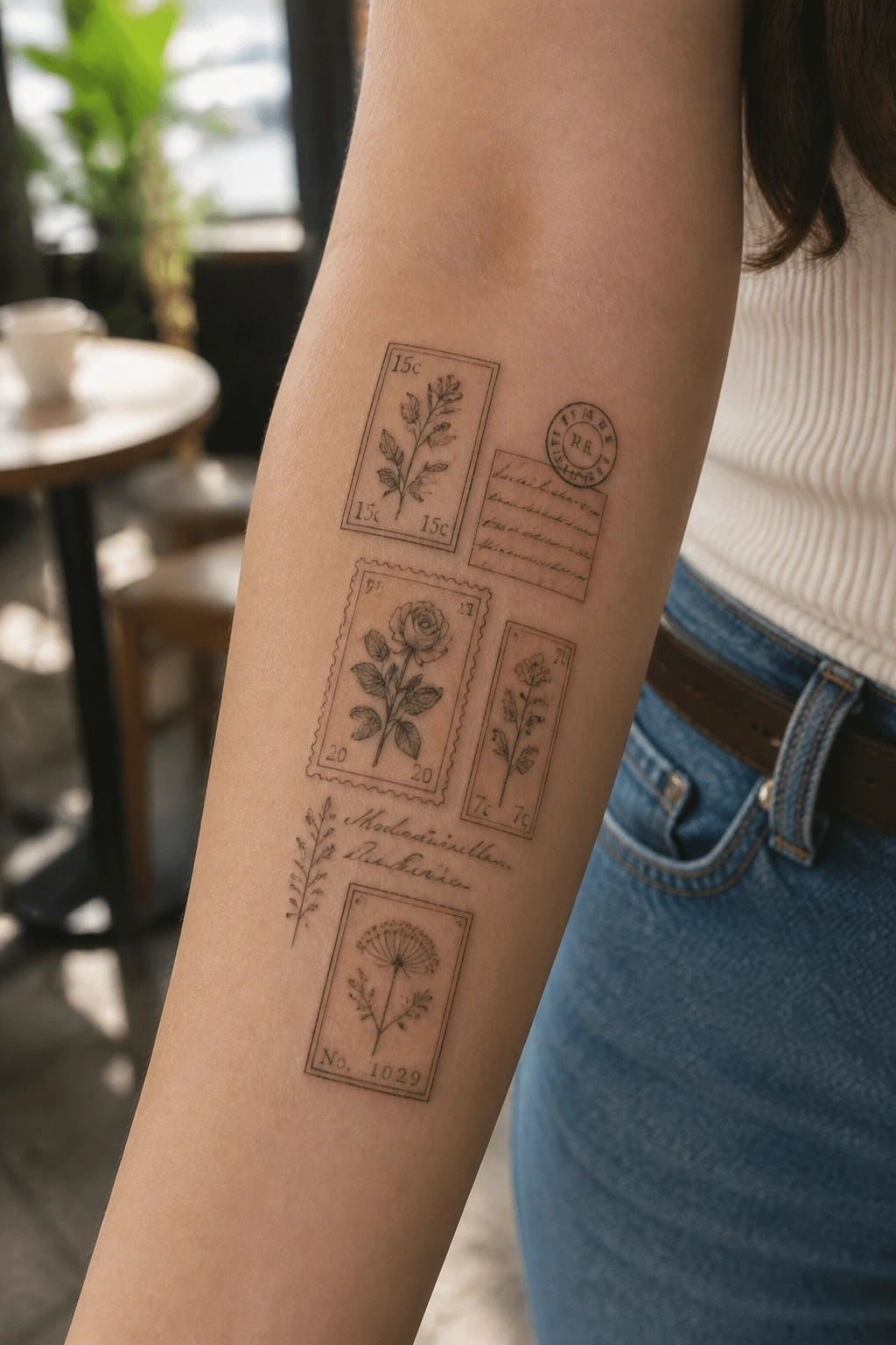
Several small stamps sit along the inner forearm in a loose cluster. Each one holds a different plant drawing with clean lines and light shading. The stamp borders and occasional postmarks give them a collected look.
This style works because it turns simple flower sketches into something that feels assembled over time. I think the scattered placement leaves room to add more stamps later without crowding the skin.
Patchwork panels cover the side torso
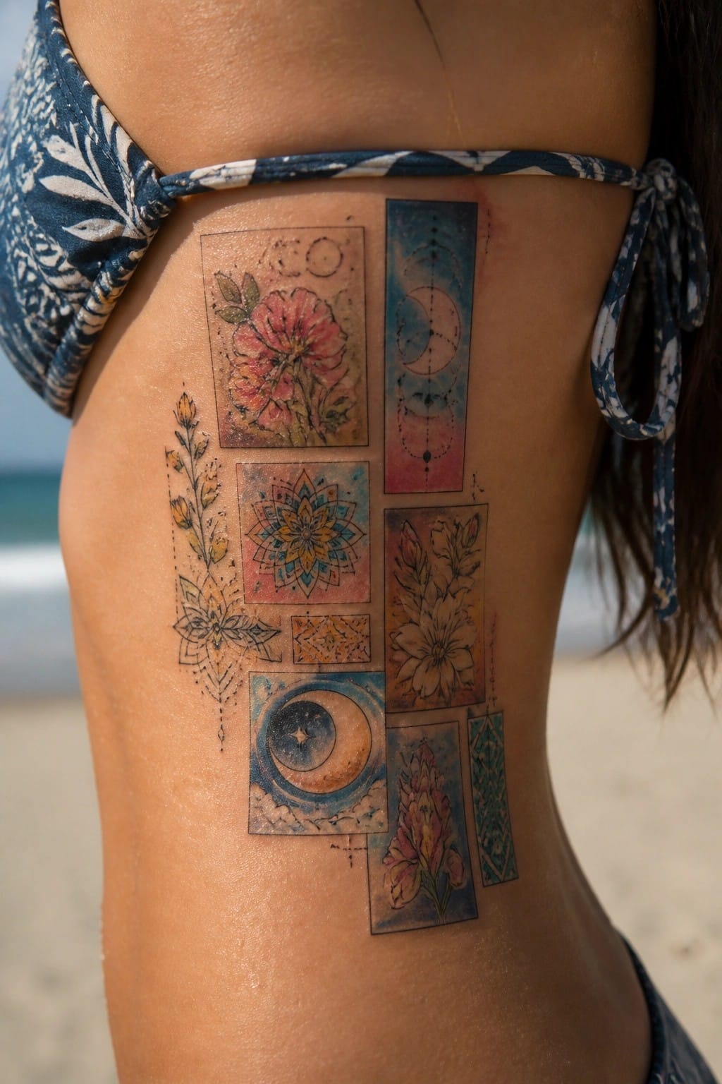
The design places several bordered panels along the side of the torso near the hip. Some sections hold flowers while others show mandalas or moon phases. Watercolor tones tie the separate pieces together without filling the whole space.
This setup lets the motifs stay distinct yet related through color and theme. The borders stop the mix from feeling scattered. I think the layout works because it turns a single area into a growing set of small tattoos.
A sequence of motifs across the collarbone
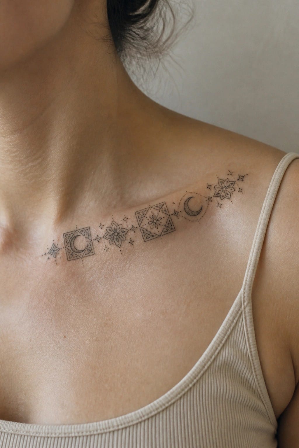
The tattoo sits in a line along the collarbone. It links several small framed pieces that include moons and flowers with stars between them. The elements stay evenly spaced so the design moves with the body.
This kind of spread keeps the details clear at a small scale. I think it works well for someone who wants to keep adding similar pieces over time without filling a large area at once.
Stacked geometric squares run down the spine
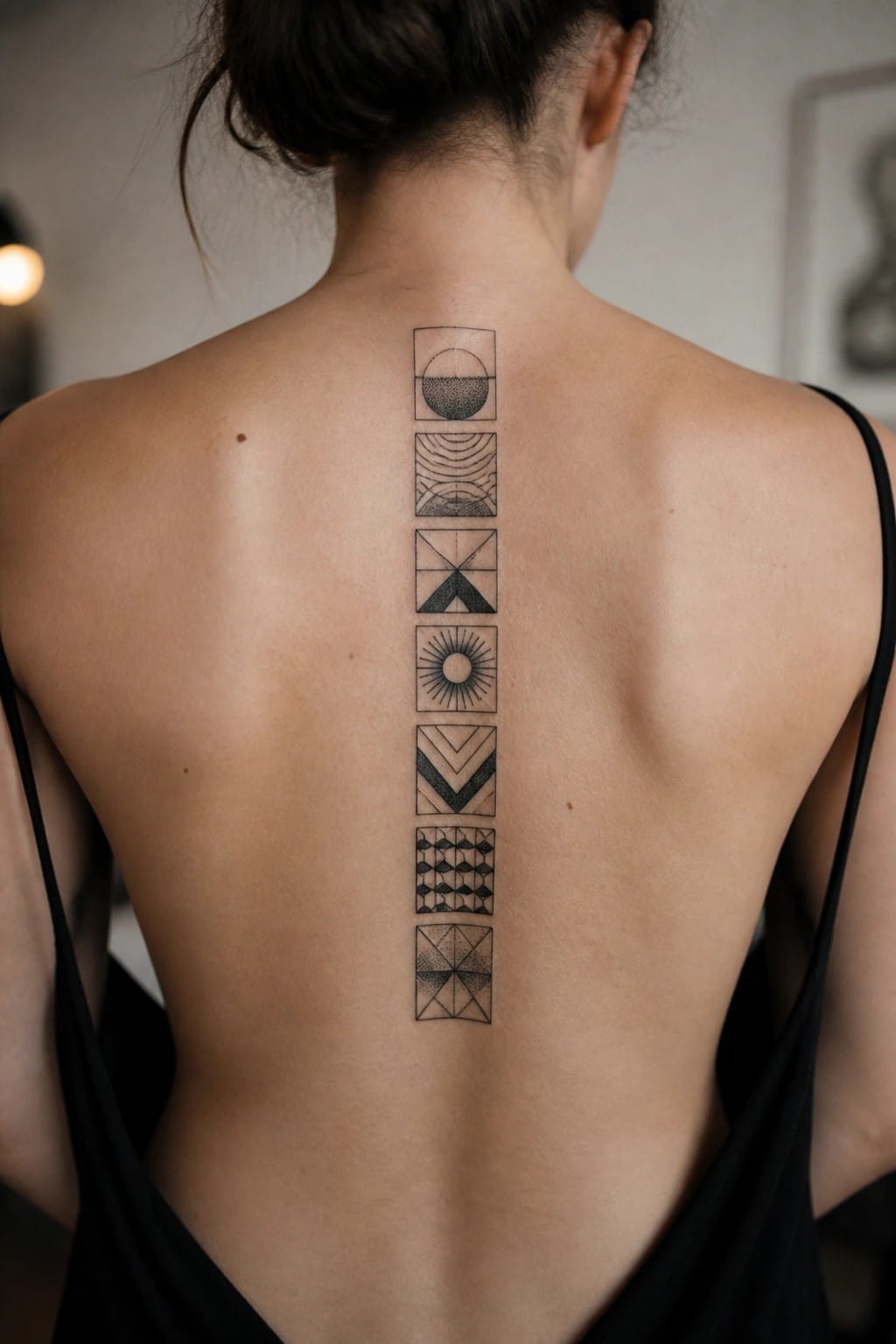
The design uses a vertical column of seven square frames. Each frame holds a different geometric pattern in black ink. The whole piece sits centered on the spine and reaches from the base of the neck to the mid back.
The even spacing between the squares keeps the tattoo readable as one unit. I like how the straight line of the spine gives the patchwork a clear structure without extra lines or borders.
patchwork squares on the hand
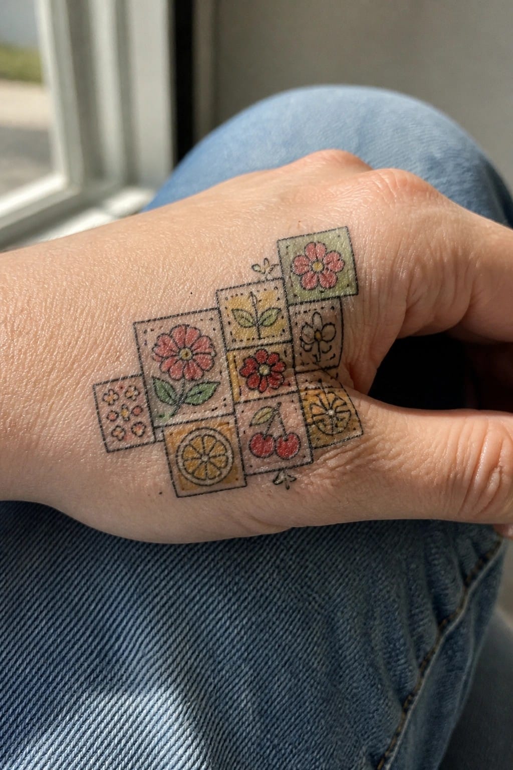
Small square patches sit across the back of the hand. Each holds a simple flower or fruit slice inside its own dotted border. The colors stay soft and the lines stay thin so nothing fights for attention.
This layout makes it simple to keep adding more squares later. I think the mix of cherries and orange slices next to the blooms keeps the whole thing from feeling too matchy.
Framed flowers build a patchwork across the upper back
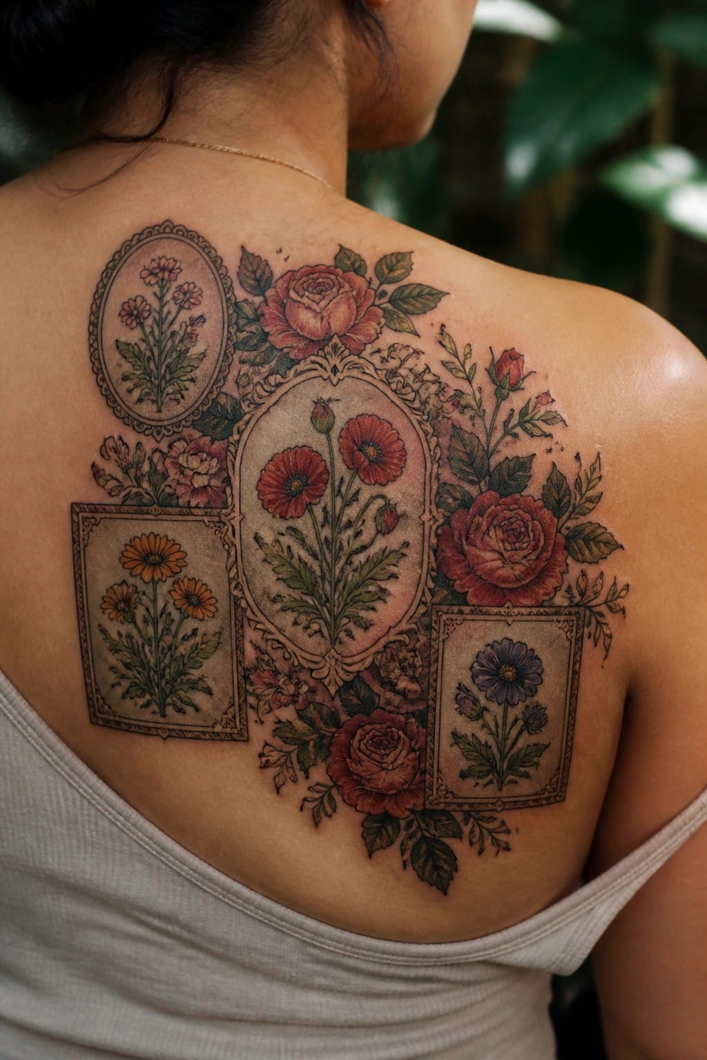
Several framed botanical pieces sit across the upper back. Roses, poppies, and daisies each get their own border in a vintage illustration style. The separate frames turn the different flowers into one connected design.
This layout keeps every bloom clear without crowding. I think the frames are what make the whole thing feel like a growing collection instead of scattered pieces.
Small quotes and symbols fill the inner forearm
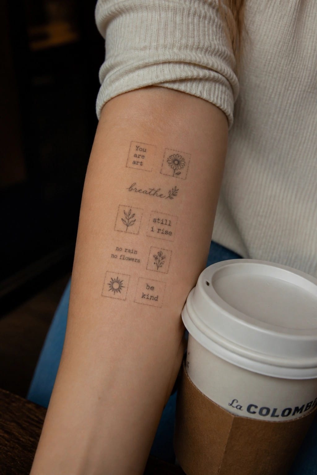
The tattoo spreads several short phrases across the skin. Each one sits next to a simple drawing like a daisy, a sun, or a small plant. The pieces stay separate but share the same fine line style.
The layout keeps every word and icon easy to read on its own. I think the open space between them stops the design from feeling busy even though there are quite a few elements.
Thigh placement for a lace patchwork tattoo
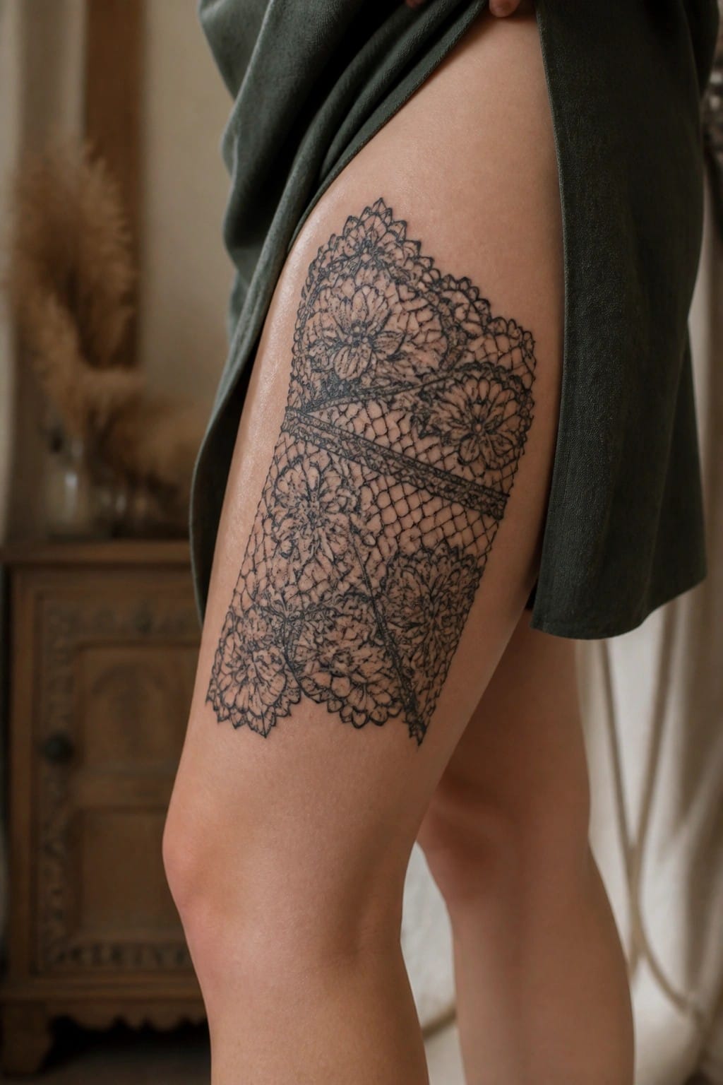
The upper thigh holds this rectangular panel without any wrapping. Multiple flower clusters connect through mesh sections that run across the middle. The black lines stay fine but the overall shape reads as one solid block.
This spot lets the full width stay visible and balanced. It also leaves room to add smaller pieces around it later without crowding the main design.
Motifs form a line across the collarbone
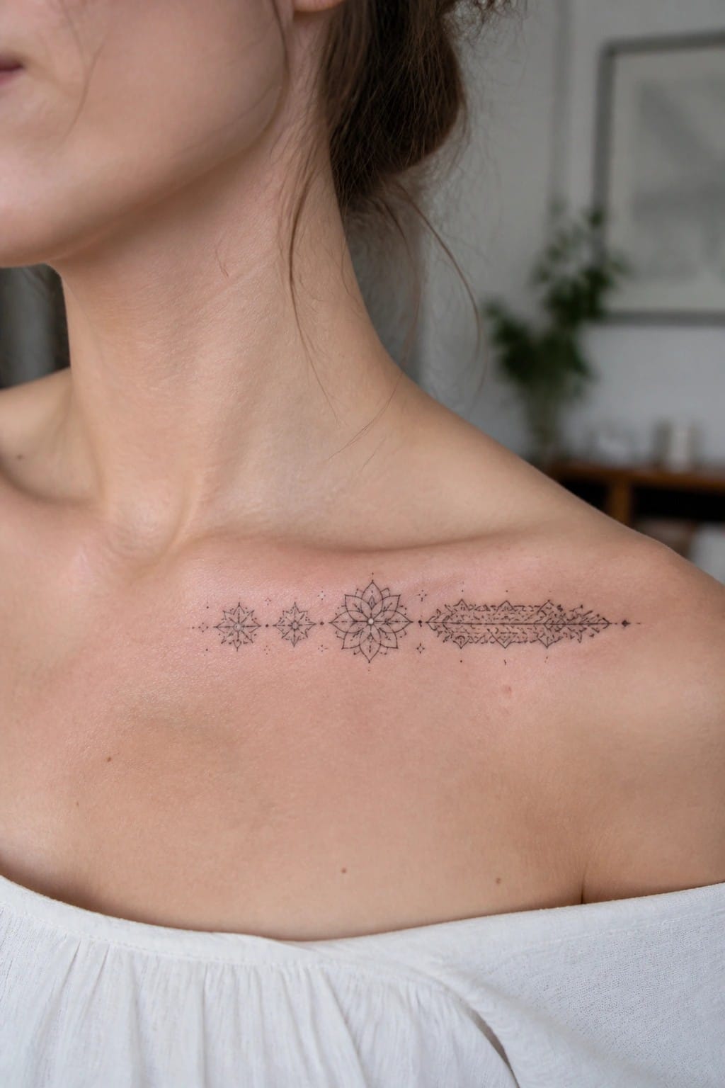
The design runs horizontally right below the neck. Small star shapes sit on the left side and lead into a central mandala. A longer patterned element extends toward the shoulder.
This placement lets the separate pieces sit side by side without overlap. I think the spacing keeps each motif clear even on a flat area like the upper chest.
Patchwork tattoo on the inner forearm
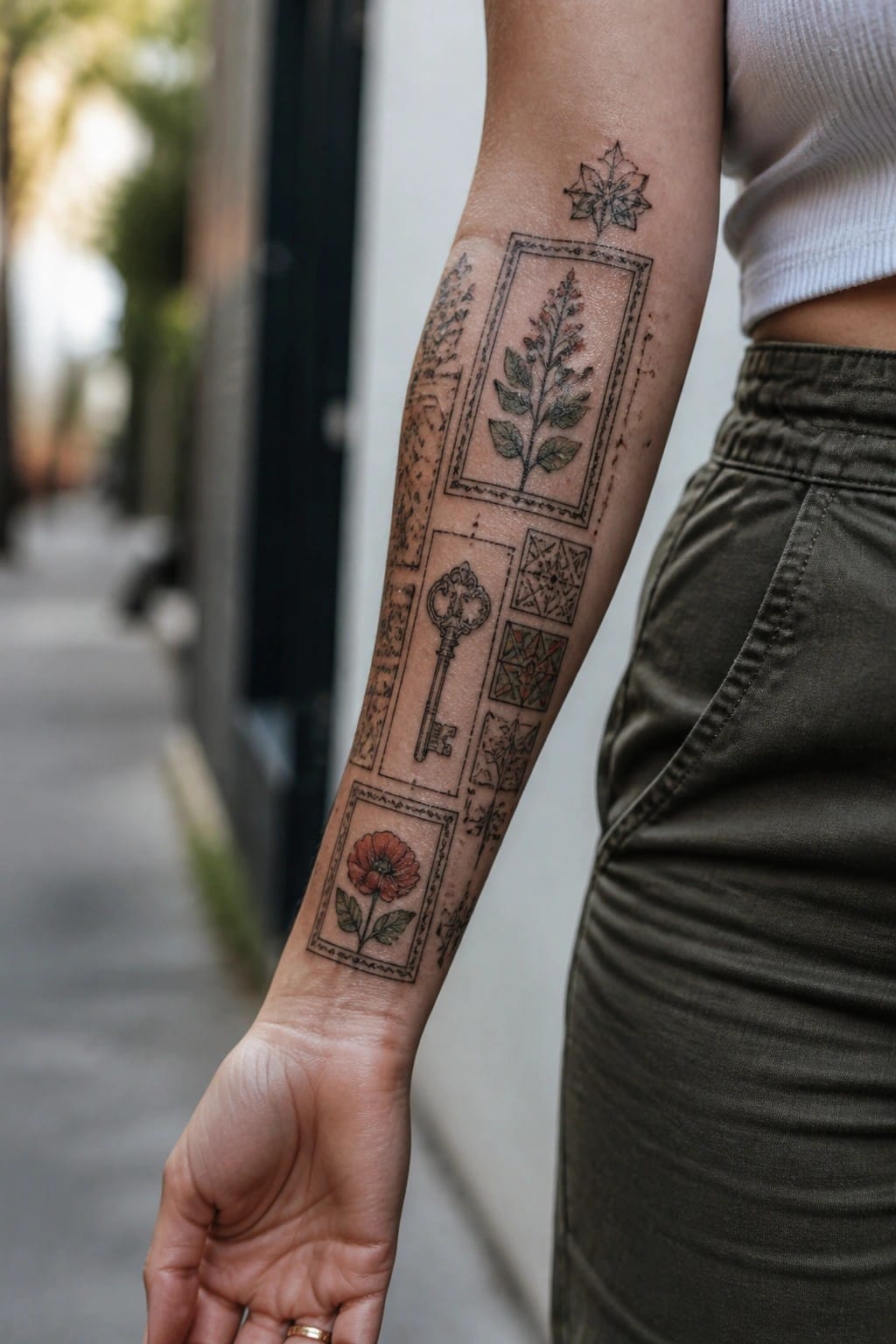
Several small framed designs run down the inner forearm in a straight vertical layout. A large key sits near the center with a red poppy below it and a leafy plant above. Thin borders and light geometric fills separate each piece while keeping the whole group connected.
This style works well when someone wants to gather different symbols in one spot. I think the matching frames stop the mix from looking scattered even though the subjects vary.
A grid of small motifs behind the ear
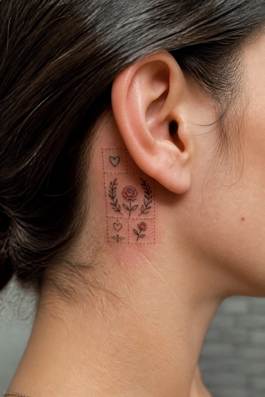
The tattoo sits directly behind the ear in a small square layout. A dotted border frames several separate pieces including roses, hearts, and leafy branches. The arrangement stays tight so the whole thing fits the curve of the neck without spreading out.
This spot works because it keeps the grid contained and easy to hide or show. I think the dotted lines help the separate elements read as one collection instead of random bits.
Patchwork tattoos line the sides of the fingers
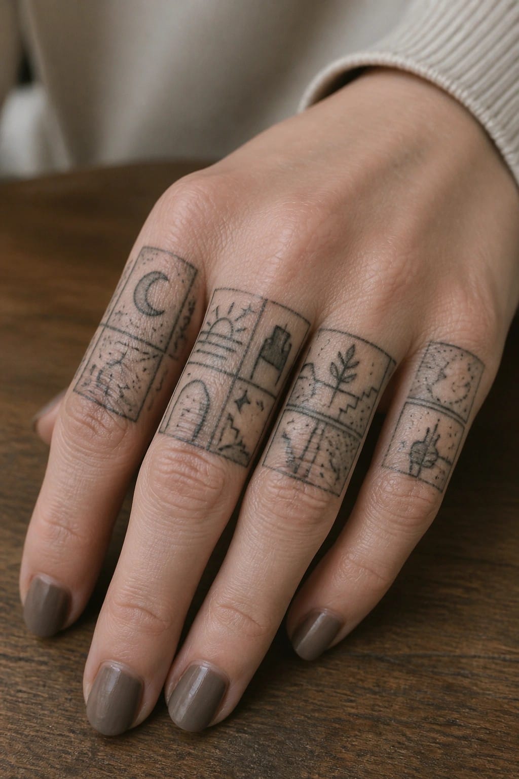
The sides of the fingers give these small rectangles a natural place to stack without overlapping. Each panel holds a simple scene and the narrow space keeps the whole set feeling connected rather than scattered. The fine line work stays light enough for the skin texture to show through.
This layout works because it turns four fingers into one ongoing collection. I think it also leaves room to add matching pieces later without crowding the hand.
Patchwork tattoo on the lower back
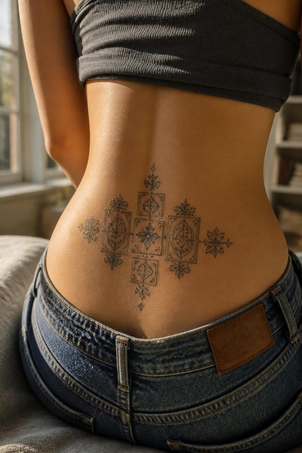
The lower back works well for this kind of design because it allows the pattern to stay centered and symmetrical. The main shapes sit along the spine with smaller pieces branching out evenly on both sides. Black line work keeps the separate frames and floral details clear without needing color.
I think the medium scale stops the tattoo from feeling overwhelming on this area. It also leaves room to add more pieces later if someone wants to build around it.
Frequently Asked Questions
What makes a patchwork tattoo collection cohesive?
To build cohesion focus on a consistent theme such as florals celestial motifs or delicate line work across all pieces. Choose a limited color palette like soft pastels or black and gray tones and maintain similar sizing and spacing so the tattoos flow together visually even when added over multiple sessions.
How should I choose body placements for feminine patchwork tattoos?
Consider areas like the ribs inner forearms or behind the ears for smaller designs that can expand into a collection. These spots allow for easy addition of new pieces while keeping the overall arrangement balanced and visible only when desired which supports a gradual build up without overcrowding.
What feminine themes work well in a creative patchwork style?
Popular options include intertwined vines with subtle animals delicate butterflies or geometric patterns softened by watercolor accents. Select motifs that share a personal story or aesthetic such as nature inspired elements to ensure each new tattoo complements the existing ones in your collection.
How do I plan for adding tattoos over time without losing cohesion?
Start with a core design in mind and map out potential future spots on your skin using temporary markers or sketches. Consult your artist about scalable styles that allow seamless integration of new elements like matching borders or recurring symbols so the collection grows naturally and remains unified.
What aftercare steps help maintain the look of delicate feminine tattoos?
Clean the area gently with unscented soap and apply a thin layer of moisturizer daily while avoiding sun exposure and tight clothing during healing. For small patchwork pieces touch up sessions may be needed later so follow your artists specific instructions to keep colors vibrant and lines crisp over the years.
