

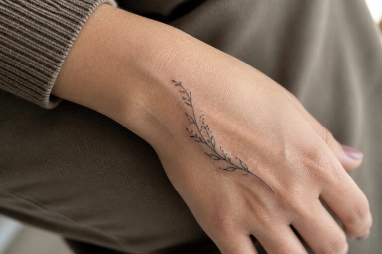
I have always preferred hand tattoos that feel soft and elegant on women. My own subtle ink reminds me daily how pretty they can look without any weight. These twenty five designs capture that light feminine charm I love recommending to friends. I think one might just spark your next favorite idea.
A fine line branch along the side of the hand
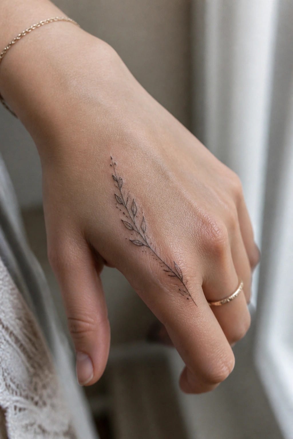
Placing this tattoo on the side of the hand lets the stem run along the natural line of the skin. The slender shape stretches from near the base of the finger down toward the wrist area without crowding the space. Small leaves sit along the stem with a few dots for extra texture.
I think the length works well here because it uses the hand’s shape without needing extra shading. The fine lines keep the whole thing light and easy to read at this size.
Small crescent moon on the finger
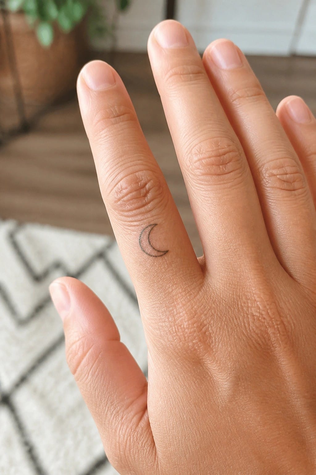
The tattoo sits along the side of the ring finger. This placement lets the design stay visible only from certain angles. The small scale keeps the whole thing contained and easy to wear every day.
The simple outline works here because it does not compete with the natural lines of the hand. I think it reads as a personal mark rather than a statement piece.
Ornate lines cover the back of the hand
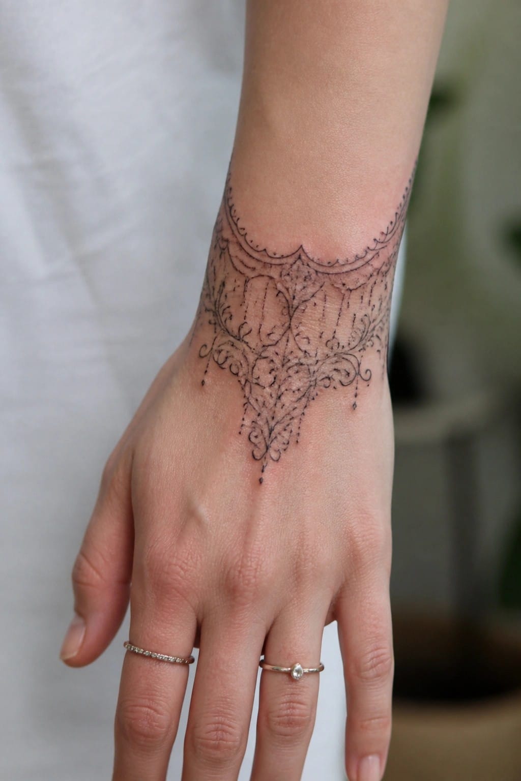
The tattoo begins at the wrist and flows down onto the hand itself. Fine lines form an open frame that narrows toward the center of the design. This shape lets the skin show through and keeps the whole piece from feeling crowded.
The hand placement gives the pattern a solid base to sit on. I think the open spacing helps it stay clear even with all the small details included.
Rose on the side of the hand
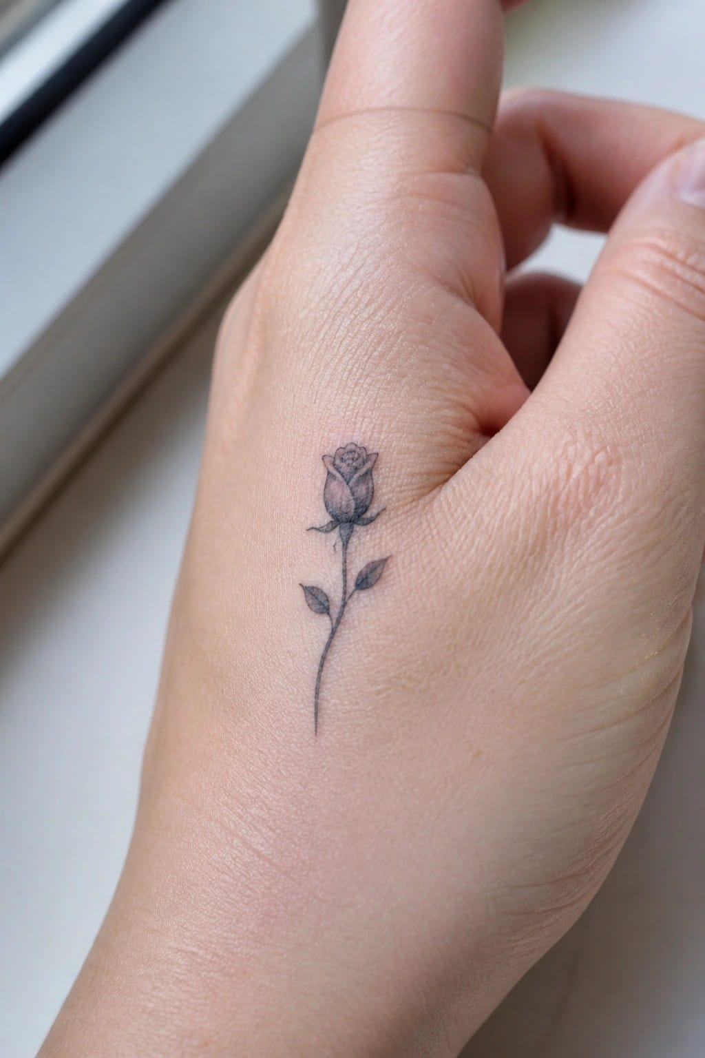
The rose sits on the side of the hand near the base of the thumb. Its stem runs downward in a single thin line with two small leaves attached. The flower stays compact and uses light shading on the petals.
This spot works because the design stays narrow enough to fit the natural shape of the hand. I think the scale prevents it from looking crowded while still showing clear detail up close.
Constellation tattoo along the fingers
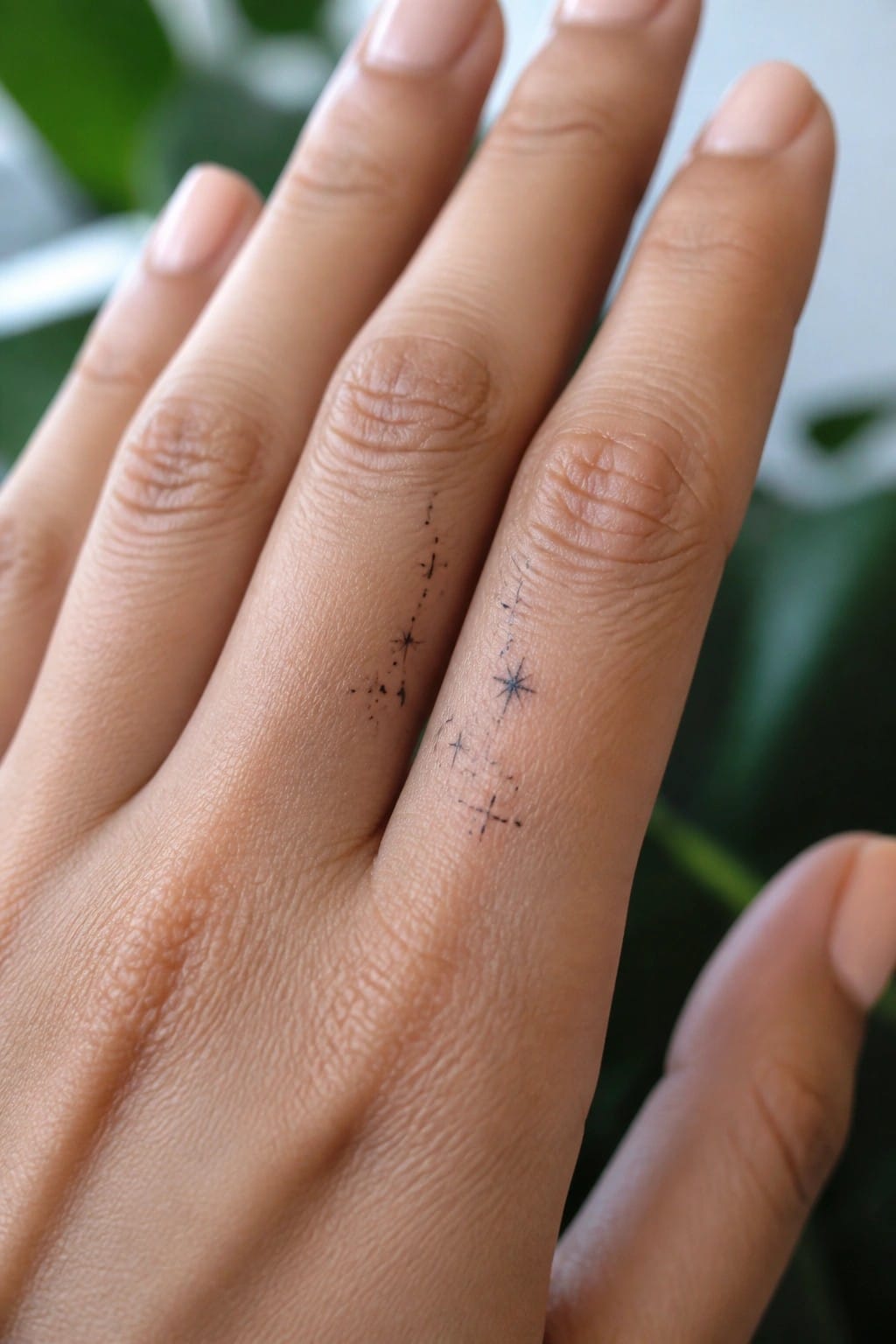
The design runs along the side of the fingers in a straight path of small stars and dots. It forms a simple constellation that stays narrow and contained. This keeps the tattoo from taking up much surface area while still showing the full pattern.
I think the finger placement works because the shape fits the length without needing extra width. The lines stay thin enough to feel light in that spot. It gives a clean celestial look that does not compete with other hand details.
Word tattoo on the side of a finger
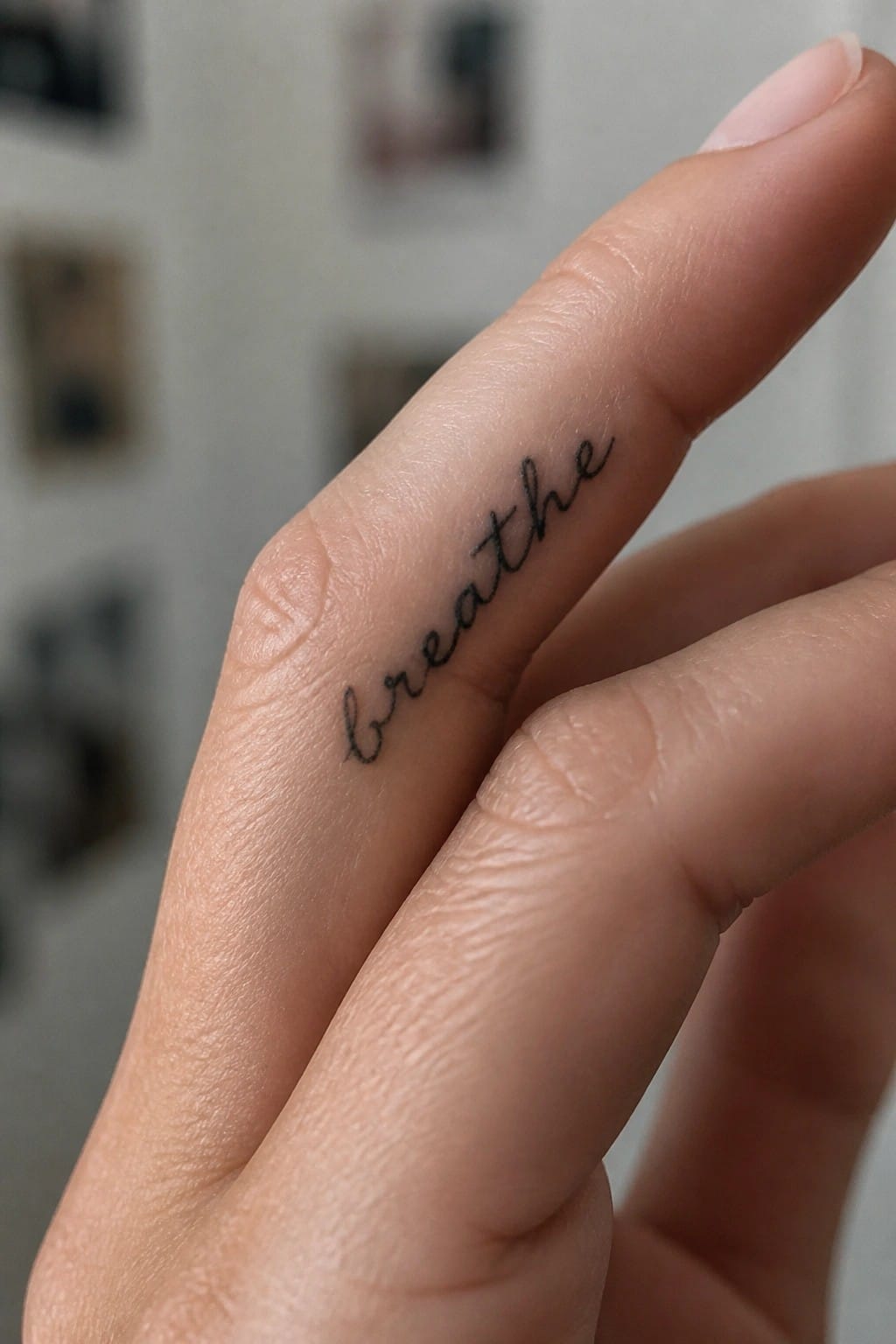
The tattoo sits along the side of the finger in a flowing script. This placement lets the word stretch out without taking up too much space on the hand. The letters stay small and follow the finger’s natural shape.
I think this spot works well because the tattoo stays mostly hidden until the hand moves. It keeps the design simple and readable at that scale.
Three triangles line the back of the hand
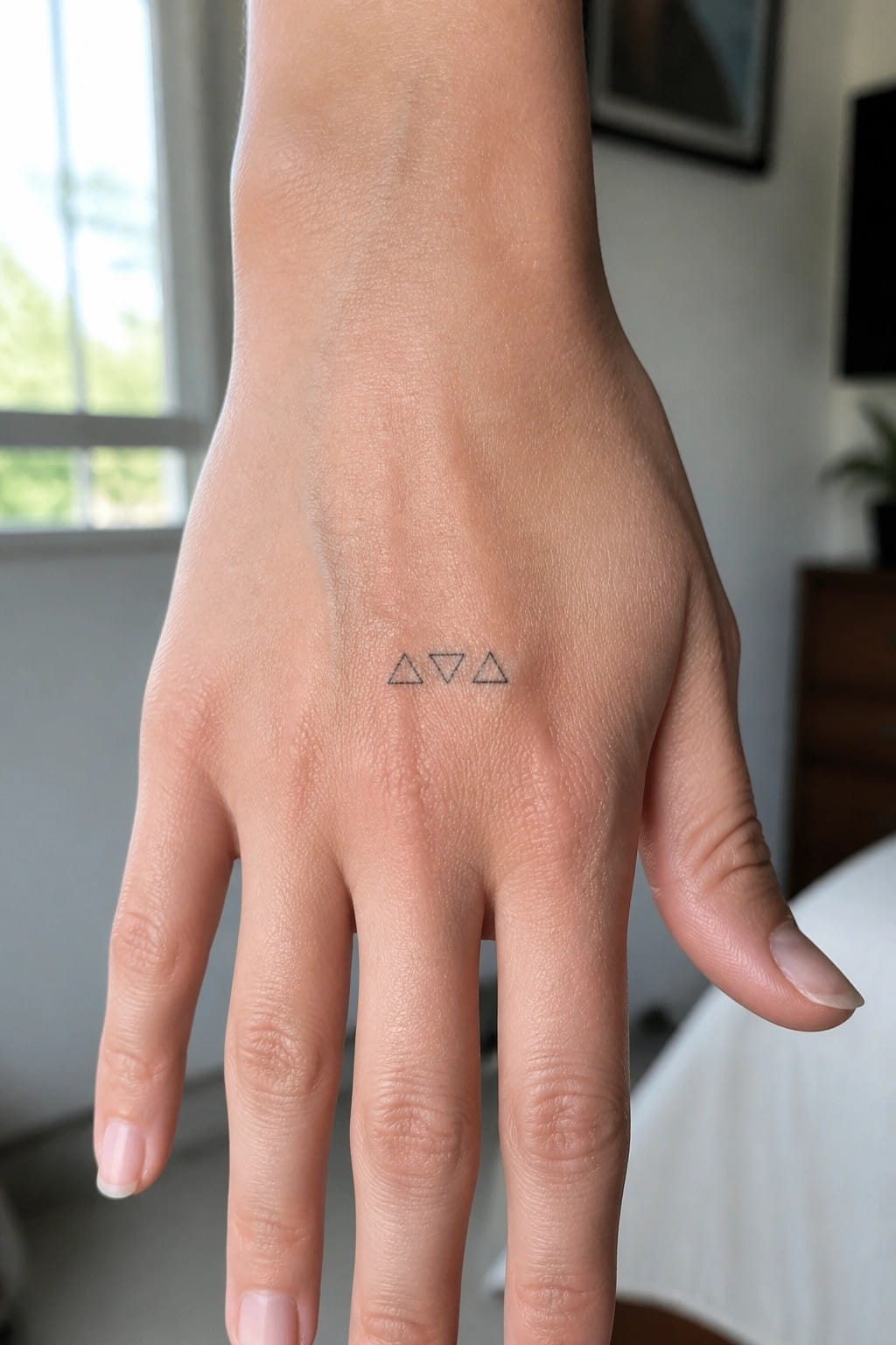
The back of the hand leaves enough flat space for three small triangles to sit in a straight row without overlapping any joints. Fine lines keep each shape thin and separate so nothing feels crowded at this scale.
I think the mix of upright and inverted triangles stops the row from looking too rigid. This size stays easy to hide under a sleeve while still showing up when the hand is open.
A thin vine runs along the side of the hand
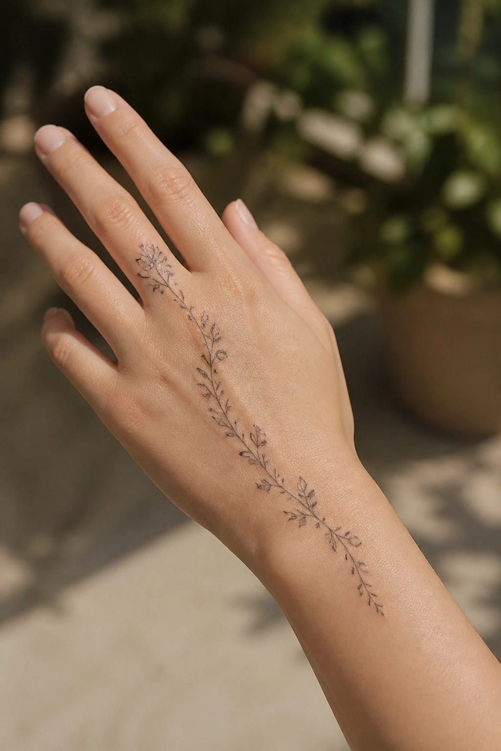
The tattoo starts between two fingers and continues in one long line down to the wrist area. This placement lets the stem follow the natural slant of the hand without sitting too close to any single finger. The fine line work keeps the leaves and small flowers looking light as they trail along.
The length gives the design some movement while staying easy to read. I think the simple stem works well here because it does not compete with the shape of the hand itself.
A sun tattoo on the back of the hand
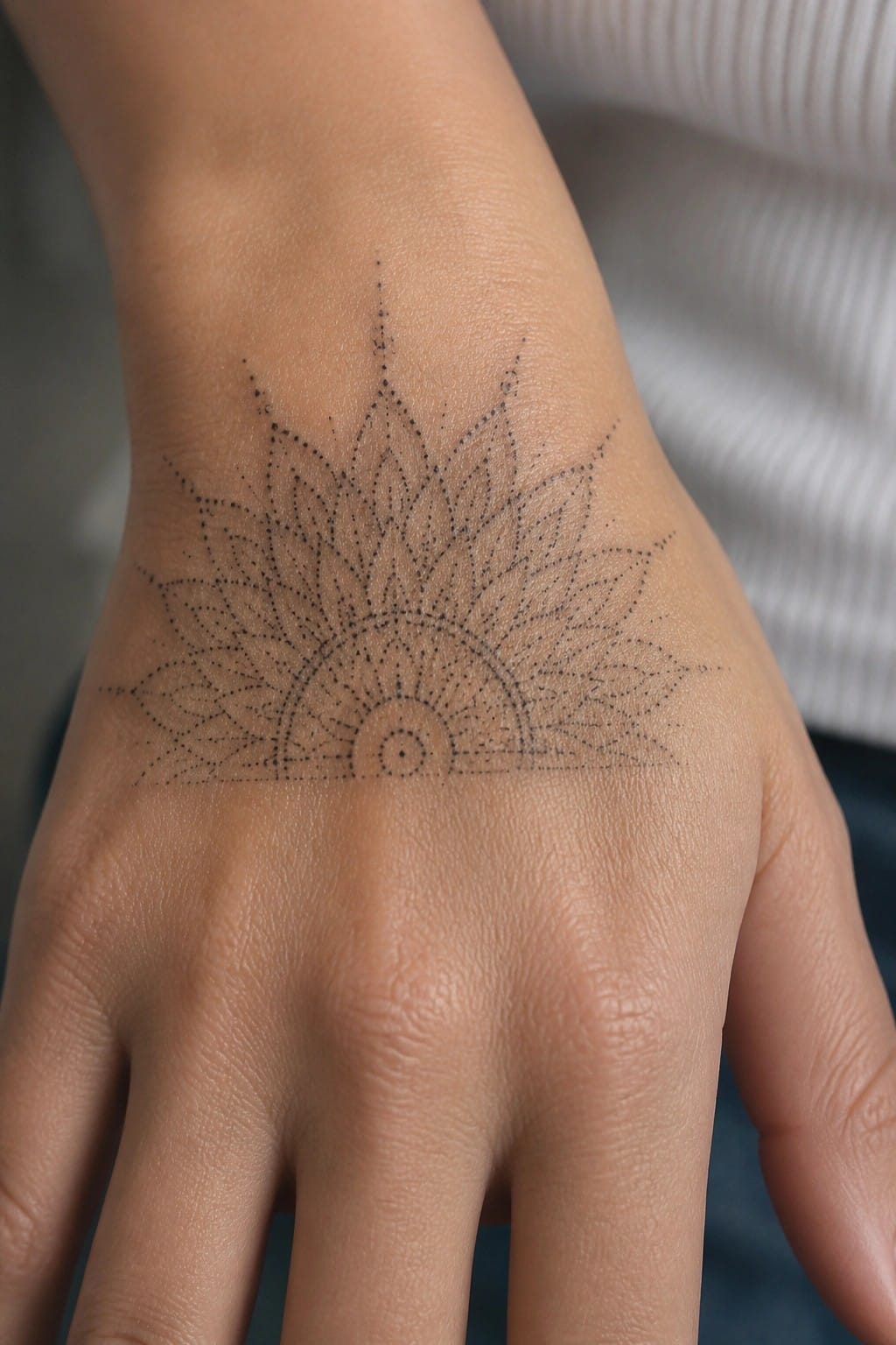
The placement puts the half sun right below the wrist. Fine dots form the rays and the curved base so the design stays open across the skin. The size lets the pattern spread without filling the whole hand.
I think the spot works because the hand stays flat enough for the rays to stay even. The dotted style also keeps the lines from looking thick when the skin moves.
Small heart on the finger
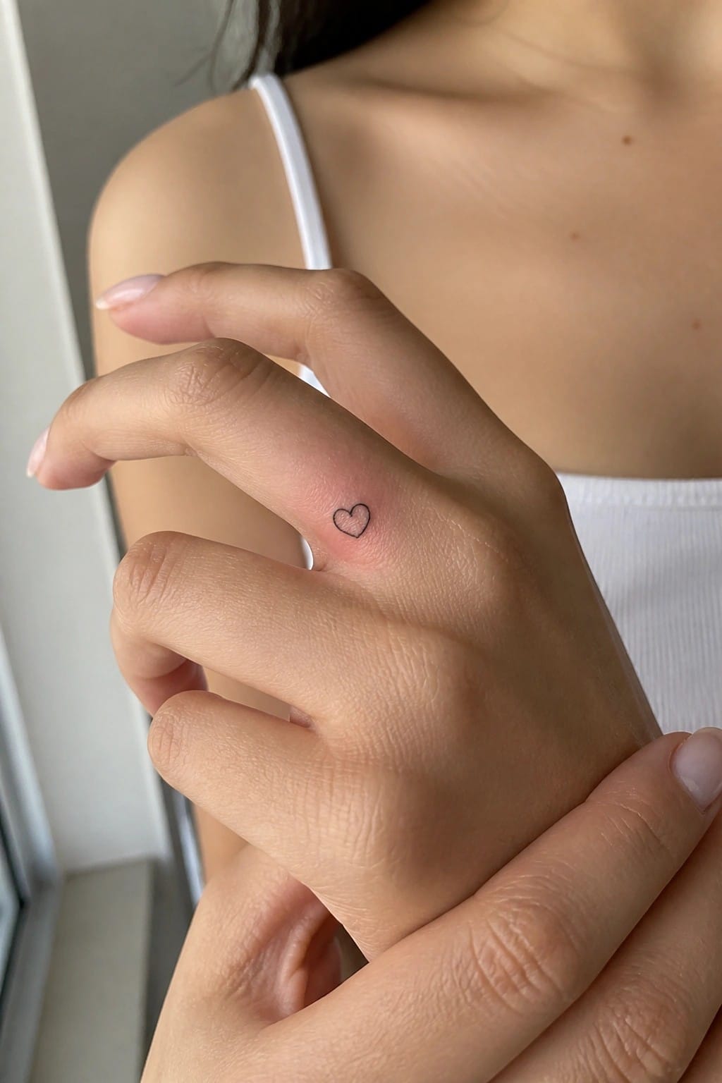
The heart sits on the side of the finger in a compact size that fits the narrow space. A single thin line forms the shape with no shading or inner detail. This keeps the tattoo from drawing attention during normal hand use.
The finger placement works for someone who wants the design visible mainly to themselves. I went with a basic outline because it stays clear without needing extra elements to hold up at this scale.
Dotted lines cross the inner wrist around a small flower
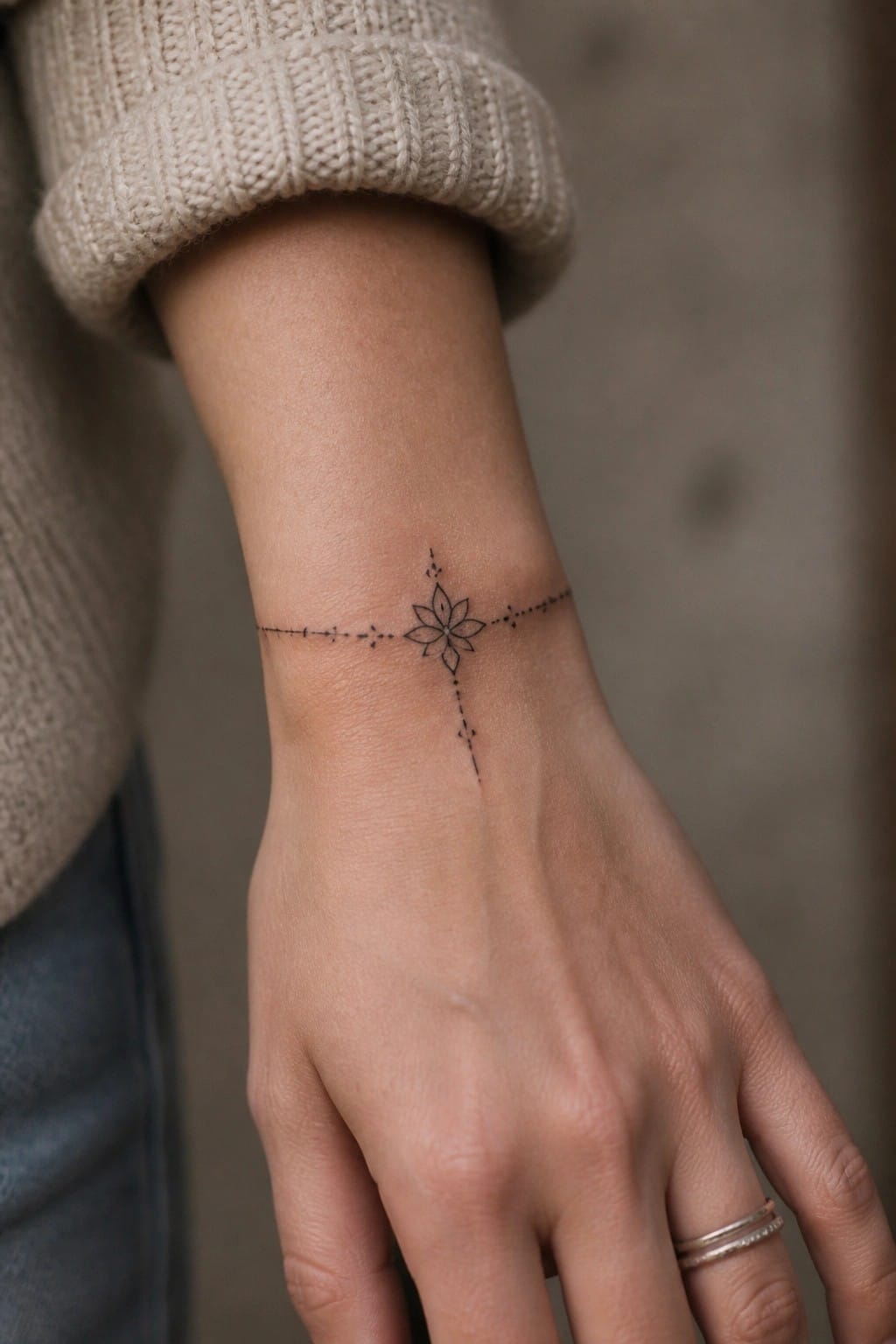
The inner wrist works for this tattoo because the area stays relatively flat. That lets the horizontal and vertical lines sit straight without much distortion. The flower stays centered while the dots trail off in each direction.
I think the dotted style prevents the lines from looking too heavy on such a visible spot. The scale stays small enough that the design does not overwhelm the wrist.
A fine line vine on the side of the hand
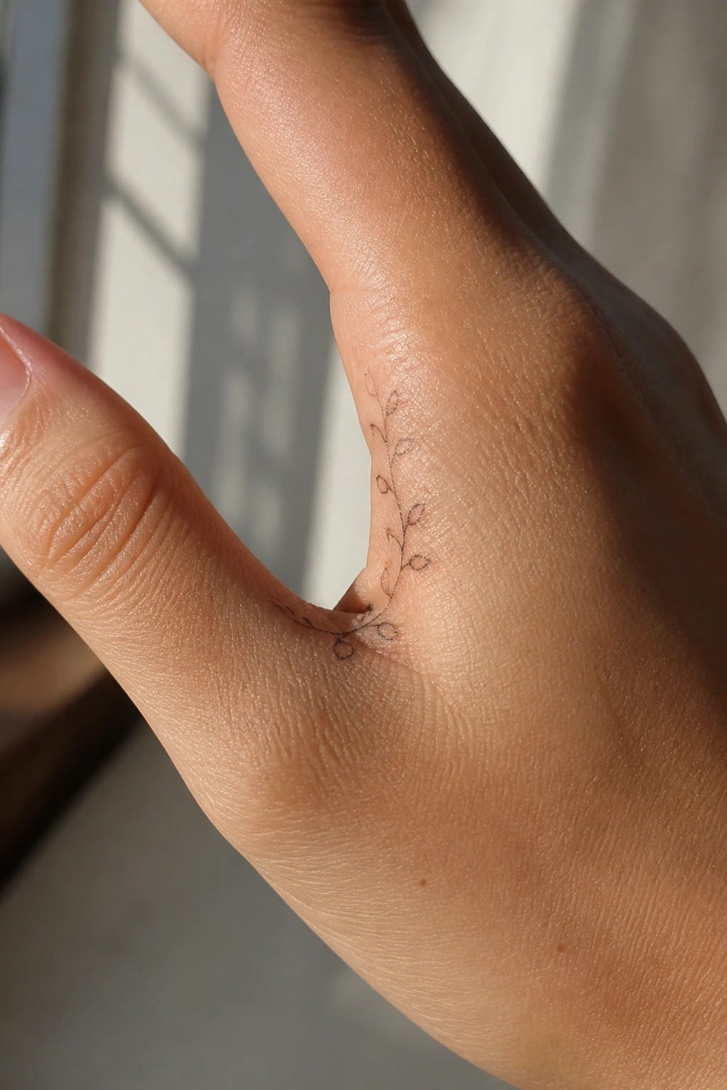
The tattoo runs along the outer edge of the hand near the base of the thumb. A thin stem curves upward with small leaves spaced out along the way. The lines stay light and minimal from start to finish.
This spot lets the design follow the hand’s natural contour without taking up much space. I think the length works well here because it stays visible but never feels crowded.
Small circle tattoo on the finger
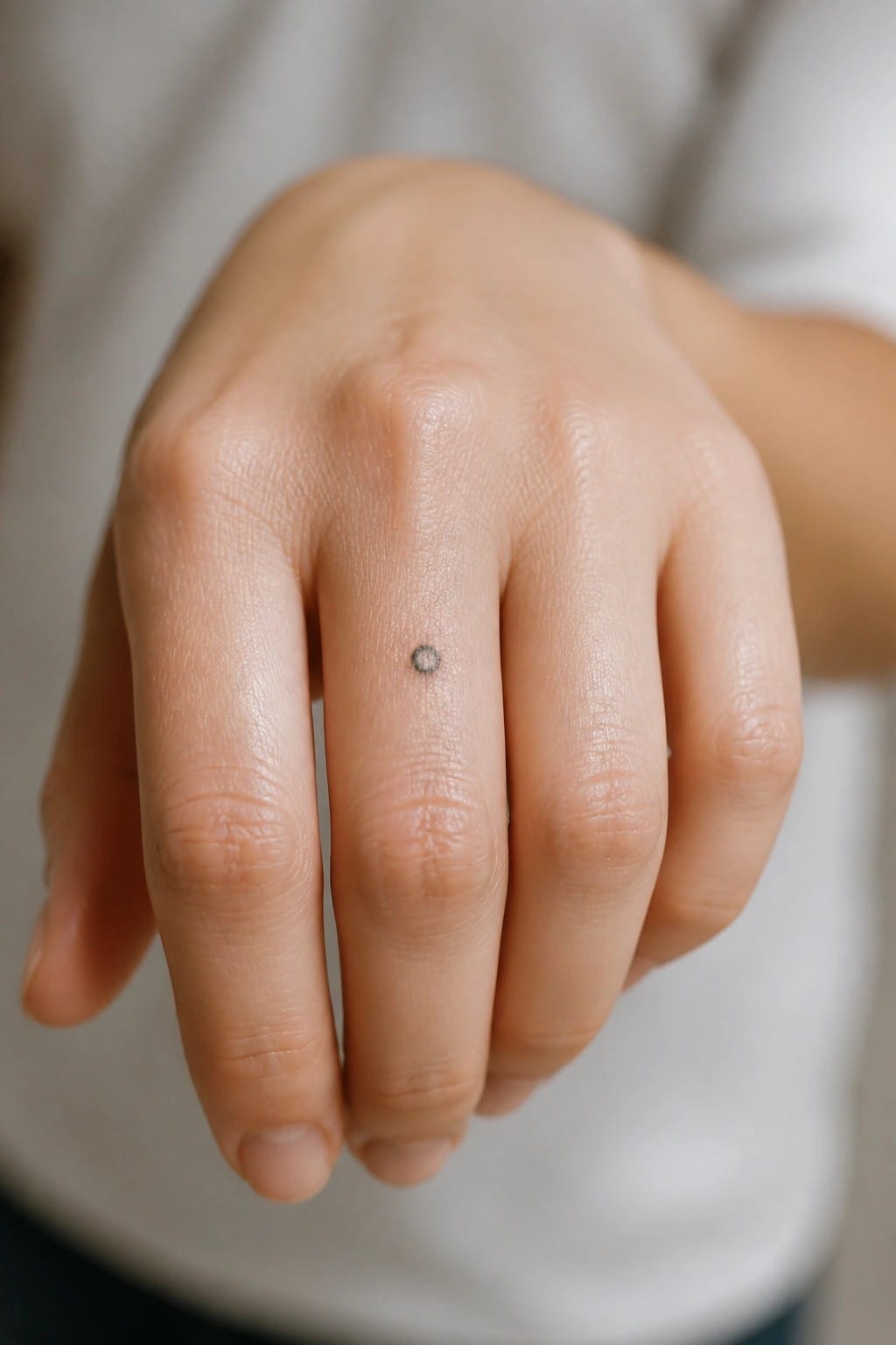
The finger gives this design room to stay understated. A thin black circle sits right on the skin without extra lines or shading.
It reads as a quiet mark rather than a statement piece. I like how the size keeps the whole thing from competing with anything else on the hand.
A compass tattoo on the side of the hand
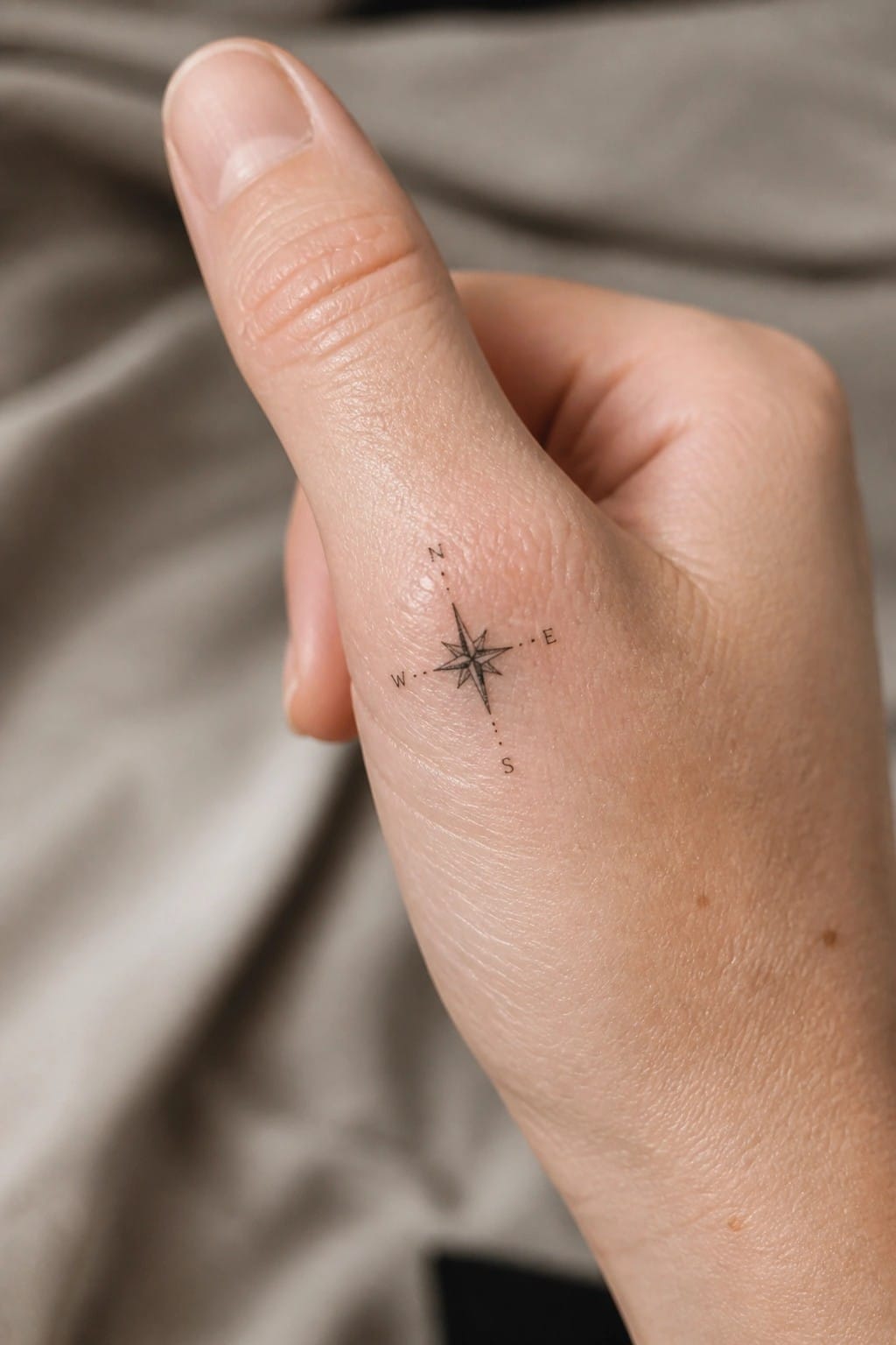
The design sits on the outer edge of the hand near the thumb. Fine lines keep the compass small and contained. The four directions stay evenly spaced without crowding the skin.
I think the letters help the shape read quickly at this size. It avoids any extra shading so the whole thing stays light.
Three fine lines across the back of the hand
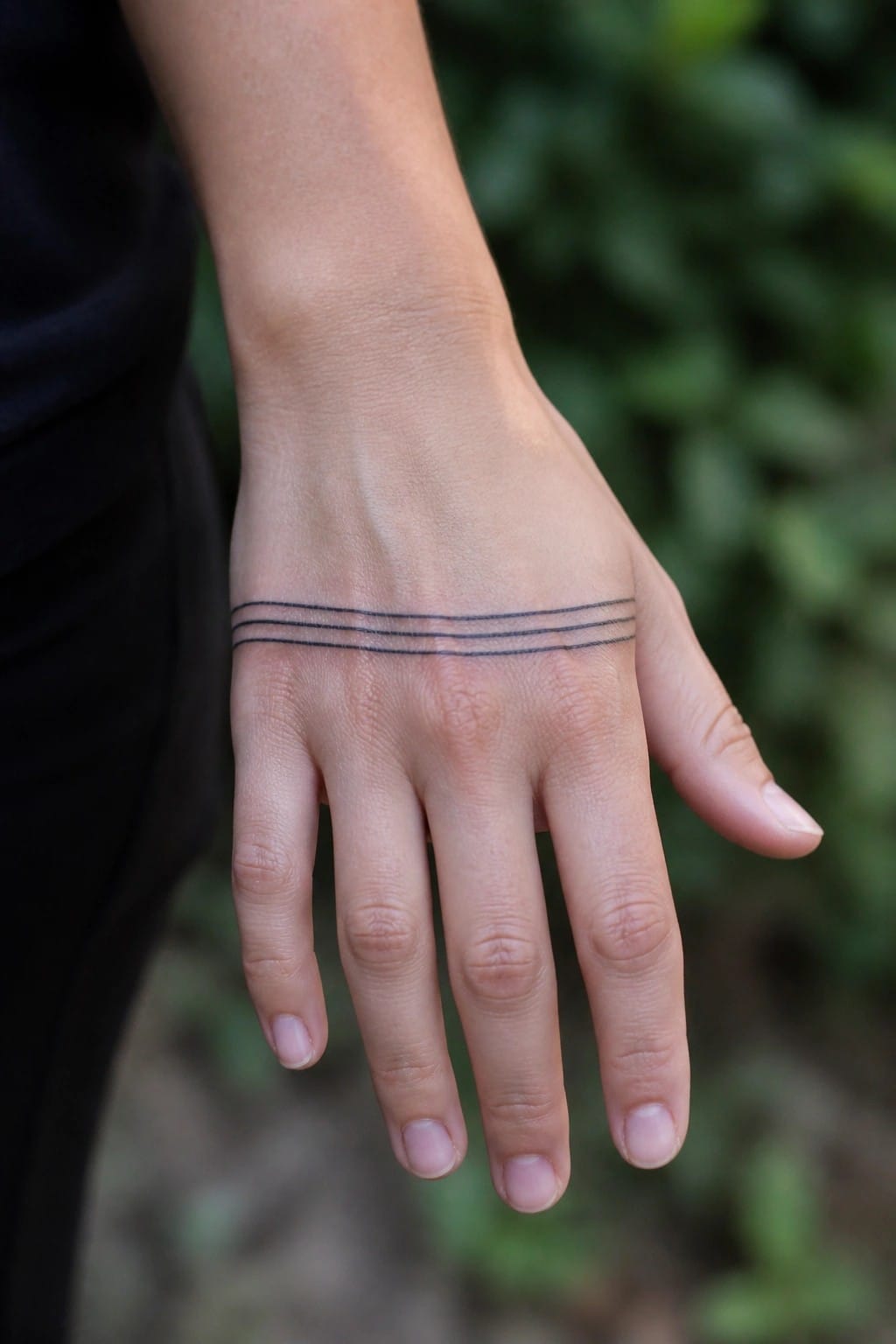
The lines sit horizontally just above the wrist on the back of the hand. They stay thin and evenly spaced with no added detail. This keeps the tattoo contained in a small area that moves less during normal use.
I think the placement works because it leaves room for the hand to flex without distorting the lines. The minimal approach also makes the design easy to pair with other small pieces later.
Small leaf tattoo on the inner wrist
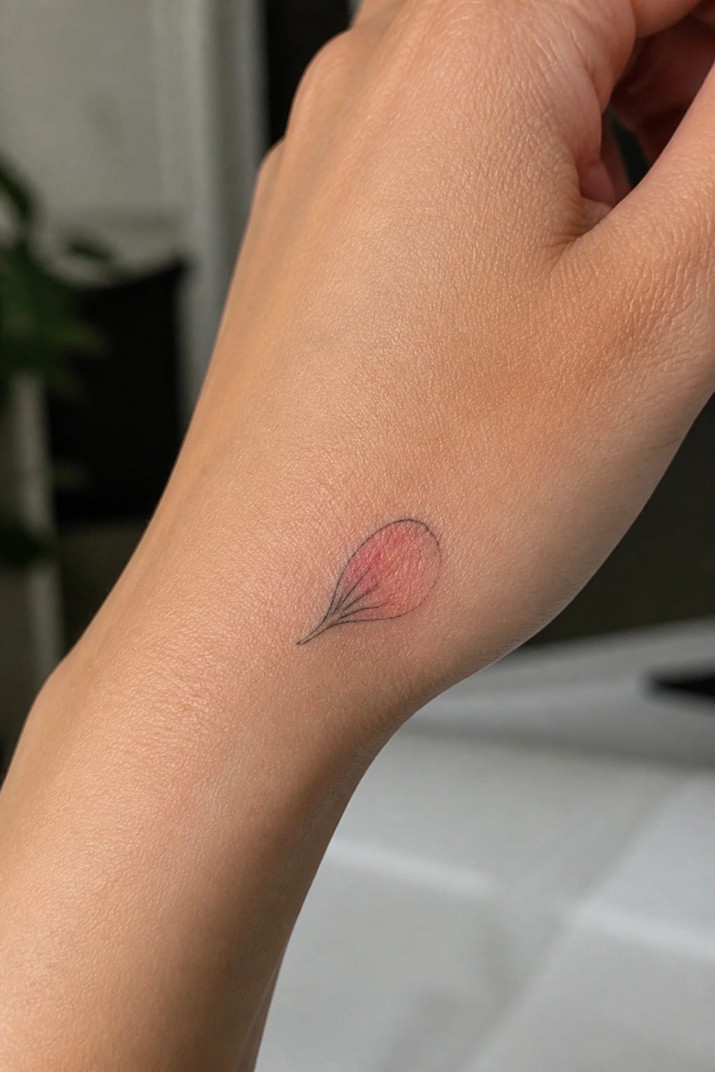
The inner wrist keeps this leaf compact and easy to place without crowding the skin. The shape tapers naturally toward the hand so it sits flat in a small area.
I think the fine lines work because they stay readable even at this scale. The light shading adds a bit of color while still feeling understated overall.
Date tattoo on the inner hand
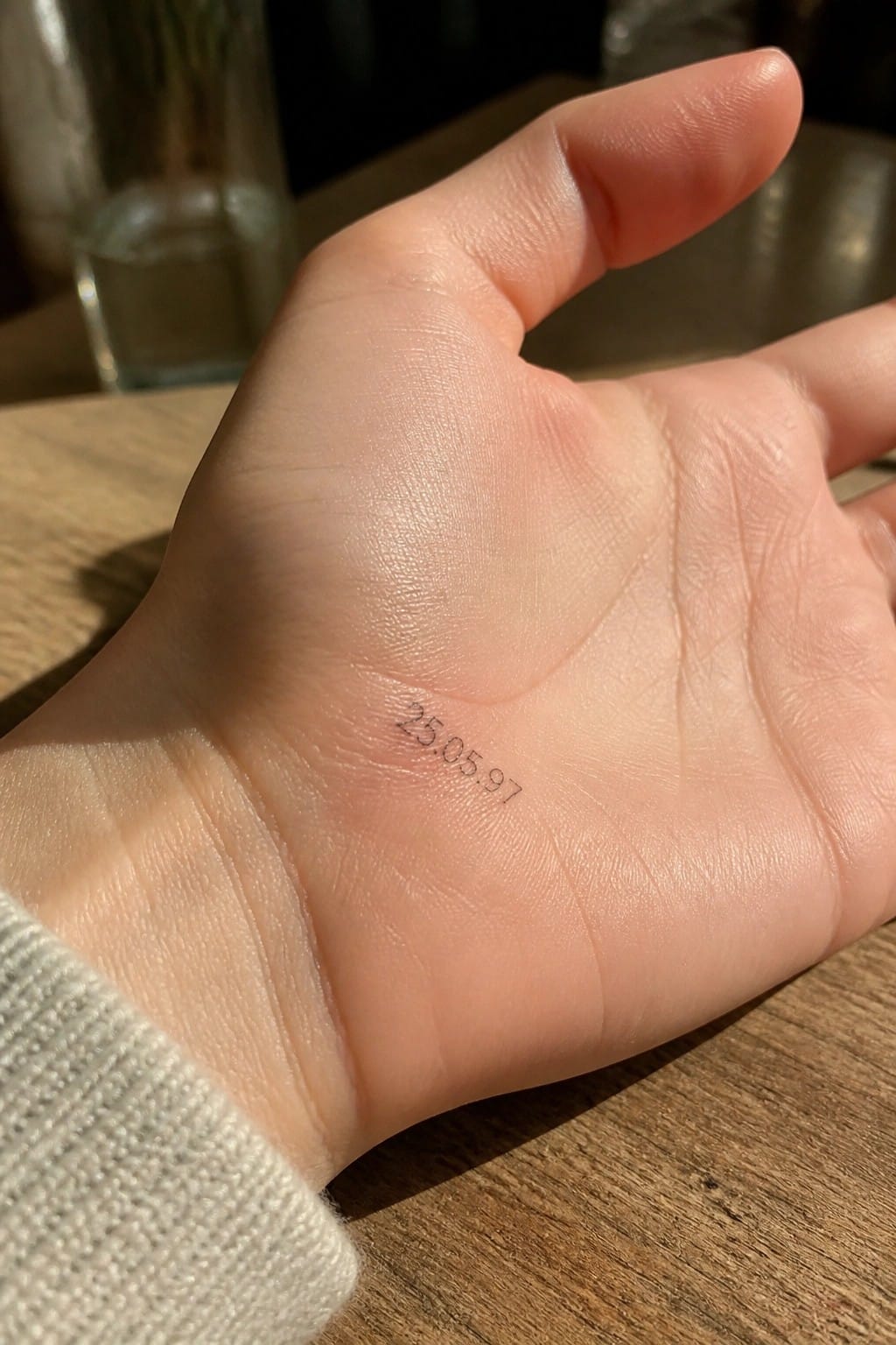
The numbers rest on the palm side of the hand near the base of the thumb. This placement keeps the date tucked away during most movements. The fine script stays compact and uses very little ink overall.
I think this spot works well for a date because it feels private until the hand turns. The small scale also helps the lines stay clean without crowding the area.
Constellation tattoo along the finger
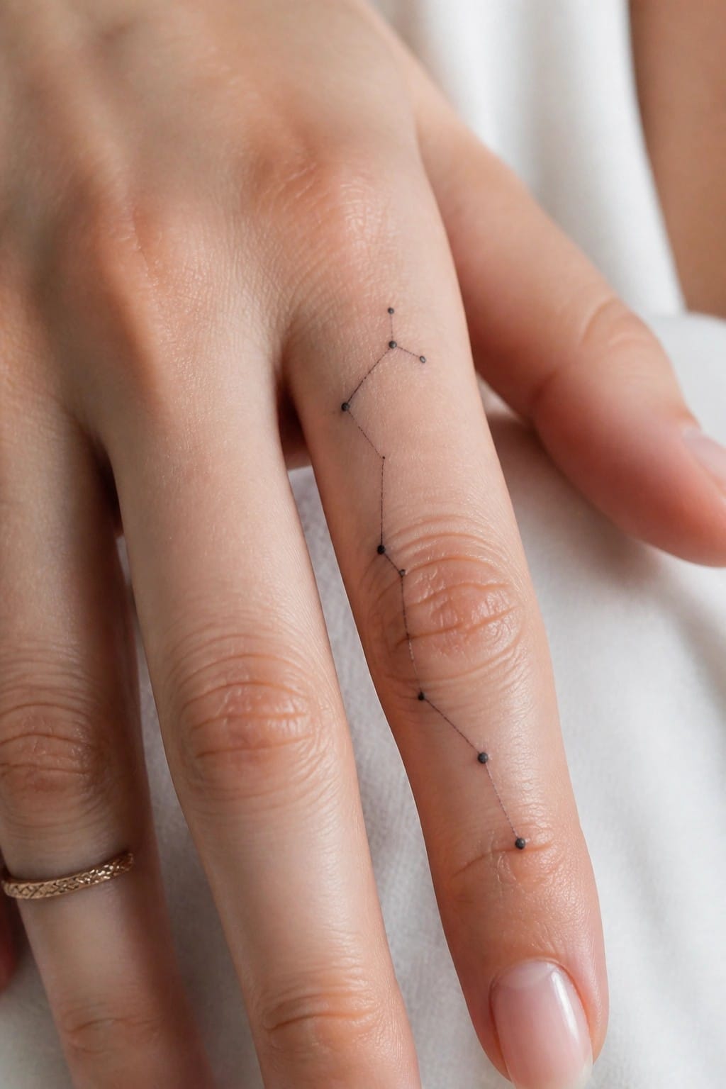
The tattoo sits along the side of the finger with a series of dots linked by thin lines. It stretches from near the base down toward the tip in a straight vertical path. The fine line style keeps the whole thing small and contained.
This placement works because the finger’s length gives the constellation a natural path to follow without extra space. I think the thin connections help it read as one clean shape even at this scale.
An ornamental design centered on the back of the hand
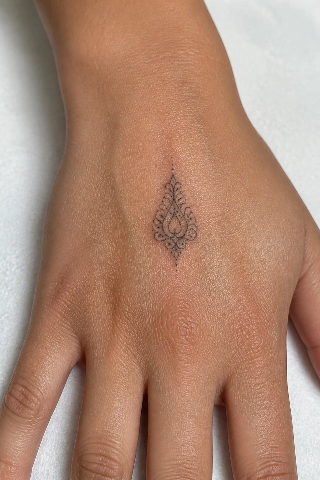
The tattoo sits right in the middle of the hand. Its symmetrical shape fits the space without spreading out too much. The fine lines keep the whole thing light and contained.
I think the placement works because the design stays visible but does not interfere with movement. The small scale also helps it feel balanced on this part of the hand.
An arrow running across the back of the hand
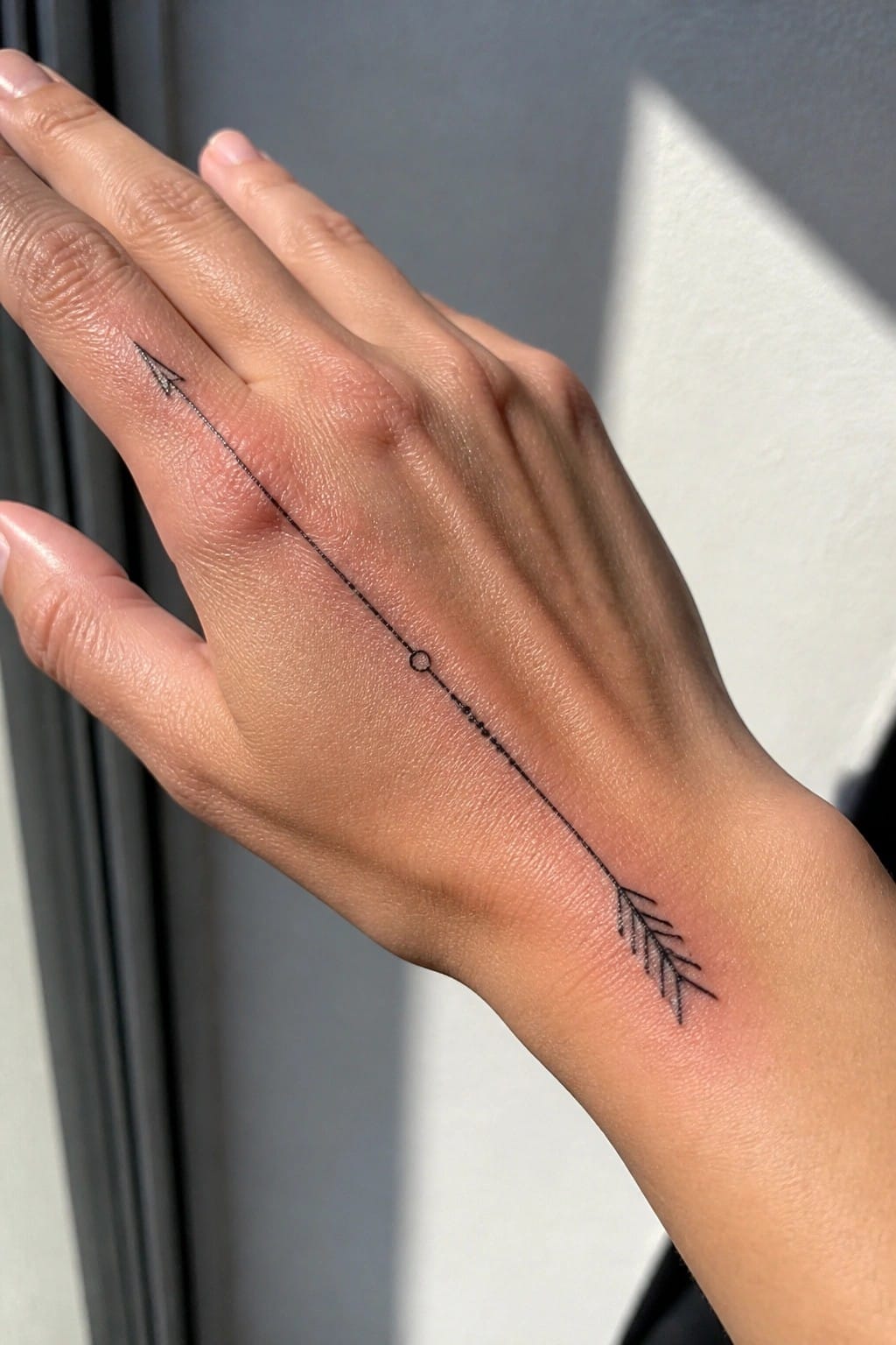
The tattoo begins near the base of the index finger and stretches in a straight line toward the wrist. Its thin line holds steady from one end to the other, with a few small dots and a circle placed along the way for light variation.
This spot works because the hand gives the arrow enough length to sit evenly without crowding the fingers. I like how the placement keeps the whole design visible at once while still feeling contained.
Small sunflower on the side of the hand
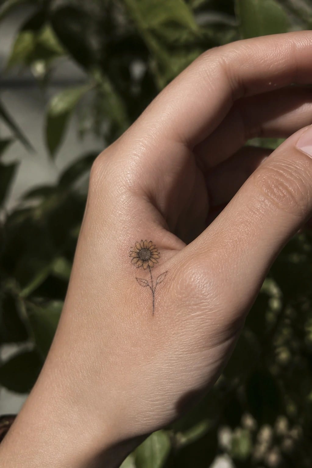
The side of the hand gives this sunflower a natural spot to rest. The stem runs downward in a straight line that matches the shape of the area. Fine lines keep the whole piece light and contained.
The small scale stops it from feeling crowded when the hand moves. I think the light shading in the center adds just enough depth without making the design look heavier.
Crescent moon with stars on the hand
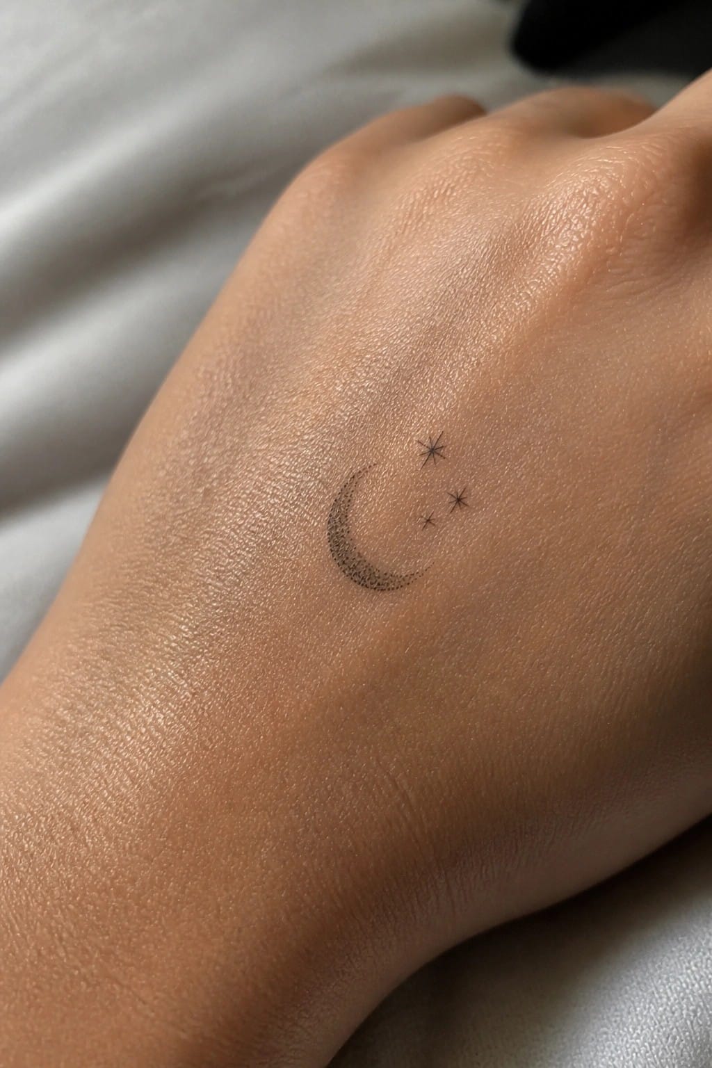
The back of the hand gives this small moon and stars plenty of space without crowding the design. The fine dots shape the crescent while the stars stay simple and spaced out.
I think the compact size stops it from competing with the hand’s natural lines. It stays easy to read even in a spot that moves often.
Arched designs wrap the base of the fingers
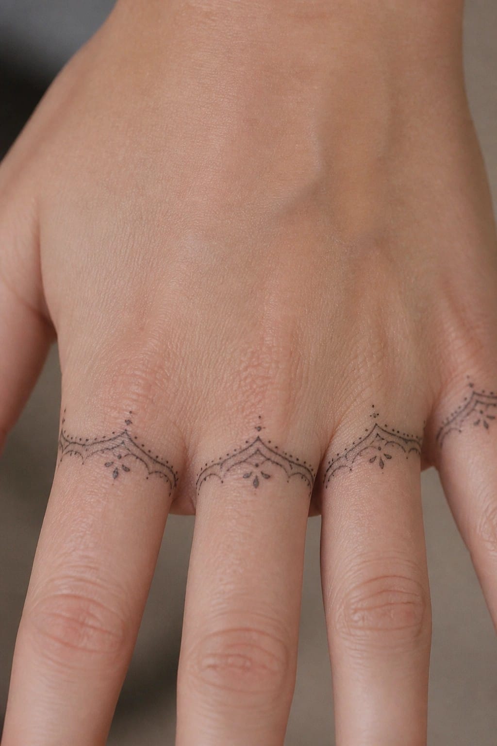
The tattoos sit at the base of the fingers in a row of matching arches. Fine lines and dots form the shapes without filling in much space. This keeps each one narrow and lets the skin show through the open areas.
I think the placement works here because the arches follow the natural line where the fingers meet the hand. It creates a repeating band effect across several fingers at once. The small scale stops the designs from feeling busy.
Infinity symbol on the side of the finger
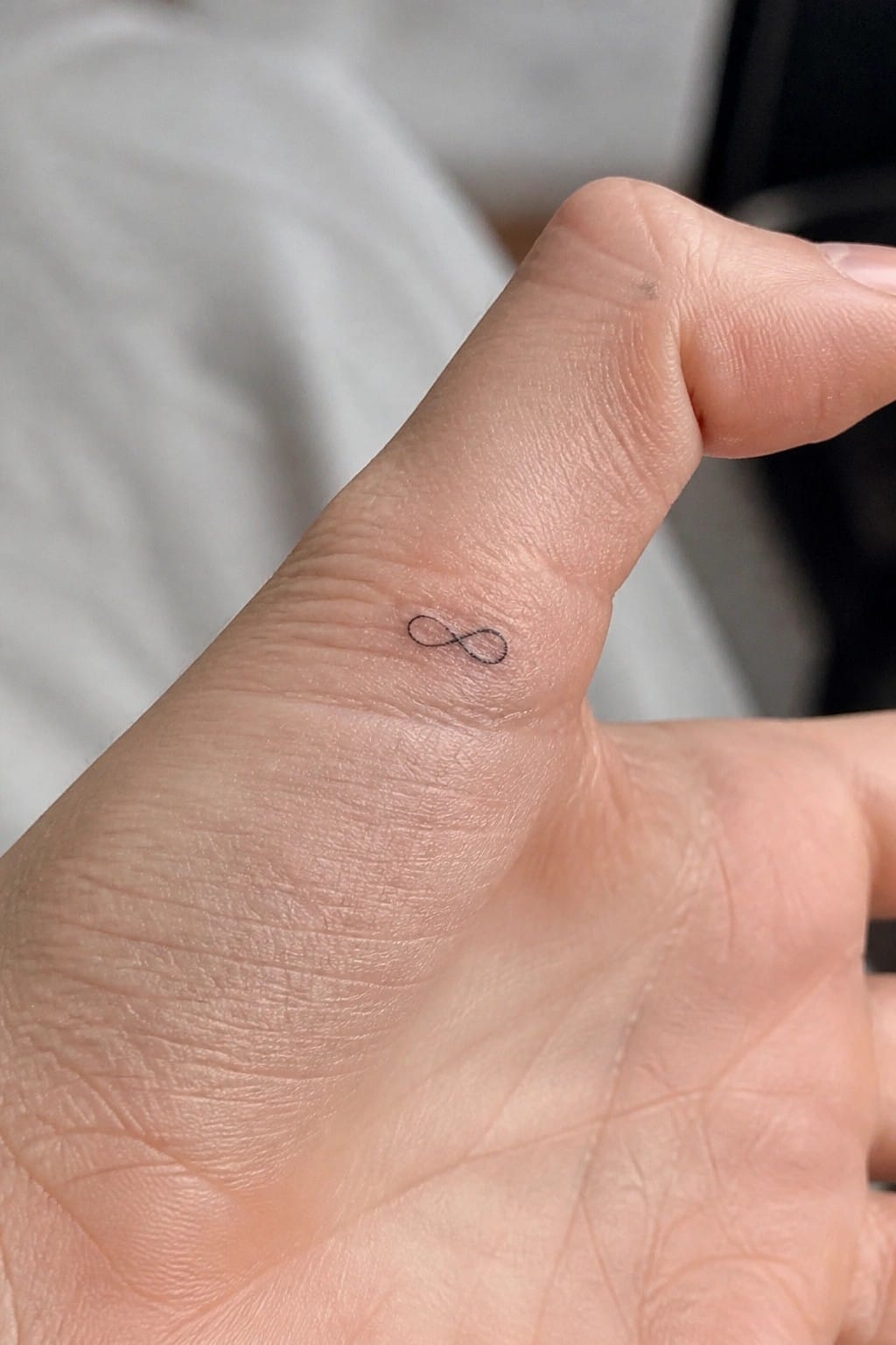
The tattoo sits along the outer edge of the finger. A thin black line forms the infinity shape without any extra details. The small scale fits the narrow space and leaves room around it.
This spot makes the design easy to see during daily movement while still keeping it understated. I think the single line approach stops it from competing with the finger’s natural shape.
Rose placed on the side of the hand
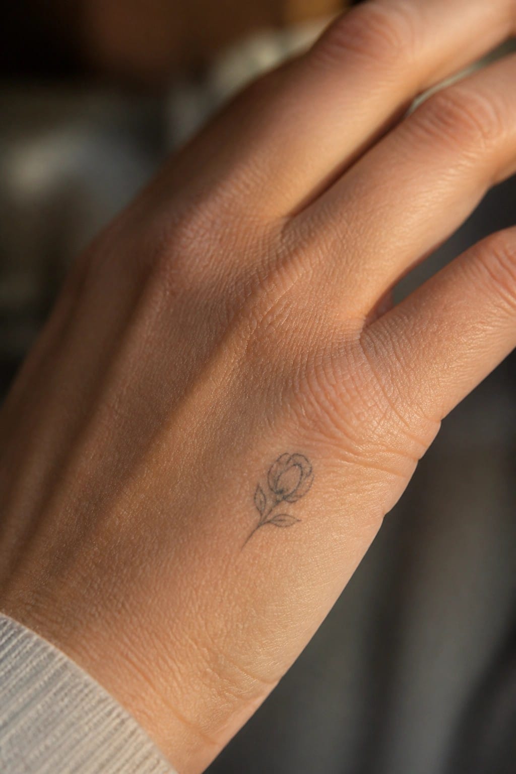
The tattoo rests along the outer edge of the hand near the base of the pinky. Fine lines shape a small rose with a short stem and two leaves pointing downward. The whole piece stays compact and contained in that narrow area.
This location lets the rose appear during rest but stays out of the way during daily movement. I think the placement keeps the design balanced without spreading across the fingers.
Frequently Asked Questions
What are the most effective ways to maintain the delicate appearance of a hand tattoo long term? Regular moisturizing with fragrance free lotions helps preserve the fine lines and soft shading in feminine designs. Avoid excessive sun exposure by wearing gloves or applying high SPF sunscreen daily since hands see a lot of light. Touch up sessions every few years can refresh any fading details without adding bulk to the original light artwork.
How should I prepare for the healing process of a hand tattoo to prevent it from looking heavy? Keep the area clean with gentle soap and apply a thin layer of recommended ointment during the first week. Elevate your hand when possible to reduce swelling and follow your artist’s instructions on avoiding tight jewelry or repetitive hand washing that could irritate fresh ink. This approach supports the light feminine style by minimizing any risk of bold scabbing or color buildup.
Which placements on the hand work best for subtle tattoos that feel feminine? Sides of the fingers or the inner wrist area allow for small elements like single flowers or thin script that stay elegant without dominating the skin. These spots also tend to heal more evenly than the back of the hand where movement is constant. The article highlights how such locations keep designs airy and balanced.
How do I select an artist who can create hand tattoos that avoid a heavy look? Look for portfolios focused on fine line work and soft shading rather than bold traditional styles. Schedule a consultation to discuss specific feminine motifs from the article such as delicate vines or minimalist symbols and ask to see healed examples on hands. This ensures the final result matches the light aesthetic described.
What common concerns arise when getting a hand tattoo and how can they be addressed? Many worry about visibility at work or social settings so consider designs that can be partially covered by rings or sleeves. Pain levels vary but hands heal faster with proper care and the article suggests starting small to test tolerance. Addressing these upfront helps maintain the feminine delicate quality without regret.
