

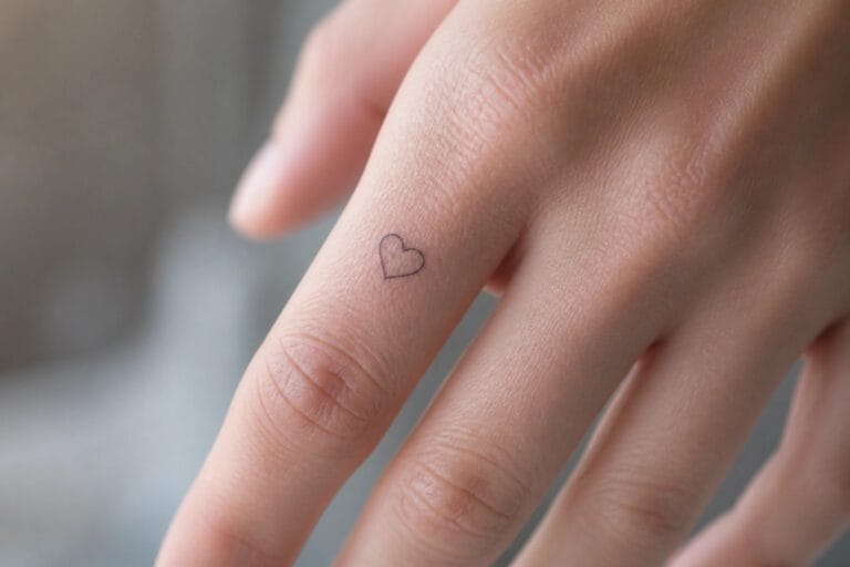
I adore how finger tattoos can be both classy and deeply personal at the same time.
My own small tattoos have always felt like secret little joys that only I know about until I want to share them.
Tiny designs on fingers strike the perfect balance between meaningful and subtle without screaming for attention.
I have rounded up some of my top picks that capture elegance in such a compact form.
These should help you find that ideal spot of ink for your next idea.
Tiny heart on the finger
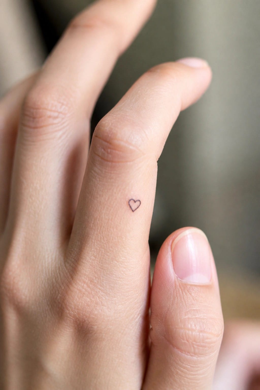
The finger gives a tight area that works for a very small heart. This outline stays thin and sits neatly along the side without taking up extra space. The scale keeps every line readable even up close.
I think the choice of size prevents it from feeling busy in such a narrow spot. It also leaves room for the skin to move naturally over time.
Word tattoo on the finger
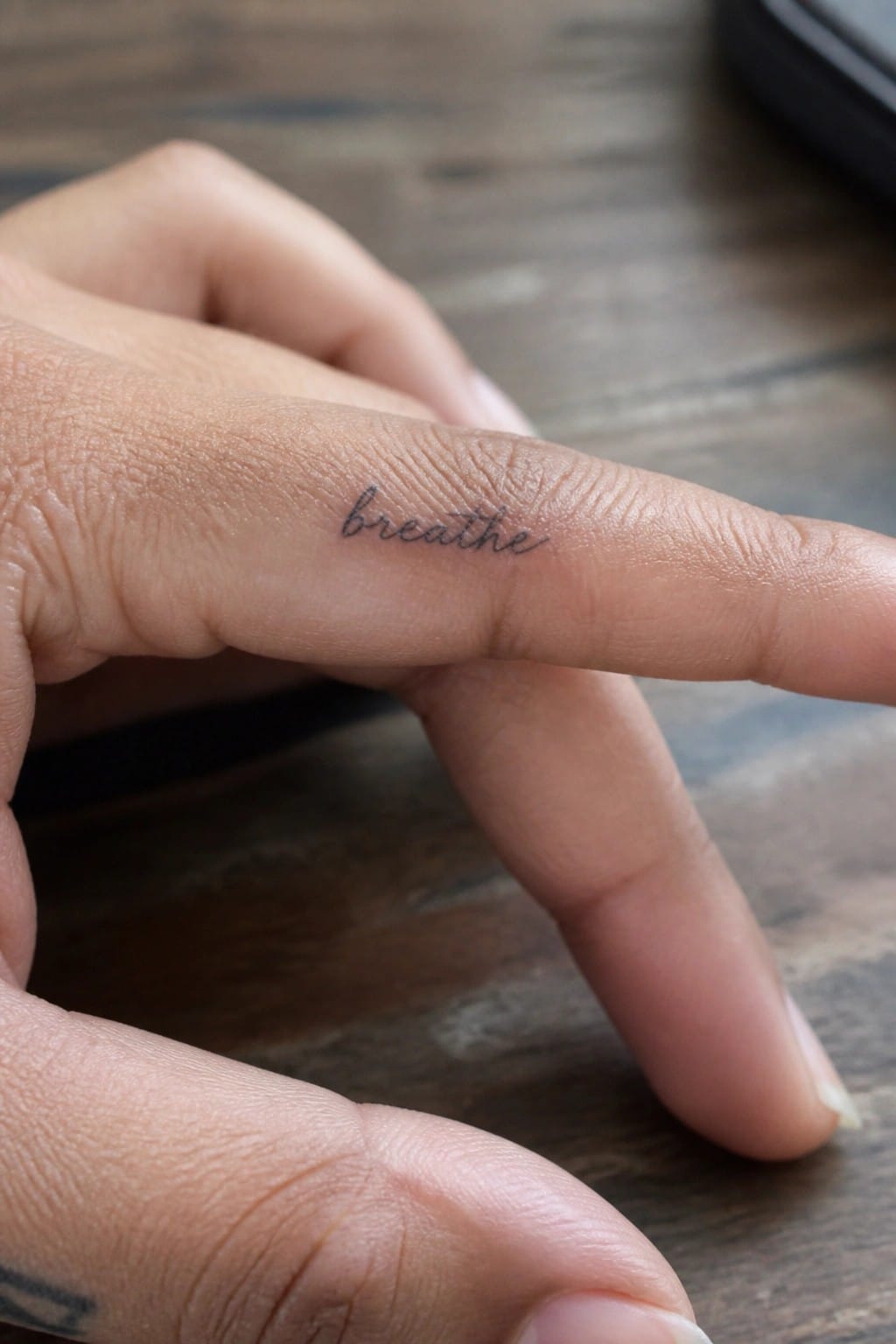
The side of the finger works well for a short word like this. The cursive letters stay compact and follow the natural line of the skin. This keeps the tattoo small and easy to hide or show as needed.
I think the placement makes sense because the reminder stays close during daily tasks. It only becomes visible with certain hand positions. That adds a quiet personal touch without drawing constant attention.
Thin band on the ring finger
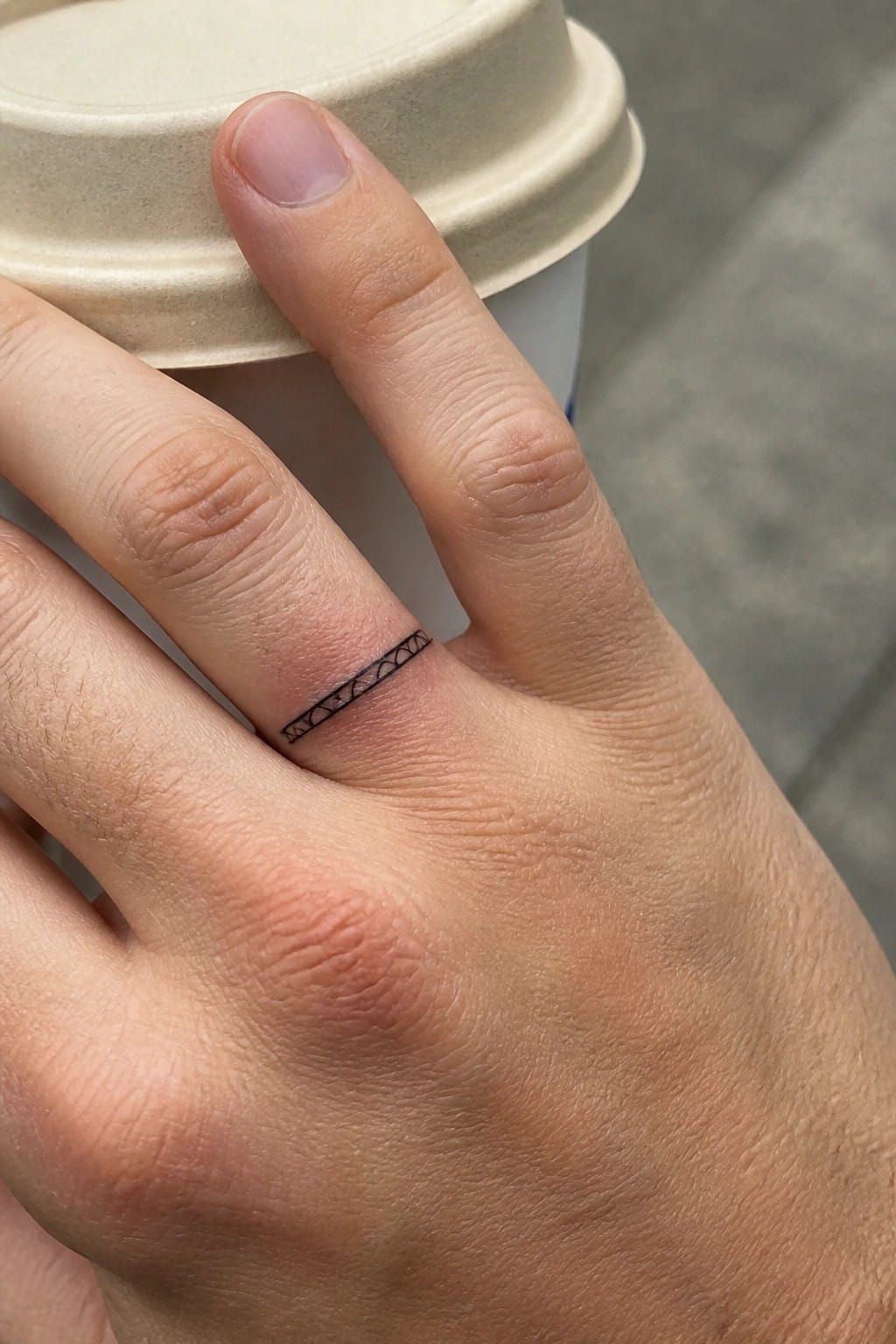
The ring finger gives this tattoo a built in frame. The thin black line sits right at the base and follows the natural width of the finger without wrapping all the way around. A row of small connected shapes keeps the pattern simple and even.
I like how the fine line style stays light instead of competing with the finger’s movement. At this size the design still reads clearly up close but stays understated from a distance. It ends up feeling more like a quiet accent than a full ring.
Crescent moon on the side of the finger
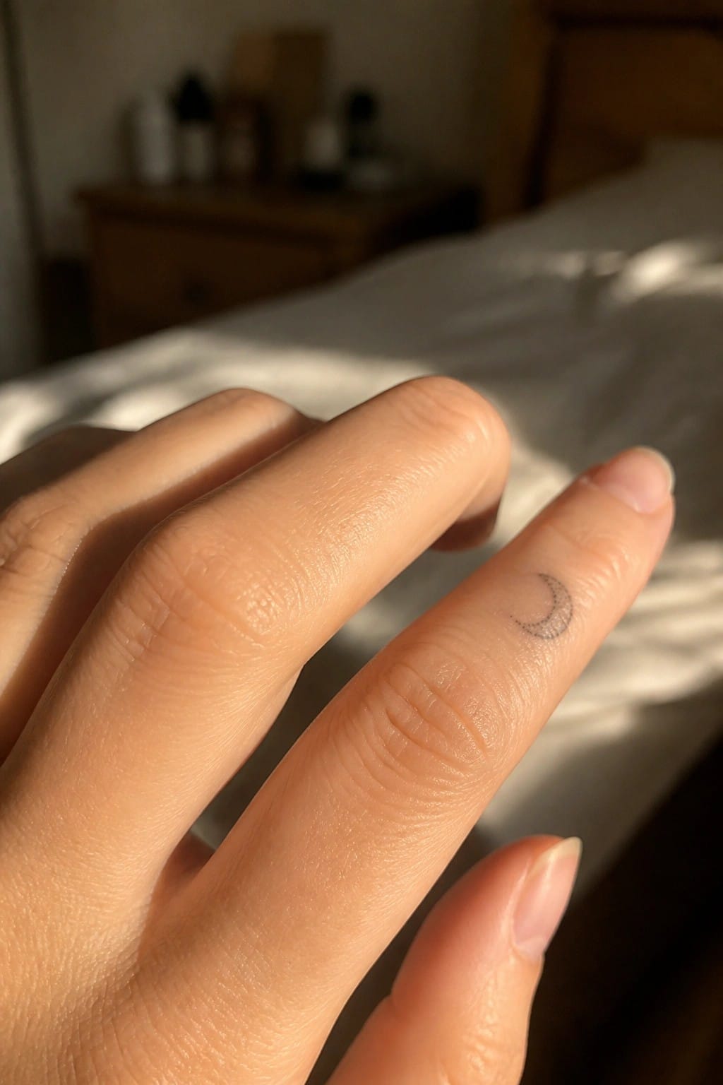
The side of the finger gives this crescent moon a clean spot. The small scale keeps it from looking crowded. A fine line approach helps the shape stay sharp.
This spot suits people who want something they can cover easily. The moon stays simple and readable at that size. I think the side placement adds a bit of surprise when the hand moves.
Arrow tattoo on the finger
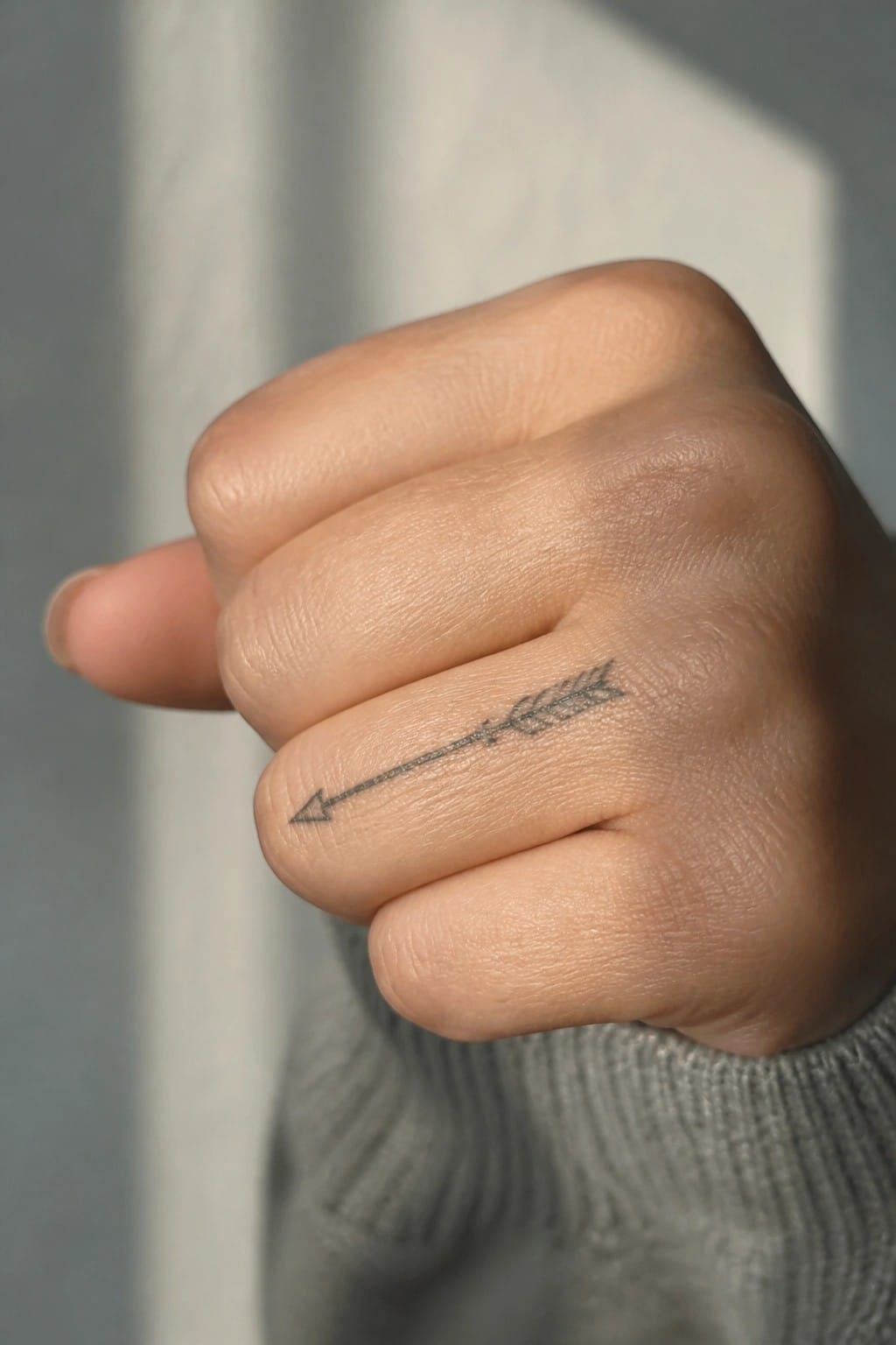
The arrow runs along the side of the finger. Its straight line matches the shape of the area and keeps the whole design narrow. The small scale means it sits neatly without wrapping around the skin.
I think the minimal lines help it stay readable at this size. The horizontal direction also makes the placement feel natural rather than forced.
Three triangles stacked on the finger
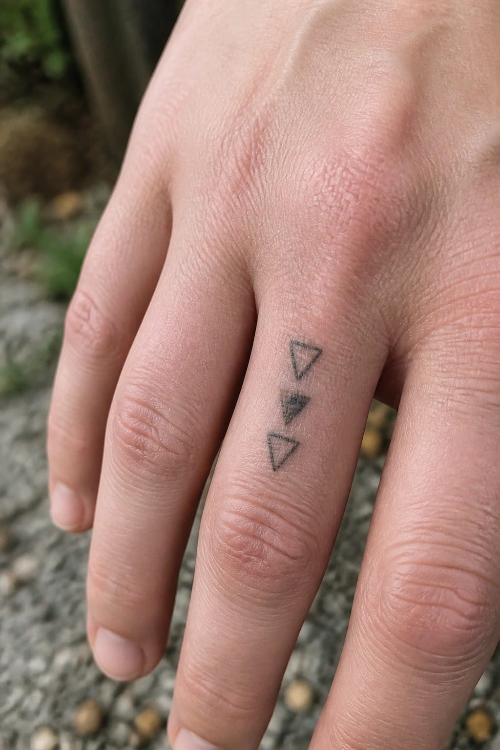
The finger gives this design a clear vertical line to follow. Three small triangles sit one above the other with the middle one filled in. The rest stay as simple outlines. This keeps the whole piece narrow enough to fit the space without crowding.
The shaded center triangle breaks up the repetition just enough to hold interest. It still reads clean from a normal distance. I think the choice to leave the top and bottom open stops it from feeling too heavy on such a small area.
Flower stem along the finger side
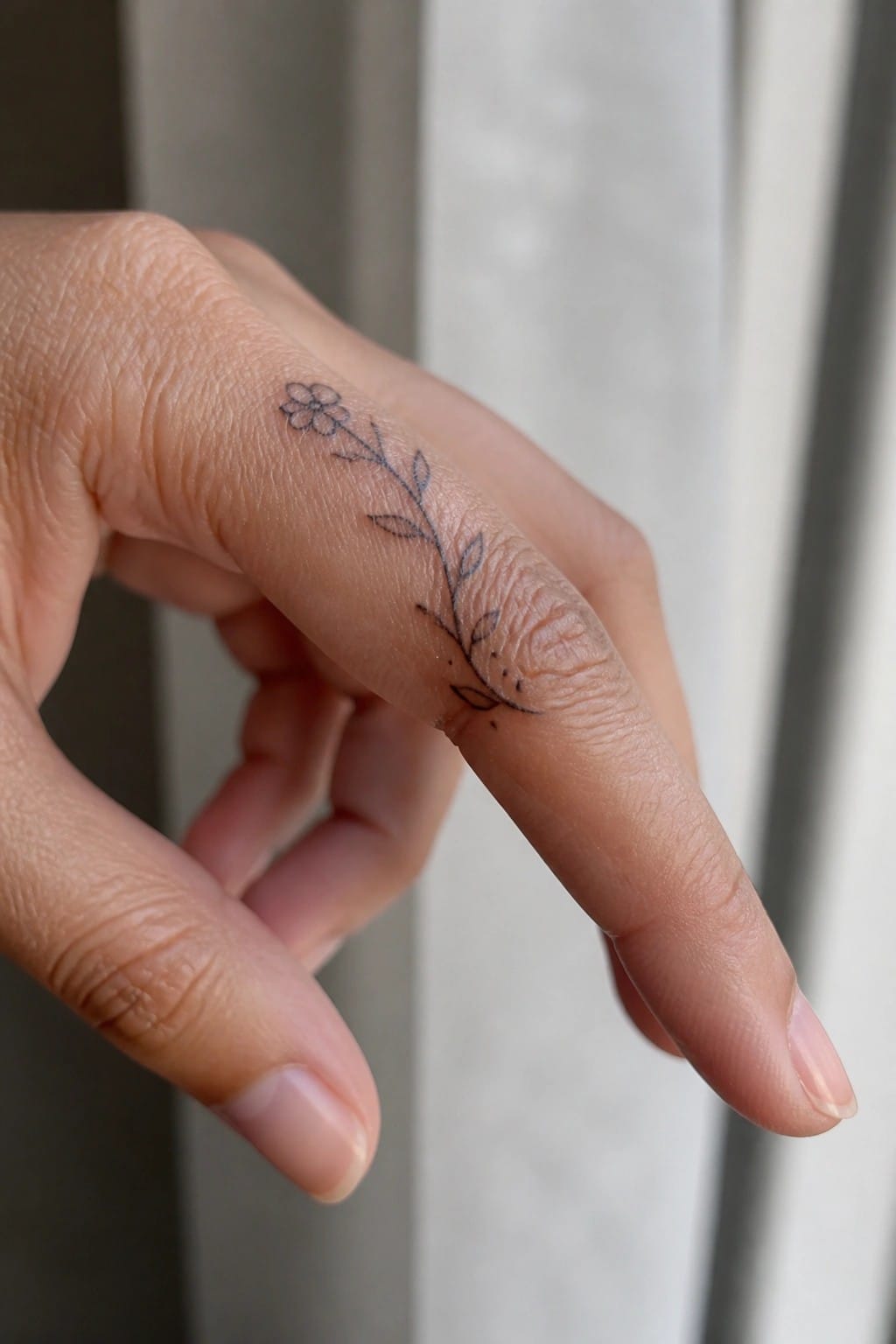
The tattoo sits on the side of the index finger. A thin stem stretches downward with a few small leaves attached. A single flower marks the upper end.
This placement lets the stem follow the finger’s length without bunching up. The fine line style keeps everything light and clear at a small scale. I think the vertical layout gives it a clean look that suits the narrow space.
Semicolon on the side of the index finger
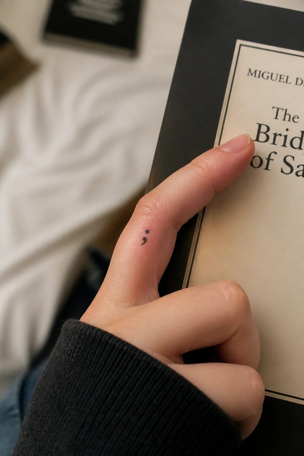
The side of the index finger gives a small symbol like this enough flat space to sit cleanly. The design stays compact with just the two dots and the curve, so it fits without crowding the skin. Normal hand movement does not pull or distort the lines much in this spot.
This placement keeps the tattoo noticeable during daily tasks but still subtle enough for everyday wear. It suits someone who wants a personal mark that stays readable at a small scale.
Roman numerals along the finger
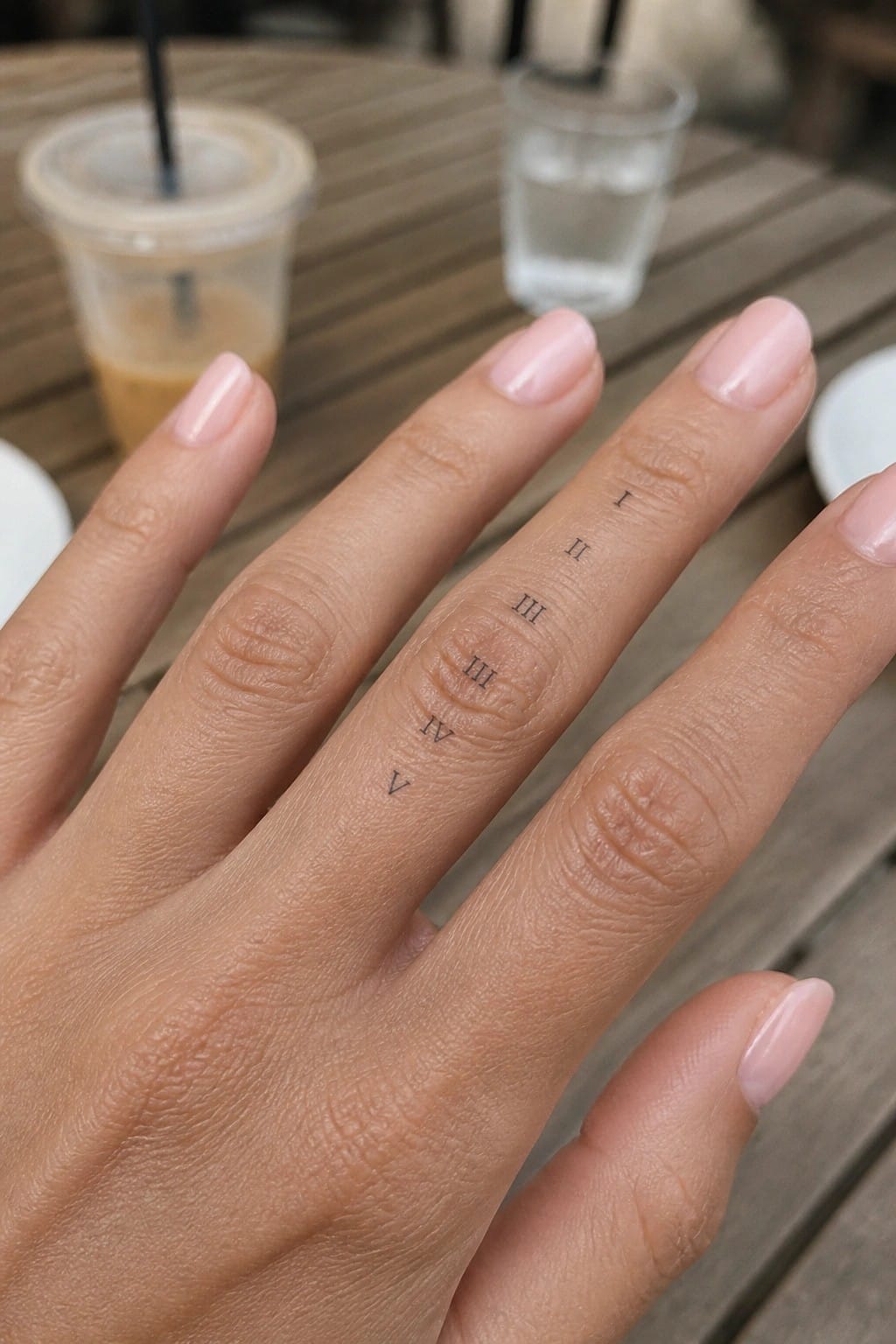
Roman numerals run down the side of one finger in a straight column. The numbers go from I near the top to V closer to the base. Fine black lines keep each one clear at this small scale.
The finger placement fits the vertical layout without forcing the design into a tight spot. It stays subtle when the hand rests but shows up clearly when needed. I think the simple font choice helps it stay readable even after some time passes.
A wave tattoo on the finger
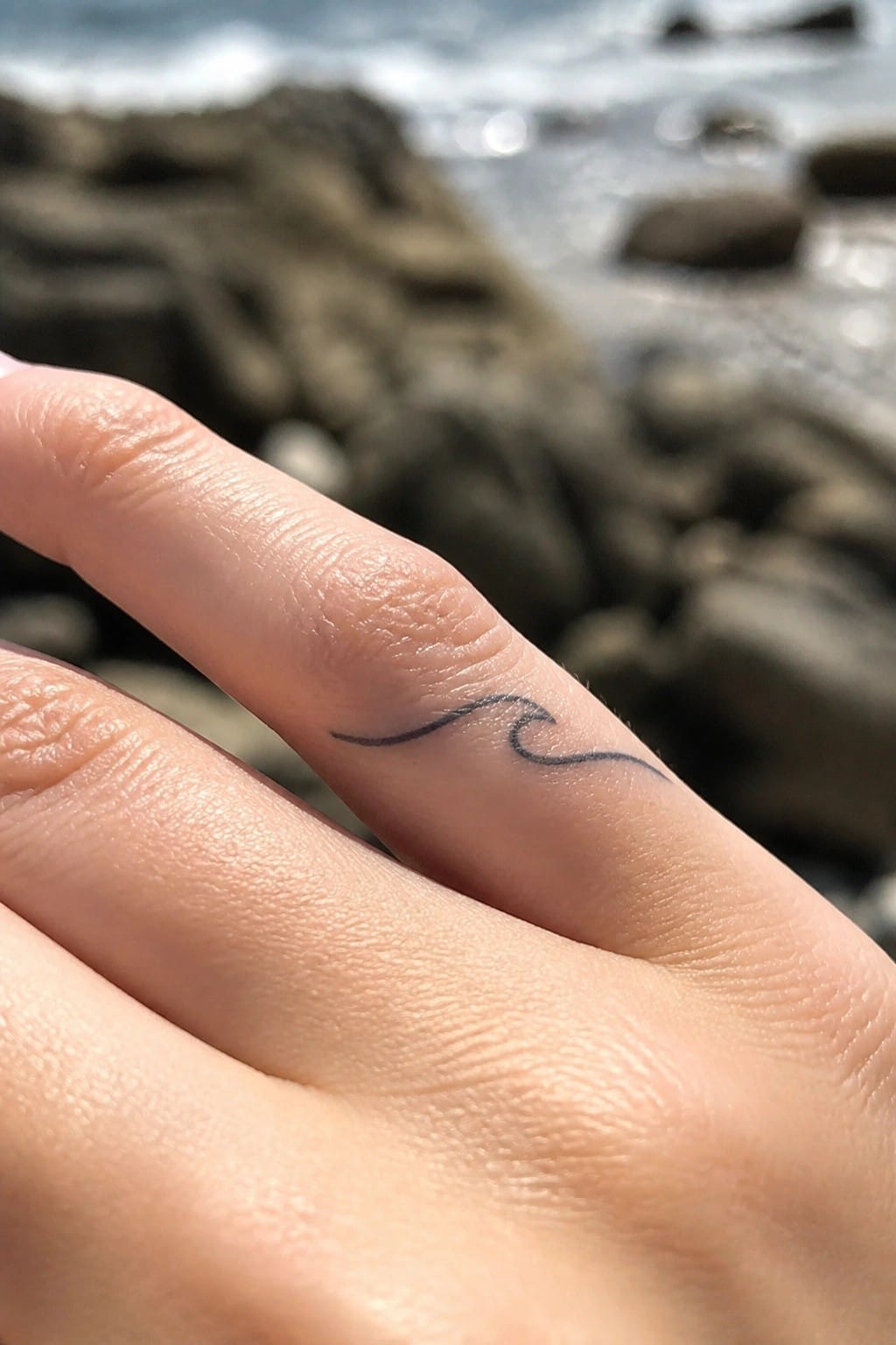
The design rests along the side of the finger near the middle joint. A thin continuous line forms a small wave that follows the finger’s curve. This keeps the tattoo compact and visible without crowding the skin.
The minimal style works here because it avoids any extra detail that could blur over time. I think the placement makes the wave feel like part of the finger itself instead of something added on.
Constellation along the finger
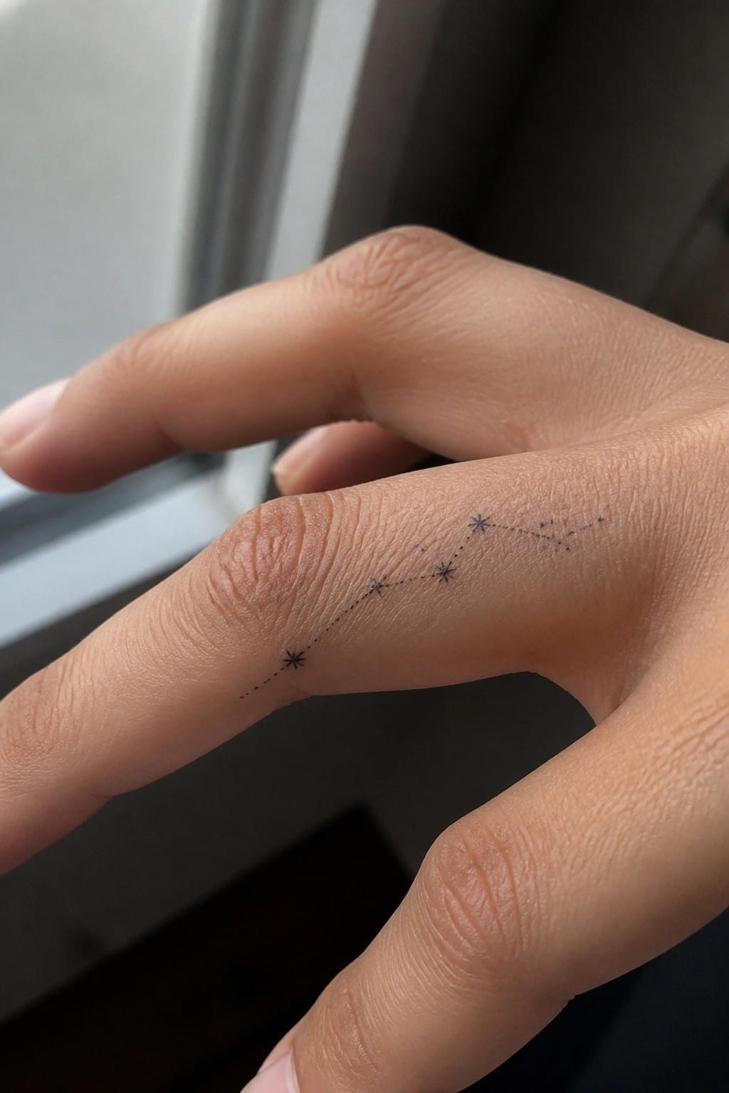
The side of the finger lets the stars run in a straight path that follows the skin’s natural line. Dotted connections keep the points linked without adding bulk. The design stays small enough to fit the width while remaining easy to read.
I think the placement works here because it turns the finger’s length into a natural canvas for the spread. The simple star shapes hold up well at this size and avoid looking crowded.
Small cross on the finger
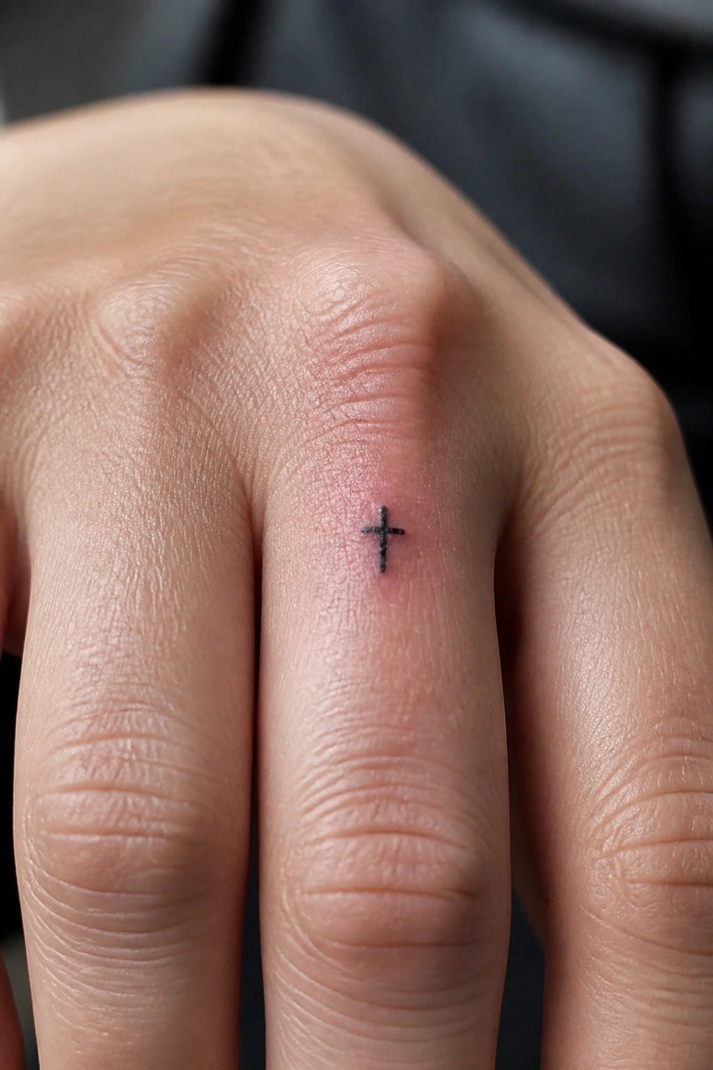
A small cross works on the finger because the simple shape stays clear even when reduced to a tiny size. The black ink sits on the side of the finger without crowding the skin or catching on daily movement. This keeps the design low key while still visible up close.
The minimal lines help it feel balanced in such a narrow space. I think the scale makes it easy to add later if someone wants more detail around it.
Leaf band sits along the ring finger
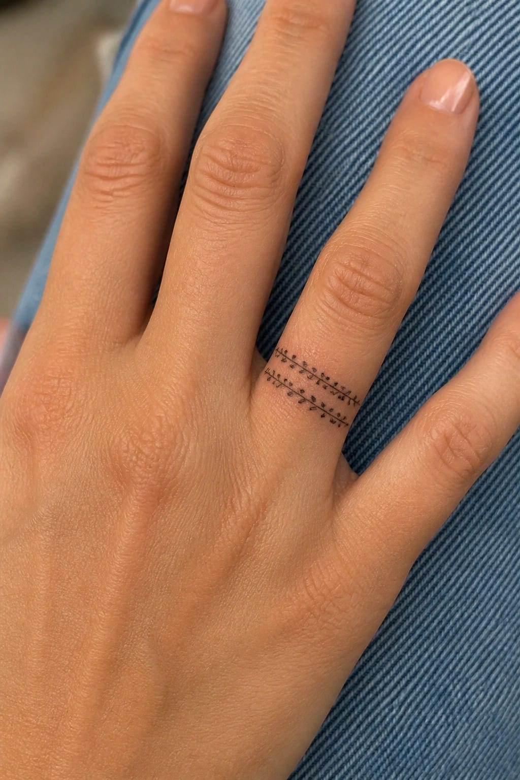
The tattoo runs along the side of the ring finger in two narrow rows. Small leaves repeat in a simple line pattern to form a thin band. Fine line work keeps the scale small enough to fit the finger without crowding.
This placement turns the design into a subtle ring alternative. The open spacing between the rows prevents it from looking heavy. I think the choice of leaves gives it a light botanical feel that still reads clearly from a normal distance.
Infinity symbol on the side of the finger
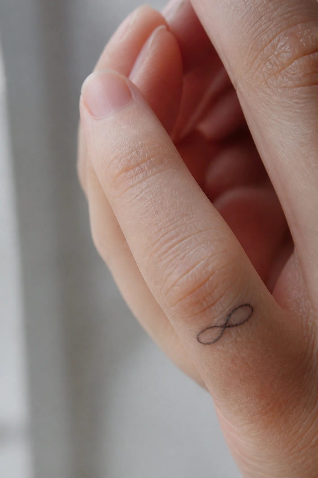
The infinity symbol runs along the outer edge of the finger. This placement lets the loops follow the skin’s natural curve without bunching up. The thin lines stay contained and do not overwhelm the area.
I think the side position keeps the design from looking too centered or bold. It works for anyone who wants a simple symbol that stays mostly hidden in daily use.
Dots wrap around the middle finger
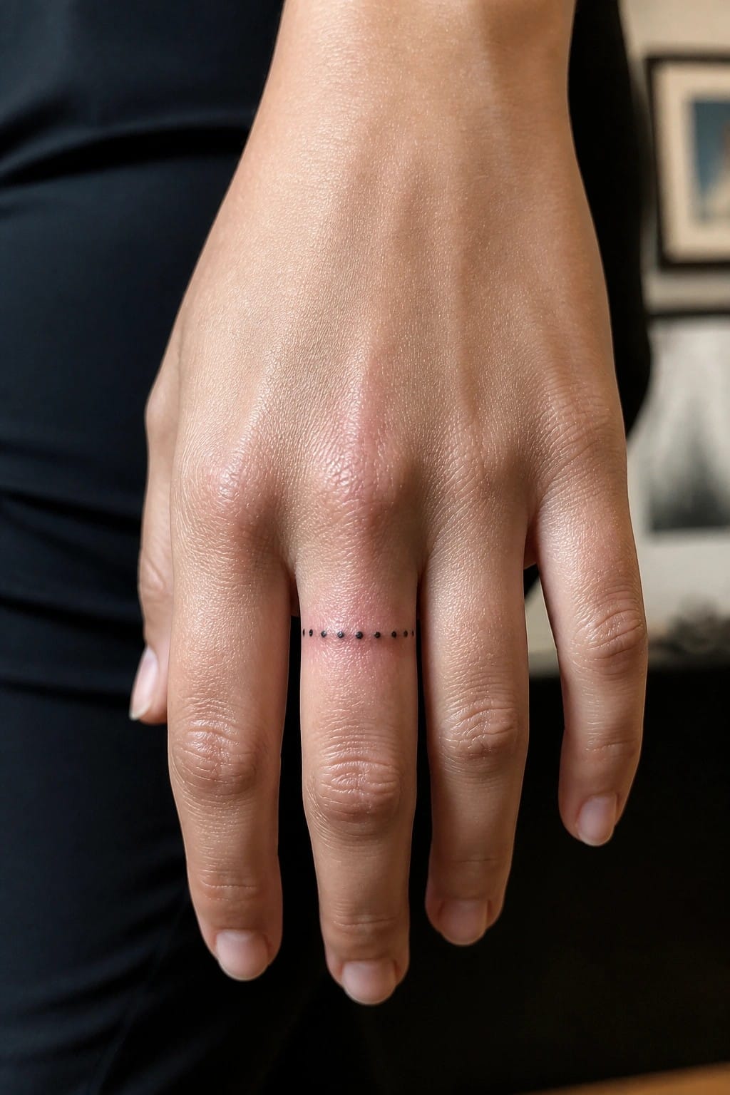
The tattoo sits on the middle finger just above the knuckle. Small black dots form a single thin line that follows the finger’s width. This placement keeps the design narrow and easy to cover with a ring or by curling the hand.
The dot style avoids any heavy ink in a spot that sees a lot of movement. It works as a low commitment option when someone wants a first finger tattoo without filling much space.
Music note on the finger
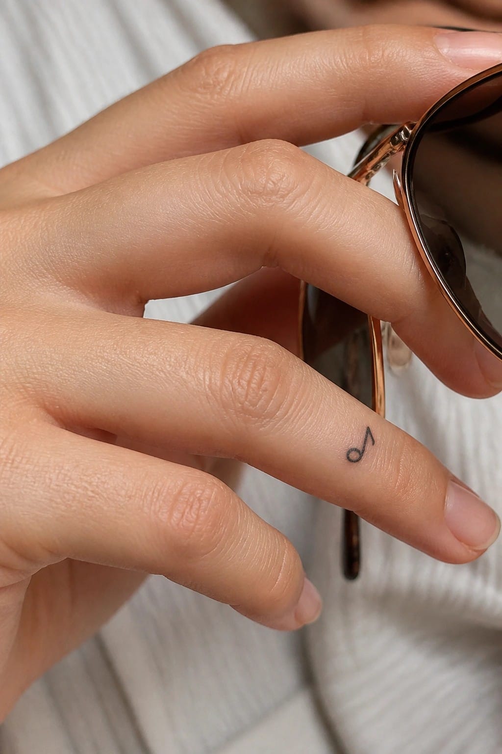
A music note fits neatly along the side of the finger in this small design. The clean lines stay simple and avoid any extra detail. This scale lets the tattoo sit without crowding the space.
I think the placement works because it keeps the note visible from certain angles while staying out of the way during daily use. It suits someone who wants a music reference without a larger piece.
Anchor tattoo on the side of the finger
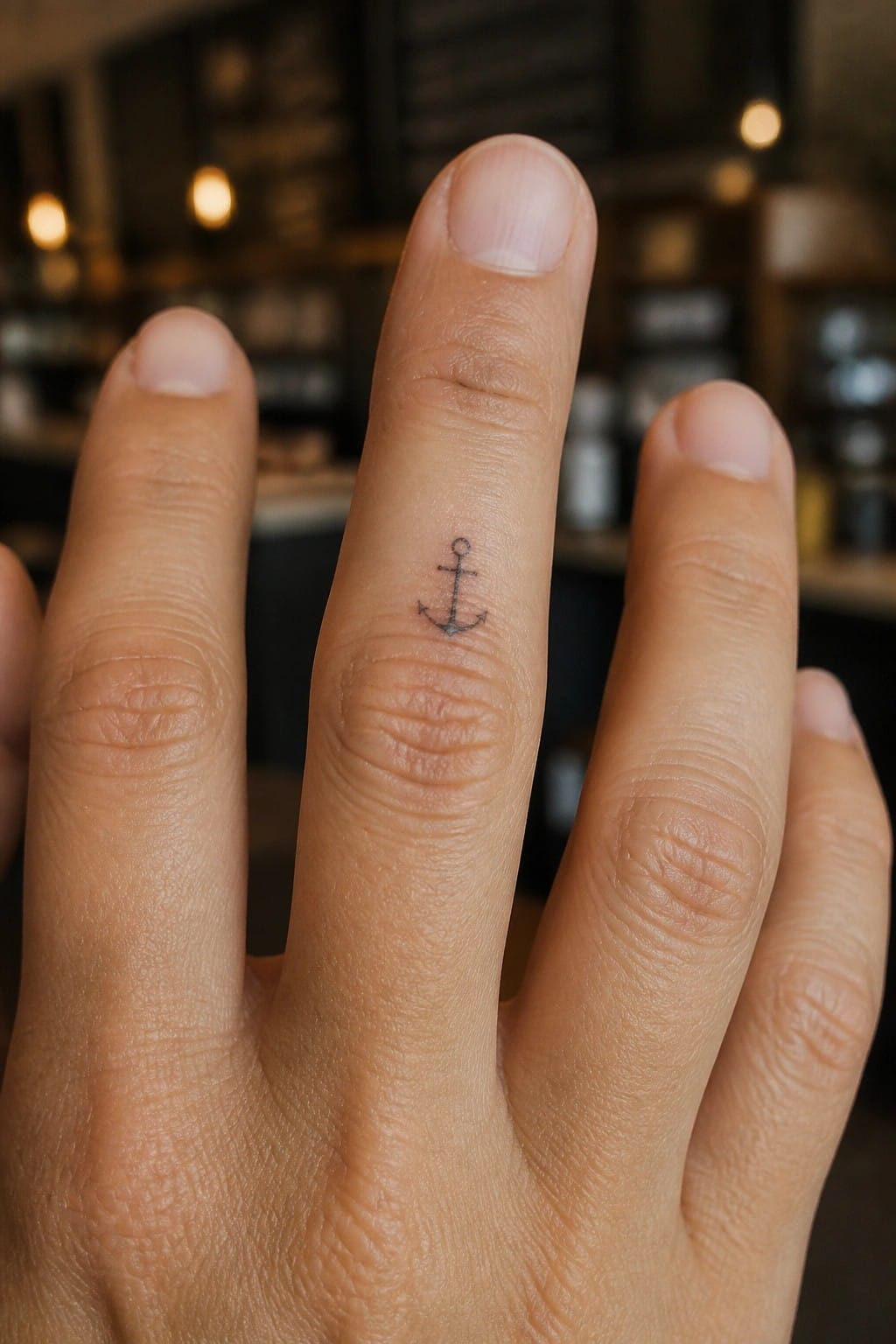
The anchor sits along the inner side of the middle finger. This narrow placement keeps the design small and contained so it does not overwhelm the finger. Simple black lines form the shape with no extra shading or fill.
I think this spot works well because the tattoo stays mostly out of sight during normal hand positions. It only becomes visible when the fingers spread or turn.
Dots and dashes form a line on the finger
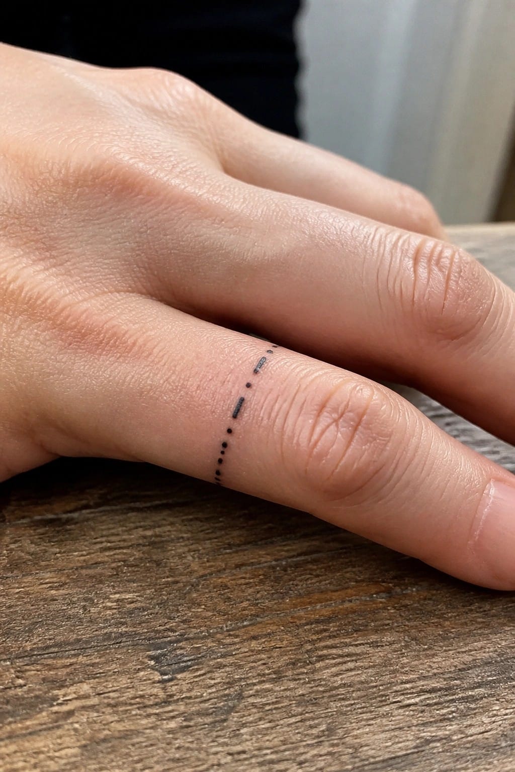
A row of small dots and dashes runs vertically along the side of the finger. The marks stay tight and even so the line stays thin. This keeps the whole thing compact enough for finger skin.
I think the simple pattern holds up well because it relies on spacing rather than detail. It stays readable even when the hand moves or the skin stretches.
Crown tattoo on the finger
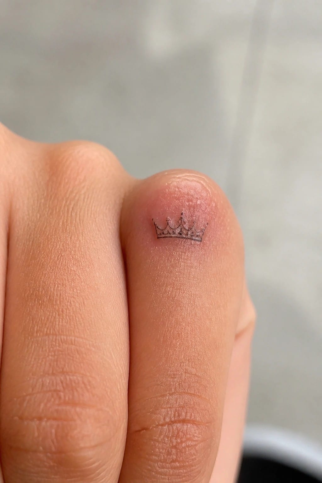
The side of the finger gives a narrow space that suits a very small crown. Its outline stays clear without needing extra lines or shading. This keeps the whole design compact and simple to apply.
I think the placement works because it lets the crown sit naturally without competing for attention. It also stays mostly hidden unless the hand is turned.
Vertical letters along the finger
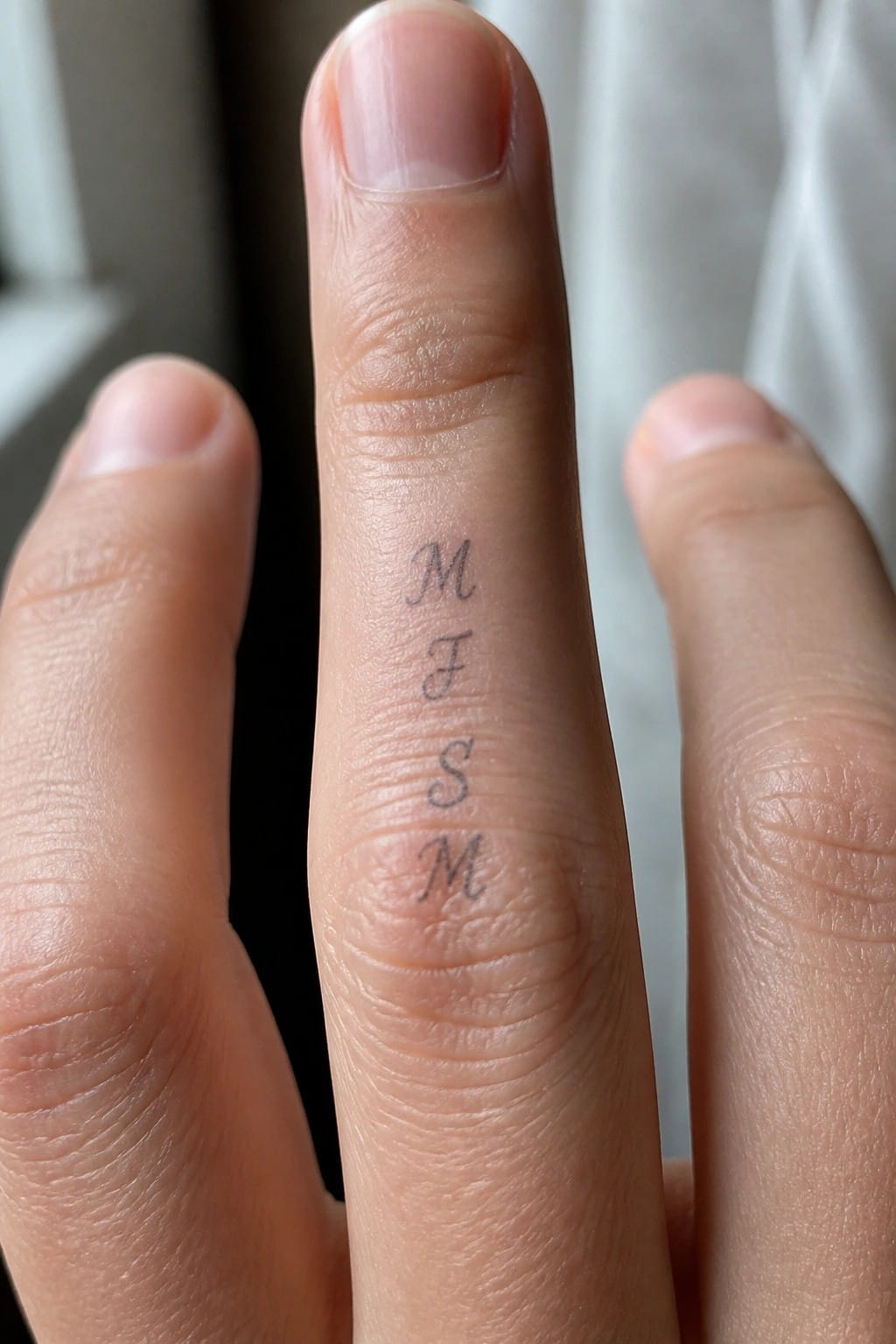
The side of the finger works for a short stack of letters because it gives a natural straight path. Four thin initials fit here without spreading out or wrapping around the curve. The placement also lets the tattoo stay visible from certain angles while staying compact.
I kept the lines light so the whole thing stays readable at this size. It avoids looking heavy on a narrow spot like the finger.
Frequently Asked Questions
What is the typical pain level when getting a finger tattoo? Finger tattoos often involve more discomfort than other areas because the skin is thin with many nerve endings nearby. Most people report a sharp stinging feeling during the process. Selecting a simple small design helps keep the session short and reduces overall pain.
How quickly do finger tattoos fade compared to other placements? Finger tattoos tend to fade faster due to constant hand washing and exposure to elements. Expect some loss of detail within a couple of years so plan for occasional touch ups. Using high quality ink and following strict aftercare can extend the life of the design.
What aftercare steps work best for a new finger tattoo? Clean the area gently twice a day with unscented soap and pat it dry. Apply a thin layer of recommended ointment several times daily to keep it moist. Avoid soaking the hand in water and shield the tattoo from direct sunlight until fully healed.
Are finger tattoos appropriate for professional work settings? Many workplaces now accept small visible tattoos but it depends on your specific job and company policy. Choose discreet designs that can be hidden by a ring or bandage during important meetings if needed. Research your industry norms before committing.
How can someone select a truly meaningful tiny design from the ideas presented? Start by matching symbols to your personal values such as a small wave for resilience or a star for guidance. Review the 20 classy options and discuss custom tweaks with your artist to ensure the scale fits your finger perfectly while retaining clear meaning.
