

I adore Chinese character tattoos because they let you wear your story right on your skin in the most beautiful way. My favorite part about helping women choose designs is seeing how these symbols connect to their lives. These twenty three ideas are sure to spark some personal inspiration for your next ink.
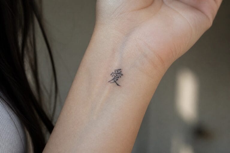
Love character on the inner wrist
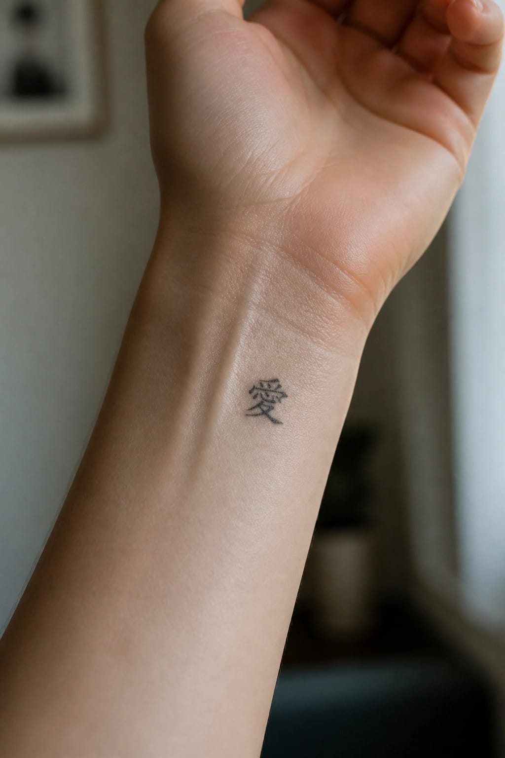
The inner wrist keeps this single Chinese character compact and easy to position. The area shows the symbol without extra space or shading. Black ink gives it a clean look against the skin.
I picked the wrist because the tattoo stays mostly hidden during daily movement. It appears only when the hand turns, which fits a personal symbol like this.
A single character on the forearm
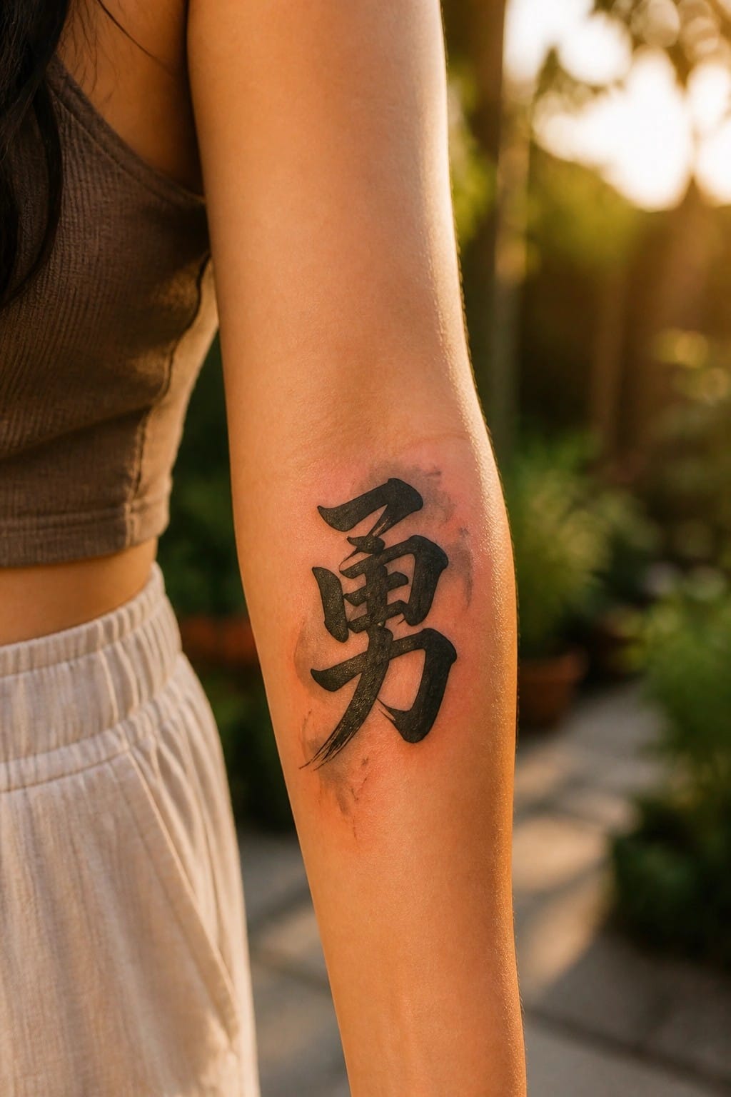
The inner forearm gives this character room to breathe while staying easy to see in daily life. A vertical layout like this follows the arm’s length without crowding. The bold black strokes hold up well at this size and stay clear even from a short distance.
I think the placement makes sense because the design stays readable without extra shading or details. It also leaves room to add something small later if wanted.
Small character behind the ear
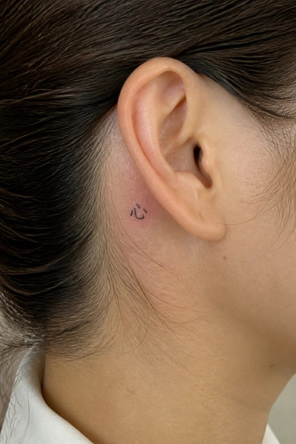
The tattoo sits just behind the ear along the hairline. A single Chinese character fits neatly in this narrow space without needing extra detail. The placement keeps it out of view most of the time yet easy to reveal.
I like how the spot turns the tattoo into something the wearer can keep to themselves. It also suits anyone who wants a small symbol rather than a larger piece.
A dream character on the upper back
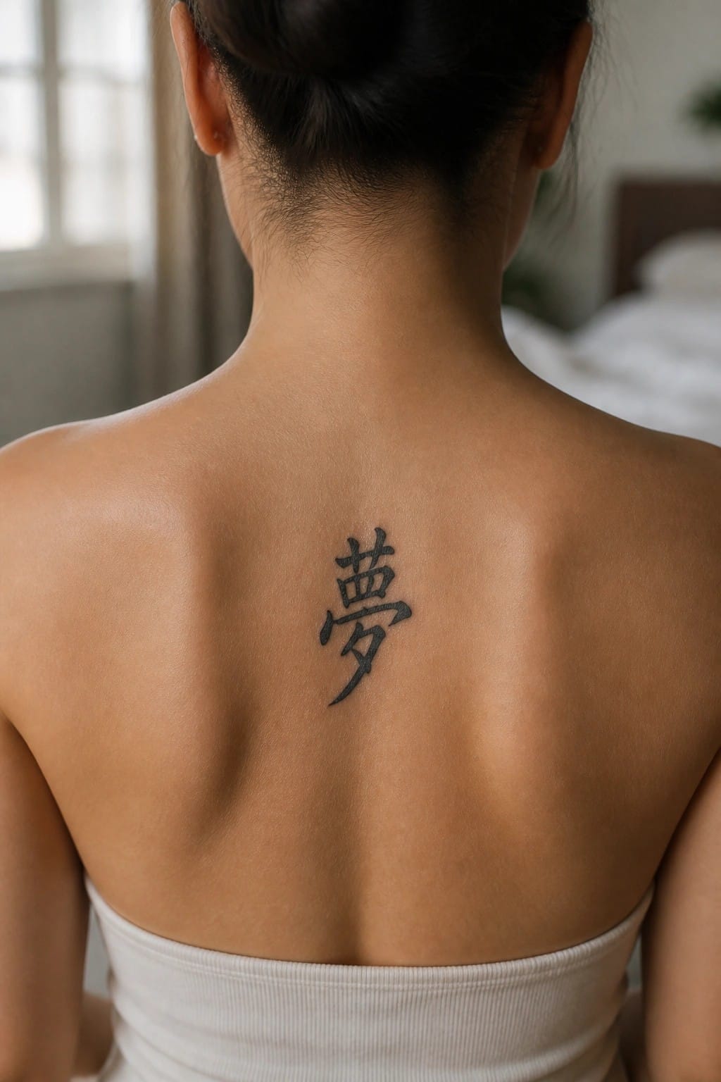
The upper back gives this single character enough space to sit straight and balanced. The vertical lines follow the natural shape of the area without needing extra elements around them. Most clothing covers it during daily life.
I think the flat surface there helps the strokes stay sharp and simple to read. It feels like a good match for someone who wants one clear symbol rather than a bigger piece.
Small character on the ankle
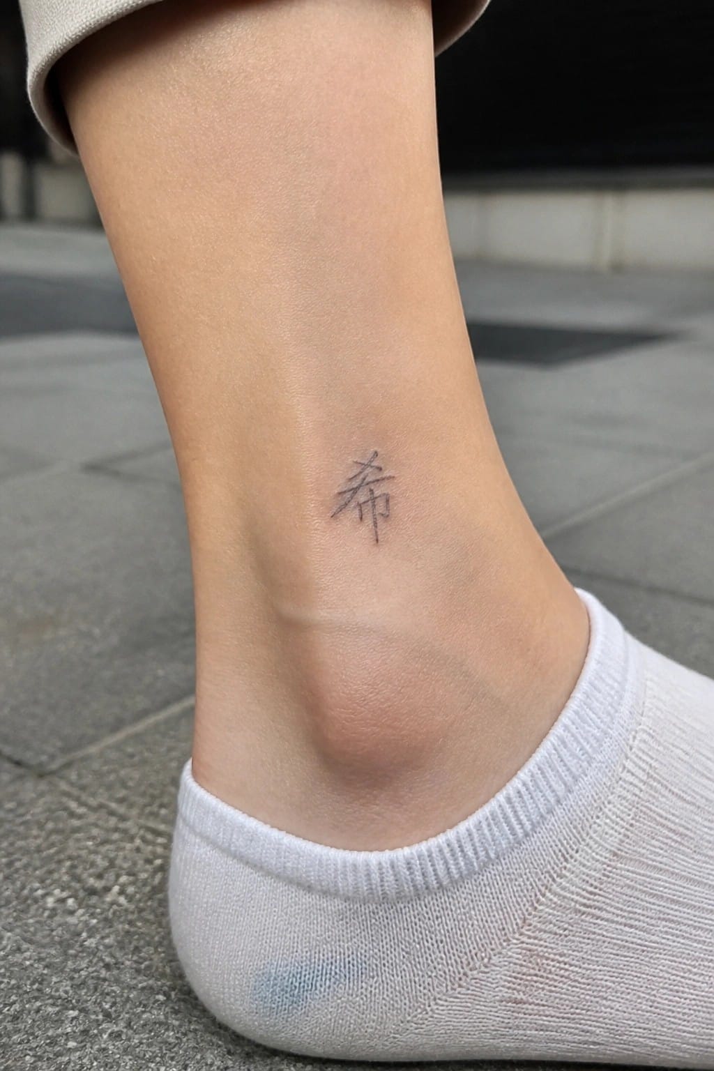
The ankle works as a natural spot for a single Chinese character. The area stays mostly hidden under socks or pants yet shows easily with certain shoes. This keeps the tattoo private for the wearer while still visible on their terms.
I think the small scale fits the ankle without crowding the skin. It also leaves room for the character to stay clean and readable over time.
Large Chinese characters across the upper back

The tattoo covers the upper back with four large characters in a single row. A misty landscape sits below them, and a line of smaller text runs down the left side. This layout lets the characters stretch out without feeling cramped.
The wide placement keeps the text easy to read even at this scale. The softer landscape adds balance but stays secondary to the main message.
A single character on the wrist
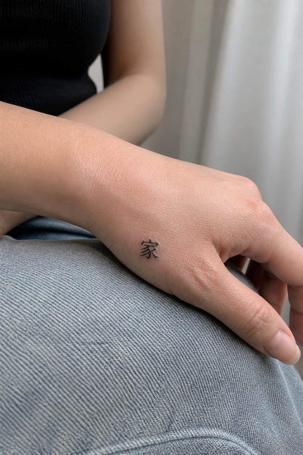
The wrist keeps this kind of tattoo small and easy to cover or show. A single character fits the space without crowding.
It stays readable even at this size because the lines stay clean. I think the placement works because it feels personal without needing much else around it.
Mother character on the upper back
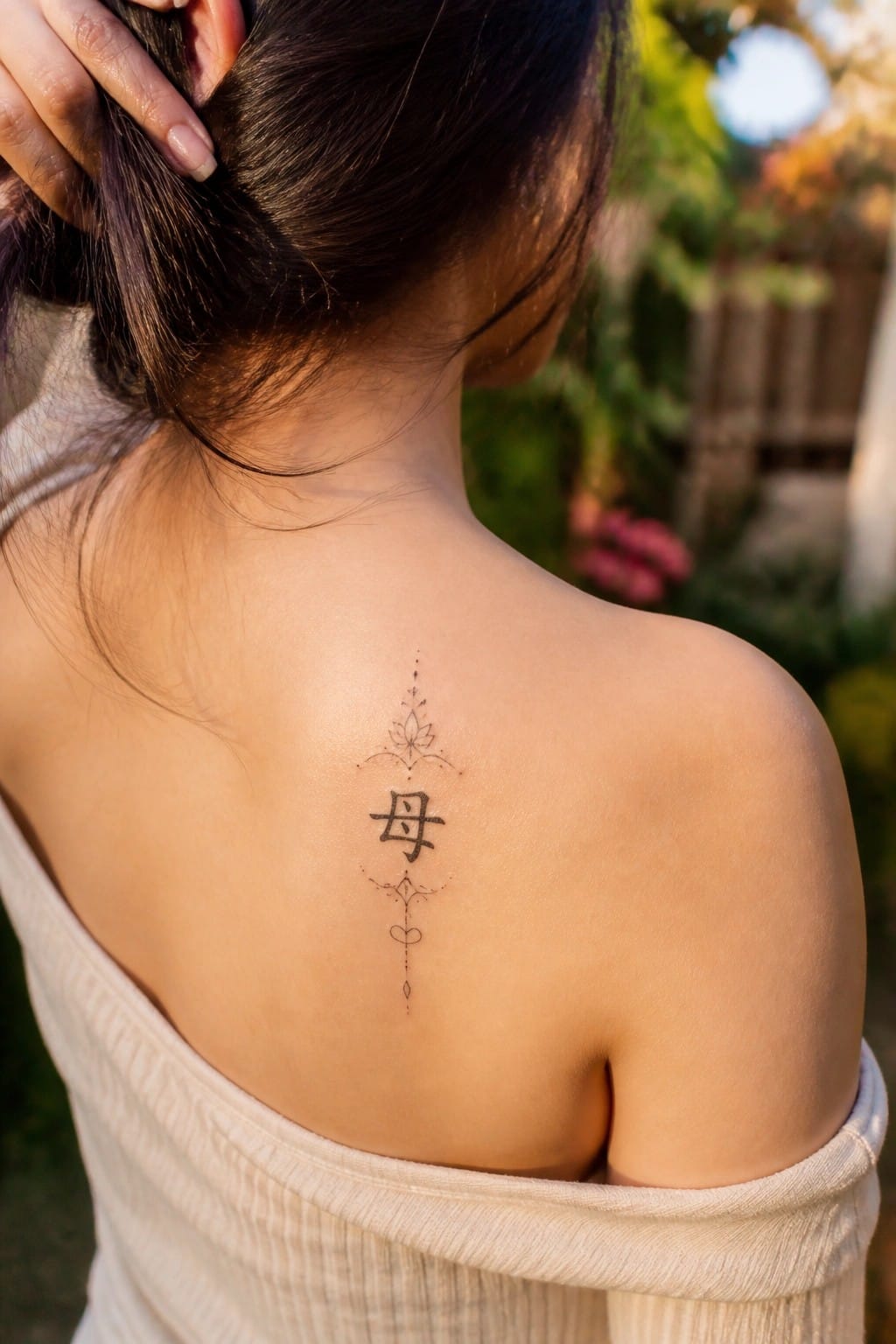
The upper back gives this vertical design enough space to sit evenly. The mother character anchors the center while the lotus sits above and the lines trail down in a clean stack.
I like how the placement keeps everything readable even when the shoulders move. It also lets the smaller accents stay visible without needing extra shading.
Small character on the ring finger
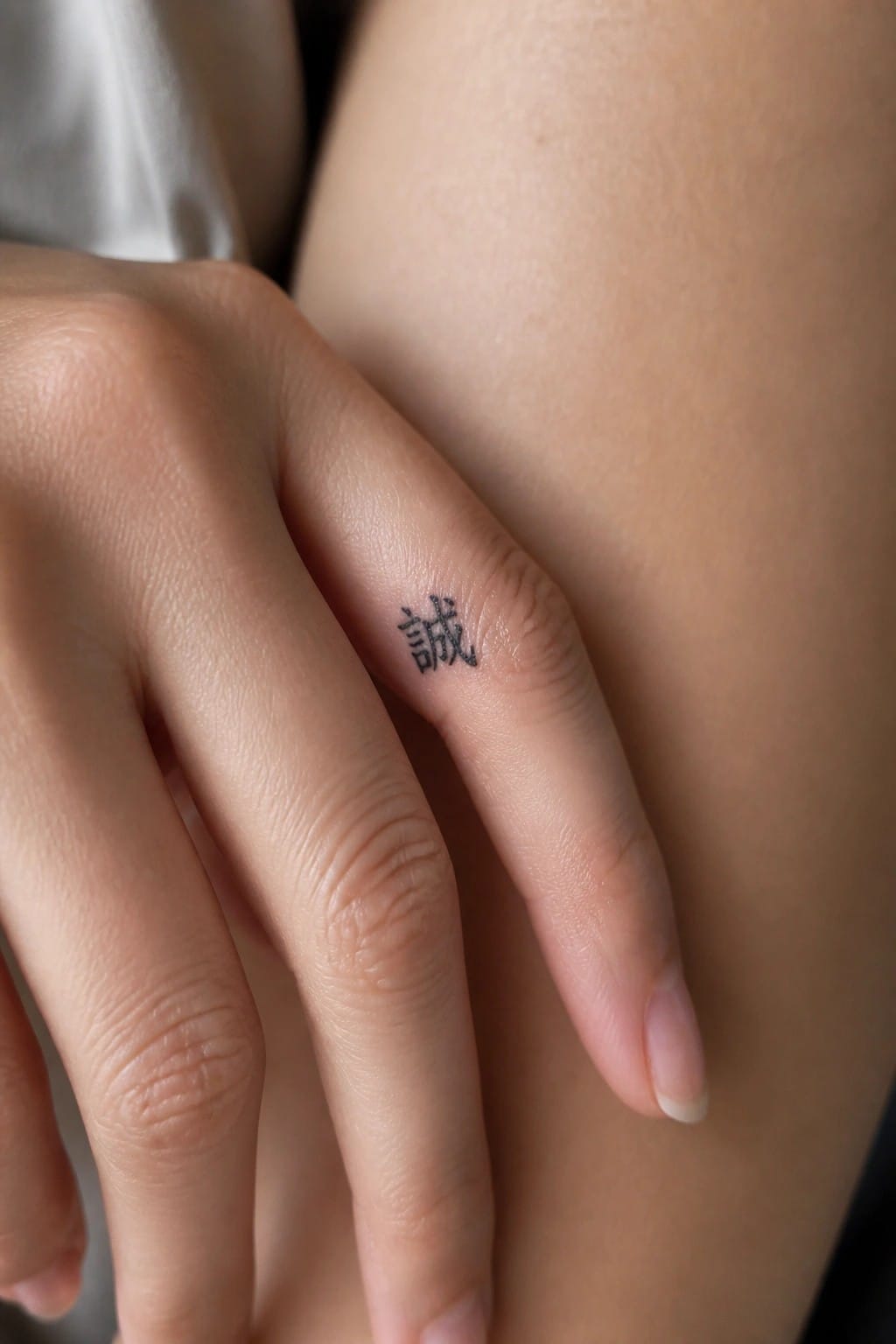
The side of the ring finger gives this tattoo a quiet spot that stays mostly hidden. A single character fits the narrow space without crowding. Black ink keeps the lines sharp even at this small scale.
I think the finger placement works because it turns the design into something personal instead of something meant to be shown off. It also leaves the option to add more characters later if the person wants to build on it.
Chinese character on the thigh

The thigh gives this design enough space to breathe. The black character sits next to a loose pink splash that softens the look without crowding the lines. People often choose this spot when they want something visible only at certain times.
I think the watercolor keeps the tattoo from feeling too stiff. It also helps the character stand out on skin that moves a lot during daily activity.
Chinese characters rest along the collarbone
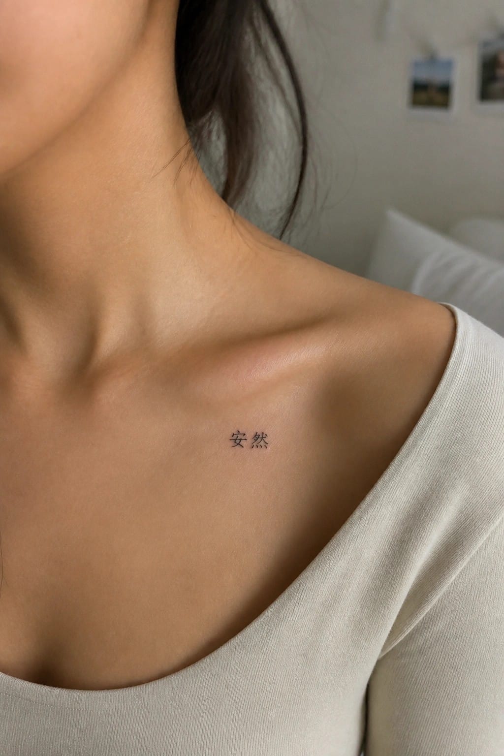
The tattoo sits directly on the collarbone in a compact script. Two characters form the design and follow the curve of the bone without extra decoration. The small scale keeps everything contained in one clear spot.
I picked this placement because it lets the text stay personal while remaining easy to see in certain outfits. The plain style avoids any extra weight that might feel out of place on this area.
A chinese character on the upper arm

The tattoo sits on the upper arm where the skin stays smooth and flat. This placement gives the thick strokes enough room to hold their shape. It also makes the design easy to see with certain tops while staying covered most of the time.
I think the medium size fits well here because the lines stay bold and readable without extra detail. The single character keeps the whole piece simple and direct.
A Chinese character on the inner forearm
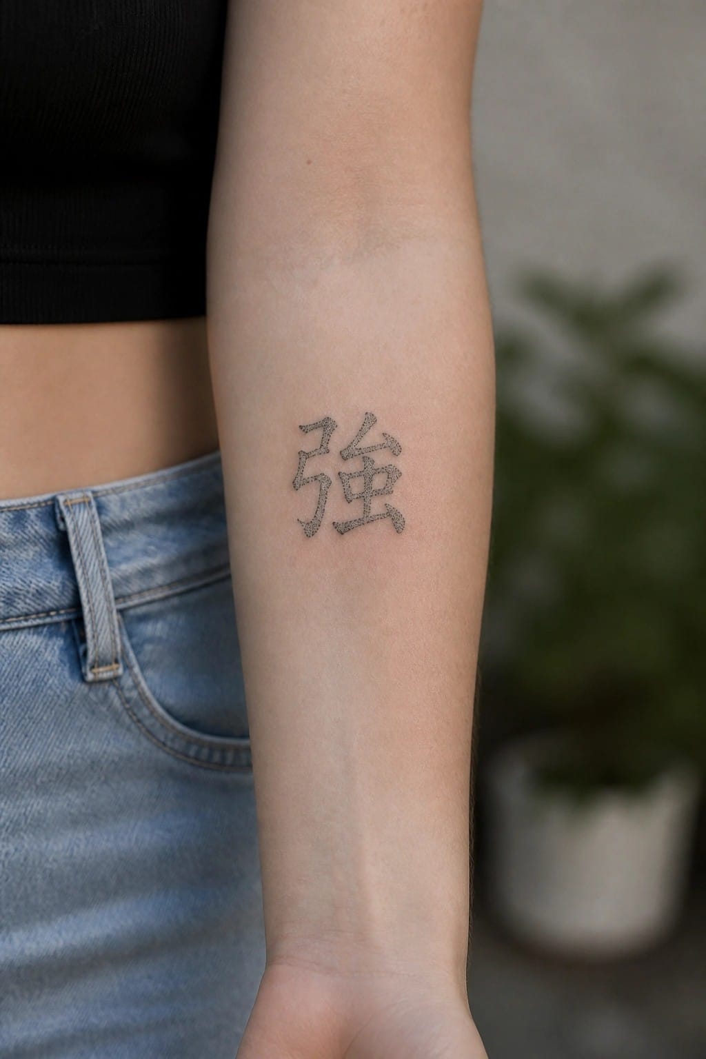
The character for strength sits on the inner forearm in a stippled style. The dots give it texture without filling the lines solid. This keeps the tattoo from looking too heavy on the skin.
I think the stippled look suits the meaning here. It adds a bit of softness to a symbol that could otherwise feel stark. The size also helps it stay clear without taking over the whole arm.
Chinese character in an ornate frame

A single chinese character takes center stage inside a detailed border on the upper back. The frame uses lotus details at the top and bottom to give the design shape while keeping the focus on the character itself.
This layout works because the border turns a simple symbol into something more finished without adding extra elements. I think the scale here keeps the lines clean and easy to read over time.
A single character on the side of the torso

The character sits on the side of the torso just below the edge of a top. This area keeps the tattoo mostly private while still allowing it to show with certain clothes. The small size matches the space without crowding the skin.
I think the placement works because it gives the design room to breathe. A single character stays clear at this scale. The spot also makes the tattoo feel more personal since it is not front and center.
Victory characters in brush calligraphy on the forearm

The brush style gives these victory characters real weight. Thick and thin strokes create movement that matches the meaning without extra decoration. The inner forearm placement keeps the design visible but not overpowering.
I think the size works well here because the characters stay clear even with the flowing lines. It feels like a straightforward choice for someone who wants the meaning front and center.
Small chinese character on the ankle
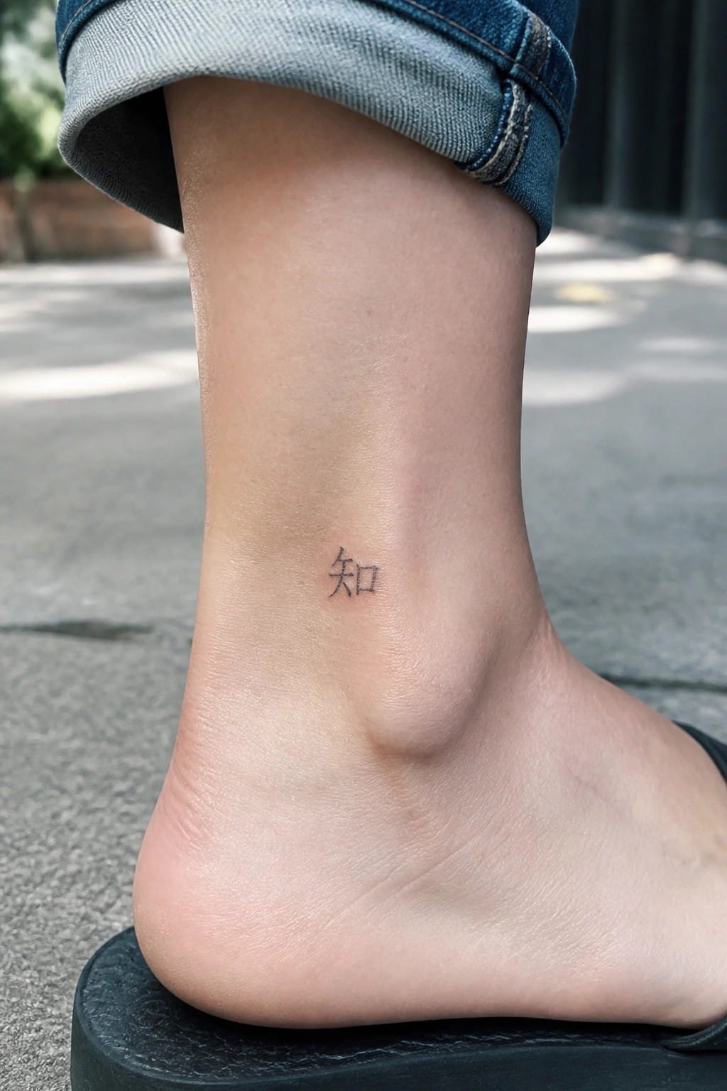
The ankle gives this tattoo a discreet home. It sits just above the foot where the skin stays fairly flat and the mark stays mostly covered by everyday shoes or socks. The single character keeps the whole piece compact.
Placing it here turns the design into something personal rather than public. The clean strokes stay clear without needing extra detail or shading.
A chinese character on the upper back
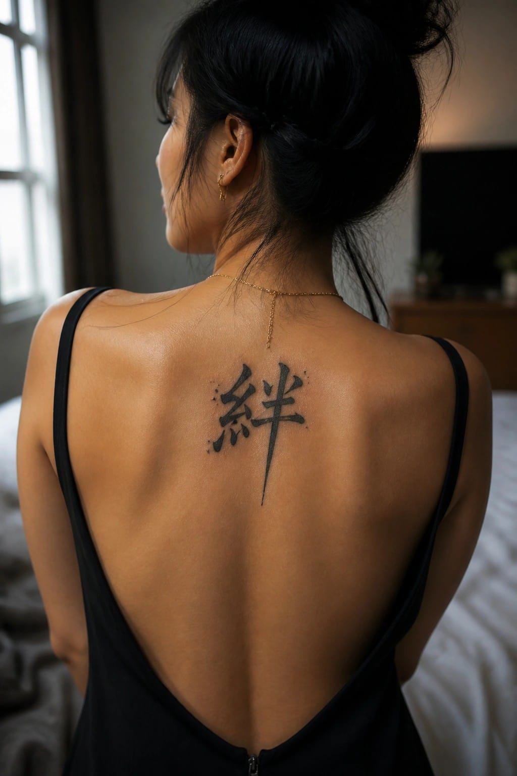
The tattoo sits centered between the shoulder blades. It shows one large chinese character in bold black ink with thick brush style strokes. No extra details or color are added around it.
This placement keeps the design personal since it stays out of sight most of the time. I think the medium size helps the lines stay clear without crowding the area.
A single character on the inner wrist
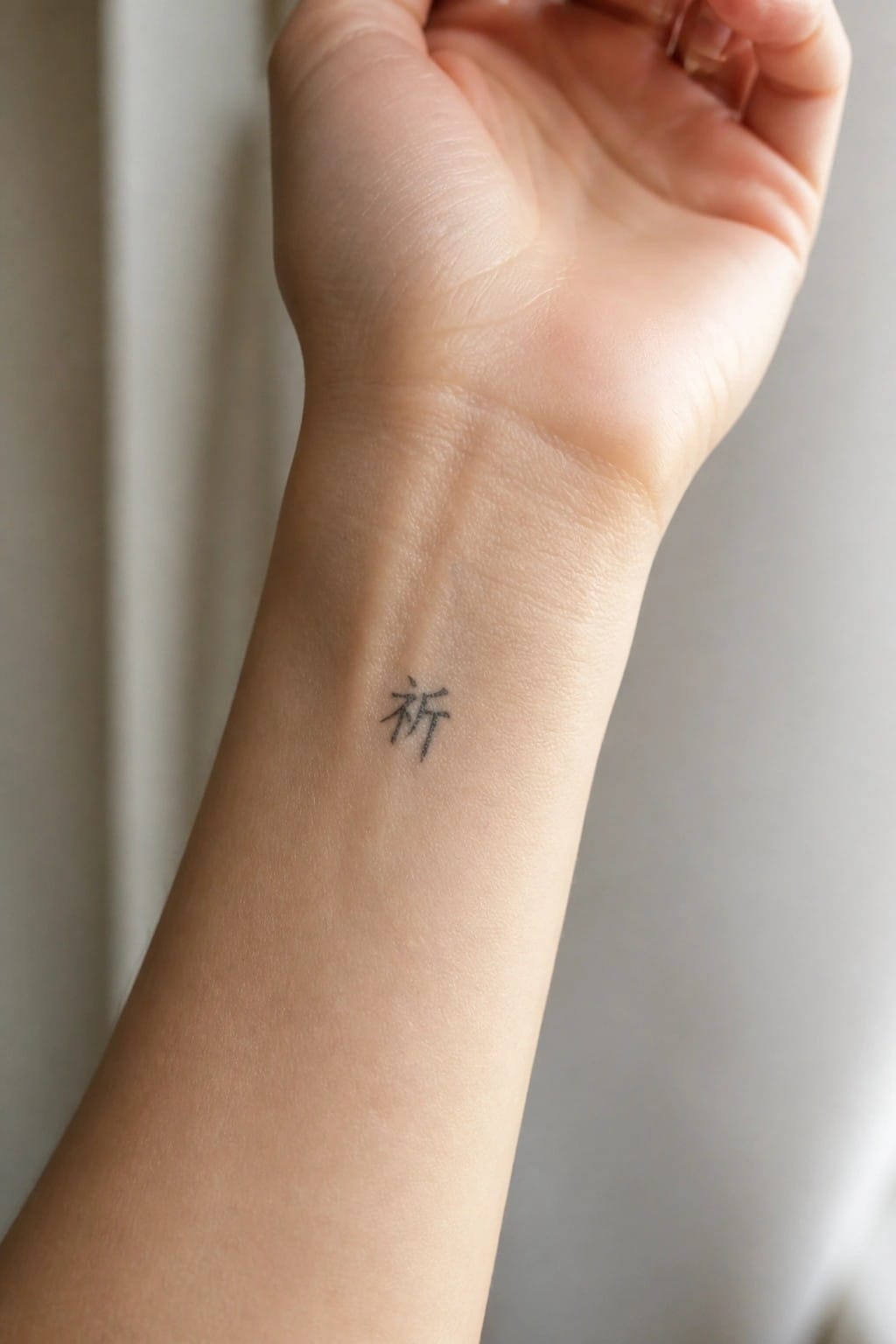
The inner wrist gives this small character a natural spot to rest. It shows during everyday gestures but stays easy to cover with a sleeve or bracelet when needed. The single symbol keeps the whole piece simple and contained.
I think the placement works because the skin stays fairly flat and the area allows the lines to hold their shape over time. It feels like a good choice for someone who wants something personal without drawing constant attention.
Chinese characters on the side
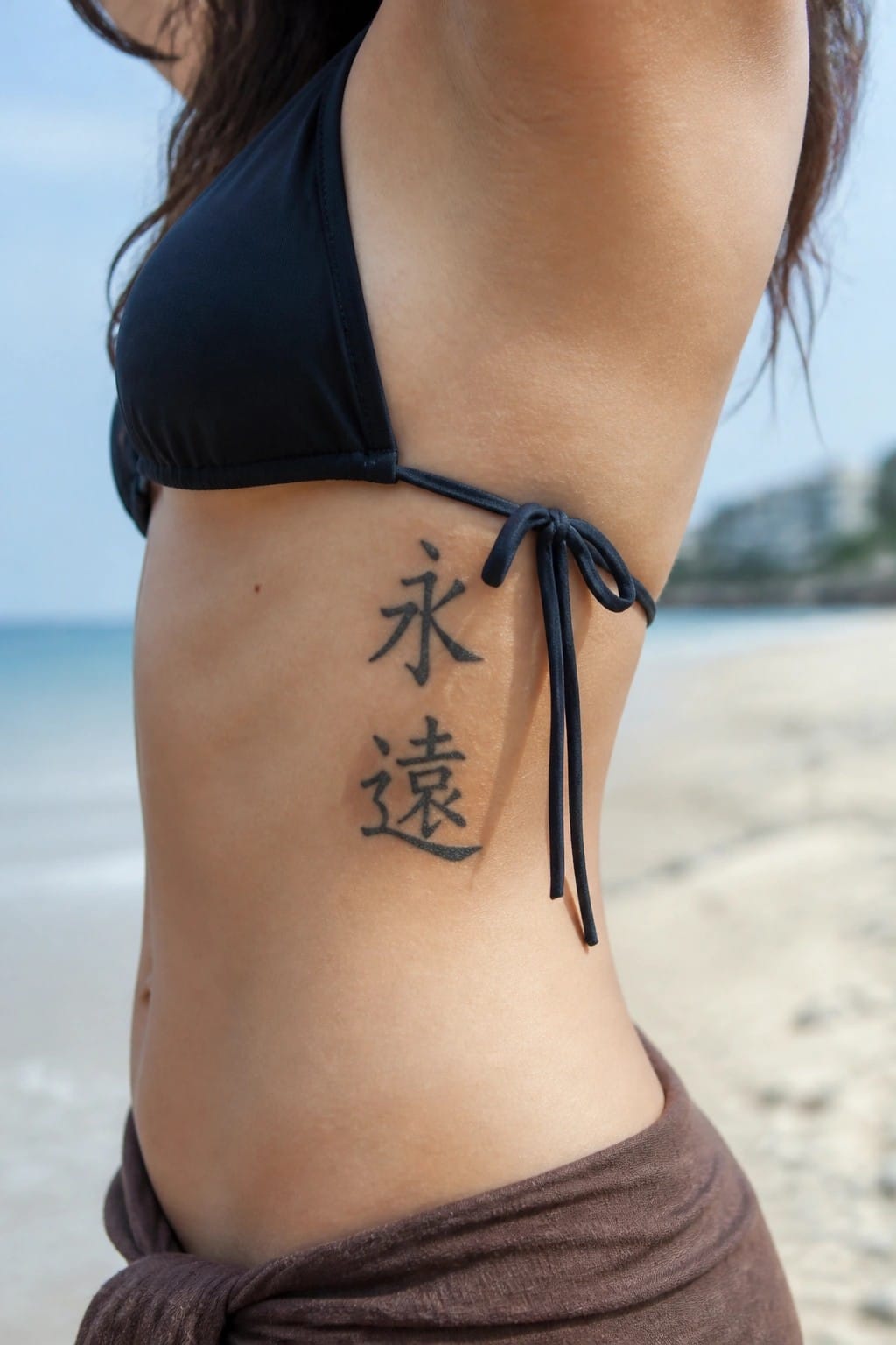
The side torso works well for a vertical pair of characters. It gives the design enough height without spreading it out too wide. The black ink stays simple and clear against the skin.
This placement keeps the tattoo visible but not overpowering when arms are down. I think the vertical stack feels natural here because the area already runs long and narrow.
A small Chinese character on the foot
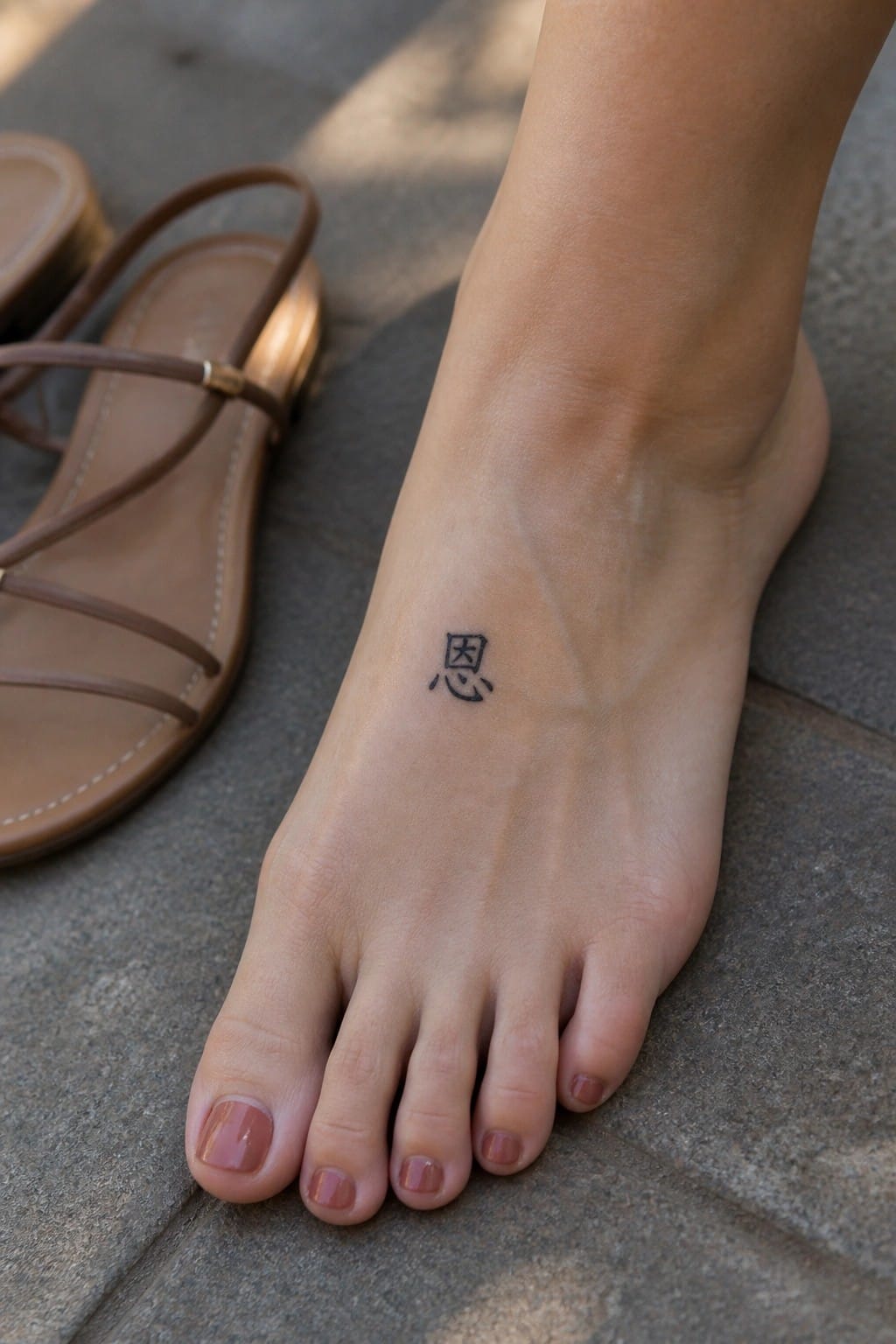
The tattoo sits on the top of the foot. It shows one Chinese character done in simple black ink. The size stays small and compact.
This spot works well for a single character because it stays mostly covered by shoes. I think the minimal approach keeps the design clear without needing extra shading or detail.
Harmony character on the upper arm
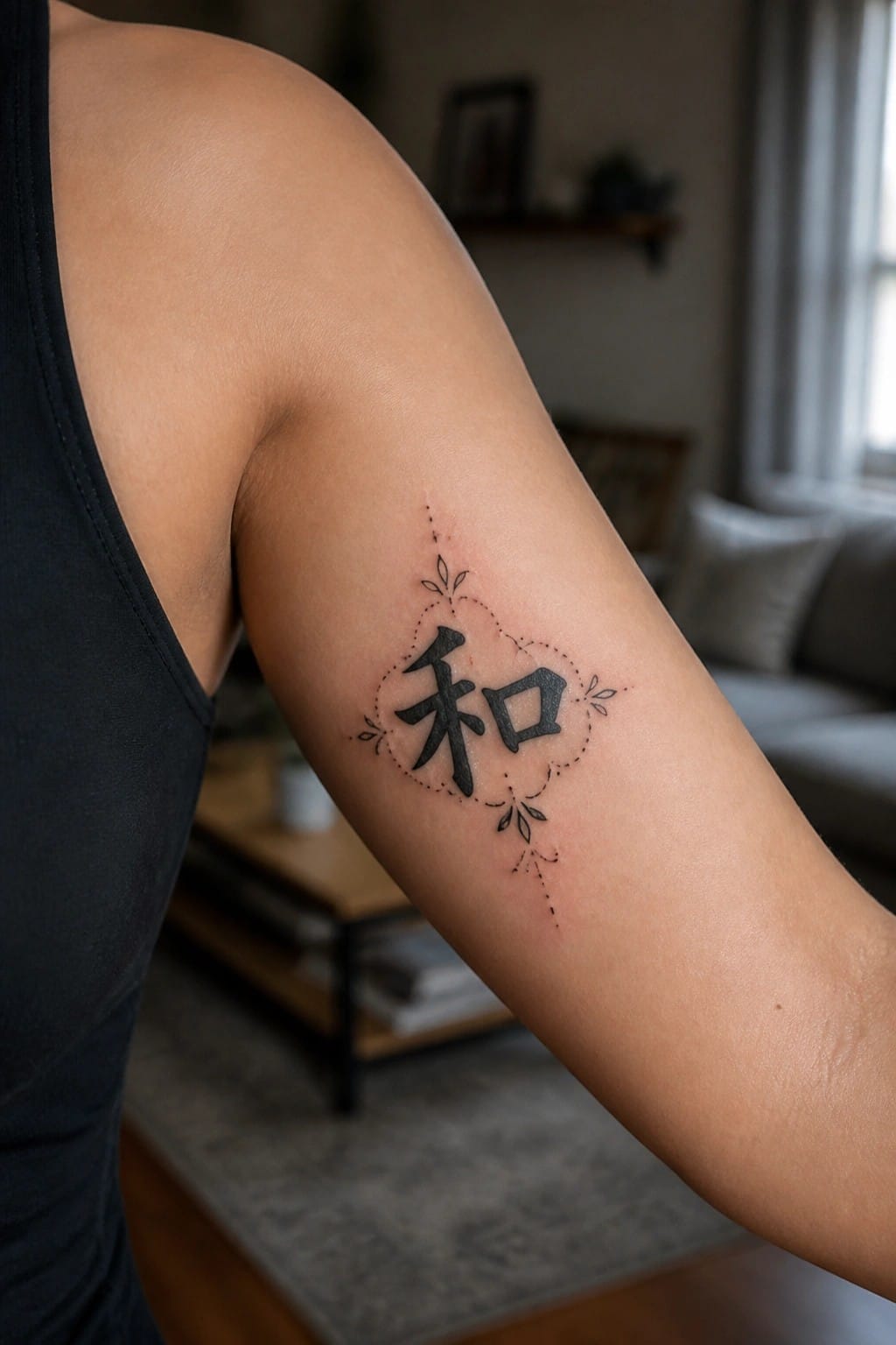
The upper arm gives this harmony character room to sit without feeling cramped. Black ink forms the main symbol while a dotted border and small leaves frame it on four sides. The whole piece stays compact yet balanced on the skin.
I think the placement helps the design stay visible from most angles. It also keeps the decorative elements from competing with the character itself.
Vertical characters on the neck
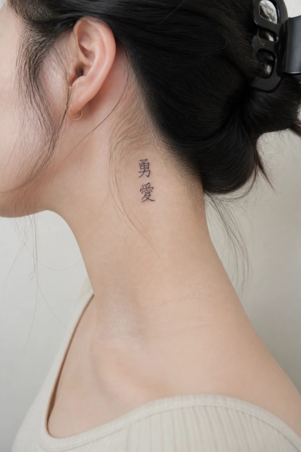
The neck works well for a vertical layout of two characters. They sit in a straight line below the ear and stay compact without spreading sideways. The black ink uses clean lines that read clearly at this size.
This placement keeps the tattoo personal yet easy to show when wanted. I think the vertical format fits the area because it uses the natural shape instead of fighting against it.
Frequently Asked Questions
How do I select Chinese characters that truly feel personal rather than generic? Start by reflecting on life experiences, values, or relationships that define you, such as a family motto, a moment of resilience, or a favorite poem line. Cross-reference short phrases with a native speaker or reputable translator to capture nuance, then review the 23 ideas in the article for inspiration on single characters like strength or harmony that can be adapted to your story.
What cultural aspects should I consider before getting a Chinese character tattoo? Respect the language by verifying meanings through multiple sources since characters can shift based on context or region. Avoid using them as fashion statements without understanding their roots, and consider consulting someone familiar with Chinese culture to ensure your choice honors rather than appropriates the tradition.
Where are the best body placements for these tattoos to keep them meaningful and discreet? Popular spots include the inner wrist for daily personal reminders, the ribcage for private significance, or behind the ear for subtle visibility. Match placement to the character size and your lifestyle so the tattoo remains a source of quiet strength rather than something exposed in every setting.
How can I confirm the accuracy of a translation before committing to ink? Work with a professional calligrapher or certified translator who specializes in classical and modern Chinese rather than relying on apps alone. Test the phrase by writing it out and checking for multiple interpretations, then compare it against similar ideas from the article to refine your selection.
What design elements help make a Chinese character tattoo feel unique and deeply personal? Incorporate subtle flourishes like a small flower motif or a faint background pattern that ties into your personal narrative without overwhelming the character itself. Discuss font styles, such as flowing script versus bold seal script, with your artist to ensure the final result reflects your individuality while staying true to the original meaning.
