


I have fallen head over heels for modern Chinese tattoo designs that feature clean lines and contemporary flair.
My own ink collection started with a simple lotus motif and it still gets compliments everywhere I go.
If you are into subtle yet powerful body art these concepts offer endless possibilities for your next piece.
They make me smile because blending heritage with fresh style feels like the perfect personal touch.
A small character on the inner wrist

The inner wrist keeps the design visible during daily movement yet easy to cover when needed. A single character fits this area well because the space is narrow and the skin stays relatively flat. The lines stay crisp without any extra elements around them.
I chose this placement for clients who want something they can glance at without it dominating the whole arm. The scale also helps the character read clearly even from a short distance.
Cherry blossom branches on the shoulder

The branches begin on the upper back and extend across the shoulder. This lets the design move with the body in a natural way. The fine line work keeps the flowers and buds from feeling crowded.
I think the spacing between the blooms helps the tattoo stay readable even at this size. It suits someone looking for a simple botanical piece that still has some movement.
Bamboo running down the forearm

The vertical stalks sit along the inner forearm and follow its natural length. Fine lines keep the leaves light while the joints add just enough structure. This keeps the design readable without filling too much space.
I think the placement works because it lets the bamboo grow upward in a straight path. It avoids wrapping around the arm and stays easy to see from most angles.
Bamboo on the side
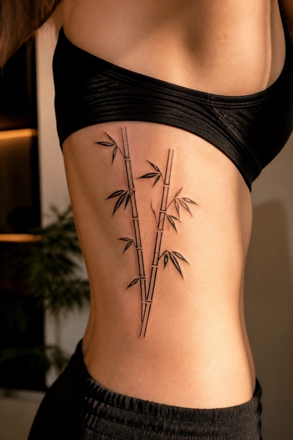
The bamboo sits along the side of the torso. Two stalks run vertically with a few leaves placed to keep the lines open. This placement lets the design follow the body’s natural shape without extra detail.
The scale works because the stalks stay balanced and clear. I think the side position gives the tattoo room to breathe while keeping the overall look simple.
A fine line peony behind the ear

The tattoo sits just behind the ear on the neck. Thin lines shape a single peony with a short stem and two leaves. The small scale keeps everything contained in that tight spot.
This spot makes the design easy to hide or show depending on hair. The simple outline style prevents it from feeling heavy there.
A mountain scene across the upper back

The upper back gives this landscape room to spread out in a single wide view. The design shows a chain of mountains with a lake below and a small boat near the center. Trees frame the sides to keep the composition even.
This setup keeps the tattoo readable without crowding the skin. The fine line approach also prevents it from feeling heavy on the area.
Small seal tattoo on the ankle

The tattoo sits just above the ankle bone. It shows the character fu inside a solid red square. The whole design stays small and uses one flat color.
I think the ankle works here because the tattoo stays visible with sandals but stays hidden under most pants. The seal format also keeps the lines simple and easy to read at this size.
Vertical characters run down the upper back
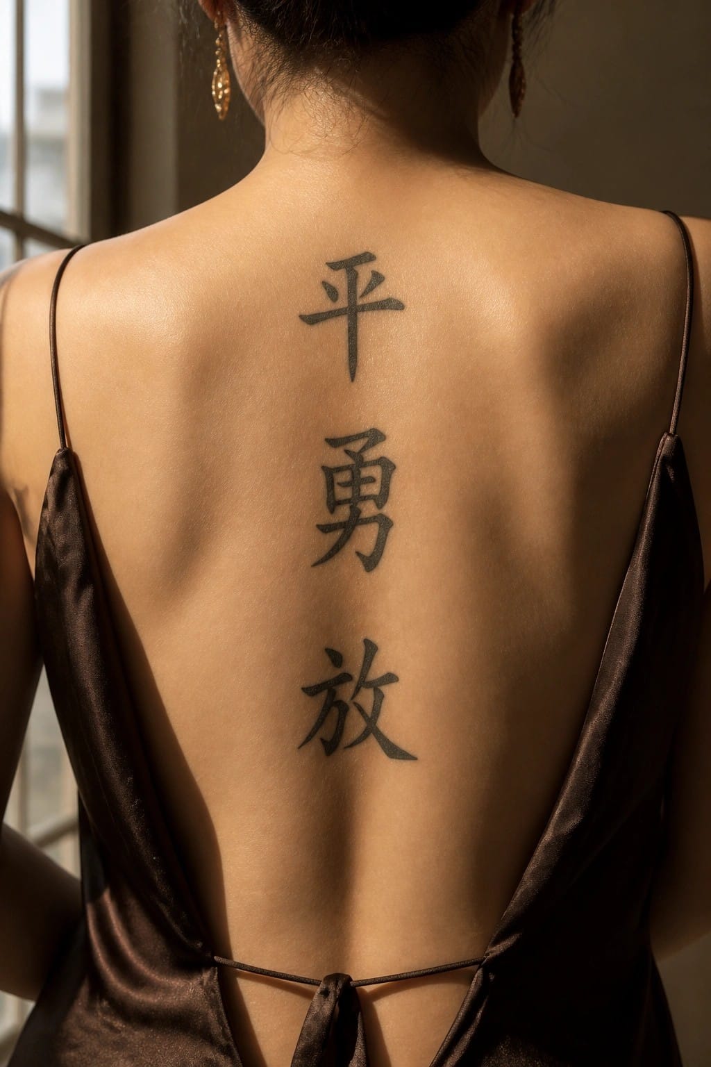
The upper back works well for a vertical stack of three characters. It gives the design room to sit straight without wrapping around curves or getting cut off at the edges. The black ink stays bold against the skin and reads clearly from a short distance.
I picked this placement because it keeps the characters aligned with the spine. That layout feels balanced and avoids any need for extra spacing or adjustments.
Chrysanthemums on the thigh
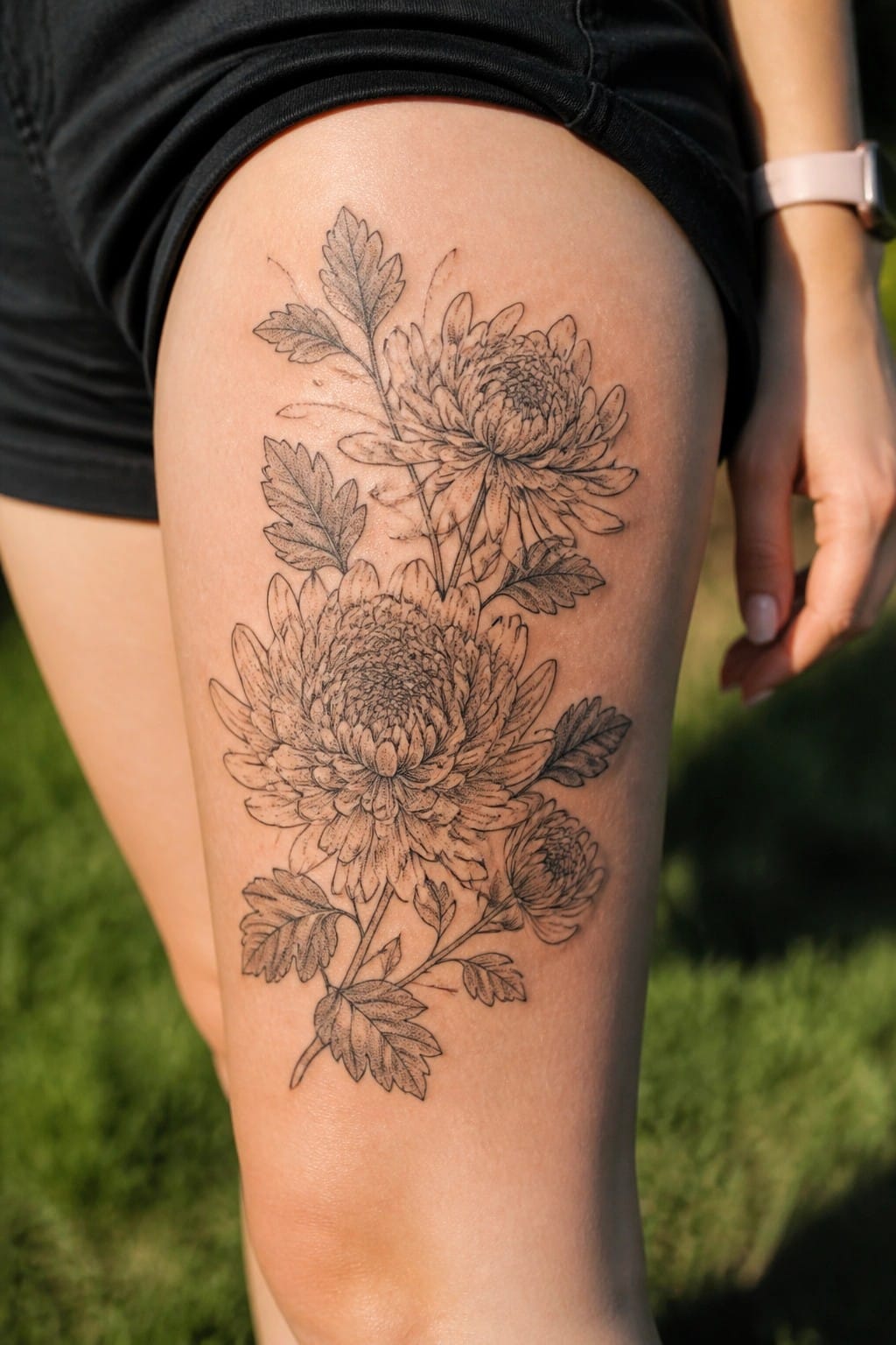
The thigh gives this floral tattoo room to spread without crowding. Several chrysanthemum blooms sit along the upper leg with leaves and stems filling the gaps between them. The vertical flow follows the shape of the leg in a simple way.
I think the medium size keeps the piece balanced on this part of the body. Fine line shading adds depth while still leaving space around the flowers.
Wave tattoos fit the collarbone area well

The tattoo sits along the collarbone and stretches out in a straight line. A single wave rolls across the skin and finishes with a cloud on the right side. Thin lines keep the design light without filling any space.
I like how the bone itself gives the wave a natural path to follow. The scale stays small so the details stay sharp even from a short distance. This placement works for someone who wants something visible but still easy to cover.
Chinese character on the forearm
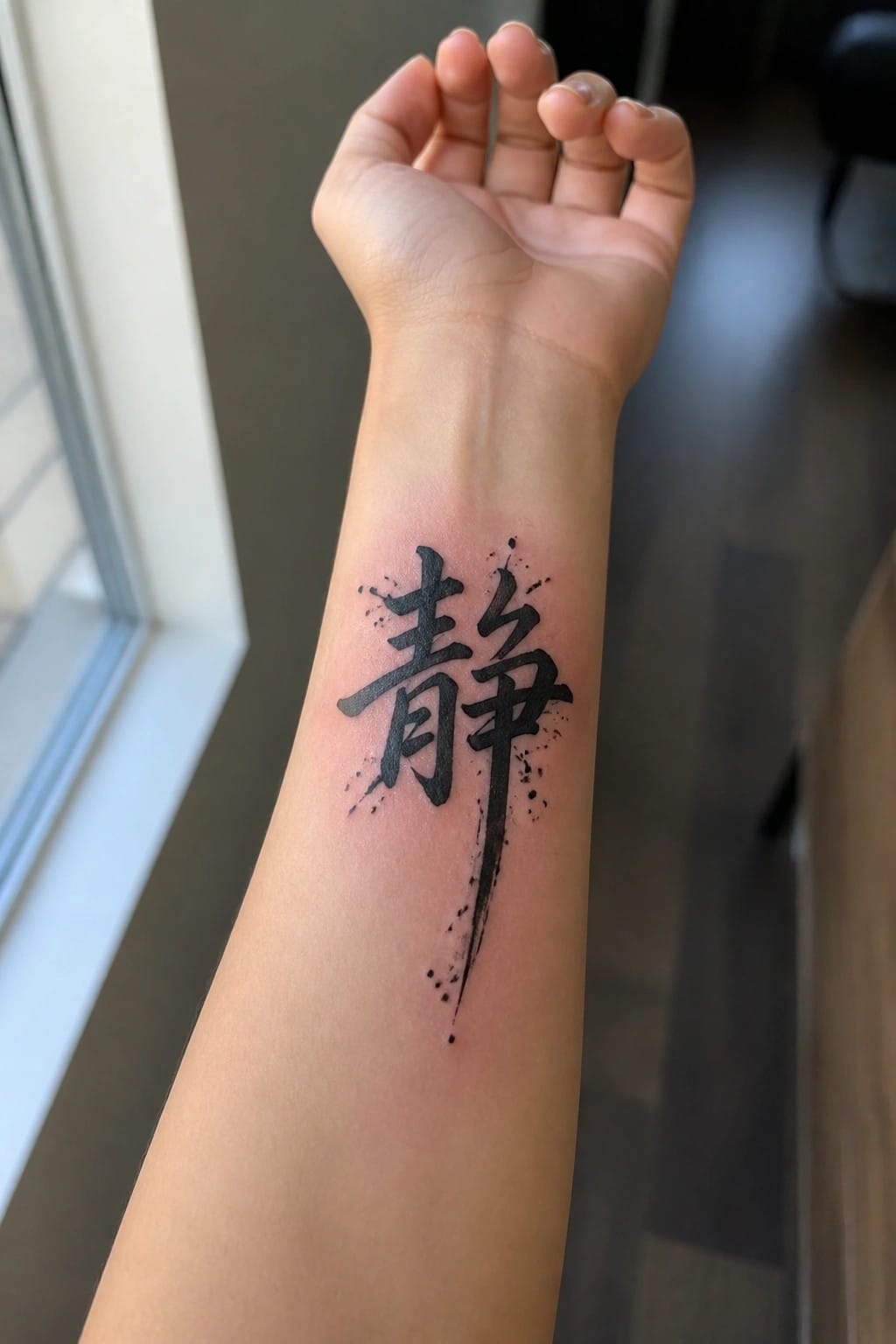
The forearm gives this tall character enough vertical space to stretch out fully. The brush strokes and lower drips follow the arm’s length without feeling cramped.
I like how the placement keeps the whole piece visible in most positions. It stays balanced even with the added splatter around the edges.
Barbed wire line across the upper arm

The upper arm keeps this tattoo in a straight horizontal line. Fine black ink forms a thin barbed wire with small leaves spaced along it. The design stays narrow so it does not overwhelm the area.
This placement makes sense because the arm gives the wire a flat surface to rest on without much distortion. The result stays simple and easy to read.
Chinese knot tattoo on the upper back

The design sits right between the shoulder blades. It takes the classic endless knot shape and renders it with simple black lines that stay open and balanced. The top and bottom points add a bit of length without stretching the whole piece too far.
I like how the clean lines stop the knot from looking overly busy in this spot. It keeps the traditional pattern readable while feeling like a modern choice.
Lotus tattoo on the sternum
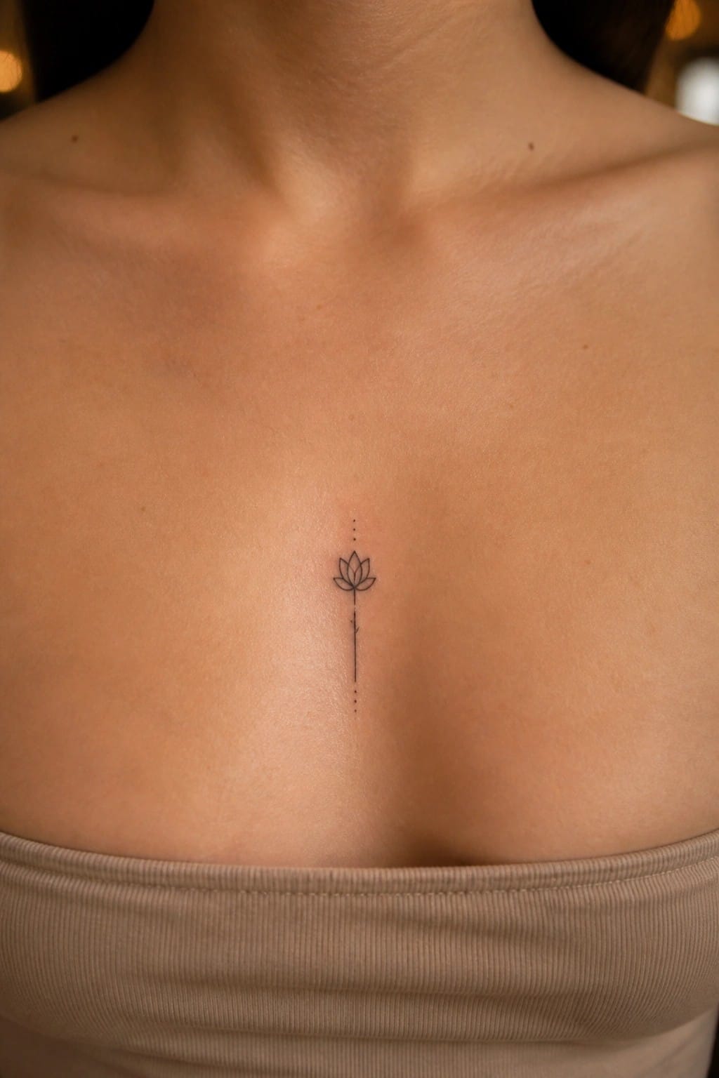
The sternum gives this lotus a straight path down the center of the chest. The dotted line runs through the flower and keeps going both ways, so the eye follows the body rather than fighting it. At this size the design stays readable without crowding the area.
I like how the dots add length without weight. It turns a simple flower into something that feels more complete on its own.
Mountain landscape on the ribs

The tattoo shows a chain of mountains with a crescent moon placed above. It stretches across the side of the torso in a single horizontal line.
This placement lets the range follow the natural shape of the body without looking forced. The black and grey shading stays light enough to keep the details clear at this size. I think the simple layout works well here because it avoids crowding the area.
lower back quote in Chinese script
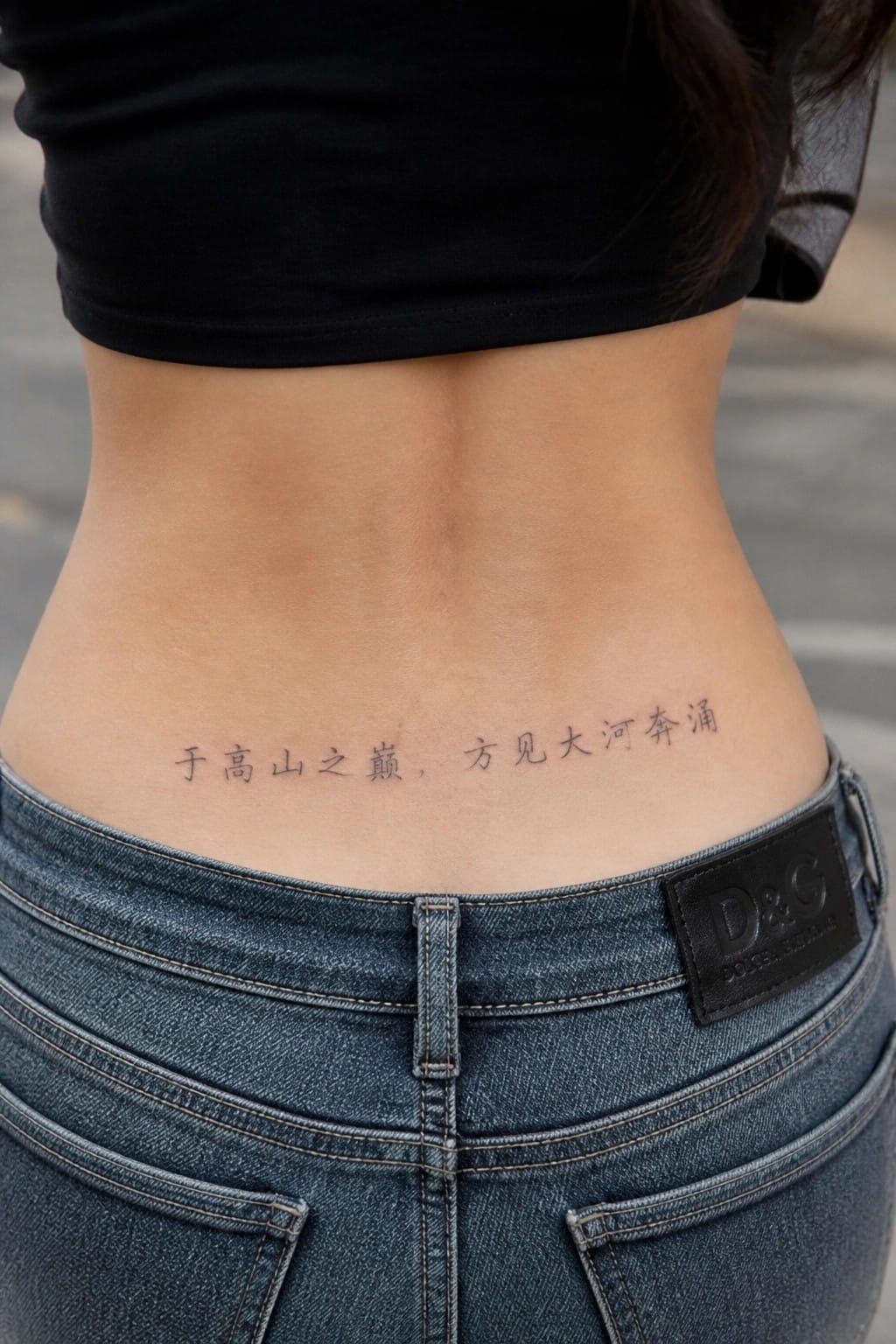
The tattoo sits on the lower back in a straight horizontal line of Chinese characters. Black ink keeps the script simple and clear against the skin. This spot works because the area stays mostly flat so the text does not bend or stretch much.
I picked this placement for the quote because it stays hidden under normal clothing yet shows when the waistband sits low. The clean script style also keeps the focus on the words without added decoration.
A peony inside a circular frame on the shoulder
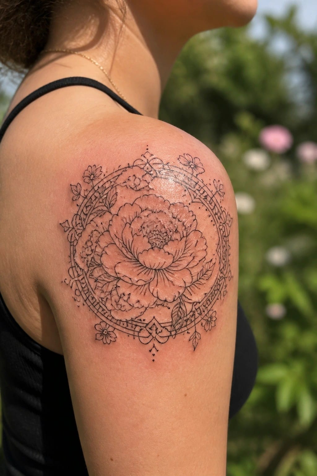
The shoulder gives this design room to sit flat while the round shape follows the natural curve of the arm. A large peony takes the center spot and smaller flowers fill the border. The circle keeps everything contained so the piece reads as one unit instead of scattered parts.
I like how the placement lets the design stay visible from the front and side without needing extra shading. It also leaves the lower arm free for something smaller later if wanted.
A small chinese character behind the ear
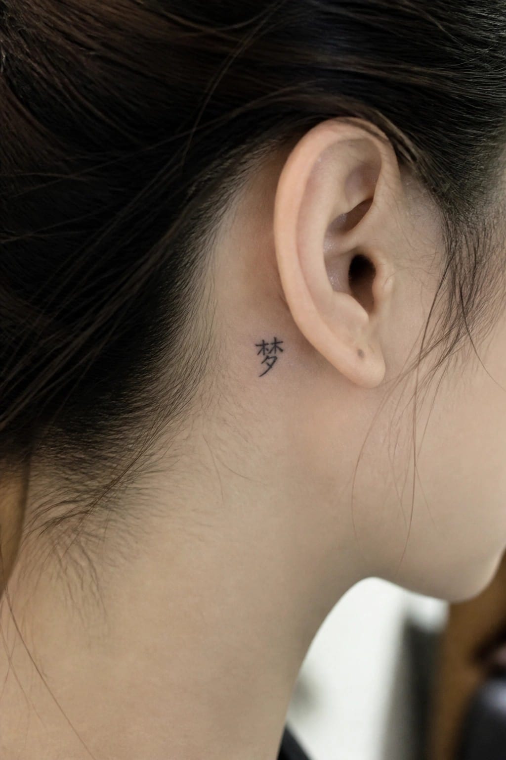
The tattoo sits just behind the ear along the upper neck. It shows one Chinese character in a simple black script. The size stays small and the lines stay thin so the design stays low key.
I like this placement because it keeps the tattoo mostly hidden unless someone stands close. The minimal style fits the small area without crowding the skin.
Frequently Asked Questions
What are the most common mistakes people make when choosing Chinese characters for tattoos, and how can they avoid them?
Many people select characters based on rough translations without confirming nuances or stroke order. To avoid errors, consult a native speaker or professional calligrapher who understands both traditional and simplified forms. Cross-reference multiple sources and test the design in different fonts to ensure it remains legible at small sizes typical of contemporary styles.
Which body placements suit clean contemporary Chinese tattoos best for women seeking subtle designs?
Areas like the inner wrist, behind the ear, along the collarbone, or the side ribcage allow for elegant flow without overwhelming the body. These spots highlight minimalist line work and negative space common in modern interpretations of elements like lotus flowers or single characters. Discuss skin movement and visibility preferences with your artist during the consultation.
How long does it take for a small modern Chinese tattoo to heal, and what aftercare steps promote the best results?
Healing usually takes two to four weeks for outline-based designs. Keep the area clean with fragrance-free soap, apply a thin layer of recommended ointment, and avoid sun exposure or tight clothing that could irritate the skin. Moisturize consistently once the initial peeling stage passes to maintain sharp lines in contemporary motifs.
What cultural aspects should someone consider before getting a Chinese-inspired tattoo to show respect?
Research the historical or symbolic background of chosen elements such as dragons or peonies to understand their significance beyond aesthetics. Opt for designs created by artists familiar with Chinese art traditions rather than generic copies. This approach helps ensure the tattoo reflects appreciation instead of unintended misrepresentation.
Can these modern Chinese tattoo ideas be adapted if someone wants to add color or combine them with other styles?
Yes, many clean designs translate well to soft watercolor accents or delicate dotwork while preserving contemporary simplicity. Work with an artist experienced in fusion styles to blend Chinese characters with geometric patterns or fine line florals. Start with a small test sketch to confirm the balance of elements before committing to the full piece.
