

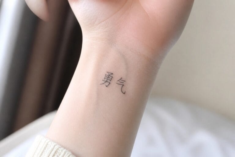
I think Chinese word tattoos are such a cool way to express yourself with elegance and meaning.
My favorite part is how these characters can hold an entire inspirational phrase in just a few strokes.
If you are into meaningful ink you will appreciate these ideas for women.
Some designs blend traditional script with modern twists that feel fresh and personal.
I have seen so many clients light up when they find a phrase that truly speaks to them.
Chinese characters on the wrist
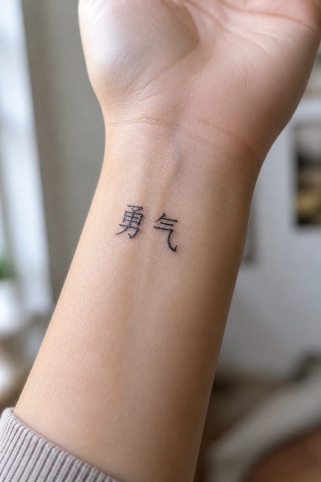
The inner wrist holds these two characters in a compact row. The script stays simple and clear at this size. That placement keeps the tattoo visible during normal movement without taking up much space.
I picked the wrist here because the narrow shape matches the design without forcing extra detail. The clean lines stay easy to read even when the arm bends.
Vertical Chinese characters on the forearm
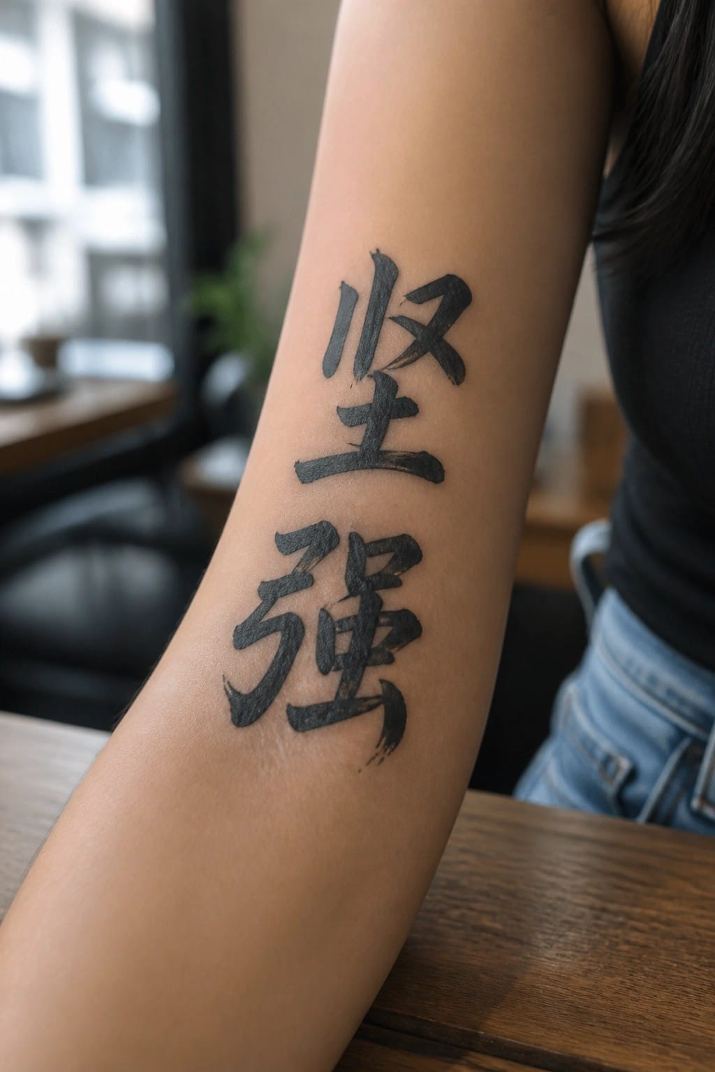
The tattoo runs vertically down the inner forearm. This layout lets the two characters stack naturally along the length of the arm. The black brush style ink keeps the focus on the words themselves.
I chose this placement because it makes the script easy to read without crowding. The size also fits the area well and leaves room to add more later if wanted.
small chinese characters on the chest
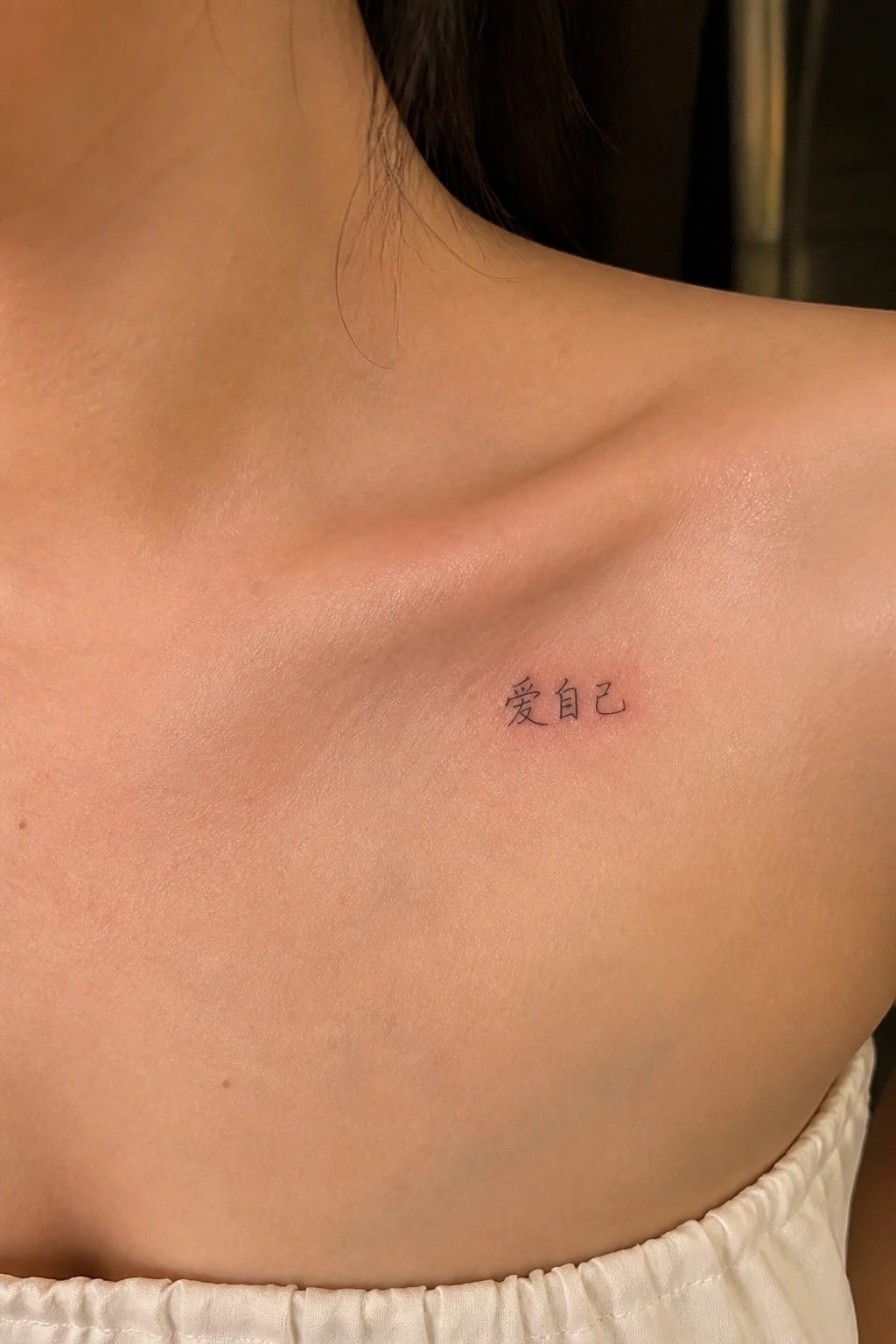
The characters rest on the upper chest near the collarbone. This area gives the small script enough flat space to stay clear without spreading out. The fine lines keep the whole piece compact and easy to cover if needed.
The size feels right for a short phrase meant as a personal note. I think the placement works because it stays close to the body without needing extra detail to hold attention.
Vertical chinese characters on the ribs
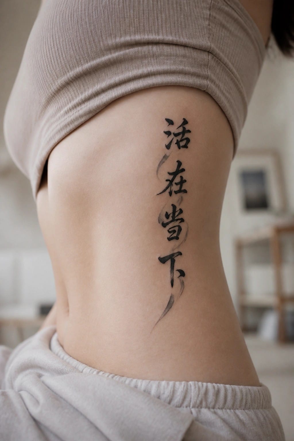
The tattoo runs vertically down the side of the torso in a straight line. The characters use a traditional script style with a bit of light shading that softens the edges without adding extra detail.
This placement keeps the text compact while letting it follow the body’s natural shape. The overall size stays moderate so the phrase remains easy to read at a glance.
I think the vertical format works here because it turns a short saying into something that feels personal rather than decorative.
Chinese characters behind the ear
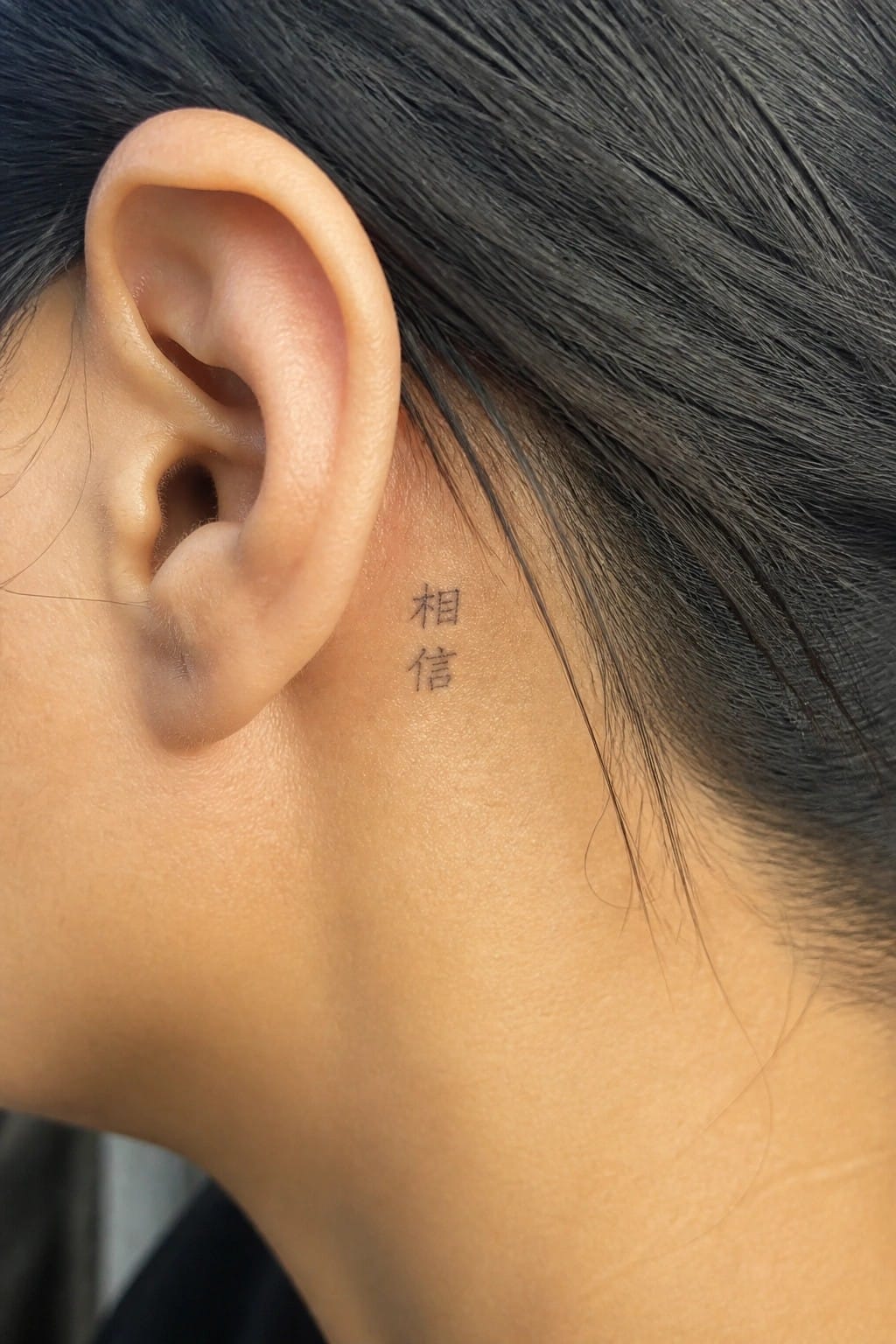
The tattoo places two Chinese characters directly behind the ear. They appear in simple black script and stay small enough to match the narrow space. Hair can easily cover them or reveal them depending on the style.
I think this location suits the text because it keeps the meaning personal without drawing constant attention. The compact size also helps the characters stay clear on skin that moves with expressions.
Chinese text on the ankle
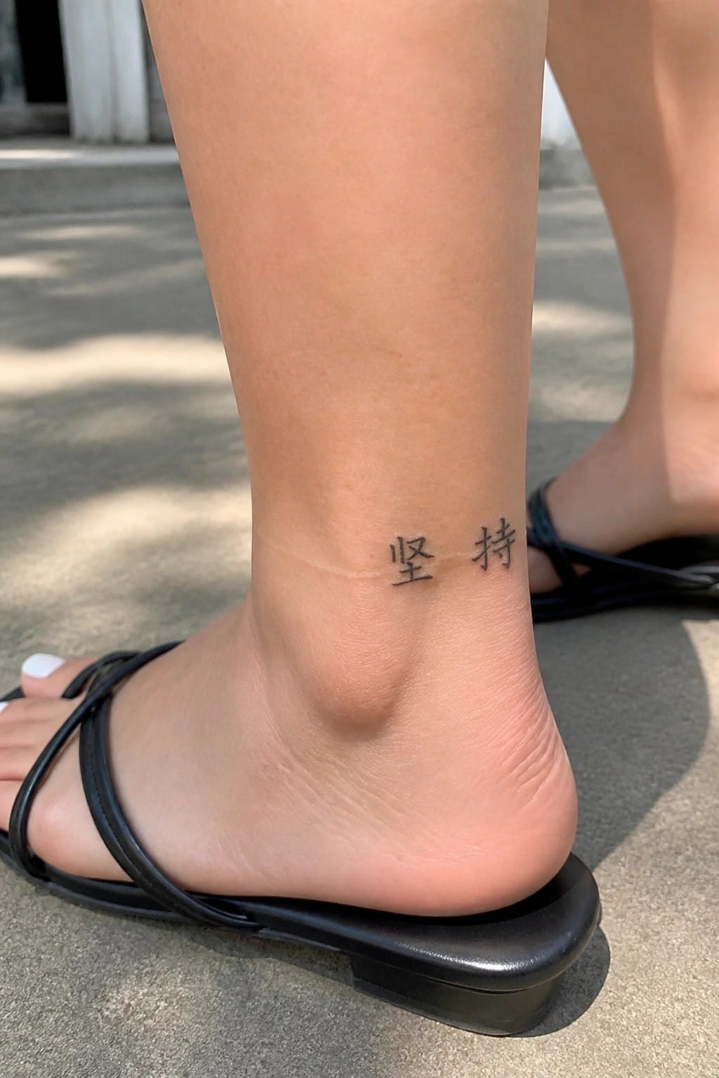
The two characters sit on the inner side of the ankle. They use a simple black font with no extra lines or shading. The scale stays small enough to fit the narrow space without crowding.
This placement works for a short phrase because it stays private most of the time. I think the clean lettering helps the meaning come across without any extra decoration.
Freedom characters on the ankle
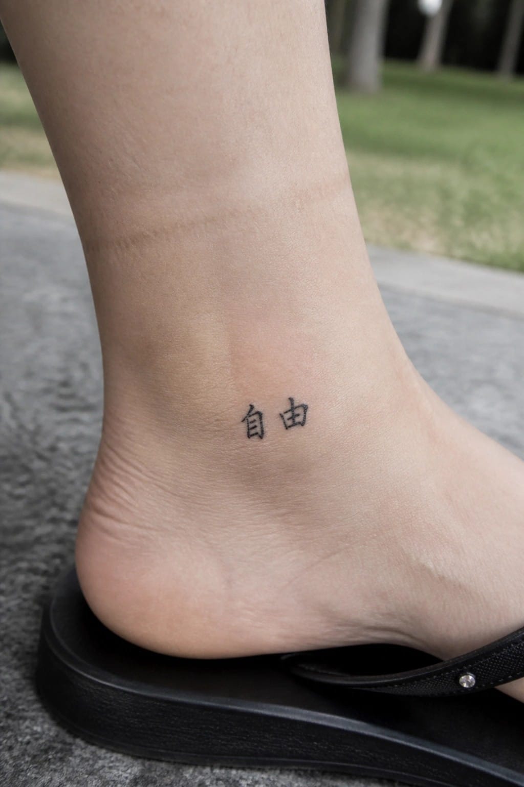
The ankle gives a compact area for small text like this. Two characters sit cleanly on the side without needing extra space or detail. Black ink keeps the lines sharp and simple against the skin.
I like this placement because the flat spot holds the text steady and visible with sandals on. It also lets the tattoo stay personal without taking up much room.
Vertical characters on the upper back
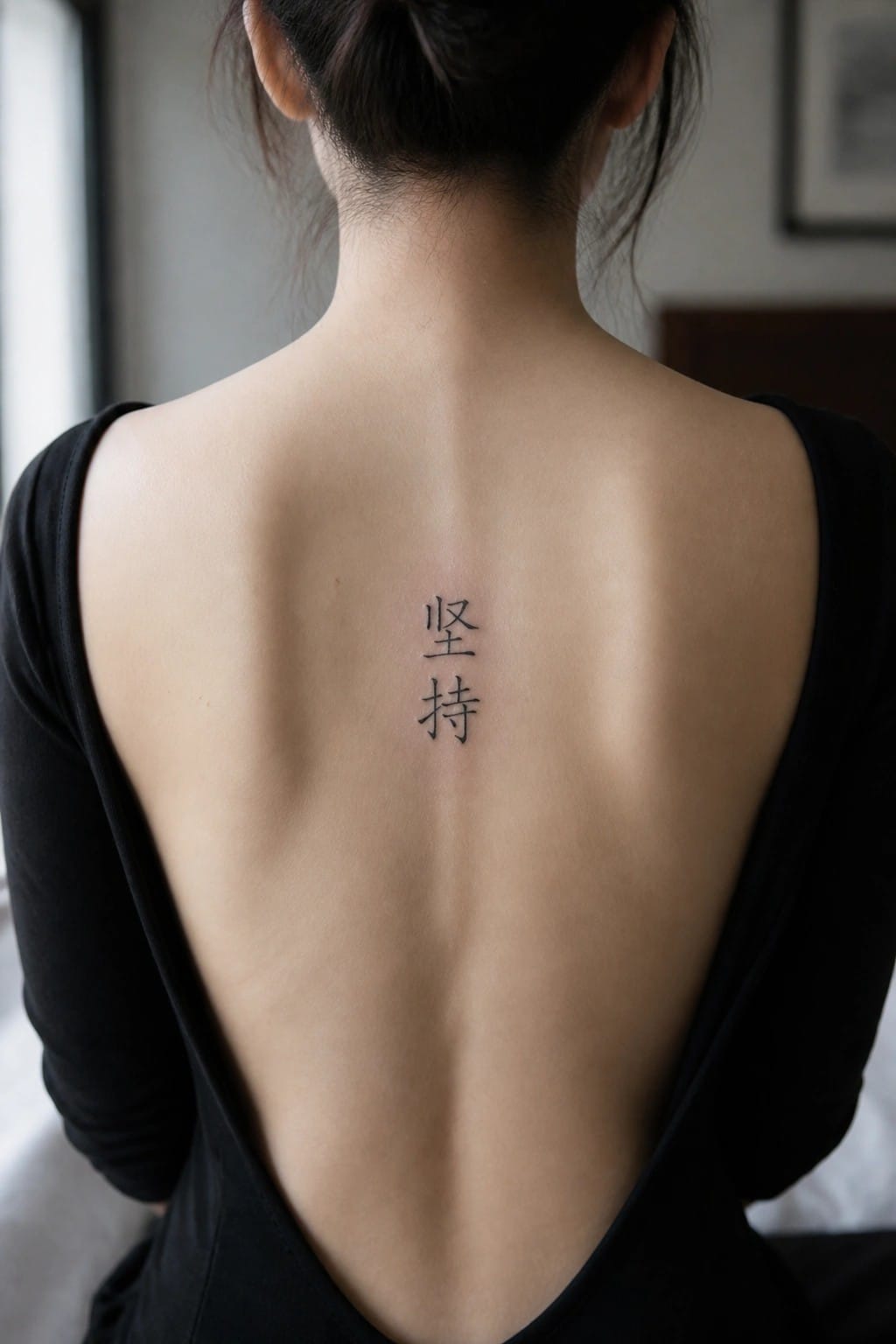
The two characters run straight down the center of the upper back. They sit close together and follow the line of the spine. This keeps the design narrow and contained in one area.
I chose this spot because the spine gives the text a clear path to stay straight. The size stays small enough that it does not need extra shading or detail to look finished.
Chinese characters on the side of the hand
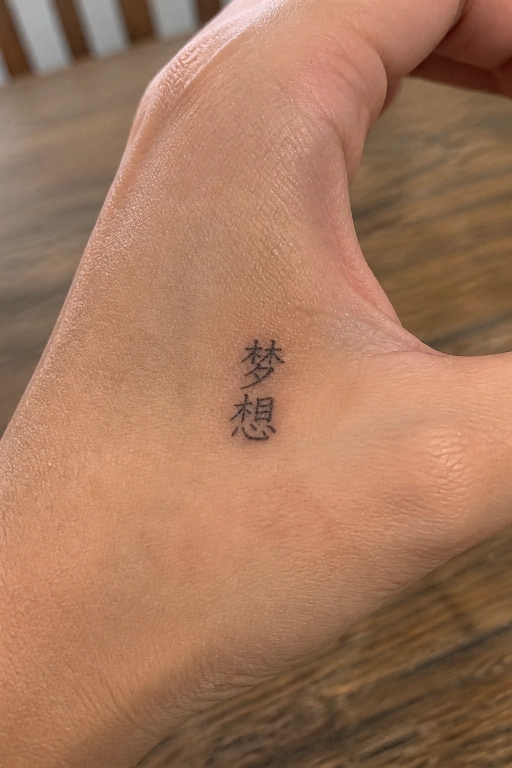
The tattoo sits along the outer edge of the hand. Two characters stack vertically in simple black ink. The placement keeps everything small and contained.
I think the spot works well because the design stays visible without taking over the hand. The clean lines also stay clear even on a moving area like this.
Chinese characters on the thigh
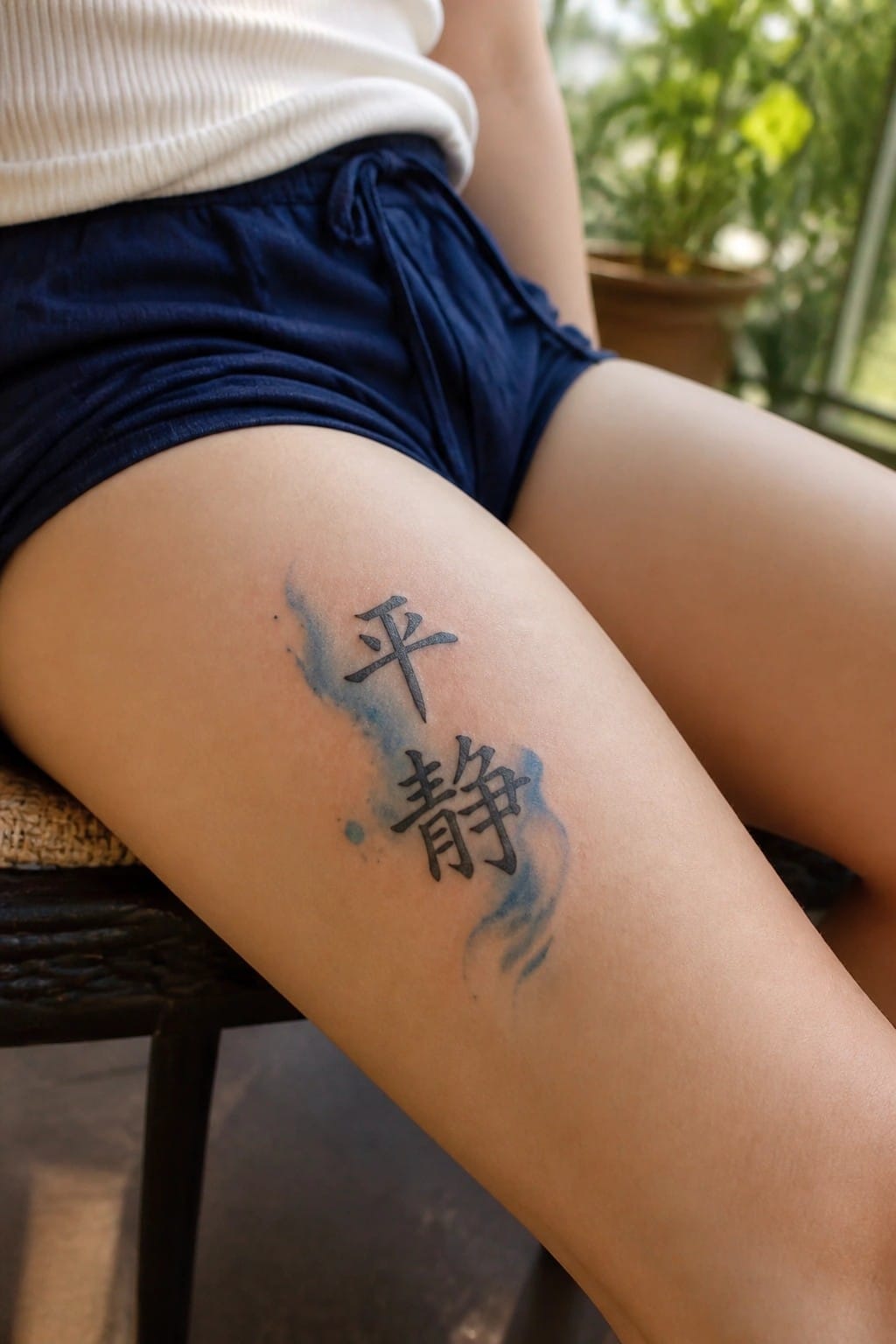
The tattoo sits on the upper thigh. Two Chinese characters run vertically with light blue shading that spreads around the edges. This spot gives the design enough room without crowding the lines.
The blue wash keeps the black ink from feeling too stark. I think the placement works because the tattoo stays mostly covered yet still reads clearly when shown.
Wrist tattoo with chinese characters for smile
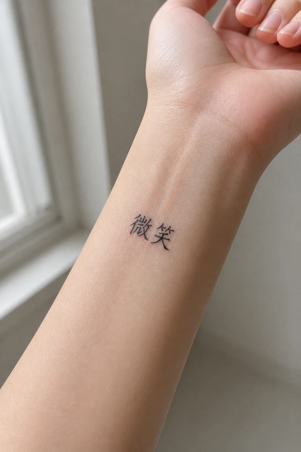
The tattoo sits on the inner wrist in a small script. Two characters spell out the word for smile. The scale stays compact so the design fits the narrow area without crowding.
I chose this spot because the characters stay mostly hidden unless the wrist turns. It keeps the meaning personal while still easy to read up close.
Shoulder tattoo with two chinese characters
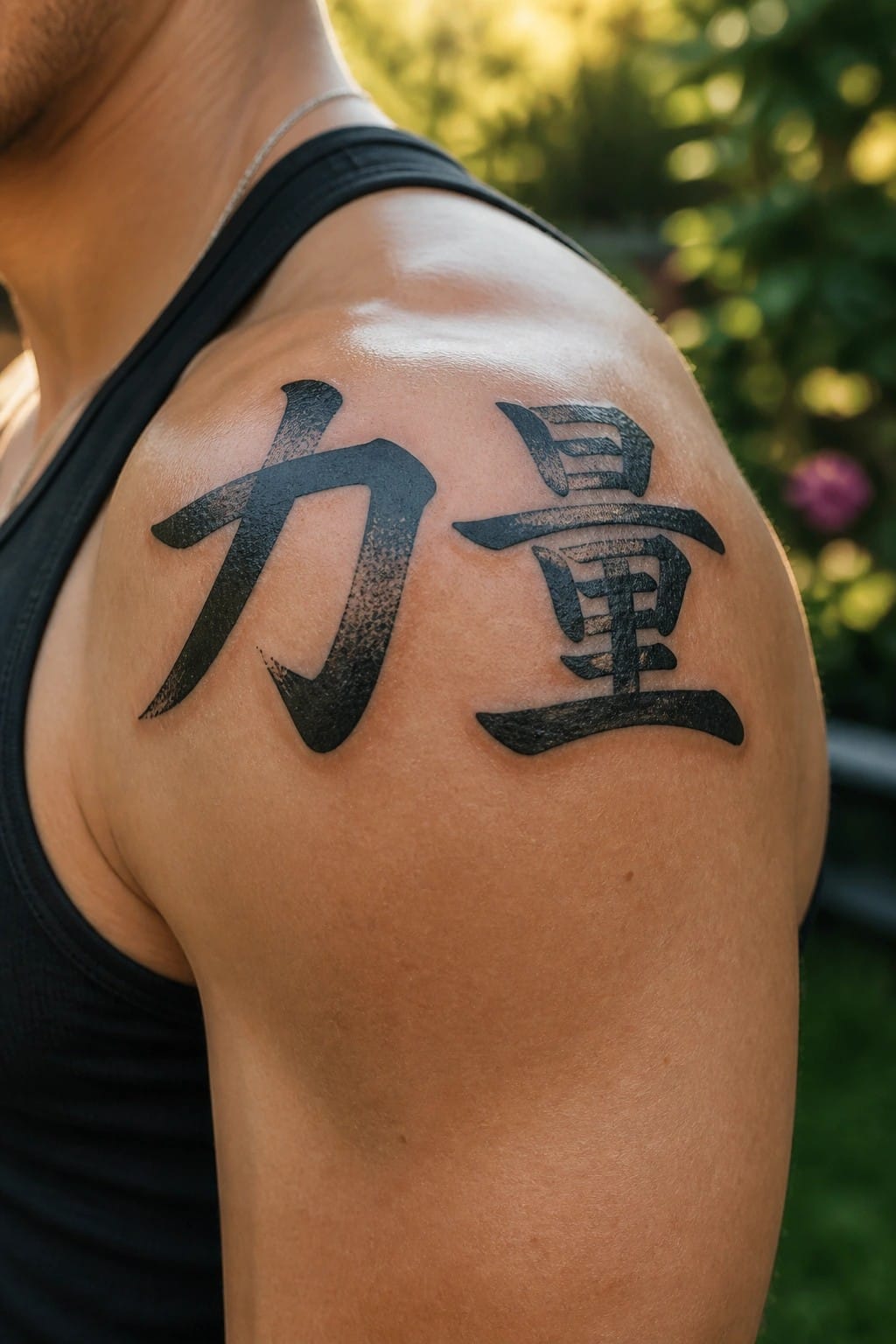
The shoulder gives these two characters room to sit side by side without looking cramped. The bold strokes hold their shape on the curve of the muscle. This keeps the design simple while still making the meaning clear from a short distance.
I think the medium size works because it avoids extra shading or outlines. The placement also lets the tattoo stay visible with most sleeve lengths.
Vertical characters sit behind the ear
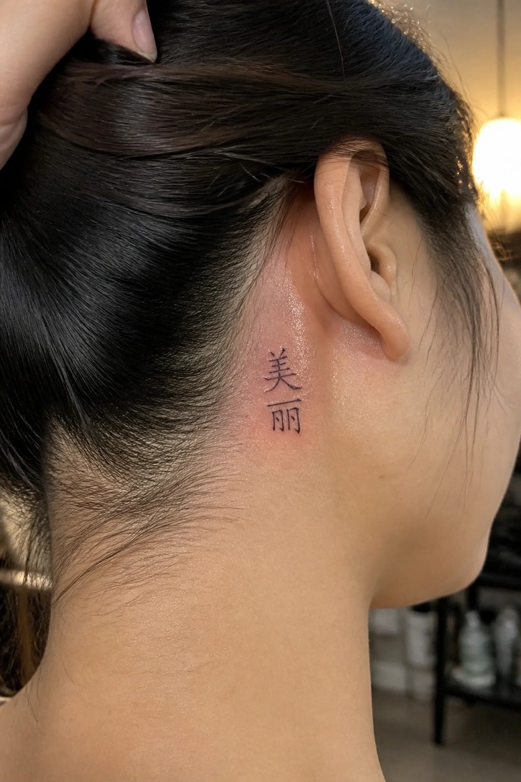
The tattoo uses two Chinese characters placed vertically just behind the ear. This spot keeps the design compact and close to the hairline. The thin lettering stays low key while still following the neck’s shape.
I chose this placement because it lets the words remain personal without needing much space. The vertical format fits the area better than a horizontal line would.
Gratitude characters on the upper arm
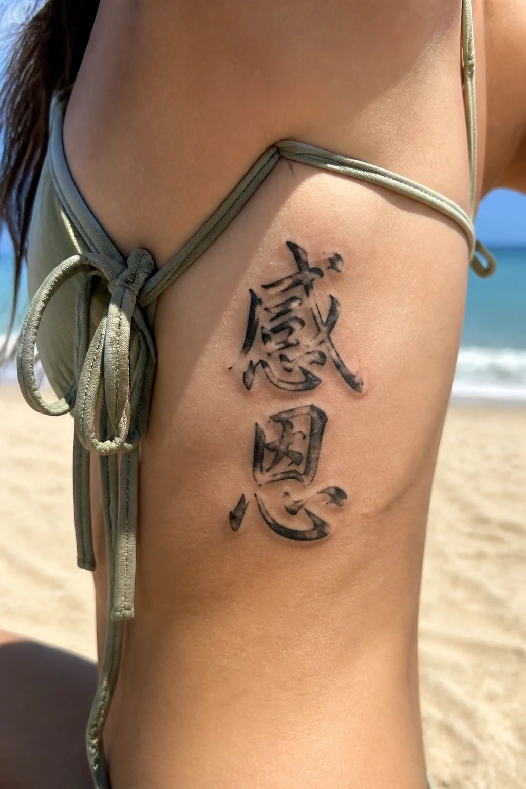
The tattoo sits vertically on the upper arm just below the shoulder. This placement lets the two stacked characters follow the natural line of the arm. The black calligraphy stays clear at this scale.
I think the vertical layout keeps the design compact while still easy to read. It also works for someone who wants the phrase visible but not front and center.
Small chinese characters on the ankle
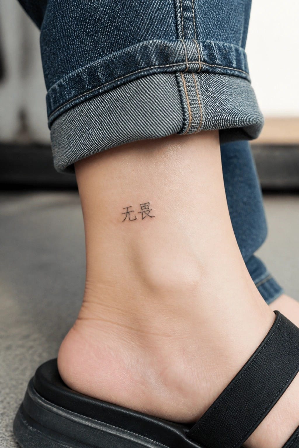
The tattoo sits right above the ankle bone on the inner side. The two characters stay small and use a clean font with no added lines or shading. This keeps the design simple and easy to read even at close range.
The ankle works well for short text because the area stays mostly covered during daily activities. I think the minimal size helps the ink age better without spreading over time.
Vertical Chinese characters on the shin
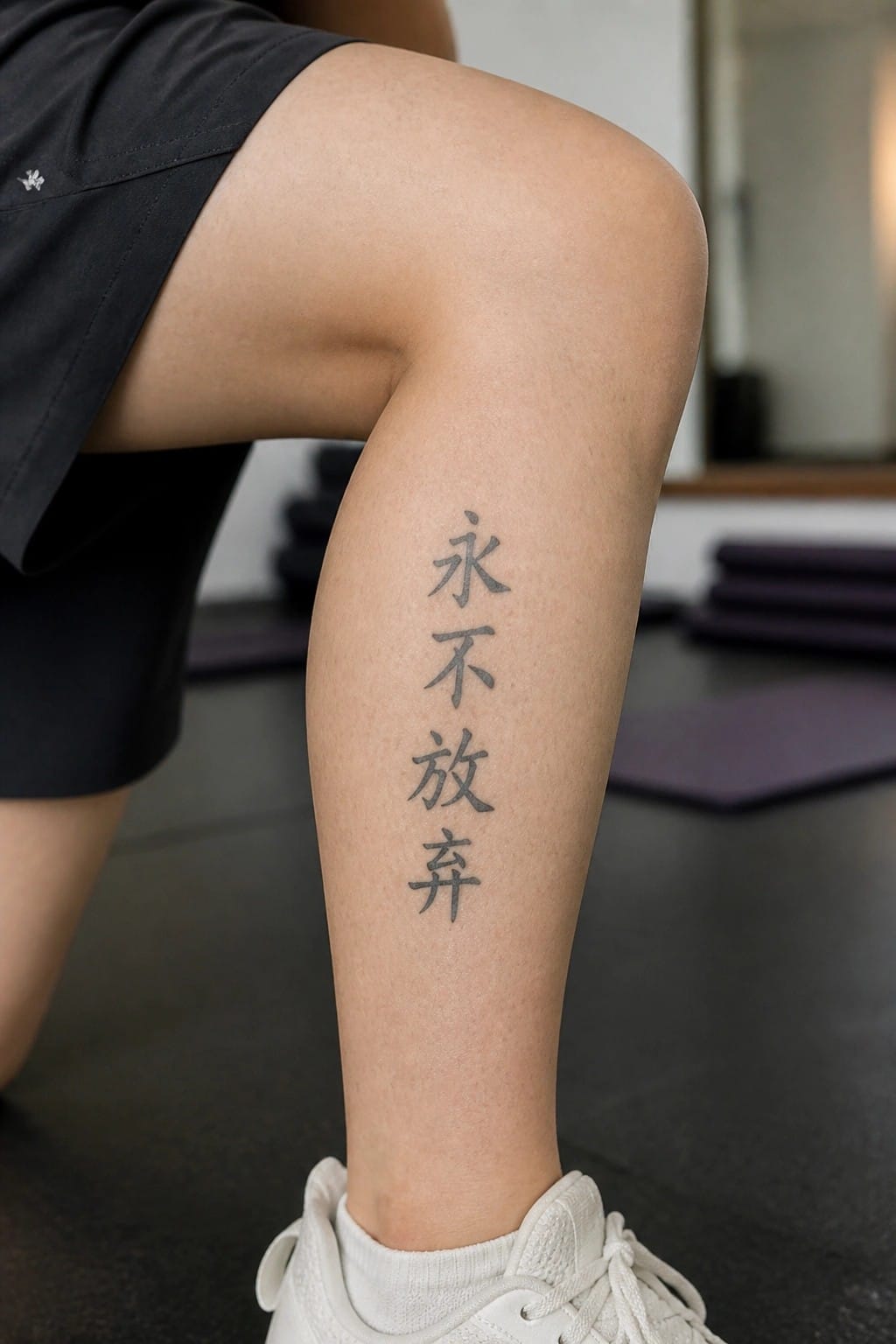
The tattoo sits on the front of the lower leg. Three characters stack in a straight vertical line. This layout matches the natural shape of the shin area.
The simple black ink keeps the phrase clear without extra detail. I think the vertical format makes the text feel balanced on this spot.
Chinese characters on the upper back
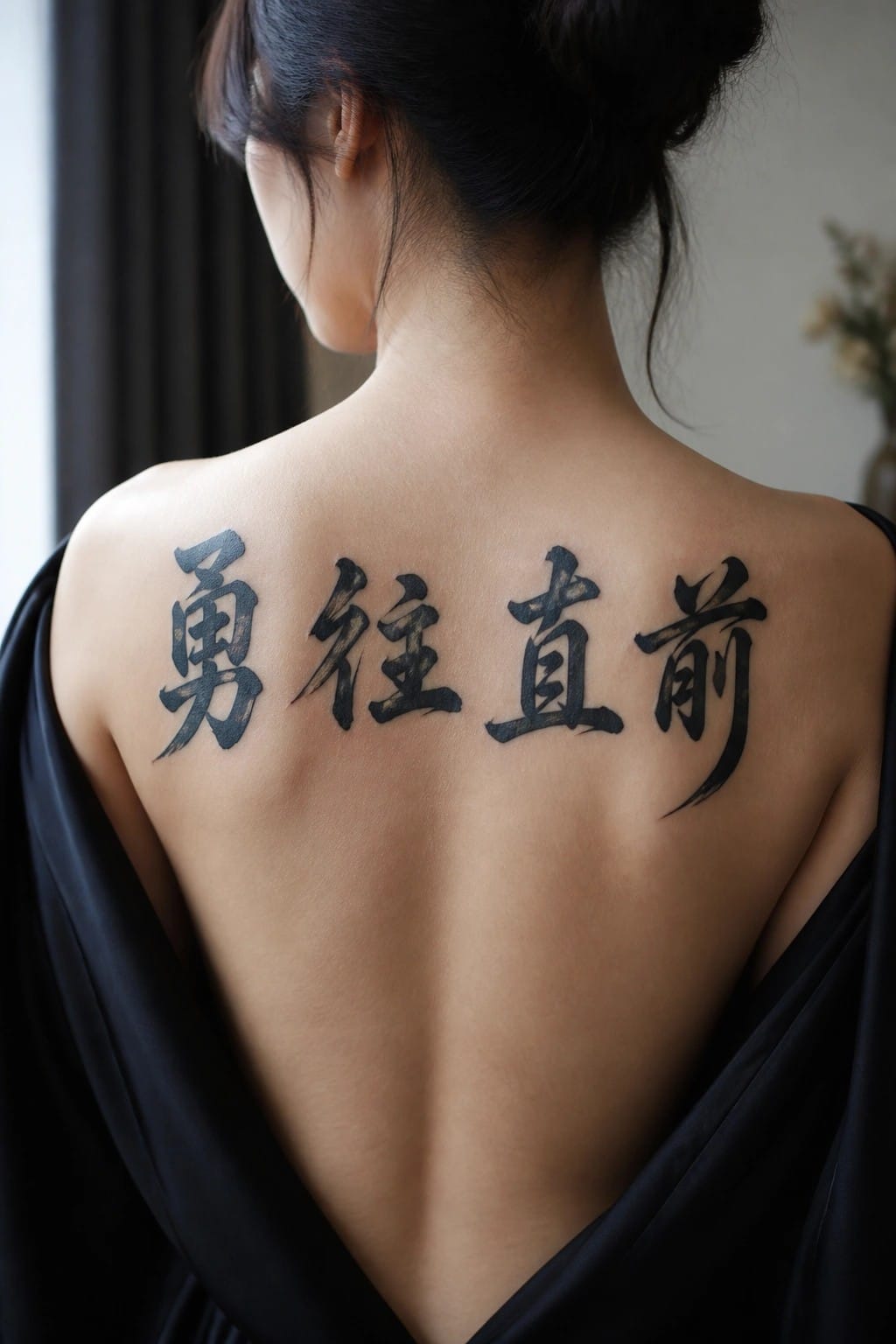
The four characters run straight across the shoulders. This spot gives the phrase room to sit evenly without squeezing the strokes together. The black ink stands out clearly against the skin.
The brush style adds some weight to each character. I think the horizontal layout works because it matches the natural width of the upper back. It keeps the whole thing simple and direct.
Vertical characters on the side
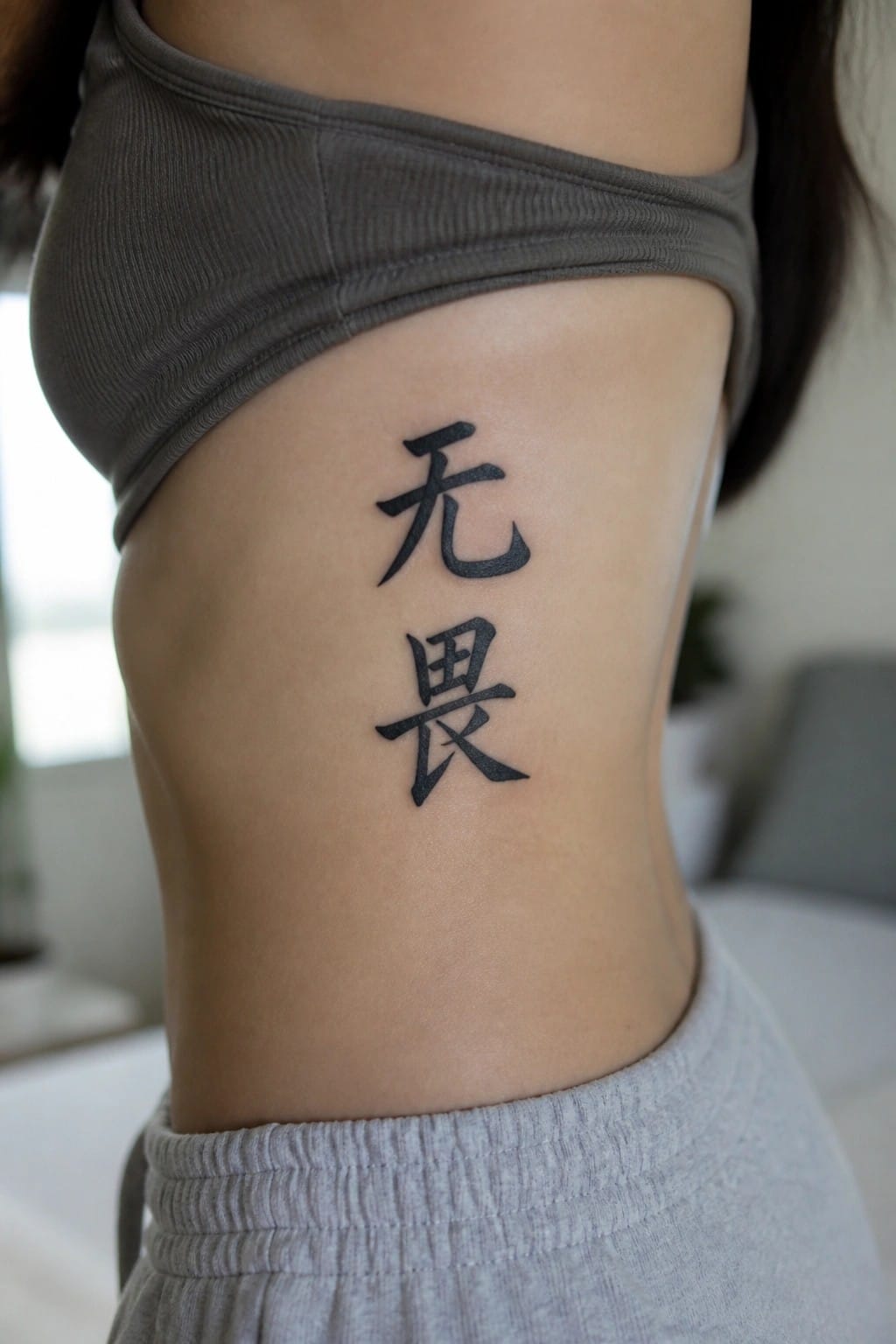
The tattoo sits vertically along the ribs with two Chinese characters stacked in bold black ink. This layout uses the natural height of the area without spreading wide. The characters stay clear and simple at this scale.
I think the placement keeps the design private under clothing yet visible when chosen. The vertical flow works with the body’s lines in that spot. It avoids looking cramped while still making a direct statement.
Frequently Asked Questions
What should I consider to make sure my chosen Chinese characters accurately convey the inspirational meaning? Double check translations with multiple reliable sources such as native speakers or professional linguists before committing to ink. Many phrases have subtle nuances that machine translators miss so testing the characters in context helps avoid embarrassing errors. Pairing this step with the ideas from the article lets you select phrases that truly resonate personally.
Where on the body do women typically place Chinese word tattoos featuring inspirational phrases? Common spots include the inner wrist for daily visibility the nape of the neck for a subtle touch and the ribcage or ankle for more private inspiration. These locations work well with smaller character sets from the article and allow easy concealment if desired. Discuss your lifestyle with the artist to match placement to how the tattoo will age.
How can I choose the right font style for Chinese characters in a tattoo? Opt for elegant calligraphy fonts that mimic traditional brush strokes rather than modern block styles to honor the cultural roots of the phrases. The article highlights how certain flowing designs enhance femininity so bring reference images to your consultation. Test the size on paper first to ensure readability at the intended scale.
What cultural aspects should I respect when getting a Chinese inspirational tattoo as a non native speaker? Research the historical context of each phrase to confirm it carries positive intent and avoid using sacred or overly personal symbols out of context. Consulting someone familiar with Chinese culture adds depth and shows respect which aligns with the thoughtful selection process in the article. This approach turns the tattoo into a meaningful bridge rather than a trend.
How do I prepare for the tattoo session and care for it afterward to keep the characters sharp? Stay hydrated and avoid alcohol the day before while following your artist’s aftercare instructions such as gentle cleaning and moisturizing for several weeks. Chinese characters can blur if not cared for properly so consistent protection from sun exposure helps maintain the inspirational details over time. Schedule a follow up to touch up any fading.
