

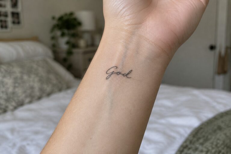
I have a soft spot for tiny tattoos that speak volumes about faith without any fuss.
My own subtle ink has taught me how a single word can brighten each day with quiet strength.
These designs mix spirituality and simplicity in ways that always make me smile.
I am thrilled to share some adorable options featuring faith lettering that might spark ideas for your next piece.
Small cursive god tattoo on the inner wrist
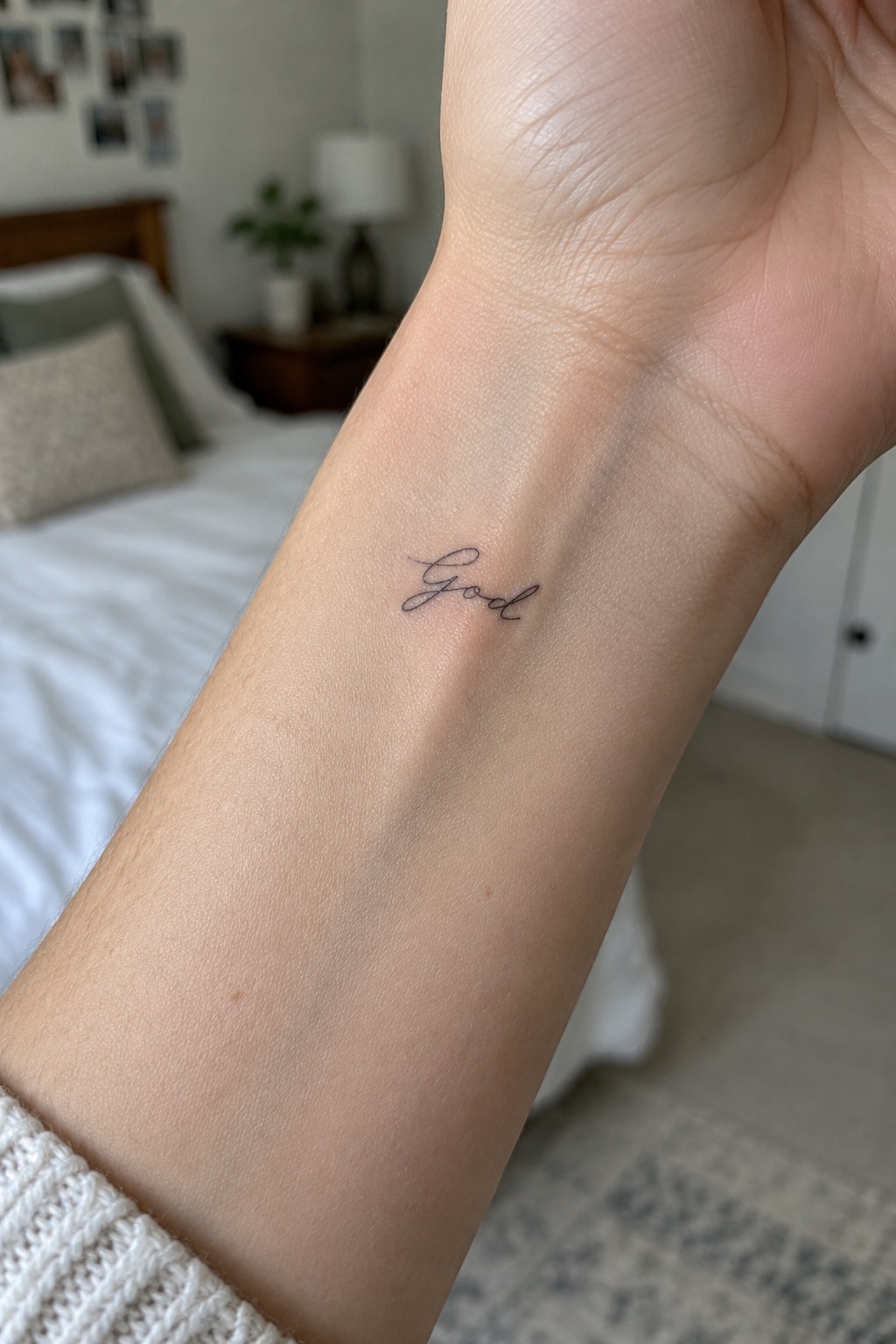
The inner wrist gives this tattoo a personal spot that stays out of sight most of the time. It also lets the lettering show when the hand turns. The small size helps the design feel understated rather than bold.
The script stays simple and easy to read at this scale. I think the placement works because the wrist area supports a delicate look without forcing extra detail.
Small god lettering on the forearm
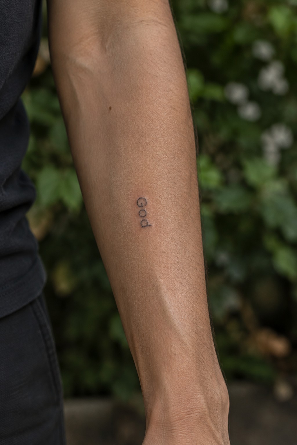
The inner forearm gives this small god tattoo a narrow strip that suits vertical lettering. The thin lines stay clean without needing extra detail or shading. This keeps the whole piece understated.
I think the placement works because it lets the word stay personal while still visible when wanted. It fits the single-word faith style without turning it into a statement piece.
Small lettering on the ankle
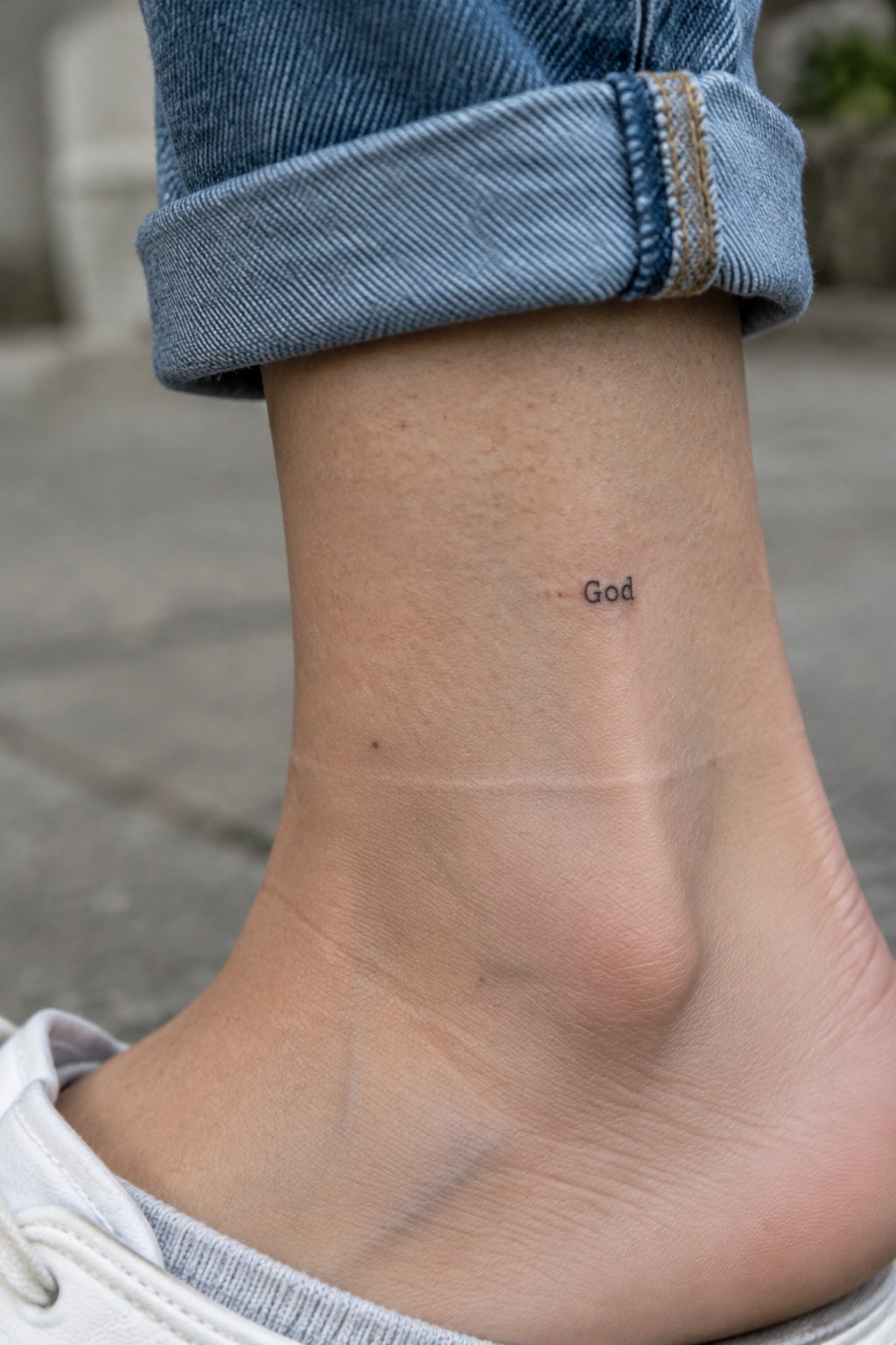
The ankle gives this single word tattoo a discreet spot that stays out of sight most of the time. Socks and shoes cover it easily during daily activities. The area still lets the text show when shorter footwear or bare feet make it visible.
The plain lettering holds up well without needing extra detail to stay clear. This kind of placement works for people who want a quiet faith reminder they can keep mostly to themselves.
Grace tattoo on the collarbone
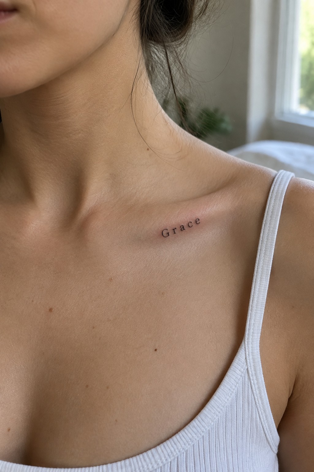
The word sits in small black lettering along the upper chest. This placement keeps the text visible with certain necklines but stays covered by everyday clothes. The clean font leaves the focus on the single word without extra decoration.
I think the collarbone works well here because the flat area holds the lettering steady and readable at this scale. It turns the tattoo into a quiet personal note rather than a statement piece.
god tattoo on the finger
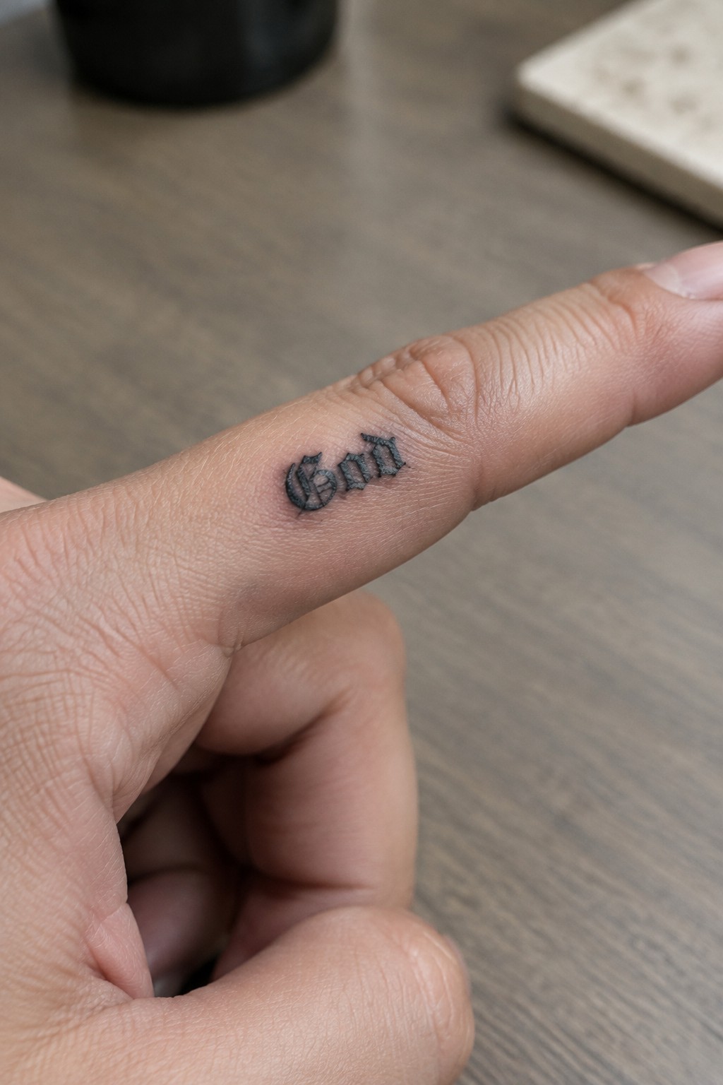
The side of the finger works well for this small god tattoo. It keeps the design mostly out of sight during daily tasks but visible on purpose when needed. Gothic lettering gives the single word enough presence without extra elements.
I think the font stays clear at this scale because the thick strokes hold up on narrow skin. The placement suits anyone who wants a quiet faith reminder rather than a statement piece.
God tattoo in cursive behind the ear
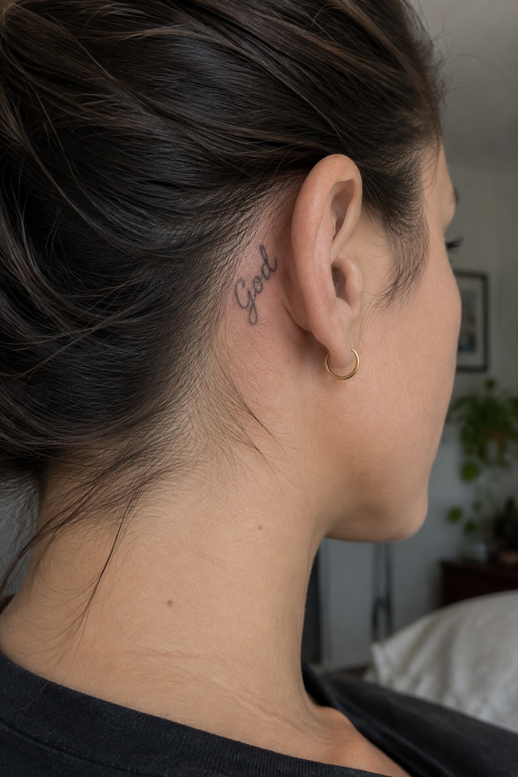
The tattoo sits right behind the ear along the hairline. This spot lets the word stay visible only at certain angles. The cursive letters stay small enough to fit the narrow area without spreading out.
The placement gives the design a private feel while still working with pulled back hair. I think the thin lines help it stay readable without competing with the neck shape.
Small lettering on the collarbone
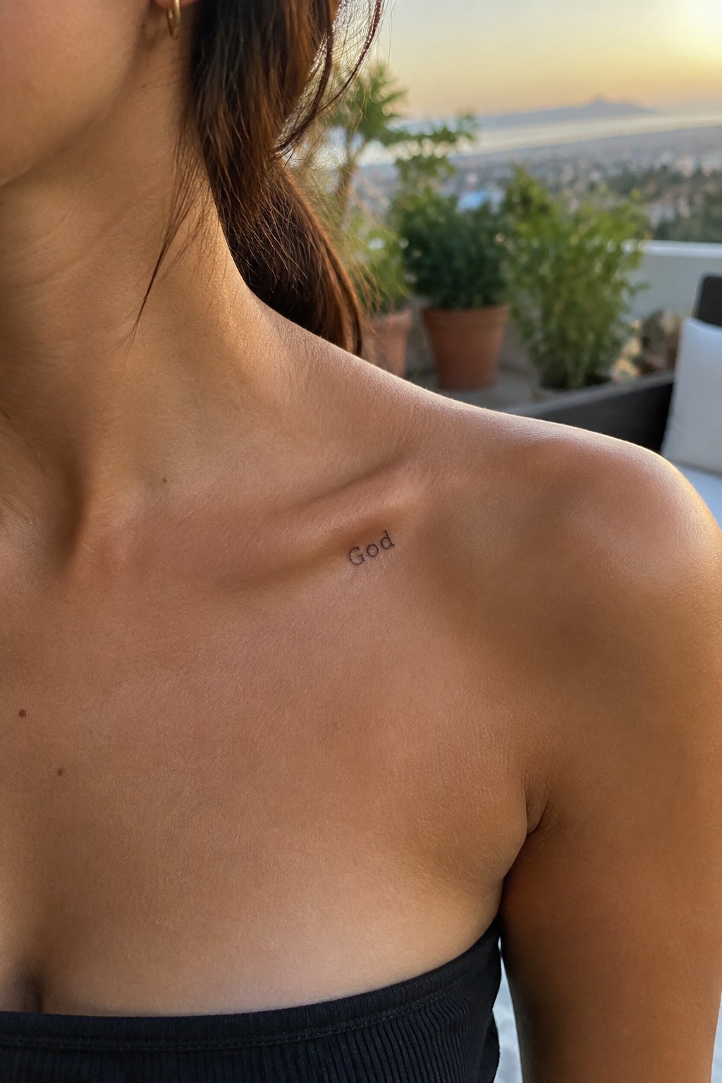
The collarbone gives this tattoo a natural spot that stays somewhat hidden under clothes. A single word fits neatly along the bone in plain lettering. The small size keeps the whole piece understated without losing any clarity.
I think the placement works well here because the word stays readable even at this scale. It feels like a quiet choice for someone who wants the tattoo close without making it the main focus.
A vertical god tattoo along the neck
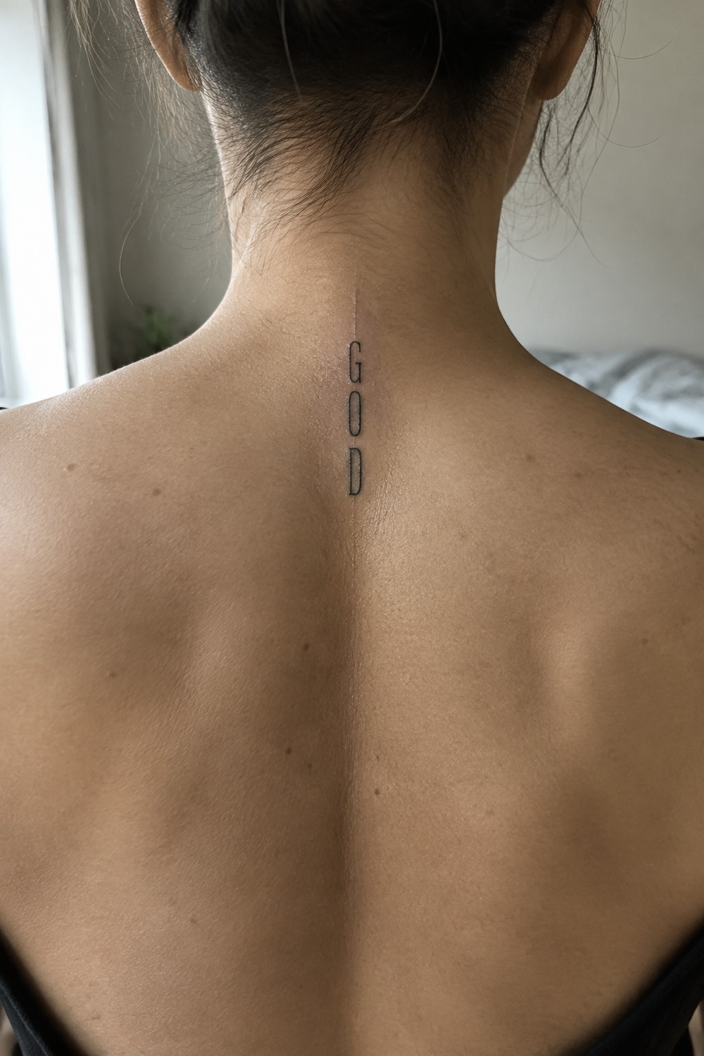
The tattoo runs straight down the center of the neck in a narrow vertical line. Simple block letters spell out god without any added lines or symbols. This spot sits just below the hairline so the design stays mostly covered until the hair is pulled up.
I think the vertical layout fits because it follows the spine without spreading wide. The small size keeps the word clear while staying easy to hide under normal hair. It gives the lettering a quiet presence that suits the single word choice.
Small cursive god on the forearm
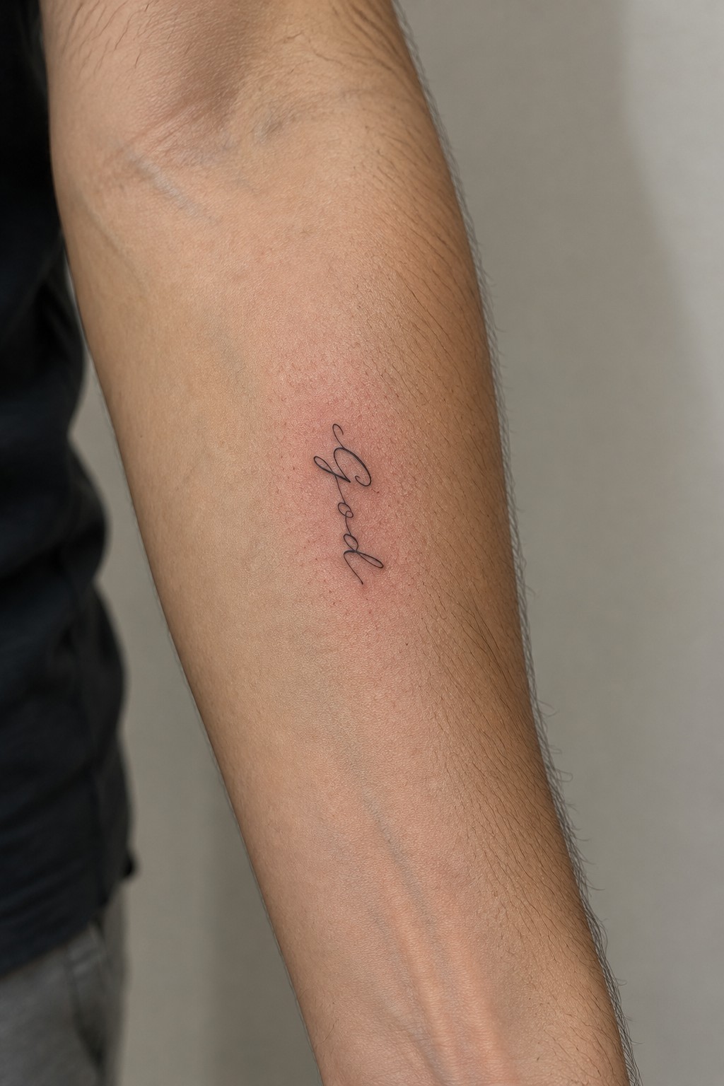
The tattoo shows the word god in flowing script along the inner forearm. Black ink keeps the lettering simple and compact against the skin. The size stays small enough to fit the area without spreading out.
This spot makes the design easy to cover or reveal depending on the sleeve. I think the clean script works because it matches the single word without extra lines or shading.
small god tattoo on the leg
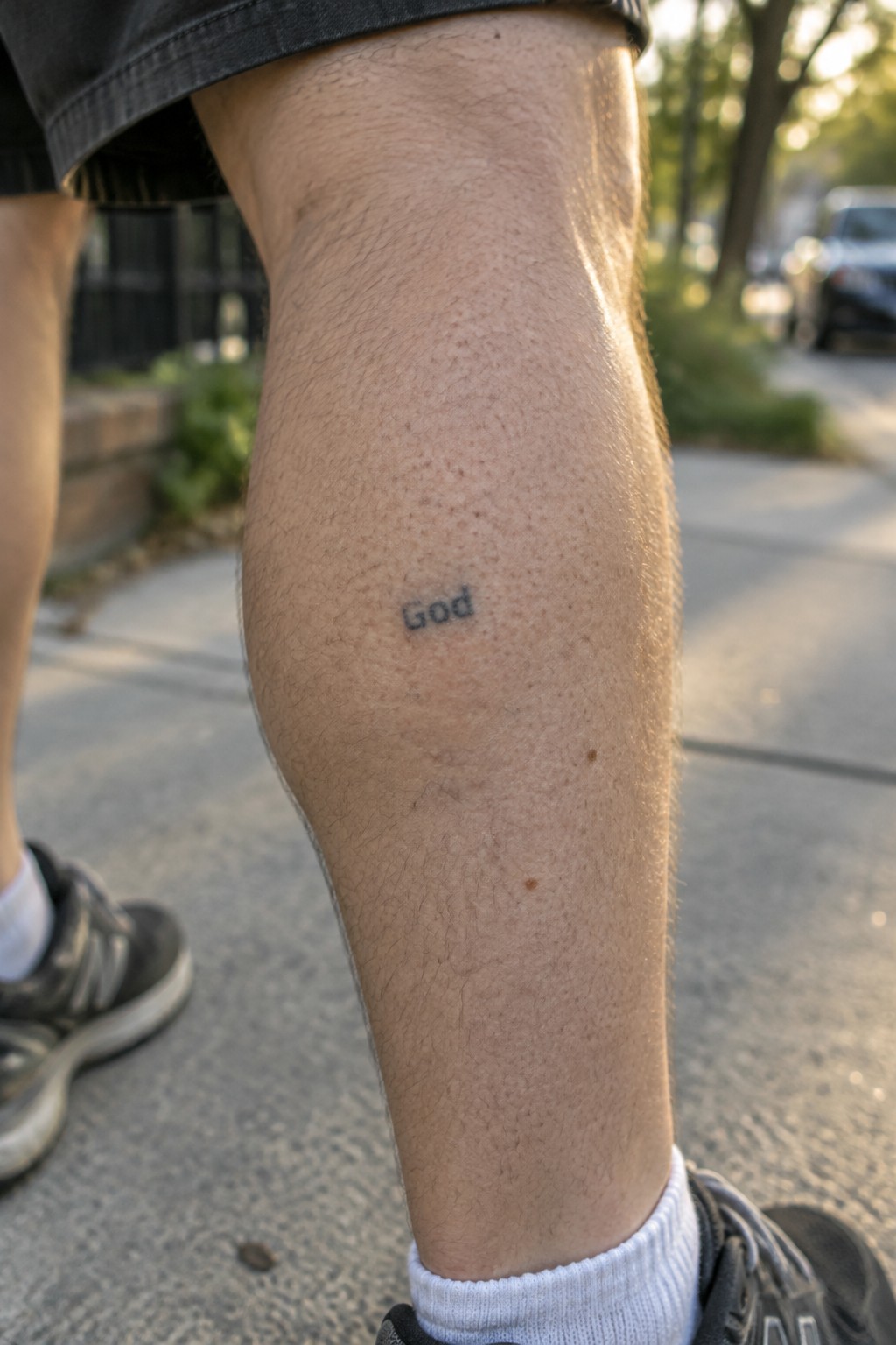
The tattoo sits on the outer leg just above the knee. This spot keeps the single word low key during daily movement but still visible when wearing shorts. The lettering stays compact and uses a plain font with no extra lines.
A simple black ink approach fits the word itself without adding weight. I think the placement works because it lets the tattoo stay personal while remaining easy to cover or show as needed.
Small god tattoo on the thigh
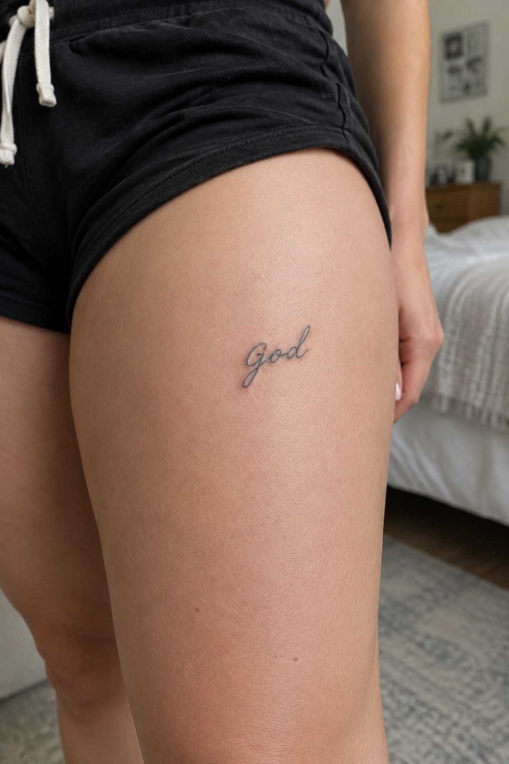
The upper thigh gives this single word tattoo a quiet spot on the body. The cursive lettering stays small and sits flat against the skin. This area keeps the design personal while still allowing the script to show its natural flow.
I think the thin lines suit the word itself because they avoid any extra weight. The placement also works for someone who wants the tattoo visible only at certain times.
Small god tattoo on the back of the neck
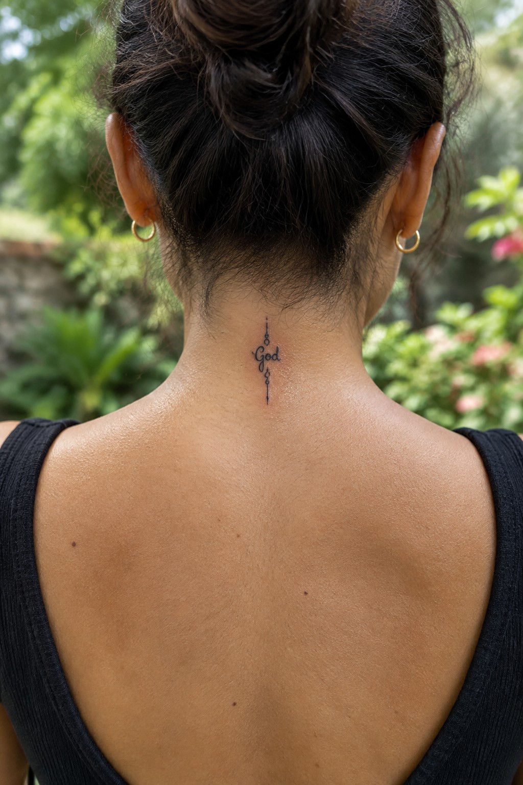
The tattoo sits centered at the nape. Its vertical layout matches the narrow space between the hairline and shoulders. The single word stays small with thin script and minimal accents above and below.
I think the placement works because it stays hidden under hair most days yet stays easy to reveal. The design stays readable at this size without needing extra detail.
Small god tattoo on the hand
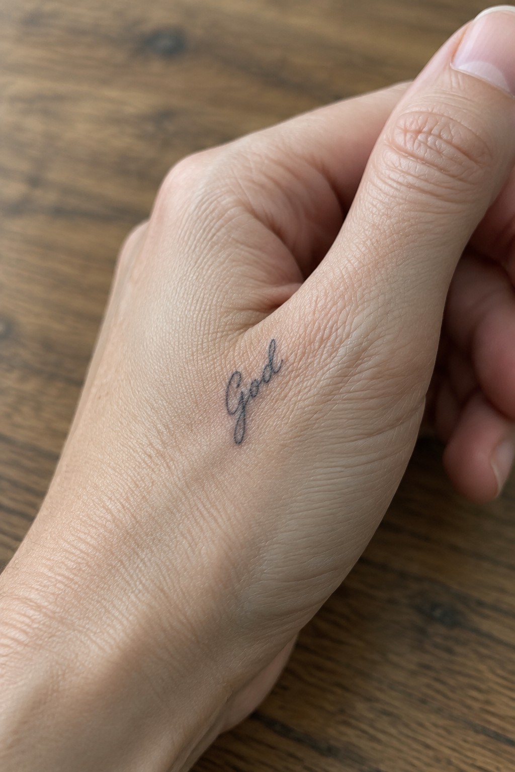
The design sits along the outer edge of the hand near the thumb base. This area keeps the lettering visible without drawing constant attention. The cursive script stays compact and follows the natural lines of the skin.
The thin lines suit this spot because they do not overpower the small surface. It works as a quiet reminder that stays personal rather than bold.
God tattoo near the waistband
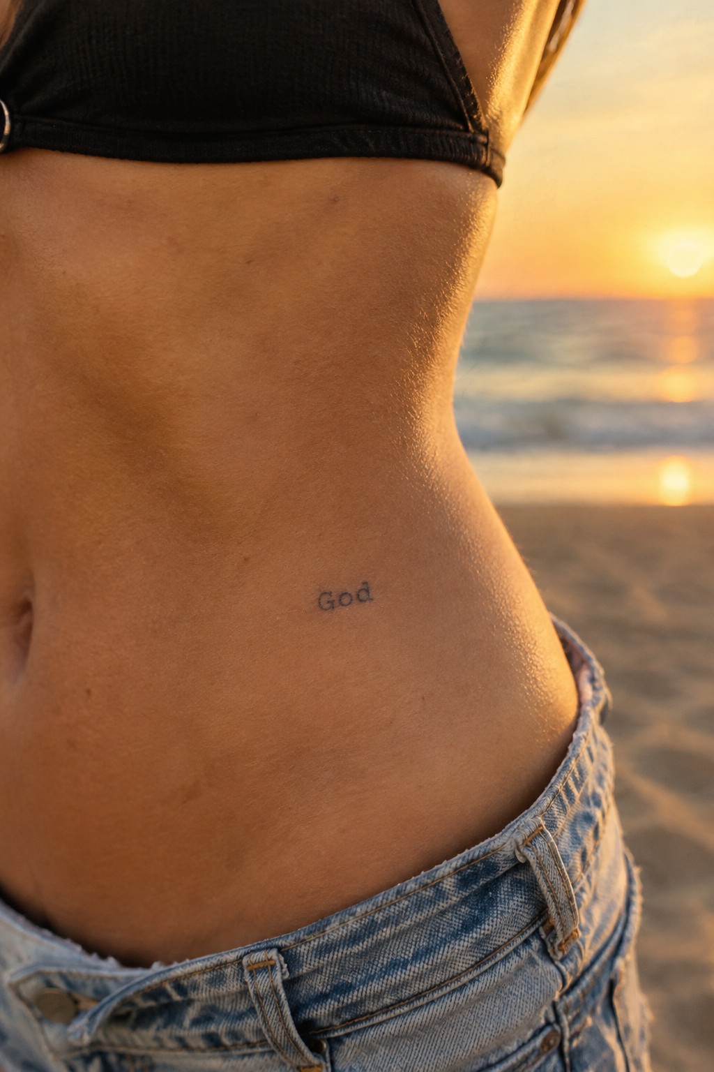
The word sits low on the hip just above the waistband. This spot keeps the lettering private most of the time yet still visible when wanted. The small scale fits the area without crowding the skin.
I think the placement makes sense because it follows the natural line of the body and leaves room for the text to stay clear. The simple lettering works best when it does not compete with other details.
god tattoo along the spine
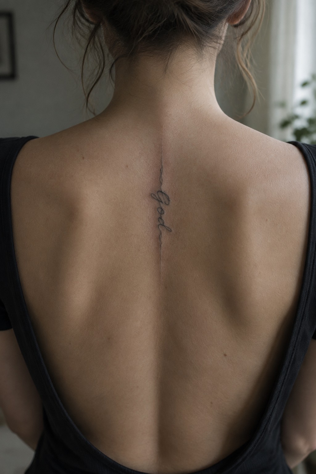
The word sits in fine script and runs straight down the upper spine. This keeps the tattoo narrow and centered without extra decoration. The vertical line matches the body’s natural shape and stays easy to hide under clothes.
The lettering stays small but still clear up close. I think the placement works because it turns the spine into a built in guide for the text.
Small god script on the shoulder
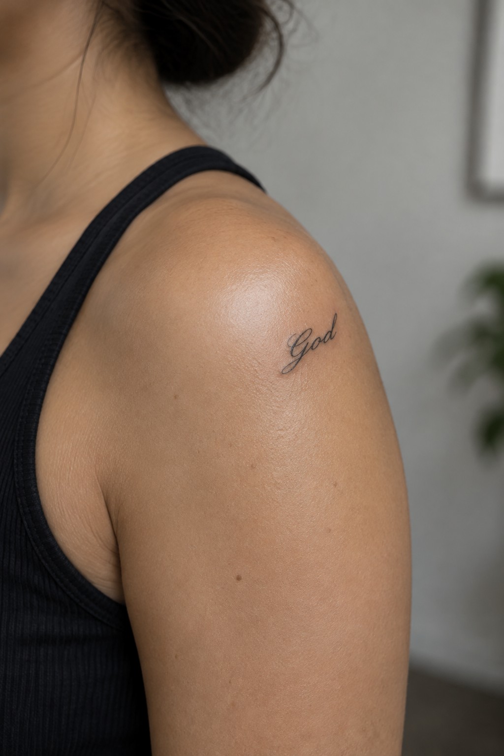
The shoulder works as a natural spot for this small lettering tattoo. The word sits on the outer edge where the skin is relatively flat and the design stays compact.
I think the cursive style keeps the tattoo readable without needing extra space. It also lets the single word stand on its own without extra decoration.
Small god tattoo on the upper arm
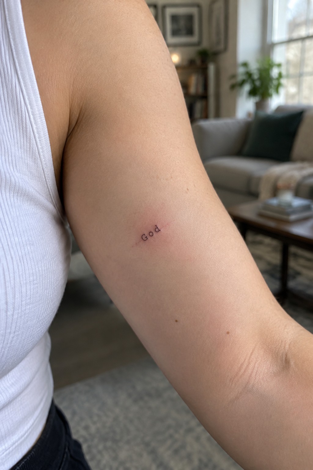
The upper arm gives this small lettering a flat, stable surface. The placement keeps the tattoo visible to the wearer but easy to cover with sleeves in most settings. A simple word like this does not need a large area to stay clear.
The fine lines help it feel personal instead of bold. I think the scale works because it stays subtle without losing legibility on skin that moves often.
minimal god tattoo on the inner ankle
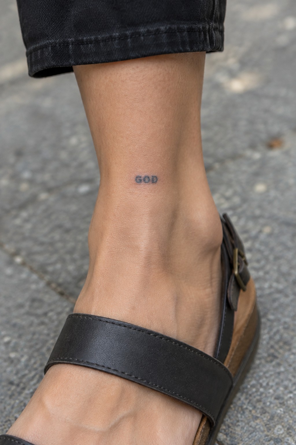
The tattoo sits on the inner ankle in small block letters. It uses a plain sans serif font with tight spacing. This spot lets the word stay visible when shoes come off but hidden most other times.
I think the ankle works well for this because the narrow area matches the compact size. The simple lettering stays clear without any added lines or shading.
god tattoo on the hip
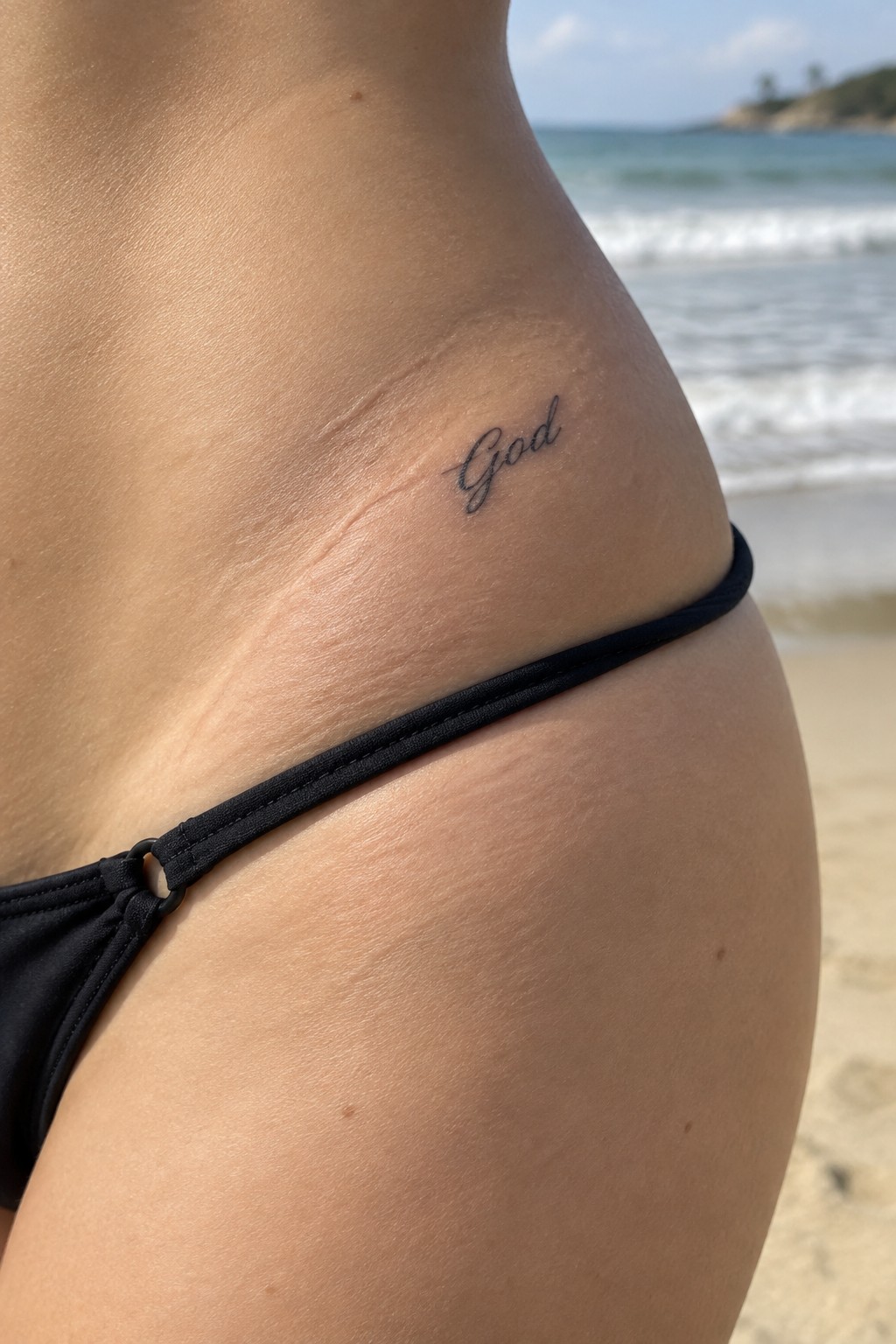
The word sits on the upper hip just above the waistband. This spot keeps it mostly covered by everyday clothes or swimwear. The cursive flows in a compact script that stays easy to read without extra detail.
I think the placement works because the tattoo stays personal until the person decides to show it. The small scale keeps the focus on the word itself rather than on decoration.
God tattoo on the inner wrist
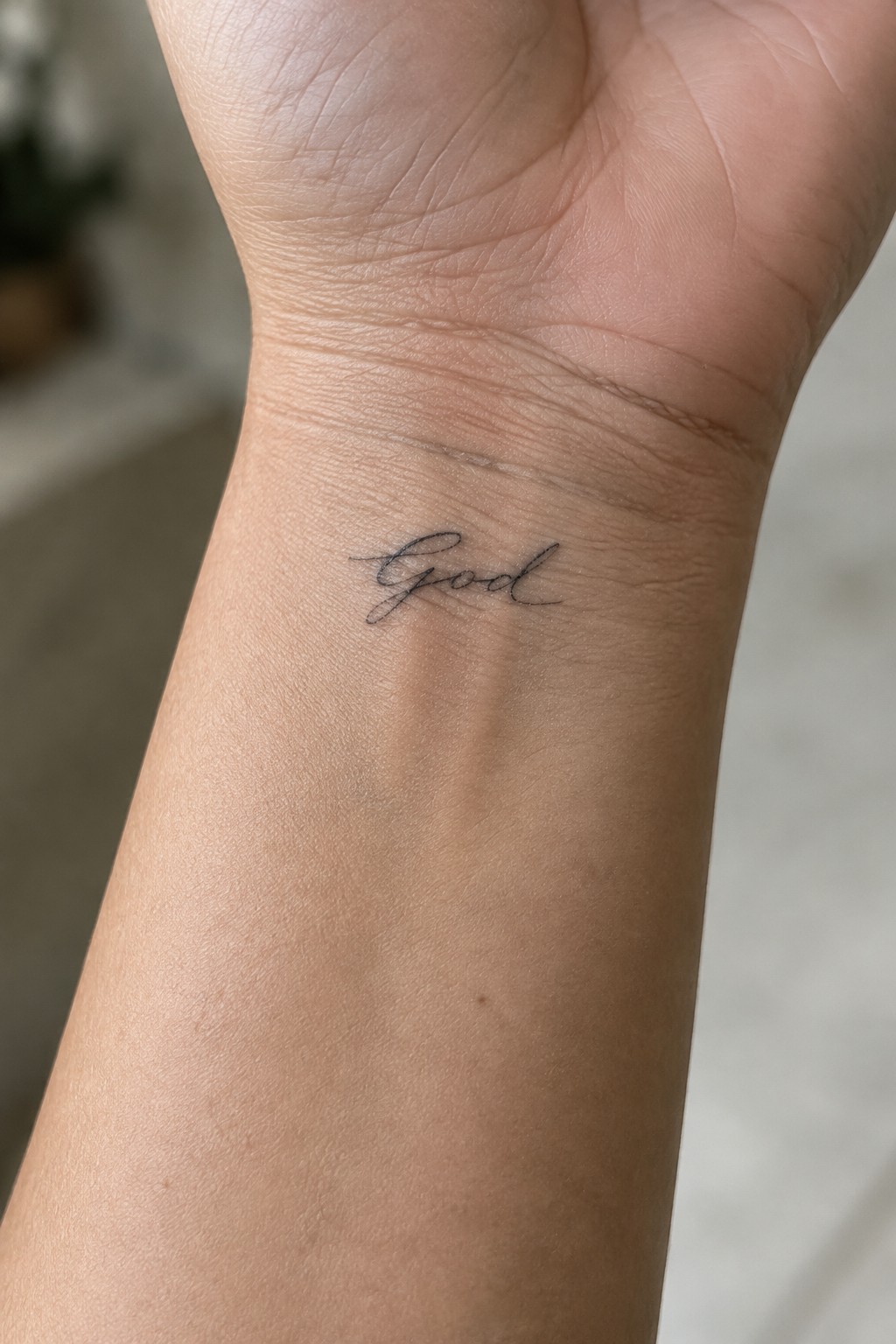
The inner wrist keeps this tattoo close and personal. It stays out of sight most of the time but becomes visible with a simple turn of the hand. The single word in cursive stays small enough to fit the space without crowding.
I think the thin lines help it sit softly on the skin. The scale also makes the lettering easy to read without needing extra detail.
Frequently Asked Questions
What are the most popular placements for subtle small God tattoos with single word lettering? Small tattoos like these work best on areas with less movement such as the wrist, ankle, behind the ear, or along the collarbone. These spots allow the design to stay crisp while remaining easy to conceal if desired. Artists often recommend testing the exact size with a stencil first to ensure it fits naturally on your skin.
How do I choose the right font style for a single word faith tattoo? Select a font that balances elegance and readability such as delicate scripts or clean sans serifs that avoid overly thick lines. Bring reference images to your consultation so the artist can adapt the lettering to your skin tone and body curves. Avoid overly ornate styles that may blur over time in small sizes.
What aftercare steps help lettering tattoos heal without fading? Keep the area clean with gentle soap and apply a thin layer of fragrance free moisturizer several times a day. Avoid sun exposure and tight clothing over the spot for at least two weeks. Follow your artist’s specific instructions since small designs can heal faster but still need protection from irritation.
How long do subtle single word tattoos typically last before needing a touch up? With proper care these tattoos can remain clear for five to ten years or more depending on placement and skin type. Areas with frequent sun exposure or friction may require a touch up sooner. Scheduling annual check ins with your artist helps maintain the fine lines in faith lettering.
What factors should I discuss with an artist before getting a God tattoo? Talk about your skin’s sensitivity, any allergies to ink, and the exact meaning you want the word to convey. Ask to see healed examples of their small lettering work to judge quality. This ensures the final design aligns with both your vision and practical healing needs.
