

I adore how scripture can be etched so beautifully on skin.
My own tattoo reminds me of strength every single day.
Fine line lettering brings such a gentle touch to meaningful words.
These twenty designs showcase that perfectly in the most subtle way.
I hope they inspire your next ink choice as much as they did mine.
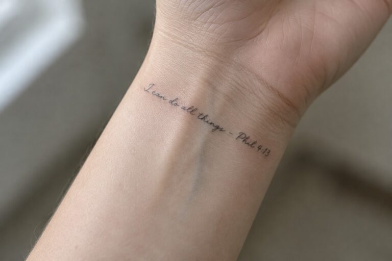
Inner wrist placement for a scripture quote
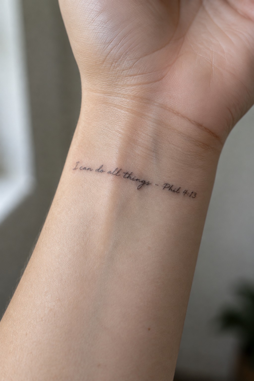
The inner wrist works well for short verses like this one. It keeps the text compact and easy to glance at without taking up much space. Fine line lettering stays clear even at this small scale.
The script flows in a natural line across the skin. I think the placement makes the tattoo feel personal while still leaving room to add more later if wanted.
A psalm verse along the side torso
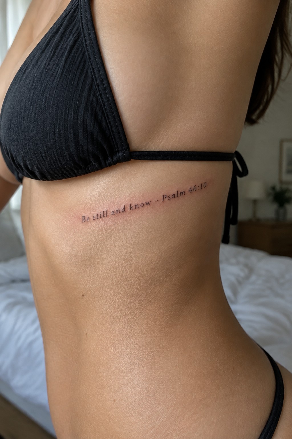
The side torso lets the text sit in a straight line without fighting the body’s shape. Fine line script keeps the words light and clear against the skin. The reference sits right after the quote in the same delicate style.
I think this placement makes the verse feel personal without drawing too much attention. The horizontal layout fits the area better than a vertical stack would.
Psalm 23 sits across the collarbone
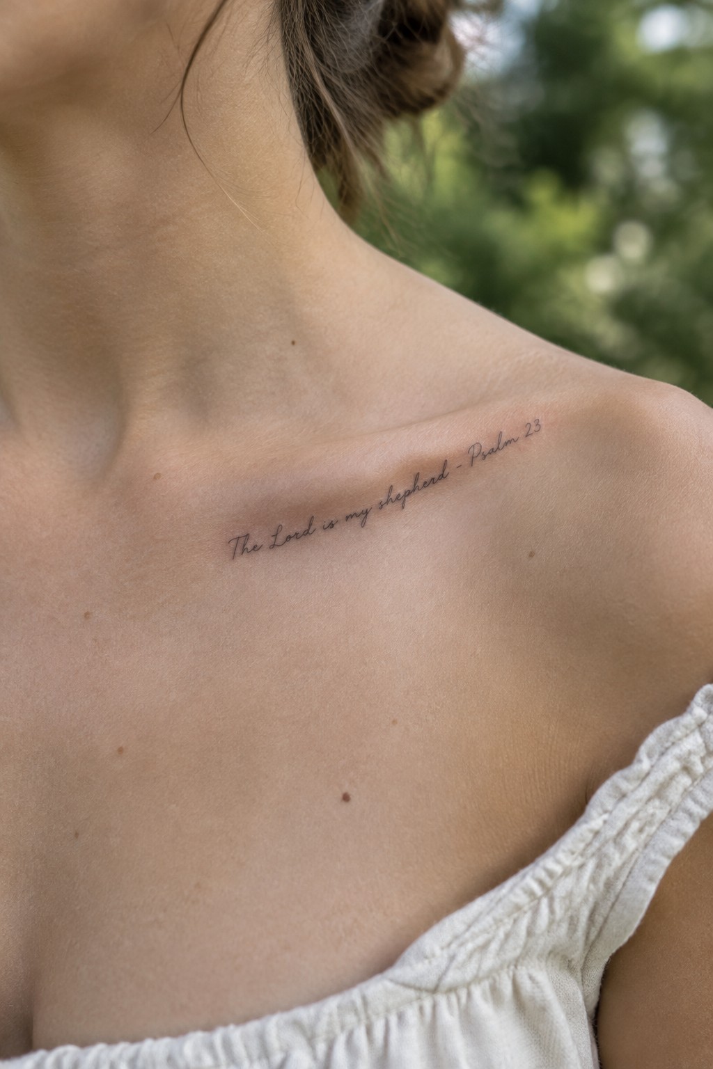
The collarbone gives this text a natural line to follow without much adjustment. The words stay short enough to fit in one row and remain easy to read at this size. Fine line script keeps the whole piece light on the skin.
The horizontal flow works because it matches the shape of the area. I think this placement keeps the focus on the words themselves instead of turning the tattoo into a big statement.
scripture along the spine
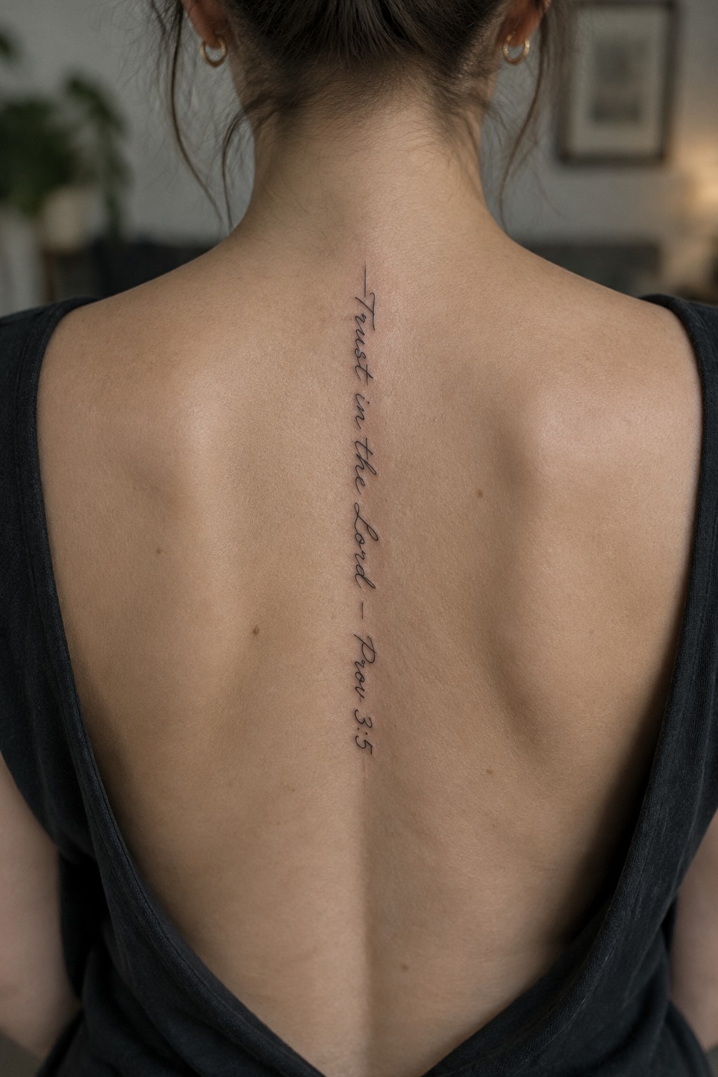
The text runs straight down the spine in one continuous column. This placement lets the verse sit in a narrow strip without extra decoration or filler around it. The fine line script stays light and keeps the focus on the words themselves.
I think the vertical format works because it matches the natural length of the phrase. The lettering stays legible at this size without needing to wrap or stack.
Scripture behind the ear
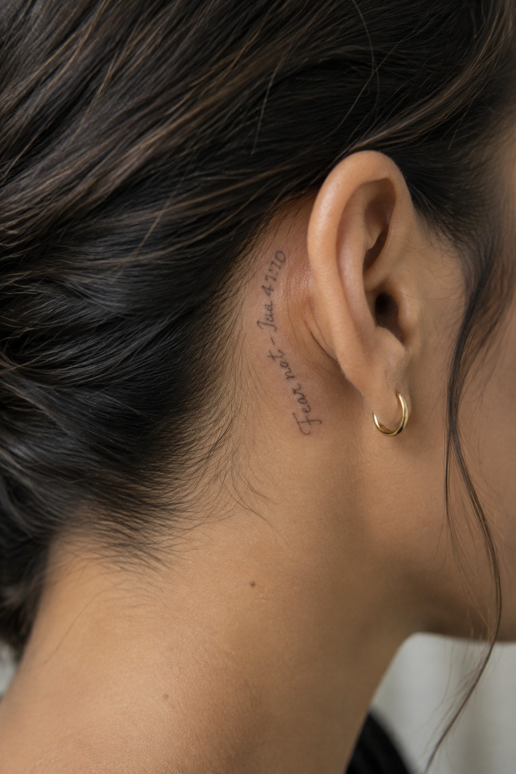
The tattoo sits behind the ear along the neck. Fine line lettering spells out the verse in a flowing script that runs vertically. The small size keeps the text compact without losing clarity.
I think the placement works because it stays mostly hidden yet simple to reveal. The delicate lettering fits the narrow space without feeling cramped.
John 3:16 runs vertically along the inner forearm
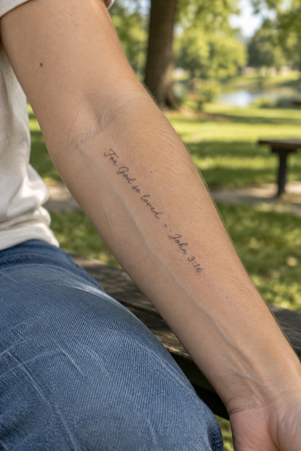
The inner forearm gives a long flat area that fits this verse without any crowding. The text sits in one clean column and uses thin lines that follow the arm from elbow to wrist. This keeps the full reference readable even at a smaller scale.
The placement also makes the tattoo simple to cover with sleeves on most days. It stays visible only when the arm is extended or the sleeve is pushed up.
John 3:16 fine line lettering on the ankle
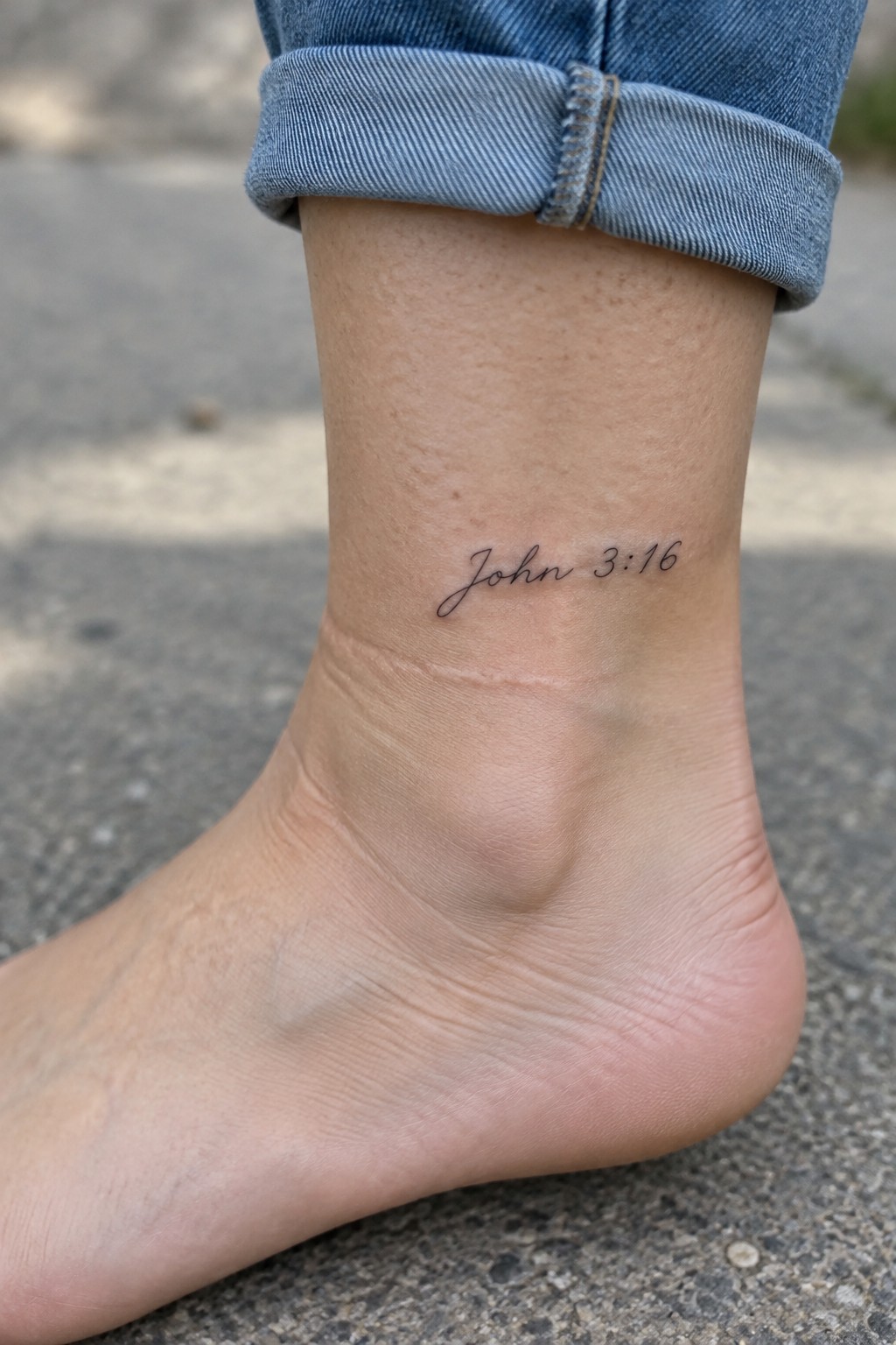
The ankle gives this small scripture reference a natural spot to rest. It keeps the design contained while still easy to see when wanted. The fine line approach fits the area without crowding the skin.
The lettering stays clear at this scale and does not compete with the shape of the ankle. People often pick this placement when they want a verse close by but not always on display.
Small psalm verse on the ankle
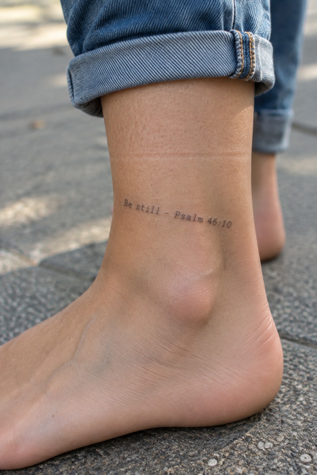
The text sits on the side of the ankle in a compact line. This spot keeps the lettering flat against the skin so the words stay easy to read at a small scale. The fine line style matches the short verse without adding weight or extra detail.
I think the ankle works for this because the tattoo stays mostly hidden but appears when the person wants it to. The size feels practical and avoids crowding the area.
A scripture quote on the thigh
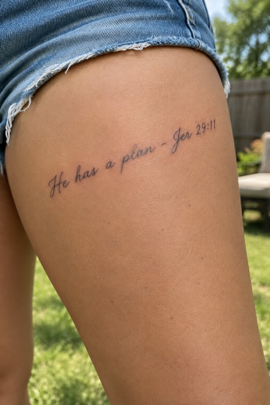
The tattoo sits across the upper thigh in a single flowing line. This placement gives the cursive lettering enough space to stay readable without crowding. The fine line style keeps the text light against the skin.
I like how the thigh works for this because the area stays stable and lets the words sit straight. The reference tucks in neatly at the end without overpowering the main phrase.
Scripture text on the upper arm
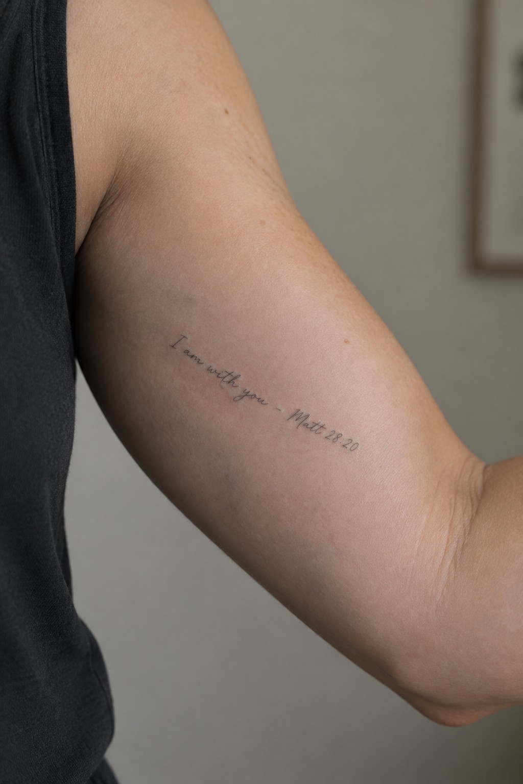
The tattoo sits on the inner upper arm. Fine line script spells out the verse with its reference placed just below.
This spot lets the lettering follow the arm’s natural line without feeling crowded. I think the placement keeps the design personal while still giving the text enough space to stay clear.
Amen tattoo along the side of the finger
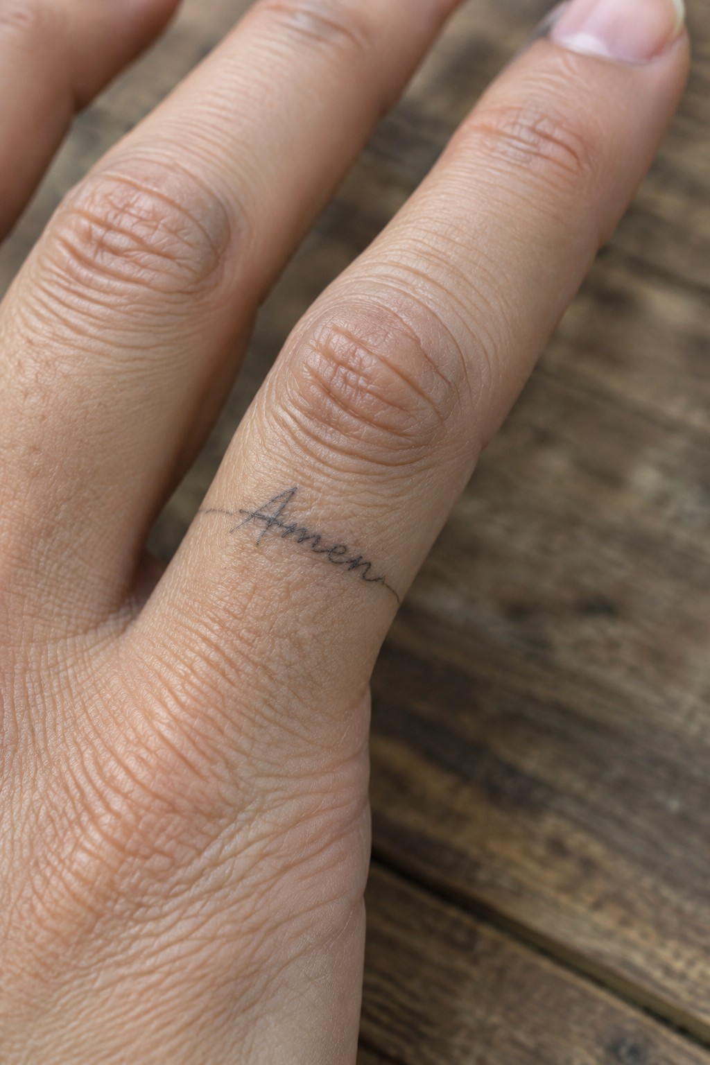
The word amen sits in thin cursive script along the side of the finger. Its compact size keeps the design from crowding the narrow space. The placement makes the tattoo feel private, showing only when the hand turns a certain way.
The light lines help it stay clear even on moving skin. This spot suits someone who wants a short phrase that stays personal rather than bold.
Fine line text on the shoulder
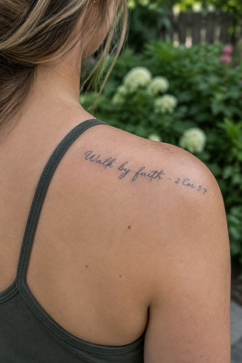
The upper shoulder gives the lettering a gentle curve to follow. This keeps the short verse compact and contained without needing extra space. The fine line approach matches the length of the quote so nothing feels crowded.
I think the placement works because it lets the text stay visible from certain angles while remaining easy to cover. The script stays light enough that it does not compete with the natural shape of the shoulder.
Psalm 16:8 stays small on the thigh
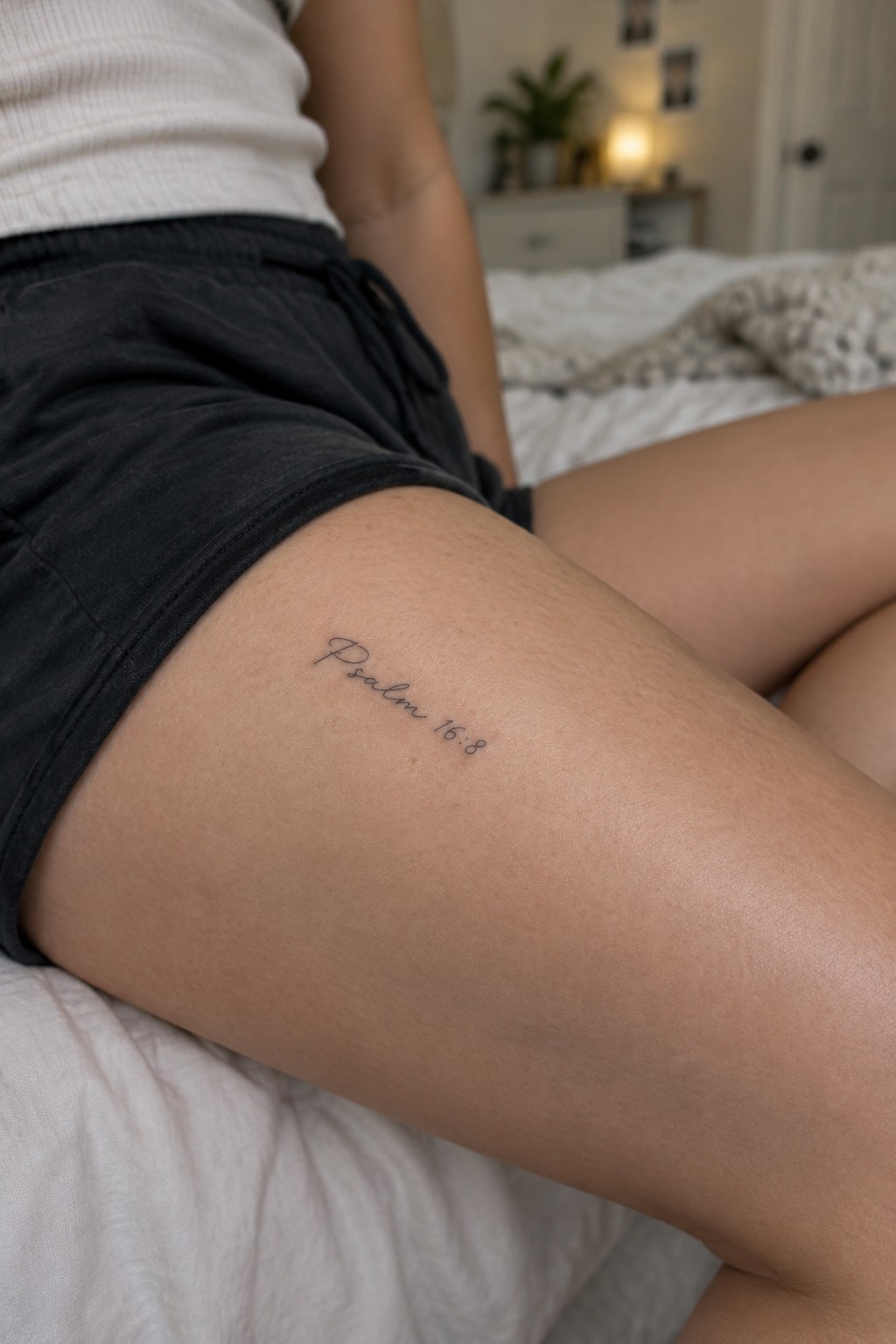
The upper thigh gives this text tattoo a spot that stays private most of the time. A short reference like Psalm 16:8 fits the space without crowding. Fine line lettering keeps the design light and simple.
I like how the cursive stays readable at this size without extra flourishes. The placement also lets the tattoo sit flat along the leg. It works for someone who wants a personal verse they can choose to show or cover.
Vertical lettering down the side
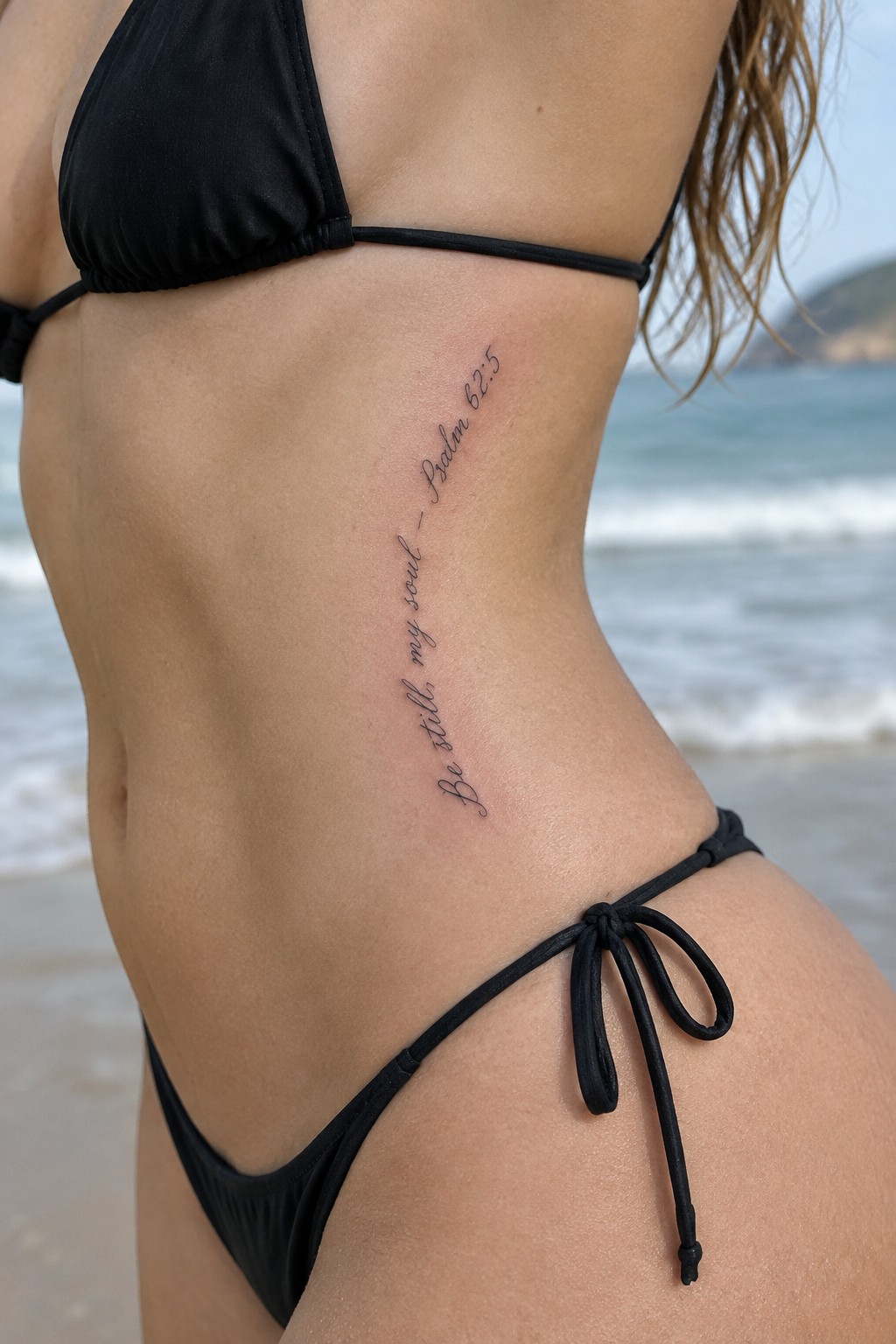
The tattoo runs in a slim vertical line along the side of the torso. Fine line script spells out the verse from Psalm 62:5 in a compact flow that follows the body. The lettering stays thin and even from top to bottom.
This approach fits the calm tone of the words without adding weight. I like how the placement keeps the text clear while staying out of the way on the rib area.
Scripture line placed on the shoulder
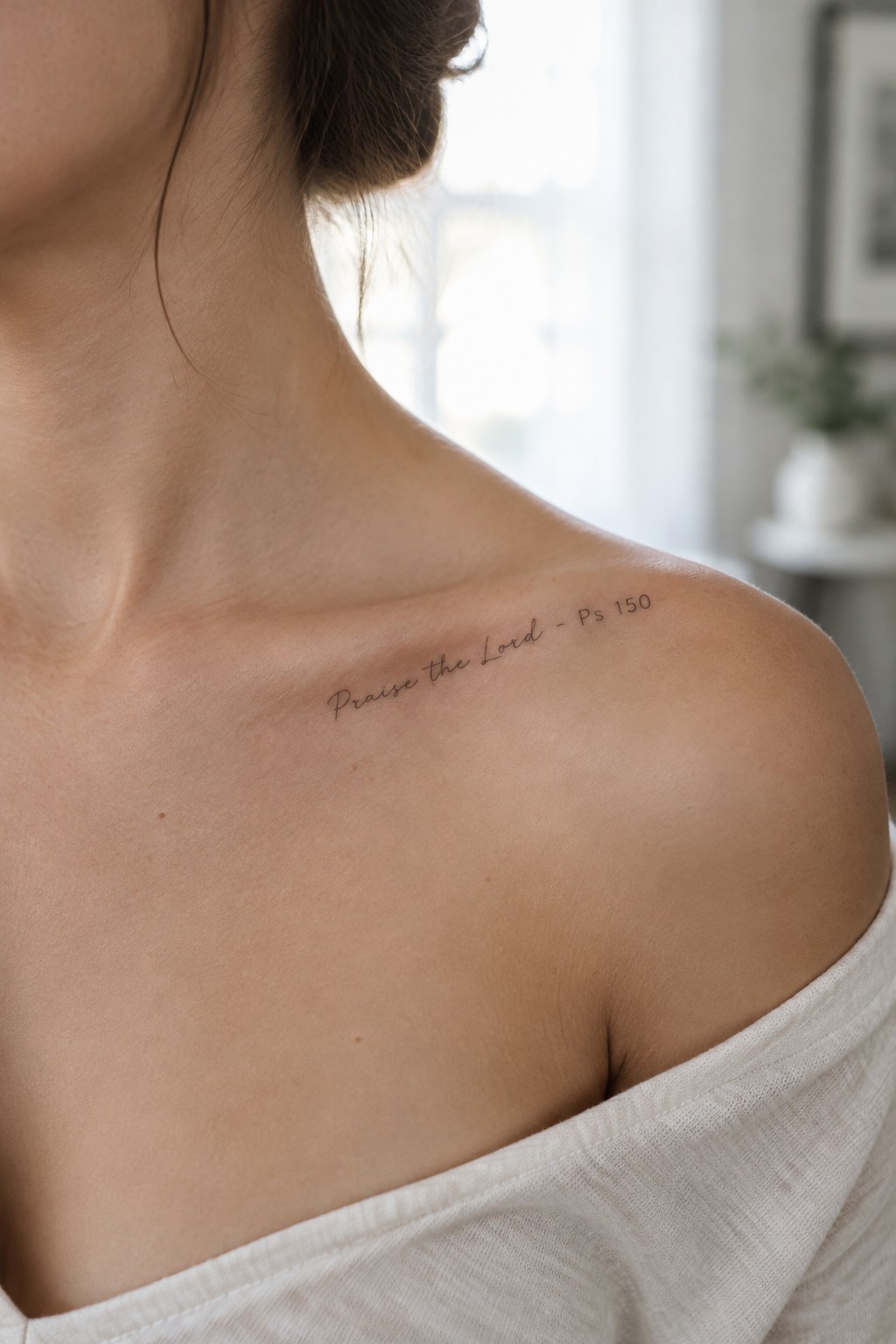
The tattoo rests across the upper shoulder in a thin script that follows the natural curve of the body. It shows the words “Praise the Lord” with the reference right beside them. The lettering stays small and sits in a spot that shows when the shoulder is bare but stays covered most of the time.
I like how the placement keeps the text personal rather than bold or central. The size also helps the words stay readable without crowding the skin.
Scripture text across the lower back
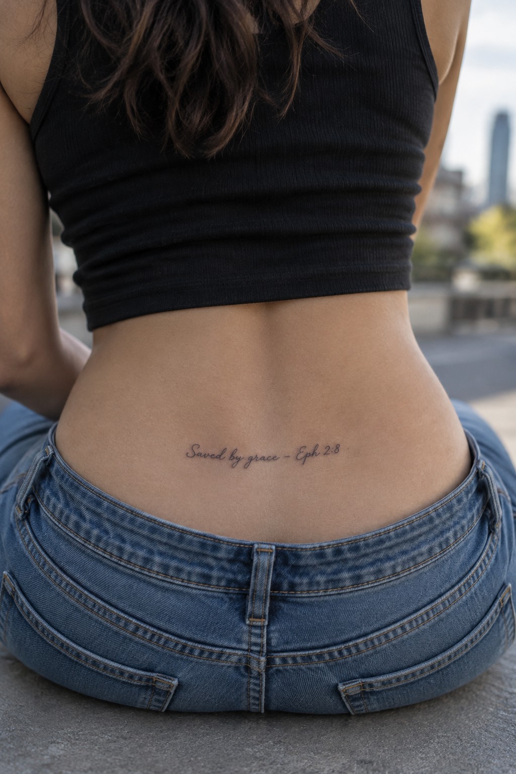
The lower back holds this verse in one straight line of fine line script. The lettering stays small and contained so it sits neatly above the waistband. This placement keeps the tattoo visible in certain outfits but easy to cover otherwise.
I think the spot works because the area gives enough width for the full phrase without crowding. The light lines also help the words feel personal rather than bold.
Scripture text on the inner wrist
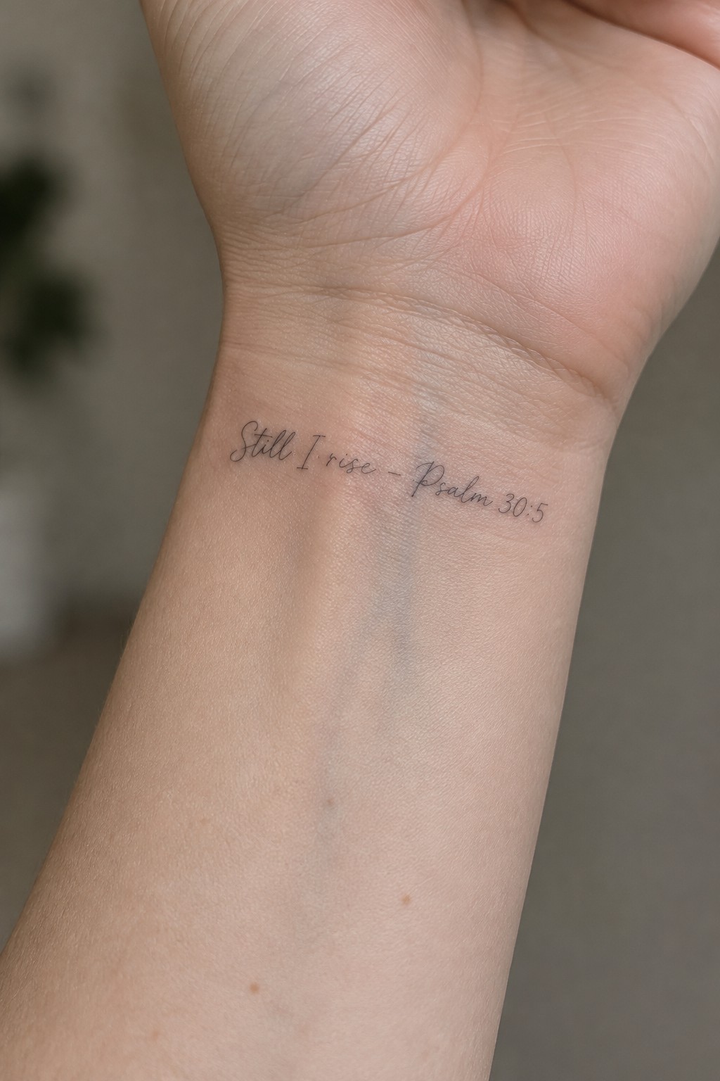
The tattoo sits on the inner wrist in fine line script. The words still i rise appear next to the psalm reference in the same delicate lettering. This keeps the whole piece small and contained.
I think the wrist placement works because the text stays easy to read at this size without extra detail. It turns the verse into something the wearer sees regularly.
Scripture lettering on the hip
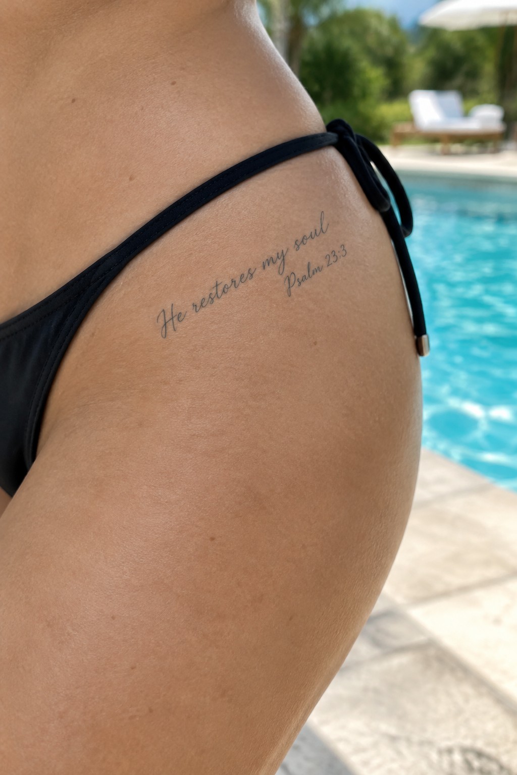
The text from Psalm 23 3 runs along the side of the hip in a slim cursive. Fine line work keeps the letters compact and easy to read at this scale. The placement lets the script sit flat without bunching.
This spot works because the verse stays short enough to fit the curve. I think the thin lettering prevents it from looking heavy on the skin.
Script text rests on the collarbone
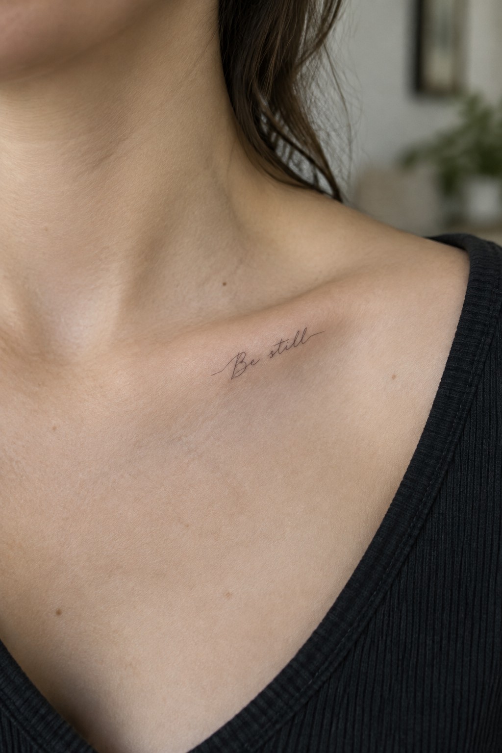
The collarbone gives this short phrase room to sit in a gentle curve. Fine line lettering keeps the text light and readable without filling much space. The small scale suits the area and avoids any need for extra details.
I picked this placement because the skin stays smooth there and holds the lines steady. It lets the words stand out on their own.
Inner forearm scripture tattoo
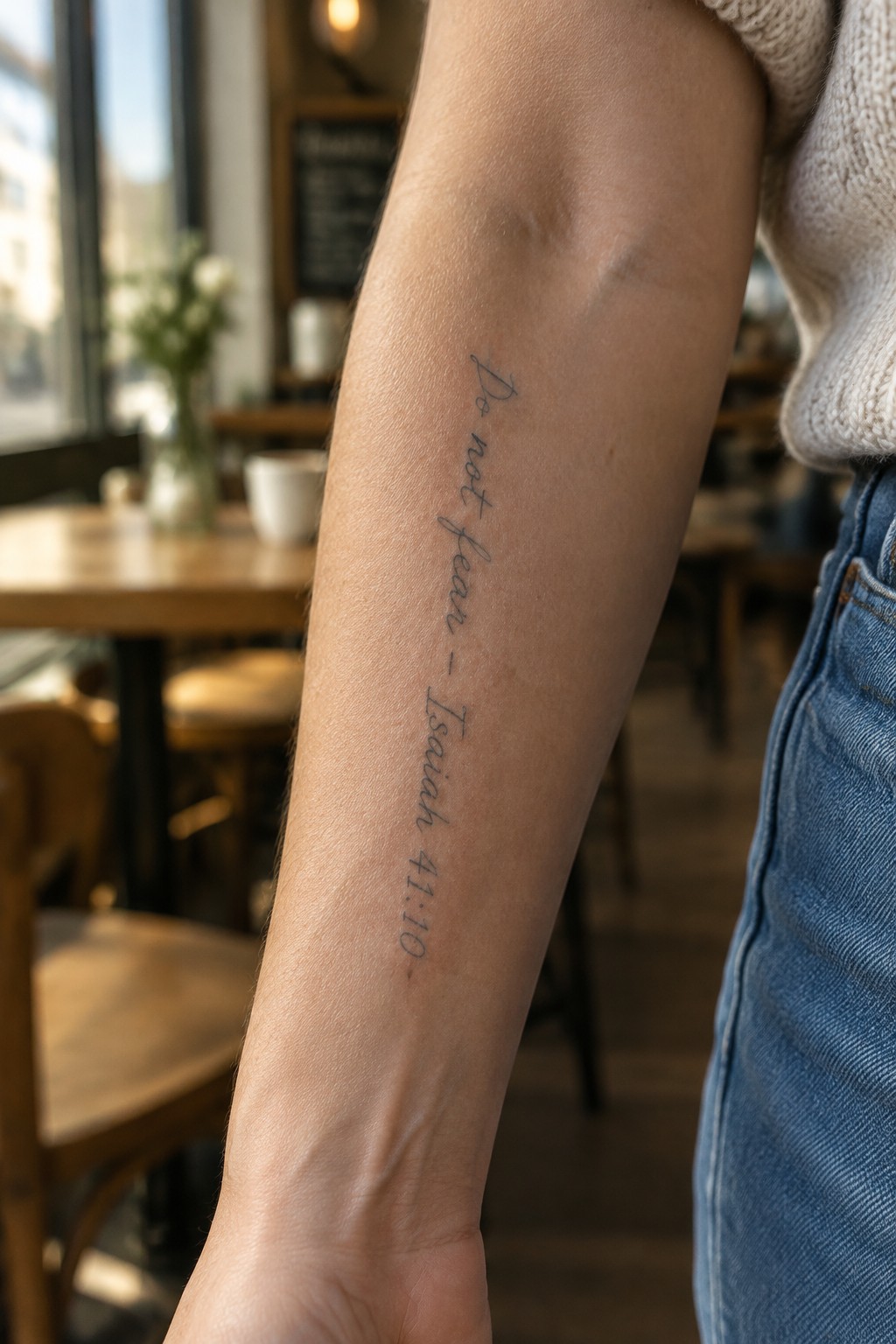
The tattoo sits vertically along the inner forearm. The fine line lettering stays slim and runs from near the elbow toward the wrist. This spot keeps the quote personal and easy to glance at during daily movement.
I think the vertical layout works because it matches the natural length of the arm without crowding. The delicate script stays clear at this size while still feeling understated.
Frequently Asked Questions
What is the best way to care for a fine-line scripture tattoo? Clean the area gently with unscented soap and apply a thin layer of recommended ointment several times a day for the first two weeks. Keep the tattoo out of direct sunlight and avoid soaking it in water until fully healed. Moisturize regularly afterward to help maintain the delicate lines and prevent fading.
How painful is getting a tattoo with delicate lettering? Pain levels vary by placement and personal tolerance but fine-line work often involves less trauma than bold designs since the needle moves lightly. Areas with thin skin like wrists or ribs tend to sting more. Discuss numbing options with your artist and stay hydrated before the session to make the process smoother.
Where should I place my scripture tattoo for it to look best? Popular spots include the inner forearm, collarbone, or behind the ear because they allow the delicate lettering to show clearly without much distortion. Consider your daily clothing and how the text flows with body curves. Smaller verses work well on fingers while longer passages suit larger areas like the ribcage.
What should I consider when choosing a Bible verse for my tattoo? Select a verse that holds personal meaning and reflects your values to ensure lasting satisfaction. Keep the text concise for fine-line readability and test different fonts by printing them out first. Consult your artist about spacing and size to avoid crowding that could blur over time.
How do I find a reputable artist for fine-line work? Look for tattoo professionals who specialize in delicate scripts and have a strong portfolio of healed scripture examples. Read recent client reviews, check for proper licensing, and schedule a consultation to review their technique. Ask about their experience with thin lines to confirm they can deliver crisp results.
