

I adore minimalist tattoos for their quiet power much like a simple home setup that brings peace to my days. My own faith journey makes these single word designs and verse references feel extra special to me. They strike the perfect balance of personal meaning without any extra fuss. I think you will smile seeing how these ideas turn faith into wearable art.
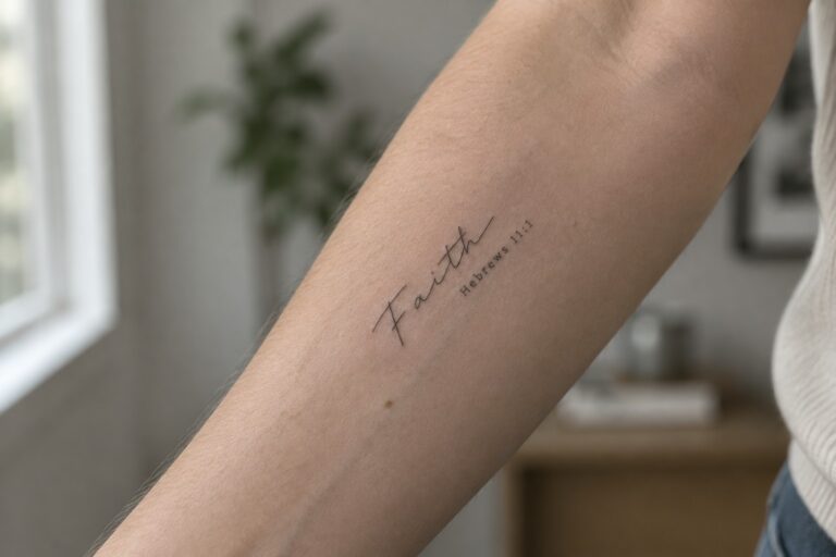
Faith tattoo on the inner forearm
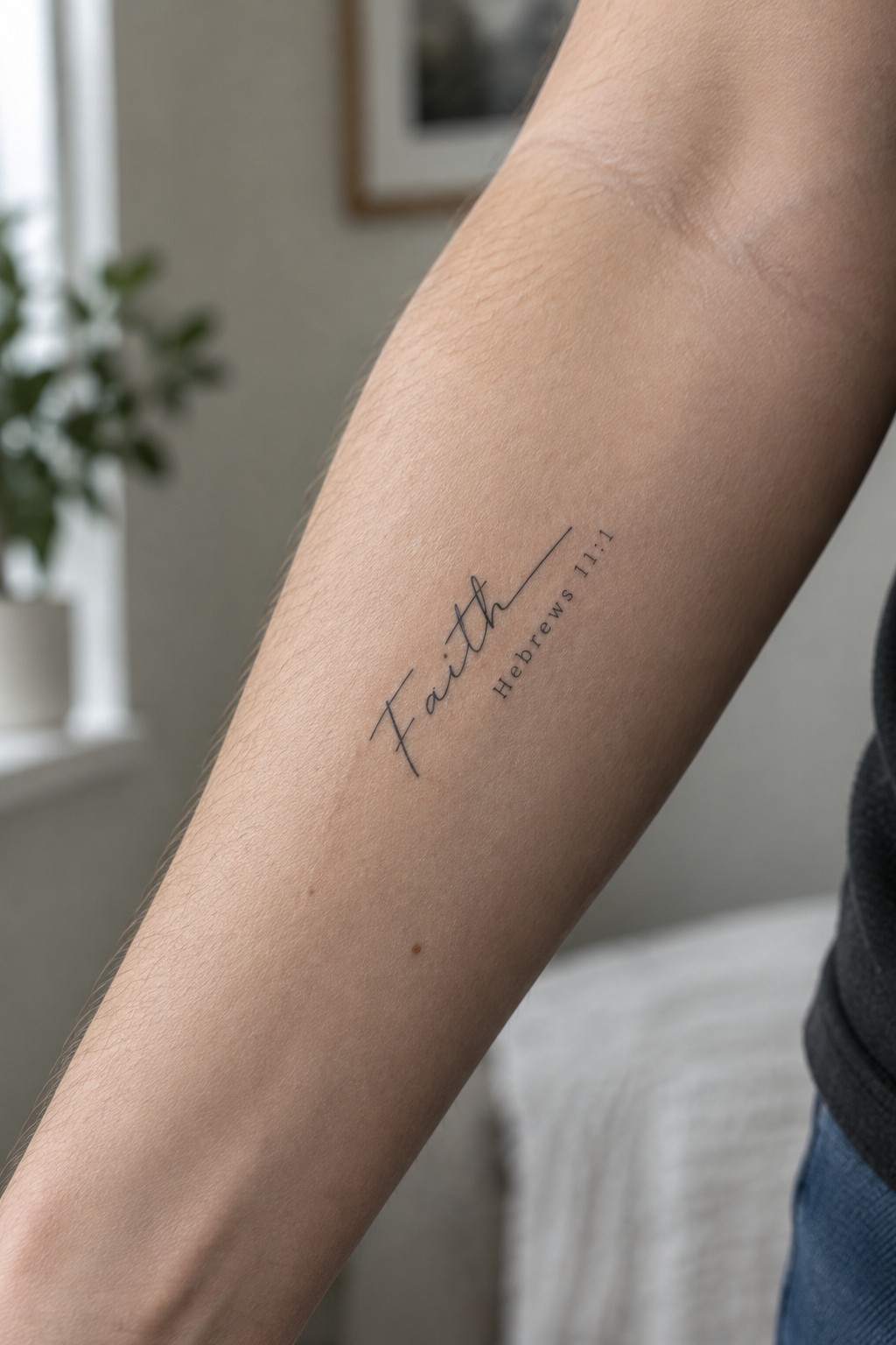
The inner forearm gives this text a steady spot where the lines stay straight and easy to read. The word faith sits in a simple script while the reference stays small and close beside it. This setup keeps the tattoo compact without losing clarity.
I think the placement works because the area stays visible to the wearer but can be covered for most days. It also leaves space if they want to add another short line later.
Grace tattoo on the inner wrist
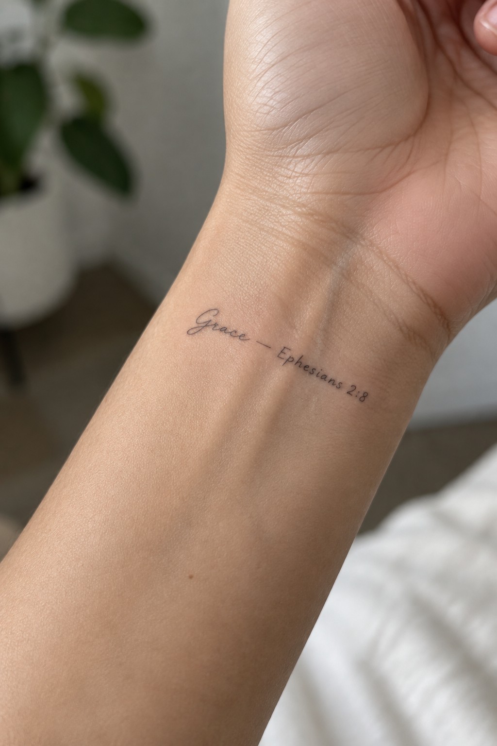
The inner wrist gives this tattoo a private spot that stays visible to the wearer. The script stays light and compact so the full line fits without stretching. Ephesians 2:8 sits right next to the word to keep the reference tight.
This placement works because the skin stays flat and the area sees less movement. The small scale keeps the text readable while it remains understated in daily life.
Hope with verse reference on the side torso
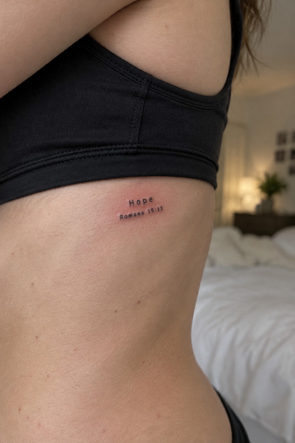
The side torso keeps this tattoo mostly private while still allowing easy access. Clean lettering spells out hope above the short verse reference in a compact block. The spot sits just under the ribs so the design stays out of sight under normal clothing.
I think the small scale prevents it from competing with the body lines around it. The plain font keeps the focus on the words without extra decoration.
Text tattoo on the side torso
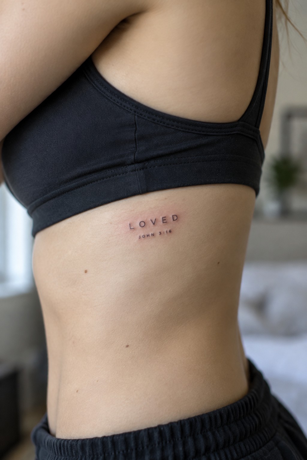
The tattoo sits on the side of the torso right under the arm. It shows the word loved in clean lettering with the verse reference placed directly below. The small scale fits the curve of the body without stretching the text.
This spot keeps the design private most of the time. I think the side placement works well because it lets the short lines stay straight and easy to read.
Blessed text on the ankle
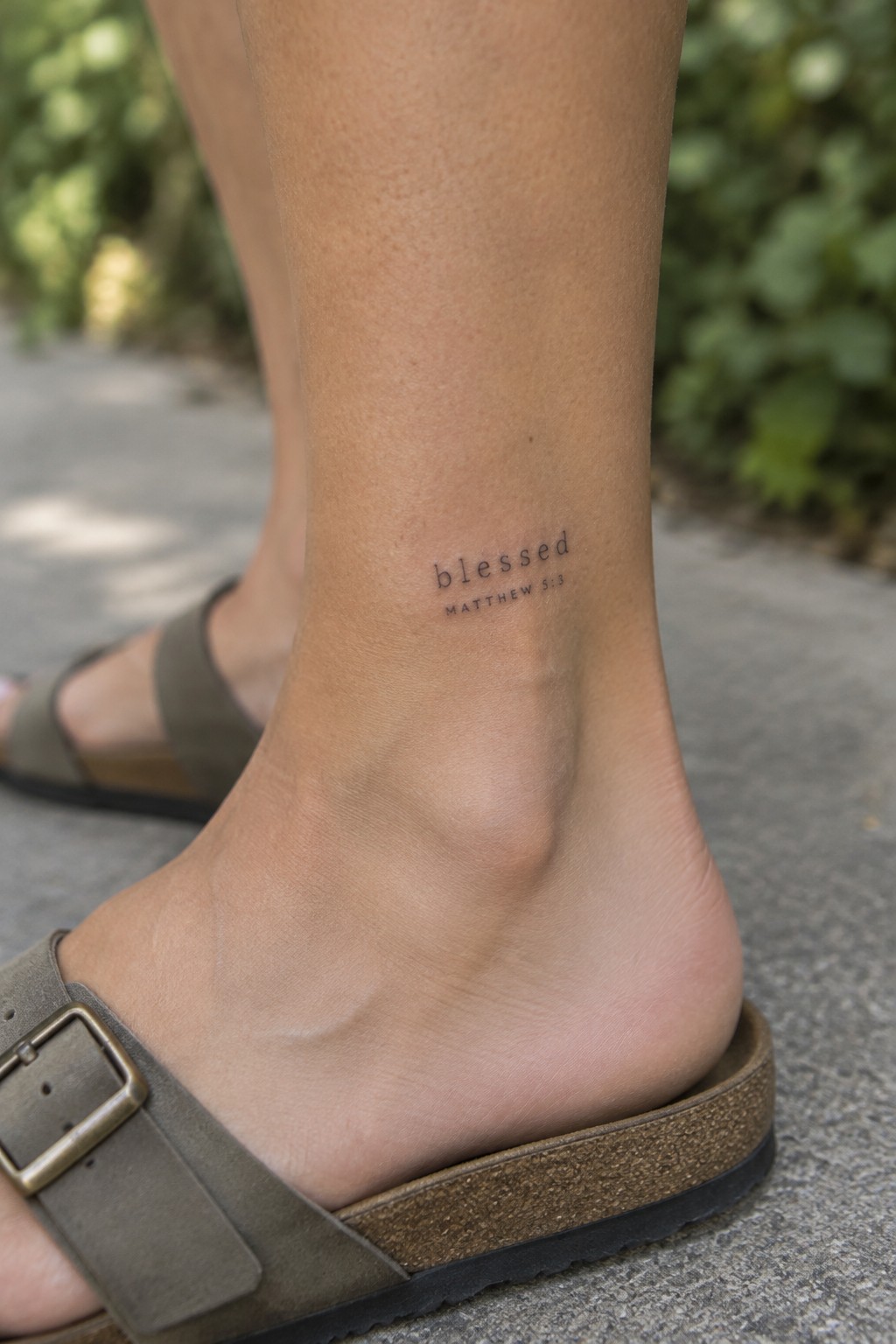
The tattoo sits on the inner ankle in a clean sans serif font. It shows the single word blessed with the verse reference directly underneath in smaller type. This spot keeps the design compact and close to the foot.
I think the placement works because the tattoo stays personal without drawing constant attention. The simple lettering also helps the text remain clear at this small scale.
Strength tattoo on the inner upper arm
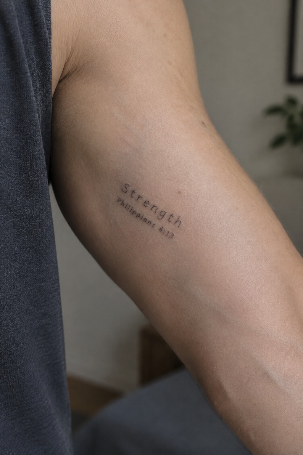
The tattoo sits on the inner upper arm in a slim black font. It shows the single word strength with the verse reference placed directly underneath. The letters stay tight and even without any extra decoration.
I think the placement works because the area gives enough flat space for the text to stay legible while still allowing the arm to move naturally. The size also keeps the whole piece from feeling loud when the sleeve is short.
Peace verse placed along the neck
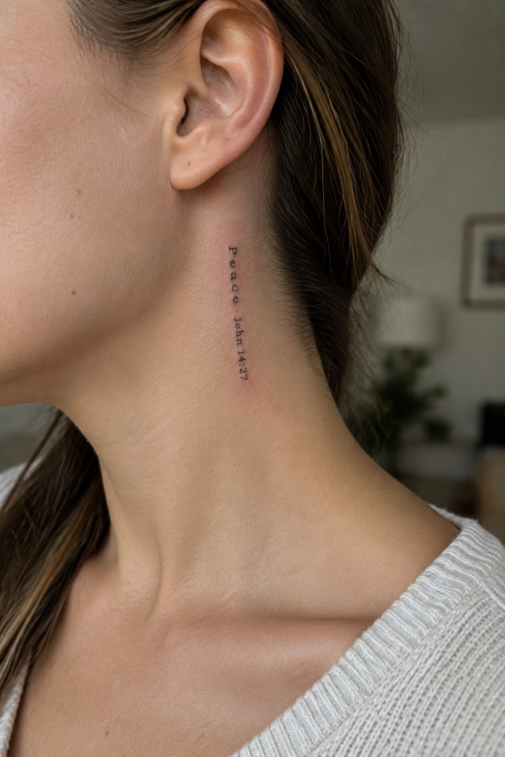
The tattoo runs straight down the side of the neck. It shows the word peace above the reference john 14 27 in a narrow script. The text stays small and sits close to the hairline.
This placement keeps the verse mostly hidden unless the hair is pulled back. I think the vertical layout works here because it matches the shape of the neck without spreading out.
Trust tattoo on the side of the hand
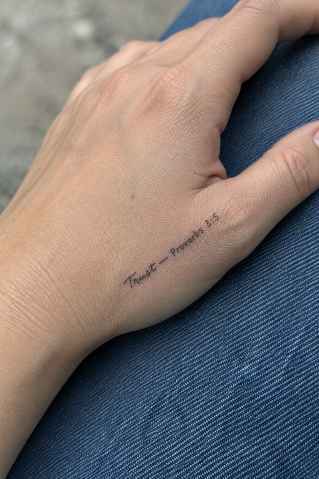
The tattoo sits along the outer edge of the hand near the pinky. This spot keeps the words visible during daily tasks without covering the whole hand. The script stays small and thin so it fits the narrow space.
I think this placement works because the text follows the natural line of the hand without looking crowded. It stays personal while still being easy to read at a glance.
A small prayer tattoo on the ankle
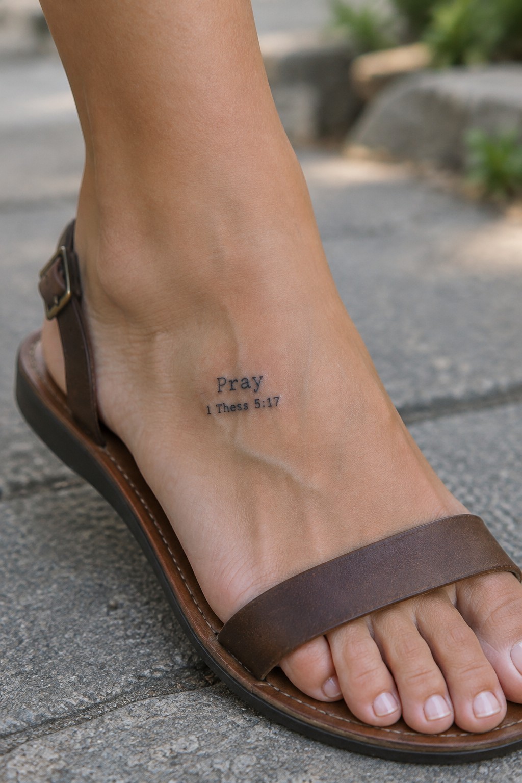
The tattoo sits on the inner ankle right above the foot. This spot keeps the message visible during daily movement while staying low key. The compact lettering fits the narrow area without stretching or crowding.
I think the ankle works here because it creates a private reminder that shows only when footwear allows. The plain font keeps the focus on the words rather than any extra detail.
Verse reference on the shoulder
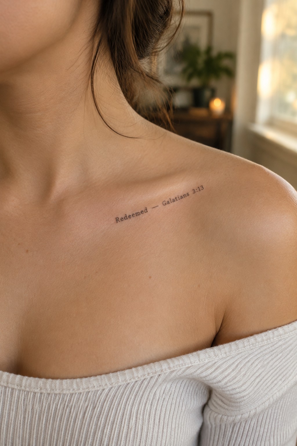
The shoulder gives this text tattoo a flat surface that keeps the lettering straight and easy to read. The words sit just below the collarbone, where they stay visible with certain necklines but remain covered most of the time. The short verse reference takes up little space and leaves the rest of the skin clean.
I think the plain font works here because it lets the words stand out without extra lines or shading. The size also feels right for the area since nothing gets cramped or stretched when the shoulder moves.
Vertical forgiven tattoo along the spine
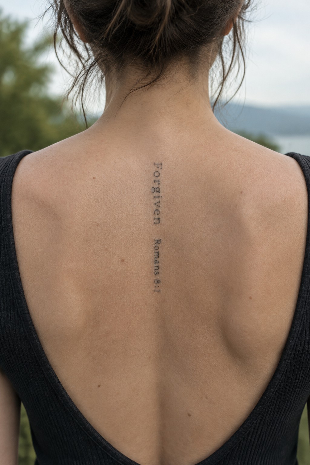
The tattoo sits centered on the upper back and runs straight down the spine. The word forgiven appears in thin vertical lettering with the verse reference placed directly below. This layout keeps the design narrow and contained in one clean column.
I think the spine placement works because it gives the text a natural path without needing extra space on either side. The small scale also helps the lettering stay sharp and easy to read at a glance.
Courage tattoo on the inner wrist
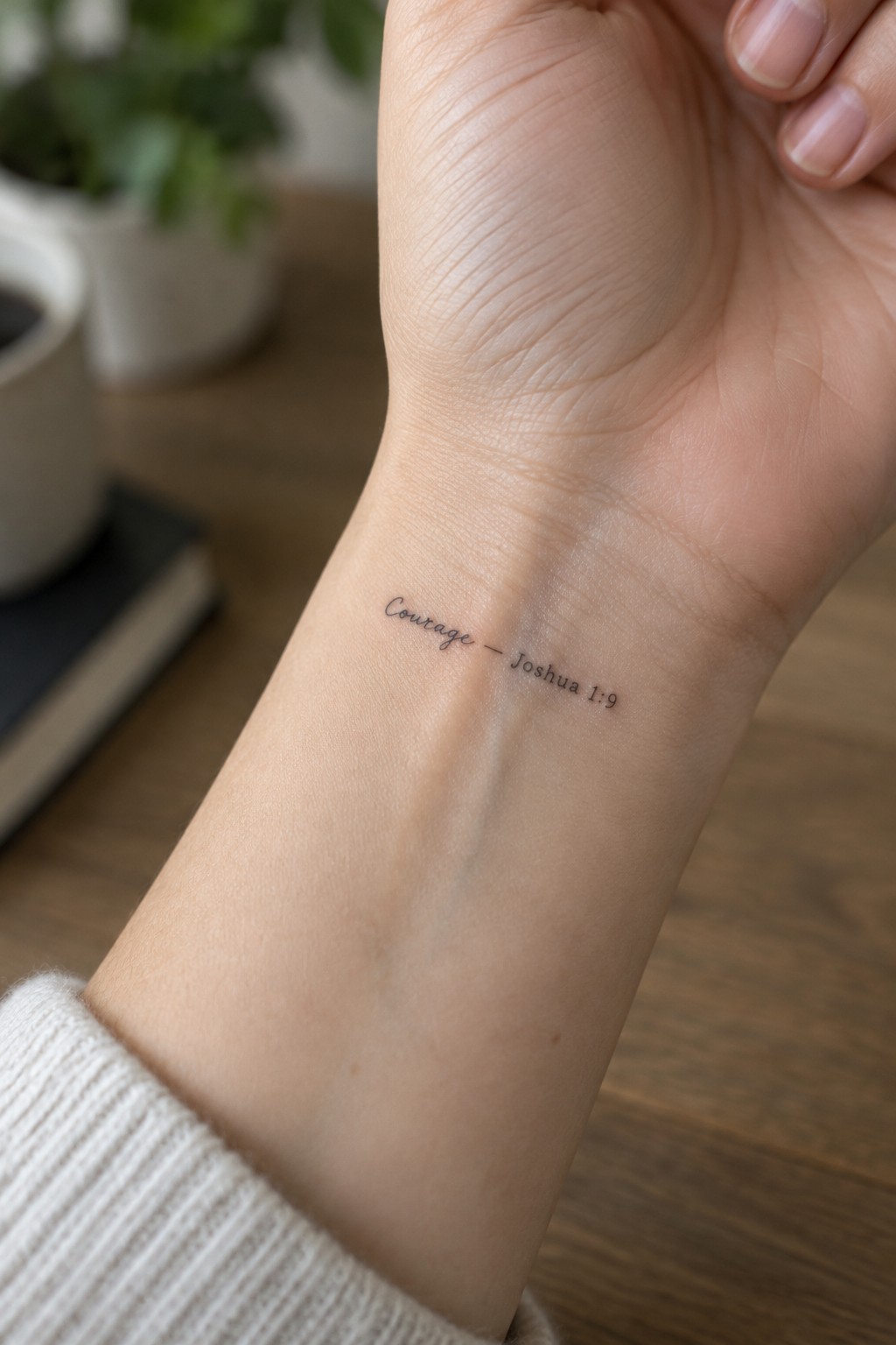
The tattoo sits on the inner wrist in a simple script. This spot makes the text easy to check throughout the day. The size stays compact so it fits the narrow space without crowding.
I think the verse reference works well right beside the word. It gives the text meaning while keeping the whole design clean and readable.
Joy tattoo on the thigh
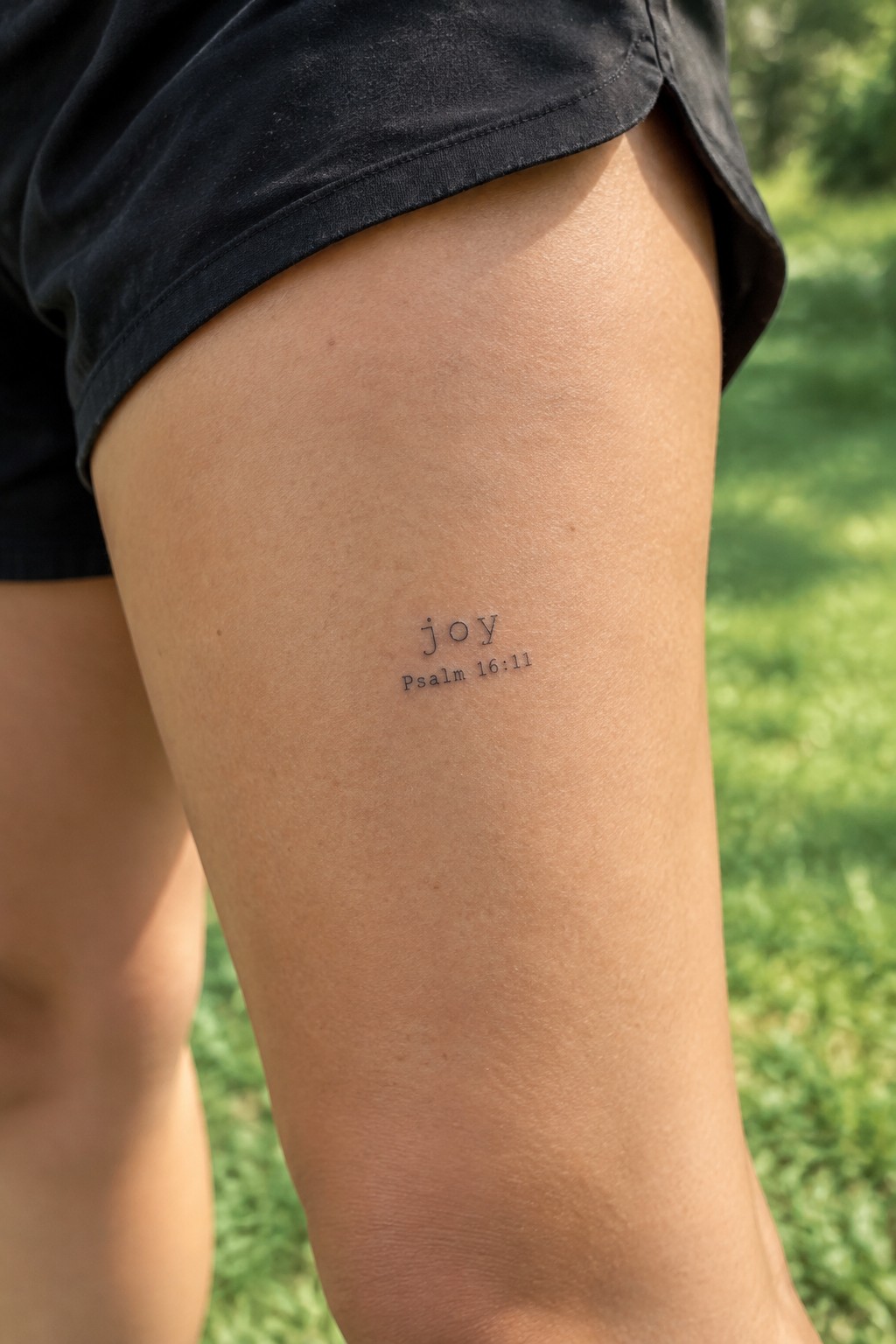
This tattoo uses the upper thigh as its spot. The small text design keeps the word joy front and center with the psalm reference placed directly below it. The clean lettering stays minimal and clear at this size.
The thigh placement fits because the tattoo stays mostly covered during daily life. It still shows up easily in warmer weather without needing a big or bold design.
Serve text on the side of the finger
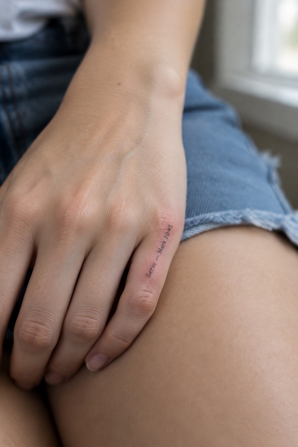
The tattoo sits vertically along the side of the finger. This narrow placement fits a short word and reference without spreading out. The lettering stays small and direct so the design does not overwhelm the area.
I think the vertical line makes the text feel steady in that spot. It also keeps the whole piece compact while still showing the full reference.
Abide tattoo on the upper chest
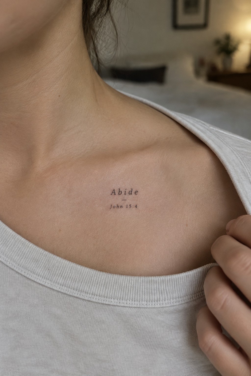
The tattoo sits just below the collarbone on the left side. It shows the single word abide above the reference john 15:4 in a clean thin font. The whole piece stays small and uses only black ink with no added lines or shading.
This spot works well because the design stays personal while still visible when the shirt moves. I think the simple lettering keeps the focus on the word itself without extra detail getting in the way. The size also makes it easy to cover with most tops.
Small seek tattoo on the inner forearm
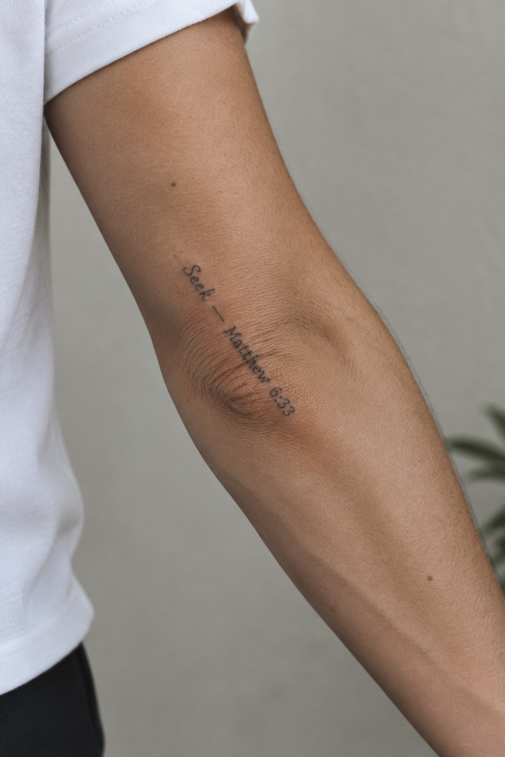
The tattoo sits on the inner forearm in a vertical line. It uses a light script font with the word seek at the top followed by a short dash and the reference matthew 6:33 underneath. The whole piece stays compact and sits just above the elbow crease.
I like how the vertical layout matches the natural line of the arm so the text stays easy to read. The small scale also keeps it from feeling crowded in that area.
Rejoice tattoo on the upper ribs
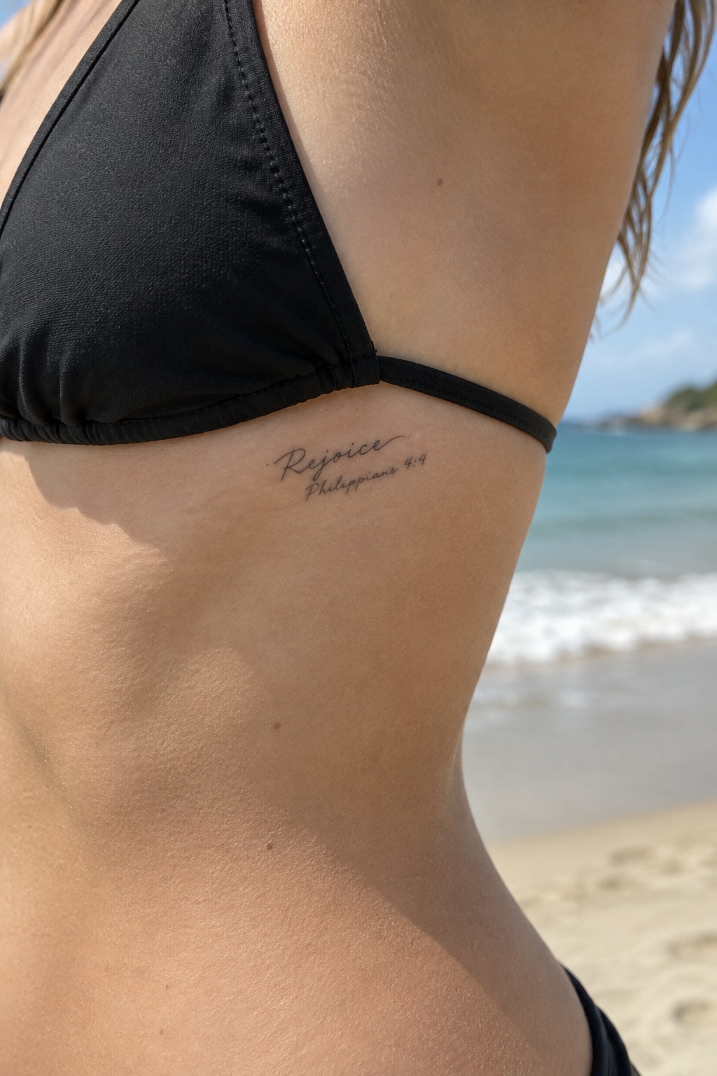
The tattoo sits on the upper side torso just below the bikini strap. It uses fine script for the single word rejoice and tucks the verse reference directly underneath. The compact layout keeps the whole piece small and contained.
This placement suits the design because the area stays easy to cover while still giving the text room to read clearly. I think the fine lines help it feel personal rather than bold.
Be still tattoo on the ankle
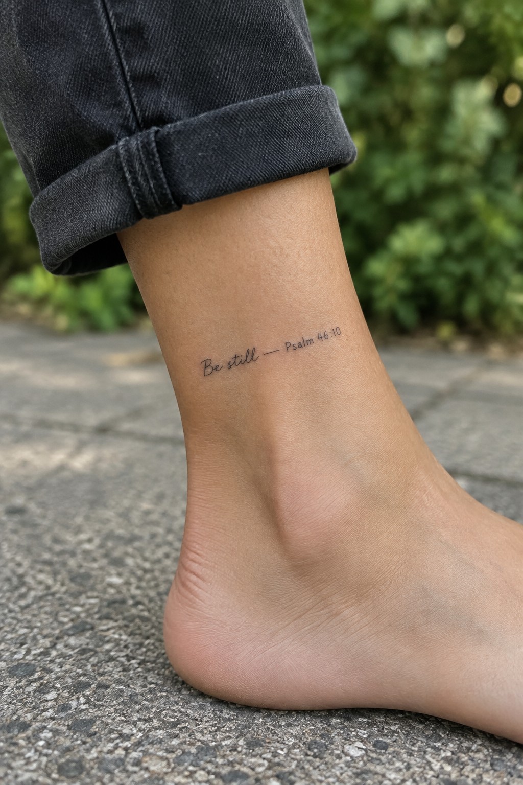
The tattoo sits on the outer ankle in a fine script font. It shows the words be still along with the short psalm reference right beside them. The compact size fits neatly in that narrow space without crowding.
This placement works because the text stays mostly covered during normal movement yet shows clearly when the ankle is visible. I think the thin lines keep it from feeling heavy on such a small area.
A verse reference on the shoulder
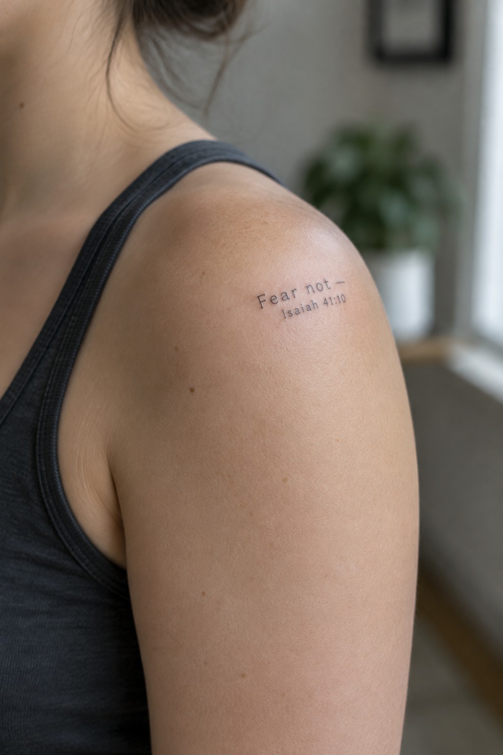
The tattoo sits on the upper arm near the shoulder. It uses small clean lettering for the short phrase and reference. The compact size keeps the design contained on the rounded area.
This spot makes the text easy to see with certain clothes but simple to cover when needed. The thin lines prevent the words from feeling heavy on the skin.
Anchor with Hebrews 6:19 on the wrist
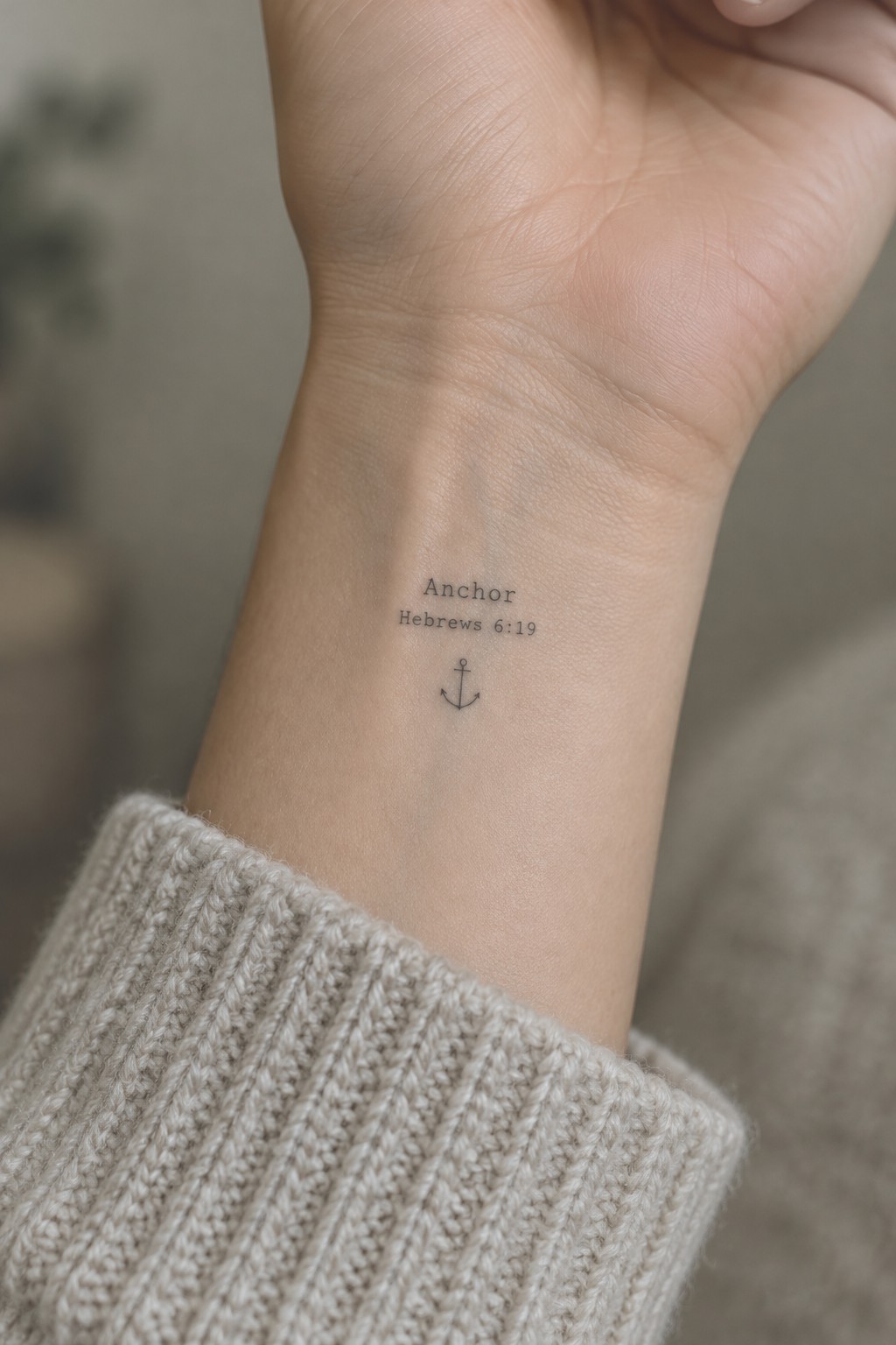
The inner wrist gives this tattoo a natural spot that stays mostly covered during daily tasks. The small scale keeps the text and anchor symbol close together without crowding the area. Fine lines help the whole piece stay clean even after it settles.
I think the placement makes sense because the design stays readable without needing much space. The verse reference sits right under the word to tie the idea together without extra decoration.
Hopeful tattoo on the side of the hand
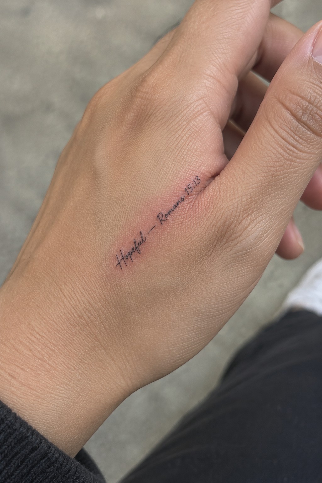
The tattoo sits on the side of the hand right where the thumb meets the palm. It uses thin cursive script to spell out hopeful followed by a dash and the verse reference romans 15:13. This spot keeps the whole design small and contained while still making the text easy to notice.
The thin lines hold up well at this size without crowding. The placement works because the tattoo stays visible during normal hand movements without demanding attention.
Frequently Asked Questions
What are some popular single word choices for these minimalist tattoos and how do they connect to specific verses?
Readers often select words like faith hope love grace or peace because they capture core biblical themes. Pair faith with Hebrews 11 1 to emphasize belief in unseen promises or grace with Ephesians 2 8 to highlight unearned favor. Review the full verse context first so the tattoo reflects your personal connection accurately.
Where on the body do these small tattoos work best and why?
Wrist ankle collarbone or behind the ear provide clean surfaces that keep designs visible yet discreet. These spots allow the single word and reference to stay legible without crowding while minimizing daily wear from clothing or movement. Discuss skin texture with your artist to choose a spot that supports fine lines over time.
How can I make sure the word and verse reference remain clear as the tattoo ages?
Choose a simple sans serif font and work with an experienced artist who specializes in fine line work. Schedule regular touch ups every few years and apply sunscreen daily to prevent fading. Avoid areas with frequent stretching like joints if possible to maintain sharp details.
What aftercare steps help these minimalist tattoos heal properly?
Clean the area gently with unscented soap twice a day and apply a thin layer of fragrance free moisturizer. Keep the tattoo covered with a breathable bandage for the first few days and avoid soaking it in water or exposing it to sun until fully healed. Follow your artist’s specific instructions since small tattoos can still develop irritation if neglected.
How do I discuss customization ideas with a tattoo artist without losing the minimalist style?
Bring printed examples of the exact word verse pairing and specify no extra flourishes or shading. Ask the artist to sketch the layout at actual size first and confirm the font size fits your chosen placement. This approach keeps the focus on the single word and reference while ensuring the final result matches your vision.
