

I have always loved how gothic lettering can give Christian symbols a bold and mysterious edge that feels personal to me. My own tattoos include a small cross with script that reminds me of old church windows mixed with a bit of rock concert energy. These twenty designs blend dark lettering with sacred imagery in ways that make faith look stylish and strong. I think they prove you can honor tradition while adding your own twist of attitude and fun.
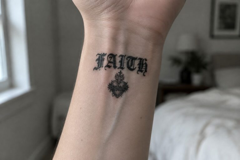
Faith tattoo on the wrist
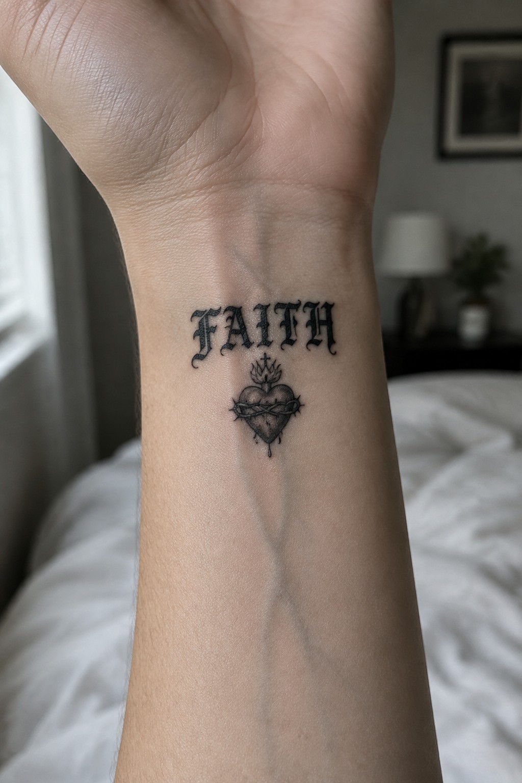
The inner wrist keeps this design visible during daily movement while staying compact. Gothic lettering spells out faith above the sacred heart. The heart includes a crown, thorns, and a small cross on top.
This placement suits the lettering and symbol together. The size stays balanced so the details remain clear without spreading too wide.
A crucifix tattoo stretches down the inner forearm
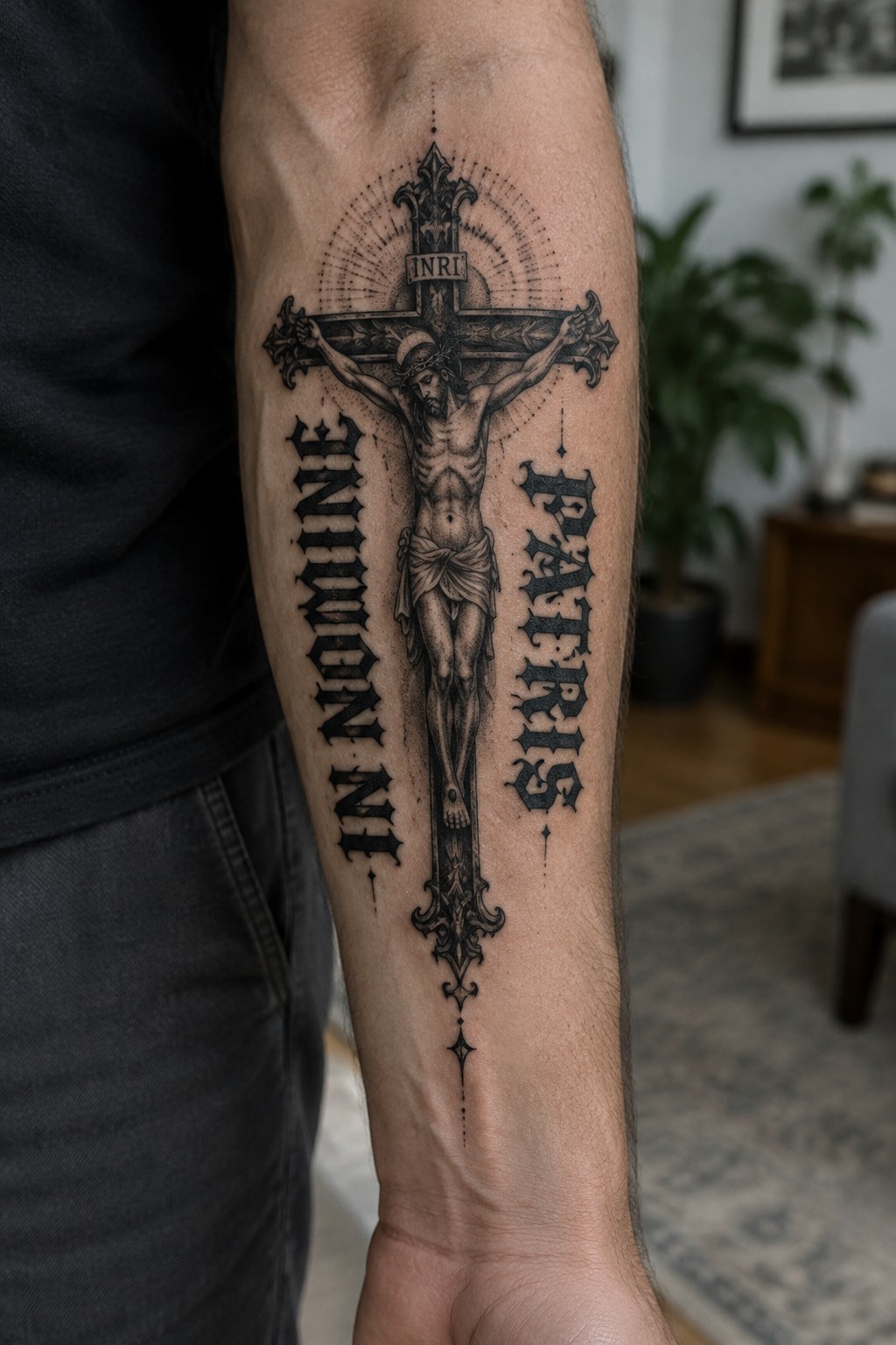
The tattoo runs along the inner forearm in a tall vertical layout. A large crucifix with Jesus at the center takes up most of the space. Gothic lettering sits on each side to form the Latin phrase.
This placement keeps the design balanced along the arm’s length. I think the vertical format helps the whole piece stay readable without feeling crowded.
A spine tattoo with memento mori lettering
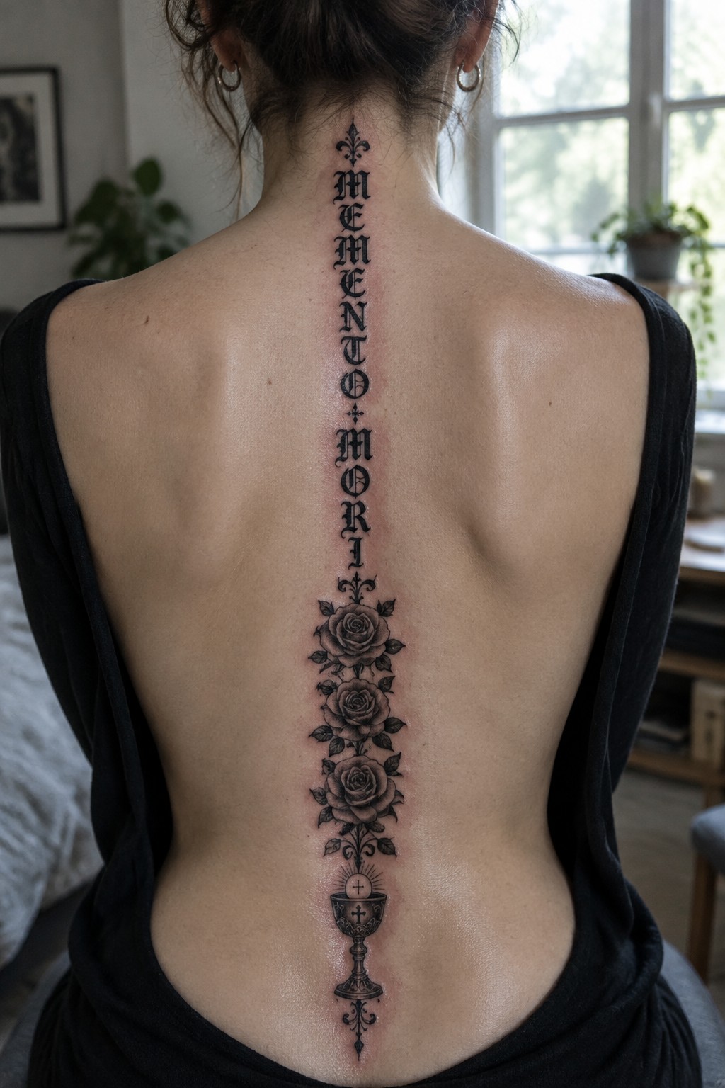
The design runs straight down the spine from the base of the neck. Gothic lettering spells out the phrase with a small cross and fleur de lis at the top. Three roses sit in the center and a chalice finishes it near the lower back.
This placement lets the text stay stacked without spreading wide across the shoulders. I think the narrow column keeps the lettering clear while the stacked elements give it structure.
Praying hands tattoo stretches down the thigh
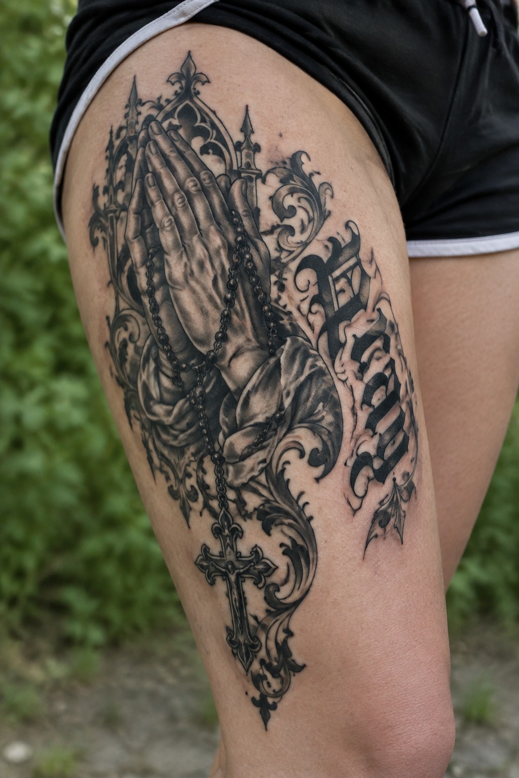
The thigh gives a long vertical area that fits the full layout. Praying hands sit near the top while the cross hangs near the bottom. Rosary beads run through the middle to link both parts.
I think the scale keeps the shading clear across the whole piece. The gothic text sits beside the hands without crowding them.
Trust tattoo with rosary beads on the ankle
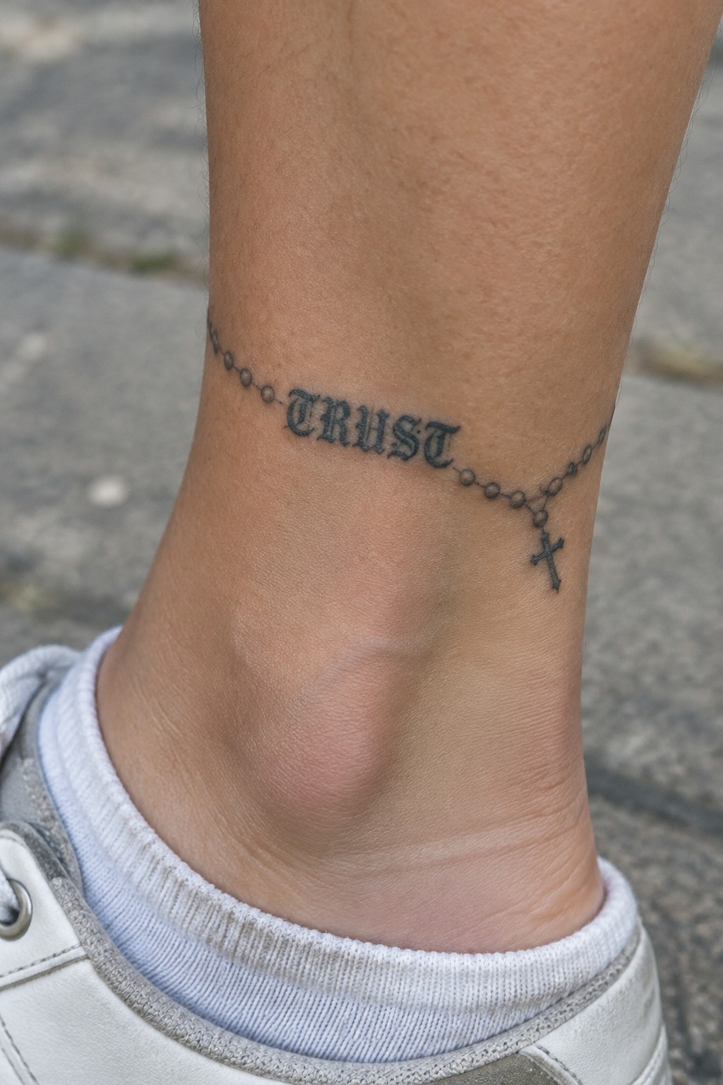
The rosary chain starts on one side of the ankle and curves around to the other. Gothic lettering spells out trust along the middle section of the beads. A small cross hangs from the end near the front of the ankle.
This spot lets the beads follow the bone without looking forced.
I think the size keeps the whole thing readable while still feeling like a single piece.
Deus vult tattoo on the upper arm
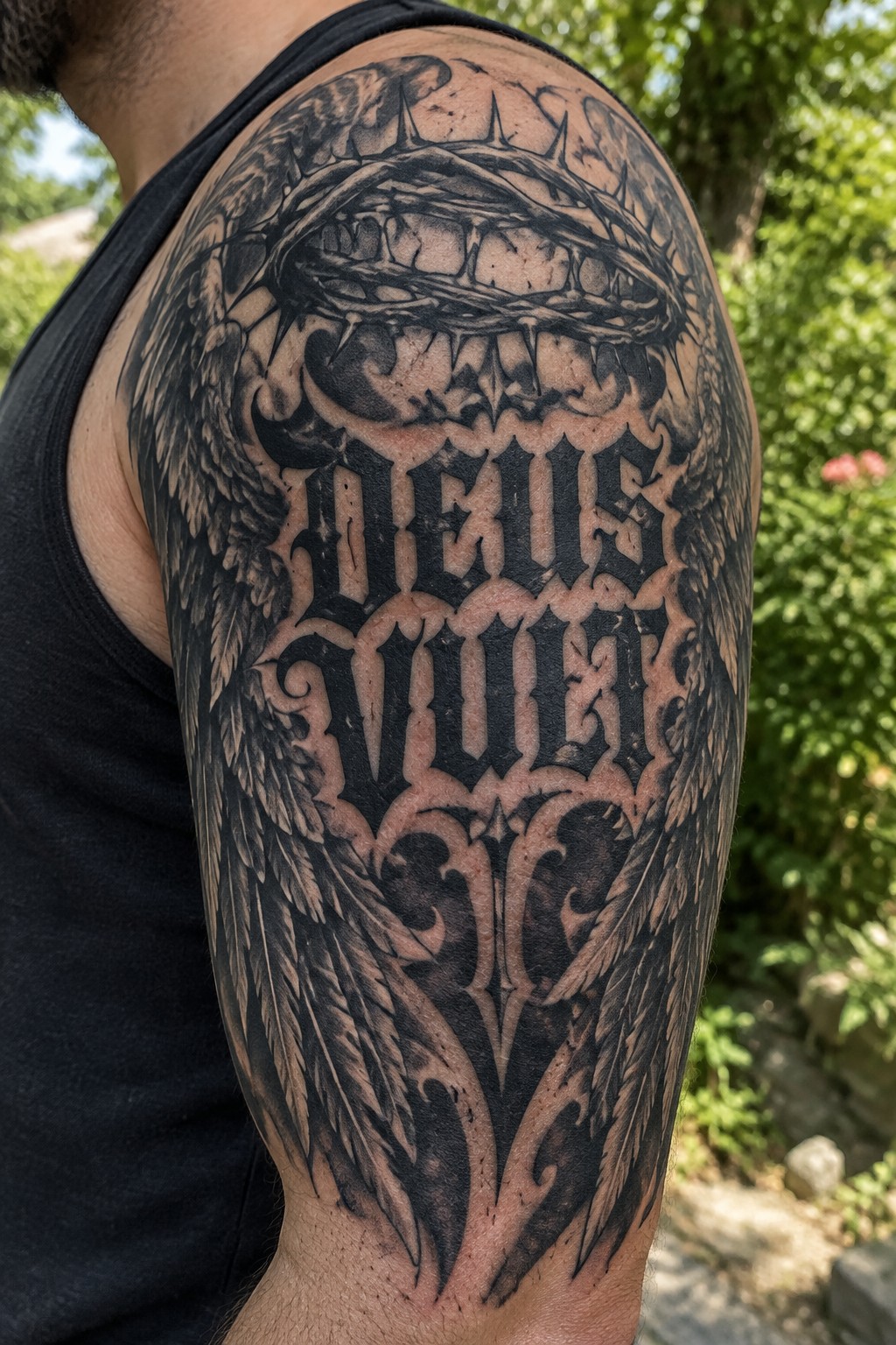
The upper arm works well for this size of piece because the flat surface lets the lettering sit straight and clear. The crown of thorns sits above the text while the wings spread out to the sides and down toward the elbow. Black and grey shading keeps the whole thing bold without needing color.
I like how the gothic lettering stays the main focus even with all the detail around it. The placement also lets the design wrap slightly so it feels like it belongs on the body instead of just sitting on top of it.
Gothic cross tattoo on the upper chest
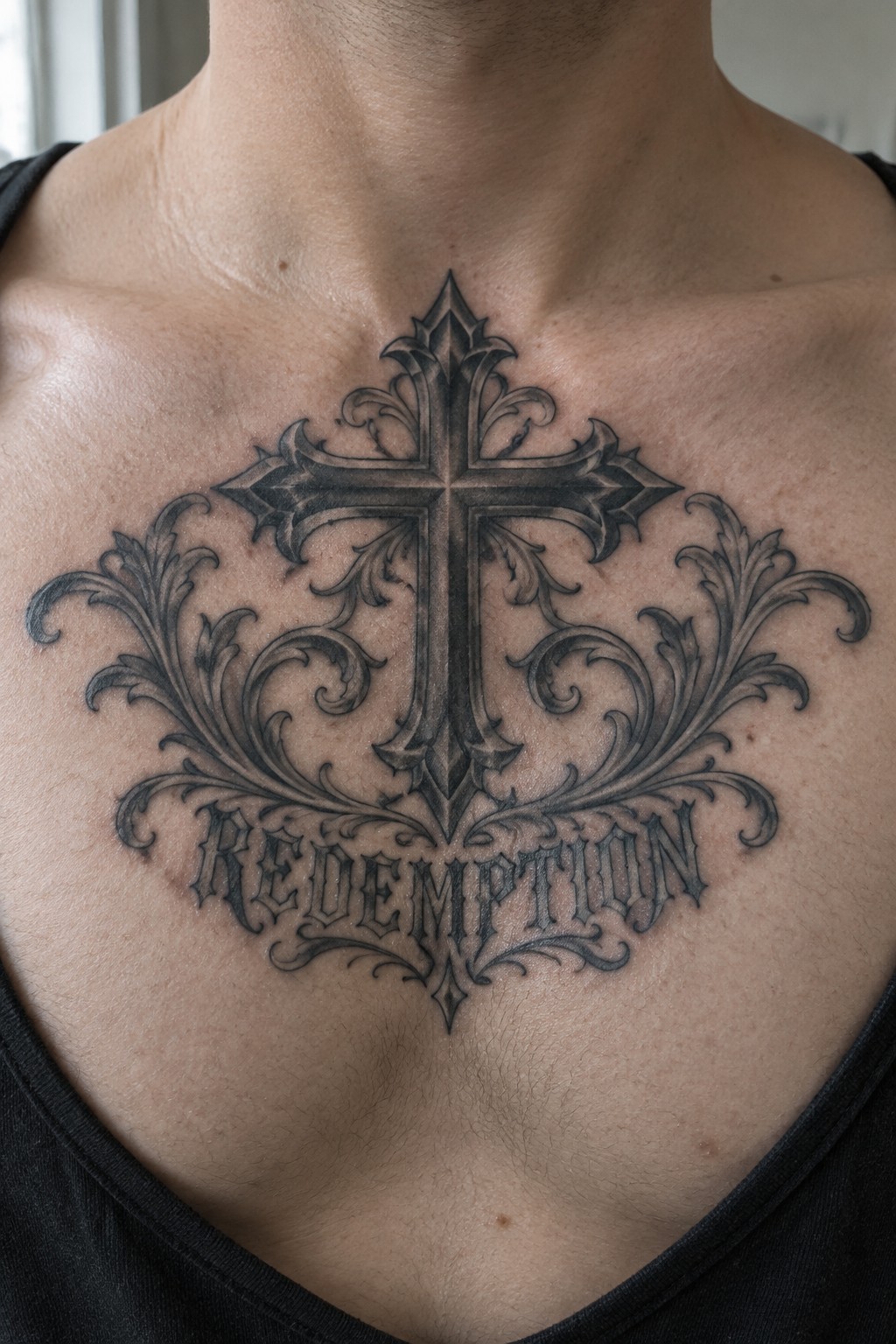
The tattoo sits centered on the upper chest. This placement keeps the cross balanced with the flourishes extending out to each side. The word redemption fits directly below in the same gothic lettering.
I think the chest works well here because the symmetry stays easy to follow from a front view. It also gives the design enough space without pushing too close to the neck.
Rosary tattoo behind the ear
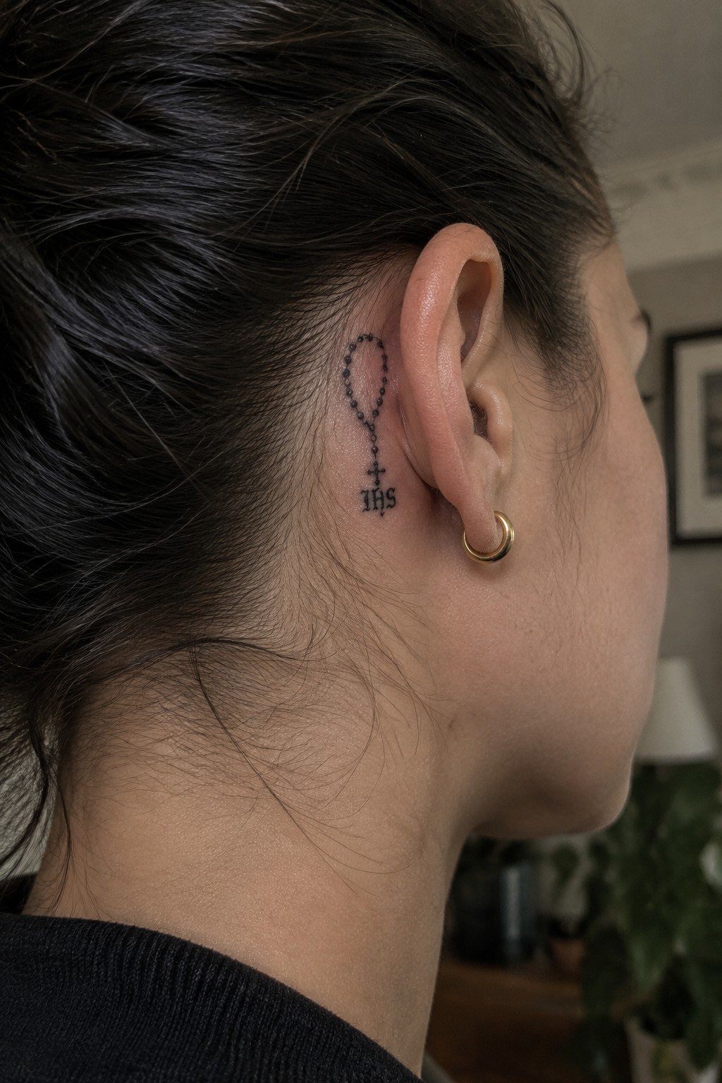
The rosary sits tucked right behind the ear in a narrow space. Small beads run in a short line down to a cross with the letters IHS underneath. This keeps the tattoo compact and mostly out of view unless the hair is pulled back.
I think the placement works well here because the design stays personal without needing much room. The fine lines hold up at this size and the symbols stay easy to read up close.
Gothic text and portrait on the thigh
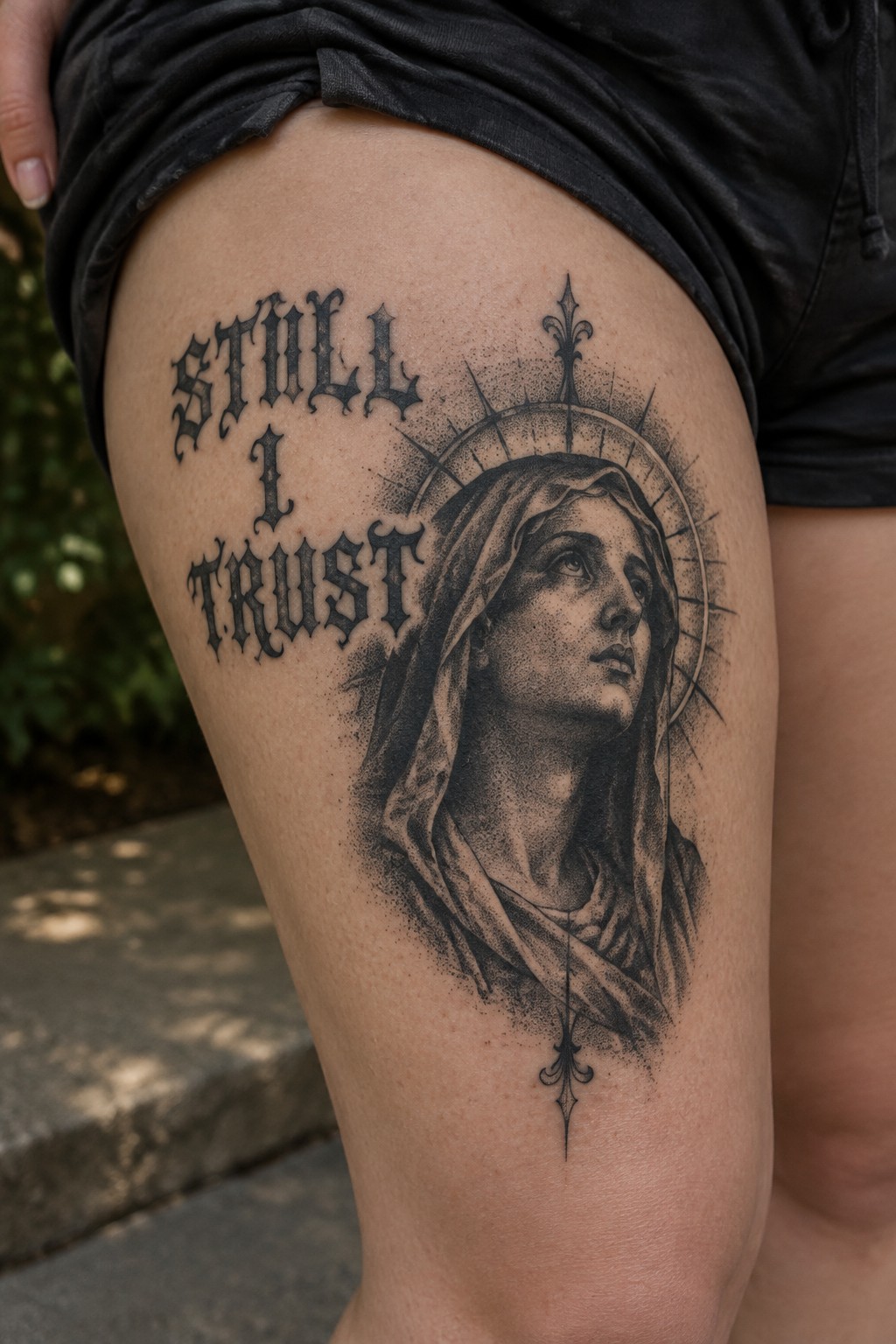
The thigh works well for this vertical layout. The gothic lettering sits above the portrait and leaves room for the small symbol at the bottom. This arrangement lets the text and image read as one connected piece.
I like how the size keeps the lettering bold without overpowering the face. The black and grey work helps the portrait stay clear next to the heavy text.
A crucifixion scene fills the back
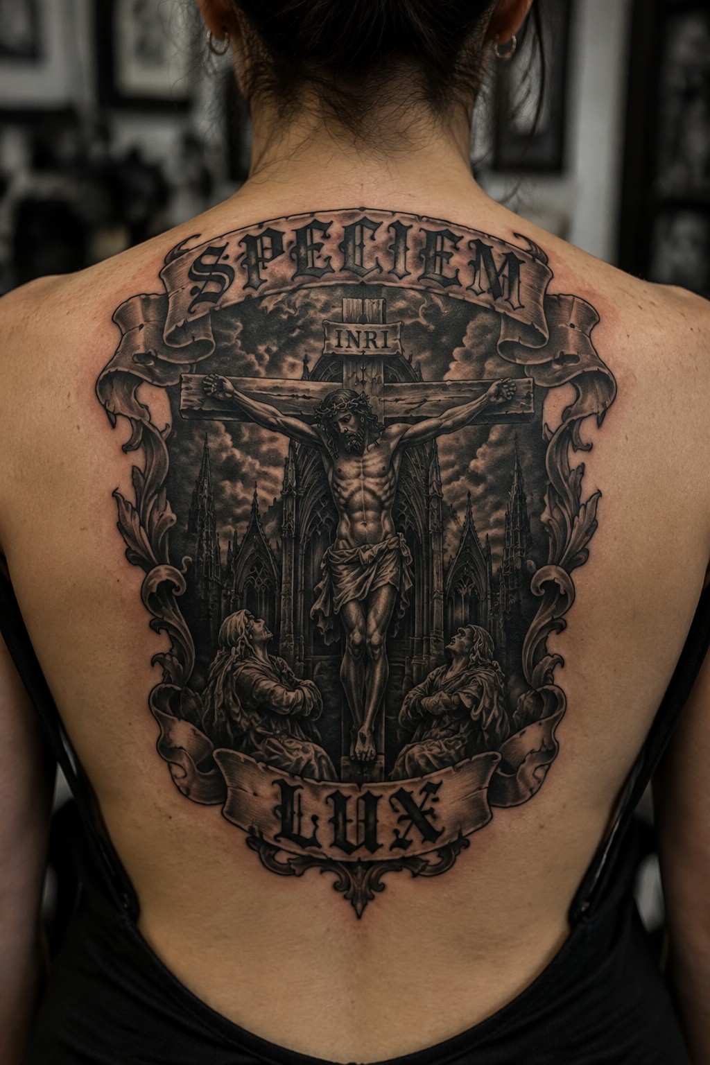
The back gives the room needed for this full crucifixion view. Jesus hangs on the cross with two figures kneeling at the base. Gothic towers rise behind them and banners carry the lettering at the top and bottom.
I picked the back because the width handles the cross arms and the height fits the buildings without squeezing anything. The black and gray shading keeps the whole piece readable even with all the separate parts.
Praying hands on the inner wrist
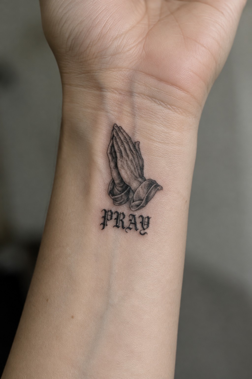
The tattoo sits on the inner wrist. It shows a pair of hands in prayer with the word pray placed directly below in gothic lettering. The hands use realistic shading while the text stays bold and clear.
This placement keeps the whole piece compact and personal. I think the wrist works well here because the design stays easy to read without needing much space.
In this sign tattoo on the collarbone
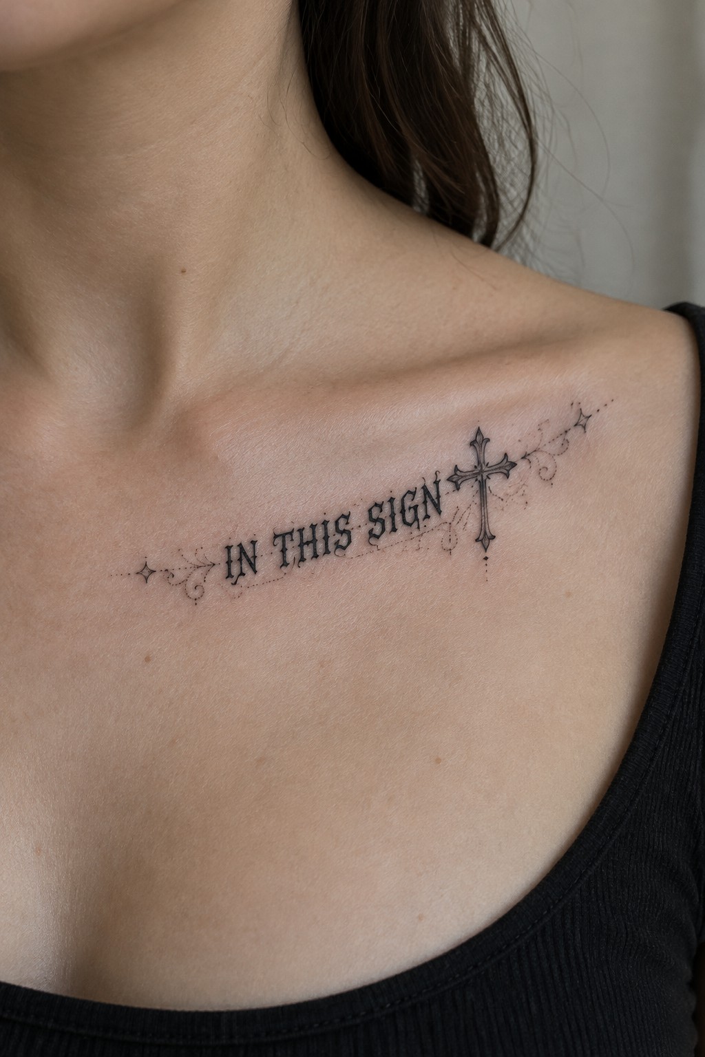
The tattoo runs along the collarbone area in a straight horizontal line. It uses gothic lettering for the words in this sign and places an ornate cross at the right end. Light flourishes and small dots sit on either side to frame the text.
This spot keeps the full phrase easy to read while letting the cross stand out as a clear ending point. I think the layout works because the text and symbol stay balanced without needing extra space.
Virgin mary tattoo runs down the side
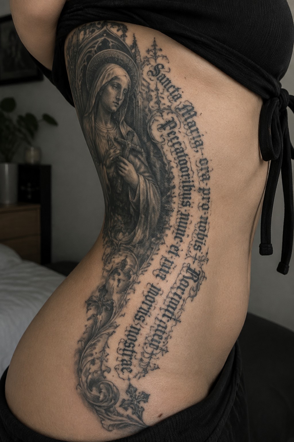
The tattoo covers the side of the torso in a tall vertical layout. It places the virgin mary figure near the top and lets the gothic text and smaller religious details flow downward from there. This setup uses the full length of the area without feeling squeezed.
I think the side placement works because it gives the lettering enough room to stay readable at this scale. The vertical flow also keeps the whole piece from looking top heavy.
Finger tattoos with a chalice and initials
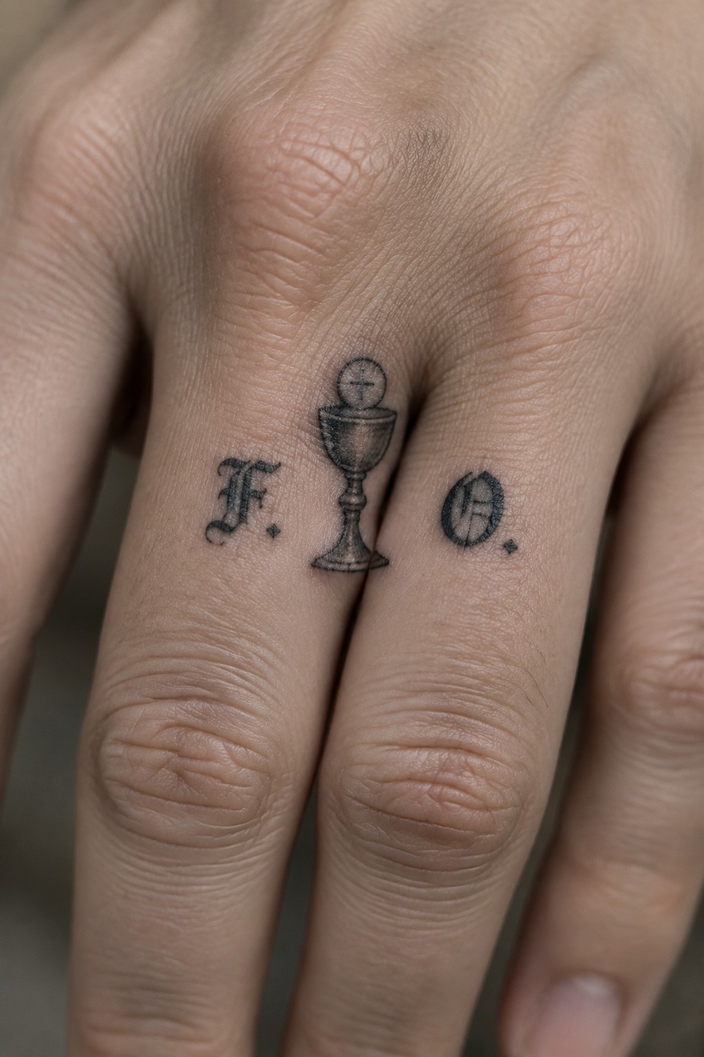
The tattoos sit across three fingers in a row. A small chalice with a cross on top sits in the middle while the letters rest on the sides in the same dark style.
This placement keeps the whole idea compact and personal. The size stays modest so the symbols read clearly without filling the finger. I think the layout works because it turns a simple religious image into something that feels private rather than loud.
Domine lettering with thorns spans the chest
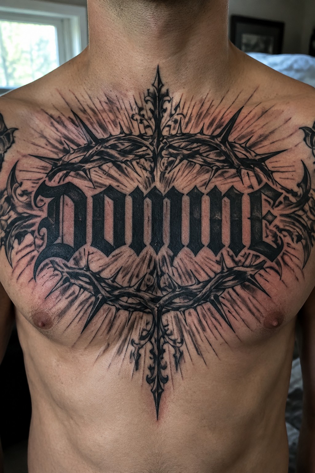
The tattoo sits centered on the chest in a wide format. Large gothic letters spell domine with thorny branches wrapped around the top and bottom. Radiating lines fill out the edges and keep the whole piece balanced.
This placement works because the symmetry of the lettering and thorns lines up with the body. I think the thorns give the text more presence without making it feel crowded.
Framed portrait tattoo on the upper back
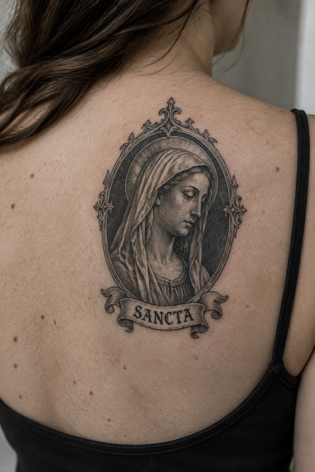
The tattoo sits centered on the upper back. An oval frame holds the portrait of a veiled woman with the banner reading sancta underneath. The black and grey shading keeps the whole design compact and contained.
I picked this placement because it gives the frame natural balance without pulling on the shoulders. The scale also lets the lettering stay readable while the outer details do not get lost.
A large crucifix tattoo covers the back of the hand
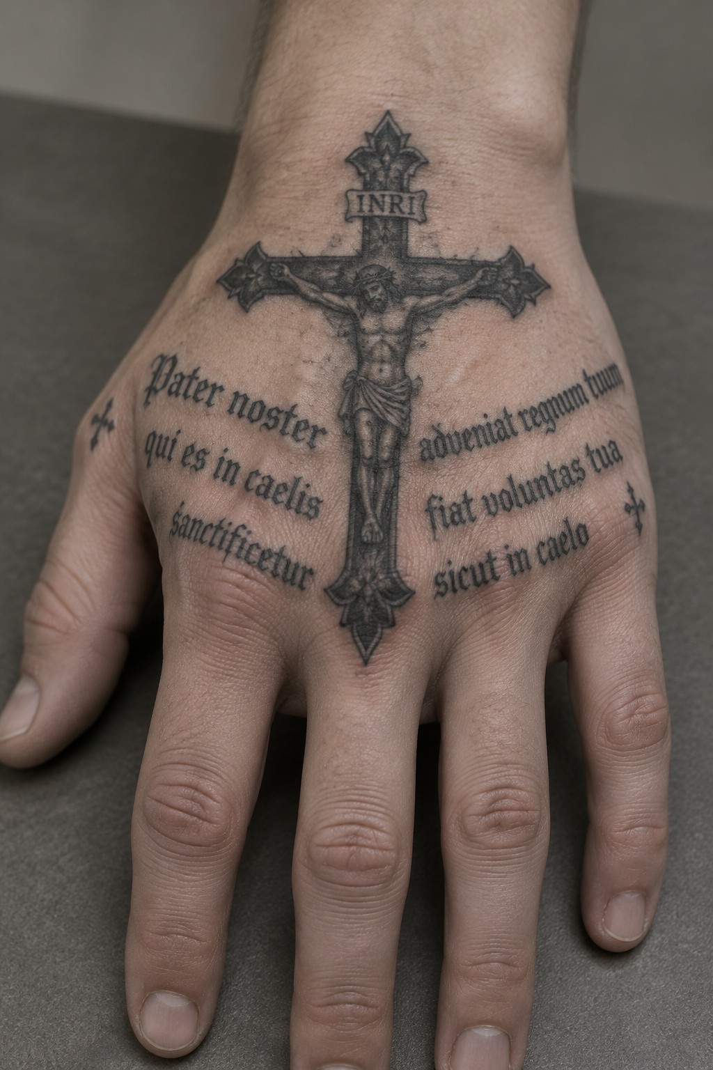
The design centers on a full crucifix with the figure of Jesus. Latin text from the Lord’s Prayer runs down both sides in dark lettering. Small crosses mark the sides of the hand for balance.
The hand placement keeps the vertical cross straight and easy to read. I think the scale works because it lets the central image stand out without needing extra shading or color.
The upper arm holds a large forgive tattoo with a skull
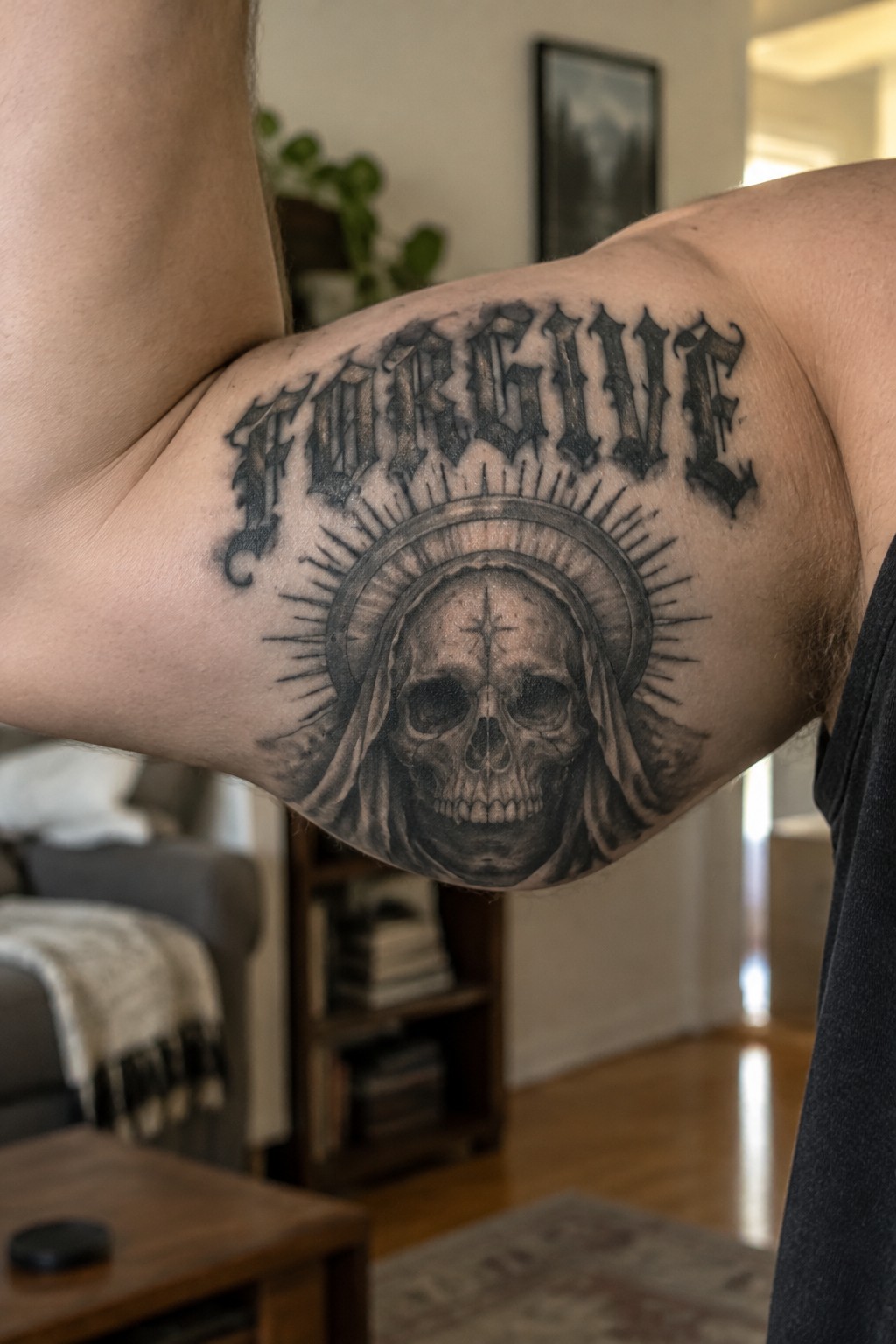
The upper arm gives enough space for the full lettering to sit above the skull without crowding. The halo and rays spread across the area while the hooded skull stays centered.
I think the gothic lettering fits the religious skull because both elements stay bold at this size. The placement keeps the text readable even when the arm moves.
Serenity prayer tattoo on the side
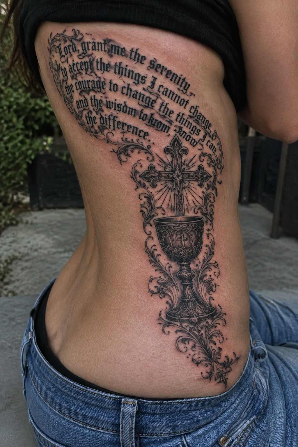
The tattoo follows the curve of the ribs and stretches vertically along the side. The prayer text arcs around the central cross and chalice so the words remain easy to read. Ornate swirls connect the lettering to the symbols without crowding the space.
This layout suits the length of the prayer because the design has room to breathe from top to bottom. I think the placement keeps the piece balanced even when the body shifts.
Frequently Asked Questions
1. What does Gothic style add to traditional Christian tattoo designs? Gothic style brings a dramatic and ancient feel to Christian symbols through the use of bold black lettering in old English fonts and shadowy details around images like crosses or saints. This approach creates a sense of mystery and reverence that highlights the depth of faith without straying from sacred themes.
2. Is it appropriate for Christians to choose dark lettering in their tattoos? Many believers find dark lettering enhances the solemn and timeless quality of Bible verses or prayers making the tattoo a powerful personal reminder of their devotion. As long as the imagery stays respectful and focused on positive spiritual elements it aligns well with Christian values of expressing faith creatively.
3. How can I select the right tattoo artist for intricate sacred imagery? Look for artists who have experience with both gothic lettering and religious motifs by reviewing their portfolios for clean line work and shading in black ink. Schedule consultations to discuss your ideas and ensure they understand how to balance dark tones with clear sacred symbols that hold personal meaning for you.
4. What body placements work best for these types of tattoos? Areas like the forearm chest or upper back allow for larger designs with detailed lettering and imagery while remaining visible or easily covered. Consider how the tattoo will age on curved body parts and choose spots where the skin stays relatively stable to preserve the sharpness of dark elements over time.
5. What aftercare steps help gothic tattoos with fine details heal well? Keep the area clean and moisturized using fragrance free products while avoiding sun exposure during the first few weeks to prevent fading in the black ink. Follow your artists specific instructions and watch for any irritation since intricate designs can take longer to settle into the skin properly.
