

I adore scripture tattoos for the way they let me wear my faith like a secret smile on my skin. Short verses with compact lettering fit my love for subtle details that still carry big meaning. My own small collection has taught me that these designs spark joy every time I catch a glimpse. You will find plenty of fresh inspiration waiting in the ideas ahead.
Small script on the wrist
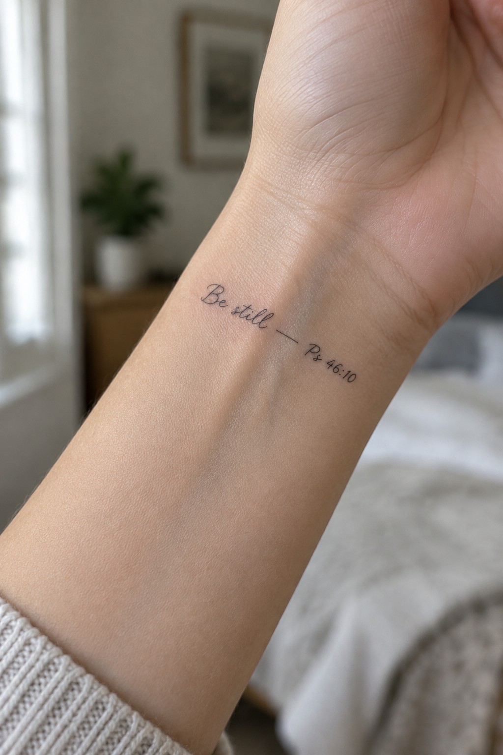
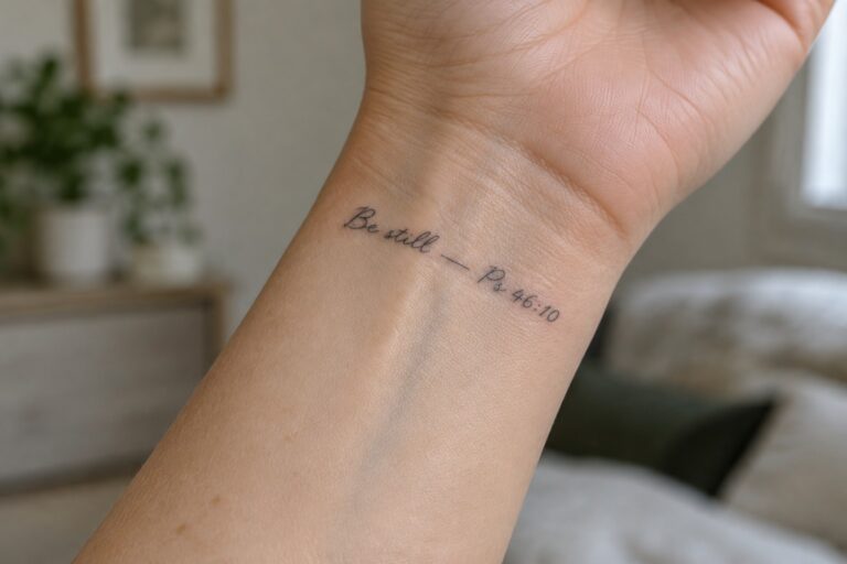
The words “Be still” from Psalm 46:10 sit in a thin cursive line along the inner wrist. The compact lettering stays close together with the reference placed right after. This size lets the tattoo rest in a natural spot without crowding the skin.
The light style suits the calm verse because it avoids any heavy look. I think the thin lines help it feel personal while still staying clear at this scale.
Short verse on the inner forearm
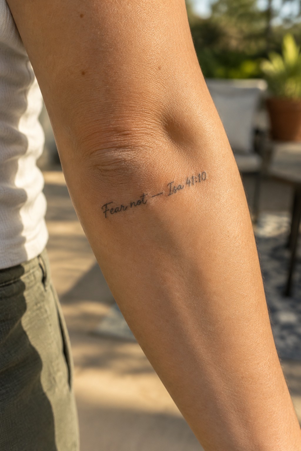
The inner forearm keeps this tattoo in a spot that shows during normal movement but stays covered at rest. The text sits along the arm’s natural line so the words stay straight and easy to read. This area gives enough room for the full reference without needing extra space.
The fine cursive keeps the whole piece light on the skin. I think the small scale works because the letters stay clear even up close. It suits someone who wants the verse visible to themselves more than to others.
Side placement keeps this verse tattoo straight and simple
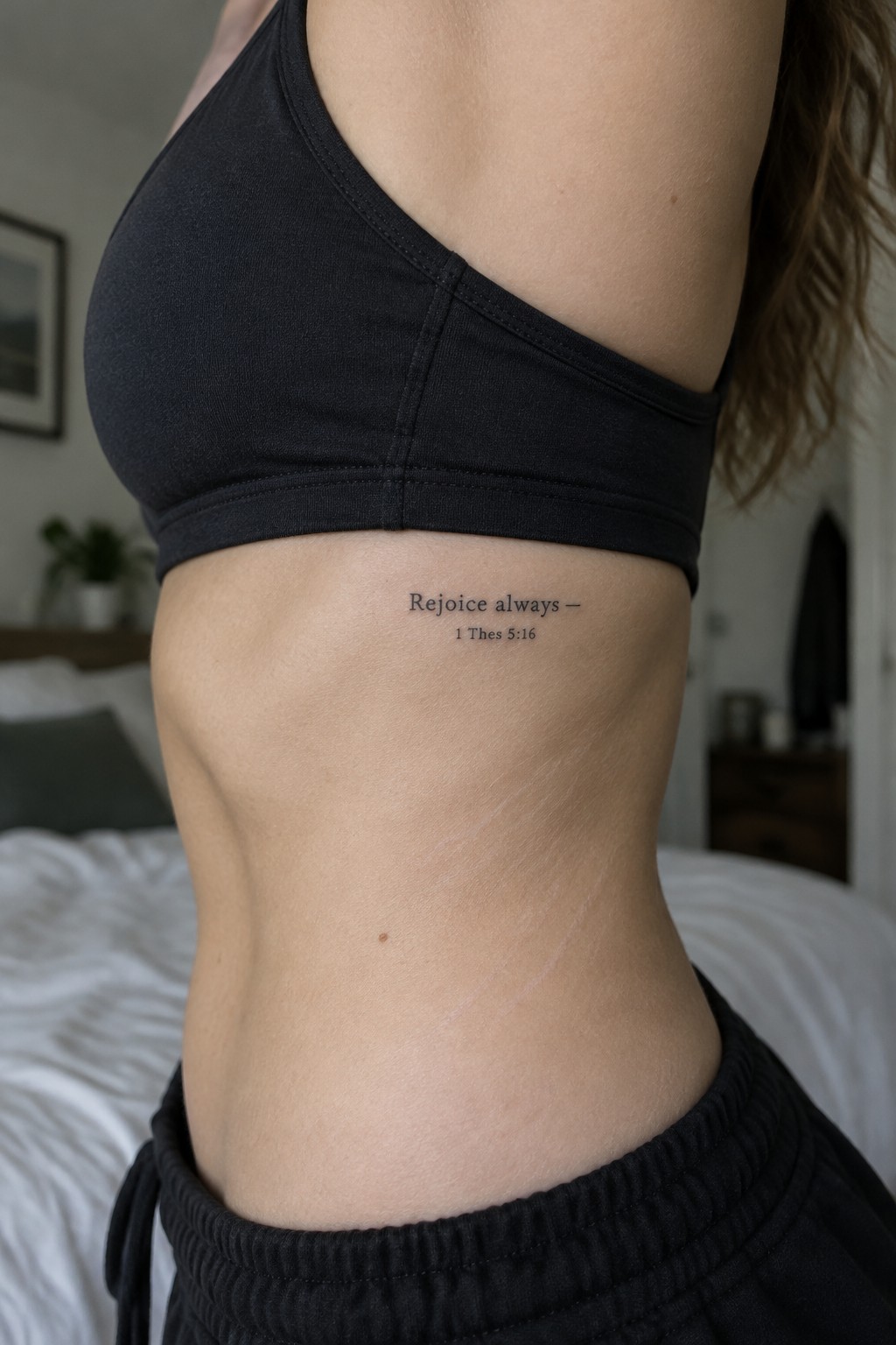
The tattoo sits horizontally on the side torso just below the ribs. This spot lets the short line of text stay level and readable without following any body curve. The lettering uses a plain thin font that fits the small overall size.
I like how the placement keeps the verse feeling personal rather than bold or public. The reference sits directly under the main text in the same clean style so nothing competes for attention. The whole piece stays compact enough that it does not need extra shading or detail to work.
Short verse on the collarbone
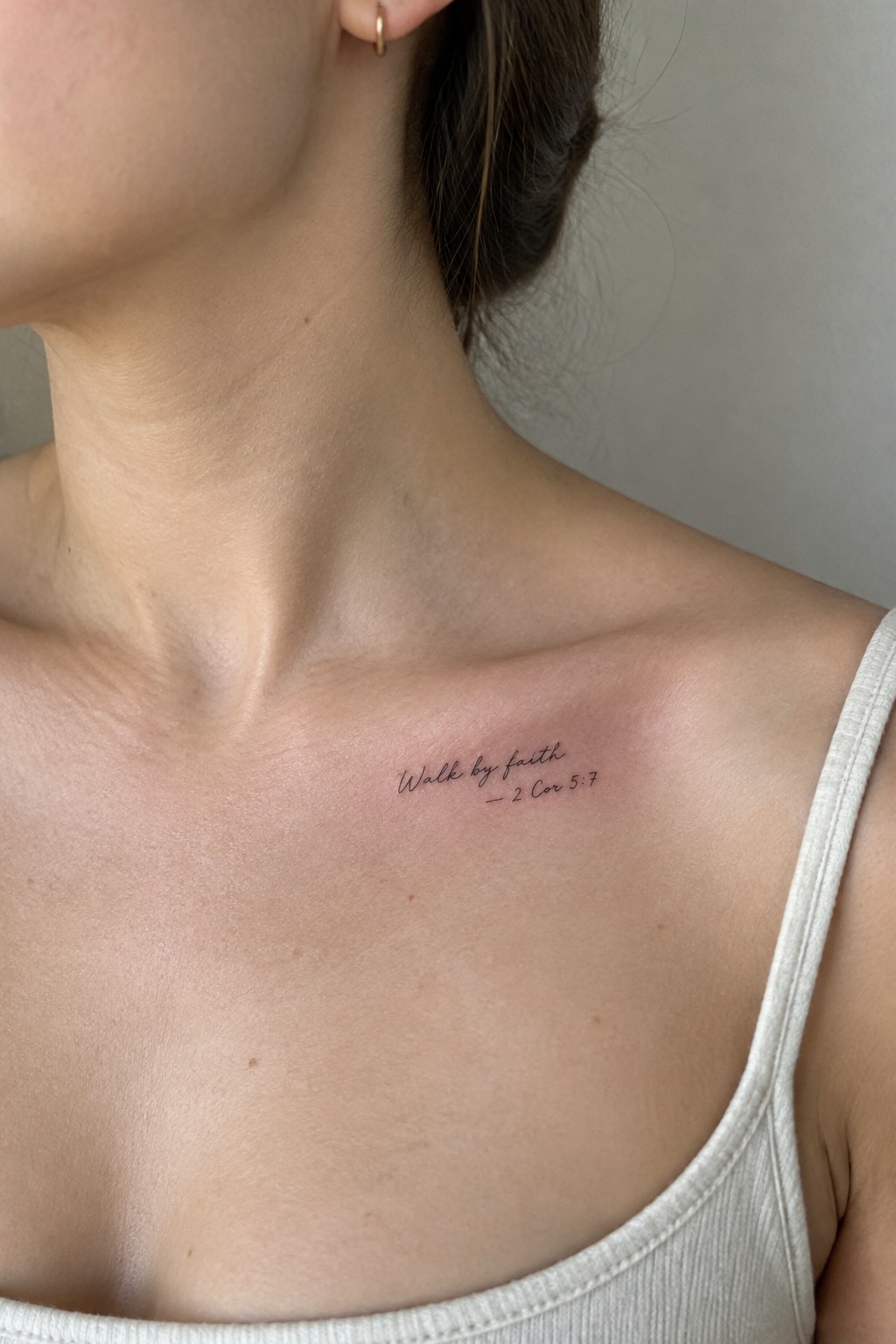
The collarbone gives this tattoo a visible but personal spot. The text uses fine cursive and stays small enough to fit the area without crowding. It includes the reference right below the main line.
I think the compact scale works because it leaves room around the words. The placement also keeps the tattoo easy to cover or show depending on the outfit.
Small verse behind the ear
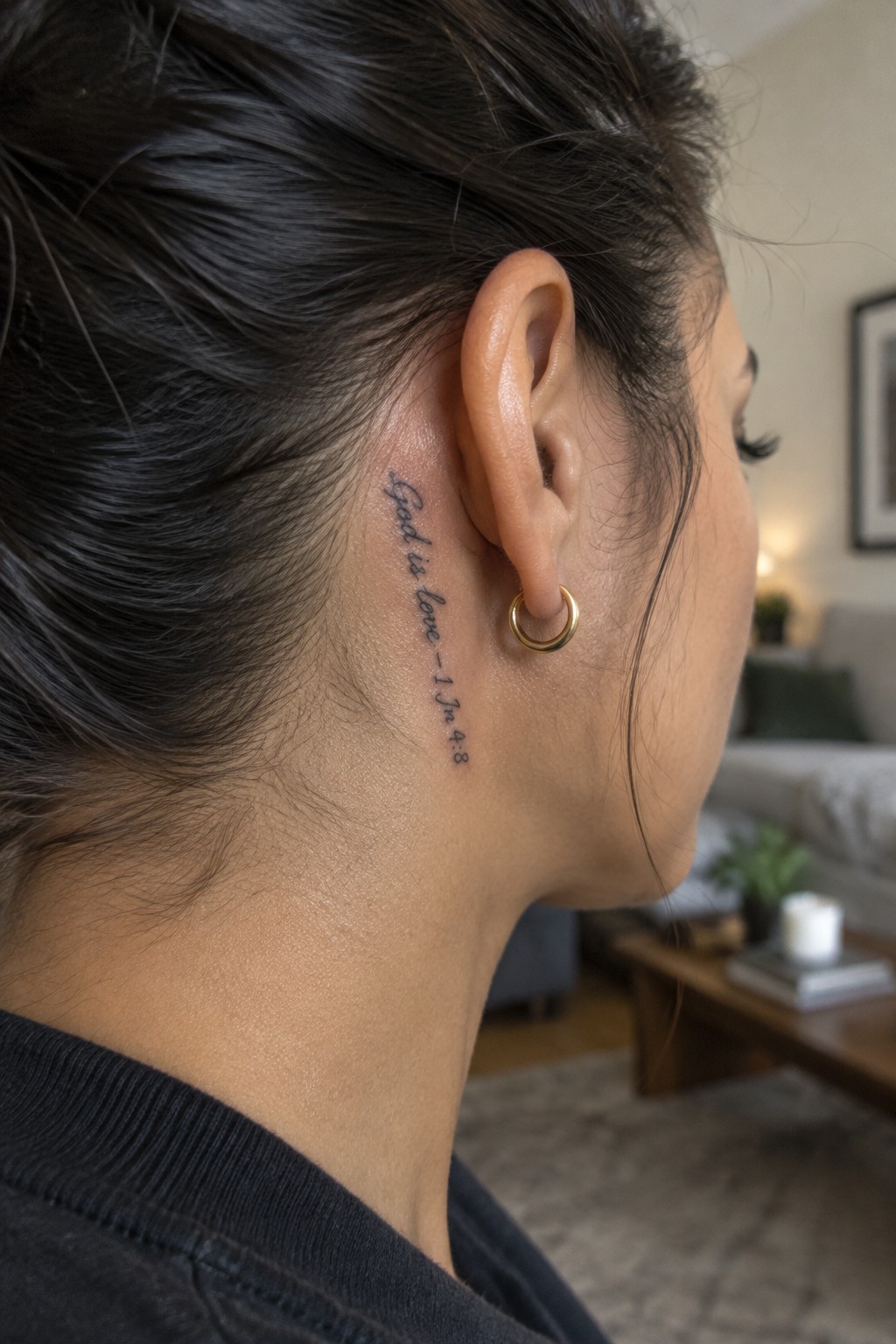
The tattoo sits tucked in the narrow space right behind the ear. Thin script runs vertically to match the natural line of the neck. The verse stays short so it fits without spreading out.
This spot works because it stays mostly hidden unless the hair is pulled up. I think the compact size keeps the lettering clear while avoiding any bulk in a small area.
Upper chest tattoo with a short scripture verse
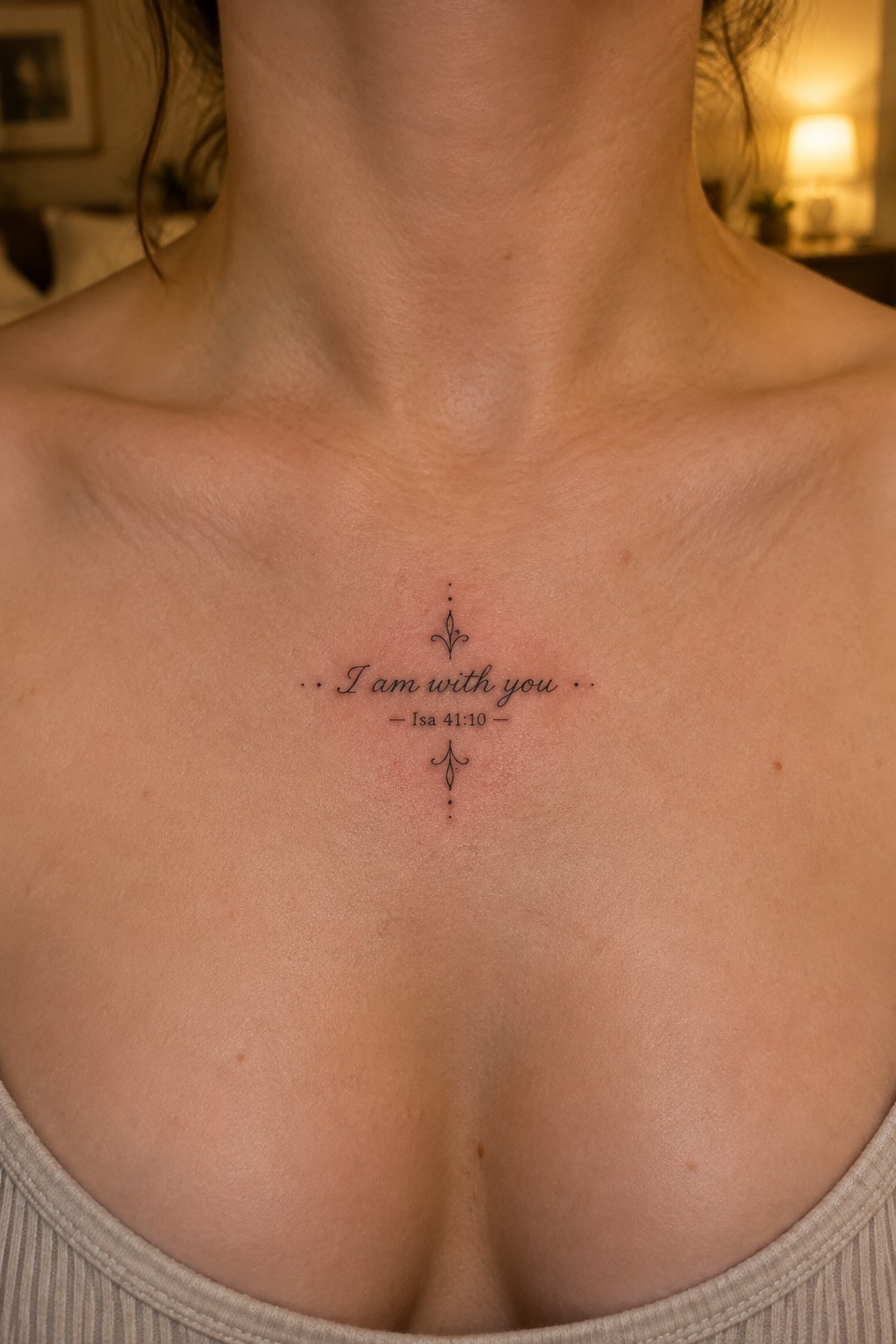
The upper chest gives this verse tattoo a centered spot that stays visible in many necklines. Small lettering keeps the full phrase readable while the minimal flourishes sit above and below without adding bulk. The fine line work stays light against the skin.
I think the placement makes sense because the design stays balanced on the sternum and does not need heavy shading to hold attention. The compact size also leaves room for the text to breathe.
Small verse on the ankle
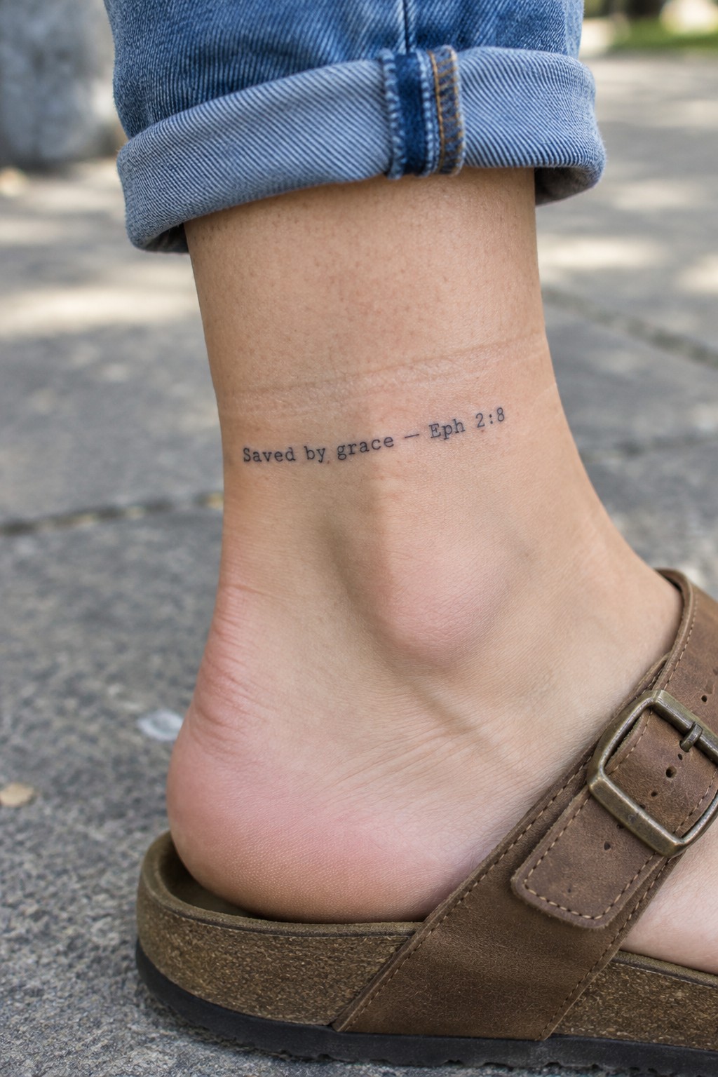
The tattoo sits on the outer ankle in a compact script. The short verse fits neatly into the space without crowding the skin. Simple lettering keeps the reference clear even at this reduced size.
I picked the ankle because it works for a personal note that stays mostly covered. The scale feels right for daily wear without drawing constant attention. It reads as a quiet reminder rather than a bold display.
Side finger tattoo with a philippians verse
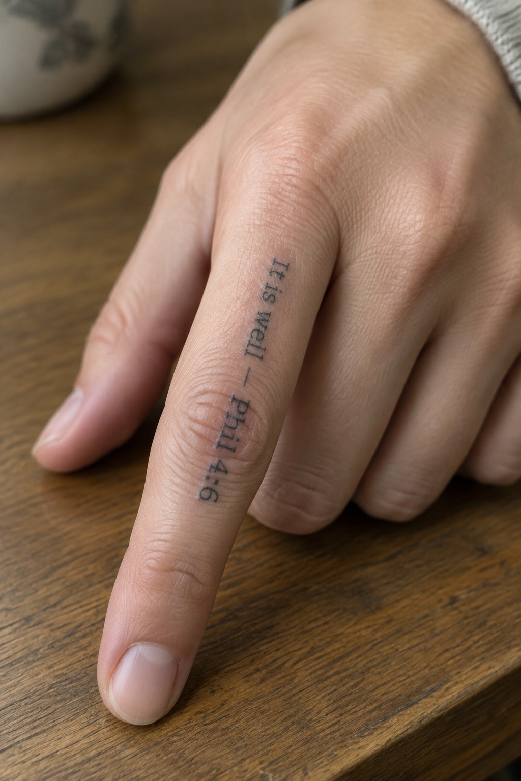
The text runs vertically down the side of the finger in small black lettering. This spot keeps the words visible when the hand rests flat but stays mostly out of the way during daily use. The compact size fits the narrow surface without wrapping around the skin.
I think the vertical layout works because it follows the finger’s length instead of fighting it. The simple font also helps the reference stay clear even at this scale.
A small scripture tattoo on the upper arm
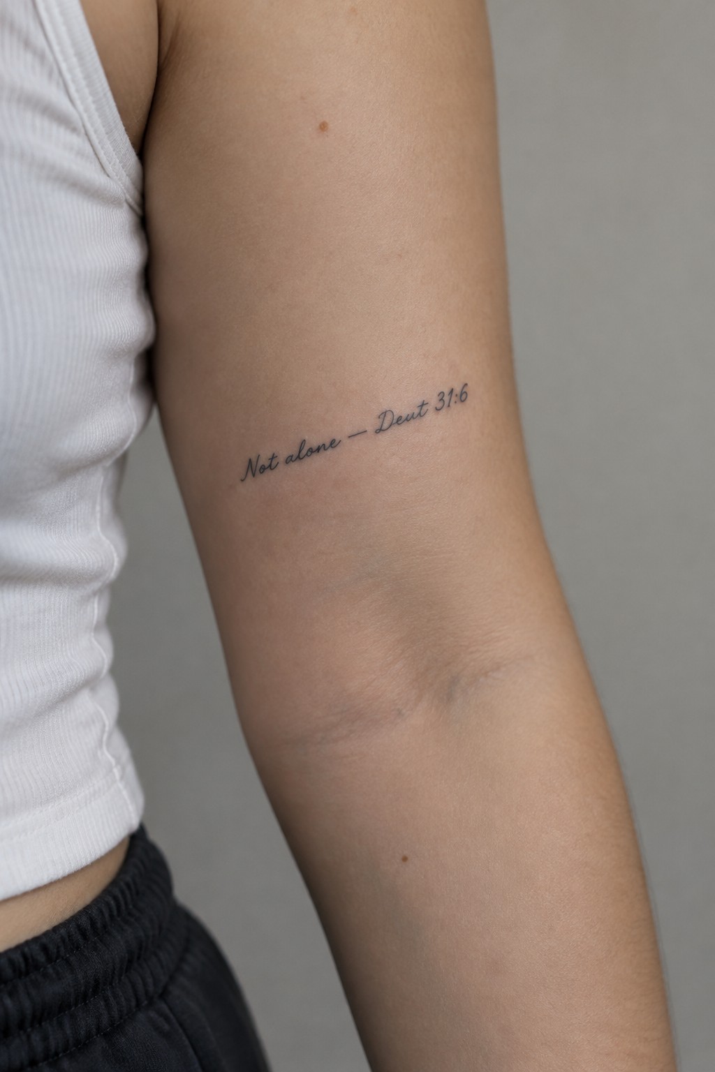
The upper arm gives this tattoo room to sit without drawing constant attention. The short verse runs in a light script that follows the natural shape of the arm. It stays compact so the reference stays clear even at a modest size.
I think the placement works because it lets the text rest where the skin moves less. This keeps the lettering from distorting over time while still making the words easy to read up close.
A compact verse on the shoulder
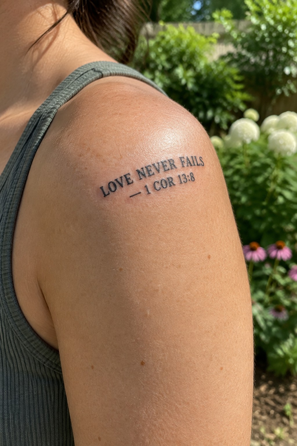
The shoulder gives this short scripture enough room to sit flat without looking cramped. The lettering stays tight and clear at this size. It rests on the muscle area where the skin moves less over time.
I think the plain font choice keeps the focus on the words instead of the style. This setup works because the verse is brief enough to stay balanced on its own.
Spine placement for this verse
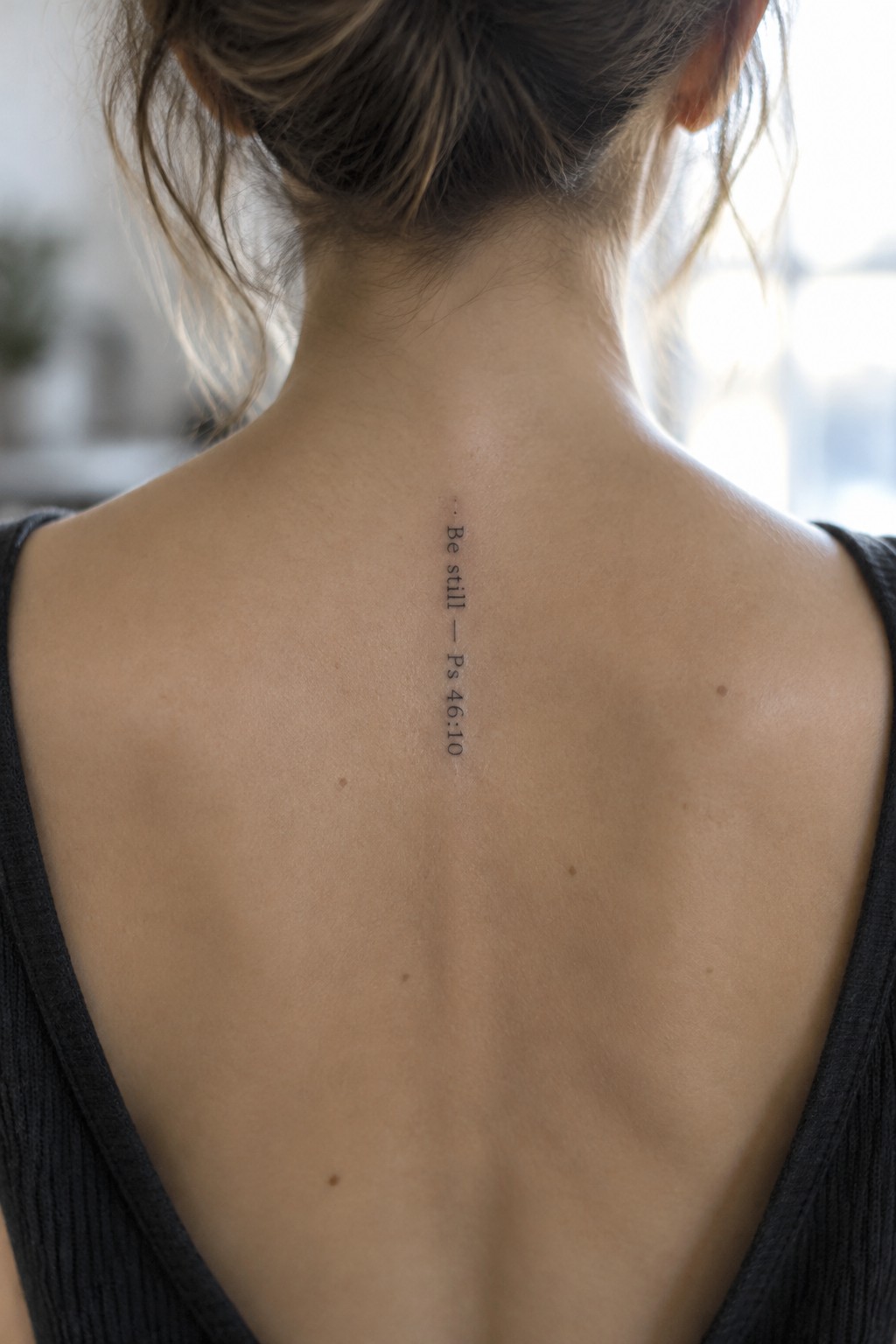
The tattoo runs vertically along the upper spine. This lines up the short verse in a straight column that follows the natural center of the back. The compact lettering stays tight and clear without spreading out.
I think the spine works for this one because it lets the text sit in a single clean line. The small scale keeps the whole thing understated while still making the reference easy to read.
Short scripture text on the upper back
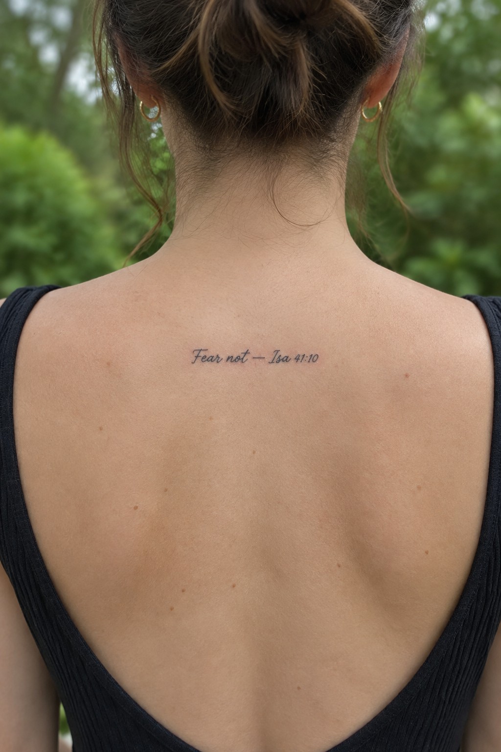
The tattoo sits centered between the shoulder blades. It uses compact cursive lettering for the phrase and reference without any added lines or shading. The size stays small enough to remain subtle on bare skin.
I think the upper back works here because the text stays mostly covered yet easy to show. The plain lettering keeps the message clear at this scale.
Philippians 4:13 across the thigh
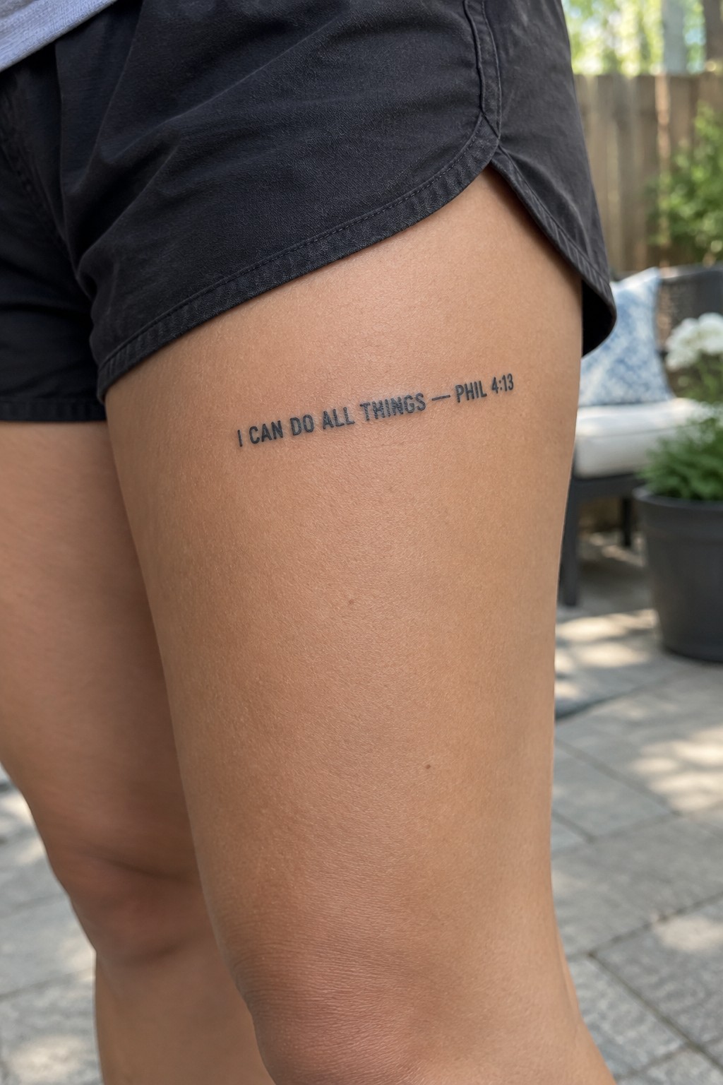
The upper thigh offers a smooth area that keeps this line of text straight and level. The compact lettering sits in one clean row without any stacking or curves. Simple black ink lets the verse read clearly at this scale.
I think the horizontal layout works because it matches the natural width of the spot. This keeps the tattoo minimal while still giving the full reference.
Psalm 23 verse on the inner wrist
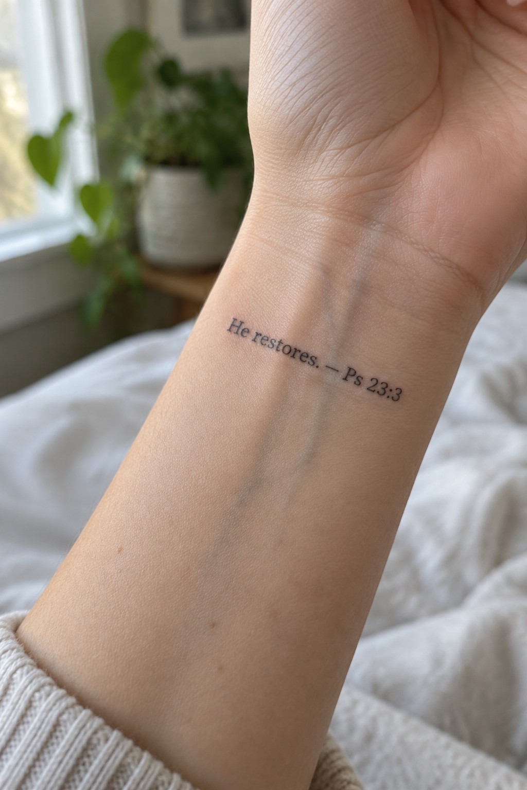
The tattoo sits on the inner wrist in small fine line lettering. It reads “He restores” with the reference right beside it. The compact size keeps the text clear while leaving room on the arm for other pieces later.
I like how the placement lets the words stay personal without drawing attention unless the wrist turns. The thin lines also help it blend with the skin instead of standing out as a heavy block of text.
Short scripture tattoo on the lower back
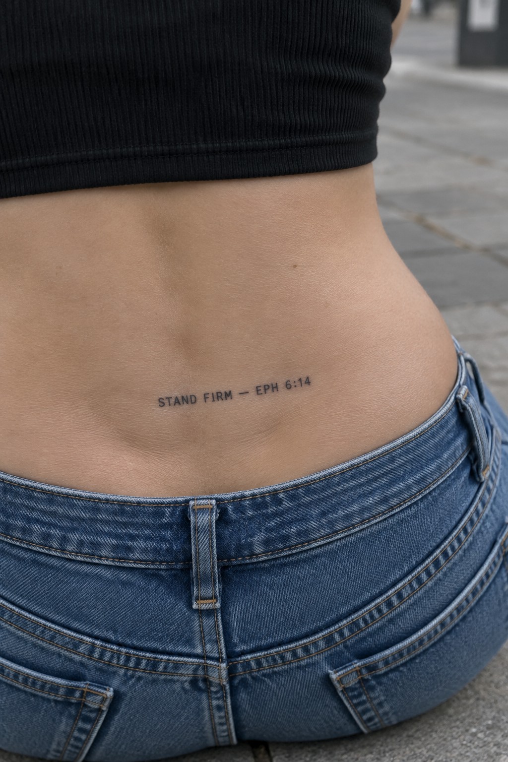
The lower back gives this text tattoo a flat area that keeps the lettering straight and easy to read. The words sit just above the waistband so they stay covered most of the time. The compact size fits the space without spreading too wide.
I think the simple font choice works because it avoids any extra lines that could blur over time. The placement also lets the verse stay personal rather than front and center.
Nape placement for a compact bible verse
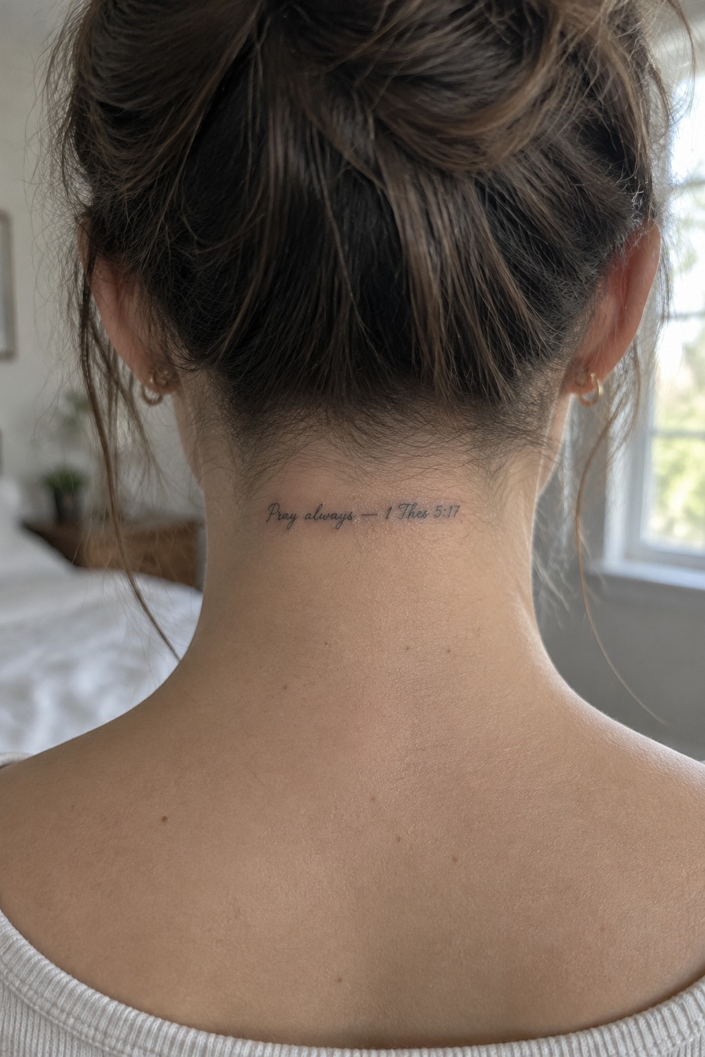
The tattoo sits low on the nape in a thin cursive script. This spot keeps the words mostly hidden under hair but visible when it is tied up. The compact size fits the width of the neck without stretching the letters.
I think the thin lines suit this verse because they keep the focus on the words instead of the design itself. The reference stays legible at this scale so the reminder reads clearly without extra detail.
Small scripture text on the ankle
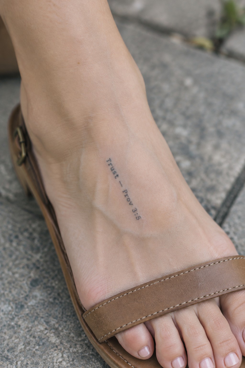
The tattoo sits on the inner ankle in a vertical line. The compact lettering uses a plain font that fits the narrow space without crowding. This placement keeps the verse visible but contained to a small area of skin.
I think the ankle works for this because the text stays clear even at a modest size. The simple style also helps it blend with everyday footwear like sandals.
Scripture tattoo on the side of the calf
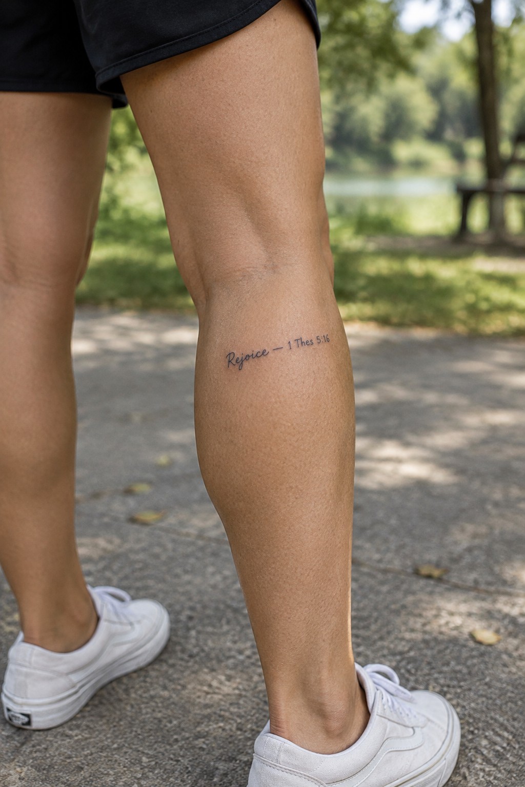
The text sits on the outer calf in a slim cursive style. This spot gives the lettering a flat surface and keeps the design compact without any crowding. The short verse fits the space well and stays clear even from a short distance.
The placement works because the tattoo shows up during movement but does not demand attention when the leg is still. It feels like a personal note rather than a large display.
Scripture text in fine script on the thigh
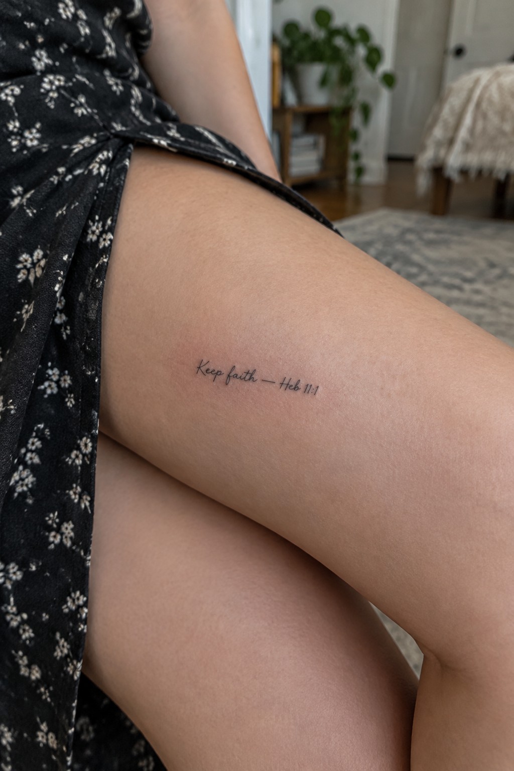
The tattoo uses a short phrase from Hebrews in thin cursive lettering. It sits on the upper thigh where the skin stays smooth and the text stays compact. The reference follows right after the words without extra decoration.
The fine lines keep the verse from feeling heavy or loud. I think this style works because it matches the personal nature of the message while staying easy to read up close.
Small scripture tattoo on the hand
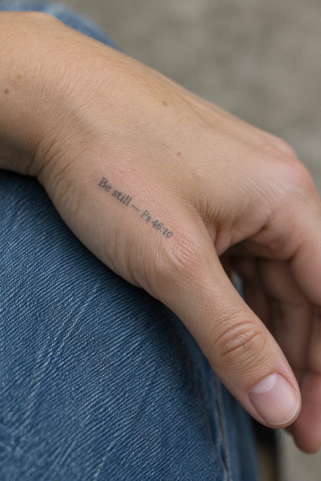
The side of the hand gives this verse a spot that stays visible without needing much space. The compact lettering sits neatly along the skin and does not stretch or distort when the hand moves. A design like this works as a quiet daily reminder rather than a large statement piece.
I like how the plain script keeps the words clear at this size. It avoids extra details that could crowd the area and lets the message stand on its own.
Scripture on the inner forearm
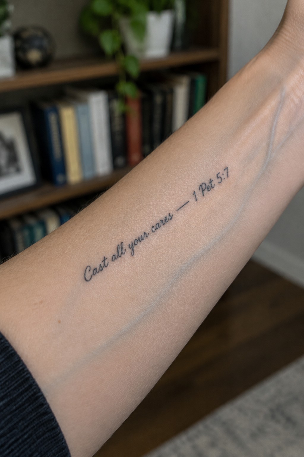
The inner forearm gives this verse a natural flow along the arm. The text sits in a compact script that stays easy to read at this size. It fits the area without needing extra detail or shading.
I think the placement works because the person can see the words when they want to without it being constantly visible to others. The fine lines also help the tattoo feel light on the skin rather than heavy.
Small lettering on the inner wrist
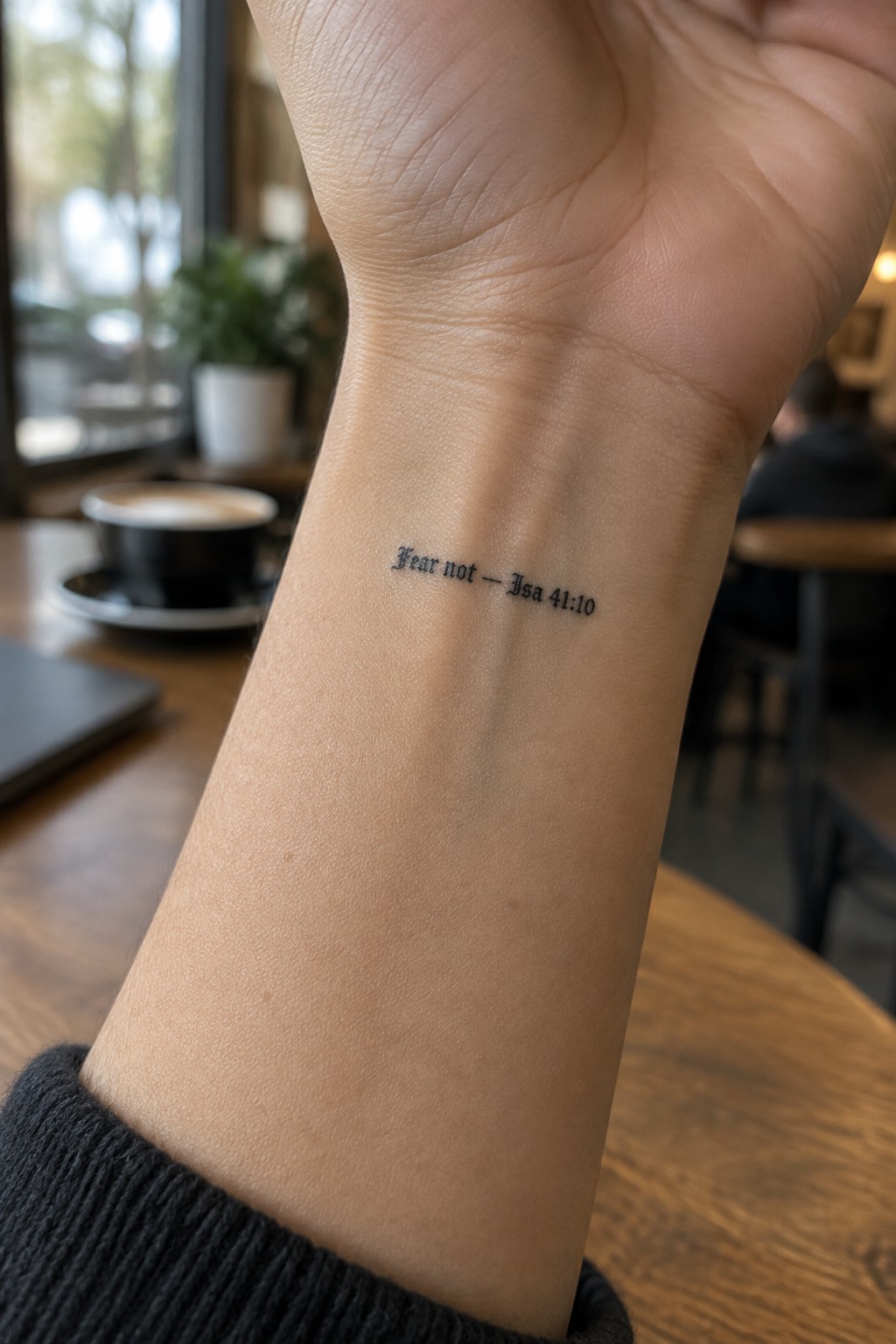
The inner wrist places this short verse where the wearer sees it often throughout the day. The compact text fits neatly along the narrow space without crowding the skin. Simple script keeps the design minimal and easy to maintain.
I think the small scale works because the reference stays legible without needing extra elements. The plain lettering also lets the words stand out on their own in that spot.
Grace tattoo placed along the collarbone
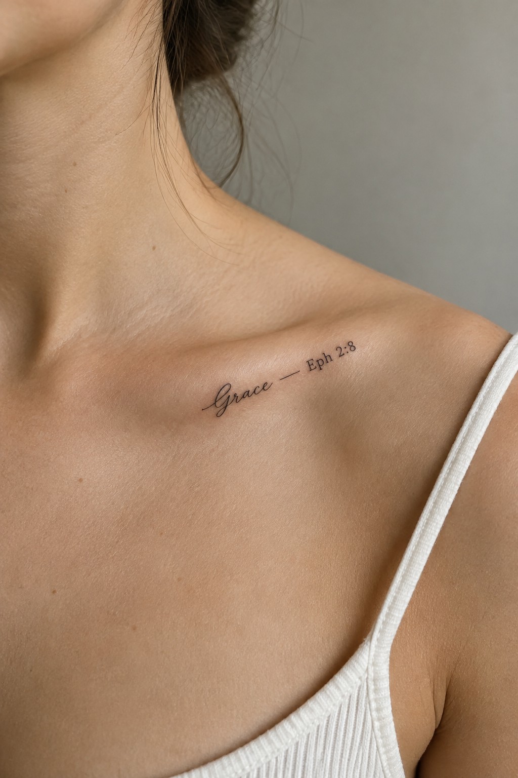
The collarbone creates a natural home for this small piece of lettering. The fine script follows the bone line without crowding the area. Eph 2:8 stays short so the whole design remains compact and clear.
I like how the simple dash keeps the two parts connected without adding weight. This spot works when the goal is to keep the verse visible to the wearer but still somewhat private.
Frequently Asked Questions
What are the best short Bible verses for a compact tattoo design? Short verses like Philippians 4:13 or Joshua 1:9 work well because they convey strength and faith in just a few words. Readers often select verses that hold personal meaning, such as those tied to a life event or daily encouragement. To choose one, reflect on your favorite passages and test how they look in a small font size before committing.
Where on the body should I place a small scripture tattoo with compact lettering? Ideal spots include the wrist, ankle, inner forearm, or behind the ear since these areas allow for discreet placement and minimal stretching of the skin over time. Avoid high-movement areas like the fingers if possible, as they can cause the fine lines to fade faster. A skilled artist can suggest adjustments based on your skin tone and lifestyle.
How do I ensure the compact lettering in my scripture tattoo stays legible for years? Choose a font that balances elegance with clarity, and work with an artist who specializes in fine line work to avoid overly thin strokes that blur. Regular moisturizing and sun protection help maintain the ink quality. Many people schedule a touch-up session after one year to refresh any details that soften with natural skin changes.
What aftercare steps support the healing of a small tattoo with detailed lettering? Clean the area gently with unscented soap twice daily, apply a thin layer of fragrance-free moisturizer, and avoid soaking the tattoo in water for the first two weeks. Wear loose clothing over the site to prevent irritation. Following these steps reduces the risk of scabbing that could affect the crisp appearance of the verse.
How can I find a tattoo artist experienced with scripture designs and small text? Look for artists whose portfolios show multiple examples of fine lettering and religious themes, then read recent client reviews for consistency in small-scale work. Schedule a consultation to discuss your verse and lettering preferences in advance. This step helps confirm they understand how to adapt the design for your chosen placement without crowding the text.
