

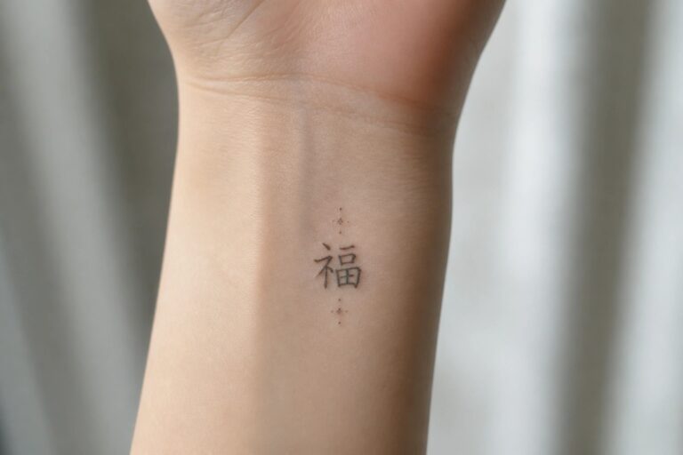
I have fallen in love with fine line Chinese tattoos for their delicate charm and deep meanings. My collection of inspiration keeps growing because these designs never fail to impress. Some people love bold statements but I prefer the quiet elegance these tattoos offer. They turn simple lines into stories that feel both personal and timeless.
Fine line character on the inner wrist
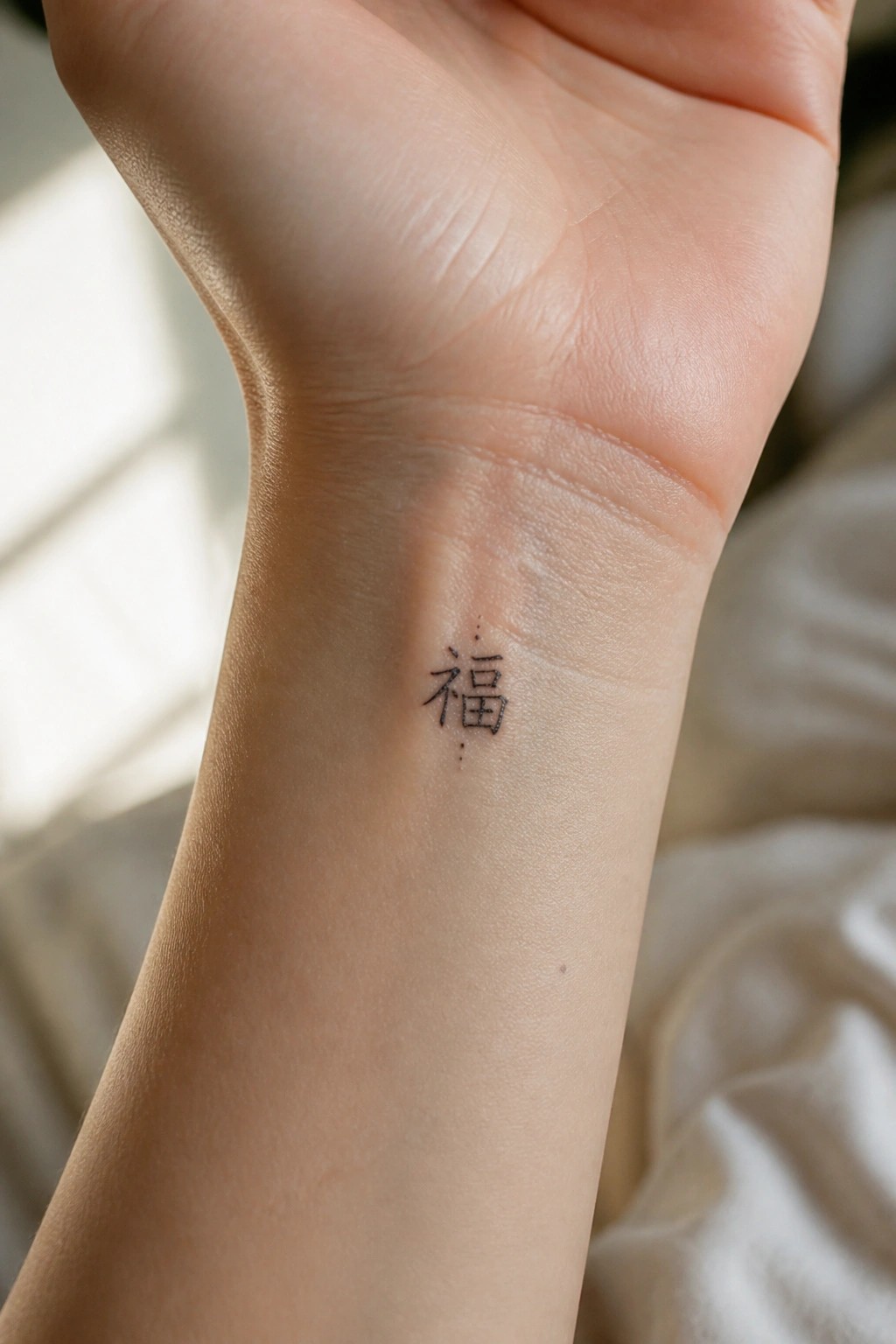
The inner wrist keeps a small chinese character visible without taking up much space. Fine lines help the symbol stay light and readable even on this narrow area.
I think the placement works because the skin stays relatively still and the design does not need extra shading to stand out. The dots give it a bit more presence while keeping the whole thing minimal.
A vertical floral vine on the forearm
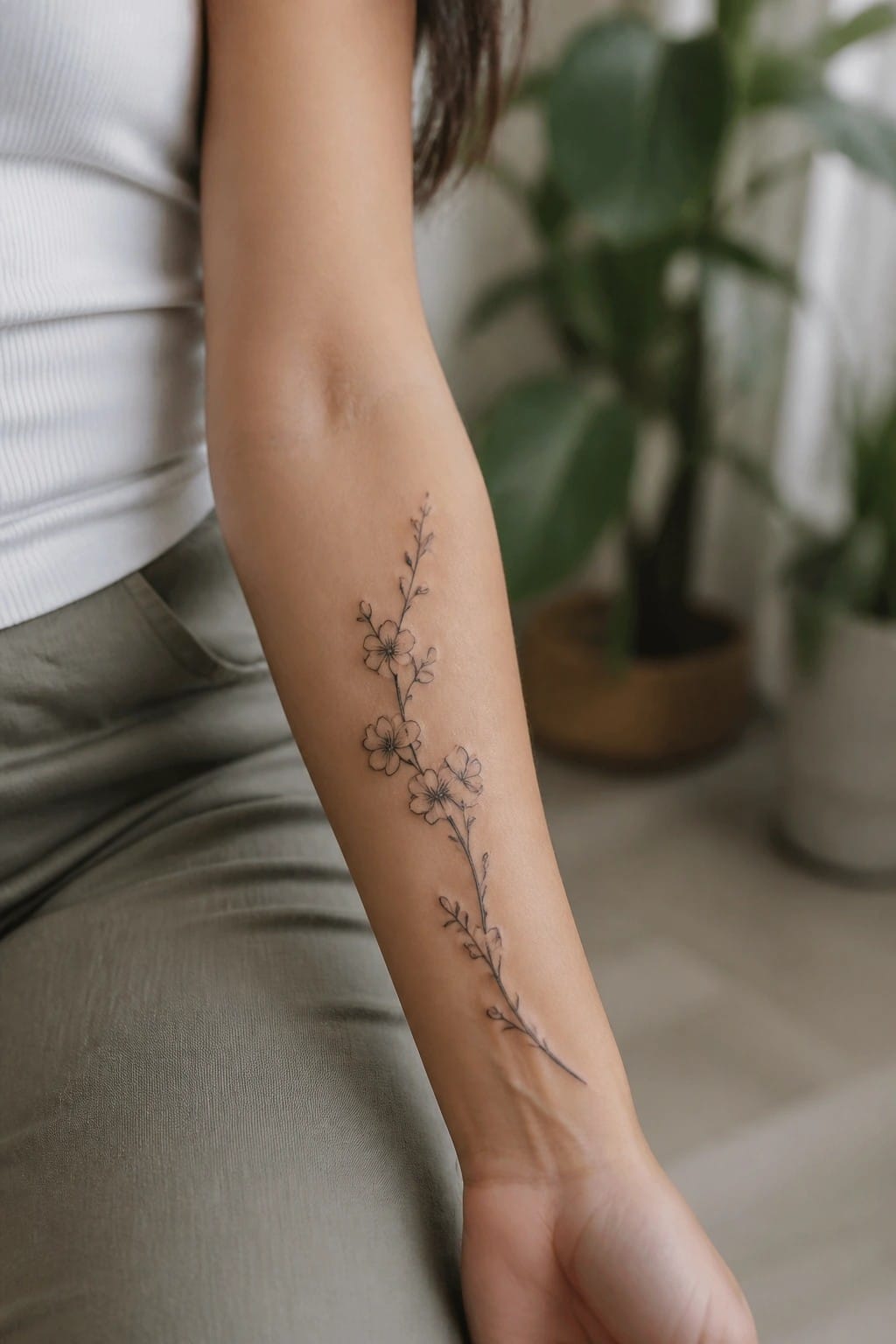
The tattoo follows the inner forearm in a straight vertical path. Thin stems link several small flowers along the way. This placement matches the elongated shape of the design.
The even spacing between flowers keeps everything clear. I think the vertical arrangement prevents the piece from feeling too busy on the skin.
Peonies on the upper back
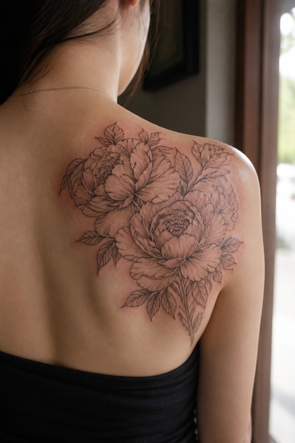
The flowers sit across the shoulder and spread slightly down the upper back. Fine lines connect the peonies with leaves that point in different directions. The open centers and layered petals keep the design from looking too heavy.
I like how the placement lets the stems follow the curve of the shoulder without forcing the shape. It gives the piece room to breathe while still covering a visible area.
Fine line branch on the ribs
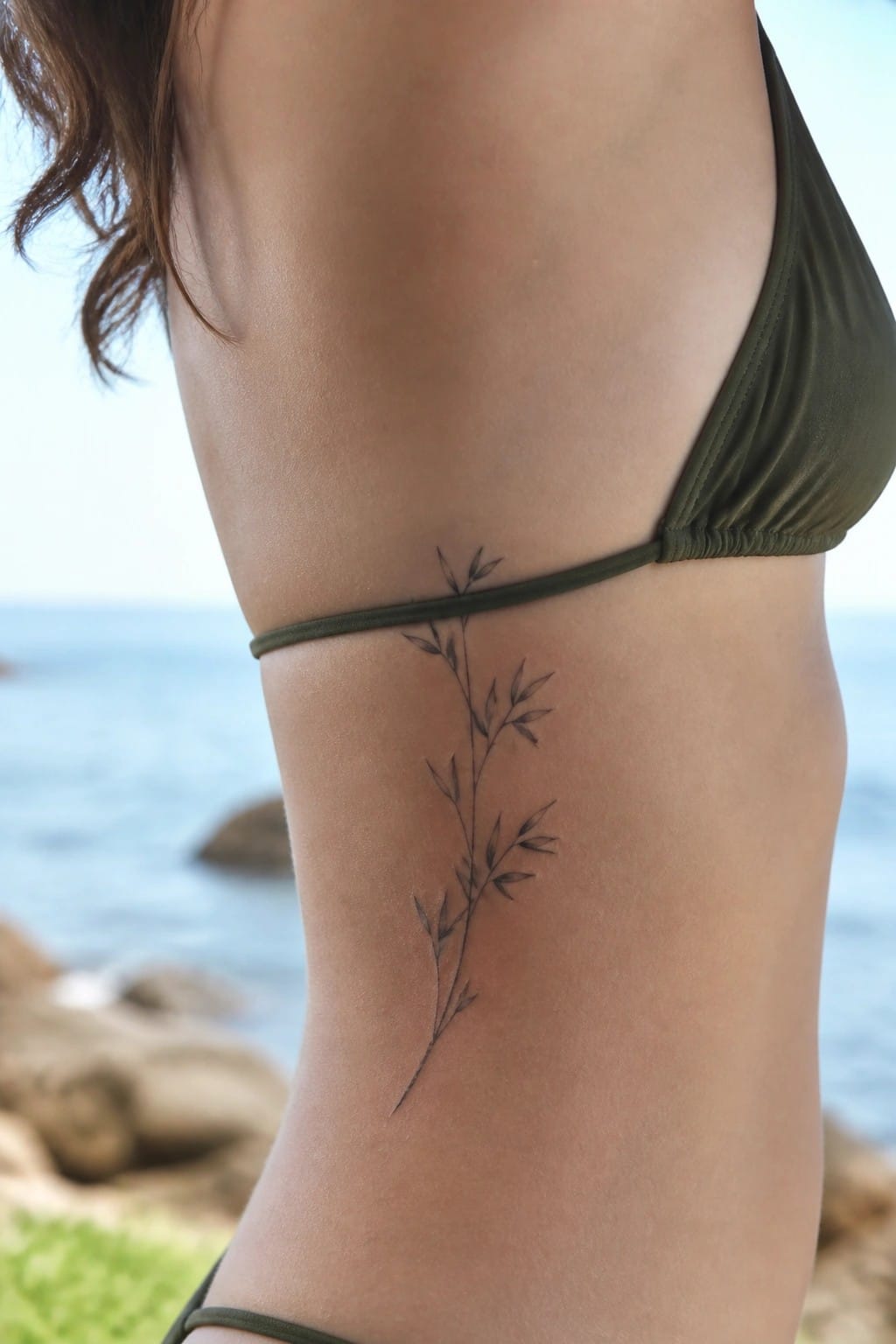
The tattoo sits along the side of the torso right under the bikini strap. It shows a single vertical stem with small leaves spaced out along the way.
This placement lets the design follow the body’s natural lines without crowding the space. I think the thin lines work well here because they stay visible but do not dominate the area.
Lotus on the ankle
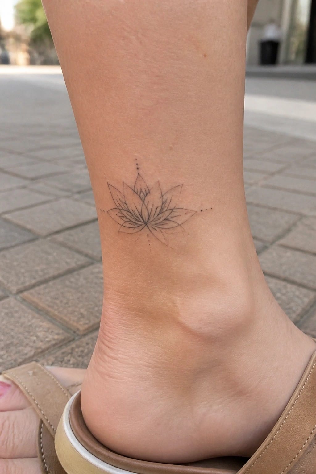
A fine line lotus sits on the outer ankle. The design stays small and centered with dotted lines extending from the sides. This placement keeps the tattoo visible from certain angles while leaving plenty of space around it.
I think the ankle works here because the lotus stays compact without needing extra detail to fill the area. It gives a clean look that still shows up well with open shoes.
Bamboo behind the ear
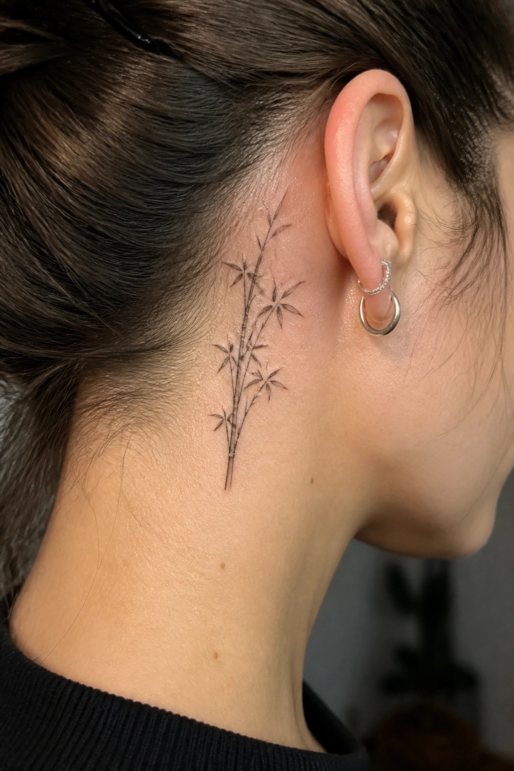
A small fine line bamboo piece sits just behind the ear. The stems run straight with minimal leaves and no extra shading. This keeps the whole design narrow enough to fit the space cleanly.
I think the spot works well because it stays mostly covered by hair yet shows up when pulled back. The fine lines also hold detail without needing to stretch across a larger area.
Waves and clouds circle the ankle
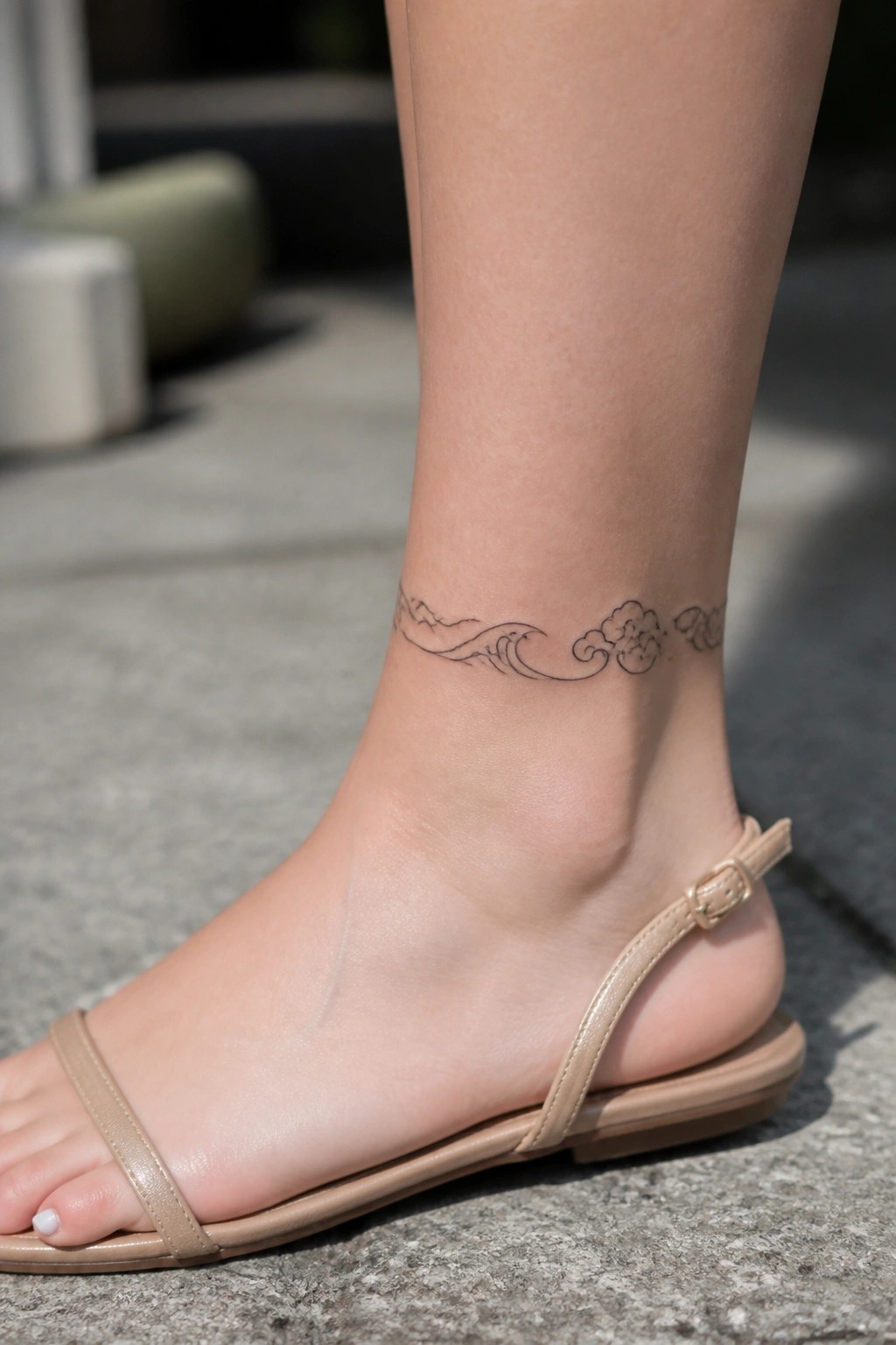
The tattoo sits just above the ankle bone and wraps in a single flowing line. A wave moves into a few simple clouds without adding extra weight. Fine line work keeps the shapes clear even on a narrow area.
This placement lets the design follow the curve naturally. It works because the elements stay spaced out and readable at a small scale.
Flowing lines along the inner forearm
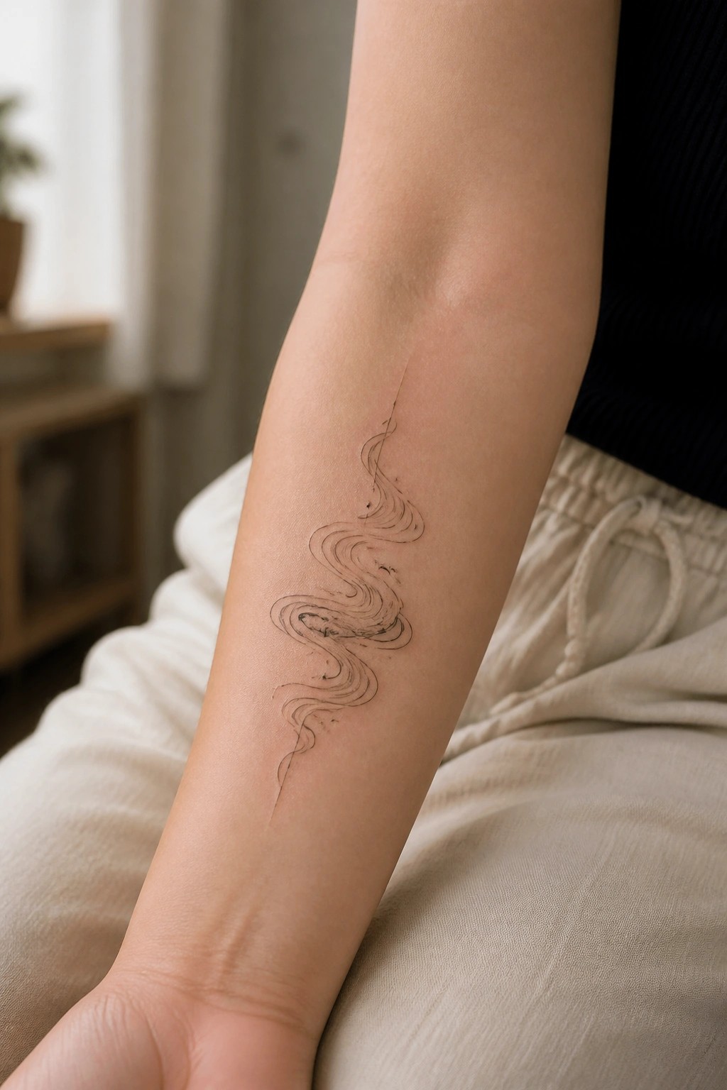
The design runs vertically down the inside of the forearm in a series of connected curves. This placement lets the lines follow the natural length of the arm instead of sitting across it.
The fine line work keeps the whole piece open and easy to read at this size. I think it works best when someone wants movement without adding bulk to the area.
Phoenix tattoo on the upper arm
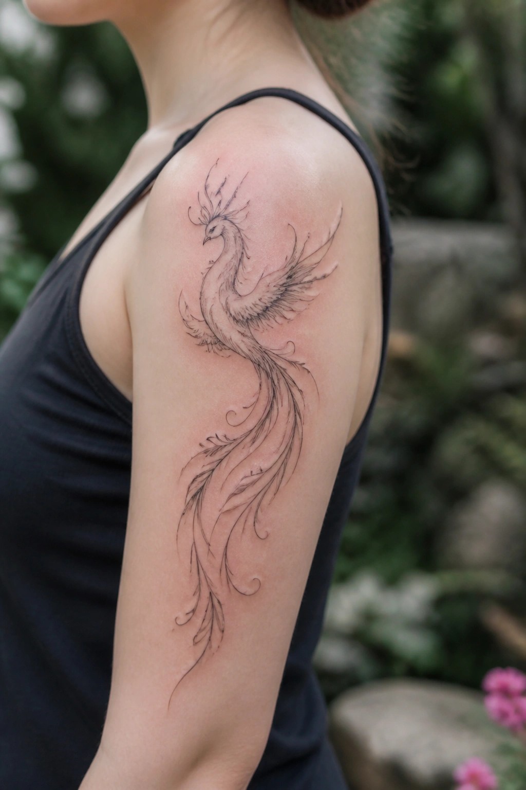
The upper arm works well for this phoenix because the design can start near the shoulder and extend downward. Fine lines define the head, wings, and long tail without filling the space.
I think the vertical flow keeps the tattoo readable even as the tail thins out toward the elbow. It also leaves room to add small elements later if wanted.
Chinese character on the finger
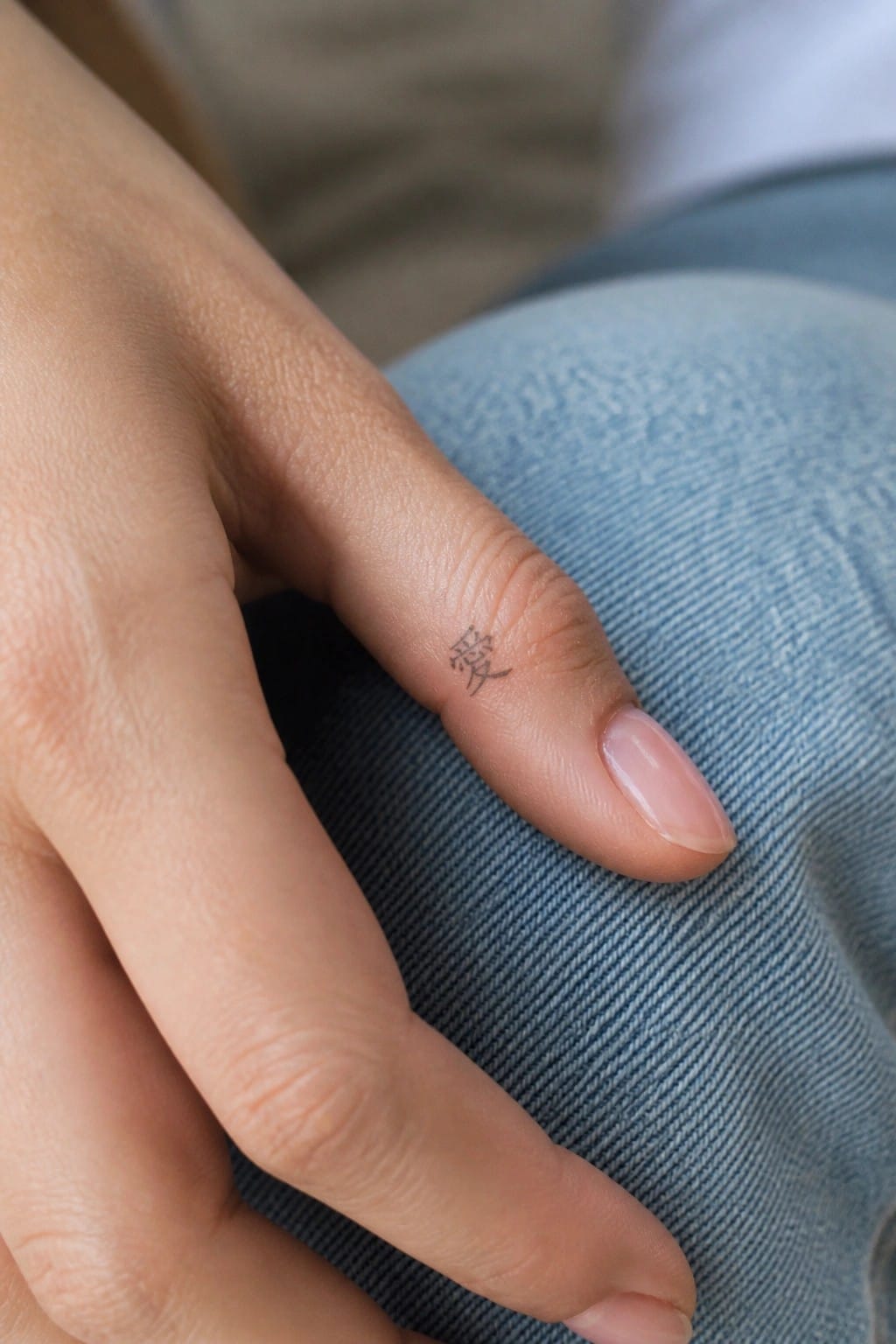
The tattoo sits on the side of the finger in a spot that stays partly tucked away during normal movement. A single chinese character takes up the space without any added lines or shading. The fine line work keeps the strokes thin and even.
I think this placement makes sense for a character because it stays personal while still showing up clearly when the hand rests flat. The size avoids crowding the finger and leaves room for the design to breathe.
Chrysanthemums running down the thigh
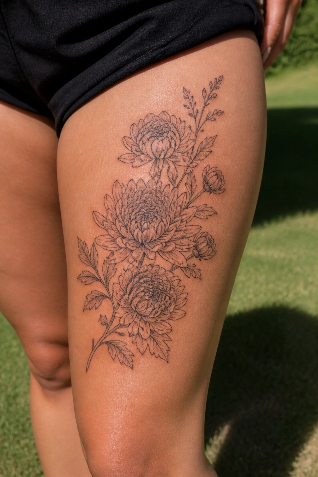
The thigh works for this design because the length lets the flowers stack naturally from top to bottom. A large bloom sits in the middle with smaller ones above and below it, plus a few leaves and stems to tie them together. The fine line style keeps the whole thing light on the skin.
I like how the vertical layout follows the shape of the leg without feeling cramped. It gives the piece room to breathe while still reading as one connected idea.
Fan tattoo on the shoulder
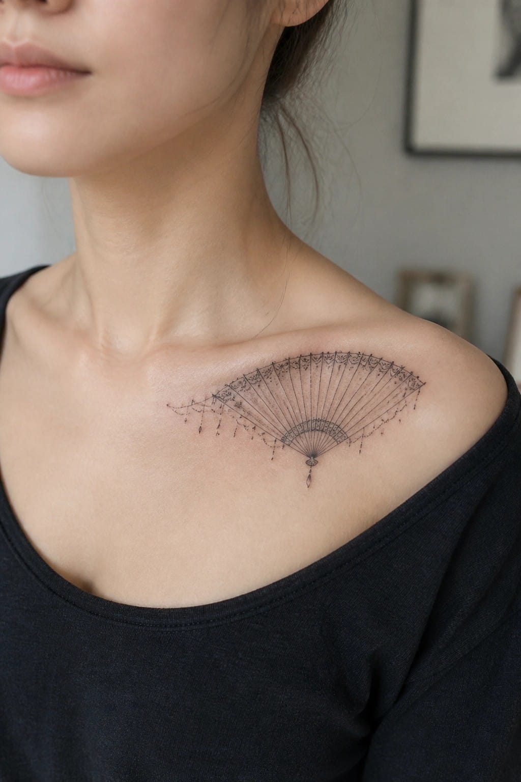
The shoulder gives a fan tattoo room to open up without feeling cramped. The fine lines let the pattern stay clear while the shape follows the natural slope of the area. Small dangling details add a bit of movement at the edges.
I think the placement works because it lets the fan sit flat when the arm is down yet still shows the full spread. It keeps the design balanced instead of forcing it into a tighter spot.
Two characters on the back of the neck
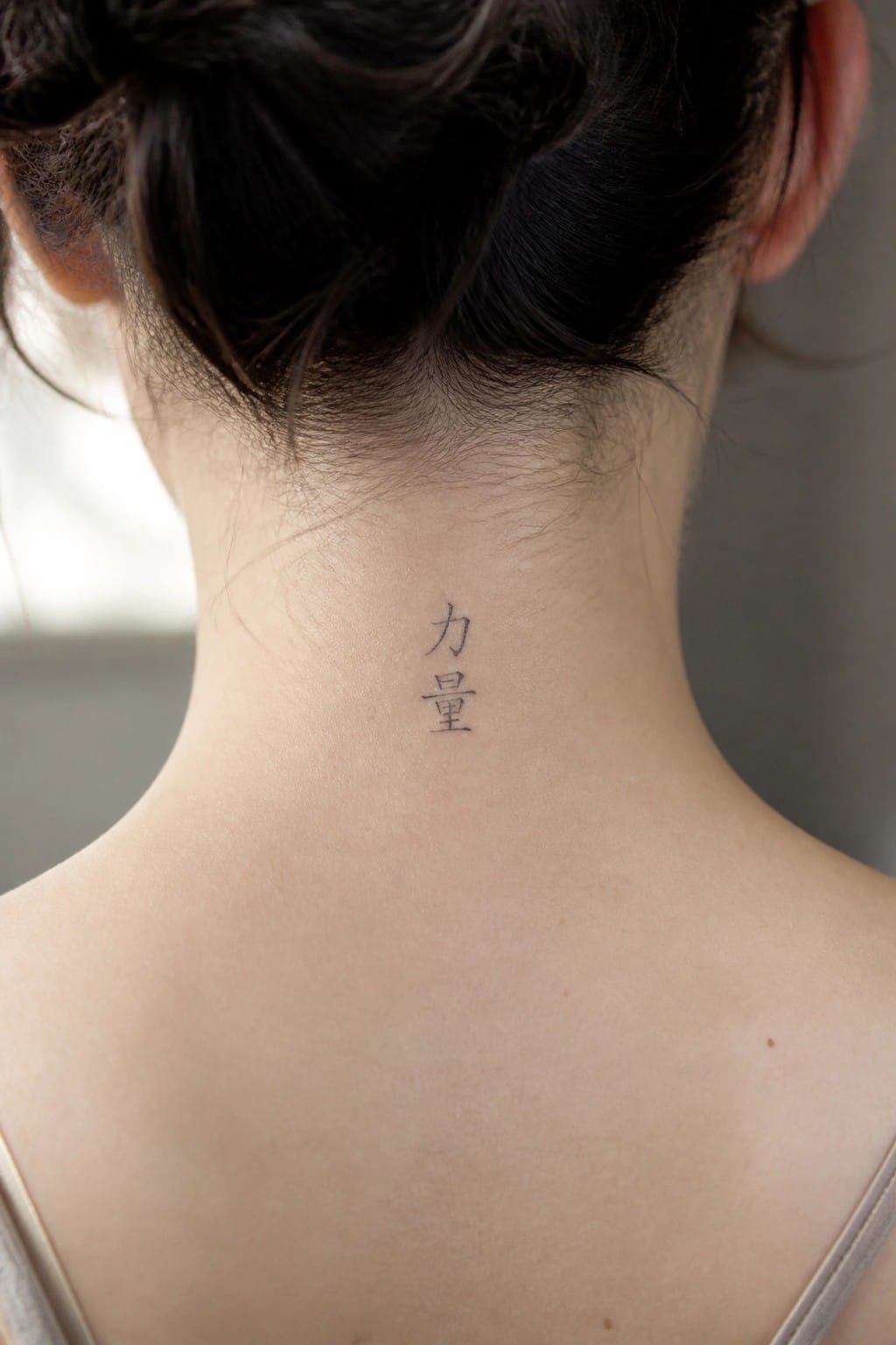
The tattoo sits at the nape where it stays mostly covered. Hair pulled up reveals the two characters stacked in a straight line. The narrow placement matches the vertical layout without crowding the space.
I think the small scale keeps the design from competing with the neck’s natural shape. The fine lines hold up well at this size and stay legible up close.
Bamboo and plum blossoms on the inner forearm
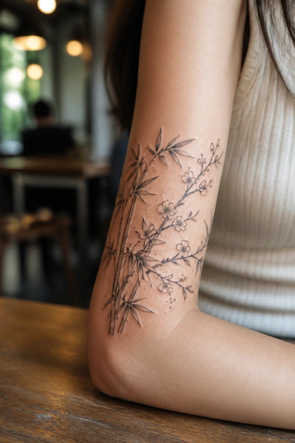
The inner forearm lets the bamboo stalks run straight up the arm in a natural line. Branches with small blossoms fill in around them without feeling crowded.
I think this layout keeps the design balanced at a medium size. The fine line approach works because it leaves enough negative space between the stalks and flowers.
Mountains across the ribs
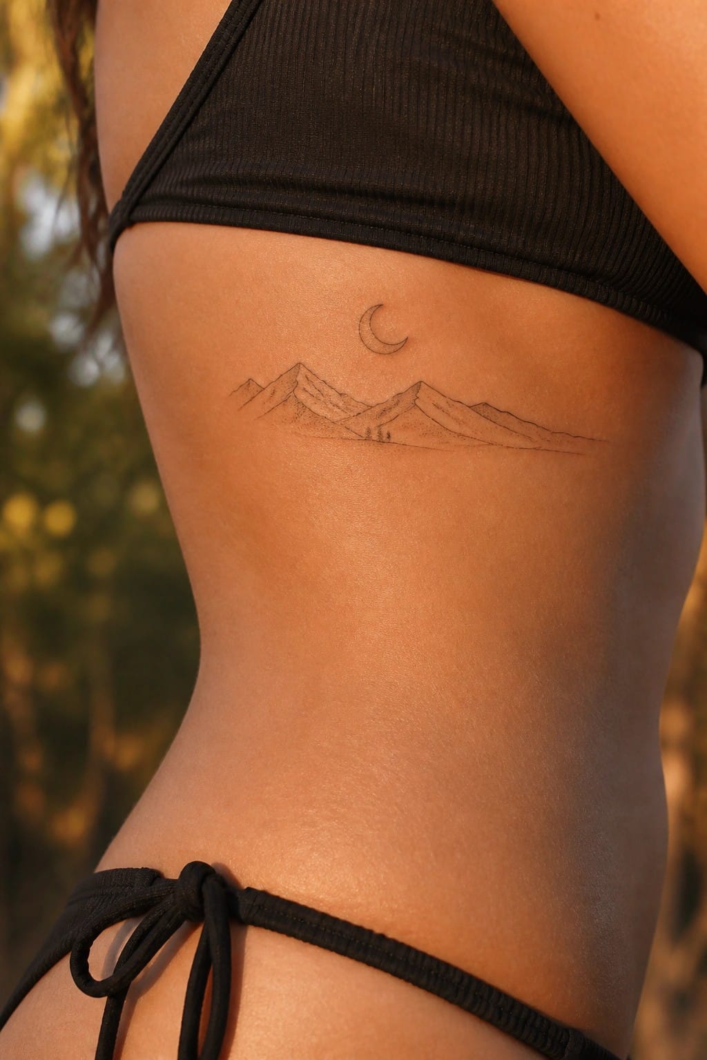
The tattoo sits on the side of the torso. It shows a row of mountain peaks drawn in fine line with a small crescent moon above them.
This placement lets the horizontal shape sit naturally along the body. The fine line style keeps the landscape light without adding bulk.
Vertical lines of poetry on the thigh
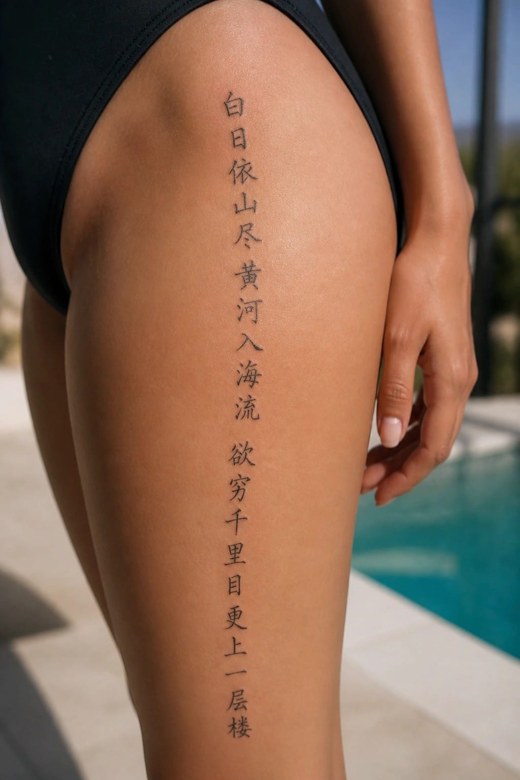
The thigh offers a long straight area that fits a full vertical poem. The characters run in even spacing from the upper leg downward. This keeps the text easy to read at a glance.
I like the way the fine line weight stays light across the whole piece. It prevents the stack of lines from feeling heavy on the leg. The result looks clean without extra decoration.
Fine line peony on the upper back
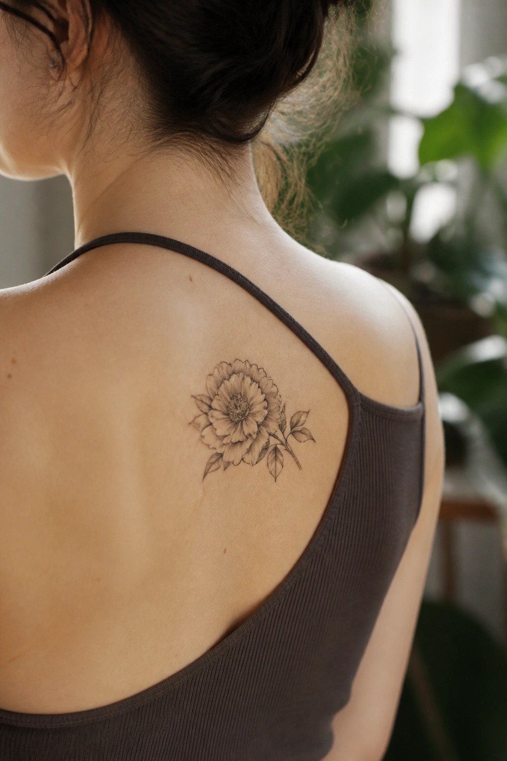
A single peony with a short stem and a few leaves sits on the shoulder blade. Fine line work keeps the petals thin and the shading light so the whole piece stays delicate. The size fits the curve of the back without spreading too wide.
I like how the stem points slightly down because it follows the natural line of the shoulder. That choice keeps the design from looking stiff.
crescent moon tattoo on the inner wrist
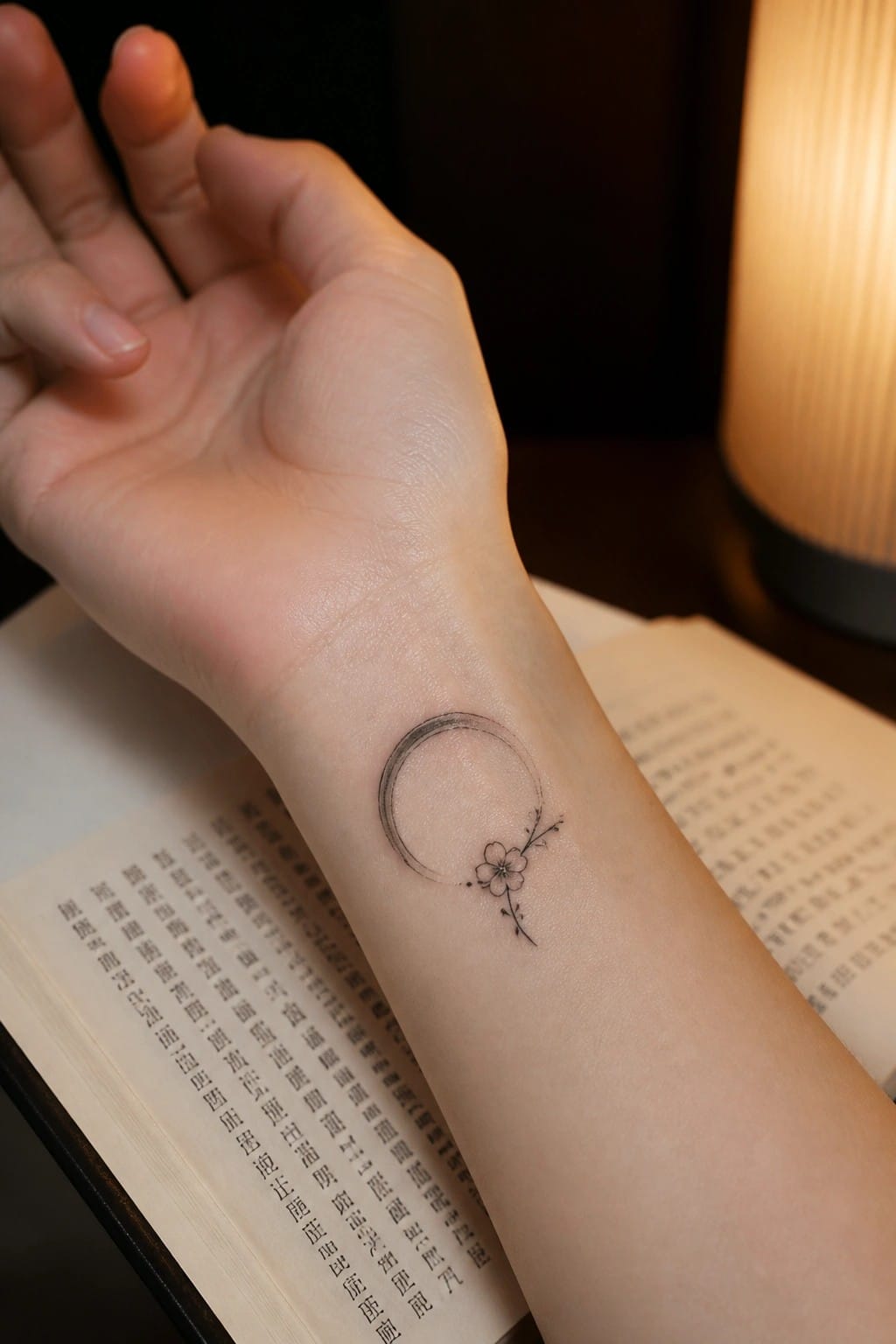
The inner wrist gives this design a clean spot to sit without much distortion. A thin crescent curves around a small blossom on a short branch, and the fine lines stay light against the skin. The scale keeps the whole piece compact yet easy to read.
I think the wrist placement makes sense here because the flat surface lets the moon hold its shape without extra shading. It also gives the option to show or hide the tattoo depending on the day.
A pagoda tattoo down the spine
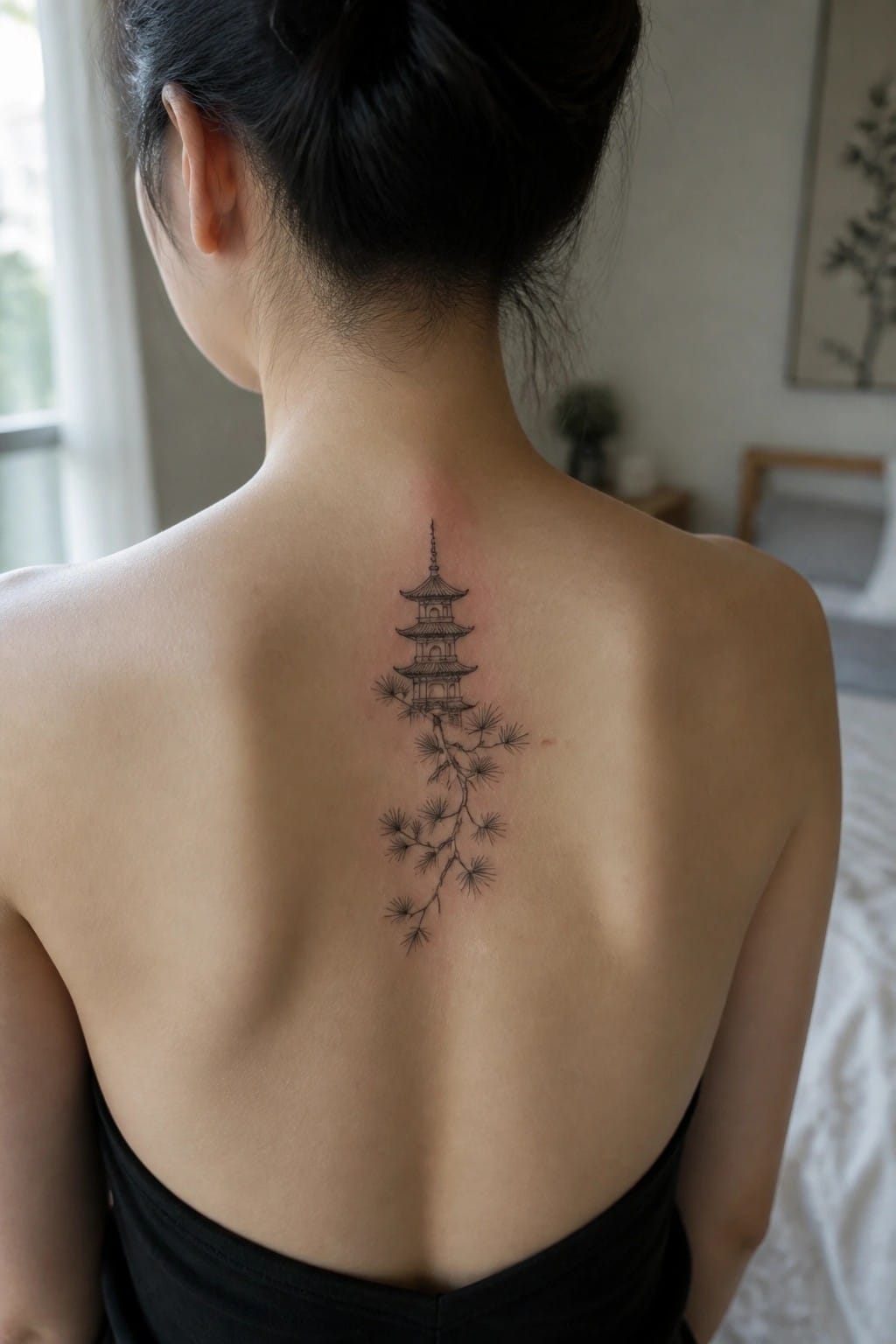
The design places a tall pagoda near the base of the neck with pine branches extending downward. Fine lines keep the structure simple while the branches add some movement along the center of the back. The whole piece stays narrow enough to fit the space without spreading out.
This layout works because the vertical shape matches the natural line of the spine. I think the downward flow of the branches helps the tattoo feel connected rather than stacked.
Seal tattoo on the ankle
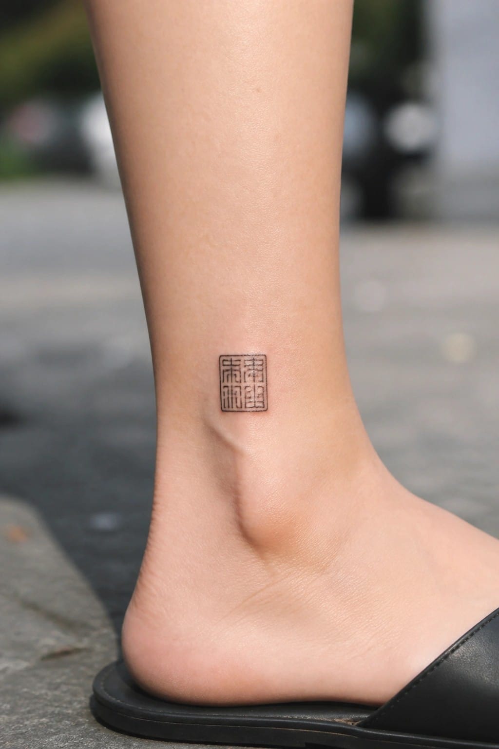
The ankle gives this square seal design a natural spot to sit without extra space around it. The compact shape stays contained and the fine lines keep each character readable even at a small size.
I think the placement works because the design does not stretch or get lost on the curve of the ankle. It feels like a deliberate choice rather than something added on.
Clouds and waves form a band around the upper arm
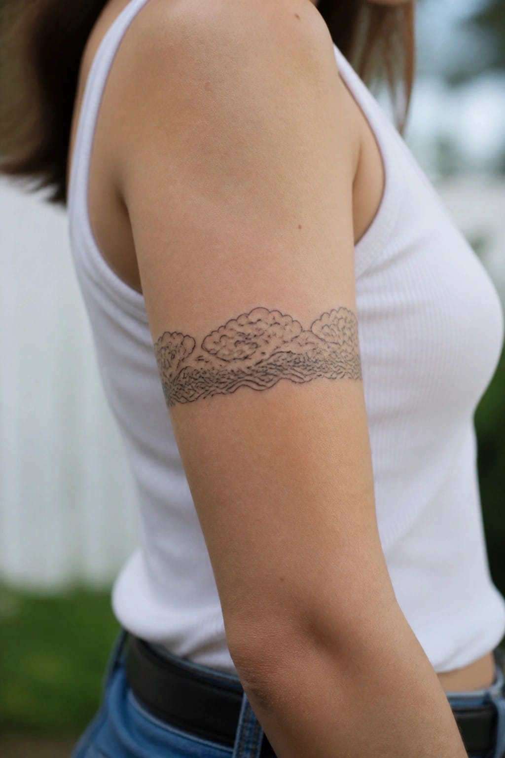
The upper arm works well for a band style tattoo like this one. Fine line clouds sit above a row of waves that run all the way around. The design stays narrow and even.
This layout keeps the pattern readable from every angle. I think the band shape suits the arm because it moves naturally with the muscle without crowding the area.
Frequently Asked Questions
What are the best ways to verify the accuracy of Chinese characters before getting a fine line tattoo?
Double check with a native speaker or professional translator who understands both modern and traditional scripts. Many online resources provide incorrect translations that can lead to unintended meanings. Bring reference images from reliable calligraphy sources to your consultation so the artist can replicate delicate strokes precisely without errors.
How should I decide on the placement for a delicate Chinese fine line tattoo on my body?
Consider areas with less movement and thinner skin such as the inner wrist, behind the ear, or along the collarbone for better detail retention. These spots allow the fine lines to heal cleanly and show off intricate details. Avoid high friction zones like hands or feet if you want the tattoo to age gracefully over time.
What aftercare steps help preserve the fine details in Chinese character tattoos?
Keep the area clean with gentle soap and apply a thin layer of fragrance free moisturizer several times a day. Avoid sun exposure and tight clothing that could rub the design during the first few weeks. Schedule a touch up appointment around six weeks later if any lines appear faded after healing completes.
How can I find an artist experienced in creating delicate fine line Chinese tattoos?
Look for portfolios that specifically showcase thin line work and Asian inspired designs with clean negative space. Read recent client reviews mentioning precision and cultural respect. Schedule consultations with multiple artists to discuss your ideas and confirm they use single needle techniques suitable for intricate characters.
Are there ways to combine Chinese symbols with other elements while keeping the design delicate?
Start with a central character and add subtle surrounding details like minimal florals or geometric accents in matching fine line style. Discuss proportions with your artist to ensure the overall composition remains balanced and not overcrowded. Test the layout on paper first to visualize how elements interact without overwhelming the main symbol.
