

I have always admired how men turn their Christian faith into lasting ink that speaks volumes without saying a word.
My own sketches often mix scripture lines with simple symbols like crosses or anchors and it always feels fresh.
These 19 designs bring that same mix of depth and style in ways that feel personal and strong.
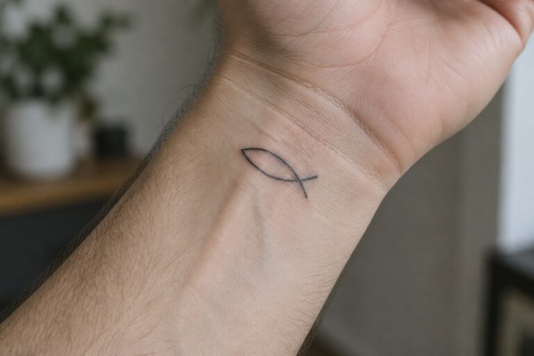
A small fish on the inner wrist
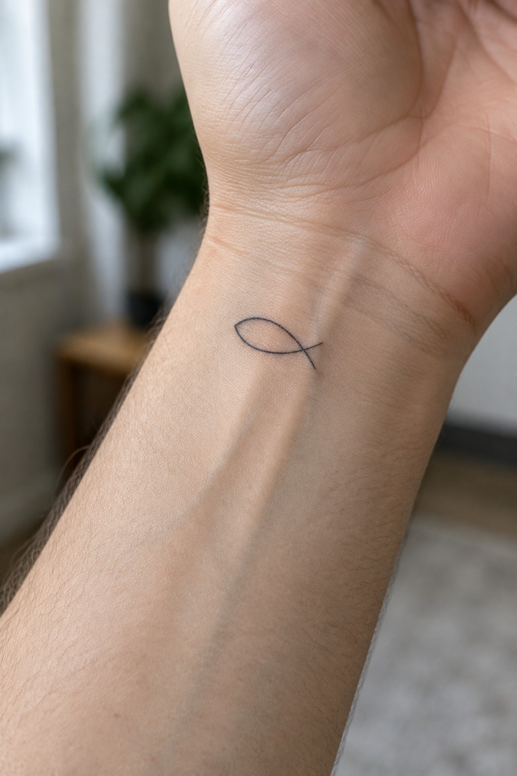
The inner wrist keeps this fish symbol in a spot that shows during normal hand movements. The thin single line stays simple and sits flat against the skin without extra shading. Its small size fits the area cleanly and avoids any crowding.
I went with the wrist because it lets the symbol stay visible yet understated in daily life. The minimal approach keeps the focus on the shape itself rather than on added detail.
Cross tattoo on the forearm
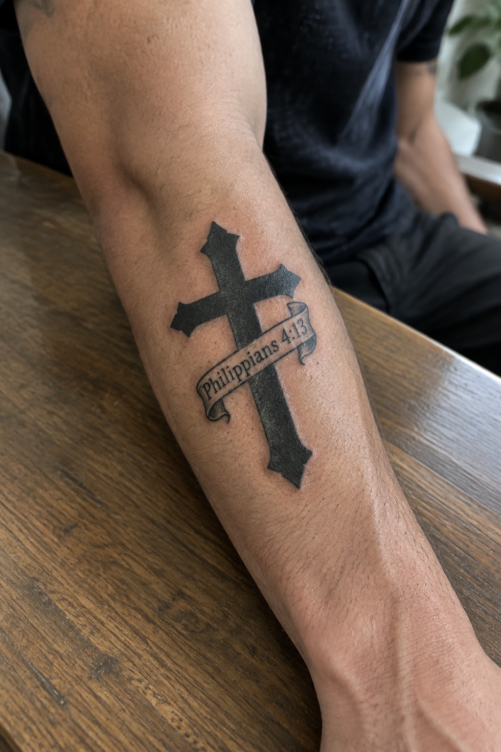
The forearm works well for this type of cross because it gives the design a flat surface and keeps it easy to see during daily activities. The tattoo uses a solid black cross with a banner across the middle that holds the verse text.
I think the size stays practical here since it fills the space without crowding the arm or losing detail in the lettering. The bold lines also help the whole piece hold up over time.
A crucifixion scene on the upper arm
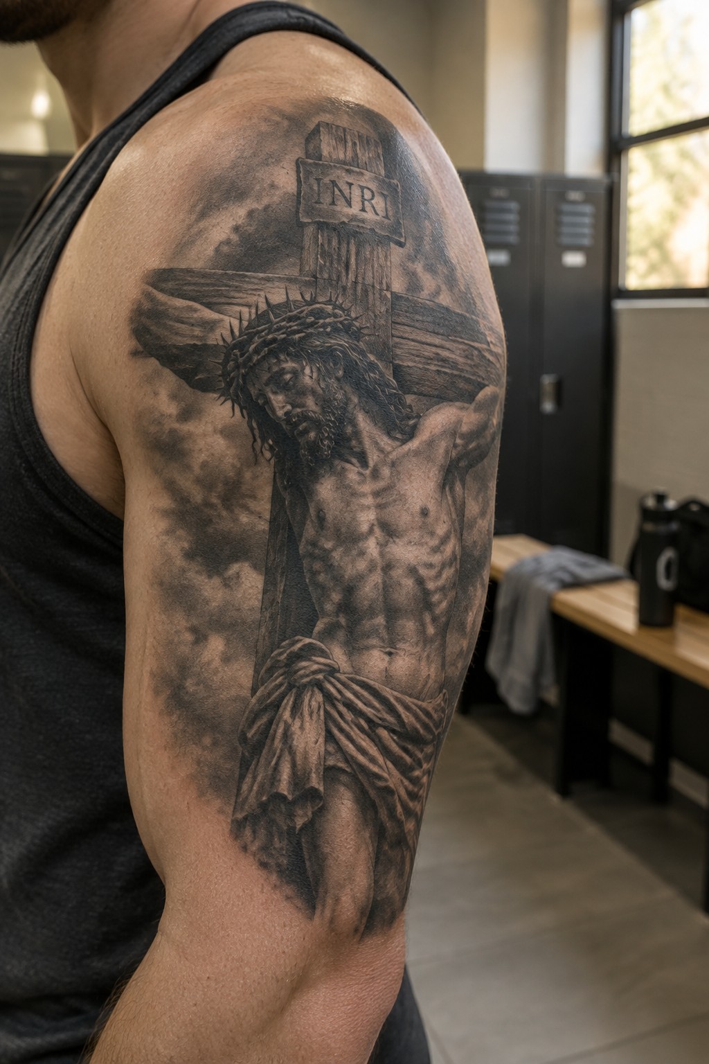
The tattoo spans the upper arm and shoulder. It shows Jesus on the cross with the crown of thorns and the INRI sign above. Clouds fill the space around the figure while heavy shading adds depth to the skin and drapery.
This spot works for the design because the area gives room for the full scene to stay readable. I think the shoulder placement keeps the cross straight and clear from most angles.
Psalm text placed along the ribs
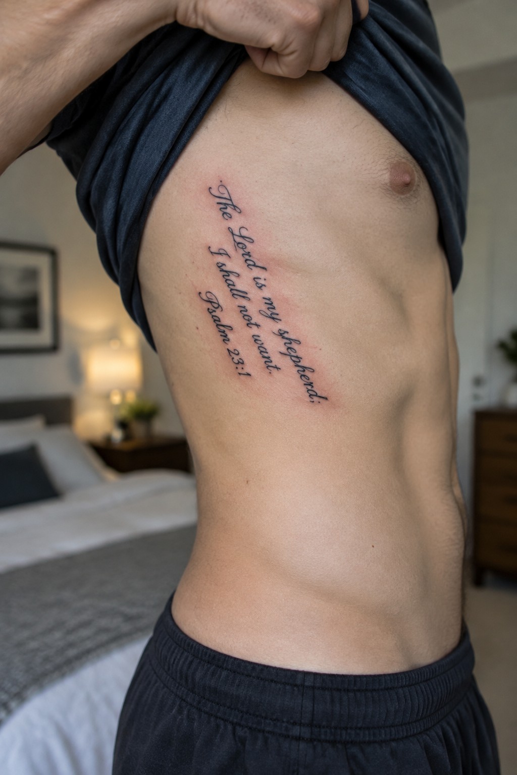
The verse from Psalm 23 runs vertically down the side of the torso. This spot lets the lines of text follow the natural shape without bunching up. The lettering stays clear even though it covers a narrow strip of skin.
I chose this layout because the verse fits the space well and stays easy to read at a glance. It keeps the focus on the words rather than extra decoration.
Crown of thorns wraps around the wrist
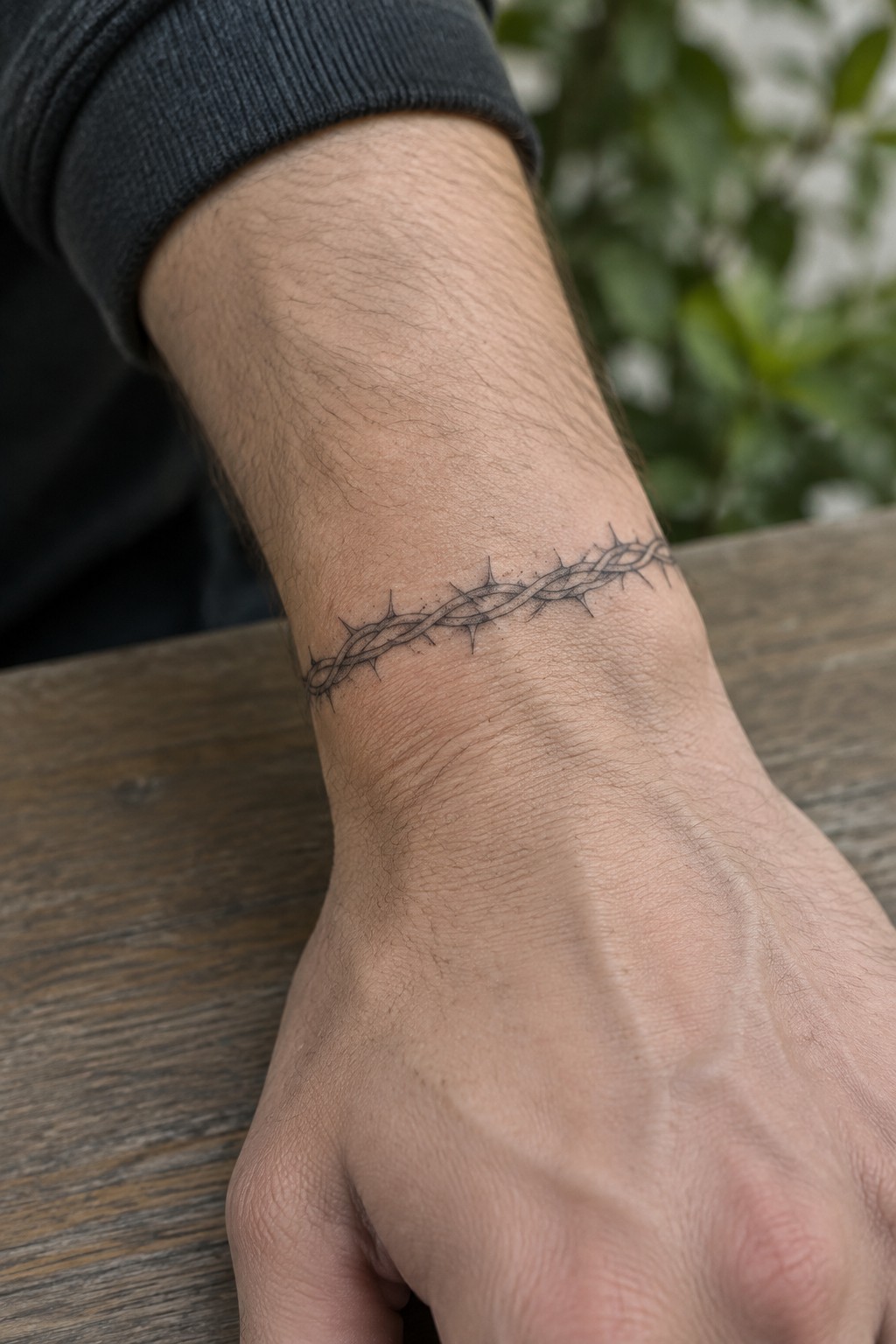
The wrist placement lets the crown of thorns form a full band. This turns the symbol into something that sits like a constant reminder without covering a large area. Fine lines keep the spikes sharp and the whole piece stays narrow.
The wrapping approach works well here because it follows the shape of the arm naturally. I think the thin scale prevents it from looking bulky while still showing the detail clearly.
Dove tattoo on the chest
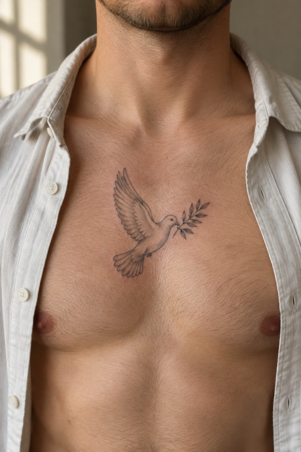
A flying dove with an olive branch sits right in the middle of the chest. The open wings and branch fill the space evenly without crowding the area. This placement keeps the bird upright and easy to see even when a shirt is open.
I chose the chest here because it gives the dove a flat surface to rest on and lets the wings spread at a natural angle. The scale stays modest so the lines hold up over time without extra shading.
Anchor placed behind the ear
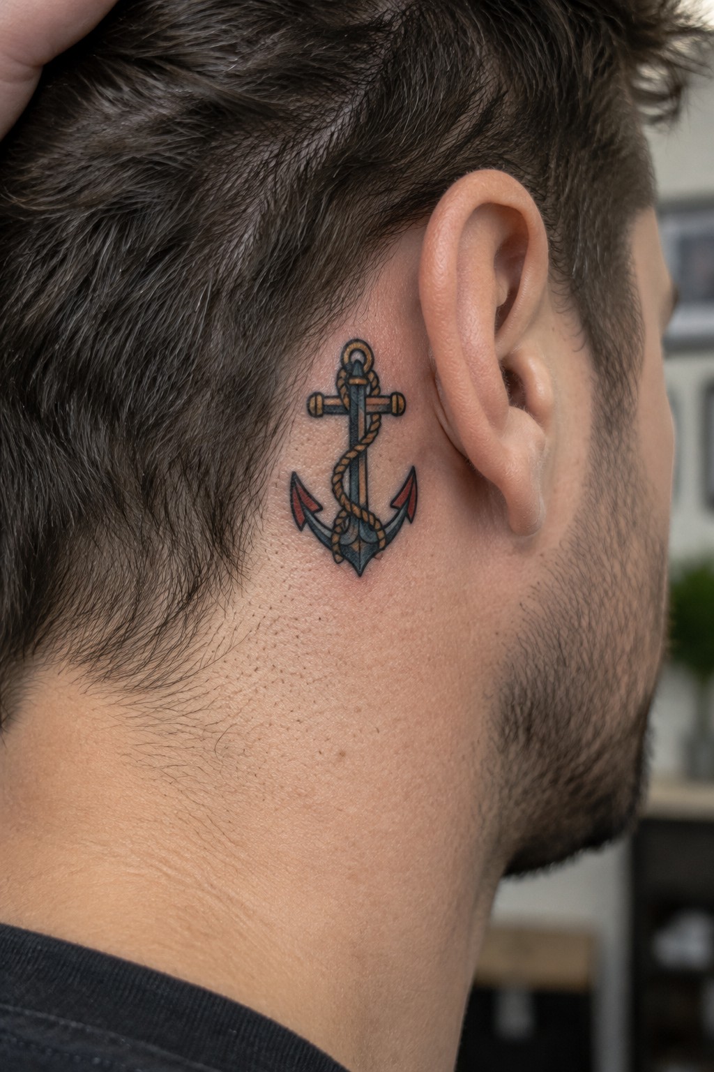
The anchor sits right behind the ear in a compact spot. This keeps the design visible only at certain angles while still fitting the shape of the head. The rope wraps the shank and the red tips on the flukes add a small color accent without expanding the size.
I think the scale works well here because the lines stay sharp even with the extra rope texture. It suits someone who wants the symbol close but not always on display.
Rosary beads wrapped around the forearm
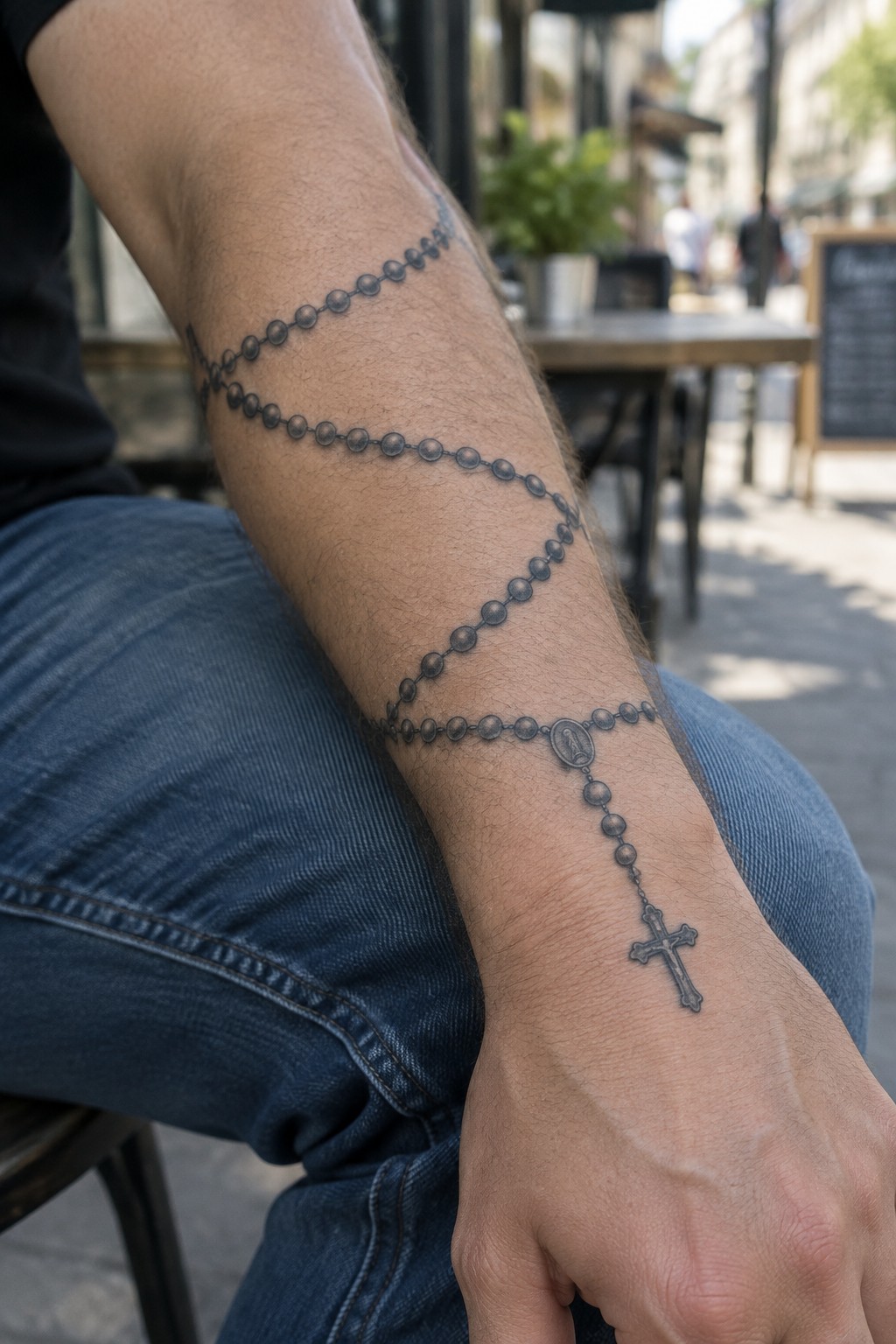
The rosary tattoo begins near the elbow and wraps down the forearm in a steady spiral. The beads are rendered with shading to give them depth while the chain links them together in one flowing line. A small medallion sits midway and the cross rests near the wrist where the design ends.
I think the wrapping placement lets the beads follow the natural shape of the arm without looking forced. It also keeps the cross in a spot that stays visible during daily movement.
Cross tattoo with rays on the upper back
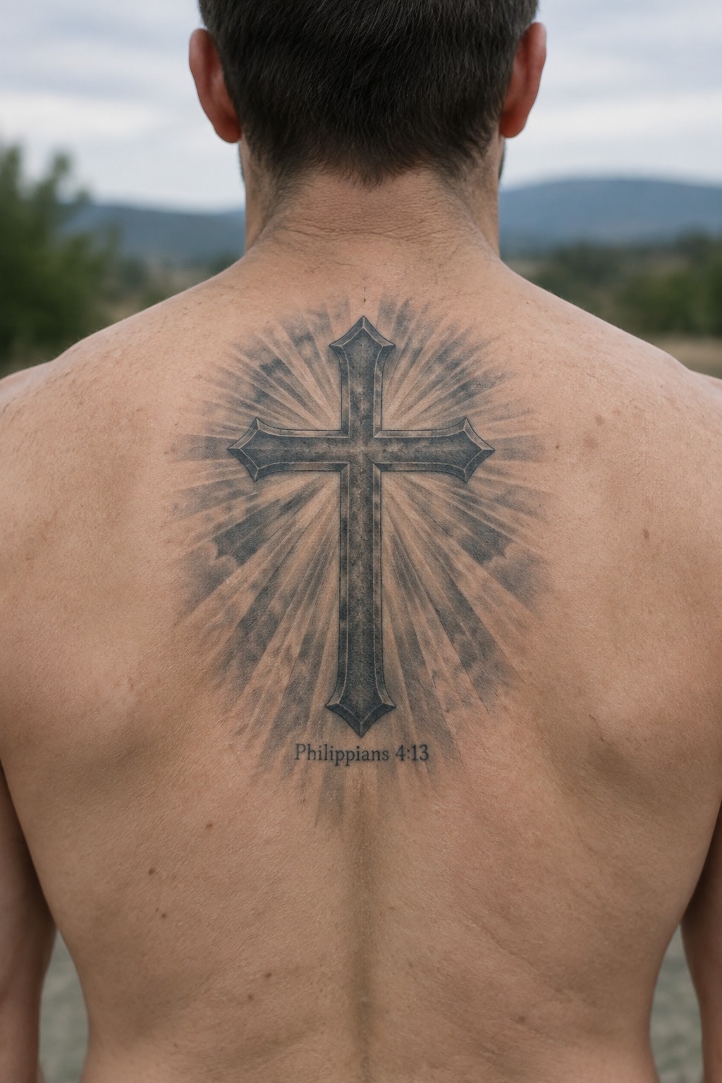
The upper back gives this cross design room to breathe. The rays spread outward in all directions and fill the space between the shoulders without crowding the edges. The verse sits centered below the cross and stays easy to read.
I think this spot works because the back stays mostly covered day to day yet still shows the full layout when the shirt comes off. The simple black shading keeps the focus on the shape rather than extra color or detail.
John 3:16 tattoo on the forearm
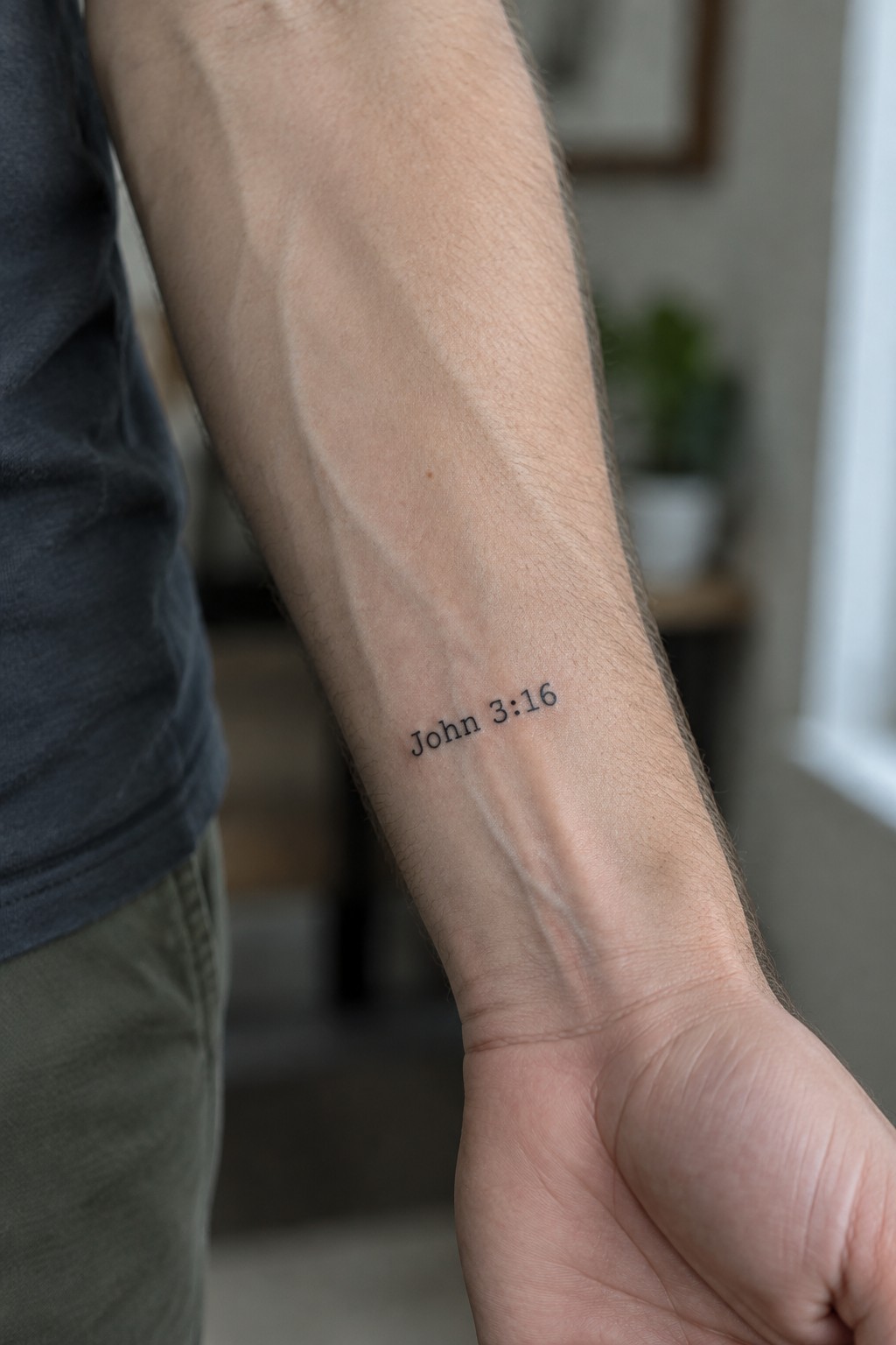
The inner forearm gives this tattoo steady visibility while still letting it stay covered most of the time. The lettering stays small and straightforward so the reference reads clearly without extra detail. Many men pick this exact spot because it works for both daily reminders and moments when they want the verse seen.
I think the plain black script keeps the focus on the words instead of competing with the design. It ends up feeling like a quiet personal marker rather than a big statement.
A lamb tattoo on the chest
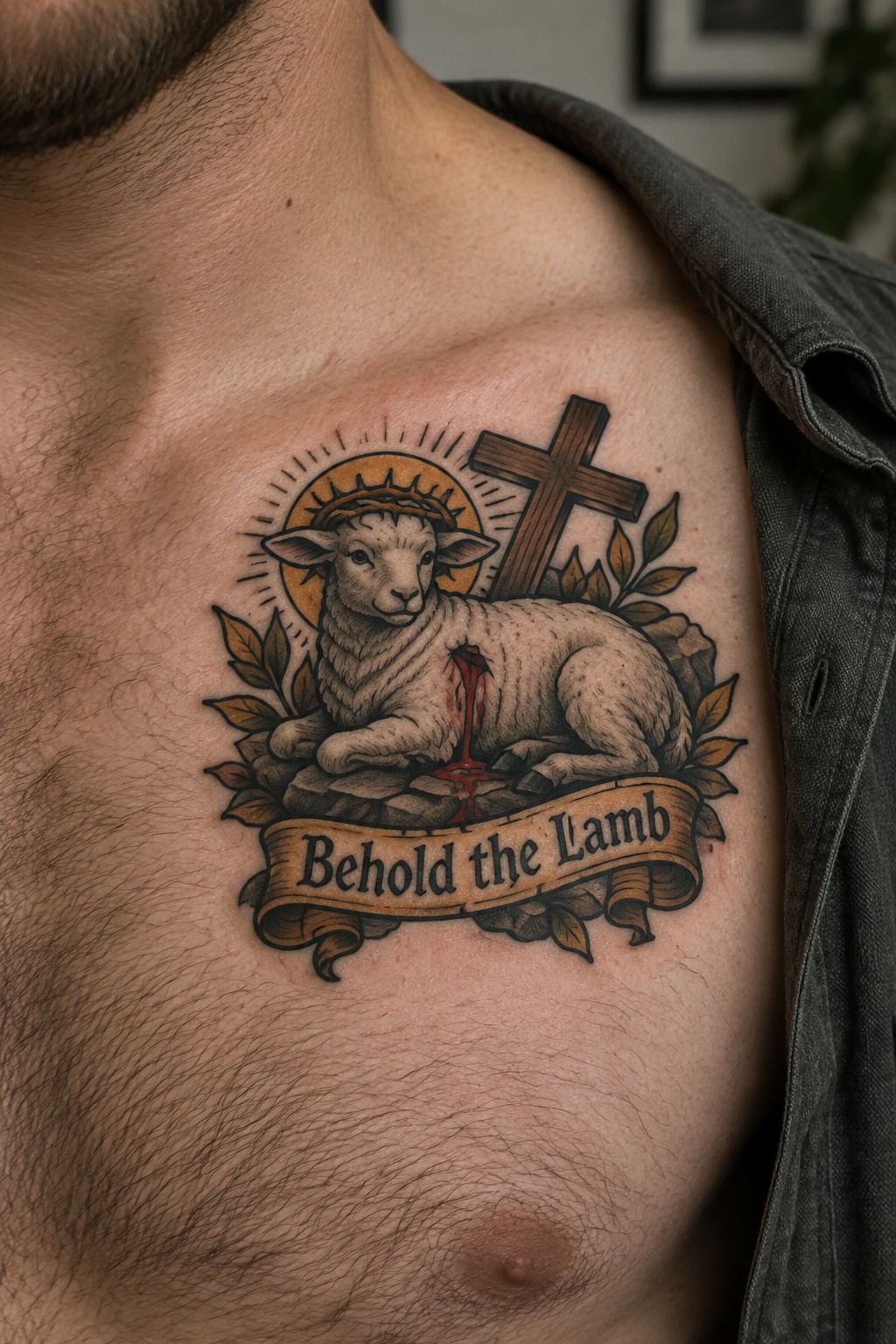
The chest works well for this design because it gives room for the full scene without feeling cramped. The lamb sits centered with the cross rising behind it and the banner running along the bottom.
I think the placement helps the elements stay readable even with the leaves and rocks added around the edges. It also keeps the tattoo in a spot that stays visible day to day.
Open book tattoo on the thigh
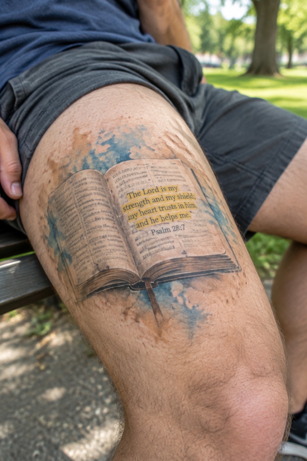
The upper thigh gives this open book design a wide flat area to sit on. That space lets the pages spread out evenly so the text stays straight and easy to read. The watercolor shading around the edges fills in without crowding the main image.
This spot keeps the whole piece balanced and visible even when the leg is at rest. It also suits someone who wants the verse to feel personal without needing constant display.
Small cross on the hand
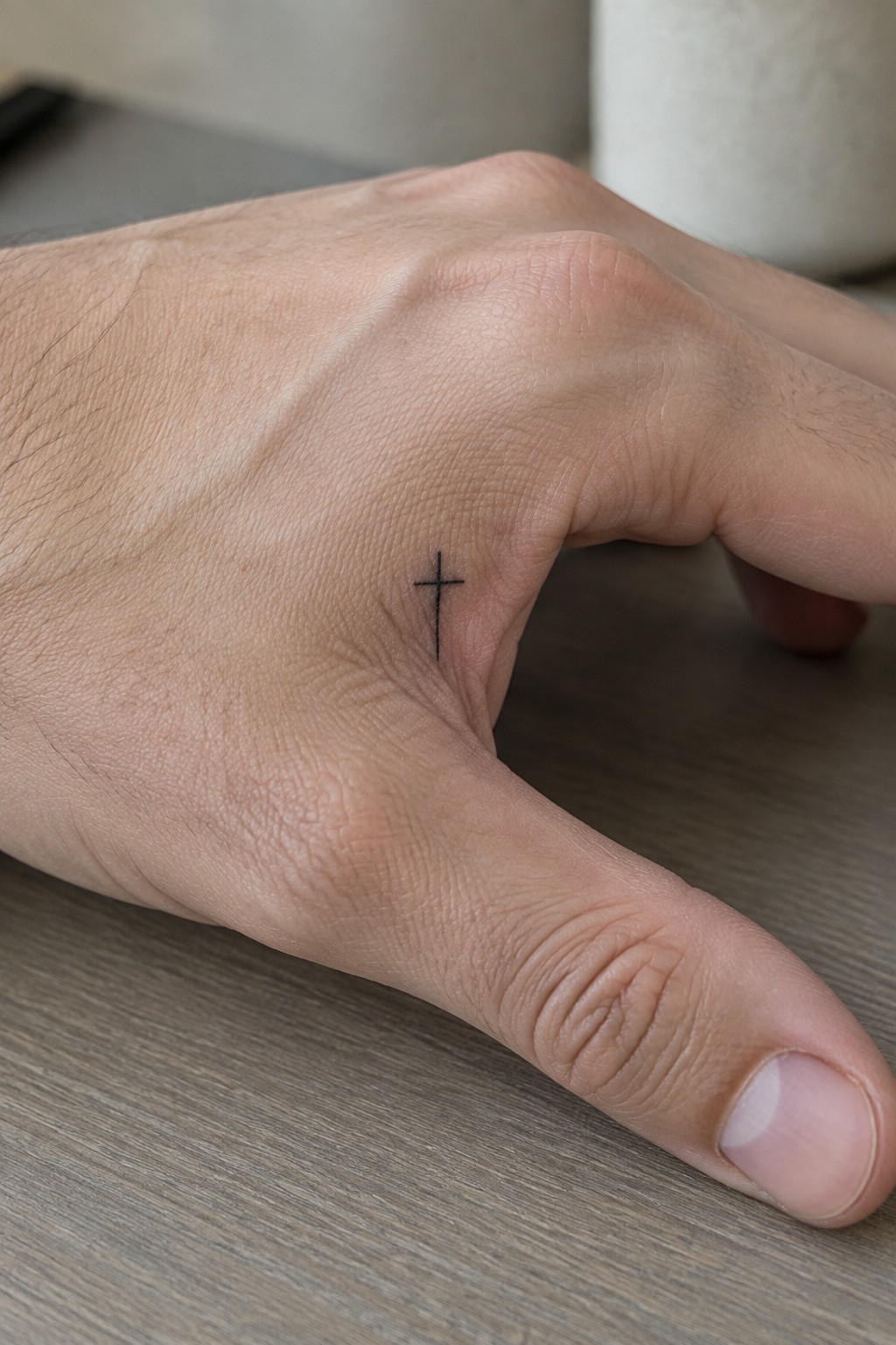
A simple cross sits on the side of the hand near the thumb. The fine black lines stay thin and clean without extra detail. This spot keeps the design close during everyday use.
The small size fits the area without crowding it. I think the plain style works because it leaves the cross easy to read at this scale.
Celtic cross on the shoulder
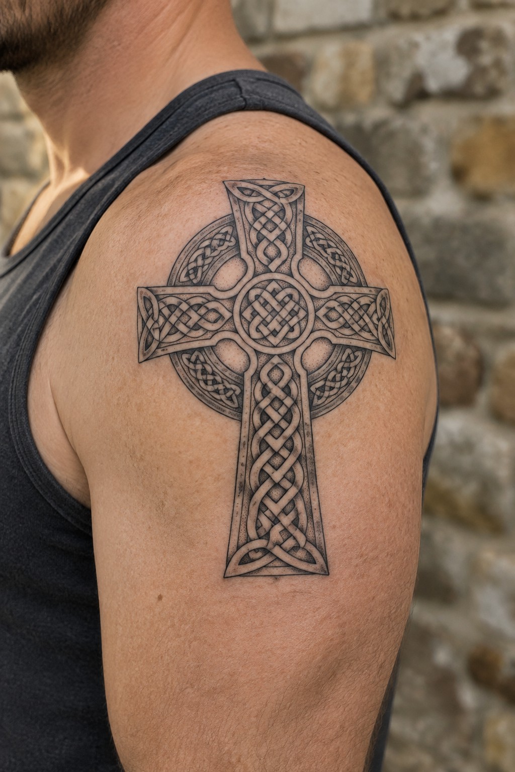
The shoulder works well for this cross because the vertical shape has space to stretch downward without crowding the area. Black ink outlines the knotwork across the arms and center of the design. The placement lets the full height of the cross sit naturally along the muscle.
I think the scale keeps the knots readable even when the arm moves. It turns the shoulder into a steady spot for a faith symbol that stays visible but not overwhelming.
Praying hands hold a rosary along the forearm
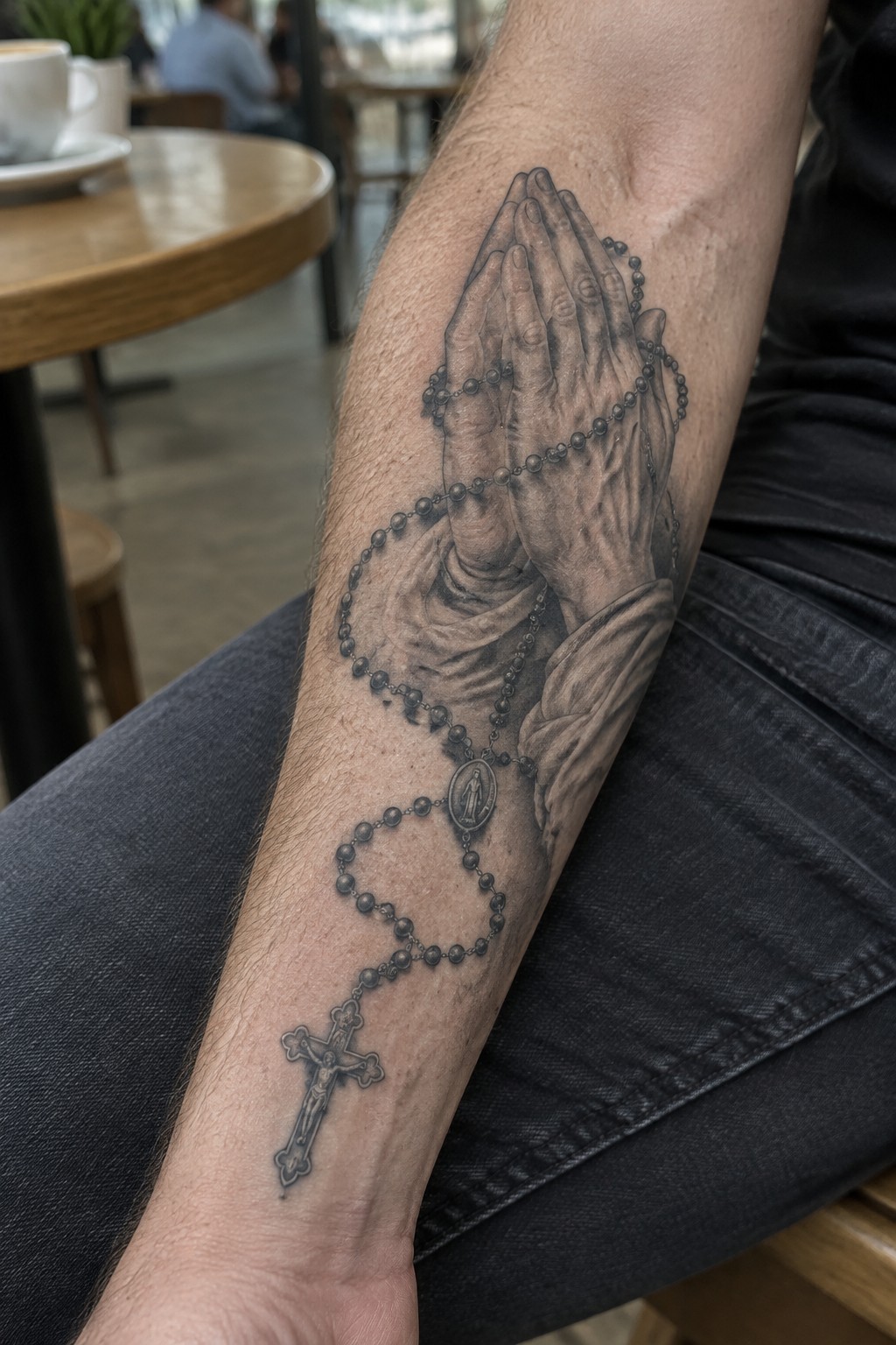
The tattoo covers the inner forearm from near the elbow down toward the wrist. Praying hands sit at the top while the rosary beads loop and drape lower, ending with the cross. This layout uses the arm’s length to show the full chain without crowding.
The forearm gives the design room to stay readable even when the beads curve around the muscle. I think the placement works because the cross can sit lower and remain visible on its own.
Faith tattoo running down the spine
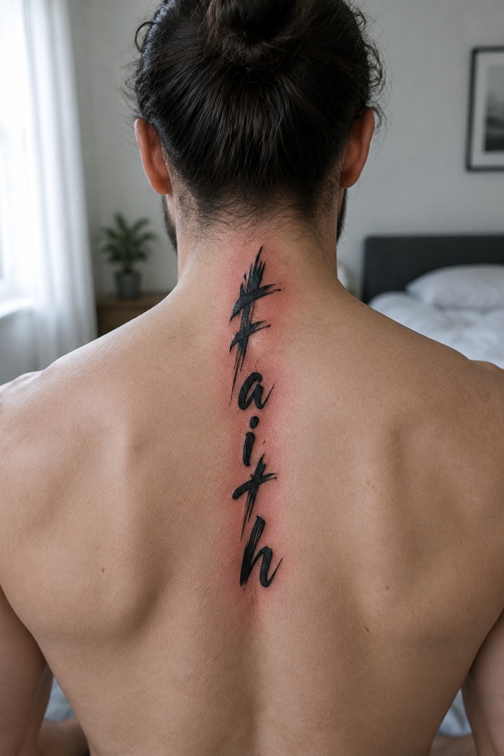
The word faith is written vertically in bold brush lettering. It starts at the base of the neck and follows the spine downward. The black strokes give it weight while keeping the letters distinct.
This placement lets the full word fit without needing extra width. It works as a straightforward option for anyone who wants a clear faith statement along the center of the back.
Cross and semicolon tattoo on the ankle
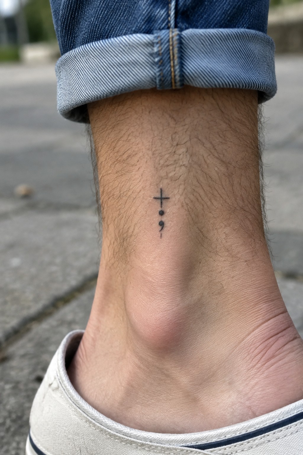
The ankle gives this small design a natural home. The cross sits above the semicolon in a straight vertical line. Both parts stay simple with thin black lines and no extra shading.
I think the spot works because the tattoo stays low key most of the time yet shows when socks come off. The compact size also keeps the lines sharp without crowding the skin.
Sleeve tattoo showing jesus with the three crosses
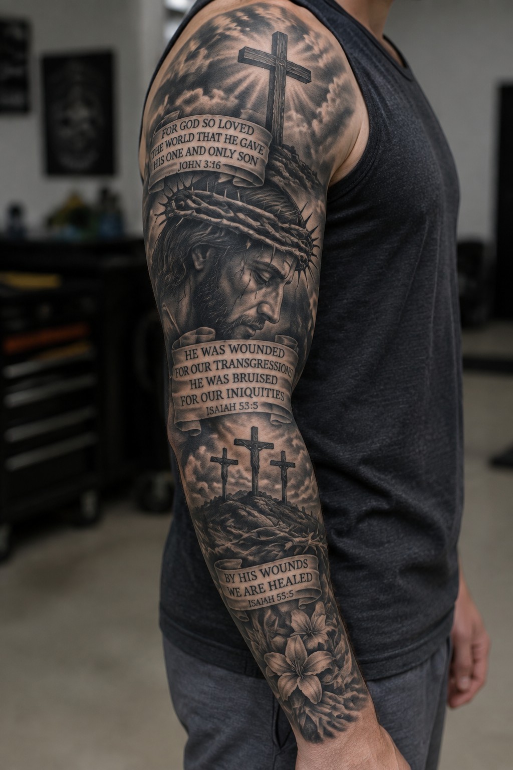
The sleeve placement gives enough room to spread out the main elements without crowding. Jesus appears near the shoulder with a crown of thorns, while the three crosses sit lower on the arm. Banners with verses from John 3:16 and Isaiah 53:5 connect the scenes and keep the focus on the text.
This layout works because the design can unfold down the arm instead of trying to fit everything in one spot. I think the black and gray style keeps the verses easy to read even from a distance.
Cross design on the inner forearm
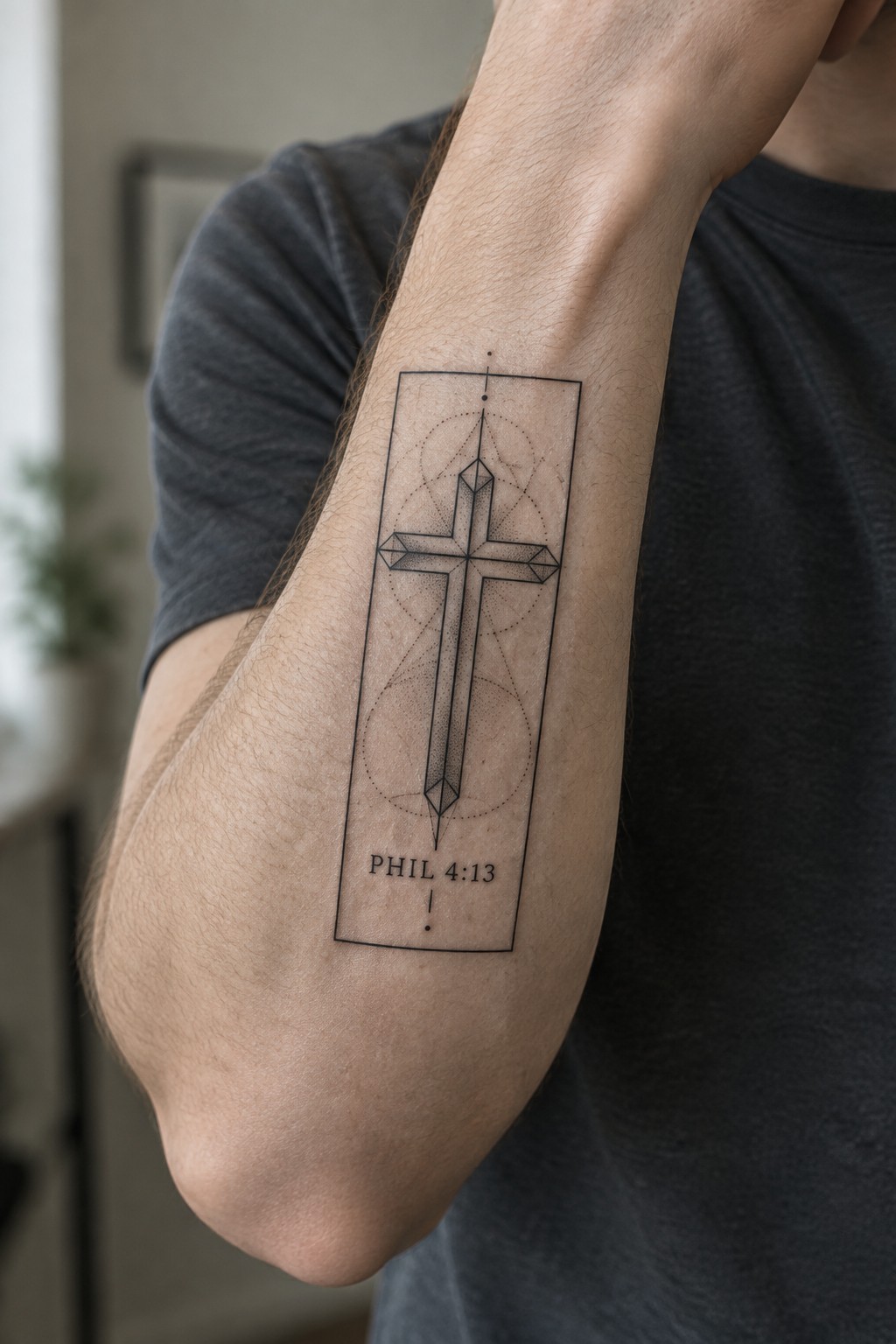
The inner forearm works well for this tall cross because the area stays flat and visible during daily movement. A thin rectangular border holds the geometric shape and the short scripture line underneath. Dotted circles sit behind the cross to add some structure without extra weight.
I think the vertical format keeps the whole piece balanced on the arm. It avoids looking cramped even though the design includes several elements.
Frequently Asked Questions
Is it okay for Christians to get tattoos? Many believers look to Leviticus 19:28 as a common concern, yet the New Testament emphasizes freedom in Christ and the condition of the heart. A tattoo that honors Scripture or points to faith can serve as a personal reminder of God’s promises rather than an act of rebellion. Pray about your motives, discuss the decision with trusted spiritual mentors, and choose designs that reflect genuine devotion.
Which Bible verses make the strongest tattoos for men? Short, powerful passages such as Joshua 1:9, Philippians 4:13, or Isaiah 41:10 translate well because they remain legible even as the tattoo ages. Consider verses that have carried personal meaning during trials or milestones. Work with your artist to test font size and placement on your skin so the text stays clear for decades.
Where do men usually place faith-based tattoos for good visibility and meaning? Common spots include the forearm, chest over the heart, upper back, or the inside of the bicep. These areas allow larger symbols like crosses, anchors, or lions while keeping the design easy to cover in professional settings. Think about how clothing will interact with the tattoo and whether you want the image visible during daily activities or only in private moments of reflection.
How can I combine Scripture with faith symbols without overcrowding the design? Start with one central verse and add a simple supporting element such as a crown of thorns, fish, or mountain range. Keep negative space around the text so it breathes. Many men choose a single meaningful symbol integrated into the lettering itself, which creates a clean, lasting image that still tells a clear story of faith.
What aftercare steps keep a Christian tattoo looking sharp for years? Follow your artist’s instructions exactly: keep the area clean, moisturized, and out of direct sunlight. Avoid picking at scabs and use fragrance-free lotion. Schedule a touch-up appointment after about a year if any lines begin to blur. Proper care protects both the artwork and the message it carries.
